Principles of designers when choosing colors
There are several rules, the observance of which allows you to get a beautiful and harmonious room in which it is pleasant to be.
You need to choose no more than two or three colors, otherwise the ceiling will be too colorful and flashy.
You can use several shades of the same color. For example, a gradient effect: arrangement in order from dark to light.
The colors of suspended ceilings should be combined with the rest of the interior. It is better to choose a range that matches the walls, floors and large furnishings.
When choosing a palette, there are two main options:
- Contrasting combination (black and white, red and green).
- Complementary (close colors, for example, turquoise and azure).
If the ceiling is bright and contrasting, it is better to choose wallpaper in neutral colors and without a large pattern. The same applies to flooring. In such an interior, the stretched fabric will become an accent. And bright walls with large patterns or photo wallpapers go well with a neutral-colored ceiling.
The style and purpose of the room is also taken into account. For classic interiors, calmer shades are suitable, and for modern ones, bright and rich ones. In the latter case, contrasting combinations or unusual patterns are possible.
Palette of shades
Red color is very dangerous. An incorrectly selected shade will ruin the appearance of the room, making it vulgar and tasteless. But if you choose the right tone, it will harmoniously fit into the interior and the room will take on a luxurious, sophisticated and sophisticated look.
Today there are several basic shades of red:
- scarlet (a bright shade, when creating a design it plays an important role, all decorative elements depend on it);
- coral (pale, moderate color, most often it will complement the image);
- burgundy (muted dark shade, great for a classic style).
To make the red stretch ceiling look appropriate, you need to paint the walls with light paint and complement the design with coral and burgundy decorative elements.
You should not overuse scarlet, as its excess contributes to anxiety and neurosis.
Also, it is worth noting that this tone is not suitable for small rooms, as it visually reduces the space. For example, it’s worth looking at a photo of burgundy-colored stretch ceilings.
Color range of suspended ceilings
Possible color solutions depend on the material and texture. They also affect the perception of tone.
PVC film
The material is available in different textures: glossy, matte, satin and textured, imitating other materials. They are distinguished by their ability to reflect light. Because of this factor, the same color creates a different impression.
The gloss is absolutely smooth, so it gives a lot of glare. It features bright, saturated colors, making it look more vibrant. This ceiling reflects the rest of the situation, which can change the color of the canvas (especially light ones). Overall, it creates a feeling of large space. The palette of glossy stretch ceilings is the richest (more than 150 shades). The range includes blue, green, yellow, red, brown, gray, purple colors. There are different tones: warm and cold, light and dark, black and white.
Matte canvas absorbs light, and the color saturation is somewhat muted, outwardly reminiscent of a painted surface. The palette includes only 10-12 colors, mostly in pastel colors. This ceiling attracts less attention and may look boring. The surface often lacks depth. But this can be easily corrected with the help of lighting, for example, built-in spots. In most cases, with such a texture, it is better to abandon dark tones. The exception is apartments with very high ceilings (more than 3 meters).
Satin texture - reflects light, but to a lesser extent than glossy. Instead of a mirror effect, you get a pearlescent shimmer. The perception of color is affected by lighting; at different distances from a window or chandelier, the shade may change. The ceiling resembles fabric. With this texture, soft and complex shades look advantageous. The range of colors is quite wide (more than 20).
Textured PVC film - obtained due to microrelief, can imitate other finishing materials (suede, leather, marble, barat, etc.) or create a complex repeating pattern. The metallic texture looks interesting. And not only in traditional gray, yellow or orange shades, but also in red or blue. And with a slight relief, any color looks voluminous.
Read more: Textured stretch ceilings
Film ceilings are more popular due to the huge selection of colors and affordable prices. In addition, any image can be applied to the surface using photo printing.
Textile
The canvas made from this material is only matte. But the surface differs from film; up close, the interweaving of the threads is noticeable (and the fabric from different manufacturers looks a little different). Due to this, the surface becomes rougher. Fabrics with a shiny coating are also available.
The color range of fabric stretch ceilings includes classic (black, gray or white) and bright colors. But there are not as many possible shades as there are with film (about 20).
The roll width reaches five meters. Thanks to this, it becomes possible to create seamless ceilings.
Yellow
A yellow ceiling will add brightness to even the darkest kitchen. An emotional, positive color will lift your spirits at breakfast and restore your energy at dinner.
The yellow palette of suspended ceilings begins with a pale sand shade and ends with bright, rich tones.
Light colors can serve as a universal frame for a kitchen of almost any style and layout.
The bright colors of the ceiling can serve as both the main accent of the kitchen and complement the overall interior.
Despite the brightness, the color does not “press” even in large volumes. Lemon shades fill the kitchen with freshness, especially in combination with white, light green and blue tones. Amber colors make the comfort warm and “homey”.
How to choose the color of a stretch ceiling depending on the room
Each room in the apartment has its own purpose (and sometimes more than one). If the palette is chosen correctly, it will be comfortable to be in it.
Kitchen and dining room
Beige color is often chosen - quite light, but not as easily soiled as white. If you want bright colors, red, yellow, orange, and green will do.
Hall and living room
Any colors can be used here, depending on personal tastes and the style of the room. Both discreet and bright shades, as well as their combinations, are possible.
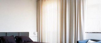
Bedroom
Light blue, dark blue, and beige tones that set the mood for relaxation are well suited. You should not choose bright colors or contrasting combinations. If you want something unusual, you can order a “starry sky” or discreet photo printing.
Cabinet
A neutral ceiling that does not distract from work is suitable for this room: white, gray, beige. A discreet design, such as an ornament or a map, is possible. If the office is perceived as a personal “den,” chocolate or cognac-colored ceilings are ordered.
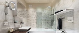
Bathroom and toilet
Blue is often used, reminiscent of the sea. White will do too. Beige goes well with warm-colored tiles.
Children's room
The traditional solution is blue for boys and pink for girls. But you don't have to limit yourself to these colors. You can use light green, lilac, champagne and other pastel shades. The atmosphere will be enlivened by bright inserts or drawings. Try not to use contrasting combinations on the ceiling. This may tire the child.
Hallway
The main disadvantage of these rooms is cramped space and lack of natural light. A glossy ceiling in white, blue or pale gray will help compensate for this.
Problem premises
A successful combination of colors will visually correct the shape. Small rooms are decorated in light colors, preferably even monochromatic ones. Then the boundaries will be blurred.
For a narrow room (for example, a corridor), choose a ceiling with transverse contrasting stripes. Bright walls and a light glossy canvas will suit a short person. It is advisable to focus on white or shades of the cold spectrum.
Kitchen – cozy and modern
The presence of burgundy is justified from the point of view of the positive color effect on the nervous system and appetite. But the small kitchen area will be a serious obstacle to implementation. A completely dark burgundy set, even against the background of light walls and ceiling, will make an overwhelming impression in a miniature kitchen space.
If you don’t want to limit yourself to curtains or a kitchen apron, an alternative division will help:
- the light top is not radically white, but its “gastronomic” variations: milk, vanilla, creamy.
- lower moderate wine-red tier on porcelain stoneware or light-colored wood floors.
- marble with cherry veining for finishing suitable surfaces.
- lack of decor on the facades, minimalism in details.
Advice. All glass elements and white splashback tiles will add lightness, regardless of style.
Kitchen sets are capable of independently expressing an idea. It is important how the burgundy color is applied - painted solid wood, matte or glossy MDF. The most popular modern solutions love bright, bold variations:
- A combination of burgundy facades and metal elements, frame models made of light aluminum, fittings and small household appliances for high-tech.
- Strict lines of minimalism and a bright shade (garnet) on a snow-white background.
- Glossy colored fronts with black elements of innovative household appliances - for a modern style that transforms the kitchen from a place of culinary accomplishments into a living space.
Primary colors
It is impossible to list all existing tones. Let's look at the most popular ones.
White
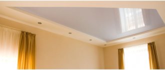
This is a classic color. Becomes a neutral background in any interior. With a matte texture it resembles plastered. It looks more interesting in gloss or satin.
Expands space, which is why it is used in small rooms. Suitable for both single-level and two-tier structures (in a combination of textures).
Beige
Another neutral color. It has many shades, thanks to which it matches the interior in both warm and cool tones. Looks great in all types of textures or in combination.
Suitable for those cases when you want a colored ceiling, but not too provocative or eye-catching. The room with him becomes gentle and light.
Grey
In a light version it looks neutral, although more strict than previous colors. Highlights other shades. Depending on the texture, it will suit both classic and modern interiors.
Dark gray is perceived differently. This tone visually reduces the height of the ceiling. It is best used in high rooms. Textures include gloss and metallic.
Black
Quite a complex color, but when properly chosen, it transforms the room. Almost always choose the option with varnish cloth. Black in high concentration causes gloomy feelings. It is often used in combination with light colors (primarily white).
Brown
Another dark color, but warmer. Associated with natural materials (wood, stone) or something tasty (coffee, chocolate, cocoa). Because of this, the interior with a brown ceiling looks cozy and comfortable. It is better to choose a mirror texture so that there is no feeling of something heavy hanging over your head.
Red
This color has an activating and tonic effect on a person. But in high concentrations it can cause anxiety.
This ceiling immediately attracts attention. It is better to make the walls calmer - beige, white. Lovers of unexpected avant-garde solutions choose black walls. But this option is not suitable for a bedroom or nursery.
In gloss, the ceiling looks brighter, with a matte surface - more restrained and calmer. A darker version of red is burgundy or wine. It looks noble and elegant.
Blue
This color calms and even puts you to sleep. Some will like its ability to reduce appetite. Often used when decorating rooms with a marine theme. The ceiling acquires depth, especially in a mirrored design.
The turquoise shade looks interesting. It is quite bright and has a less depressing effect.
Blue
Close to the previous version, but lighter. It also relaxes and calms. The possible range ranges from a faint shade close to white to almost blue.
Expands the space, makes the room lighter and airier. One of the design options is photo printing in the form of a daytime sky with clouds.
Pink
This is a diluted red, the tonic effect is partially preserved. But pink looks more tender and fresh. The room will appear taller and brighter.
Combines with all textures. Looks especially good in satin.
Violet
The attitude towards this color is ambiguous. It can have both a depressing and a stimulating effect on different people. Much depends on the shade and texture. But in any version, purple looks intriguing and elegant, attracting attention.
Green
This color has a calming effect. But unlike blue, it does not put you to sleep, but increases performance.
Thanks to a wide palette of shades, it fits into any interior. One of the options for use is the image of tree branches, grass, leaves, etc. But even without photo printing, green is associated with nature. Combines with white, blue, beige, brown and other walls.
Yellow
Reminiscent of sunlight, brings warmth and a feeling of joy. The palette includes both bright and pastel shades of yellow. The former creates a bolder look, while the latter creates a soft and cozy atmosphere.
Orange
Orange, carrot and other bright shades invigorate and tone. Suitable for rooms with windows facing north. And a south-facing room may be too hot in summer.
What wallpaper will suit a red ceiling?
The walls should be light. For large rooms, choose wallpaper in orange, golden, and beige colors. To emphasize the brightness of the shade and “cool” it, use white and red. Calmer combinations are obtained with soft blue and gray.
It is not recommended to continue the shades of such a bright ceiling finish on the walls. For color support, it is better to choose accessories and interior details. A print is allowed on wallpaper with a predominant light background; a dark one - black, brown - is allowed.
Combinations of two or more colors in single-level ceilings
Such combinations make the atmosphere more interesting and provide the opportunity to zone the space. But it is better not to use more than three colors (unless they are from a similar range and differ only in saturation).
Technically, the combinations are implemented in the following options:
- single-level ceiling with a dividing profile;
- soldering of canvases;
- contrasting finishes, for example, ceiling plinth (for small rooms).
Colors are selected taking into account the rest of the interior. White, beige, gray can be combined with any tones. Dark and bright - with light, preferably neutral or similar shades.
Alternative combinations
If in combinations with materials such as marble, wood, natural stone, metal, burgundy color manifests itself in all its glory, then not everything is so simple with contrasting colors. Only informed decisions and moderation will make it possible to make burgundy friends with other representatives of the color palette.
Designers do not use purple as a companion, and with caution, in doses:
- Herbal green. The best shade is natural greenery, and in its natural form: 2-3 beautiful plants, small decor.
- Olive. Moderate application will highlight and aesthetically calm the brightness of dark reds.
- Citric. Current shades of yellow will add positivity.
- Blue. Cool tones, with the addition of notes of gray and turquoise, will allow the fashionable color trend - Marsala - to appear in an advantageous light.
Photo printing
Another option for a colored ceiling is an image printed with special inks (eco-solvent, ultraviolet or latex). The drawing does not smell, does not harm human health, does not fade, does not spread. It can occupy the entire canvas, be located in the corner or center. The topics are varied:
- natural and urban landscapes;
- animals;
- abstract patterns and ornaments;
- fruits, berries, etc.
Colored stretch ceilings are an interesting modern solution. Don't rush to order traditional whites, look at what the contractor offers. Maybe the colored canvas will be exactly the interior decoration that was missing.
Two-tone options
Fabric stretch ceilings are not sewn together - they are stretched only as a single piece. PVC film can be soldered, which is used by designers everywhere to create fancy patterns and combinations. But two-color options have their own characteristics:
- When combining several colors, it is worth considering that the seams on a matte film will be much more noticeable than on satin - due to the fact that the satin film is slightly thinner and softer due to the lack of texture. Traces of soldering are least noticeable on glossy fabric, so this is what is most often soldered.
- There is usually no additional charge for a seam on a single-color film, but combining several colors will make the fabric more expensive. This will take into account not only the number of colors, but also the complexity of the solder line.
- It’s better not to do a simple straight seam line by soldering two colors (if you don’t want to see the flag of your favorite country above your head). Curvilinear seams and geometric patterns look much more interesting , but this design is not suitable for every interior.
- Contrasting combinations look the most beautiful . Most often, a richly colored stretch fabric is placed in a white plasterboard box. In this case, one rule applies: the smaller the area of the film, the brighter and more saturated its shade should be.
If you plan to cover the entire area from wall to wall, leaving only a narrow box around the perimeter for spotlights, then it is better to choose a canvas in pastel shades. If in the total mass there are only small inserts of glossy fabric, then it is better to make them more contrasting.
Black and white
The combination of two diametrically opposed colors gives the most shocking result. Such a ceiling always attracts attention and leaves no one indifferent.
Such a bold design can be implemented in various versions:
- Each color occupies exactly half the ceiling area. The most common options: geometry and Yin-Yang;
Don't miss: Black and white kitchen - how to do it and not regret it?
- one tone dominates the other. More often, most of the area is given to white, but the opposite option is also found.
The plasticity of the film allows you to realize almost any design, creating all kinds of curvilinearities and geometric patterns. Photo printing can complement the interior. You can choose the color and type of pattern for photo printing in special catalogs, or develop an image design yourself.
White-brown
When combining these colors, you need to understand what the final result should be.
Dark shades, wenge and dark chocolate will give a strict, laconic design. Therefore, such tones suggest the presence of straight lines and geometric patterns.
While a softer shade of milk chocolate or dark caramel is more suitable for curves and smooth patterns.
It is also worth considering the general style of the interior and the features of the kitchen. A glossy film that is too dark will require additional lighting. It is better to wrap a room with low flows in a white film with photo printing in brown tones, but in a spacious kitchen you can make a white box with brown inserts.
Metallic foil will create the effect of a rich bronze ceiling, filling the kitchen with a warm golden hue.
Red-white
Another bright combination. But this combination of colors is suitable only for strong, balanced people. In people with unstable psyches, such an emotional combination of colors can cause attacks of unmotivated aggression and outbursts of anger. Also, red color is contraindicated for people with heart disease and high blood pressure.
If red on the ceiling is still necessary, then let it play the role of “second violin”, leaving the solo part to white.
White-gray
A cooler neutral combination. Together with furniture of the same tones, this tandem will create a strict, laconic design. But if you complement it with bright accents, then it would seem that cold colors will look completely different.
It is also worth considering the texture and shade of the gray film: light ash gray, dark graphite and metallic silver will look completely different in combination with a white box or film.
So metallic is ideal for high-tech style, light tone will look better in a classic interior, and graphite will organically complement modernity.
Is it worth buying a glossy ceiling: advantages and disadvantages
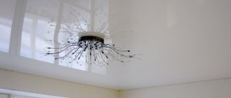
It is gloss that can be distinguished by its high reflective ability, which allows you to make the room brighter: every light source will be reflected, making the room brighter.
The canvas does not require any special care, it is easy to wash, and there are no streaks left on it. Accidental stains are removed with non-abrasive household products.
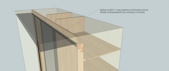
The advantage of a tension structure is that it hides utility lines and defects in the main ceiling
It is worth saying that the ceiling itself is very beautiful and decorative, which plays a role in the design of the room, visually making it larger. The reduction of several centimeters is imperceptible precisely thanks to the gloss.
Such ceilings can be installed in the kitchen, in the bathroom, and installation is quite quick.
There is no need to omit the disadvantages: if there is a connection between two glossy canvases, the seam line will not be hidden from view. The cost of installing the product is high, and if there are several levels, the price will increase even more.
Related article:
How to wash suspended ceilings at home. Types of materials for making ceilings, care features, types of cleaning products, recommendations and advice from experts.