Very often, designers choose a fashionable tiffany shade for interior decoration. For people ignorant of modern trends, the shade of the color remains a mystery, as does the name. Meanwhile, the mint and turquoise palette has become one of the most fashionable over the past year. The tiffany color, which can be found in modern interiors, offers a wide range of different shades, photos and descriptions of which we will offer in this article. Our editors will tell you what the American film of the same name has to do with Tiffany color, and will also introduce you to the rules for combining shades in the interior of different rooms.
Tiffany is the smell of a fragrant bun and the freshness of the sea breeze. Tiffany style is always a bright palette combined with white shades
A little history: where did the tiffany color come from?
If you saw in the photo a pleasant color of a mint shade in milk with hints of blue, but did not know what color it was, then you admired the Tiffany color.
He’s so lovely in his shades PHOTO: homester.com.ua
in 1837, a little-demanded color seemed interesting, which combined the features of gloss, sophistication and perfectly set off jewelry. And so it happened: all their products are sold in a box of a company color with a white ribbon.
Traditional boxes from the company PHOTO: ru.wikipedia.org
But the founder’s son went further and applied these shades to interior decor: he created amazing glass lamps that are still ready to decorate any interior today.
This color does not make the room dull and boring PHOTO: weareart.ru
Unique color
So, if your home lacks bright and fresh colors, then Tiffany color is for you. Where did this amazing shade of turquoise come to us from? There is hardly a girl who doesn’t know about the global jewelry brand Tiffany&Co. This company has literally been packaging its jewelry masterpieces in turquoise boxes since its inception. The stylish shade of these boxes is now directly associated with something beautiful.
Why is this shade so unusual? The fact is that, despite its depth and richness, it looks soft and very gentle, truly feminine. This shade of turquoise attracts the eye, but does not distract attention. Furniture, decorative items and surface finishing - you can use Tiffany color everywhere.
Of course, like any other color, this shade should not be overused. It must be combined with other tones. Tiffany color fits best into the interior as color accents. Small pillows on the sofa, curtains on the windows, an elegant vase - all this will wonderfully decorate your living room. In the bedroom, you can combine a turquoise bedspread with chair covers in the same color. Remember, if there is too much turquoise in the interior (turquoise walls, turquoise tablecloth on the table, turquoise curtains on the windows and all this in one room), it will simply lose all its tenderness and romance.
The tiffany color combines most successfully with all delicate pastel shades, however, there are other good combinations:
- Tiffany color and white will give the interior notes of purity, harmony, and freshness. In this design it will be easy for you to relax and unwind from business and worries.
- Turquoise and blue complement each other perfectly, since they have the same “root”. In this case, turquoise should become the background for the blue accent. Try the following combination for your living room: a deep blue sofa against a soft turquoise wall.
- Turquoise plus green or light green is a fresh spring combination. It pleases, inspires and encourages.
- Blue and turquoise colors will “make friends” well with each other in the interior of a bedroom.
- The combination of tiffany and pink colors is very popular abroad. It is used mainly in children's rooms. And for good reason! This duet is very stylish and gentle. Any little girl will love it.
- As for the little boy’s room, turquoise can be combined with any bright, saturated color, for example, sunny yellow.
Tiffany color: pictures and descriptions of shades
How would you describe the tones you saw? Those who looked at it called the color elegant and at the same time fresh, light and aristocratic. It combines perfectly in the interior with wood and metal elements: the result is an exclusive decor of any direction.
Delicate tones PHOTO: design-homes.ru
More muted tones PHOTO: weareart.ru
Some people still cannot determine whether this color is closer to blue or green. Well, this is a tough question. It’s better to see photo examples for yourself and draw conclusions. But designers describe it as pale blue with a hint of green.
Tiffany style color scheme
There is an opinion that the main color of this style is frivolous and impractical. However, it is he who helps transform the interior, make it interesting and non-standard. This color is always relevant: in the heat it will cool you down perfectly, and in winter it will help create the right atmosphere on New Year's Eve.
An interesting shade will help you restore strength and relax in a pleasant environment. It may seem quite complicated when combined with other colors, which is completely untrue. White, black, brown, silver colors go well with it. Combination with red tones, burgundy and wine shades, dark blue and green is also quite acceptable.
Tiffany color code: what is its unique hex code number
Copyright is reserved for the tiffany color under registration number PMS 1837.
If we take the hexadecimal code - hexadecimal triplet cod, there we will find the marking #OABAB5. It's between shades of blue, green and some red. On the RGB scale (r, g, b) – 10, 186, 181, on the HSV (h, s, v) – 178, 95, 73.
As a result, we get these beautifully painted things PHOTO: tomdom.ru
How to get tiffany color in paints
Despite copyright, using such a beautiful shade in the palette is not prohibited. You can find exactly the tone that will make your interior perfect. To do this, you need to mix the base blue and green colors, but not in equal proportions: if you add a mute white or light gray tone, you get a delicate paint. To acquire a rich shade that goes into turquoise, take green, blue and a little yellow: the tone is muffled with white.
The process seems difficult at first, but soon everything will work out PHOTO: ru.wikihow.com
But for true Tiffany, only blue paint with green pigments is suitable: you can use cyan, ultramarine, azure or cobalt.
First, cyan and greens, obtained from a mixture of blue and yellow, are applied to the palette. For blue you need to take 2 parts, and for green from 0.5 to 1.5 parts. They take very little yellow.
Advice! Prepare the right amount of paint at once, next time the shade may be different!
What is the difference between tiffany and mint colors: expert answer
We can already describe Tiffany in more detail: shades of heaven, fresh greenery, even a little pure ice, everything is woven together. This is the perfect color to incorporate into decor.
Unobtrusive tones in the interior PHOTO: design-homes.ru
For some reason it’s easy to choose accessories and decor for this color scheme PHOTO: design-homes.ru
Now let's compare it to a mint tone:
Mint tones are much greener PHOTO: wiki.wildberries.ru
Main features
- Smooth lines. The main decorative technique that is inherent in this style is the abundance of smooth curved lines that follow the contours of plants and trees. Arched protrusions, curved and sliding s-shapes are manifested in everything: furniture design, shapes of interior items, graceful silhouettes of lamps.
- Stained glass. This feature is designed to bring a bright play of colors and light into the interior as opposed to ordinary transparent or translucent glass. Multi-colored glass inserts on kitchen cabinets, amazing Tiffany-style lampshades, and Bohemian glassware are a must-have for a modern kitchen.
- Moderate lighting. There are, of course, exceptions, but in most cases, when decorating a modern kitchen, they try not to overdo it with light. Stained glass or colored glass lampshades muffle the light well and smoothly diffuse the light. This atmosphere is conducive to relaxed cooking, family dinners and intimate conversations at the table.
Now let's take a closer look at the aspects of modern kitchen interior design.
What does Tiffany color go with: suitable tones
The question of what colors the Tiffany color goes with is important for those who are designing their home or apartment. Experiments may result in a unique interior design; don’t be afraid to try!
What about compatibility with white and pastel shades?
This is definitely a suitable tandem; all the colors will adequately complement and set off each other. It will make a wonderful backdrop for a sleeping space or for living room decor. White itself will become a kind of frame for such a delicate shade.
Pleasant and affectionate combination PHOTO: roomester.ru
Nice looking kitchen PHOTO: pinterest.com
White also serves as edging PHOTO: styldoma.ru
Two shades created for each other PHOTO: roomester.ru
Subtleties of contrasting combinations with brown, black and green
To achieve contrasts, you need to boldly include rich Tiffany tones in your design. As a pair, purple, black, brown and deep green will suit him.
Unobtrusive contrast PHOTO: happymodern.ru
For contrasting combinations, you should choose rich tones PHOTO: folksland.net
Quite unusual combinations PHOTO: folksland.net
Decor and accessories
In general, such a kitchen should create an aura of aristocracy and romance, closely intertwined with cooking and family gatherings at the table. The final filling must be approached carefully and tastefully.
Lighting. As mentioned earlier, it should be muted. An elegant chandelier with colored glass lampshades, table and floor lamps in the Tiffany style - all this will come in handy.
Work zone. It is advisable to choose the design of household appliances “antique” and, if possible, hide them behind facades. The apron is made of small tiles or mosaics depicting something natural: flowers, birds, landscapes or flowing abstractions.
Dinner Zone. The table can be square, but with curved legs or convex sides. Chairs with beautiful backs, velvet seats, and leather elements. Wood carving, originality of shapes, massiveness and high quality furniture are very welcome.
Moderation. The interior of a kitchen in the Art Nouveau style does not tolerate clutter with accessories - only the best and most appropriate decorative items. Figurines made of bronze or copper with various colored stones, stained glass vases, figurines of animals and insects, noble indoor flowers in elongated flowerpots, etc.
The interior of a kitchen in the Art Nouveau style will appeal to connoisseurs of the sophistication of the late 19th and early 20th centuries. Its aristocracy, originality and dynamics are ideally combined with natural curves and smooth lines, creating a unique ensemble of harmony of forms and materials.
In which interiors does Tiffany color dominate?
We have to dive into the study of suitable interior styles where Tiffany shades can be implemented.
Mediterranean style
Where there is more blue in Tiffany color is in the Mediterranean style. Simplicity of lines and natural sea colors, reminiscent not only of the sea, but also of its shore with shells. To get a chic stylistic environment, wood and stones should be included in the interior. Tiffany will emphasize freshness, turning the atmosphere in the room into a breath of gentle breeze.
You shouldn’t mix too many colors PHOTO: roomester.ru
Several more colors will make good partners: olive shades, blue, azure, terracotta and white.
Mediterranean design suits terraces, bathrooms and kitchens.
Calm and soulful country and Provence styles
Country and Provence style wood in any of its forms is beautifully decorated in a Tiffany theme. These include accessories, any decorative elements, and furniture. You can use this paint for ornamentation, artificial aging of some decorative element, or painting furniture.
You can take a shade closer to green or blue PHOTO: 100lustr.ru
In bathrooms and toilets this is also a suitable color PHOTO: dizainvfoto.ru
Modern interior
You can decorate the interior of modern styles in different ways and technologies. This green-blue shade goes well with absolutely all finishing materials.
You don’t need to use any special bright splashes, everything will turn out stylish.
Coffee with milk tints this color well PHOTO: dizainvfoto.ru
Using Color in Styles
Delicate shades of Tiffany will harmoniously fit into any interior ensemble. They are especially often used in marine and Mediterranean design, but this is not the only style solution for this palette. The color is quite appropriate in such areas as:
- modern - exquisite turquoise furniture with ornate fantasy shapes will be an excellent accent on a neutral background;
- classic - bluish-green wall panels in combination with white stucco and exquisite accessories will add tenderness to the room and soften the severity of classical forms;
- hi-tech is an ideal choice for a modern urban interior - glossy turquoise elements, set off by chrome details, look very impressive and relevant;
- Scandinavian - the main task of this style is to catch and save as much light as possible. Therefore, it is necessary to introduce as many light reflective surfaces into the interior as possible. To decorate the walls, it is allowed to use only the most delicate Tiffany paints. The brighter and more saturated “representatives” of the palette will absorb light. For furniture, you should also choose pastel sky blue paints, but a few bright accents are also quite acceptable;
- Provence – Tiffany’s color is simply created for delicate rustic interiors. This shade looks incredibly organic in wall decoration, upholstered or cabinet furniture, textiles and accessories;
- pop art – bright, extraordinary interiors will only become more spectacular thanks to turquoise splashes.
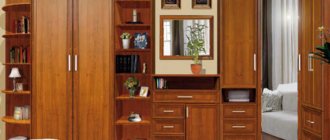
Tiffany color in the decoration and decor of different rooms
In the decoration, you can consider Tiffany-colored wallpaper for the walls, and choose furniture of this color palette as decor. Let's explore design options for furnishings.
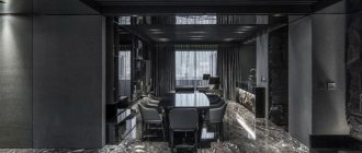
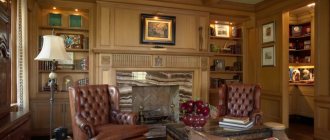
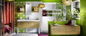
Living room and study
Here the color scheme is arranged in such a way that Tiffany is the main one. But other colors, which will dilute the main tone, will set the overall atmosphere. In general, we admire and notice the subtleties of the design idea.
PHOTO: dizainvfoto.ru
PHOTO: homester.com.ua
PHOTO: m.yandex.ru
PHOTO: m.yandex.ru
PHOTO: weareart.ru
PHOTO: happymodern.ru
Bedroom and children's room
The bedroom does not require bright accents or flashy colors, so pastel colors can always be a companion to the main tone. You can also use light coffee colors and shades of green. Bed linen should also not look inharmonious.
For a child’s room, you can use either muted tones or, conversely, rich ones.
PHOTO: design-homes.ru
PHOTO: dizainvfoto.ru
PHOTO: archidea.com.ua
PHOTO: m.yandex.ru
PHOTO: folksland.net
PHOTO: design-homes.ru
PHOTO: yandex.uz
PHOTO: president-mobility.ru
Kitchen and bathroom
The kitchen and bathroom are rooms with their own requirements for the quality and characteristics of finishing and furniture.
If the room is small, do not overuse color, leaving only islands of accents in the form of accessories. But the impression will not be complete if you do not make sure that each cup is in harmony with the tone of the interior.
The bathroom will surprise you in that the color of the walls changes slightly with different lighting conditions. It is better to choose a tile of a different tone. In this case, it will not merge and spoil the effect.
PHOTO: dizainvfoto.ru
PHOTO: yandex.kz
PHOTO: dizainvfoto.ru
PHOTO: yandex.kz
PHOTO: dizajninfo.ru
PHOTO: pinterest.dk
PHOTO: santa-keramika.ru
PHOTO: archidea.com.ua
Tiffany color in furniture and textiles: let’s place accents
Furniture of this color refreshes and softens the perception at the same time. The decor will beautifully highlight the rest of the room, but you should choose the right companion color.
Graceful harmony PHOTO: mebelnadom.ru
Wooden surfaces painted Tiffany PHOTO: design-homes.ru
Textiles in the form of pillows, bedspreads, curtains in Tiffany design always give a feeling of spring and some kind of freshness. Textiles are well complemented by lamps, paintings, and indoor plants.
Spring beauty all year round PHOTO: dizainvfoto.ru
Transparent fabric will look more advantageous PHOTO: domshtor.ru
We remember that we create comfort!