» Purple » Purple color and combination with it
Purple color is a bright tone at the junction of pink and violet. The combination with it is common and loved by everyone both in clothing and in the interior.
This color contains the divine and the earthly, which means it belongs to those who are in supreme power. Thus, in Byzantine culture, purple is the most important attribute of royalty. He is an imperial dignity. Only Basileus had the right to sign in purple ink, sit on a purple throne, and wear purple boots. Only the altar Gospel is allowed to be in the purpura. And only the Mother of God and St. Anna, as a sign of deep respect, could be depicted in a purple robe.
Purple combines red and blue, as two extremes, and is a point of balance - wisdom, thoughtfulness, awareness and duality. He is not only a symbol of royalty, but also of lower lust. It is known that the Whore of Babylon was dressed in purple. Roman soldiers, mired in unconventional love, were also famous for their purple togas. And sometimes both the lower and the higher were united in one person, for example Julius Caesar, Caligula, Nero, Otto, Tiberius and others, who often appeared in public in colorful purple outfits.
Purple - there is sensuality, restraint, caution. After all, if you dilute it you can get many pink shades. Thus, purple is the unification of the masculine and feminine principles. His movement from carnal love to the acquisition of wisdom, and the completion of the creation of man in the likeness of the Lord.
Shades of purple. Photo
Purple has bright, rich shades. They can be quite different, however, the main characteristic will be the predominance of red over blue in the composition of violet.
Shades of purple in the Pantone system
Bright purple - blinds with its piercing, luminous property. We see it when a red and violet wave hits the retina of the eye (as the shortest and longest, thereby covering infinity + and -). For us, this is a spectral color, which is why the tone is so bright.
The red-purple tone is softer, more refined, and rich. Due to the high red content, it can be classified as a pink color, for example, a fuchsia variant.
Classic purple is a medium, red-violet tone with a precise balance of red and blue in its composition: 2 to 1. Velvety, attractive, it can often be seen in spectacular combinations.
Lilac purple is a softer version of bright purple with an amethyst shimmer. It is clean, sonorous with a festive context.
Wine purple is a deep, velvety, luxurious color that is the crowning glory of purple inspiration. It can be described as a cross between purple and burgundy.
Violet-magenta is a red-violet that contains more blue than other tones, which makes it mysterious and evening.
Purple color combination
Combinations with purple are expressive, contrasting, rich. It combines both complex and bright tones, however, in addition to color contrast, it is interesting to see light contrast: when the tones in a pair are lighter than the main color. There are 10 palettes for you with different shades of the same tone. Choose the most attractive pair for yourself.
Color combination: purple and pink. Both warm and cold shades of pink are combined with it; the former look much more interesting in tandem, since in addition to light they create thermal contrast. For a couple, you can take white-lilac, royal pink, sunset pink, flamingo, amaranth.
The combination of purple and red is a combination of related tones with a slight thermal contrast. It is bright and exotic. Try combining watermelon, Chinese red, coral red, bright burgundy, and wine to complement the main tone.
The combination of purple and orange is a bright, rich, oriental combination built on a light thermal contrast. They are united by the related presence of red and the additional opposition of purple and yellow. Combine with light peach, orange-coral, carrot, red-orange, red.
Purple is combined with yellow - as an option close to an additional pair: purple + yellow. The combination is expressive, but not flashy. The tandem can include apricot, sunny yellow, mustard, yellow-gold, bright gold.
Purple combines with warm shades of green to form a natural pairing that can be seen in nature. And at the same time, it does not lose its exoticism, since the purple itself is rare and bright. Combine it with pistachio, olive, marsh, brown-green, dark green.
Purple is combined with cool shades of green to create a vintage, rich palette, with a slight thermal contrast. This pair can become an independent decoration, for this use: the color of green water, menthol, mint, emerald, malachite.
Color combination: purple and blue . In this case, the main tone is warmer than the tone of the satellite, so the whole pair goes into a cold range. The light contrast will be interesting. An example of a combination with aquamarine, soft blue, bluish green, dark turquoise, Prussian blue.
The combination of purple and violet is a combination of shades of the same color: lighter or darker shades deepen the tone, giving it volume and vibrant shine. Combine it with lilac-lilac, thistle, lavender, eggplant, and grape.
The combination of purple and brown is a successful combination of basic and highly colorful tones, while both components equally enhance each other offering a very aesthetic look. Consider a combination with oak, tan, mahogany, chocolate, dark chocolate.
The combination of purple with white, gray and black as neutral tones is a beneficial solution for such an expressive shade. Light tones will make it rich and luminous, dark and medium tones will give it a languid, temperamental look. For example, a combination with creamy, light beige, gray-lilac, anthracite, wet asphalt.
Psychology of purple
Since ancient times, this shade has been considered a symbol:
- authorities;
- caution;
- inconsistency;
- holiness.
The shade is born from a combination of red and blue. Two formative colors that are opposite in direction cause a variety of perception. Depending on the:
- designer's ideas;
- combinations with other colors;
- dullness and intensity;
- Purple affects people in different ways.
Creative workshops are often decorated in this color. In small doses it is great for children. And for both girls and boys. Many beauty salons choose purple as their advertising color. It attracts attention, focusing it on lofty aspirations.
Complex purple color combination
- with plum color (2), creating a contrasting combination based on differences in saturation and lightness of the participants in the pair. Both tones (magenta and plum) are violet shades, so in this combination our eye sees depth, like light turning into deep shadow.
- with yellow-pink color (3), forming a color contrast. It is known that yellow is a complementary color to violet, which when paired create very effective combinations, but are rough for constant perception. Going red softens this effect.
Complete the combination with old gold, red and blue.
Harmonious color combinations
The names of colors and shades of purple depend on the proportions of red and blue colors combined in them. The intensity of the color also affects the nature of the effect of various combinations.
Due to the fact that the color of eggplant is dark, combining opposing essences, it can be used in combination with light tones. The eggplant color looks good in tandem with a dim turquoise tint, which will somewhat muffle the influence of the veiled red color and make the overall range more stable. The combination of eggplant with any shades of yellow looks great. This interaction complements each other and is a perfect color combination. Purple acts as a contrasting background for yellow.
Bright purple color. Combination
The bright purple color is as piercingly rich as red, but unlike the latter, it has more mysticism and femininity. These are oriental beauties; they shimmer amazingly on transparent, smooth and rough materials. Bright purple is not suitable for everyone (see who suits the purple shade) and therefore, before using it, you need to soberly assess your appearance. The tone has a negative effect on a non-contrasting appearance and can emphasize figure flaws, as it visually expands objects. It is definitely a holiday look and can be used for underwear, leisure wear or sportswear.
Combine this tone with shrimp, sunset pink, red-orange, bright orange, red-orange, corn, bright gold, yellow-green, patina, thrush egg color, dark blue, charoite, eggplant, tea, ivory, black and gray.
Red-purple color. Combination
The combination of red and purple colors is expressive, but compared to bright purple, more strict and businesslike. The red-purple tone is distinguished by restraint, it is closest to pink (fuchsia), and therefore takes on most of its properties.
Unlike the previous one, the tone can be used in an everyday wardrobe, however, it is perfect for holidays, recreation, and sports. Consider combinations with white-lilac, carnation, Chinese red, golden copper, red, saffron, pale gold, lime, kelly, sky blue, Prussian blue, amethyst, grape, chocolate, light beige, wet asphalt.
Clothes combinations
Warm yellow-orange, green-yellow and related lilac-burgundy shades will best support our color.
Cool blue, cool mint, turquoise create contrasting combinations with this tone, so it is recommended to think through this look carefully.
Using such a palette, apply the rules of proportions two to one - one color is twice as much as the other.
Black
One of the simple combinations that requires little effort and will add style and luxury to your outfit.
To make the look sparkle, just complement it with a light accessory (silver, gold), shoes, bag or jewelry (bracelet, chain). A mysterious outfit, with the addition of a little shimmer, is good for an evening event.
- A black floor-length dress and an eggplant clutch, with nude high-heeled shoes.
- Anthracite leather pencil skirt, pumps, clutch plus chiffon blouse in a delicious tone.
- Eggplant color suit, black turtleneck (T-shirt, top) plus loafers.
White
Another traditional way. However, unlike other tandems with white, here it is not so advantageous. It is best to include here another tone that will definitely add severity to the appearance and set a specific style - this is black. A trio like this will help make your look expressive and unusual. And eggplant and white definitely won’t get lost in it.
Pastel colors: beige, milky
Since eggplant is a deep, incomprehensible magic, calmer colors are required to “pacify” it. All delicate pastel shades (cream, milky, nude, beige) do an excellent job with this task. This can even include a shade of a different spectrum, pistachio.
Lilac-purple color. Combination
Combinations of lilac-purple are colorful: from piercingly bright to dominant color spots. The shade itself matches bright purple, however, it is closer to amethyst. More subdued versions of it can be used in an everyday wardrobe, but this particular tone is intended for relaxation and entertainment. Thin, delicate, rich, it strives for a romantic style. You need to be careful with it: it is suitable for a highly contrasting appearance, as well as the “spring” color type.
Combine it with cloudy pink, coral pink, garnet, orange-coral, red-orange, signal, bright gold, light green, emerald, bright blue, sapphire, red-violet, eggplant, milk chocolate, papyrus color, wet asphalt .
Wine purple color combination
Deep, juicy combinations with wine-purple will not leave anyone indifferent. This shade is good and like the “first violin”. Full of expression, inner strength, lively brilliance, it is closer in character to burgundy, but if it is in full view, then wine-purple is full of mysteries and secrets.
The tone is universal, it can be seen both in a strict office version and in an evening outfit. It can be combined with sakura, clover, crimson coral, tangerine, red, yellow gold, old gold, olive, malachite, water color, royal blue, lilac, plum, cinnamon, latte, dark black.
Violet-purple color combination
The combination of violet and purple is mainly based on the contrast of dark and light. The tone is quite rich, dark and at the same time the coldest of the shades of purple, which gives it restraint. As a dark purple, it creates colorful compositions that can be embodied in a casual, evening, or sports wardrobe.
It will look good paired with carnation, light coral, scarlet, mango, pumpkin, wheat, dark gold, swamp green, emerald green, thrush egg color, cornflower blue, lilac-amethyst, dark purple, bronze, ivory , dark black.
A fine line: purple and purple in the interior, what is the difference and ideal combinations
There is an opinion among marketers that the most successful projects are born at the border of different types of business. Psychologists believe that “borderline states” are the most mysterious. And the most beautiful interiors certainly contain complex shades that are born at the intersection of two colors.
Our next issue on the topic of color combinations will tell you about two interesting neighboring shades (they are next to each other on the color wheel). Despite the fact that they are often confused (especially in light shades, called “lilac”), there is a significant difference between them. And, as a result, harmonious combinations for them will also be different.
You will see 2 palettes of ideal combinations and 3 sections with examples - 21 photos of interiors for each color: violet and magenta , as well as ideas for using both colors in the space of one room.
So what's the difference?
First, let's decide on the names. The Russian language differs significantly from English in this regard. Our "violet" is "purple" and our "magenta" is "magenta". Therefore, you will see English names in the pictures in this gallery, and Russian ones in the text.
Firstly, one of them is more strict and cold, and the other is soft and warm. This is explained by the fact that purple is considered the last color in the cold sector of the color wheel. And purple is the first in the warm sector (and not “red”, as is commonly believed).
Secondly, a different approach to ideal combinations with other colors. You will see all this on the palettes, but a few words are still worth saying.
Of course, white and black are not discussed - they highlight both violet and purple. Gray will take on the shade of the color it is next to. But in combinations with other colors there are already significant differences.
Combination with red: rich and pure shades of red are ideal for purple, more muted shades for purple.
Combination with yellow: for violet - exactly “yellow” (the color of egg yolk), for purple - ocher (yellow-orange).
Combination with green: purple harmonizes perfectly with apple, olive and malachite, and purple prefers any shades of turquoise.
Combination with blue and cyan: for purple these should be purer tones, purple allows for some muting and an admixture of gray.
Combination with rich pink: purple looks great next to the brightest neon shade called “hot pink”, while purple prefers a softer shade, what we call “raspberry”.
That, in fact, is the whole theory. Our examples will tell us much more eloquently about this.
__________________________
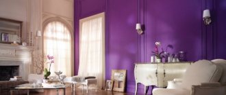
purple color in the interior
palette of combinations for purple color
__________________________
purple color in the interior
palette of combinations for purple color
__________________________
ideas for combining purple and purple in one room
Purple color in clothes
Purple is the color of excellence. In fact, it is more powerful than red, which attracts with its leadership nature. Purple, on the other hand, represents transcendental leadership, something beyond the ordinary, so it evokes a very powerful impression in clothing.
Bright shades of purple will not be appropriate in everyday style. But for a banquet, holiday, or nightclub, these colors will come in handy. To embody a purple image, which means sensual, powerful, balanced, you need a contrasting appearance (or the ability to create one like the “spring” color type through bright makeup). Therefore, purple is contraindicated for the “summer” color type. Purple looks especially beautiful on smooth, airy and shiny surfaces. So a dress made of purple sequins will be more profitable than purple viscose. But do not forget that bright colors and purple increase the volume of shapes.
[edit]Using eggplant color in clothes
File:B 300 0 16777215 00 images 2014 11 5 8f2be(1).jpg eggplant in clothes
- The color suits almost everyone: plump and slender, tall and petite, blondes and brunettes.
- Blonde girls with snow-white skin should not overuse eggplant. The whole purple range gives such Nordic young ladies an unhealthy look.
- It will decorate almost any look: casual, evening, business.
- Eggplant is bright enough for an evening out, but discreet for a business look.
- The saturation and complexity of color compensates for its loneliness in the image. True, this solution is best suited for beauties with red, brown or copper-blond hair.
- A chic highlight will be wedding sets in eggplant color for the groom or bridesmaids. This color gives individuality, sexuality, and nobility to the images of men.
- Well, the bride’s snow-white outfit against the backdrop of the bridesmaids’ dresses in the shade of eggplant will look contrasting, bright and even take on a bit of mystery in the photo.
- This color of clothing is chosen by people who want to find harmony with themselves and peace.
- An overabundance of eggplant tones in clothing can lead to a desire for privacy, unsociability and invisibility of a person to others.
- This color is not suitable for a business meeting. An outfit in eggplant tones will be harmonious for an evening dress.
- The rich color should be diluted with light shades of gray or yellow. A combination of an eggplant dress with a ring and earrings with stones of the same color would be ideal.
- Clothing in dark purple tones suits almost any type of appearance.
- The exception is people with a reddish skin tone.
Eggplant can be called universal. Provided you comply with the main requirements for the shape of the cut and the choice of things in each style, you can find a worthy use for this color. It will look most advantageous in the following styles:
- New look,
- Casual,
- Urban chic
- Business,
- Sports,
- Vintage,
- Evibel,
- Gothic style.
It is not recommended to use color when creating an image in a vamp theme, since eggplant is too calm for the aggressive-sexual mood of the style. It is unlikely that the color will be suitable for a romantic direction, where it is customary to use light and soft colors.
Who should wear purple in clothes?
For “spring”, pure and bright colors will be relevant, such as bright purple, lilac-purple, red-purple, classic purple. “Winter” will share an interest in bright colors, but in addition to them will add wine purple and violet purple to its palette. For “summer”, more restrained tones will be relevant: muted purple, red and violet. “Autumn” will be able to focus on red, classic, wine and violet purple.
Purple and gold - a royal look
A combination of purple and gold will provide a truly royal look to the room. This combination is good to use in the interior of the living room. Depending on the third color, the room can be given a different mood. For example, a combination of purple with a calm gray color will create a feeling of calm and tranquility in your living room, while gold will give this interior nobility and elegance.
living room in purple and gold
By combining purple with a brighter third color - lemon or apple - you will get a bright, sunny living room, the richness and sophistication of which will be emphasized by expensive metal.
Combination of purple color in clothes
The presence of purple in your wardrobe can qualitatively change its aesthetic component, because it can transform even very boring things and shades.
Dark purple tones combine favorably with black: rich, temperamental. A very good evening option.
Black+white+purple is a spectacular pair: high light contrast along with the expressiveness of the color “spot”. There is graphics.
A black and white stripe next to the main color is a bright, stylish technique.
Various shades of gray will highlight the red-violet chic.
White + purple, like brilliant fresh ideas, of heavenly origin.
Light pink tones, both its shades (mauve) and warm salmon colors keep it on the level of a neutral color.
To achieve a particularly bold look, you'll need red to mid-pink pieces.
Orange: subtle oriental flavor fills the range with a bright sunset glow.
Yellow gives a confident contrast to the complementary pair: flashy, dramatic.
It is better to complement green color with white, black, gray, gold.
But blue-green combined with purple is good on its own.
Blue tones will enhance the mystical effect of the color.
A dark blue color coupled with beige and white can add a business-like tone - this is the highest skill.
Blue, lilac-blue and lilac will give the couple softness and dreaminess.
And beige, gold and brown will highlight the shade favorably without remaining in a colorful shadow.
We combine color in clothes with makeup
The eggplant shade carries notes of sexuality. And if you wear the right clothes, you'll also need some amazing makeup. Before you make it, you need to decide on a color palette. To do this, it is recommended to be guided by eye color:
- green and gray - then makeup in pink and purple shades will come in handy;
- brown - in this case it is advisable to choose flesh and silver tones.
Whatever the outfit, you should always be guided by the rule: “we place the emphasis either on the lips or on the eyes.” Hence there are 2 makeup options:
- It is necessary to draw an outline on the eyes. A black or very dark purple pencil is suitable for this. The upper contour should go into the arrow (how long it will be is up to the girl). The moving part of the eyelid should be covered with lilac shadows. You need to take several shades. In this case, the darkest one is applied from the outside and carefully shaded. If the eyes are deep-set, then at the inner corner you can apply shadows of a light shade (close to white). A pearl highlight is applied under the eyebrows on the outside of the eyes. Next, the eyelashes are covered with black mascara. To complete the makeup, apply mocha blush and light pink lipstick.
- Another makeup option combines purple and golden shades. First you need to apply shadows: purple on the eyelids and golden under the eyebrows. Next, we highlight the look with eyeliner or a special pencil. Depending on the color of your eyes, you need to choose its shade. Green-eyed beauties can choose a black or dark gray option. For blue-eyed and gray-eyed girls, a blue contour pencil or eyeliner would be ideal. To complete the makeup, cover your lips with golden-pink lipstick.
Purple in the interior
Purple color is more common in oriental interiors. Lots of curtains, fabric wallpaper, hanging translucent ceilings, low beds and sofas, a sea of colorful pillows. This is due to the natural sensuality of Eastern people. If you take a color idea and implement it into a modern room, then the best choice for its implementation would be the bedroom. It is better to cover the walls and floor with purple fabric rather than paint them the desired shade. The center of the room will be an eggplant-colored bed with rough fabric upholstery; it is a continuation of the bench-shaped ottoman, which stretches along the entire wall. The simple shapes of the bed in a minimalist style add a modern touch to the design. A bright bedspread and pillows create comfort. There can be a lot of pillows, and they will all be different, or you can maintain minimalism. The main highlight of the room will be the lighting - dim, warm and soft. To do this, we will choose round, colorful lampshades: we will hang two, and we will place one near the bed.
Combination of purple color in the interior
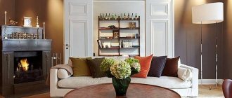
The combination of purple color in the interior gives the room a colorful elegance. The tone looks good next to gold and neutral shades, and pairs brightly with other colors. It is very diverse and therefore you can create very exotic and pompous decorations.
VIEW COMBINATIONS WITH SIMILAR SHADES (click on color)
USEFUL ARTICLES ON THIS TOPIC (click on the picture)
4 comments on “Purple color and combination with it”
- Elena
October 6, 2013, 16:58
I have two purple items in my wardrobe: a down jacket and a military-style jacket, and I consider myself a deep summer color type: dark brown hair, fair skin and hazel eyes (green-yellow). Although I would say the jacket is amethyst color. And yet, I think that this color suits me very well, makes me expressive and attractive.
I wonder if purple and amethyst are not the same thing?
- Ksenia
October 16, 2013, 23:35
Amethyst is closer to lilac, in my opinion, but what will it give you if you consider it purple?
- Elena
October 22, 2013, 10:18 pm
Thank you, I really like your site and always read your new articles with great interest. But I believe that there are exceptions to any rule. And perhaps purple is my exception.
Ksenia, sorry for being off topic, are you planning to talk about fashionable prints? I am very interested in the cage and, in particular, the “crow’s foot”.
- Ksenia
October 23, 2013, 20:38
Fashion prints are difficult to associate with color, and this is a site about color. And about the cage it is written in this article: lookcolor.ru/cvet-v-odezh…y-chast-pervaya/
Color harmony
If you want color variety, but want to avoid sharp contrasts, then choose colors that combine harmoniously with each other.
We provide the most harmonious examples of color combinations that successfully combine with each other below.
Find the color of your interior (current or planned) and see what colors it goes with:
- The red interior harmoniously combines with: white, blue, pink, orange, golden yellow, silver, black. Look at the tables of combinations with red in the interior.
- The orange interior is combined with: white, red, pink, yellow, ocher, green, black, gray.
- The interior is in green tones , combined with: light green, lime, blue, yellow, black. Look at the tables of green color combinations in the interior.
- The interior is in blue tones , combined with: green, turquoise, red, purple, gray, gold.
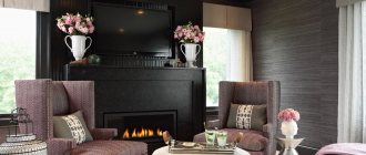
- The interior is in purple tones , combined with: blue, white, gray-blue, lilac, pink, gold, orange, light green. Look at the tables of color combinations with purple shades.
- The interior is in pink tones, combined with: red, white, beige, gray, coffee, lemon.
- The interior is in yellow tones, combined with: white, green, blue, black, many shades of brown. Look at the tables of yellow color combinations in the interior.
- The interior is in brown tones , combined with: white, beige, blue, gold.
- The interior is in blue tones , combined with: white, blue, gray, purple, light green.
- The interior is in gray tones , combined with: black, pink, green, blue.
