Choosing a color for your home takes literally a few moments; selecting furniture sometimes takes months, but the result of the work will remain for many years. You can’t rush, because after applying the shade to the walls, finding furniture can become more difficult. If something happens, the “classics” will come to the rescue - brown tones, among which there is also a modern “interpretation” in the form of the color of cappuccino and similar shades inherent in coffee drinks.
If we focus specifically on the color of cappuccino, it is worth noting its softness and neutrality. In fact, it is a dim, but aesthetic option, which is also characterized by aligning the overall gamut with nondescript, acidic, colorful or defiant accents. Coffee shades on furniture improve the already finished, but not the most successful design. Brown and its shades will highlight any of the styles known today.
About color: properties, characteristics and psychology of color
The color is a caramel shade, which is observed in the drink of the same name. In the interior, light brown tones are often used, especially cappuccino - fashionable, soft, non-irritating and non-allergenic. Designers note the compatibility of this color, neutrality and ability to create transitions in light and dark interiors.
Cappuccino is a light "version" of brown, which is created by mixing two, three or four of the common colors - red, orange, yellow, green, blue and purple. The shade of the popular drink has a pink tint.
An environment with a predominance of shades of coffee drinks makes people feel protected and calm. The light brown design evokes thoughts of a delicious drink and sweets like milk chocolate. Residents and guests perceive the color of cappuccino almost always positively.
Kitchen area
The place where coffee is brewed is the kitchen, and therefore these colors always look organic there. Even if cappuccino is not the main color in the interior, then various decorative elements, furniture facades, fittings or kitchen accessories will create a cozy and “tasty” environment.
White color and dark nuances of cappuccino will create an abundance of light in the kitchen interior. To increase appetite, use a combination of brown and red in cabinet doors.
The combination of milk chocolate and soft pink colors appeals to most housewives. Dark wood and frosted glass are a tribute to modern trends.
Cappuccino color shades
In fact, the human eye perceives almost all pale shades of brown approximately equally. Cappuccino has notes of orange, pink and red tones. They are present to a greater extent in the foam, less in the drink itself. People intuitively distinguish the shade of cappuccino from coffee due to the presence of a characteristic tint in the former. The color of cappuccino is affected by milk that is white or light yellow in color.
The coffee and light brown palettes include the following colors:
- sand;
- walnut;
- ecru;
- dark beige;
- zinnwaldite;
- pink-brown;
- ocher;
- light clay;
- wheat;
- light khaki;
- the color of withered leaves.
Nature has given humans hundreds of shades of brown, dozens of which are similar to coffee and its varieties. The coffee range includes nut, wheat, sand, ecru, zinnwaldite, light clay, and a shade of natural ocher paint. Visually, burnt sienna, light copper and red fall into this category. Shades of coffee drinks are actively used in design, painting and even for hair coloring.
Basic shades
More often, coffee-milky color is used in the decoration of walls and furniture, while light cappuccino is intended for interior partitions, and dark cappuccino is intended for furniture facades.
To prevent the room from looking dull and gloomy, do not use only dark colors or only light cappuccino. The monotony of brown and cream in the interior can be diluted with decorative elements of blue or turquoise. Red or orange fragments will also add dynamics to the design. Achieving coziness in the living room is possible by adding green furnishings.
Combinations with other colors
The most popular combinations:
- Several shades of coffee from lightest to darkest;
- Cappuccino and white;
- Light brown with mint or olive;
- Cappuccino with gray;
- Cappuccino with golden and red;
- Cappuccino and pink, cherry or purple.
In order for the decor to look stylish for as long as possible, it should be saturated with uniform combinations of shades or made completely “impersonal” and monotonous. Mixing the color of cappuccino with green undertones such as olive, light green, turquoise and mint is used in the Mediterranean style. The combination of natural greenery and clay-like flowers has become common among the peoples of the Mediterranean. White and cappuccino symbolize the painted foam on the drink and, in a sense, the classic combination of coffee and milk. Designers use a palette of different shades of light brown in their mini-masterpieces. In spacious rooms, the range includes decor, books and practical items. A light chocolate shade together with gold and red denote status and a high level of well-being. Transitional colors work well with cappuccino color.
Combinations
In interior design, you need to observe not only the correct proportions of furniture dimensions so as not to overload the room, but also take into account color combinations. This is necessary so that the overall room looks harmonious. What color goes with cappuccino in the interior? It looks good with light shades: beige, milky, white, peach, sand, lemon. Dark colors are also a good addition: black, brown, gray. If you want brightness, you can add red, burgundy, purple, green, olive, blue, sapphire. You can use photographs of palace interiors from the last century as inspiration. What if you want something gentle and modern? Take a closer look at the pink shade. It should be a delicate color that can be mixed with a hint of cappuccino and get an interesting combination. Or you can use pink in the glass that will fill the room. What about taboos? It is advisable not to use purple and blue shades. All bright fluorescent colors are also prohibited.
What styles can it be used in?
Cappuccino's uniqueness as a color is evident in its mixability and relevance to a long list of styles. The shade is considered a presentable version of brown, which is a real find for a modern interior. The color of cappuccino will not be out of place in a glamorous setting, Provence and loft styles, modernity and classicism, mixed in technological and ethnic directions. Pure brown, as well as white, gray and blue tones, for all their popularity, are inferior to cappuccino.
In a modernist design, a pinkish coffee hue will highlight intricate shapes in plain and dark brown tones, creating eye-catching contrasts. The color is suitable for the role of background. Thus, it is used in the interior rooms of houses in the classicism and baroque styles. In the high-tech style they use plain glossy furniture with a cappuccino finish. In lofts and rooms in the spirit of the province, coffee tones are combined with textures and textures.
Lighting Features for Color
The central chandelier is used more often than other light sources. We are talking about a lamp decorated with crystal, fabrics and metal with decorative patterns. The choice of lighting power depends on the brightness of the cappuccino color. A conventional strip of spotlights will make a shade that is too light watery. In this case, only two additional lighting lamps and 4 more spotlights will be enough. The latter are selected and placed in the way that is most convenient. Yellow lamps above the large sofa will come in handy in the living room. They buy white ones for the kitchen and install them above the apron. In the nursery, a play corner is allocated and lit in a way that is best for the child. The bathroom is made either very bright or in muted colors. In the bedroom and living room, devices are installed that provide diffused light. They buy floor lamps and wall sconces. Increasingly, they are being replaced by modern conceptual analogues.
Combination with other shades
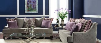
A brown accordion sofa, as in the photo, will look great in an interior in which shades are used wisely. Let's talk about the most successful combinations:
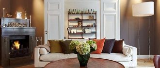
Cream. This tone goes well with chocolate, giving the living space maximum comfort. Wall surfaces in cream will make a strict brown sofa in the living room more delicate.
White. This combination is considered classic, for this reason it is suitable for every design style. The tones of a snow-white and brown interior space come in a wide variety.
Rich chocolate shades go well with a creamy background, and coffee shades go well with a milky one. Experimenting with the palette makes it possible to create contrasting as well as calm interior spaces.
Grey. To create the brightest possible interior, it is enough to place a sofa in a gray-brown color. There is no need to add other shades. A neutral shade of gray successfully emphasizes the original color of the decor, while creating a contrast that does not become boring even after many years.
Orange. An orange-brown sofa in a fairly bright room refreshes it and illuminates dark places.
Pink. To some, this tone seems completely inappropriate. However, in fact, the combination is intended for arranging a nursery. Interior space in a pink-brown tone has a positive effect on the child's psyche.
Burgundy. Will make every interior original. Furniture in a shade of red-brown will give the room stability and chic.
Using color in interior design
The shade of cappuccino is ideal as a background color in private storey houses where there is a lot of interior space. In the corridors and hallways of apartments, they are generally limited to only this version of brown. The main target rooms where coffee coffee is used are the hallway and bedroom. To a lesser extent, this applies to offices, bathrooms, kitchens and children's rooms.
The dark beige shade is similar to the pure color of cappuccino, and together with the latter it is popular as an alternative or replacement for brown. Solid brown rooms, supposedly classic, are gradually becoming a thing of the past, because light shades better reveal the features of objects, and the transitions between light and dark provide a wide field for the designer’s work. In the interior, coffee color looks much more organic if the corresponding color is naturally present on materials and fabrics.
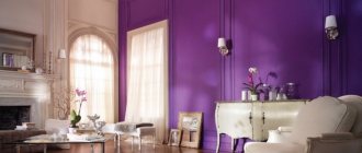
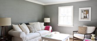
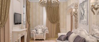
In the living room
Spaciousness and status - that’s what cappuccino color can give to a living room. The shade is combined with mirrors, crystal, ornaments, precious stones, and gilding. Coffee walls will organically emphasize the level ceiling or decorative elements on it. The light brown design has moves to combine technological details with luxury objects into one. The shade of cappuccino is played with curtains, shutters, lamps, carpets, capes. This often happens naturally, because these items usually match in color and “approach” a light brown tone.
Light shades of coffee also solve opposite problems. The furnishings are given sloppiness, simplicity, roughness - as, for example, in lofts. The industrial living room shows off more than the rest of the rooms combined. The shade of cappuccino is also suitable for a room in a restrained youth style.
To roughly understand how the living room wallpaper will look at different times of the day, its surface needs to be illuminated with a flashlight.
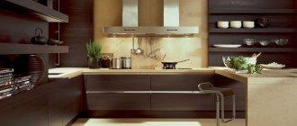
In the kitchen
Cappuccino-colored furniture fits perfectly with white walls and ceilings of kitchens - even if it doesn’t look as technologically advanced as green, blue and purple tones. The softness of the light brown color improves appetite, which is useful when eating and preparing food.
The light brown shade harmonizes with bright lighting and patterns. It also appears in the kitchen along with wooden inserts and wooden refrigerators.
Light coffee color is used in minimalist kitchens to avoid bright colors. We are also talking about kitchens in studio apartments, where they use every opportunity to unload the space.
Lighter shades of cappuccino are better in every way. For dark and cramped kitchens, for a light background, for an unusual dark design with the need for contrast. Light combinations make stripes and transitions much better.
In the bedroom
There is no more suitable place for a shade of cappuccino than the bedroom. Soothing colors from a neutral or warm range are helpful in a room. The inhabitants “love” the coffee walls surrounded by a white ceiling, floor and textiles. The fabrics themselves come in cappuccino colors, from blankets to upholstery.
Light brown flooring finishes solid dark gray bedrooms, all snow white in Scandi style. Defiant red rooms are diluted with transition zones and partitions, which are made coffee, yellow, and white. Sometimes shades like cappuccino are given the role of inserts, door panels, and headboards.
Those who want to add brown color to the bedroom and lack options should think about patterns and wallpaper. You can allocate only one wall for this. The view will be excellent; it is not necessary to decorate the entire space this way.
Popular colors for walls:
- coffee and gold;
- cappuccino color, white and yellow;
- light brown, gray and silver;
- coffee and pink.
In the nursery
In this case, coffee shades are rather an exception, because adults try to decorate children’s rooms as brightly as possible. Cappuccino color is more suitable for teenagers' rooms. There you can arrange something unobtrusive in the spirit of a provincial setting or on an environmental theme. The younger generation will benefit from large shelving, spacious drawers for things, and light brown and coffee tones are commonplace for wooden items. A touch of cappuccino won't hurt if your child has a lot of soft toys. Light brown imitating animal skin will be included in a single color combination. The theme is developed by distributing “little animals” throughout the room.
A hint of cappuccino will not hurt where a small child under 2 years old sleeps and plays. We are again talking about the relaxing properties of the brown palette. Children cry less if there is no provoking color in the room.
In the office
Coffee color is sometimes replaced with banal brown. Offices usually have a lot of wood, so the idea of at least diluting the brown with light furniture elements or wall color is not a waste of time.
In the classic design, cappuccino color is used for the central sections of the walls. Paintings are often hung on a coffee background and figurines are placed. In addition to the usual green, red and brown upholstery colors, you can occasionally see a shade of cappuccino.
The coffee shade is meant to be dominant, so it's worth trying to arrange a bright office. In this sense, they implement something like a home office with a light desk and modern lamps. In a dark office with a classic design, you can purchase original coffee-beige armchairs and the same sofa.
In the bathroom and toilet
In the bathroom, coffee color is present on ceramic tiles, sanitary ware, and sometimes on wooden objects. As for the latter, we are talking about shelves, bedside tables, organizers, hangers. Coffee is one of the alternative shades for baths. White fonts are replaced with colored ones to emphasize the cost of finishing materials.
In bathrooms, a combination of brown and white colors is often used, and instead of the first, sometimes only coffee is used. This way they emphasize the texture of the cladding, making the room lighter and more spacious. There is another way to saturate your bathroom with the color of cappuccino. The shade of the screen, for example, paintings.
In addition to a light coffee-colored bathroom, an equally equipped toilet would not hurt. Single-color walls are diluted with several dark borders, but more often two main colors are used. The restroom is equipped with dim yellow lighting.
Principles of creating an interior
When planning the interior, the main thing is to exercise moderation, otherwise staying in the room for a long time will be uncomfortable. This especially applies to the choice of contrasts and determining their quantity. Cappuccino should play the dominant role, all other colors are added in smaller quantities, although reverse combinations are possible.
In the kitchen it is better to use washable coverings: wallpaper, panels, which will be not only stylish, but also practical. Overloading the room with too dark tones should be avoided: usually an accent wall or textiles or decor in richer shades are enough.
If cappuccino is used, in addition to it, it is undesirable to introduce more than two colors into the interior in one room. It will look pretentious and unnatural, and the natural magic of cappuccino will be lost.
In any room, you should follow the rule: light colors are used at the top, darker ones at the bottom. In small rooms, it is recommended to select the lightest furniture for cappuccino-colored walls and install white or beige interior doors: this will create the impression of expanding boundaries.
Other important rules for room design:
- if the interior seems boring, you need to introduce 2-3 bright spots into it;
- you should avoid an abundance of gray and black in combination with cappuccino - the atmosphere will become gloomy;
- Cappuccino loves a combination of different textures, for example, wallpaper and plaster, or heterogeneous types of furniture facades, wood and rattan, and cork.
Walls
The choice of color for the walls is directly determined by the quality of the lighting. If the room's windows face north, it is better to choose only warm light colors for decoration. Southern rooms usually have excellent natural light, so they often use cool shades of cappuccino with a grayish undertone.
How can you decorate the walls? Depending on the purpose of the room, the coffee-colored material may vary:
- ceramic tile;
- paint on putty or drywall;
- decorative plaster – bark beetle, Venetian, stone-like, etc.;
- washable or paper wallpaper;
- natural and artificial stone;
- brick;
- tree;
- panels, including stone-like ones;
- cork;
- bamboo.
Cappuccino in the color of the walls is perfect for all the most popular styles. The color is ideal for hi-tech, minimalism, classics, modern, Provence. Depending on the style, natural or modern synthetic materials, gloss and matte finishes are welcome. In the kitchen, it is popular to decorate the apron with tiles of a contrasting tone, for example, chocolate, in combination with a light coffee set. The walls can also have a beige color, while one of them is made an accent: painted cappuccino or pasted on a fresco or photo wallpaper in these colors.
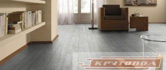
Floor
Light floors are usually chosen for small rooms to visually expand the space. If the room is dark, then light flooring will be the best solution. Where dimensions allow, use darker colors for the floor: chocolate, coffee, to create an interesting contrast with the walls.
In the kitchen, you can use a checkerboard type of floor finishing - a combination of white, beige tiles with cappuccino-colored tiles. It is possible to manufacture a self-leveling floor, which will provide an expensive, aristocratic look to the room. The most economical finishing methods are laminate and linoleum, which are sold in a wide range and include different cappuccino shades.
Ceiling
Choosing the right shade for the ceiling is very important: the overall appearance of the room will depend on it. Before painting or installing a suspended ceiling, you need to take into account light levels, square footage, and the color of large-sized furniture: sofas, walls, furniture. If you decide to use cappuccino for the ceiling, it is better to choose the most delicate, pastel colors: they will add airiness.
For low ceilings, you should also choose the lightest colors or still prefer white paint. A suspended ceiling can combine white and cappuccino: usually the center is decorated last, and the edges are made snow-white.
Doors
Often, choosing a tone for door panels is difficult. The door can be in harmony with the floor, baseboards, or be contrasting or repeat the shade of the walls or textiles. The darker the background of the doors, the more austere the interior looks.
Doors can be made from different materials: natural and artificial. The most expensive option is natural wood, but it is environmentally friendly and incredibly beautiful. The cost of veneered doors is much lower, although they also vary greatly in price depending on quality. The most expensive in this category is eco-veneer - a coating that accurately imitates the structure of wood.
The choice of door design in a cappuccino tone should depend on the style direction and personal preferences. Most often, buyers purchase simple, classic doors with or without a pattern, glass. Non-standard designs are also sold: hinged, sliding, folding, but their installation is best left to specialists.
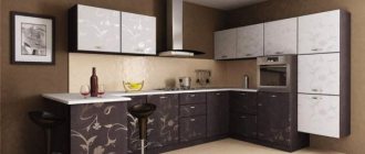
Furniture and kitchen set
The furniture should be plain or combine 2 shades: cappuccino and a color that goes well with it. The latter can be contrasting or neutral. If you want to create the feeling of a drink in a cup, furniture is made using the ombre technique, where light colors smoothly turn into darker ones.
Light furniture is chosen if there is a richly colored floor and rich wall decoration. Furniture handles can be gold, chrome, silver. Kitchen sets in cappuccino color often have complex facades with fragments painted in different shades of this tone. Using lighter or richer coffee colors, you can create various geometric patterns or decorate the set in a classic way (top – light, bottom – dark). Also, the upper facades can be red, purple, and the lower ones can be a cappuccino shade, which will look no less stylish.
Decor
Typically, fabrics for curtains, sofa upholstery or covers for upholstered furniture are chosen in a color similar to the shade of the walls. But small textile elements: pillows, napkins, potholders in the kitchen should be contrasting, this will bring joyful notes to the interior. Light, natural fabrics are used, and rough textures are also welcomed.
The tulle in the room can be made white, beige, while the curtains can be in cappuccino color. Decorative items can also be contrasting or coffee-colored: vases, bowls, figurines, picture frames. It is recommended to hang a picture of coffee beans in the kitchen: this will enhance the charm of the cappuccino shade. Living plants that are suitable for any room in the house will help make the interior more harmonious.
Lighting
The central chandelier serves as the main light source. In the classic style, lamps with elements of glass, crystal, and metal are used. Small lighting devices are placed in groups of three or four to focus attention on them.
Additional lighting is selected depending on the purpose: for example, in the kitchen it will be needed in the work and dining areas, in the hall - in a place for secluded relaxation, in the children's room - on an impromptu playground. As decoration, small sconces and floor lamps are used, which provide diffused light and provide the room with a finished look.
The color of cappuccino can transform any room. It is beneficial to use it in the kitchen, bedroom, living room, hallway: everywhere household members will find comfort, tranquility and a unique “coffee” atmosphere.
Furniture in cappuccino color
Sets, wardrobes, sofas and armchairs with a light brown tint are sold in 2 main options: monotone and with one complementary color. To select the lightness of furniture, designers advise focusing on the floor. The rich color of the coating will indicate the appropriateness of light bedside tables and armchairs, and exactly the opposite option is also acceptable. Cappuccino-colored furniture has chrome, silver and gold handles. Manufacturers paint kitchen walls in several shades of light brown if they want to create a complex modular combination. Patterns are applied in lighter colors. A color division is used horizontally or vertically, in which one half is cappuccino color and the other is regular brown. Among complementary shades, preference is given to white, beige, olive, cherry, and purple. They logically complement the coffee one - with small inserts or create a noticeable contrast.
The feeling of a drink in a cup is achieved thanks to the “ombre” technique with a smooth transition of light to dark tones.
Color selection
Brown is as versatile as any other range, and the choice of shade determines the mood, the character of the interior, and whatever you want to combine it with. Among the combinations (and chocolate and other nuances are combined with almost the entire palette) are sophisticated duets with milk and beige, eco-designs in wood, complex combinations with dark purple, etc. But first things first - first you need to choose the optimal tone for your taste .
The brown palette can be different:
- Light colors of cocoa with milk or natural wood are ideal nuances for eco-style, modern interior or light, unobtrusive design in minimalism, Japanese and Scandinavian design options.
- More saturated beige, light brown, as well as coffee with milk - such notes can also become the main palette in the design, so the sofa can merge with the decoration and thereby become almost invisible.
- A chocolate sofa (all shades of chocolate from chocolate to lighter) in the living room interior is the most common option (up to almost black) and can be called a strict, elegant, and discreet option. This particular model with leather upholstery can be seen not only in official establishments - for example, meeting rooms in large companies, but also in the interiors of a house or apartment.
- Not the most ordinary palettes, which are most often found in rare types of wood , are an unusual decoration for any interior. As a rule, in such an environment there are also other non-standard details - ethnic decor, exotic objects, etc.
To find an exquisite solution for the living room of a residential building or apartment, recommendations from designers and photos of finished projects will help. Tips on selecting furniture according to room parameters will be useful.
If the room is not very large, you should abandon overly saturated models, but for spacious living rooms, almost black products are also suitable.
Textiles and decor in cappuccino color
Light coffee colors are somehow present in every room where there is a lot of textiles and decor. We are talking about the following items:
- candlesticks;
- pots;
- vases;
- tapestries;
- carpets;
- covers;
- bedspreads;
- stands;
- paintings;
- regular and draped curtains;
- tablecloths
Light brown is better suited than other shades for textiles: natural, knitted, synthetic. Cappuccino colors make blankets, pillows and bed bolsters. An expensive canopy bed and a simple one for one person become more comfortable with a lot of light textiles. Patterned brown wallpaper looks perfect next to a false fireplace.
Historical classics would be inaccessible without capes made of expensive fabrics, vases and painted dishes. If you manage to coordinate all these accessories with the overall coffee palette, the result will be beyond all expectations. It wouldn't hurt to buy draped curtains for a light brown room. They can be completely covered and illuminated.