Home » Decor » Interior colors
Interior colors
Liana
1 comment
If you think that a gray interior is boring, the photos say otherwise. This color is a fashion trend for modern life.
Is gray wallpaper boring or stylish?
What is gray color? This is the border between white and black. These concepts are completely opposite. Designers and decorators play on this: they connect the unconnected: finishing materials of different styles, furniture. Against a gray background, even laconic sofas with bright upholstery or a dark-colored slide become art objects.
Border between white and black
A room decorated in this color becomes interesting if you apply design tricks.
It is necessary to choose the right complement to the “capricious” color.
- Don't decorate all the walls in the same color, as this will cause boredom. Apply one of the three options described below.
- If you want the same wallpaper, choose a different texture.
- Plain walls become a good backdrop for bright details.
- Choose beautiful furniture (that attracts attention with color and shape).
Apply the law of color, proper lighting, decoration depending on the size of the room and the room will turn into a masterpiece.
The room becomes interesting if you apply design tricks
Interesting wall decoration:
- One wall is decorated with wallpaper with a large print. Choose a design in one color and different shades.
- Similar to the first option, but the drawing has a different color scheme. It becomes an art object. Don't decorate the entire wall; frame it with moldings or stucco. You can create a handmade painting.
- Three walls - smooth wallpaper and one with a large texture. In this case, variety is guaranteed, and textured options become an additional decoration of the room.
Don't decorate all the walls in the same color, it's boring
Advice Do not combine diametrically different styles: kitsch and empire, high-tech and baroque. Otherwise, the room will turn into a “hodgepodge”.
Gray is indispensable in offices. A business atmosphere will be ensured. If you combine gray with brown, the room takes on a solemn look. Choose smoky, steely shades that provide a sense of maturity.
A business atmosphere will be ensured
How to make a monochrome gray and white interior beautiful?
Don't be afraid of calm colors. The great Leonardo da Vinci said: “White is the first of the main ones.” But few people dare to choose a pure white interior. A large number creates a cold atmosphere, internal tension and memories of hospital wards.
For lovers of serene peace, a good option is the gray and white design of rooms with fragmentary inclusions of bright details. What could it be? Dark wooden furniture, picture frames, fresh green flowers, bright lighting fixtures or curtains.
“White is the first of the primary colors” Leonardo da Vinci
Such a basis for the interior becomes a “blank canvas” for other items. It charges with energy and gives purity of thoughts. The combination of two basic shades can be complemented with any others and it looks harmonious.
The use of materials of various textures:
- gray walls painted with decorative paint and furniture with glossy doors;
- white walls and gray furniture upholstery, gray and white carpet, anthracite facades and furniture tabletops;
- One of the walls is decorated with white, and it becomes the background for paintings, floor vases, upholstered furniture, and decorative shelves. The remaining three are in gray.
The combination of two basic shades can be complemented with any other colors and it looks harmonious
This interior is the easiest to transform and change. You can organize seasonal decor: in winter, add warm colors: red, orange, yellow pillows; in spring - green vases, bedspreads for sofas and armchairs; in summer - provide coolness with blue or blue; in autumn - pink or lilac tones.
How do curtains change the appearance of a home?
Textiles transform rooms, emphasize the chosen style, balance the severity of laconic design, and protect the room from the environment. What do designers offer? Natural materials and their imitation:
- linen;
- cotton;
- silk;
- taffeta;
- velvet.
Gives you the opportunity to play with different textures
Consider the location of a particular room. For the north side, choose light shades; the south side needs good protection from the sun, so rich colors are quite appropriate. It does not distract from other interior items and becomes an addition rather than an accent detail.
This year's fashion trend is natural tones.
Gives you the opportunity to play with different textures. Thin curtains are chosen with the texture of linen and cotton fabrics. A satin or silk curtain with soft folds smooths out sharp corners. Unless you are decorating a room in a neoclassical style, forget about lambrequins. They have lost their positions.
Textiles transform rooms and emphasize the chosen style
Want to provide variety? Make three-layer curtains of different shades. You can cover the windows with light or dark canvases, thereby changing the appearance of your home.
Use tiebacks for draping. They provide soft, even folds. It is desirable that curtains and other textiles are in harmony with each other. This allows you to create your own comfortable atmosphere.
Beautiful combination
In the kitchen
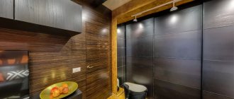
Dark shades combined with equally fashionable ocher helped Anton Petrov design a fashionable and memorable interior. Gray and black tones create a feeling of calm and confidence, and also advantageously emphasize the play of textures. Look how effectively tinted glass, black enamel, liquid brass inserts and decorative “lava” coating on the facades combine with each other.
Kitchen interier. Author of the project: Anton Petrov. Photo: Sergey Krasyuk.
Kitchen interier. Author of the project: Anton Petrov. Photo: Sergey Krasyuk.
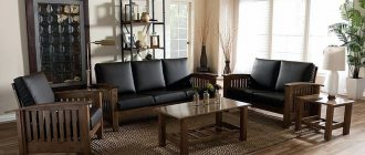
Sofas
Furniture needs to be fashionable and functional. Gray gives elegance and sophistication. It's the graphite leather upholstery that looks great, not black. We will consider two options: gray upholstery of sofas in interiors of other colors and colored furniture in gray rooms. Both options are possible.
For those who like experimenting, two sofas are installed in the living room: one gray, and the second white, black or brown. Variety and exclusivity are guaranteed.
Elegance and sophistication
A similar approach can be used for kitchen sofas in open-plan rooms. The upholstered furniture in the living area is large and gray, and the kitchen corner has bright upholstery. This approach balances the monochrome interior, but does not irritate with a riot of colors.
White, black, blue sofas with gray pillows and armrests decorate the interior and create a sophisticated atmosphere. This technique looks better than bright monochromatic models.
Furniture needs to be fashionable and functional
Tip Play with the texture of the upholstery: gray background with a dark gray pattern; plain seats and backrests with colored armrests can completely change the appearance of the environment.
Dark shades, natural or forest green
They are distinguished by their richness, depth, and repeat the color of algae, coniferous and herbaceous plants. They create bright accents and a certain atmosphere indoors, most often in a living room or office.
They look interesting in the bathroom and kitchen against the background of white sanitary ware and glass. Serve as a background when decorating spacious luxurious rooms.
Green color in the interior is combined with white, cream, beige, brown, yellow, orange, as well as lilac and soft blue.
Coffee table in an emerald interior Source uutvdome.ru
Kitchen doors, what color is fashionable?
Gray is often used in the design of kitchens and hallways. Why am I suggesting this color? Brown in various interpretations is already boring. Manufacturers come up with:
- unusual inserts with stones;
- sandblasting patterns;
- stained glass;
- bindings of various shapes.
A simple version of kitchen doors
If you want to quickly update the interior, but not renovate the entire apartment or house. Try installing gray doors. The effect will be amazing. The color range is extensive:
- pearl;
- light gray;
- smoky;
- ashen;
- graphite.
What is their advantage:
- Doors refresh a room and make it cozy.
- No visible dirt.
- Doors and floor coverings of these shades become the ideal background for green, cherry or black.
- Beige and gray options provide a warm, intimate environment.
- A door leaf with a bluish tint gives a refreshing chill and emphasizes cleanliness.
Gray is often used in the design of kitchens and hallways
Doors become the boundary between two rooms. Choose models in the same style, otherwise discomfort is guaranteed. For children's, bedrooms, and bathrooms, models with solid fabric are preferred. In living rooms and kitchens, door leaves with textured, colored glass look good.
In what interiors are they suitable? Smooth canvases with laconic moldings for modern houses and apartments. Imitation of aged light wood emphasizes country and Provence style. A silver palette, curly ornate panels, and decorative overlays complement the classic styles. Bindings with glass for eco styles, Japanese and minimalism.
Doors refresh the room and make it cozy
What should you avoid?
- Do not place a smooth door in a room with a neoclassical style. Otherwise, the interior loses its value and looks cheap.
- Graphite and anthracite tones are not acceptable for a small room. They visually steal space.
- Eclecticism and Empire style do not go well with gray doors.
Dark brown wall decoration and the same doors evoke negative emotions. But the interior with pastel walls becomes larger, and luxurious accessories and furniture acquire charm. The graphite door sets off the furniture in different shades of white: baked milk, ivory. Steel also supports elegant blue and light blue.
Model in a silver palette
Bedrooms
It gives an atmosphere of peace in the rest rooms. Becomes a good background for other items and your life in general. It does not distract, but allows you to focus on yourself and your loved ones. Combines with pink and yellow. Gives positive energy.
Natural shade and fashion items
Well complements colors for environmental styles:
- green;
- brown;
- orange;
- blue.
This creates an oasis of peace, even in a smoky and noisy city. In long rooms, paint the short walls a tone darker than the long ones and you will see that the room has been transformed and visually acquired different parameters.
Natural shades and fashionable items, interior elements provide a harmonious combination of nature and modernity. This technique guarantees relaxation and a feeling of harmony.
Gives an atmosphere of peace in rest rooms
Advice Gray is important for children with hyperactivity. They need calm and an environment that will balance excess emotions. However, additional bright details are sure to be added to the nursery: bedspreads, tables, toy boxes, curtains.
Combinations of gray with other colors in the interior
Gray tolerates almost any color combination, as it matches most known warm and cool shades. Bright colors that contrast with it are appropriate, creating a special mood. Pastel, powdery shades will look no worse next to gray, providing an atmosphere of lightness in the room. Below are the most common colors that can be considered as companions for an achromatic tone.
Beige
Both of these colors are considered neutral, so they can be combined with each other. A pair of light beige with a pale steel color looks especially interesting. The room will look incredibly airy, since both shades are close to white.
If the interior uses beige and dark gray tones, it is better to add white accents - curtains, curtains, and make the ceiling light. The introduction of bright details is also not forbidden: yellow, peach, and orange elements will fit perfectly into such an interior.
Brown
Usually brown is introduced into design in the form of wood tones (oak, cedar, wenge), warm chocolate shades. This combination will make the room cozy and add homely warmth. Gray will be an excellent background for wooden furniture, and it will look no less good as a floor covering with brown furniture.
White
Steel color can become a background for white parts. Most often, this tandem is used in the kitchen, bedroom, hallway.
Green
The gray-green interior is inherent in eco-style and country style. Gray looks very advantageous against greenery and creates an interesting contrast. No less beautiful is light gray in combination with rich green; together they have a relaxing effect and make the room cozy. The greenery can be living plants, a green carpet, a blanket, blinds, a pattern on tulle or curtains.
Blue
Blue color is introduced into an achromatic interior to give it airiness, warmth, and freshness. This duet is suitable for classic, marine style; when diluted with other light colors, it can become part of Provence. Gray wallpaper with blue patterns, as well as blue curtains, textiles, and decorative elements look attractive.
Pink
Gray goes very well with pink; moreover, the combination is considered very fashionable and stylish. The shade of rose will add tenderness and romanticism to the interior, and together with gray it will have a relaxing, calming effect. For the loft and high-tech directions, you can take both tones in bright variations, but pink - in small quantities. Another option for successfully decorating a room is a combination of pink-lilac and graphite with the addition of green or white accents.
Turquoise
Light shades of turquoise can be taken as a basis by installing gray furniture in the room with dark turquoise pillows and capes. The reverse combination is also possible, when the walls are made in grayish tones and the accents are turquoise, the interior will also look advantageous. A similar mixture of colors is well suited for the bathroom, living room, corridor (in the latter case, all shades should be light or richly diluted with white, milky details).
Yellow
If there are too many gray shades in the room, yellow will help brighten up their dullness. It will create an original image of the apartment, adding richness and warmth. Gray-yellow in the interior of a bedroom or living room can be combined with black and white, for example, in the form of decorative elements: monograms on cabinet furniture, picture frames or mirrors.
Violet
Saturated purple loses its heaviness next to grayish tones and becomes neutral in meaning, of course, when introduced with emphasis. More delicate shades of lavender, lilac, coupled with gray are ideal for a living room or bedroom in the Provence style.
Blue
When combining gray and blue colors, an important rule applies: if blue is dark, then the second color should be light, light, cool. For bright blue you need to take dusty, muted grayish shades.
Red, orange
The interior, based on steel and red tones, is considered one of the most complex, but elegant. The atmosphere will not be warm, but it will certainly attract attention. The kitchen, bedroom, and children's room are not suitable for this type of design; it is best to use a similar tandem in the living room or bathroom, liberally diluting the decor with white details. If you want brightness and catchiness in the interior, it is better not to take muted shades of red, but replace them with crimson and scarlet.
Saturated orange in large quantities can be tiring, so it is used as accents on a gray background. You should choose their bright colors: red, carrot, orange: they will give the room a boost of vigor.
Living room
To prevent the interior from seeming monochrome, it is enough to dilute it with contrasting objects or bright accents:
- floor lamps;
- sconce;
- lamps;
- vintage curtains.
In the interior of the living room
Gray and red are an unusual combination. But it is well suited for rooms facing north and northwest. Usually these rooms do not have enough light. Red acts as a pop of color and provides warmth. It is associated with classic Empire style interiors.
Tip If you have a large room, choose upholstery of upholstered furniture in this color, plus gray walls and the room will acquire a palace charm.
Note : Experiment by painting all the walls light gray and stenciling them in graphite or silver. You don’t have to select the required wallpaper pattern or waste time on pasting. With a minimum investment, the effect is amazing.
Gray and red - an unusual combination
For living rooms, color nuances help avoid a riot of colors and give peace, which is necessary for relaxation. Owners have a wide range of decor choices:
- paintings;
- vases;
- lighting fixtures;
- floor coverings.
It’s easier to choose textiles and change them according to your wishes.
Fans of Japanese style will love the combination of gray walls, flooring and furniture, finishing materials, and wooden doors. Anthracite-colored furniture with a laconic shape is also quite appropriate. In such interiors, all the details serve to help people listen to themselves, their feelings and enjoy the world around them.
Helps avoid a riot of colors and gives peace
Light shades of gray are needed for decorating small rooms. The same can be said about :
- fur capes;
- carpets;
- decorative pillows.
If you want to quickly change the interior, replace textiles, play with texture. There used to be satin, take a tapestry, replace the fur with linen. The world around you will immediately sparkle with new nuances.
Introduction of warm colors into the interior: yellow, orange give peace and a feeling of sunny mood. Use this technique in the fall and winter to prevent a depressive mood and not lose your sense of joy.
Light shades are needed for decorating small rooms
Gray color and fashionable interior: what to look for
Additional colors for rooms in gray tones should be chosen taking into account the contrast principle: a graphite shade will look great next to light objects, and dark furniture will look good against the background of light gray walls.
When choosing color combinations, first of all we want to be guided by how good it is in terms of the latest trends in interior design, but we also need to take into account the functionality of the room.
However, we must not forget about the basic rule: the walls should be lighter than the floor and darker than the ceiling, gray furniture should be a darker shade than the walls, but lighter than the floor. Deviations from the rules are permitted, but should be done with caution.
Gray-blue
Gray gets along well with blue, similar blue and turquoise. In the bedrooms and living rooms, pearl shades of decoration and blue furniture and textiles provide classic chic. These colors and shades are intertwined and complement each other.
For high-tech style, where chrome-plated metal is used, furniture facades with a neon tint, glass countertops are an acceptable choice. You don't have to think about flashy details. The room is calm, pleasant and not boring.
Gray gets along great with blue
The classic combination of blue + gray has its roots in Baroque palace interiors. This trend does not go out of fashion, since everything created in the past remains with us at the genetic level and includes the necessary strings of the soul. As a result, there is no explosion of colors, but there is nobility of lines and restrained fashionability. Turquoise upholstery and decorative pillows set the necessary accents and add cheerful notes.
Calm, pleasant and not boring room
Gray-white – light nobility
Don’t like the explosion of color spots that fans of pop art and kitsch offer. But tired of the beige palette - the trend of recent years? Pay attention to the tandem: white and gray.
White color dilutes the main gray tone and provides a visual enlargement of the room. The fragmentary use of graphite or anthracite shades will help diversify the interior. It could be:
- frieze of ceramic tiles;
- door frames;
- window sills;
- bar counter.
Tandem: white and gray
This combination suits Scandinavian style décor. And this is not surprising: residents of northern regions with snow bring natural shades into their home design. They are needed for those who value the comfort of their home and inner peace. Remember the snowy plains, what peace they give with their pristine purity. Gray and white interiors give such sensations.
In north-facing rooms, use soft white shades:
- creamy;
- baked milk;
- cream.
They guarantee a soft transition and do not make the room cold. A winning option: anthracite flooring, neutral gray walls and snow-white furniture.
White color dilutes the main gray tone and provides visual enlargement of the room
Psychology of gray
Can gray color make a living room comfortable and stylish, as the art of design demands? Psychologists were the first to prove that yes!
According to the Luscher test, gray color is chosen by people who:
- tired of stress and struggle for status
- strive for privacy and harmony!
And Johannes Itten in his book “The Art of Color” wrote about pure gray tone that it corresponds to a state of balance, therefore it is useful and even necessary for vision and for the brain.
In general, psychologists agree that a gray (but not gloomy) environment is suitable for sensitive and creative people, for those who have to communicate with people, compete, and show intelligence and imagination in their work.
Moreover, gray color has a beneficial effect in living rooms, and especially in bedrooms and lounge areas. It is very relaxing and erases everything unnecessary from memory.
Let's take a closer look at what designers think about this.
What can linoleum give to the interior?
Wooden floors and tiles never go out of style. But linoleum flooring remains popular. The main advantage is the price, variety of patterns, versatility, and the ability to quickly replace the floor covering . Let's talk about color and pattern.
The advantage of such linoleum is the price
It is enough to go to construction stores or online sites to understand that linoleum imitates:
- stone;
- marble;
- tree;
- parquet;
- abstract drawing.
Compatible with other materials:
- tiles;
- parquet board;
- laminate
It is enough to purchase transition thresholds, the connection problem is solved.
This material helps you avoid making large financial investments and quickly change your interior. Small clarifications. For the hallway you need linoleum with good wear resistance. For living rooms, a foam or felt base is important. Otherwise, comfort is difficult to achieve.
Linoleum flooring is still popular
What do you need to consider?
What kind of floors are we used to seeing in interiors? Most will say: brown in different color and texture interpretations. This is why I suggest using gray. Don't be afraid to experiment. An updated home color scheme can radically change your life.
To decorate the floor, designers suggest using various materials. Let's figure out why they should be different. In living rooms, bedrooms, offices, children's rooms - warmth is needed. Kitchens, hygiene rooms, hallways are washed frequently. Based on this, take a look at the collections of building materials, take the best they offer in gray: linoleum, tiles.
A good, non-staining choice for flooring
Let's look at what gray materials are applicable in the interior:
- Wood is a wonderful stylish option.
- Ceramic tiles come in a wide variety.
- Linoleum is a budget opportunity to experiment.
- Self-leveling floors are an expensive option, but the effect will be amazing.
A seasoned, somewhat strict, yet elegant gray color for any material does not lose its properties. It gives peace, sophistication, exclusivity and does not irritate, unlike collections with bright, complex color patterns.
Tiles are best suited for the kitchen or hallway
An interesting effect is produced by a wooden board with a gray texture in different collections; it has the name: “Oak Ice White”, “Grabo”, “Rustic Oil”, “Cardamono”, etc. They complement the styles: Scandinavian, Colonial, Provence.
Let's talk about the practical side. This floor covering is easier to use. Water stains, abrasions, scratches, and dust are less noticeable. This makes life easier for homeowners.
This flooring base complements other items well:
- furniture;
- decorative things;
- textile.
The original appearance of the property is guaranteed.
Gives peace and sophistication, exclusivity and does not irritate
Rooms in gray tones
Subtleties of color decoration of premises.
Kitchen
A kitchen space with a predominance of gray tones promotes concentration on the process of cooking. This design is associated with a production area in an upscale restaurant, complete with steel furnishings. A home kitchen equipped with wooden furniture or stone countertops becomes more practical and looks stylish thanks to this color scheme.
The photo shows gray color in the interior of a kitchen made in neoclassical style.
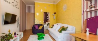
Living room
In a small living room, an excellent solution would be to decorate it in warm colors, while for a spacious hall, cool shades are suitable. A monochrome palette will add some complexity to the atmosphere. The interior can be complemented with bright accents in the form of curtains, a sofa with pillows, armchairs and more.
The photo shows a small guest room in gray and white colors.
Bedroom
Light gray colors with a matte or light and silky texture are especially appropriate for decorating a bedroom. White or pink accessories will add even more tenderness to the room, and beige or brown elements will fill it with warmth.
Bathroom
This color scheme is a fairly practical option for the bathroom, since dirt and stains are less visible on gray surfaces. When choosing a tint solution, pay attention to the dimensions of the room. In a room with a small area, it is better to use light tiles, paint and other finishes, as well as use glossy and mirror surfaces.
Hallway and corridor
This hallway interior looks noble and elegant. Due to the cladding and decor in pearl grey, aluminum or silver tones, it is possible to expand the corridor space and add light to it.
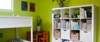
Children's room
Gray wall decoration in combination with light furniture, a white ceiling plane and rich inclusions will be a worthy solution for a stylish nursery design.
The photo shows a children's room with walls painted gray.
Toilet
The interior of a gray toilet will look much more original with the help of additional contrasting accents, such as colorful mosaics, bright paintings or other decor. You can decorate one wall in the room with graphite and anthracite shades. In this way, it will be possible to achieve the correct distribution of light and shadow in the space, making it more comfortable and organic.
Cabinet
Smoky and steel colors that create a business atmosphere are considered indispensable in the design of a work office. The gray-brown combination will give the room some solemnity.
Balcony
Light or warm gray as the main background will harmoniously complement rich accents in lemon, red or orange colors. This palette is not subject to fading and exposure to ultraviolet radiation, so it is considered an ideal option for a loggia.
Tile
Light gray tiles add coziness and emphasize cleanliness. The winning option is gray walls and bright tiles. Large print designs are on trend and well dilute the monochrome calmness of the main color.
In small rooms, play with texture and size.
Choose large tiles with a rough surface for the floor and glossy ones for the walls. The tile pattern should be similar or in the same style. Make the floors a little darker than the walls. Some collections offer such options. As a result, the combination of gray surfaces, snow-white plumbing fixtures, lamps, and mirrors makes the room large and elegant.
Light gray tiles add coziness and emphasize cleanliness
If you buy tiles of the same color, a console toilet, or a washbasin without a leg, the room loses its clear boundaries, which becomes advantageous in small hygiene rooms. This color masks stains, small debris, and dust. The housewife will not have to walk around with a rag all day long, as happens if the color chosen is black or white for the tiles.
Use natural materials with these shades. You will be surprised how life and family relationships begin to change. It’s no secret that what surrounds us creates our inner “I”, helps us move forward or “die of boredom,” create masterpieces or regret missed opportunities. Choose what you like, you will see a completely new tomorrow.
Make the floors a little darker than the walls
The basic rule is the harmonious introduction of color additions to various shades of gray. Now let's summarize.
Gray color has advantages: it gives calmness and becomes the base tone for decorative items and furniture.
Pairs well with a variety of colors. To provide variety, decorate the walls of individual rooms with different shades.
Shades of gray in large quantities are depressing. Creating a historical interior requires skills. Only in this case, adding gray pigment to the paint will give bourgeois luxury and the walls will not look dirty. The gray color in the nursery needs to be complemented by a large number of different colored pieces of furniture and interior design.
The basic rule is the harmonious introduction of color additions to various shades of gray
The effect of gray color on walls, floors, furniture
Gray painted walls
If gray dominates the walls and furnishings, it harmoniously ties together bright and neutral elements.
Gray wall covering (decorative concrete or paint) is an excellent basis for radically changing the interior, creating a modern environment in a loft or minimalist style
.
However, to decorate walls in living rooms, it is often not the steel industrial color that is used, but gray-blue, gray-pink and any similar shade that is close to natural. And these colors are definitely suitable for those who are closer to the styles of Provence, romantic, and French classics
.
In addition, when you select a shade, you need to consider how well the room is lit during the daytime. Making walls dark gray can only be done in spacious rooms with large windows.
Gray wallpaper
And this is a more classic option. Classic
welcomes pearl gray or gray-beige wallpaper, with stripes or geometric patterns. In order to decorate an accent wall in an interesting way, gray wallpaper with a light print can be used.
Gray floor
The gray floor is the highlight of the European classics,
techno, Scandinavian
styles . In such design projects, graphite flooring is very naturally combined with white, golden or beige walls and accessories.
3 rules for using gray on the floor:
- The gray color on the floor, as well as on the walls, visually changes the area: dark shades “narrow” the room, light shades preserve the feeling of spaciousness.
- Moreover, if the interior is overloaded with classic massive furniture, a light smoky floor will make it more fresh and “free.”
- Laminate with an original grayish color - for example, gray-beige or gray-violet - is a rare find that will create an expensive and cozy environment for relaxation, creativity, and friendly tea parties. However, it is not recommended to use such a coating for the work area - the color is too “relaxing” and does not allow you to concentrate on current affairs.
Gray ceiling
For the ceiling you can only use very light grayish tones - pearl gray, silver. The ceiling structure itself should be smooth and simple. Tiered elements that create a shadow are not welcome if you have chosen a gray color scheme.
Gray furniture and decor
Gray furniture is an original puzzle of the latest expensive interiors. Pale gray colors in the sets mute the rich basic shades, and therefore make the decor more “adult” and prestigious. Silver floor lamps, candlesticks and vases also add status to the interior.
Some interior styles have their own conditions regarding which shades of gray and in what doses should be used. Let's give a few examples.