Help the site, share with friends:
Since blue is a dark color, it is better to treat it with special attention.
It is better to immediately remember that not every room in the room goes blue, so if you are not sure that you can choose the right shade, then seek help from a professional designer.
Peculiarities
Blue wallpaper in the room looks luxurious and sophisticated. They help us relax, rest, and gain new strength. Although this color is used in all rooms, it is worth noting that it still looks better in the bedroom and bathroom.
Since blue is a cool color, it should be combined with warm elements of the interior or decoration.
You've probably already noticed that if you take only dark blue wallpaper, the room becomes visually smaller, and vice versa. Therefore, if you still choose a dark color, then use it closer to the window, or in a room with many windows.
Palette of shades
The blue palette includes quite a few shades. And the character of the future interior depends entirely on what tone you choose as the base one. For example, blue shades will help create a light and dreamy mood in the room, bright turquoise can distract from pressing matters and inspire, and dark blue will create a strict atmosphere in which you will want to reflect on some interesting topic.
Photo: midamericafurniture.com
Combination of blue with other colors
The most popular is the combination of blue and white, because it reminds many people of clouds, and therefore nature. Therefore, you can decorate the room with blue wallpaper, and add white furniture for a more expressive note.
The combination of blue and silver is familiar to us, which is also called “royal”, for the reason that these colors were worn by the rulers of Europe.
The design will become magnificent if, against the background of blue wallpaper, you add silver decorative pillows, floor or table vases to the interior.
Such decoration elements will refresh the interior design.
Note! Vinyl wallpaper in the interior - 120 photos of amazing design.
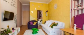
Those who love brightness and contrast will certainly like the combination of blue and yellow. This option is closer in morality to young people or teenagers.
Well, those who are more relaxed will certainly like the combination of blue and chocolate.
Ideal combinations
The blue palette is quite wide, varied and rich. If this shade is chosen as the main tone for the walls, then you should give preference to soft and pastel colors, for example, sky blue, pale cornflower blue, dusty blue, Provencal blue, mixtures with purple, lavender, violet and the like.
The blue color palette is quite wide, varied and rich.
You can choose brighter shades for details and accents. For example :
- Prussian blue;
- blue dust;
- dazzling blue;
- electrician;
- color of the Caribbean Sea;
- royal and underwater blue.
Will look perfect on:
- paintings;
- armchairs;
- sofa cushions;
- armrests;
- capes.
For different details, you can choose brighter shades
It goes well with:
- white - such a double combination is typical for the Mediterranean style;
- beige - this may include milky, sand, ivory, yellow, such combinations are found in the Provence style;
- brown – with it the interior becomes stately and looks natural; this combination is typical for the classic style. To neutralize the cold shade, warm tones of coffee with milk and cinnamon are used.
Maintain tonal balance
When combining colors in the interior, it is important to maintain tonal balance. The interior should not turn out to be too cold, so it is combined with warm light. It can be created not necessarily by warm colors, but also by lighting techniques. For this purpose, floor lamps, lamps around the perimeter of the walls, and large central chandeliers are used in the interior.
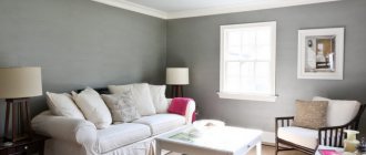
Popular gray-blue tandem
Due to the similarity of the color range, the interior in such shades is perceived very easily, it is comfortable to be in it, the atmosphere is pleasantly relaxing, but at the same time solemn and even refined. Therefore, it is best to use such a tandem in the dining room, living room or office.
The interior in such shades is perceived very easily
If you choose light colors for the room, the atmosphere will help you rest, relax, and gain strength. This combination is also ideal for the bedroom.
Rich dark blue and light gray create a certain contrast that will not be flashy. That is why the combination will always look harmonious and pleasant.
Gray itself is neutral, so you can choose it as a background, complementing it with rich or bright blue accents in the form of sofas, armchairs, pillows, carpets, floor lamps and other accessories in the interior. The main thing is not to overdo it with such details so that they do not merge into one inharmonious spot.
Rich dark blue and light gray create a certain contrast
To balance the strict gray-blue interior and soften the color combination, you can choose wallpaper or curtains with floral patterns.
Blue-brown combinations
The brown shade in the interior is associated with the tones of natural wood. The color of the natural material matches perfectly with most shades. The following will look harmonious:
- dark oak;
- nut;
- cherry;
- chestnut;
- mahogany.
All of them will bring nobility, restraint and luxury characteristic of the classical style to the interior.
Warm brown will reduce the intensity and soften its coldness a little. But it is best to use combinations of such shades in spacious rooms. In such a room, you can make a choice in favor of absolutely any shades, even the most saturated ones.
The color of the natural material matches perfectly with most shades of blue.
Two dark tones can simply turn a small room into too gloomy. Muted shades and pastel colors will help to avoid a gloomy atmosphere in a small room.
This combination of shades is natural. This is how sea and mountains, earth and flowers, sky and trees can be combined. Therefore, any interior will create this feeling of unity with nature.
The brown shade in the interior is associated with the tones of natural wood.
Most often, delicate shades of blue are chosen as the main tone of the room, for example, for decorating walls, and brown shades complement it. You can also use the reverse technique by choosing brown as the main color.
In both cases, a positive effect with bright accents will be created, charging with positive energy.
Combination of blue and green
It is not for nothing that these two similar and related colors are located next to each other on the palette. It’s not for nothing that they are called analogues, because they both bring calm and tranquility, but in combination they are not contrasting. However, I would like to note that not so long ago this tandem began to gain popularity.
It’s not for nothing that these colors are located next to each other on the palette.
A few years earlier, such combinations scared both designers and interior owners a little. Moreover, such combinations were not even used in clothing. Now people are full of determination and courage, they are ready to undertake any experiments in a combination of colors, shades, textures, objects and other details.
The combination of these shades makes the room lively, harmonious and gives it depth. This bright or subdued tandem will look good in a children's room and is equally suitable for both girls and boys.
These colors bring calm and tranquility
More restrained and neutral colors of green and blue will have a positive effect on a person’s emotional state. Therefore, they can be used in the living room, dining room or other rooms that evoke nature.
A decorated kitchen will suppress not only a person’s appetite, but also the desire to eat sweets. Just green nuances can bring harmony to this room. Tandem with green in the bedroom will help you relax faster, calm down and fall asleep instantly.
The combination of these shades in the interior makes the room lively, harmonious and gives it depth.
Combining blue tones with yellow or orange
I have already mentioned that the coldness of the finish needs to be softened with warm shades. Therefore, yellow and orange will come in handy here. They will perfectly dilute a cold interior.
Tip The blue palette is also divided into warm and cool colors. Those that will be in the warm category should be combined with warm shades of yellow or orange. Conversely, cool goes better with neutral yellow and orange.
Yellow will perfectly dilute a cold interior
We must clearly understand that blue and yellow are not always a flashy combination of two saturated shades. This can be a restrained interior with a combination of sand and sea wave.
The combination of the night sky and orange is a combination of two opposite colors - warm and cold, which in tandem give a huge charge of energy.
Such combinations are appropriate to use in the Art Nouveau style, filling them with bright details that emphasize modernity. These bright combinations are suitable for children's rooms, especially for boys, and of any age - from a toddler to a teenager.
Blue is best combined with warm shades of yellow or orange
Blue-blue tandem in the interior
When similar colors, such as blue and blue, are combined, the space expands. In this case, you need to choose fundamentally different colors of walls and furniture. For example, you can make the walls dark blue and the furniture bright blue or even turquoise.
Most often, a combination of just two colors is not enough, so they are diluted with at least white or black. You can add brown, beige, milky to them, which are ideally combined separately with each of them.
The combination of these colors expands the space
The design looks much brighter, complemented by bright accents:
- in the living room it is enough to put several bright pillows in yellow, orange, red or pink;
- in the bedroom you can place several floor lamps, vases or bouquets of similar bright colors;
- in the kitchen this can be a variety of kettles, multicookers, toasters, dishes, cutting boards and many other accessories for bright accents.
These colors are diluted with at least white or black
Tip You can play with contrast to add expressiveness.
But here we also cannot do without the support of white.
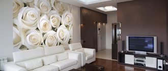
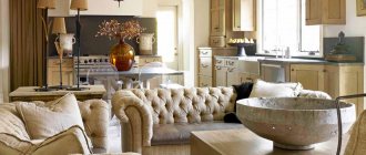
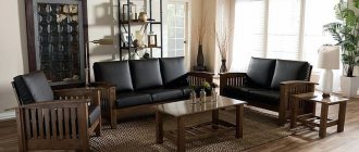
Living room in blue wallpaper
Since the living room is one of the important rooms of the house, where you spend a lot of time with your friends over a cup of coffee, or have family evenings watching TV, then you should approach its design with a special touch.
When choosing deep blue wallpaper for the walls in your living room, you must make sure that the room is well lit.
Otherwise, the room will look dull and cold. For the best look, dilute the blue with a soft and warm shade.
Living room
Any shades will be appropriate here, depending on your preferences, but there are several important points.
Things to consider:
- The living room is the largest room, and therefore dark colors look especially beautiful in it, which are not always applicable in small rooms. You can safely use wallpaper in indigo, cornflower blue, cobalt, sapphire, etc., the main thing is to make sure that enough light gets into the room, this will avoid the feeling of gloom.
Advice: if there is not enough natural light, it is worth considering artificial lighting to make the walls “play.”
- It is necessary to correctly correlate the wallpaper with the color of the furniture; in one case, a match in palette will serve as an interesting factor that will unite the interior, and in another, it can become that small drop that spoils the “barrel of honey.” If there is a lot of blue on the walls, the sofa and armchairs should be of different colors, and it would make sense to throw a couple of cornflower blue pillows on them as a connecting link.
Proper combination of wallpaper and furniture colors: blue striped wallpaper and furniture upholstery
- Drawings on blue must be selected in direct proportion to the dimensions of the room, according to the principle, the larger it is, the larger the ornament. But if the living room is replete with ledges or niches, it is better to leave such areas plain, since in this case large images will have the opposite effect.
Advice: if your living room has a niche, it is better to take one tone, but combine the texture of the wallpaper, for example, the main area of the walls can be with patterns, and the niche can be a single color.
- Blue wallpapers look best in modern styles; in extreme cases, they can be incorporated into neoclassicism, but then they will need to be, at a minimum, diluted with gilding.
- Light furniture with small elements of the same blue in the upholstery goes very nicely with dark blue plain walls.
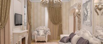
Classic living room with dark blue wallpaper and white furniture
- It looks interesting to add another color to the basic blue shade, which matches it according to the rules of compatibility. The result will be an analogue of black and white monochrome.
Blue wallpaper for the kitchen
Wallpaper in blue tones for the kitchen is an excellent solution, because it blends with the color of water, washcloths and the rest.
But you should remember that it greatly reduces appetite, so you should not choose it if you have small children. But for those who take care of their figure, this is an ideal option.
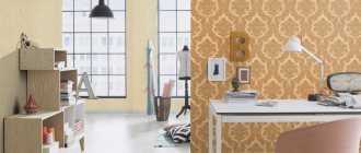
Study
It would seem that blue is the ideal color for wallpaper in the office, because psychologists claim that it stimulates calm thoughtfulness and mental activity in general.
The cobalt color in the interior of the office can be diluted with bright decor in the form of flowers, figurines, books
But there is one more property - it relaxes, and here everything will depend on the character of the one who will conduct business in such an office. Let's say it is ideal for a scientist, philosopher, poet and prose writer, but it will calm the risky impulses of businessmen who very often conduct and win their businesses on the brink of a foul.
That’s why, just in case, it’s worth turning your attention to more neutral versions of blue and adopting wallpapers that have a palette closer to sea wave or almost gray, which puts you in a businesslike mood.
Choosing a neutral blue color for your office is the right decision