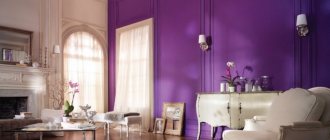
Basic rules for choosing colors
When choosing a color scheme, it is important to base yourself not only on your own preferences, but also on the rules of color composition. Here are the main ones:
- Of all the colors used in the interior, only one (maximum two) should dominate.
- combining two dominant colors is not an easy task, and only professionals can handle it correctly.
- the main tone simply must be in harmony with the other colors of the interior.
- if several shades of the same color are used, it is advisable to limit yourself to two, maximum three. Otherwise, the space will visually disintegrate.
How pastel shades of green combine
Pastel greenish-beige or gray-green colors are perfect for children's rooms, bedrooms, and kitchens. This interior has a lot of light and air, it is cozy and at the same time stylish.
Balanced pastel shades of light green will harmoniously fit into interiors in retro style, suitable for Provence and Art Nouveau. Light tones from the green spectrum can be used to decorate not only walls, but also ceilings. The ceiling looks great in a soft pistachio or light olive shade.
Pastel colors are usually cool. However, you can also find more “friendly” warm colors, such as sandy green, for example.
Advantages of green (lime) color in interiors
Green. What is it associated with? With the greenery of the meadows, with the first blossoming spring leaves. And it is from this association that the main property of this color emerges - to have a calming effect on the human psyche.
But green is different from green. The most pleasant shades are those that are diluted with yellow - the so-called light green colors.
The main advantages of green shades, including light green:
- Color is not defined as feminine or masculine.
- Standard green is neither a warm nor a cool color - it is as neutral as possible.
- Light green predominantly tends to favor warm colors.
- Perfectly matches almost any style of the room.
- If you don’t want too intense a color in the room, you can always dilute it with white, resulting in very delicate shades.
Disadvantages of green
Perhaps the only disadvantages of green are:
The fact that it requires careful selection of companion colors. Not every shade will go well with it.
Green should not fill most of the space, or even less the entire space - this will cause visual fatigue of the room.
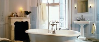
Blue-green interiors
The blue surface of water in nature is combined with green grass on the shore, with floating water lilies or beautiful algae. Therefore, the combination of blue and light green shades is well perceived by humans and looks natural.
A composition of blue-green shades is suitable not only for the bathroom (although it looks ideal here), you can paint your living room or bedroom in these colors, if you choose the right shades, the combination is also suitable for the kitchen.
You should not get carried away with saturated colors and deep shades of both the blue and green spectrum - such interiors may turn out to be too heavy. But for a bohemian living room or a solid office, the deep tones of blue and green can be perfect.
Advice! Light green and blue colors are ideally combined. They can be complemented with a white, beige or gray background color.
What shades and colors does light green go with?
In order to get a harmonious combination of light green color in the interior, you can also use the following shades:
White is the perfect companion for green.
The second ideal combination is light green and the color of natural wood, and this can be the color of trees of various species, from the lightest to deep brown.
Warm yellow shades, orange, coral red tones.
Complex colors that include grayish and brownish tones are also suitable - gray-blue, champagne, vanilla, soft terracotta.
Combination of blue and green
The combination of blue and green is an excellent combination for a bright living room, bedroom and children's room. Today we will look at how the combination of blue and green works in the interior.
Blue and light blue colors go well with clean, light and rich shades of green - usually from a fruity palette.
In the first photo, rich blue is combined with pistachio (this is a canonical combination in Western modern design).
_____________________
In the photo on the right - light blue is combined with the color of kiwi - a light, peculiar green color, neither cold nor warm.
Fruity green shades go well with blue and blue. In the photo below on the left - the walls of the living room are a very light pistachio color, the ceiling is light blue, the sofa is dark olive, and the chair is dark blue. In the photo below on the right, light blue is combined with dark pistachio.
White color is an excellent addition or background to interiors built on a combination of blue and green. But there is one subtlety here. Compare two pictures:
The photo on the left uses clean and bright colors from the summer palette - bright blue, grass green (border of pillows) and the color of young foliage (pattern on the chair). And all this on a white background looks bright and cheerful. In the photo on the right, the interior uses a darker and muted blue in combination with pistachio, but this combination is complemented not only with white, but also with gray and brown. As a result, the interior in the photo on the right looks much less lush.
So, the first rule of using blue and green in the interior:
— a white background and white accents are very refreshing to the combination of blue and green, while gray and brown are very muted
When building an interior on a combination of blue and green, choose pure shades of blue, blue, and green - this is a win-win option if you need a bright and “ringing” room.
In the photo on the right, light blue walls, a light blue sofa and bright accents of new foliage make the whole room feel very fresh. This is a great base for a nursery.
White is especially important if you are using fairly dark shades of green and blue or blue. Compare two pictures:
The interior in the photo on the left has white inclusions and looks much fresher and lighter than the interior in the photo on the right. If you do not set yourself the task of creating a dark interior, then white color becomes simply necessary.
Please note that you can use not only interior objects, but also indoor plants as green accents.
In the photo on the left you can see a great example of how green leaves enliven and add warmth to a beautiful blue and white interior. Take note of this technique!
I’ll show you an absolutely crazy interior based on blue and lime colors:
This interior uses pure and rich blue from the summer palette and complements it with white and ocher from the autumn palette. From the autumn palette – light brown walnut color of wooden furniture. But, of course, it's the blue and green elements that get all our attention.
Of course, this interior is noticeably “over-sweetened” - here you have a patterned border on the sofa cover and curtains, festoons on the pillows, and patterned fabric, and candle flowers - but the work with color is beyond praise. The colors are distributed very competently, none of them catches the eye or tires you, the overall impression is a very positive room. Notice how the ocher floor reduces the activity of the bright green shade.
Two more palettes actively used in interiors are the pastel palette (photo on the left) and water colors (photo on the right).
_________________ Please note in the photo on the right that a light emerald shade in combination with blue can make the bathroom terribly cold - so the walls are painted in a light vanilla color so that it “raises the temperature” in the bathroom.
The combination of pastel shades of blue and green, as in the photo below, is very calm and soft, you can use these colors in any quantity, adding white as a third base color and bright colors as accent colors.
___________________
Let's look at the issue of bright colors in a little more detail. Below you can see two unsuccessful examples of using bright accents.
The interior in the photo on the left is problematic, firstly, because in combination with a muted dark blue, different shades of green are used - a moss-colored carpet, marsh-colored bed linen, a pistachio chair, and a lamp the color of young foliage. Such a variety of green shades from different palettes gives a feeling of unfinished interior. Secondly, the bright blue bedspread from the catchy palette is completely unnecessary here.
In the photo on the right, the base color of this interior is light blue, and there was absolutely no need to complement it with an electric blue bedspread. In addition, red and purple accents do not go well with each other. A carpet with inclusions of bright turquoise is absolutely ridiculous.
So, the second rule for using blue and green in the interior:
— do not use colors from different palettes - if you took green from the fruit palette as a base color, you do not need to add green from the autumn palette; the same thing with blue - if you took blue from the summer palette, then a catchy blue will be superfluous
For example, if you take a bright bright blue color, complement it with an equally bright green, and the picture will turn out, of course, very bright, but still harmonious, as in the photo on the left.
It is quite possible to achieve harmony by combining bright blue and green shades from the summer and catchy palette, but you need to act carefully. You probably already know that palettes are complex; you need to be able to work with bright colors in the interior.
For example, there is no need to combine bright colors on background surfaces, as is done in the photo on the right. Here bright blue is combined with bright pistachio, as in the previous photo, but there is no feeling of cheerfulness and energy, since the “pieces” of color are too large, they do not give play and freshness to the interior, but only tire.
This decision to use summer and bright colors on the background surfaces in the children's room is one of the worst, avoid this mistake and use these bright colors for accessories.
If you are determined to make the room bright, then, firstly, let it not be a children’s room, and secondly, to achieve the same effect as in the photo on the left - so that it is bright and cheerful, but at the same time does not hurt the eyes - quite difficult. The main task is to choose colors of the same brightness so that none of the colors disappears against the background of the other.
In addition, the plane of a bright wall must be crushed, as was done in the photo on the right, and this is how this interior differs radically from the previous one.
A bright wall should not remain empty - hang pictures (also bright), mirrors, shelves and other wall decor.
The combination of blue and green is very, very tolerant of many accent colors. What colors could these be?
For example, a calm interior, like the photo on the right, which uses cream, light lilac and cherry brown, can be rowdyly complemented with accents in bright apple green and blue, like the chairs in the photo on the right. It looks unusual and extravagant, but good.
So, bright green and blue accents can be introduced into a calm interior built on cream, pastel lilac, brown and ocher colors - it will be good. To be honest, experimenting with cherry brown, like in this photo, is risky.
If you have cherry or maroon furniture and want to add a combination of blue and green, use warm shades of green like the photo below.
A universal option is golden honey and light yellow furniture, as in the photo below. It goes with all shades of blue, blue and green.
The best partners for combining blue or blue with green are yellow and orange.
The combination of blue and green plays great when there is orange and/or yellow in the interior, as you can see in the photo above.
But there is one thing that you need to strictly avoid and which you can see in the photo on the right. This combination extremely dislikes the inclusion of black. See how the black accents are harsh and ruin this nice interior, mentally remove them and you will see the difference.
____________________
- do not include black in the interior where a combination of blue, yellow and green is used
If you are using cool greens and blues from the water color palette, complement them with equally cool shades of pink and lilac, as in the photo on the right. Pink color is generally the perfect accent for this combination. ___________
The interior, which is dominated by a calm green color, is perfectly complemented by a cream color, as in the photo on the left.
So, the fourth rule for combining blue and green in the interior:
— pure shades of blue, indigo and green are perfectly complemented by cream, yellow, orange, pink, lilac and blue
The combination of blue and green is a great solution for table decoration, it looks very fresh and spring, and is perfect for an Easter or wedding table:
I hope this article was helpful to you - if so, click the “+1”, “like” button or your social network icon. Thank you!
Photo of light green color in the interior
Read here Interiors in golden color: 60 photos of a complex color in decoration, but not capricious
Did you like the article? Share