Psychological characteristics of color
On the one hand, pistachio is a variety of green. Green is responsible for the following points:
- Filling with energy
- Relaxation and trust
- Assimilation of knowledge and information
From the point of view of the teachings of Feng Shui, green and pistachio colors refer to the energy of wood, which, in turn, is responsible for creativity and career growth.
On the other hand, pistachio carries shades of yellow. He is responsible for our joyful and bright emotions and brings a positive attitude, happiness and delight into the room.
Shades of pistachio
Pistachio is by no means a uniform color. This is a rich palette of shades: from rich, bright, tonic to neutral, pale, calming. “Thick pistachio” is obtained from mixing deep tones of green and yellow. It is they who give pistachio energy and cheerfulness and at the same time do not tire either the eyes or the psyche. “Calm pistachio” is formed when green and yellow white are added to the mixture. The more white, the softer and more calm the shade becomes.
Photo: centimetdecor.com
Calculate the exact cost of repairs using an online calculator
and receive a free detailed estimate for repairs
Calculate
The choice of pistachio shade largely depends on two factors: the color preferences of the home owners and the interior design of the room. If the room is decorated or planned in Provence or shabby chic style, then only pastel colors are used here. For a classic interior, as well as for modern, pop art and eclecticism, “thick pistachio” applied to large surfaces is perfect: walls, floors, cabinet fronts. But for minimalism and hi-tech - only decorative inclusions: pillows, vases, table lamps. And of course, pistachio, from dark to light, is actively used in chalet and eco styles. Natural color for a natural interior.
Photo: decoor.net
What rooms is it suitable for?
Depending on the functions of the room and the shade of the color itself, it can look harmonious everywhere:
- Kitchen
- Bedroom
- Living room
- Cabinet
- Children's
Thanks to its multi-tonality, pistachio color is universal. The tone should be selected depending on the use of the room.
For spaces where we want to relax, it is better to give preference to warm shades. For work rooms - colder.
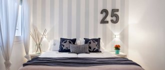
Bedroom decoration
The bedroom in pistachio shades also looks good. However, here you need to choose the shade very carefully. A cold tone would not be appropriate in this room. It is better to choose a rich warm tone. It will create an atmosphere of romance and relaxation.
Warmth and coziness will be added here by details in dark colors and delicate textures:
- Dark wood furniture
- Heavy curtains
- Long pile carpet
- Fur blanket
In this case, it is better to choose additional colors in the same range or neutral tones: dark green or dark brown. The monotony of the interior will create an atmosphere of calm.
Furniture and textiles
Pistachio color exudes cheerfulness and warmth, making it a suitable option for textile decoration. With the help of attractive elements you can create a special cozy and comfortable atmosphere in your home. It is used in both classic and modern design in any textile:
- curtains;
- upholstery of chairs and sofas;
- decorative pillows;
- bedspreads;
- carpets
Naturalness and delicacy of color help to successfully fit into the most fashionable trends in design. The choice of plain textiles or with prints depends on the specificity of the interior. The main thing is to achieve harmony and not overload the design with the same type of things. For example, to remove the facelessness and severity of plain walls and floor surfaces, you need to add bright contrasting patterns and ornaments.
Using textiles, you can visually adjust the features of a room, for example, visually expand the space by hanging light curtains. A carpet of rich pistachio shades will reduce discomfort in an overly spacious, seemingly empty room.
When choosing pistachio furniture, you need to adhere to the general style in the interior, for example, for high-tech, choose attributes made of glass and plastic, for a classic style - wood with additional forged elements. The main background can be either a plain pastel or a bright, provocative one. Pistachio furniture looks great in contrast with the overall tone of the room. To enhance the emphasis, it is permissible to use convex textures and interesting intricate shapes.
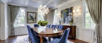
Application in the living room
Pistachio color in the living room interior will also look harmonious.
Note!
Olive color interior: 135 photos and video description of how to use olive color correctly
Turquoise interior - TOP-180 photos and videos of interior options in turquoise tones. A palette of combinations of shades and textures. Selection of furniture and decor
Red interior - 140 photos and videos of rules of use and subtleties of placement when decorating the interior
However, this room assumes the appearance of a large number of strangers. Therefore, here other details are kept in cold shades, which will add formality and pomp to the space.
For example, you can choose furniture in white or light beige tones. It is better to choose curtains in cooler colors: blue, pink or even white.
The magic of mixing paint colors
The color gets its name from the nuts, whose shells are cracked to reveal a pleasant green color. The palette varies from brown-green, slightly withered to a joyful light color. It is worth understanding what shade you need to get in the interior. In any case, certain colors of paint will be required, and the question of how to get a pistachio color will be solved in practice.
The palette ranges from brown-green, slightly withered to a joyful light color!
What is needed for work:
- color sample (interior photo, piece of wallpaper, illustration);
- paints: blue-green, yellow (ochre, terracotta);
- brush; paper;
- palette for mixing paints;
- glass of water.
Secure the sample in the middle of the Whatman paper. Start mixing paints. Gradually adding color, carefully mix until smooth and paint near the sample. By varying the amount of one color or another, color saturation, texture density, strive for a perfect match with the selected sample. Write down the proportions of mixed paints; to paint the walls you need to know the exact dosage of each color . Enjoy the process, because the walls in your house will be painted in your favorite shade. Make several samples from light pastel to dark rich colors.
Related article: What color to paint the ceiling: basic rules, important points
If the speed of getting what you want is more important to you, then visit a hardware store. In the paint and varnish department, you will be offered pigments, mixing them with the base color to create the desired pistachio color for walls or other surfaces. With this approach, you can vary the intensity, density, and compatibility with other shades.
The easiest selection option is to purchase ready-made, graded paint in the required volume. You should choose a shade according to the ral palette. By examining the proposed palette, it is easy to understand what saturation and density of shade you need for your interior, and choose color combinations in the design of the room. Take a closer look at catalogs that contain photos of interiors using the selected palette.
The easiest selection option is to purchase ready-made, graded paint in the required volume!
Cabinet design
If you use this shade in an office, then this should be a room for creative people. Warm, joyful shades will create a pleasant and productive environment for the birth of new ideas and plans.
If you use pistachio to decorate the office of an engineer or accountant, then it is better to give preference to light, cold tones. In this case, it is better to choose less saturated tones. This will create a calm environment for thought and calculation.
In any case, it is better to decorate the window with elements of light colors. This will add air and freedom to the space, which means it will be easier to think, create or count here.
Note!
- Black interior: 160 photos of interesting options on how to use black correctly
Dark interior: 140 photos and video description of how to create a unique style in dark colors and shades
- Brown interior - interesting ideas and beautiful uses of brown (130 photos)
Choosing a color for the nursery
This color will primarily bring joy and fun to the children's room.
Having chosen pistachio as the main one, it should be complemented with other colors: yellow, pink, blue, white, turquoise, beige - there is no limit to your imagination.
At the same time, pistachio, as the main color, will create a picturesque interior. It will be very easy to dream and fantasize in such a room.
The role of pistachio color in the design of the living room
Successful photos of a living room in a pistachio style make it clear that any shade of it can be used both as a base tone, which will serve as a background for placing an accent, and as a successful addition to a light and dark palette.
Pistachio walls in the interior of a small room
The role of pistachio color in the design of the living room is very important. With this color you can get in the interior:
- A real “explosion of freshness”. To do this, you need to combine different shades of it, while giving preference to slightly muted ones. Too bright colors and their intensive use will make the color design of the living room poisonous, aggressive and acidic.
- "Unity with nature". This effect can be achieved by combining warm pistachio shades with woody ones. This design will be successful for ethno interiors, appropriate for living rooms of country houses and cottages.
- "Nobility and aristocracy." This effect is achieved by combining pistachio with white and dark brown. To obtain it, it is important to maintain the proportion. White and dark brown will be dominant, pistachio will play a secondary role. It serves as a bright accent.
In order to decorate the living room in pistachio tones , you do not need to radically change the interior or repaint the walls. It is enough to complement it with several elements of this rich color, for example - curtains, sofa cushions, covers for upholstered furniture, etc., and your room will be completely transformed.
Pistachio color invigorates and improves mood
Room color and size
The interior in pistachio colors is primarily intended for small spaces. For them, this shade is truly magical.
On the one hand, color brings a lot of light and air. On the other hand, it does not make the room cold and faceless. On the contrary, this unique color creates a “cool, cozy” feeling.
In large and spacious rooms, the shade maintains an airy atmosphere and at the same time gives warmth and care. At the same time, in large rooms you should be more careful with this color.
A large room in pistachio color can look too cold or even toxic. In order to avoid going overboard with color, it is better to zone it or decorate it with details of other colors.
Selection of furniture for the pistachio living room
Once the most basic details have been thought out, you can move on to choosing furniture. It is better not to use pistachio furniture in small rooms, as it will create the effect of a bright spot that will definitely need to be diluted.
If the room is quite spacious, pistachio furniture may be present, but not in the whole set, but in its individual parts. Perhaps it will be a closet or a slide, a sofa with pillows of other colors.
Wooden objects will fit very harmoniously into the pistachio interior.
Summarize. With the right approach, pistachio color will add zest, sophistication and elegance to the interior.
The main thing is not to forget about the main rules regarding color combinations and clearly decide what effect you want to get in the interior.
Combination with other colors
There are several options for diluting this color. So, closer to the window you can place lighter details, and in the deep side you can place furniture and decor in a darker green color. This will create a magical perspective and open up the room.
Another option is to add rhythm to the room with colorful details. These can be individual elements of orange, pink, dark green or red.
As you can see in the photo of the pistachio color in the interior, contrasting colors do not overload the entire ensemble, but create a certain dynamics.
This combination of pistachio color in the interior with other shades is best suited for a living room or office. In the bedroom or kitchen it is better to use smoother transitions.
Shades
The color of pistachio in the interior is a harmonious background for natural wood.
Today, designers actively use various accessories in soft green shades of varying degrees of saturation in the design of different styles.
Pistachio is successfully used in the formation of Victorian and colonial styles. And in combination with the color of golden green and white, it can be successfully used in high-tech or pop art style rooms.
Combination of shades
Typically, designers do not limit themselves only to pistachio tones when decorating the interior. Avoid merging surfaces and use different colors.
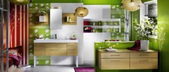
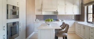
White
The universal white color can soften the richness of the tone and bring into the room a calm, pleasant atmosphere filled with homely warmth. For small rooms it is important to use pistachio furniture and white trim.
Grey
This color brings prestige in a classic style. Light gray in combination with pistachio elements will give a mysterious atmosphere, and thick, rich gray will add contrast and depth.
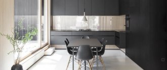
Black
The composition is not suitable for all rooms, as it looks bold, even a little aggressive. Black tiles or a sink in a pistachio kitchen will add rigor and originality to the design.
Orange
The gamma with cheerful “orange notes” will give the room a cozy and warm, cheerful atmosphere. The color of pistachio in this case serves to mute the bright orange.
Brown
Finishing materials made of wood in brown shades in combination with pistachio naturalness will emphasize the fusion with nature. Brown upholstered furniture looks good against the background of pistachio walls and floors.
Violet
Compositions of violet, lilac and pistachio add uniqueness to the interior. Such a memorable design seems to “breathe” with pleasant coolness and envelops you in a mysterious atmosphere.
Turquoise
The color of turquoise gives the room uniqueness, unusualness and refreshes even the most dull interior. The success of the combination lies in the harmony between the cold notes of pistachio and turquoise.
Pink
These two colors make it possible to achieve excellent results in interior design. It is best to use pastel colors in furniture and decor.
Not recommended combinations
Calm pistachio will be lost against the background of bright green. A duet with a marsh color will make the room gloomy and gloomy. In a dark room with pale blue walls, the delicate shade looks dull and dirty. Designers do not recommend combinations with acidic and poisonous tones.
Pistachio color and styles in the interior
Due to its harmony, this shade suits any style. The interior in pistachio colors in any case looks modern and dynamic.
First of all, these are the following options:
- Classical
- Modern
- Hi-tech
- Loft
- Scandinavian
- Rustic
The most harmonious use of this color is, of course, modern classic or modern. The unusual choice of color coincides with modern design, and the laconicism of the forms is emphasized by warm and soulful shades.
Classic combined with pistachio will look more modern. The deep yellow-green shade will perfectly set off the stucco molding on the ceilings and decorative elements on the walls.
The lightness of pistachio combined with the brutality of solid wood furniture will look very advantageous. Additional colors here can be white, beige or dark brown.
High current involves a lot of experimentation. And pistachio color is no exception. First of all, contrasts are important here. This could be a contrast of colors or a contrast of materials.
Matte and glossy surfaces of the same shade will create the necessary depth. And unusual bright colors will add dynamics.
A high-tech interior in pistachio color is ideal for a long or small corridor. A loft with white brick walls and individual elements in picturesque light green tones will also look harmonious here.
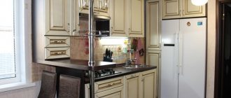
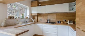
The combination of glossy metal surfaces and warm natural tones will look harmonious in the kitchen. The same high-tech will come in handy here. It will also bring a certain amount of sterility to the cooking area.
With all the variety of options and styles in the use of this color, the main thing is its warmth and spaciousness. It is these qualities that he brings to the premises and it is these that are important to preserve in order to make the house truly cozy.
Interior styles
- Minimalism. Pistachio adds lightness to the interior; it will be an excellent backdrop for minimalist furniture. Try to avoid very dark surfaces - they go worse with pistachio.
- Mediterranean. This style is favored by bright colors. Yellow, orange, blue form a wonderful tandem with pistachio. The use of various prints is allowed, and good lighting will help highlight the advantages of the room.
- Eco style. Pistachio is a soft natural shade that goes well with the same natural tones - yellow, brown, green and others. The main thing is not to overdo it with details. By the way, you can also experiment with textures: wicker items made of wicker, straw, and wood products will find their rightful place.
- Classic. Here pistachio plays the role of an additional shade. In combination with light shades it can visually expand the space, and with dark shades it can correct shortcomings. Most often this color is used in textiles or an accent wall.
- Provence. Pistachio will go well with soft pink, lilac, blue, and gray. Complete the interior with floral motifs, wicker or artificially aged furniture - and a piece of France will settle in your home.
- High tech. Pistachio can go well with plastic and chrome elements. Most often it is used to decorate the kitchen - the facades of cabinets are made of pistachio. However, it is quite appropriate in the living room or bedroom.
Advice! The accentual use of pistachio color is acceptable for pop art, eclectic, and contemporary styles. This shade should account for no more than 20% of the total space.