No matter how global the design project of the room is, in the end the whole point always comes down to the accent. It is color accents that are a lifeline for true lovers of minimalism. One of the most successful accents (especially in a classic interior) are olive-colored curtains.
Photo of olive curtains: the most sophisticated element of the room
We use it in design
The shades of olive curtains are always distinguished by their richness of palettes. It is precisely because of this fresh atmosphere, clearly emphasizing silence, that olive-colored curtains are most often used to emphasize the classicism of the interior. Despite this, green curtains also find their way into studios where high-tech predominates.
Olive curtains are distinguished by their paradoxical nature. That is why olive curtains play a kind of dual role in the interior - on the one hand, they bring more light into the room, on the other hand, they absorb light. The romantic atmosphere in bedrooms with curtains of these colors is beyond doubt. Despite the fact that they can be safely introduced into the interior, guided only by your own ideas, there are some unwritten rules that it is advisable to adhere to:
- The use of curtains in the living room is permissible when the room itself is spacious and bright. It is desirable that the ceilings be high and the walls painted milky, with an unobtrusive texture. The windows are wide, ideally stained glass.
- Before choosing curtains in the bedroom and using olive tones, fully decide on the lighting. It should be thought through carefully.
- Olive color isn't everything. The room should have decorative items that “support” and highlight it.
- It is desirable that the room contains textile decorative elements.
How to choose the right colors in the interior
Here are the rules that will help you choose colors and create a harmonious interior.
- The rule for the harmonious distribution of colors. A person perceives better the ratio of colors in the interior when 60% is the dominant color, 30% is the additional color and the remaining 10% is color accents. In relation to the interior, this rule looks like this:
- 60% comes from the color of the walls;
- 30% - on furniture, upholstery and textiles, including curtains;
- 10% - on accessories (color accents).
- Rule of the circle. To select an interior color scheme, a color wheel is used, on which analogue and complementary colors are marked. Complementary colors are used for color accents, and analog ones are used to decorate the interior in the same range.
- Accents in the interior are a salvation for lovers of minimalism. You can add personality to a room with a few well-placed color accents. This solution is suitable for lovers of minimalism and high-tech style. Additional colors - yellow and blue, green and red, etc. For example, olive-colored curtains in the interior will be a good accent.
- Analog colors are the best solution for bedroom decoration. Analogous - colors that are located next to each other on the color scheme. Therefore, such an interior is calmer and suitable for relaxation areas.
- Don't forget about black. Despite the apparent gloom, black objects in the interior favorably emphasize the brightness of the rest of the interior. This is an old design technique that works timelessly.
- If you want to choose the right colors, look outside the window. Try to look at what surrounds us in nature. Nature is wise, and she is also a great designer. The movement of color in space will help connect the rooms in the house into a single ensemble. To achieve this, repeat the colors in the rooms. The color of the curtains in the living room can be repeated in the color of the upholstery on the chairs in another room.
- Contrast is everything. For business premises, the rule of contrast is used. It's similar to a complementary color scheme, but in this case you choose colors that contrast sharply with each other. The interior becomes clear, concise and restrained. The room becomes emotional with the help of color. Blue is associated with relaxation, as are green and olive, but yellow and orange are associated with energy and action. Therefore, it is better to make the bedroom blue and the dining room yellow.
- Everything new is well forgotten old. To avoid the hassle of choosing a color scheme, look at how the interior was decorated in your area in the past. People’s problems do not change, and our ancestors also thought about how best to decorate this or that room.
- Don't buy without checking! Before you buy textiles or wallpaper, arm yourself with a sample of the material and study how the texture and color look in your room in daylight and evening light. Light greatly affects the perception of color and after checking, you may have to change the selected color scheme.
Related article: Equipment for manufacturing blinds in production
Olive color in the interior
Let's talk about shades
The uniqueness of the palette of this color is that it contains both cold and warm shades. Cold ones contain gray pigment, which is what dominates the cold component of the color. As for warm tones, yellow predominates here.
The most optimal thing when calculating the shades of curtains is the correct selection of lighting. It is advisable that the light from the lamps does not contain a yellow or blue tone, limit yourself to white colors only.
The more white pigments there are, the stronger the intensity of the colors.
When considering the color of curtains and wondering whether it makes sense to choose something close to green, you should remember an important rule that is constantly used in interior design - the “Rule of Color Harmony.” According to this rule, you can always choose the optimal colors not only for curtains, but also for other interior items. According to this rule, the proportions of colors should be approximately as follows:
- 60% belongs to dominant colors;
- 30% belongs to additional colors;
- 10% is distributed between color accents.
Thus, 60% will belong to the main color of the wall, 30% will belong to the furniture, 10% will belong to the decorative elements.
Olive and natural wood color
The combination of olive color with wood is an ideal solution for connoisseurs of classic or baroque style. Such an interior should have gold and bronze details. The role of a useful note will be played by pompous tablecloths and curtains. A luxurious lambrequin is a great addition.
Wood-colored details will fit perfectly into an olive country kitchen. The only decoration here is simple checkered tablecloths and curtains and wooden accessories. Olive walls and wooden furniture are the perfect solution.
Olive color plus wood is the classic basis of a loft-style kitchen. All that remains is to select accessories and furniture that create an “attic” interior. In this option, wooden objects and parts should have a muted gray or light brown color. Mahogany with a shiny finish is taboo.
Hall, living room
For classic-type halls, it is customary to use particularly contrasting combinations - a muted color will be the most suitable. The curtain will create a positive and relaxing atmosphere. The combination “olive blackout curtains – chocolate furniture” is considered to be the best. Green textiles for the living room should be chosen more strictly than for the bedroom. Indeed, furniture in soft, brown tones looks especially harmonious with these elements.
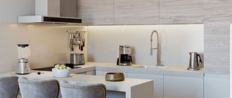
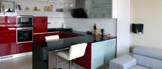
Olive-gray cuisine
Gray with olive is a popular combination used in high-tech style. The “wet asphalt” shade harmonizes with metal household appliances and elements, creating the desired effect, and muted khaki will add a fresh touch.
The combination of gray and olive is also appropriate in the loft style. Laconic stools on long metal legs, brick details and simple lamps form a successful example of industrial style.
It is worth noting that the arrangement of such a kitchen is relatively cheap, but it looks extremely stylish and fashionable.
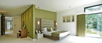
To the bedroom
A very muted olive color for curtains.
In bedrooms, it is customary to use the light-absorbing properties of olive color. By crossing this color with milky, cream and chocolate colors (this can be pillows, capes, bedspreads, upholstered furniture) there is every chance of achieving incredible results. The design of a bedroom, in which there is decor with green tones, is always saturated with light-colored decorated objects. You should not forget about tulle.
Eco
The eco-friendly style is perfect for using an olive shade, since it is based on green tones. As is clear from the name, eco is a tribute to nature in the complex form of its stylistic adaptation to the subject-object environment of a person.
Stylistic features can highlight an exceptional example of a strict combination of 4 colors (black, white, green, gray), taking into account the fact that it should be manifested both in coloristic and textural terms. This specificity classifies this style as modern, which is emphasized by its minimalistic design and simple designs.
A kitchen designed according to this type will definitely become comfortable and attractive for you for a long time. It will have a timeless stylistic format, which, with its purity and artlessness, will allow you not to get fed up with it and have a positive attitude towards the space and lightness contained in the basis of eco.
You can diversify the severity and symmetry of the facade of the set using an accent apron with a naturalistic illustration or completely covered in olive color. Otherwise, you can liven up your kitchen interior by using decor such as pots with plants and a “green” zoning wall.
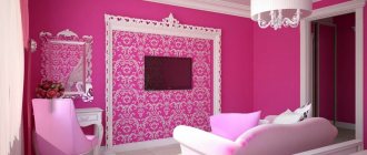
Children's
Photo of the nursery
In children's rooms it is customary to use a green component. Small, not overly lush curtains will look great in combination with grassy shades, furniture elements containing a plentiful amount of beige, yellow, and white tones.
It is not advisable to use pink, crimson, and yellow colors together with green textiles. Otherwise, there is too much dissonance. Drawings are most suitable with polka dots and large checkered patterns.
The versatility of olive
Olive belongs to a warm, natural color palette. It is obtained by mixing green, yellow and gray. The color of olives represents calmness and balance. It’s easy to choose a harmonious combination for it. It can be combined with colors of both warm and cold spectrum. It is characterized as a warm, soft, rather complex positive shade.
Depending on the chosen tone, you can achieve either a visual increase in space or a decrease in space.
This color has no clear definition. Olive refers to all tones, from green-brown to ocher. They are used if owners do not like unnatural, saturated contrasting colors.
In the West, the olive color scheme is considered optimal for residential premises, since it is universal and allows you to create amazing combinations.
Due to the fact that olive is a pastel shade, its use in the interior requires the presence of a certain number of accent colors. The best options would be cream, green, ruby and dark purple. Any design that includes a shade of olive will create an atmosphere of home comfort in the room.
When using olive-colored curtains, lighting plays an important role. It is advisable that it be in the cold spectrum, otherwise there will be a feeling of oppressive space. Typically, olive is the choice of mature, emotionally balanced individuals who prefer a leisurely pastime.
Such a palette cannot be called dynamic. The lead shade that is part of it neutralizes the overall saturation and makes it balanced.
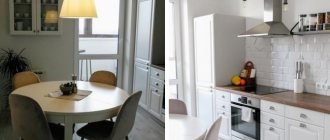
To the kitchen
Tenderness and severity in one person
Spacious modern kitchens look great with green shades. It brings freshness and a certain “ecological friendliness” to the room. Even the most minimalist kitchen will look elegant. In the kitchen, this color goes well with those shades that are secretly included in the olive tone: caramel, lemon color, orange tint.
The colors of the curtains must be duplicated in the colors of decor, household items, and furniture. A Roman blind or a luxurious roller blind will look great in a calm, delicate kitchen.
Design
An olive-style kitchen is an example of harmony between aristocratic elegance and the rigor of modernism. This color can elevate and set a sublime tone for a given room.
The atmosphere created by “olive” will be calm and melodic, sedate and gentle, laconic and light, exactly what the kitchen room requires.
A variety of stylistic trends, unique in their structure and generalized by the primary color, played out and revealed by the most original and unpredictable images, which will be discussed below, allow such a promising plan to be successfully implemented.
Types of premises where they are used
The fresh delicacy of olive tones is most often used in:
- Country houses, cottages;
- Offices, art studios, art workshops.
- Cozy cafes and restaurants, where it is customary to use linen, silk and veil products as decoration.
- SPA, beauty salons and beauty salons.
Variegated translucent green curtains will add a “delicately expensive” effect to almost any room where there is a lot of light and the decor is tasteful.
Olive and white kitchen
Olive plus white – luxurious minimalism. The advantage of a minimalist white-olive kitchen is the opportunity to experiment with design by introducing various accessories.
A few bright floral arrangements and lace fabrics will be enough to add romantic, delicate notes to the interior.
White and olive cuisine can become the apogee of classics. In this case, bright elements are not required, because a few olive tones are enough.
The lack of bright inclusions is easily compensated by simple decorative elements, for example, vases with white fresh or artificial flowers, appliqués and beautiful curtains.
THE LIVING ROOM IS BATHED IN OLIVE TREES
The olive color of the walls is combined with dark bronze, and natural wood gives the interior a slight elegance. It is highlighted by white stripes and carpentry, which will add lightness to the interior.
Just like white and gray textile accessories, always with the addition of yellow. Yellow curtains are great and will invigorate the interior, especially on autumn days.
It is generally accepted that the living room is an ideal place for relaxing and meeting with family and friends. The elegance and naturalness that the olive shade exudes promotes relaxation.
If we also take care of soft, warm lighting, we can enjoy the atmosphere of spring and summer in the apartment all year round.
Olive accents pair perfectly with gray furniture and walls in the living room.
APPETITE FOR OLIVES
Olive color fits well into the interior of the dining room. In a version with a white or cream floor and light-colored furniture, the room immediately becomes more modern than in a version with a dark floor.
Modernity will also be emphasized by using the color of olives on the selected one wall and juxtaposing it with the insanely fashionable gray. In such surroundings it is great to spend time with your loved ones over a shared lunch or dinner. Especially lovers of Mediterranean cuisine, who yearn in winter for the atmosphere of Greek taverns and Italian taverns, will appreciate the olive grove in the design of the dining room and not only it.
Olive green is considered a fashionable combination when compared with orange and turquoise.
Kitchen in Provence style olive color
Provence is the ideal companion for olive color. The following shades are suitable for the design of such a room:
- moss;
- fresh olive;
- dark olive.
Olive kitchen decorated in Provence style.
These color names are given by the International Panton Color Institute. The above shades have warmth and a tendency towards yellowish-brownish colors. They create a cozy design in the kitchen, giving it a special charm.
What is olive color?
It is no coincidence that the evergreen European olive was called the “Tree of Life”. According to the Holy Scriptures, it was the first plant on Earth to grow after the Flood. Since ancient times, peoples of different countries have considered it a symbol of peace, goodness, purification, prosperity, good health and long life.
The dark, yellowish-green color of unripe olive fruits invariably evokes a feeling of harmony and the value of life, calms, adjusts to a measured existence and nourishes with vitality. No wonder he is so attractive to people.
The presence in olive to a greater or lesser extent of yellow, green, gray, and sometimes black gives rise to a rich range. It can be recommended to those who are alien to poisonous colors, who crave nature and natural self-sufficiency. All shades are filled with warmth and sunshine and go well with many cold and warm members of the palette. They make it easy to create harmonious compositions.
All shades of olive can be divided into cold (with a predominance of gray or dark green) and warm (with a predominance of yellow).
It is better to combine cool shades with equally cold shades and use them in strict, laconic interiors that require concentration. Warm tones have greater combinatorial capabilities and are used more widely.
Minimalism
Olive color is not excluded in minimalism either. Preference is given to light colors or a shade is introduced as an addition. White and beige will be good allies.
Bright accents are not excluded. The scheme should not contain more than 3 colors at the same time. This is the feature of minimalist design.
Olive-black kitchen
The olive-black kitchen is not a classic option like the previous two, but rather a reflection of something more technological and modern. Therefore, it can be used in bold, trendy solutions. For a modern style, you can use a combination of olive wallpaper in the kitchen with black kitchen furniture.
Olive-black color scheme in the kitchen interior.
Important! This option is only suitable for bright, spacious rooms with large window openings. Otherwise, the overall impression of the interior will be quite gloomy and depressing.
Living room
The interior depends entirely on the chosen style. Olive can be used as the main color. It is possible to use several tones of the gamut to create a volume effect.
When designing, they carefully select combinations of shades and work with lighting.
Olive beige kitchen color
The combination of olive and beige is classic and emphasizes the closeness of this range to the natural and natural. The two colors can be either as light or as dark as possible. Bright color spots look great against their background.
Olive beige kitchen.
It is also possible to combine dark and rich shades of olive with the lightest shades of sand.
Characteristic features of color
Olive color combines rich green and yellow pigments. This combination absorbs light well, so it is better to use this color in a large room with a fairly high ceiling.
In an ordinary city apartment, the combination of olive curtains will not look as impressive as, say, in one of the rooms of a country house.
If the owners of a small home still decide to use olive color in the interior, it is necessary to provide a sufficient amount of lighting. A chandelier in combination with several sconces will perfectly cope with this task.
When decorating a kitchen, it is worth remembering that shades of green increase appetite. They improve digestion and, in addition, promote relaxation.
Read here: Curtains in the Hi-Tech style - 58 photo design ideas
Olive green color in clothes
The soft and pretentious shade does not fit with everyday clothes, but it does lend itself to sophisticated style. It goes well with gold and can sometimes look fabulous. Therefore, you need to use it accordingly: long and cocktail dresses for significant celebrations, such as New Year's or a dinner party in a restaurant. Olive green color will make you an irresistible, mysterious and luxurious woman.
On the other hand, it is suitable for leisure and home wear. This shade can be used by such color types as “spring”, “summer” and “autumn”.
Kitchen in classic English style
In this case, it is also necessary to use muted warm or neutral tones of olive. They can be applied to the fronts of kitchen cabinets. Used as an ornamental decor for tiles. Olive wallpaper in the kitchen with a classic ornate openwork pattern is also suitable.
Olive kitchen in classic design.
OLIVE COLOR OF WALLS IN THE LIVING ROOM - ARRANGEMENTS
Nowadays, interior designers use olive almost everywhere - on walls, upholstery and decorations, how should it be used in home arrangements? Here are the most interesting options:
BOTANICAL STYLE
Olive color fits perfectly into the current fashion of returning to nature, which is manifested in the use of plant patterns, environmentally friendly fabrics and natural materials and colors.
How to combine olive color to create an atmosphere straight out of an exotic garden in your living room? It is best with warm shades of wood, a large woven base of the carpet, ethnic paintings and living plants.
A style with natural shades promotes a good mood and closeness with nature.
ECLECTIC BOHO STYLE
Olive color has a certain romantic charm that makes it ideal in rooms that connect different worlds, patterns and colors, representing a neutralizing connector.
The soft and assertive character of olive color sets the mood, and sparkling and silver accessories are a wonderful addition to the interior.
Olive color contains a certain romantic charm that allows you to connect different worlds, patterns and colors.