Candy, powder, fuchsia, pale or intense - pink has many shades. The color created by mixing red and white is one of the hottest choices of the season. Check out the trendy interiors in which pink undoubtedly plays the leading role. Contrary to appearances, it is not a preference for babies and is kitschy, although the color can often be sweet. Depending on the intensity and additives used, pink for the living room can also be gentle, romantic, calm, fresh and rich.
Pink living room - fashionable interior
When thinking about pink, the color that usually comes to mind is a pale pastel color or a bright shade of rose. If you choose pastel, it is not just one shade. Among the most desirable colors in interior design you will find colors such as:
- pastel pink - that is, it is “cotton candy”, a very bright color with a lot of white;
- dirty pink is extremely elegant and stylish, thanks to the gray mixture it works in almost any interior;
- Millennial pink is an absolute hit in recent months, the color of the 80s generation is a mixture of pastel pink with a hint of peach.
- Rose gold is an alternative to cold, chromed steel and a striking, classic gold color.
With such a palette of colors at hand, interior designers are increasingly proving that pink is your best friend for warm, stylish and elegant guest room compositions.
Gray in the living room interior as the main one
In most cases, gray tone is used as a base tone. This color can be used for wall decoration, ceiling surfaces, flooring, or furniture, carpet and curtains can be selected.
If you are not sure that you can use the shade correctly, it is better to seek advice from a specialist. Trained designers will help you choose the right gray living room interior.
Photo of a pink living room combined in different styles
When decorating a living room with pink, it is worth remembering that, despite restraint, in large quantities this color can dominate the interior. For this reason, it is better to use it as an accent color, for example installing a Scandinavian-style seating area upholstered in pastel cotton, rather than painting all the walls.
Neutral interior compositions and pink color
In most interiors, pink is best paired with neutral colors. The most sought-after and versatile color combination is the one popularized by the Scandinavian philosophy of Hygge. Cozy, hygienic interiors are designed in white, cream tones with natural wood colors and pink accessories such as decorative pillows and blankets.
In modern Scandinavian-style interiors, “dusty pink” is also great. Instead of white, the base color of these compositions is gray, which in itself can create the impression of gloom and cold. In addition, it is worth equipping the space with soft textiles and rose gold, for example, in the form of a lamp or table, in which the Scandinavian interior design of the living room acquires character and softness.
The obvious combination of colors is a harmonious palette. A good combination of pink with a pastel shade of blue. In fashionable interiors, designers also often offer mint and very bleached yellow. However, when decorating the interior in pink and pastel colors, do not overdo it with the number of colorful elements. It is best to place them against a white wall or in combination with a subtle gray.
Pink with rich colors and glamorous style
It's completely different when you choose a glamorous living room interior. This design requires intense colors, so you can successfully combine, for example, fuchsia walls with pink furniture and accessories. Here it is also worth using rose gold, which will give the interior an even more luxurious design. Mirror frames, candlesticks or lamps can be metal, don't forget about decorative pillows. Rose gold textiles should shine as much as possible and resemble a precious metal, so choose fabrics such as brocade, silk, satin or sequined options.
Lovers of bright colors and classic interiors should definitely think about combining pink with dark blue. This unobvious combination proves to be extremely stylish and, when combined with simple but sophisticated finishing elements, produces expressive and elegant arrangements. Pomegranate and roses triumph especially in fashionable living rooms, where dark wall colors are welcome.
Pink living room furniture
Regarding the color design of furniture in a pink living room, you can also note several of the most important nuances. If such nuances are not taken into account, then the “freshly purchased” furniture will have to be returned back to the furniture showroom, since it will not fit into your wonderful interior. What nuances are we talking about:
- There are not many pure pink pieces of furniture, without color dilution. And if there are, then frankly speaking, they don’t look nice. When decorating any piece of furniture in pink tones, furniture manufacturers try to add at least one color - a companion, and the larger the item, the more relevant this becomes. If you make furniture to order, be sure to take this point into account when you and a specialist make a working drawing of the future product.
- You should not purchase pink furniture if you plan to install it against a wall that is already decorated in pink. In general, if you have already used quite a lot of pink when decorating surfaces, then it is better to avoid furniture in the same shades altogether.
- With any amount of pink in the interior, you must take into account that upholstered furniture should at least partially reflect the color composition of the living room design. For example, if the main color is light pink, the secondary color is white, and brown is used as an accent color, then the upholstery of upholstered furniture can be white, with small brown spots, and there should be pink pillows or a blanket with a pink pattern on it.
A pink living room can become the ideal interior decoration that you have been striving for all your life. However, this “ideal” can easily be spoiled if you approach the creation of a color composition involving pink incorrectly. After all, in essence, its creation is a complex creative work. If you suddenly have problems with color design, contact a professional designer, this will save your time and money.
Wall color: pink wallpaper in the living room
Pink walls are a great idea not only in a little princess's room. This color will pair well with bright, muted Scandinavian style, as well as with glamorous additions, a pastel version of the retro style. Daring people will pair pink with dark green or blue and spice it up with gold accessories, for example. Choose pink flamingo wallpaper - it's a real hit lately.
In addition to skillful color combinations, the proportions in which you use pink in your interiors are very important. And while it may seem like the easiest way to introduce color into a room is to repaint the walls or wallpaper.
If you want to have pink walls, then you can choose only one of them. Remember that a multi-colored wall in warm colors will always seem closer than it actually is. Therefore, choose a smaller surface in the living room. It would also be ideal if the surface is illuminated by natural light, that is, next to a large window.
Option 4. Contrasting opposites
The interior of the living room in pink and green evokes associations with blooming herbs and spring freshness. The combination looks good
emerald and raspberry, juicy peach and grassy green. Such a living room creates a rainbow mood, the brightness of which can be adjusted to your own taste: if a rich light green and deep pink shade is suitable for a youth room, then for a calmer interior you can choose smoky pink and gray-green soft tones.
By the way, it is not necessary to experiment with finishing colors. A living room interior in pink tones with greenery can work quite well in a room decorated on a white, beige or any other neutral background. To do this, just choose textiles and accessories in rich shades of greens and roses. And if necessary, it is also easy to change the color scheme of the living room using decor with other colors
.
Fast and safe - pink furniture and accessories
The solution, of course, is simpler and less demanding is to use furniture and accessories in pink. A beautiful Scandinavian style nook or sofa will allow you to bring not only color but also elegance. A bright piece of furniture with wooden legs feels light, which is very useful if you don't want a pink living room interior.
Of course, once one piece of furniture is installed, no arrangement is complete, so be sure to invest in pink trinkets and decorations. You can change the color of the flower pots, hang a painting or design above the sofa in a similar tone, or place a rug that resembles a pink cloud on the floor.
Furniture and interior items
Shades of pink are characterized in different ways, and many perceive it only as a color for decorating a girls’ bedroom or a woman’s bathroom. A living room in pink tones is also associated with a romantic haven for newlyweds, where they can revel in tenderness and passion. And when the “honey period” passes, it is better to transform the living space in some other way. But this is an erroneous statement, and this color has many attractive shades for men, which symbolize nobility and an optimistic attitude. Using the advice of designers, it is not difficult to decorate a pink living room, the friendly atmosphere of which will give the owners and guests the rapture of aristocracy, sensuality and peace.
Table of contents:
Pink color: psychology and characteristics of perception
Pink is a mix of white and red, so it combines purity and ardor. Perhaps that is why it is associated with tender passion and hidden sensuality, untapped potential and warmth. This color has many tones with opposite properties, depending on the admixture of another palette and the proportional ratio of the colors mixed. Our personal perception and general view of the pink interior of the living room depends on this. This color attracts the main attention, so you should not make the entire environment pink or overuse too bright accents, except for special design tasks.
This color is associated with a romantic mood and an optimistic approach; it is not without reason that they say about looking at life through rose-colored glasses. “Kind” color calms and distracts from gloomy thoughts, dulls aggression. On the other hand, it radiates warmth, awakens the desire to taste a sweet delicacy, spend time over tea and dessert in a circle of pleasant people. Sentimental pink color is appropriate for a living room combined with a dining room.
Psychologists say that it is useful for people suffering from lack of appetite or “obsessed” with diets. It is also recommended for decorating rooms of overly emotional or unbalanced children. Most of all, sentimental girls love the rich pink color, for whom the room is decorated in the style of a little princess or Barbie doll. But socialites also willingly use the shade of rose petals for an apartment in a palace style, as well as for a glamorous bedroom combined with a living room.
This color is most popular among the fair sex, and for young women and girls, decorating a bedroom or living room using shades of pink is considered classic. This choice subconsciously encourages you to look sensual, feminine, gentle.
However, a pink palette with an admixture of gray, beige, caramel or peach is quite acceptable for men who do not refuse knitwear and shirts of these shades. To women, a man in a salmon-colored pullover or a gray-pink shirt seems especially attractive. These same shades are also popular today in apartment decoration, in particular, the pink living room, photo:
Wealthy ladies do not often order projects in pink tones from professional designers, but even men, when they enter such a living room, note the pleasant atmosphere and positive attitude. This especially applies to a well-thought-out and consistent interior style, where you immediately feel comfort and tranquility. Pink color is perceived as “warm” or “cold”, depending on the admixture of blue or red, respectively, creating different sensations. But the choice of shades should be dictated more by style than by personal preference or fashion.
It has long been noticed that men pay much less attention to colors and shades of some calm or neutral color. But when trying to describe the design and convey their feelings after visiting a pink living room, in most cases, men cannot. They do not remember the main shade, but confirm that there was a good mood and a feeling of harmony. And this is another argument in favor of choosing this color, for example, when zoning a house without walls.
However, the wrong shade can create a general imbalance, shift the emphasis, and even be perceived negatively by one of the family members. For example, the pink fuchsia color or the “doll” shade used for Barbie’s house. It is worth consulting with family members in advance to avoid annoying misunderstandings, and not to turn the living room into a set for a puppet show.
Tip: Immoderate lovers of bright colors, such as representatives of subcultures, can decorate their room however they want. For example, in a “screaming” black and pink color scheme, and this will be normal for the apartment of a lonely person. But an excess of hot pink can “stun” those people who prefer a calmer palette. Too bright a color will quickly get boring, even if it is your favorite shade.
Psychologists attribute different properties to shades of pink. And he considers the color of tea rose petals to be the most comfortable. Some tones are considered purely feminine or childish, but ash pink has always been considered noble and aristocratic. However, the optimistic atmosphere of the living room in pink tones helps the business lady feel like a carefree princess of a “tender age”.
Blurred and muted pink works well as a background as an alternative to white walls. This palette is perceived as friendly, affectionate and gentle. This choice is approved by many married couples, especially in wallpaper with a mother-of-pearl texture. Such a living room is perceived as rich, especially when complemented by golden accessories, velvet upholstery of upholstered furniture, wooden parquet and luxurious lamps.
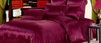
Pink curtains for the living room
First of all, take care of the textiles in the room. The great advantage of pink is that it gives the impression of warmth and softness. You will enhance this effect if you replace curtains, pillowcases, blankets and bedspreads with pastel pink.
Until recently, pink was associated primarily with kitsch. However, today we can talk about a real pink revolution. This color has captured the hearts of interior designers from almost all over the world. And rightly so! Today, pink is associated primarily with sweets, delicacy and grace. Pink curtains will look great in combination with classic colors: white, gray and black. You can go even further and pair the color with chocolate brown or original garnet. Remember that the palette of pink shades is very rich - from fine powder to rich fuchsia and raspberry, as well as intense neon.
Soft pink brings an atmosphere of calm and romantic notes to the living room interior. Stronger shades of fuchsia, in turn, add dynamics and expressiveness to the design. Numerous interiors from a rich photo collection will allow you to choose a living room design to suit any style and composition.
How does the color pink affect a person?
From a psychological point of view, the vast majority of people associate the color pink in the interior with something good. Some people imagine pink flowers, some people imagine ice cream, others can imagine little pink piglets. But in any case, seeing this color a person experiences positive emotions.
Bright pink photo wallpaper
It’s another matter when this color is present in abundance in the interior, clothing, and some household items. In this case, psychological satiety may set in, and then even the most beautiful and interesting shades may be “received with hostility.” In a normal situation, both women and men perceive this color normally or with delight. Such enthusiastic feelings about pink are more typical for women or creative men with a fine mental organization.
Bright interior of a modern living room
The combination of colors in the interior of a living room with beige walls
If you look at photos of interiors in 2020, you will notice that beige continues to be the most popular color in living room design. Cream, sand, creamy tones often become the background for the entire interior composition. These basic shades are usually mixed with brighter accents. In the interior of a living room with beige walls, you can now often find the color combinations listed below.
Beige and blue in living room design
In the photo: Design of a beige living room with blue accents
Pistachio accents in the design of a beige living room
In the photo: Beige living room design with pistachio accents
If you are a fan of pistachio ice cream, then the color scheme of this living room design will seem very attractive to you. The designers of Olga Kondratova Studio dilute the light beige monochrome with bright green accents. In addition to the kitchen set itself, stylish sofa cushions also stand out from the general color palette. Pistachio accents bring the composition closer to nature.
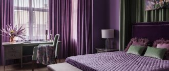
Beige and purple in the design of the living room in the house
In the photo: Purple color in the interior of the living room in the house
Living room design with lavender shades
In the photo: Design of a large living room with lavender accents
Light lavender textiles in the interior of the living-dining room in the photo are the optimal solution for creating a light, weightless space. In this case, they help create the atmosphere of an aristocratic salon in the room. Candelabra and comfortable lavender upholstered chairs in the dining area make it a great place to host dinner parties. And for afternoon tea and friendly conversations, the room has a sofa area with a fireplace decorated with a clock in the spirit of the era.
Successful combination in the living room interior of gray and white
The gray and white living room combines two similar colors. With their help you can create the most stylish interior. Shades can give a room a cozy atmosphere. Often, designers choose not pure white shades for decoration, but slightly diluted ones, for example milk, beige, coffee.
Together with gray, different patterns and ornaments look impressive and can complement the overall design.
An endlessly summery atmosphere in the living room thanks to the combination of yellow and gray.
Using gray together with yellow will help you experience summer freshness every day. This use fills a person with energy, which is very important on cold, winter days.
Typically, gray shades are used to decorate the walls, and bright yellow accents liven up the room. These could be chairs, pillows on the sofa, curtains or fresh flowers.