White kitchens: pros and cons
It’s no wonder that white color in the interior has become so popular in the last few years. And it’s not just about fashion, but also about its properties. Let's see what are the advantages of using white in design.
- Visually expands the space. For owners of a small kitchen, this solution will be especially relevant.
Expert opinion
Irina
Irina Polyakova is the founder of an interior studio, architect and interior designer. The main area of work is kitchen design
You need to be careful when using white in poorly lit rooms - with small windows or windows facing the shady side. In the absence of good natural light or in cloudy weather, white can have a dirty or gray cast. To avoid this effect, dilute the interior with other light, warm shades and bright accents.
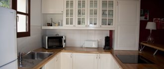
Small white kitchen
- White is easy to work with. He has already helped out more than one designer. After all, almost all colors go well with it.
You can be bolder in choosing bright colors for accents.
If you don’t want to make a mistake with the choice of colors, then a neutral background for the interior in the form of white is the best solution.
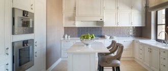
A bright apron in the form of brickwork against a background of snow-white furniture
White looks especially impressive with deep blue, turquoise, mint, mustard, purple, emerald, orange and coral.
- Versatile - fits any style. White is equally good in both modern and classic interiors.
- Never get tired of it. And if you get tired of it, you can always change the color of the apron or the design of the handles: and now the kitchen is as good as new.
- Compatible with any equipment. If you need to build a coherent ensemble, choose built-in equipment or a matching set.
Many Russian celebrities also love white kitchens - presenter Ksenia Sobchak, designer Masha Tsigal, producer Yana Rudkovskaya, actress Anna Khilkevich.
Interior of the snow-white kitchen-living room of Yana and Evgeni Plushenko. This is the favorite color of the famous couple. The kitchen in the mansion on Rublyovka is also made in light colors
Kitchen of actress and TV presenter Anna Khilkevich from the Maria factory
Is white always so good? Under certain conditions, even its advantages can turn into disadvantages. Let's see what the disadvantages and when it is better to stop using white in the interior.
- Poor lighting. In a room with small windows, pure white can make the room feel cold and uninviting.
- White doesn't like saving. Cheap white paints, due to their low density, can give an undesirable sheen. And cheap white facades will quickly reveal dirt accumulated at the edge.
- Too much white will make the interior gloomy and lifeless.
- For textured and embossed facades, white can be a real problem. If the surface is poorly washed, then caring for such a set will bring a lot of trouble.
See also useful video reviews about white kitchen :
Style selection
White, thanks to its versatility, can be paired with almost any style. In such as Scandi, for example, it is a calling card. And in art deco or classics it can serve as an auxiliary one - to create color transitions.
Modern
A white set will always fit harmoniously into the modern interior of a kitchen, kitchen-living room or studio. There are no strict limits in choosing the design of facades or handles. This is an ideal basis for any experiments in choosing an apron, wall color, floor, etc.
Classic and neoclassical
Is it acceptable to use white in a classic style kitchen design? In some cases, it is not only acceptable, but also necessary. For example, when you need to lighten the elegance and pretentiousness of a traditional interior in a small kitchen.
For a small kitchen, neoclassical or urban classic style, combining traditional and modern design elements, is more suitable.
Light set with a milky tint in “Stalin” style
Expert advice
Irina
Irina Polyakova is the founder of an interior studio, architect and interior designer. The main area of work is kitchen design
The classic style does not like saving on materials. Expensive premium solid wood facades really cannot be compared with anything. However, from some reliable manufacturers you can purchase good quality MDF furniture that is not inferior in appearance to premium furniture, but at a lower price.
Minimalism
Where else can you see white so often, if not in minimalism? Perhaps only in scandi and hi-tech. A white set is an ideal base for creating a calm, monochrome and strict interior. Facades without handles, matte or glossy, lack of decorations - a light kitchen in the minimalist style looks so ascetic.
If you are afraid that the design will turn out to be too cold and uncomfortable, add wooden surfaces.
Scandinavian
It was with this style that the great popularity of white began. And it was Scandi that debunked the myth among many that this color turns the interior into something like a hospital ward.
Thanks to the use of natural wood in the design, decor in the form of wicker napkins or baskets, bright accents in the form of green, red, blue or yellow, a bright Scandinavian-style kitchen looks very cozy.
A matte set with paneled or smooth facades is suitable. Gloss is rarely used in Scandinavian style.
Loft
This style is eclectic, which means it is not forbidden to use white furniture. The set can be either ultra-modern or with an antique effect. It doesn’t matter what the facades are - you can choose matte or glossy, with panels or smooth. The main thing is to create a creative atmospheric space in an industrial spirit.
High tech
White is the ideal base for creating a monochrome kitchen in a high-tech style. This style is characterized by the shine of metal and glossy surfaces. Therefore, you can safely choose a set with glossy facades.
The set must be functional, preferably with built-in equipment. There is no decor on the facades, and even handles can be dispensed with by setting the push-to-open mode. But with a light surface, this solution is not the most practical. As an option, you can choose facades with integrated (hidden) handles or profile handles.
Options for handles for high-tech headsets
Provence
For Provence, a light set with aged paneled facades, with a light yellowish or milky tint, with a gold or silver patina, is suitable. Copper or brass colored handles will look great.
White kitchen interior design
When choosing a white kitchen, owners often choose this shade for decoration, and not just for furniture. Despite the fact that against such a background any set will be harmonious, albeit traditional even in the original modern or organic style, most often the room is made in a single color, maintaining harmony in the accents.
Finishing
In many photos of a white kitchen you can see that bright walls are usually not used here. An exception may be one strip in the dining area, if we talk about a traditional space, or an apron in the working part. The pattern and the actual color of such an accent are chosen in accordance with the style, so there simply cannot be universal solutions in this case.
In general, choose wallpaper for a white kitchen that is most harmonious with the chosen design:
- A modern interior will be exceptionally sleek. Perhaps it will not be wallpaper, but paint or plaster, plastic-coated panels.
- The choice of designers for classic kitchens is embossed materials. If you prefer smooth or textured wallpaper, then you can choose pearl tones.
- The pattern on the walls can be present in small quantities - on one wall or even on one strip if, for example, you have chosen not an ideal white apron, but with the same pattern in the work area.
The floor is one of the most practical surfaces, although it also sets the mood of the room. The dark bottom brings the furniture to the fore, forcing you to look at the details - handles, facades, utensils, even curtains. A light floor attracts attention on its own, so it is important to choose the most harmonious option. This can be durable and moisture-resistant tiles, deck boards, linoleum or wear-resistant laminate. Then even the dark top of the set will seem original, but quite a light solution for a bright space.
Ceilings remain the most traditional in any room: white, practical stretch fabrics or plastic panels are suitable.
Details
The design of a kitchen in any palette is based not only on the prevailing tone, but also on the details, so they absolutely cannot be ignored. Regardless of the interior style, please note that:
- Straight headsets require more emphasis on the apron. It may be a bright skinned wall or even white brick in the kitchen interior, but it is this wall that becomes the accent.
- Corner kitchens in white do not allow the apron to be revealed as a bright detail , so in this case traditional tiles or a discreet pattern will do.
- The combination of light furniture with dark household appliances is appropriate , but then other details should emphasize this combination. This is not only curtains or decoration of the dining area, but also utensils, decor, perhaps even part of the facades at the bottom of the set.
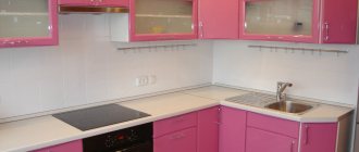
Original solutions are, of course, appropriate, but it is unlikely that you choose white for this reason. So think about whether pink curtains will suit the futuristic design of a high-tech kitchen? Or ultra-modern blinds to complement the natural Art Nouveau style? Everything is good in reasonable proportions. Therefore, traditional options - the same tiles, matte facades or simple wallpaper - can sometimes turn out to be the optimal solution for achieving harmony.
Matte or glossy - which facades to choose?
The choice of matte or glossy facades is not only a matter of taste, but often also of practicality.
To weigh the pros and cons, we compared two types of facades. The results are in the table below.
| Parameter for comparison | Matte | Glossy |
| Which ones are easier to care for? | It is more difficult to remove dirt, especially from a textured surface. | Easier and faster to clean the surface. |
| On which ones is dirt more noticeable? | Fingerprints are not as noticeable. | Fingerprints are more visible. The problem is solved with the help of well-chosen handles, in which the contact with the surface of the facades is minimal. |
| Lighting requirements | There are no special requirements for lighting (other than its sufficiency). | Incorrectly directed lighting can ruin the entire interior due to glare that irritates the eyes. |
| Room size | Versatile. | Glossy facades can visually expand the space in a small kitchen. But (!) subject to properly organized lighting. |
| How to choose depending on style? | Matte facades are appropriate in any style. | Glossy ones are inappropriate in traditional, classic interiors. |
| Where do the windows face - on the sunny or shady side? | Once again, matte is versatile. And in a kitchen with windows facing south, it is preferable to use matte surfaces. | If there is a lot of sunlight in the room most of the day, then glare from gloss can be annoying, but where there is not enough sunlight, gloss will come in handy - it will compensate for its lack. |
| Fashion | The trend towards naturalness dictates its own rules - matte ones look more organic and do not irritate with their active shine. Matte surfaces are more popular now. | It is worth focusing on fashion if it does not contradict common sense. If elegance is simply necessary, or the use of gloss is dictated by the chosen style (art deco, for example), then why not give preference to it? |
Color combinations
White is a great base. And against its background, you can build color combinations, guided by a simple rule - no more than three colors at a time.
You can create monochrome interiors by adding gray, black, ivory or milky to white with varying degrees of saturation. Another option is to create contrasts and diversify the white kitchen with bright accents - blue, red, orange, etc.
We will tell you further about which colors white goes best with.
Black and white
A classic combination that can turn out to be quite aggressive if it is not softened with small amounts of color accents or surfaces with the texture of natural materials (stone, wood, concrete).
A colored apron diluted the dark white interior
Black and white kitchen in minimalist style. Brick wall softens the contrast
White-green
This combination is considered one of the most successful and favorable for psychological perception, because nature itself created green in a variety of shades. The color of lush summer grass, turquoise, light green - all shades harmonize equally well with white facades.
In green you can make an apron, walls, curtains, a kitchen sofa or chair covers. The photo below shows successful design ideas with different shades of green.
A set without upper cabinets with a green accent wall
Interior with pale green walls and emerald tiles on the floor
With a tree
Using wood in its natural form in the interior will help get rid of the coldness and asceticism of white.
Combination with wood-effect fronts
With facades imitating light ash wood
Wood can be used in the design of countertops, floors, and even walls (for example, decorate one of the walls with wooden slats or build a partition from them in the kitchen-living room).
With wooden worktop Kitchen with wooden bottom
Spectacular combinations with bright and complex colors
Some of the most beautiful combinations of white with:
- purple and lilac;
- orange;
- red;
- blue, cyan and their shades.
.
White set and white trim: together or separately
Most often, a snow-white kitchen is entirely made in this color, only the countertop, apron and a few other details are painted in other colors. But such a set will be harmonious against any background:
- pastel olive in country style, Provence, eco-design;
- light pink in an interior such as shabby chic: here you can also use white furniture with a wooden countertop, but the entire kitchen will be more openwork than in the above directions;
- soft blue in the same styles;
The photo shows a snow-white kitchen set against a background of pale blue walls.
- light gray in contemporary.
When choosing a monochromatic finish in combination with a snow-white set, the space will seem more spacious, since the walls and cabinet fronts will simply merge together. This is a completely traditional design for a modern vision of the classics - contemporary. Monochrome is also applicable in other design options. It is in order to diversify it that accents are used, including a wooden tabletop.
White kitchen interior design
A kitchen in white tones is the basis for experimenting with the decoration of walls, floors and ceilings. Before choosing materials, decide on the general color scheme in the interior. Decide for yourself which of the principles of color combinations in the interior is closer to you:
- monochrome – when 1 color and its shades are used;
- contrasting - when shades located opposite each other in the color wheel are combined (blue and yellow, green and red, etc.);
- harmonic - a combination of neighboring colors on the color wheel.
In addition to the principles listed above, there are many other combinations that the color wheel allows you to create.
It is not advisable to use more than 3 colors at the same time. But you can use different shades of them.
Decoration of walls, floors and ceilings
Based on the chosen color scheme, it will be easier to choose the design of materials for finishing the walls, floors and ceilings.
- How to decorate the walls?
If the kitchen is small, then it is better to decorate the walls to match the kitchen unit: this way the furniture will look visually lighter. For decoration, you can choose white wallpaper (paintable, textured, or with a pale and barely noticeable pattern). Another option is decorative plaster with a brick texture, light concrete or any abstract, simple pattern.
Expert advice
Irina
Irina Polyakova is the founder of an interior studio, architect and interior designer. The main area of work is kitchen design
A light set allows you to implement cool ideas with an accent wall. One of the walls can be finished with brickwork, painted with colored paint or covered with wallpaper with a pattern, a bright pattern or photo wallpaper.
With a brick wall
The most win-win and practical option for wall decoration is washable paint on decorative plaster, waterproof washable vinyl-based wallpaper. As for the choice of shade, the universal option is walls in neutral light colors (milk, ivory, peach, beige, light gray) depending on the chosen interior color scheme.
If the kitchen does not have upper cabinets, then an empty wall can be made an accent by decorating it with a bright apron up to the ceiling, pictures or shelves with beautiful dishes.
- How to decorate the floor?
A win-win option for finishing the floor is wood (laminate, parquet or porcelain stoneware that imitates natural wood texture).
A white or very light floor (marble, jellied, tile) will not reveal the dust that has accumulated over a couple of days, looks impressive (especially marbled) and with a white kitchen creates the effect of endless and airy space. Is this always a good thing? It all depends on your own perception and on whether such an interior is diluted in the right amount with other shades.
A more versatile, calm and practical option for finishing the floor is tiles in calm tones (porcelain stoneware or PVC), wood-look, brown or with a discreet pattern. The shade of the material can be selected to match the walls, apron, and countertop.
What if you focus on the floor? A bright, spectacular and contrasting pattern or pattern on tiles in combination with white facades is not such a risky solution if you keep the rest of the design in neutral colors and do not go overboard with the decor.
- How to decorate the ceiling?
The best solution for a small kitchen with white furniture is a matte white ceiling or with a satin sheen.
The most universal option in all cases is a white matte stretch ceiling.
You can use other light and unobtrusive shades - cream, light beige, milky, etc.
A high suspended or painted ceiling in a classic kitchen can be decorated with stucco.
Colorful, bright, glossy ceilings have gone out of fashion and are only appropriate in a large room. They are very difficult to work with for someone inexperienced in design, so it is better to stick to traditional finishing options.
Read more about which ceiling to choose for the kitchen in our separate material - go to.
Tabletop
The most successful countertops with a white kitchen look like wood, natural stone with a pronounced pattern, white, gray and dark.
The choice of countertop is determined not only by the color of the kitchen set, but also by the style, design of the apron and the overall color scheme. For example, in a classic interior with patinated paneled facades, a countertop made of natural stone will be in harmony.
In the Scandinavian style or in Provence, a wood-look countertop looks very harmonious. High-tech loves contrasting combinations of white and black, so you can choose a dark countertop, but you need to take into account the difficulty of caring for it. The white countertop is universal and suitable for any modern interior.
The apron and countertop can be made in the same design. If you need to focus on the apron, then the tabletop can be made neutral white, matching the color of the set.
Colored countertops are a rarer, but possible option. In this case, a bright colored tabletop can be made to match the apron or stand out against a general neutral background.
Yellow bright countertop against the background of a white kitchen. The apron is discreet in design and does not distract attention from the main accent.
Blue tabletop in the interior
Apron
The choice of an apron is determined by the task: to emphasize it or, on the contrary, to leave it discreet and neutral.
A white kitchen set removes the limits in choosing an apron design. You can be bolder in the selection of materials, colors, and patterns. But at the same time, take into account the size of the room, for example, in a kitchen-living room of 20 sq. m, both a matte or glossy hog and large tiles of bright colors will look great.
If the kitchen is small, then do not choose an apron with a three-dimensional pattern or a 3D pattern, even against a white set.
A bright apron with a pattern or design can be supported by the same colors in the design of the dining area or in decorative items - flower pots, curtains, wall frames, etc.
An interesting idea - a combination of a yellow apron with a base of the same color
The main thing is the principle of moderation. If the apron acts as a bright accent in the interior, then the overall design should not argue with it and draw attention.
A textured apron imitating wood, concrete, brick, or stone looks creative with a white set.
If it is necessary that the apron does not stand out from the general background, you can choose tiles, porcelain stoneware or a panel to match the facades or in a similar shade as its finishing. To prevent the design from looking too boring, choose the original shape of the tile or highlight it with contrasting grout, such as in the photo below.
Curtains and textiles
Curtains and textiles are the main tool in transforming a white kitchen. Curtains, upholstery of kitchen chairs, armchairs, sofas in the kitchen-living room set the character of the interior and its atmosphere. When choosing the color of your curtains, consider the overall color scheme and style.
In a traditional monochrome or neoclassical interior with a white kitchen, brown, beige and similar shades will look beautiful.
In a modern style, you can experiment with bright, rich colors of kitchen curtains and use them to create accents.
Expert advice
Irina
Irina Polyakova is the founder of an interior studio, architect and interior designer. The main area of work is kitchen design
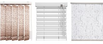
For a small kitchen, you should not choose lush and richly decorated curtains. In a modern interior, it is permissible to completely abandon curtains in favor of roller blinds, which will perform only a practical function - protection from the bright sun. This will make the white kitchen even more spacious and let in more light.
If the interior already contains a bright element, then it is better to “dissolve” the curtains in the space by choosing an option that matches the tone of the set or walls.
White kitchen set in the interior: color palette, combinations, stylistic solutions
When a buyer chooses a snow-white set - both gloss and matte facades, the first question that arises is: what should the walls be made of? Of course, literally a whole range of shades goes well with white. With some of them it will look gentle, elegant, strict or even unnoticed, but with others it will contrast and create a special character in the kitchen setting. That is why it is important to choose solutions that are comfortable for yourself:
- Typical options include white furniture in an interior with light finishes. Here, the monochrome of the light palette is diluted with accents, which can be appliances (their facades are often made in black or dark gray), utensils, and a dining room group.
- White top and dark bottom is one of the common combinations in spacious rooms where dark finishes are used. For example, there will be a deep-colored floor and part of the wall, which can be implemented in a large kitchen. This decoration looks harmonious in the corner rooms of private houses, where two walls are made of glass - translucent sliding structures that lead, for example, to the terrace, compensate for the dark palette in the decoration of the room.
The next photo shows a combination of a white kitchen set with a dark kitchen finish.
- White matte furniture will be harmonious in an openwork design such as shabby chic, or in a pastel environment of a workspace in the Provence style. Here monochrome is eliminated thanks to the presence of carved details and simple but elegant elements.
- A traditionally harmonious interior is made by a successful combination of a fairly bright shade with a white set. Then the color of the walls in the kitchen can be any, but white is included in the decoration. However, you can use the finishing tones of the rest of the room in the design of the work area. Although, if you choose wallpaper rather than paint, you can play up the duo, which is comfortable for the eyes, with the help of an ornament: stripes, a combination of different geometric patterns, floral motifs - it all depends on the style of the decor.
In what styles will a white set be harmonious?
The versatility of the work area in white shades is the key to the harmonious use of such furniture in literally any of the existing styles.
- Classic kitchen sets, even in monochrome, look solemn and elegant. Additional colors are rarely used here, although they may be present in the decoration of the living room and dining room combined with the kitchen. The golden line is used as finishing and decor on facades and in the design of walls, parts, and furniture.
- Modern high-tech furniture is usually an acrylic kitchen with a glossy finish, often without handles - with technologically advanced functional opening mechanisms. Although more saturated colors are often chosen for such a workspace, white can be the optimal solution for a small room. Often, paint is used in decoration rather than wallpaper, so the walls in this case can be quite rich and colorful.
The next photo shows a small white kitchen with acrylic on the facades.
- It would be interesting to choose white furniture for a loft-style kitchen. Old brickwork and massive industrial communications in the form of steel or even copper pipes are usually preserved here. Therefore, in such an interior, a snow-white set looks contrasting, but extremely elegant. Moreover, in the “attic” room, both glossy solutions are applicable - for a more modern design, and matte - facades stylized to match the appropriate surroundings.
The photo below shows a white loft-style set.
- Contemporary is a modern interpretation of the classics, which is implemented in simple and highly functional forms , natural materials and exceptional comfort. Here, white is usually combined with a natural wood shade and gray, typical for technology and communications. Brown wood, like gray, can be quite dark, and light doors usually blend into the walls, visually freeing up space. White and brown sometimes look quite contrasting, but the natural grain of the wood makes the combination quite soft. In this case, the choice of lower facades can also be made in favor of natural solid wood.
- In an eco-style, a snow-white set will be combined with fresh greenery in the decoration and, again, with natural wood. Here surfaces are rarely painted and glossy technological solutions are never used. The furniture will be matte, with wooden handles. The rest of the room is decorated with wallpaper with floral patterns, macro photography, landscapes or pure natural shades. Whatever colors you choose for decoration, they cannot be flashy, although the brightness in natural tones cannot be taken away.
Furniture and appliances
Any appliance goes well with a white set.
Furniture with a built-in refrigerator or oven will cost more. And with a white kitchen, a freestanding white refrigerator will seem to disappear into the background, and you will be able to save money without sacrificing design.
Colored, black equipment and with a metallic tint will also look good.
Island hood with white glossy kitchen Small kitchen with glossy fronts without handles. Non-trivial solution - white hob
Against the background of a snow-white set, you can highlight the dining area using dark or bright colors, which will allow you to zone it without resorting to a kitchen bar. Seat covers or cushions, as well as colored upholstery of chairs and armchairs, can fulfill this role.
Always a universal option - a dining table with a white tabletop of simple shapes and chairs in natural wood or basic colors.
Depending on the area and shape of the room, the configuration of the headset can be straight, U-shaped, corner, double-row parallel, island. White is equally suitable for any layout.
Corner configuration of kitchen furniture in Khrushchev with a bar counter-window sill
Direct layout of the kitchen unit. Notice how light the top of the kitchen looks: some of the wall cabinets have been replaced with shelves
Island Kitchen with Yellow Accent Backsplash Straight kitchen with no upper cabinets. An empty wall allows you to highlight the hood and focus on it. Black handles and accessories, paintings in black frames with mats, contrasting grout on the tile seams help emphasize the black hood
A rational solution in a small kitchen is to make a white set under the ceiling to increase storage space. In combination with white walls, light furniture will not burden the space.
Kitchens that are almost identical in size are visually perceived differently. In the second case, thanks to the upper cabinets under the ceiling, it was possible to free up space by the window
Lighting Features
Light sources play an important role in the perception of the final result. Lighting should be good near the work area, above the kitchen sink, in the eating area, so it is important to organize multi-level lighting. Where the lamps will be placed needs to be planned together with the headset project, taking into account the height of the cabinets and their placement.
The main ceiling light source is not the only one and it will not be enough to get glare from a white set. The brightness of the light should be adjustable, then you can have dinner in the twilight, or adjust the maximum lighting while cooking.
Ceiling additional lighting can be spot or strip with LEDs (the light should be neutral and even).
To illuminate the desktop, you can use furniture lamps that are mounted on the lower part of the upper cabinet.
A ceiling chandelier with adjustable length can be placed directly above the dining table. The lampshade and trim should not be made of fabric, this will complicate cleaning; glass or plastic trim would be appropriate.
The white kitchen set looks beautiful with frosted or stained glass inserts and internal LED lighting in the upper cabinets and drawers when opened, which consumes little energy and does not heat up. Open shelves will be decorated with LED strip or spotlights.
The photo shows a corner set that functionally divides the room. Additional lighting on the ceiling and in the cabinets creates a cozy atmosphere.
Lighting
All the positive qualities of white in the interior can be crossed out by improperly organized lighting. It is especially important to create uniform, multi-level lighting in a kitchen with glossy facades.
For a white glossy kitchen, choose diffused light lamps. Otherwise, glare cannot be avoided. Such lighting can be created by a central chandelier, built-in overhead or spotlights, local and wall light sources - sconces, floor lamps, etc.
It is necessary to organize lighting in the work area, in the center of the kitchen, in the dining area. If the set has built-in display cabinets, their lighting will create an additional decorative effect. For the kitchen-living room you may need sconces, floor lamps and table lamps.
In a small kitchen, it is better to abandon pendant lamps and large chandeliers and use uniform spot lighting in a suspended or suspended ceiling. The more lamps, the better.
In medium-sized and large-sized rooms, a large and bright chandelier can become the main decoration of the interior, standing out well against a neutral, light background.
When choosing lamps, give preference to options with neutral white light so that the shade of the furniture does not change under artificial lighting at night.
Harmonious composition with a white set
As a rule, white color for furniture is chosen by those who value not only order and cleanliness, but also a lot of light and free space. You can provide it even in a tiny kitchen with the help of a snow-white set. Of course, then the decoration of the walls of the dining area will be light.
In a room where the space allows for a little imagination, you can use unexpected or completely traditional solutions:
- White with red. The red edging of the white details, the accent red stripe on the wall in the dining area with a geometric white pattern - circles, stripes, looks interesting. Combinations of patterns will be no less interesting.
- White with black is another standard, but rather extravagant solution that can be used in a small kitchen, but then there will be few dark shades - in the edging, in the utensils, in the facades of household appliances, in the finishing details of the rest of the room.
- White with bright blue. This typical nautical design can make a room feel fresh and dynamic in any design direction. As with green, white in this case emphasizes the depth of another shade and can be used in contrasting mirror solutions - when the walls are decorated with the same wallpaper, but the pattern and background in them change places on different surfaces.
- White and orange is a sunny design option that can be implemented in literally every detail from decor to furniture surfaces.
A white set for a kitchen of any size is a truly universal option, since the furniture can be decorated in any style. Moreover, in every room, no matter what the design, this snowy shade will help achieve harmony, freshness, cleanliness and an abundance of light.
White kitchen decor
Decor in the form of house plants, vases, tableware in display cabinets, beautiful dishes or a wall collage of family photographs can make even the coldest and gloomiest white kitchen feel homely and warm.
The more neutral the background is (white walls + white furniture), the more options there are in choosing decorations. And vice versa - if the interior is already very active, then the decor should be minimal.
Not so long ago, carpet mats came into fashion.
Care Tips
A white kitchen gets dirty no more often or less often than any other. But dust and stains on light-colored facades are less noticeable than on colored ones and, even more so, on black ones. The complexity of maintenance largely depends on the material from which the facades are made. As we wrote above, glossy surfaces are easier to care for; for embossed, paneled, milled ones - it’s more difficult.
To make the cleaning process as simple and time-consuming as possible, try to adhere to the following recommendations.
- If you have not yet purchased furniture and are just about to install it, then at the design stage it is important to ensure that the edge of the tabletop extends beyond the facade by 40-50 mm. It would be good if the back side of the countertop had a drip tray.
- Wipe the facades and work area regularly, without waiting until the dirt becomes visible. It is better to do this every time after cooking and washing dishes.
- After each cleaning with a damp cloth, be sure to go over it with a dry cloth to prevent plaque from forming.
- If the facades are already heavily soiled, use professional products designed specifically for cleaning kitchen furniture.
- Never use sponges, brushes or abrasives.
- Yellow water deposits on light-colored facades can be washed off with a professional detergent.
Home remedies made from soda, vinegar and other handy ingredients should be treated with caution: some of them are strictly contraindicated for certain materials.
