The living room is rightfully considered the center of the apartment and house, since it is here that family and friends gather for rest and relaxation after a working day. For a good mood, relief from nervous tension and complete distraction from everyday life, the color of the walls in the living room is selected taking into account a number of rules used by professional designers around the world.
Features of choice
A correctly selected color scheme can visually make a room larger and more spacious, fill it with light, support the overall concept, and even eliminate some of the shortcomings of the room.
Criteria for color selection
- Features of lighting. Dim lighting can be corrected by using bright, light palettes that distribute light evenly and eliminate dark corners. If natural light enters the room in sufficient quantities or even in excess, preference should be given to cool, calm tones.
- Design and personal preferences. First of all, the color of the living room should be liked by its owners. In addition, if a certain style concept has already been chosen in a design project, it must be adhered to.
- Functionality requirements. The color of the finish can often act as a tool for zoning space instead of massive partitions or furniture groups.
- Living room area. A spacious room opens up more opportunities for realizing bright ideas. Here you can create a contrasting finish, or use smooth transitions. Small living rooms require the use of light colors and neat accents that will harmonize with other interior details.
Not all walls have to be painted the same tone, but there should be balance in everything. The finishing of the floor and ceiling is pre-thought out so that all surfaces fit well together.
What to consider when choosing a primary color?
If you don’t know which color is your favorite, then one way to decide is to look into your wardrobe and analyze what colors you wear most often, which tones you prefer as accent colors, and which as basic ones. Keep track of your favorite clothing combinations. Which shades do you most often combine in your wardrobe - these will be able to harmonize perfectly with each other in the apartment. But this doesn't always work. For example, if you prefer black in clothes, then you shouldn’t be afraid of it in the interior, but you shouldn’t choose it as a background shade, it’s more suitable for an additional one.
Influence on the choice of cardinal directions
Any palette can manifest itself differently depending on the degree of natural light. This factor depends not only on the size of the window openings and their openness, but on the side of the world from which the room is located.
- South. Often there is not only enough sunlight, but also in excess. In order to reduce the “temperature”, it is recommended to use moderately cool shades (white, blue, turquoise, gray).
- West. During the daytime peaks, the room may be too hot and light, so there should be cool shades, such as mint (closer to blue), deep blue, gray, brown.
- East. It is recommended to give preference to pink and brown tones, which will benefit from the sunrise and compensate for its lack in the afternoon.
- North. Due to the coldness and short duration of sun hours, you need to choose warm, soft shades (beige, coffee, green, yellow). They will not only add light to the room, but also visually fill it with sun.
Before choosing the color of the walls for the living room, you need to consider the location and intensity of the lighting fixtures. If they are located around the entire perimeter of the room (in the form of LEDs or built-in lamps), the tint palette can be changed depending on the desired effect.
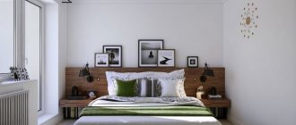
Blue shades on the walls
Blue color is an option that few people also approve of: a room in such shades does not go well with the homeliness of a residential apartment. But this is another case when you need to correctly combine different shades.
The blue color of the walls calms and balances. If you are in doubt about what shade to choose for a child's room, it will be the color that will stimulate the child's mental development and calm him down at the right time.
To prevent the room from seeming too faded and boring, you should be more careful in using a combination of light blue and white. It is better to combine cold shades with warm ones. For the floor we select brown. The same color should be present in furniture elements. If the furniture is white or too light, the room will look like a hospital ward.
Feng Shui in the color scheme of the living room
The use of Eastern teachings when choosing interior colors allows you to determine the direction of vibration and energy, which will have a positive effect on a person’s mental and physical health. The teaching is based on the basic elements: Wood, Fire, Metal, Water and Earth. In this case, the finishing should be placed on smooth, even walls so that nothing interferes with the movement of positive energy.
Characteristics of Feng Shui flowers
- White. Symbolizes ideal, purity, light. For comfort and warmth, use in combination with another palette. An excellent solution is to add yellow tones.
- Red. The color of passion, activity, movement. It stimulates the appetite, but can sometimes cause attacks of aggression. When combined with gold, it attracts good luck. Red doesn't go well with black. The palette is not recommended for use by people with diseases of the nervous system.
- Orange. Combines the positive energy of yellow tones and the power of red. Conducive to a pleasant conversation in the guest room, attracts prosperity and kindness.
- Gold. Denotes respect, honor, status. Previously, only rulers could use this color in the interior. The golden palette has a positive effect and attracts money energy.
- Black. In fact, it is not considered a mourning color, but a magical color according to Chinese teachings. But many still equate it with negativity, so it is better to minimize the use of black or use it for accents.
- Blue. The main association is water. The palette has a calming effect, restores harmony, relaxes and is suitable for meditation. Blue stimulates spiritual energy and intuition.
- Green. The color of calm, peace, nature. It stimulates wealth and well-being, means life, growth, harmony with others. Pairs well with yellow and gold colors, creating the energy of success.
- Yellow. Symbolizes positive energy, success, happiness. It attracts warmth and makes the living room cozy, evokes an optimistic mood, and attracts good luck.
- Violet. It has mystical, magical properties. Suitable for creative people, symbolizes material well-being.
When choosing not one, but several wall colors in the living room interior, it is important that they indicate one direction to enhance energy. You should be guided not only by the above characteristics, but also by your own preferences in order to create a cozy interior.
How to combine walls and floors
Modern flooring materials, as a rule, have shades that can be ideally combined with literally any walls. Don’t be afraid to make the floor more contrasting, for example, combine a dark floor with light tones, and vice versa. Beige tiles will look great with a dark brown floor, and a deep blue shade will look great with sand.
The floor shade does not have to be from the same palette as the walls. Contrast is not only fashionable, but also an advantageous technique that can be used for both floors and walls. The main thing is not to be afraid to experiment.
Related article: Pistachio color: how to get the right shade
Video gallery
Photo gallery
The best posts
- Purple color - royal luxury in the house (+50 photos)
- Sunny yellow - its shades and combinations
- What color to paint the walls: combination and nuances (+40 photos)
- Green is the color of an apartment for optimists
- Choosing the color of the walls in the kitchen according to expert advice (+42 photos)
- Orange color is a shade of joy (+42 photos)
- Passionate red and all its shades (40 photos)
- Light green color and its combinations (+42 photos)
Popular publications:
- What color to paint the walls: combination and nuances (+40 photos) A well-chosen color scheme plays a decisive role in interior design….
- Graphic black and white: primary colors (+45 photos) The black and white interior reflects a modern urban society striving for an uncompromising…
- Sunny yellow - its shades and combinations The combination of yellow in the interior is almost always positive, but with…
- Purple color is royal luxury in the house (+50 photos) Blue and red are two opposite colors of the rainbow, which...
- Green is the color of an apartment for optimists Green color in interior design is considered an excellent choice. Associated with...
Optimal solutions
Gray background
A modern, popular palette that is suitable for both classic and loft, minimalism, and modern styles. For greater effect, it is complemented with geometric textures. Thanks to the variety of shades, it is suitable for rooms of different sizes.
Yellow scale
When choosing, you should pay attention only to pastel and calm shades, and not bright and flashy shades, which will negatively affect your relaxation and cause nervous tension. Sunny, warm yellow is associated with summer and comfort. In spacious rooms it can be used for all walls, in small living rooms - for interesting accents in decor, photos, etc.
Brown tones
Mainly used for classic solutions. More saturated and deeper shades are chosen for accents, coffee, chocolate, etc. for the background.
Olive shade
Well suited for Provence, Scandinavian style, country. A soft, natural, pastel shade of green is suitable for rooms of different sizes and locations. The noble tone gives coziness and comfort and goes well with other soft tones.
Light orange
Associated with rich summer colors. It is used for various interior solutions and will become the highlight of a mixed style of classic and modern. Pairs well with turquoise and gray. Looks good in dark living rooms with windows facing north. It also compensates for the lack of lighting.
Shades of beige
A popular, versatile, practical color that can be used to decorate any living room. The room will be warm and harmonious. For decoration, bright, rich colors, imitation brickwork, and textured plaster are used.
Shades of turquoise
The turquoise palette will give you a feeling of freshness, freedom, and spaciousness. The shades are presented both rich and deep, and pastel, fresh. It goes well with different color options without overloading the interior. Makes a cool palette softer and more appropriate. More suitable for spacious rooms, plays well as accents.
Natural shades of green
A natural, comfortable palette that symbolizes life. Various shades are used in the living room interior. Often gamma is used to zoning space. Pairs well with shades of gold, brown, and floral prints.
White background
Strict and restrained, but at the same time, a neutral color that can be used as a base for any style. Its color palette is wide and varied, and textured application will open up new facets of white. The palette visually expands the room, fills it with light and warmth, and eliminates dark corners.
Popular colors for the living room
Beige
Beige color is universal; it looks harmonious in almost any style. The living room will be warm and cozy; the character of the room can be changed with the help of decor. The finishing can be brickwork or an unusual application of paint.
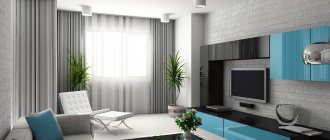
Grey
A modern and fashionable color, which is often used to create loft, classic, and modern styles. The walls of the room can be complicated with a variety of textures and geometric shapes.
Blue
Various shades of blue have a relaxing effect. For people with high workloads, it will be the best solution for decorating a living room. Corresponds to oriental, maritime, Mediterranean and shabby chic style.
White
White color is considered neutral, but by playing with colors you can create absolutely any interior. It has a lot of shades, and thanks to the complex application on the walls, the living room will turn out to be original and completely unusual. White walls will become the basis for creating the character of the living room. For a dark living room, white color will be a salvation; there will be more light in the room.
Decorative elements will make the interior strict and refreshing, or, on the contrary, will give comfort and warmth.
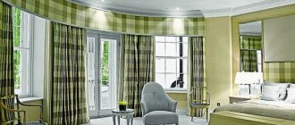
Green
A trendy color for recent years, which is associated with greenery and nature. The walls can be painted in different shades, zoning the space of the room. Wallpaper with a bright print will highlight the eco-style of the living room.
In addition, green has a beneficial effect on vision and has relaxing properties.
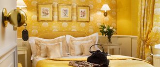
Yellow
A bright, summer and sunny color, it is subconsciously associated with something warm and pleasant. Suitable for covering the walls of a spacious living room.
A too bright and poisonous shade of yellow in a small living room will be oppressive, while pastel and light colors will promote communication and increase attention and mood.
Olive
Olive is a shade of green; it envelops you with its noble shade and gives a state of comfort.
Wall decoration in olive color will look harmonious in classic, Scandinavian and country style.
Peach
Peach-colored walls will fill the interior with rich colors of summer and early autumn. Suitable for classic, modern and fusion styles.
Peach is combined with gray, turquoise and burgundy.
Turquoise
Painting the walls turquoise will give a feeling of freshness and spaciousness to the living room. It has different depths of color from weightless pastel to rich and deep. Combines with almost any color without overloading the overall interior of the room.
Characteristic stylistic palettes
- Contemporary. Modern style allows you to use more bright colors such as blue, turquoise, emerald, lilac, etc. A combination of several contrasting colors in one room is typical.
- Scandinavian. The style is characterized by the use of beige, gray and white tones, as well as shades of blue. The color should be harmonious and maintain spaciousness.
- Classic solutions. These directions are characterized by muted, calm colors of brown, green, and blue. Only one shade is used in the interior; patterned wallpaper is used for accents.
- Loft. A modern solution for decorating a living room. Mainly cold, calm tones are used for the interior. Gray and white go well with brick. For such an “industrial” idea, you can use black.
- Country. A rustic theme is impossible without natural shades such as brown, green, soft yellow, blue, peach, olive, etc.
- Provence. The base is pastel colors such as olive, beige, lavender, etc. It has a natural, restrained palette.
The palette of each style may vary depending on the functional purpose of the color, the area of the room, and personal preferences. If, according to the design project, the implementation of non-standard tones is appropriate, there are no restrictions for bringing such an idea to life.
Variety of palettes
You can choose the right color for any room. Special color palettes from manufacturers will help with this. Modern painting technologies allow you to create a unique design using bold colors.
Any type of wall paint can be tinted, made duller or brighter. Each company store has tinting machines. You can achieve the desired color yourself by adding special pigments before work. For mixing, it is better to use the main composition and powder from the same manufacturer. If the proportions are observed, the mixture is guaranteed to correspond to the expected shade.
In order not to make a mistake in choosing paint for the walls, you need to experiment with samples. You need to add the desired colors to the created sketch and evaluate their combination. If they fit harmoniously, you can start painting. First, they finish a small area, controlling the saturation of the shade.
The color of the paint can change the texture of the walls. Any shade will look darker than in the palette on a rough surface. For coarse-grained plaster, choose a paint that is 6-8 tones lighter; for smooth walls, a discrepancy of 2 points is sufficient.
Cool colors
The color palette is divided into several main types. Cool tones form one of the categories, the main ones being: blue, green. Shades from this selection are often used to paint the walls of spacious southern rooms. Staying in such a room in the hot summer will be the most comfortable.
When using cool tones, the main thing is not to overdo it and not create a feeling of sterility. It is better not to paint the walls the same color. Due to the different intensity of interior lighting, it will look different in each individual area. The color of the walls is the background for furniture, accessories, and decor. The properties and perception of any of the shades of the cold palette are influenced by the area of the room and neighboring rooms in the house. The smaller the space, the lighter the tone should be.
Warm colors
Warm tones include beige, yellow, red, pink, lilac and other colors that create comfort and lift your spirits. When painting the walls of small rooms, they should be used with caution, as they visually reduce the space. Warm colors will be an excellent solution for rooms with poor lighting and windows facing north.
The color scheme of the walls is selected based on the purpose of the room. Depending on the saturation, any of the warm colors except orange can have a cool tint. This feature must be taken into account when composing wall paint. Some shades will change temperature or become neutral.
Calm color palette
In such combinations, cold tones are perceived to a greater extent. They don't always have to be pale and dull. An excellent combination for walls would be purple – green – blue. Any color from the calm palette can be safely combined with gray.
Blue is often used as the main color in calm palettes. It can be any shade of it - steel, silver. Saturated colors emphasize the strength and leadership qualities of the owner of the room, while light colors calm and pacify.
A warmer, calm palette includes beige, light brown, and white. The darkest color can be used to paint an accent wall or a specific area, the rest can be used for contrast. In small quantities, minor bronze and gold details will look great.
Bright color palette
Colors that are too bright are not suitable for application on large surfaces. With the help of such a palette, individual elements are usually highlighted. You can diversify a calm interior with beautiful patterns. To give the room originality, contrasting coloring of adjacent surfaces is used. This technique will look advantageous in spacious rooms.
When choosing a bright color palette for the walls, furniture, floors, and ceilings should remain only an addition. Do not oversaturate the room with color, otherwise it will seem motley and tasteless. Orange, yellow, and red will help narrow a huge space.
Types of color combinations
- Contrast. This color combination is used to implement modern interiors. You can choose the most unexpected colors if you place them correctly in the room. Use options - accent wall, geometric patterns, stained glass or panel effect, etc.
- Neutral combination. Opens up ample opportunities for the implementation of original ideas. Delicate shades are suitable for classics, for modern solutions - cooler palettes.
- Monochromy. The use of one color scheme allows not only to visually preserve the area, but also to expand it. There are many combinations, since each color can have dozens of shades. Without overloading the interior, you can zone the space.
- Two colors. The use of two different colors is acceptable for spacious rooms, but other solutions can be considered if both shades are light. It is important that the colors chosen are from one half of the spectrum. The transition is smooth, the gradient method is popular.
The use of several combinations is possible only if the living room area is 25 square meters or more. Then one of the zones can be decorated for relaxation in soothing colors, the other can be decorated for receiving guests, etc.
Wall materials
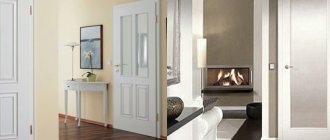
And yet, the main issue when choosing a specific palette remains the selection of wall material. The traditional answers remain paint and different types of wallpaper. A painted interior is the simplest solution, the implementation of which is accessible to everyone. For a textured finish, you can choose paintable wallpaper, which has an unobtrusive texture, or plaster, but it’s better not to work with it yourself without skills.
Other options include decorative wood panels, glass and stone panels for accent and partial wall decoration. Such coverings can imitate doors to other rooms, look like paintings, disguise built-in wardrobes, etc.
The most common option is, of course, wallpaper.
The choice of these depends on many factors:
- If coatings are needed for an accent wall, you should pay attention to bright shades, catchy patterns, and stylish ornaments. For example, if you choose materials for the Provence style, floral wallpaper will do. It’s worth choosing the same curtains and sofa cushions.
- To create a harmonious combination, it is worth considering what color other surfaces are painted.
- When choosing basic coverings with a pattern, it is worth finding a plain or textured strip for placing photographs on the walls. The curtains are chosen in the same tone.
- Wallpaper can be combined - plain with canvases with stripes or floral motifs, stripes with floral motifs on adjacent walls, alternating stripes, contour ornaments and plain textured areas.
At the same time, the color of the wallpaper with a pattern loses its original character - here the main role is taken by the shade of the ornament. This should be taken into account when decorating the living room in a certain color scheme.
Choosing colors for a small living room
To decorate a small living room, light, calm colors are used that will be in harmony with other interior elements. It is better to avoid patterns and prints, as they may make the room seem smaller. Decorative items and furniture are used for bright accents.
To visually enlarge the room, you need to think about a lighting scheme that will highlight the color of the walls, and also hang mirrors. If you use wallpaper or decorative plaster, they should be discreet, monochrome, without unnecessary details that could negatively affect the visualization of the space. An interesting solution could be to paint an accent wall in a different shade, if you choose the right color.
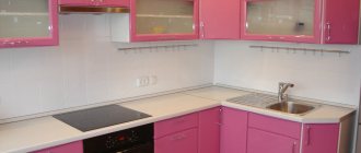
Pink shades
Pink paints should also be used skillfully. They are suitable not only for decorating glamorous powder rooms. If you choose the right shade and combine it correctly with other colors, you can create an elegant and original interior. This tone is ideal for hallways, bedrooms and living rooms. It might look good in the kitchen too. The main thing is to focus on calm, noble shades. For the floor we choose either white or brown shades. By the way, few people know that a one-time look goes well with brown.
Related article: What color to paint the walls: combination and nuances (+40 photos)
Photo gallery
Our gallery features photographs of completed projects demonstrating the correct use of color for living room walls.
Cool colors for the perfect interior
A cool color can be either primary or complementary, depending on specific decisions. Includes the following range:
- Silver. Associated with frosty winter. It will be an ideal solution for those who prefer this time of year. Warm notes are added through combinations of yellow or green decor.
- Blue. The rich tone, evoking associations of elegance, charges with energy and additional vigor. To soften (domesticate) the interior, it is diluted with less saturated tones. Goes great with white.
- Blue. Evokes associations similar to blue, the surface of the sea, the sky.
- Lilac. Associated with blooming flower buds. Depending on the neighbor, it can be perceived as cold or warm. The interior of the living room, in which it is used as a dominant feature, looks impressive and amazes with its chic. Looks great in symbiosis with gray, white, beige.
- Green. Depending on the shade it produces a different impression. Bright contrast will fill you with energy, add strength and energy. Muted, calm - creates a feeling of privacy, reminiscent of summer warmth. When using a green background, you should pay more attention to the selection of accompanying shades. Sharp contrasts are not allowed here.
Pistachio color combinations in the living room Source www.oboidecor.ru Dark sofa against the background of gray living room walls Source www.zastavki.com
Silver walls of a large living room Source legko.com Living room with windows facing east Source caparolpro.com
Important! Some colors, in terms of warm and cool, can be universal. Depending on the variation of shade, they belong to one or another group. For example, the green color of mint, emerald or malachite is cool. Yellow-green or olive - to another group.
Light gray walls in the living room interior Source otlichnyjremont.ru
How to use a color palette
The red color used in the interior lifts the mood and gives strength. Use it not as the main background, but as a bright element. The hue of fire creates an atmosphere of festive celebration.
Do not use red in rooms of overly active children or sensitive people. An intense shade will lead to irritability and overwork. The downside of fiery coloring is the visual reduction of space. It is better to use it in spacious rooms, but not as a background, but in the form of textiles, furniture or decor.
The yellow interior evokes joy. It invigorates, cheers, gives a feeling of comfort and warmth. Don't go overboard with the shade. Yellow walls, ceiling, and floor can put pressure on a person. Therefore, it is better to use this color as decoration or for the kitchen. The shade improves mood and stimulates appetite. But the yellow tone is not suitable for the living room and bedroom, but just right for the nursery. Children love the color of the sun, the main thing is not to overdo it.
The orange hue creates an atmosphere of celebration, fun, and fills the house with joy. Orange decorative elements are eye-catching and look best when used as pops of color. Citrus color stimulates brain activity and activates creative processes. Suitable for interior decoration in a study or children's study area, fits well into the kitchen and dining room.
A decor created in a Moroccan or Spanish style needs orange. The shade combines well with other warm colors, but does not combine well with cold ones.
Source: liveinternet.ru