Read: 5,304
When choosing a color scheme for your living room, consider gray. It is practical and versatile. Perfect for rooms of different sizes, thanks to the huge number of shades. Gray color for the living room has a number of advantages:
- Versatility. Suitable for any style.
- Goes great with other colors.
- Has a huge number of shades.
- The gray color is not easily soiled.
- The color is neutral and does not exert pressure.
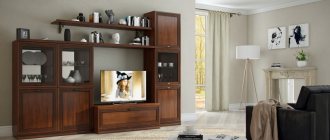
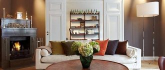
Living room design in gray tones
Living room in gray tones
Living room in gray tones
Living room in gray tones
Living room in gray tones
Living room in gray tones
Living room
Pros and cons of gray
Gray is considered part of the transitional black and white spectrum. This achromatic color represents rationality, balance and realism. And today it is increasingly included in interior design. Despite the fact that many people consider the cloudy palette gloomy and rather ordinary, it is gaining popularity, so living room designs in gray tones can already be seen in a variety of styles.
The use of steel makes any interior softer to perceive, even in the most contrasting and extravagant projects. At the same time, he always looks stylish and sophisticated. Although the color itself does not attract attention, allowing you to focus on the main thing - on your thoughts, on relaxation, on comfort.
The color of silver is suitable for perfectionists who always strive to be perfect: in such an environment there is no need to prove anything to anyone, because gray is stable and calm.
In combinations with other shades in the design of a room, smoky highlights more saturated tones, giving them the main role, emphasizing the dignity of the companion and his character.
The gray scale also has disadvantages:
- This color is associated with loneliness.
- A living room in gray tones is absolutely devoid of emotion, but not comfort.
- The interior can look exhausted, not just restrained.
- Unfortunately, gray is associated with illness - this is the color the skin of an unhealthy person becomes.
Nevertheless, everything depends on personal perception: there is a category of people who see only the future in a smoky palette. And this is the color of spaceships, chrome-plated parts of high-tech equipment, robots that simplify human life. This is a shade of freedom, calmness and absolute balance.
Choosing a steel shade for the hall will help you find both a detached and comfortable solution for decorating a modern and functional interior. Although gray is also applicable in the classic style: a rich interior does not have to be catchy and flashy; rather, an economical setting will be rich and bright.
Psychology of gray
Gray color helps to increase confidence, pragmatism and increase intelligence in a person. From a psychological point of view, this color is the personification of calm, balance and security.
Negative qualities include the possible occurrence of emotions such as feelings of melancholy, fatigue, decreased creativity and increased depression. Neutral light shades are conducive to relaxation and rest.
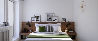
The photo shows the interior of a teenager’s bedroom in the attic, made in gray tones.
How to use gray color correctly in the interior
The neutrality of the smoky color scheme determines its use in any combination, and the combination of gray with others in the interior turns out harmonious with different proportions of the use of shades.
The variety of gray tones allows you to choose any basis for decoration: light is easier to perceive when extensively painting surfaces, but dark should be used carefully - only in spacious rooms, in doses and wisely. It is rich graphite that raises a lot of questions: what can it be combined with, in what details and surfaces can it be used, with what lighting and in what style. In a light palette, absolutely all tones are combined with gray, so it is easier to use, especially since such a color is really virtually invisible.
Before choosing successful combinations, you still need to decide on the main color:
- The warm spectrum of gray is a luxurious platinum, silver, ash, linen, and their shades in mother-of-pearl finish.
- Cold range - steel with blue notes, the color of tin and lead with a whitish coating, slate, stone.
Obviously, the “temperature” of the room, the nature of the furnishings, as well as the decision of which matching companion color to choose depend on this. But this does not mean that only corresponding colors are combined with warm tones: gray, like the universal beige, is able to pacify opposite tones.
The choice of style will also help you decide what color to combine gray with in the living room interior. If you want to create a monochrome design, you can use textured combinations.
Combination of gray and white
Among the most successful combinations, of course, one cannot help but notice duets of steel and white. As with black, achromatic gray is ideal with other similar shades. But if, in combination with the deep color of the night, gray acts as a background, and dark is used to graphically highlight accessories, details, furniture, then in the white-ash duet the roles are evenly distributed.
The gray and white living room is a traditional solution for the Scandinavian style, where snow-white walls are the backdrop for smoky accessories - cozy knitted textiles. A similar combination can create light-optical illusions in other directions, the play of light and shadow, gradient transitions from pure snow to intense graphite.
Gray and brown
One of the noble duets involves combinations of a smoky background with natural wood surfaces. Of course, such combinations can also be present in glossy facades, ceiling panels and technical units. Whitewashed solid wood with ashen notes in the decoration look exceptionally organic together.
This combination of colors in the living room interior is appropriate in a classic design, contemporary, modern, minimalist, eco style. Natural gray can be seen in natural solid stone, which goes well with wood.
Pink combined with gray
The frivolous color, recognized throughout the world as a shade of youthful femininity, combines perfectly with a neutral palette of gray. A living room in gray-pink tones is an elegant design option, since ash “muffles” the flashy notes of a romantic palette, which can be quite vulgar if used excessively.
As a rule, a smoky background is chosen, although a pink interior with an abundance of gray accessories also looks luxurious. If, when choosing crimson accents, you can paint the room in dark slate, then when changing roles it is better to choose light gray. The dark shades of the smoky palette are applicable against a delicate background.
The pink living room is the exception rather than the rule. In combination with a silver color scheme, this can be a classic interior, with a dark ash color - art deco; in minimalism or high-tech style, you can also see an interesting combination of these two shades with pearl notes.
In neoclassicism, art deco and pop art, velvet upholstery would be appropriate - in pink and graphite tones in living rooms. In such a fabric, raspberry or peach look especially rich, but slate still makes such a palette softer.
Bringing freshness with green
In a monochrome interior, typical shades of gray often lack freshness. Therefore, for comfort in such an environment, you can use green accents. Living plants, especially large ones, look best in large tubs. The presence of such decor will make any room more cheerful. In addition, green has a positive effect on the human psyche. This color evokes a feeling of calm, peace, and relaxation.
Combination of gray and red
The combination, active in nature, invigorates the people in such a room. The fiery color seems to explode the faceless reality, so the duet turns out to be contrasting and quite saturated. Even in a few red details, he places such dynamic accents that there is no need for many of them. In large quantities, the combination of ashen and fiery resembles powerful lava, which can only cause panic.
Dilute it with blue or cyan color
Cool furnishings in blue-sky tones go most organically with gray surfaces, because the colors belong to the same palette. Brighter shades become accents, while muted shades can appear on equal terms with smoky shades in background surfaces.
Blue and gray create an elegant duo that looks great in a living room of any size. Intense blue emphasizes functional details in an original way - in the Scandinavian style this could be the binding of ottomans, in a minimalist living room - metal lampshades, in high-tech design - glossy facades without any fittings.
Interestingly, the masculine principle is attributed to the marine color scheme. In reality, this is not so - women often like the palette too. It is the fair sex who often choose an intense pattern on gray wallpaper, then a blue living room with a silver background for an accent wall becomes elegant.
A duet with turquoise, which contains both heavenly and green notes, will also be organic. Azure itself is an attractive color, so it is chosen more often than pure seawater or grassy tones. Although the color of the deep sea in a noble muted shade is an exceptional option for an expensive interior.
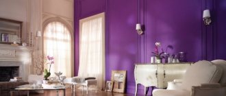
Add purple or lilac
The purple finish contains mysterious notes with a certain amount of mysticism. With all the restraint, the combination with gray turns out to be quite sensual and mature. Such an interior is rarely chosen by young couples - it is rather the choice of experienced families with income and position.
A living room in lilac tones with a light gray background is the best option for the Provence style. Here lavender can be present both in accents and in the background - along with ash or even lighter - silver. The lilac atmosphere gives unusual sensations: a mysterious and light color, but psychologists consider it quite restless. It is curious that the light palette of lilac is considered an “immature” violet. Although the lilac interior of the living room is perceived much easier than intense lilac.
Despite the fact that in combination with asphalt a similar range will be more pleasant and softer, there is a certain intrigue in this duet. In addition, the stylish combination of gray and lilac in the interior immediately elevates the decor to the category of elite. The companions look exceptional in art deco style. The combination is also applicable in neoclassicism, but is less common in classicism. A purple living room with a gray background can also be implemented in a high-tech style.
Mixing gray with yellow
The grayness and dullness of ashy instantly disappear if sunny accents appear in the interior. It is an energetic, positive color that transforms any neutral palette.
The gray and yellow living room is an interesting and bright solution. A sunny carpet, picture frames on the walls, one catchy chair - all this will add individuality and charm to the simplest design.
The color of the sun has a positive effect on a person’s mood, and together with the steel basic design, you can create the effect of constant illumination of the room with sunlight: gray seems to be a shadow on all objects, and yellow accents are where the rays fall.
A variety of shades in the living room from dark to silver
As already mentioned, the palette of gray is actually so large that you can choose successful combinations with absolutely any of the shades. The range can be distinguished between cold and warm tones, which are present throughout the spectrum.
The most common is a light gray living room. It is predominantly steel, in which one can notice blue, as well as tin and lead shades, mother-of-pearl, platinum, linen, asphalt, silver, moonlight, as well as the colors of opal, dove wing, etc.
Smoky, stone, Coventry, and pewter will be a little more saturated. Dark gray colors include the color of iron, stormy sky, charcoal, and slate. Such shades are close to black tones and are sometimes mixed with them in the living room in detail.
What colors can gray be combined with?
Gray goes well with many colors. But with some it can be used in proven and safe combinations. With which ones?
- A tried and true combination is definitely pairing it with white - this neutral color will always look good.
- He will create a good, safe set in a duet with beige or cream, ivory, magnolia, although some of these combinations may seem dull and colorless.
- As a neutral color it will look great in the company of strong colors such as:
- crimson;
- pink;
- turquoise;
- yellow (especially mustard);
- citric;
- red.
Using bright colors will enliven the room, add character to it, and make it more interesting. However, when choosing such combinations it is easy to make a mistake, so it is better to choose proven options or seek the help of a specialist. You should not introduce more than two bright shades into the interior and use them on a large number of additives.
Gray and white design
To dispel sad shades, it is good to combine grays with light tones. A combination with white would look ideal. However, it is worth considering that this combination will be somewhat cold and may seem gloomy in a room with windows facing north. White additives will add a little freshness to such an interior, make it lighter and give the necessary feeling of spaciousness.
Living room in gray and white tones, photo
This solution is perfect for small rooms where an abundance of dark tones creates a depressing impression. White furniture, textiles, white flooring will make such a room lighter and friendlier. An excellent solution could be a fashionable white brick wall, which will become a bright, light accent in such an interior.
Interior with bright accents
Interior designers also offer a combination of gray shades with other, brighter shades. Furniture and accessories in the following colors will look good as bright accents:
- yellow;
- brown;
- green;
- red
The drabness in the living room will not be boring if we liven it up with additions or furniture in natural shades - brown or green.
But such bold experiments, however, require knowledge and skills in order for their results to please you.
A living room in gray-violet tones or with a touch of pink will also look elegant. It should be remembered that such compositions will look especially good in the interior in classic and glamorous versions.
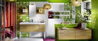
Living room in gray and turquoise tones, with green accents . Rich green shades will be the best choice for a gray living room in a modern style. Green color will add energy to the interior and dynamism to the decor. A calmer result can be achieved by choosing olive or turquoise colored additives.
Living room in red and gray tones. Red additions enliven the room and make the interior more dynamic. Red furniture with soft plush upholstery is especially effective.
Yellow and orange additives are a very popular solution! This choice is unconventional, but very effective. Yellow and orange additions will make a gray interior more modern.
In harmony with beige shades
Muted colors such as beige add softness and warmth to the interior, making it cozier and softening the sharp accents. Beige in a gray living room can create a soft and supple background or can be present in interior elements, such as light wood details or upholstery on a sofa and armchairs.
Objects, furniture and accessories made of light natural wood, which creates a unique comfort and friendly atmosphere, will look especially good in such an interior.
Wood contrasts slightly with the coldness of gray and creates a complementary duet. However, such an arrangement will require several expressive accents. In a fashionable interior, these can be stylish black or dark brown additions, and those who like more daring solutions can add bright accents, for example, red, blue, orange or turquoise pillows on a gray sofa. The neutral base of our composition allows us to introduce some very bright and bold additions, for example, a bright yellow chair.
Light shades of beige, approaching cream, will make the room visually larger and airier, while at the same time not giving it cold notes, as is the case with white.
Cool design in gray-blue tones
Gray goes perfectly with blue and blue. This combination brings a feeling of freshness and lightness to the interior. Delicate blue slightly mutes dark gray, but blue, on the contrary, will look good with light gray. Blue tones will help you relax and unwind. However, this combination is quite cold and is best used for sunny rooms, where the sun's rays fall most of the day.
The ideal third tone would be light and dark brown, which can be present on the floor, wooden furniture and accessories; it will make the interior warmer and more comfortable. Additions of black, beige and white colors will also look impressive in such a living room.Choosing a style
The first associations that gray evokes are steel pipes, urban smog, and industrial areas. It was technological progress that brought this palette into interiors. At first glance, they are devoid of emotionality, which means that the emphasis is on functionality, but everything gradually transforms, and the atmosphere becomes individual. Even minimalism can be cozy - according to your requirements.
The interior of a living room in gray tones is most often implemented in modern styles, where metal, concrete and glass predominate, where space and practicality, expressiveness, but not emotionality, are needed.
- High tech . The interior of the future, in which the functions of objects seem to be subordinate to a person, as soon as he thinks about his desires, is often done in pure colors - white and black. Gray is a halftone between contrasts, but in this case it is a harmonious shade of the metal parts presented in the living room. The interior is given dynamism by glossy surfaces, which, together with perfectly polished plastic, perfectly reflect light in such an environment.
- Loft . Concrete walls without finishing, brickwork, utilities in the vast space of workshops, abandoned to the “tearing apart” of the new owners - creative individuals with their own vision of comfort. Here gray acts as an inconspicuous background against which interior items of other shades look great.
- Underground . Against the canons and stereotypes is a style that can be distinguished by the rough finishing of concrete or brick walls, the simplest possible household items, the lack of decor combined with unexpected details - fittings, untreated wood stumps, cardboard boxes instead of cabinets. Very often, such an interior can be seen in rooms with low ceilings - in semi-basement rooms. But it is also chosen by non-standard individuals.
- Urbanism . A typical city living room is not complete without a smoky palette: there is concrete, metal structures, and glass. Mandatory elements of the interior remain city landscapes, bright elements, comfortable items - carpets, sofa cushions, anatomical chairs.
- Classic . Quite rarely, but you can still see a silver palette in this solemn, noble and elegant style. Here, on an ashy background, traditional white and gold pieces of furniture can be used, or more restrained, sophisticated sofas in charcoal or even black, natural wood models made from expensive species.
Of course, this is only a tiny fraction of the directions in which a room can be decorated. A living room in the style of minimalism, functionalism, contemporary, maximalism, etc. can be decorated in a light or dark graphite palette.
Today, stylistic canons are increasingly being erased and mixed, especially in directions that are similar in philosophy and form. These are eclectic, but most importantly - functional, comfortable, truly cozy interiors with individual features that the owners themselves introduce.
Decoration of the hall in various styles
Quartz, coal, anthracite, granite and other gray colors best reveal the specifics of various style solutions.
Modern style in the interior of a gray living room
For example, for the high-tech direction, a silver and steel palette is especially often used, which is combined with white, black, red colors, metal and gloss elements.
Authentic Scandinavian homes suggest pearl gray tones, while French interiors feature warm and soft gray colors.
The photo shows the interior of a gray kitchen living room, made in an industrial loft style.
The monochrome palette is an almost integral part of laconic minimalism. The interior is sometimes diluted with a bright accent in the form of a wall painting, sofa cushions or one chair.
Gray is no less popular in the industrial loft style. Concrete, brick or plaster surfaces combine favorably with light gray curtains and a sofa with mouse-colored upholstery.
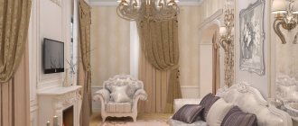
Classic style in the living room
Light gray shades of Gainsborough or zircon blend into the classic design and are ideally combined with snow-white stucco decor and wooden furniture with carvings or forging.
For neoclassicism, the use of elegant gray-beige colors is assumed. To create a truly aristocratic atmosphere, the living room is decorated with bronze decor, crystal lamps and furniture with gold or silver patination.
The photo shows a room in a neoclassical style, decorated in light gray colors.
Ceiling and floor decoration
When thinking about implementing an interior in gray tones, you should not get carried away with one shade - you can find your own tonality for each surface. According to the rules of composition, the floor should be the darkest surface, and the ceiling the lightest. In such an environment, a person will feel comfortable regardless of the primary color. Exceptions, as a rule, are a special series of design works that are not to everyone’s taste.
Therefore, for your own comfort, you should use the usual techniques in materials that fit into your budget.
- The gray ceiling in the living room interior can and should be light - platinum, lunar, cloudy . The practical and most convenient solution for today is a tension fabric. It can be matte or glossy. By the way, in the second option you can choose darker surfaces - for example, in part of a multi-level ceiling. Please note that glossy coatings reflect rays of light, so they do not visually clutter up the space, and even increase it.
- A textured ceiling in the living room in an ash palette is a phenomenon acceptable in any industrial style, where such a surface will resemble raw concrete . These are rooms in loft, underground, etc. designs. Although the texture can be different: velor on a stretch ceiling, for example, in a silver or thicker slate shade looks noble and elegant, which is suitable for such trends as classicism, neoclassicism, art deco.
- In any style and design, the most ordinary white ceiling will be appropriate, which can be set off by a chandelier in a suitable range . Although, you can choose a volumetric lamp or one consisting of many parts that will give a shadow, and in any case it will be the color of tin.
Interiors with gray floors can be seen more often than with ceilings, although in fact, living rooms usually use natural wood flooring in its natural color. Of course, for exclusive settings you can find appropriate materials - expensive wood, which naturally has ash notes in its texture. For example, there are elm, taupe zebrawood, white maple, and olive-smoky lapacho, which are also called ipe, taupe walnut. With gray laminate in the living room design, you can see similar pieces of cabinet furniture, although their cost will be quite high. However, built-in models are increasingly being chosen for modern interiors, so only facades are called upon to support the palette, and they can be glass, paneled, or slatted.
But gray laminate is not the only option for arranging a smoky floor. It could also be a stone, although it will not be very easy to find one in natural minerals, as well as in an assortment of wood. For industrial and ultra-modern interiors, self-leveling floors, which can be a pure concrete color, are increasingly being chosen. In exclusive finishes, such coatings may include 3D designs and patterns that match the style.
Finishing materials
Wallpaper
Wallpaper is the most affordable wall decoration material; it hides uneven surfaces and light cracks. Wallpaper can be plain, with a floral or other pattern in a contrasting color, liquid with gold threads and the addition of shiny chips. Depending on the density, there are paper, vinyl and non-woven materials. If the walls are not level enough, you can use glass wallpaper for painting and create your own design.
The photo shows a living room interior with non-woven wallpaper with decor that matches curtains and textiles.
Photo wallpaper
Photo wallpaper in the interior on an accent wall in gray color is suitable with the image of a pencil sketch, photograph, city, monochrome drawing.
Brick
A brick wall is suitable for a loft style and kitchen backsplash. Can be painted or natural grey. It is better to limit yourself to finishing one wall with brick and combine it with colored or white wallpaper.
Painting
Painting is suitable for smooth walls of the kitchen, living room, bathroom and corridor. Latex, silicone, acrylic and modern eco-paints are suitable for the apartment.
The photo shows a monochromatic interior with painted walls, white paintings and trim, corner decorative lighting adds brightness.
Tile
It is used to decorate walls and floors in the bathroom and kitchen, it comes with a classic decor, frieze, puzzle-type pattern, mosaic.
Laminate
For additional sound insulation and unusual wall decor, laminate is used, which is an independent finish and is attached to liquid nails, clamps or lathing.
Plaster
To add texture to the walls, plaster is used, which does not absorb odors, is a durable material and effectively hides surface roughness. Suitable for art deco, minimalism, hi-tech interiors.
Decorative rock
It is used for the interior of the kitchen and corridor, decoration in the living room or to create panels. Lighter than natural stone and easily mounted on the wall.
The photo shows the living room interior with an accent dark wall made of decorative slate and light plain wallpaper. Stone and fireplace combine harmoniously in a modern style.
Wall panels
Chipboard, MDF are resistant to moisture (in the presence of a wax coating), withstand the load of shelves, gray PVC panels have a high service life and fire resistance.
Wall decoration in gray tone
The universal palette of steel colors allows you to decorate the walls in any shade for any of the existing design styles. Usually this is plain paint or plaster, less often - concrete, as in the loft, underground, industrialism style. But gray wallpaper is also used in the living room, like other coverings, but with a smoky pattern.
- Concrete gray walls are traditional for the above design directions . These can be ordinary rough surfaces or decoratively finished textured solutions, when hatching is applied to the fresh mortar - parallel to the floor or windows, in squares with perpendicular stripes, diagonally, etc.
- Rooms with gray walls may include brickwork painted in the chosen shade . This surface looks textured, so it will be self-sufficient on its own. Unlike smooth finishes, masonry acts as an independent coating.
- Gray wallpaper is most often present in the interior of the living room, which the owners renovate with their own hands . Although design works also use ordinary paper or photo coverings for accent walls. With gray wallpaper, a living room in a classic, neoclassical, or art deco design will be harmonious. Most often these are materials with large ornaments - ornate rosettes, plant motifs, less often with stripes in a wide range of smoky shades.
The photo shows the interior of the living room in gray color in a classic style.
Coverings in the same color as the background, but with a contrasting pattern, look luxurious. In a monochrome design, a silver pattern on a dark slate background will look organic, or vice versa – a charcoal pattern on a light moon background. Gray wallpaper in the interior of a modern living room can be plain or with a geometric, abstract, illogical pattern. You can choose a wide range of space ideas - drawings of the universe, starry sky, spaceships.
- In most cases, the platinum palette is replaced by white wallpaper in the living room interior , which contains an unobtrusive silver or steel pattern. They do not catch the eye, do not clutter up the space, being an unobtrusive decor and mood-forming finish.
Gray wallpaper in an apartment in the living room depends on the overall design and its concept. An accent wall may contain patterns on a general monochromatic background, contrasting coatings - in a negative relation to the main shade, or completely different colors - catchy, decorative, energetic. When choosing them for decorating a space, they are usually used in other interior details - in paintings, lampshades, carpets, furniture.
Furniture and accessories in gray
Accessories in neutral colors always look great. This is due to the fact that they do not attract too much real attention and easily fit into the interior. They mute other bright accents and bring restraint to the interior. Pale gray colors mute other shades, so a feeling of “prestige” and sleekness is created. Silver floor lamps, lamps, vases also play a role in increasing stateliness.
Gray walls will serve as an excellent backdrop for bright pieces of furniture.
Gray furniture can be used to create beautiful and bold interiors with a fashionable and functional design.
Gray always looks harmonious and natural if you learn how to combine it correctly. It will give the interior a special chic that many strive for.
Furniture for a gray living room
The steel furnishings of the hall are presented as a total platinum interior, in which there is gray furniture - sofa, set, armchairs, tables, poufs, etc. A few items may stand out from the general palette. As a rule, these are bright accents - one armchair or chair, a carpet, a painting, a drawing on an accent wall, a lamp. But first things first.
- Speaking about a sofa in a gray interior, you should pay attention to simple models that are designed to provide comfort, not decorativeness . Only products in classicism become decorations for the decor. In modern designs, a sofa is a simple geometric piece of furniture that can be modular with individual attached pieces. It is important to select a product that is proportional to the space.
- Poufs can be part of a sofa or separate items . Accent elements include knitted upholstery, bright flashy colors, and unusual geometry.
- Coffee tables are another detail that is often present in spacious rooms . For a living room in one of the modern styles, you can choose a glass model with metal pipe legs, a wooden product in a suitable shade, or a metal table.
- Wardrobes in a gray room can be represented by built-in compartments with matching fronts , which can blend in with the overall finish so as not to visually take up space.
- Walls, shelves, and racks are used as additional storage space . In the literal sense, the set, as it was before, can no longer be seen, except in the preserved furnishings of apartments furnished in the second half of the 20th century. New products are more modern designs. These can be racks formed along the contour of the TV, parallel cabinets or vertical shelves, backlit installations. When choosing a gray wall for the living room, you can pay attention to a wide palette of shades that merge with the main finish, or glossy facades that reflect the rays, thereby creating an interesting play of light and shadow. Even in dark colors, gloss helps reduce the bulkiness of furniture.
Most of the solutions described are suitable for modern technological areas. For classics, decorated wooden surfaces are more appropriate - with carvings, moldings, stucco, and volumetric elements. There will be no glossy surfaces, but there may be metallic shades - platinum, silver, chrome.
Using gray in furniture and decorative elements
For a monochrome interior, furniture in gray tones is most often selected. It is quite practical - non-staining, and can be upholstered with an interesting texture. If the walls are a fairly dark shade, the furniture should be several shades lighter so as not to blend in. For a light shade of the walls, a darker tone is selected.
For light-colored walls, it is better to use furniture with darker upholstery.
It is very important to choose the right textiles for the interior. It should be selected especially responsibly for the bedroom and living room. In most cases, for calm gray interiors, curtains are selected to match the walls, and are, as it were, their continuation . Decorative pillows can be selected in darker shades.
Curtains in the living room are like a continuation of the walls
If you are decorating a nursery, or you have chosen one of the modern styles for the interior, you can choose curtains in bright colors or stripes with patterns.
For a nursery in gray tones, it is advisable to choose bright-colored curtains
Black and white photos, paintings, and panels are perfect for wall decor. It is acceptable to use decorative elements made of metal, plastic, and glass.
Metal and plastic furniture parts fit organically into the kitchen design
Particular attention should be paid to lighting fixtures - they can become the main accent in the interior.
Lamps of unusual shape perfectly complemented the dining area
Any interior will be decorated with vases, decorative dishes, and unusually shaped clocks. Don't forget about plants - they are a universal decorative element that will be appropriate in any room.
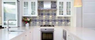
Decorating a gray kitchen-living room
Technological tones are one of the practical solutions for decorating functional areas, so a kitchen-living room in gray will be quite appropriate in a variety of design directions. In most spaces, the work area will merge with the main background - the decoration of the walls and ceiling. But here too there is a place for bright accents and contrasting surfaces.
The photo shows a design project for a kitchen in gray tones, combined with a living room.
In a modern interior with technological surfaces, the set will be glossy, which will visually help make the room more spacious. In a similar way, facades in a light ash tone are used for kitchens with both white and platinum walls. Matte furniture is applicable in classic, loft, neoclassicism. To create an easy-to-read interior, choose light shades. If there is no such goal, you can choose a beautiful smoky color.
A gray kitchen is a stylish solution for any design, especially if there is an abundance of metal parts in the work area. The main color emphasizes its functionality and manufacturability.
Rules for using accents
Decorating a room exclusively in one tone of gray is a rather boring and conservative solution. To decorate the living room in your home, you should use a bright, light accent that can dilute and enliven the atmosphere.
It is worth noting that the use of such a conceptual solution is appropriate in fairly spacious rooms that are well illuminated by natural light sources. If the area of the room does not allow for bright colors, it is recommended to use contrasting colors.
Contrast is created by using different shades of gray, or by adding black and white color accents.
Adding an accent of bright color to the base gray color changes not only the appearance of the room, but also its mood. The use of red, orange and yellow palettes contributes to the appearance of vigor, energy impulse, and stimulate activity. Such accents can warm, uplift, and evoke a feeling of joy.
Bright elements should be used sparingly, especially red. After all, its excess provokes a state of anxiety, discomfort and aggression. It must be taken into account that such accents should receive a lot of light.
Adding green to a gray living room provides an atmosphere of calm and harmony. Elements of the blue palette will add relaxation and coolness.
Purple accents will help create an atmosphere of elegance and mystery. But you need to add it carefully, because an excessive amount can be depressing.
You can use an interesting color aspect in the following variations:
- furniture;
- textile;
- accessories;
- graphic elements on the walls or ceiling.
Thus, the combination of gray colors with bright ones in the interior of the living room gives the atmosphere of the room coziness and optimism.
When decorating a room, professional designers recommend following the “five colors” rule. According to this rule, more than five shades of the main color and one additional color are not used.
Gray textiles and additional elements
The ambiguity of the steel palette leads to the fact that most owners of achromatic design strive to find bright accessories that will dilute the everyday palette. Although in a number of shades this color looks very elegant and even elegant. Of course, these are light colors with shiny notes - platinum, silver, chrome, moonlight, pearl and pearl gray. Although in velvet surfaces of smoky, graphite and charcoal shades, such a palette also looks luxurious and very expensive. This is exactly what textiles in a classic design will look like.
And in a modern cool gray living room, textile elements designed to provide the desired comfort can be very diverse:
- Blankets knitted in large braids in ash tones are the most suitable home textiles in the Scandinavian style.
- Sofa cushions can be made to match the upholstery of the sofa or serve as bright accents.
- A carpet can be fluffy even in the most minimalist direction, regardless of the color of the product.
- Another mandatory textile element in the living room interior is curtains . As a rule, they are chosen to match the color of the sofa upholstery or wall decoration, less often - in an accent shade. To match curtains to gray wallpaper, you should choose an absolutely identical tone - the background or pattern, if present in the decoration. In a technological style, where there are many metal parts, canvases with an appropriate shine will be harmonious. In such rooms, matte curtains will also go well with gray wallpaper.
Dark translucent textile details look interesting. Most often it is organza or tulle framed by windows. Lampshades can then be made in a similar tone, which, thanks to their metallic shine, will also appear translucent.
Shades of gray
Modern design uses a wide variety of shades, for example, pearl gray, metallic, ash, linen, the color of wet asphalt and many other tones, which are an ideal and unobtrusive background for rich accents.
The photo shows a warm gray color in the design of a living room in a Scandinavian style.
Silver tones look especially fresh, stylish and solemn in the room. For those who like a discreet and non-irritating design, light gray colors are perfect. The graphite shade in a matte finish without unnecessary shine has a very impressive look. This combination will be a beneficial addition to chrome parts.
Choosing accents for the interior
In fact, it is difficult to imagine a living room in gray tones without eye-catching spots that add personality to the interior. Such a palette with bright accents will be easier to perceive, because such details create the mood, atmosphere, and make the environment more emotional than in a monochrome design.
When choosing bright elements, you should pay attention to harmonious ash shades. Of course, literally all other scales are in harmony with an achromatic color, but not every tone can become an accent, because muted tones will be lost on a fairly intense slate color.
Bright accents in a platinum interior are red, orange, blue, blue, turquoise, pink, purple and, of course, yellow details. They look especially stylish with limited use of laconic and rather original items. Just two or three, maximum four elements can change the character of the composition.
As a bright spot for a living room in steel tones, choose sofa cushions, a rug, a chair or armchair, a wide modern picture frame, a couple of furniture fronts, and curtains.
Ceiling color
Light ceiling
It is used more often than others, decorated with moldings, modeling, white plaster, paint, and suspended ceilings are used for finishing.
The photo shows a modern interior with a white, flat ceiling that echoes the white wood panels, which makes the dining room bright despite the dark floor and black table.
Dark color
Suitable for a spacious room and high ceilings, as dark will make it visually lower.
Bright
It can be created in a monochromatic or gray-white interior using wallpaper, panels, paint, or a stretch ceiling.
To match the walls
The ceiling will be a continuation of the walls and can be decorated with stucco.
Living room in gray tones: photo selection of interesting ideas
Of course, you can talk about extraordinary solutions almost endlessly, but words still will not reflect the atmosphere created by the achromatic palette of gray halftones. Photographs of different design works will help you choose an interesting idea or combination, style or eclectic solution.
The photo shows a gray living room interior in high-tech style.
Here you will see how comfortable and harmonious ash interiors can be, both in the abundance of glass and metal, and in classicism with its velvet sofas and carved cabinets. A balanced and discreet color will appeal to people with incomes who do not want to “shout” about their well-being. It is in this range that the living room in your home can be designed if you want to achieve peace and comfort in a functional environment, subordinated only to your interests.
Spectacular and stylish combination of colors in a gray interior
In interior color design, the rule of combining 2-3 shades always applies. Therefore, let's find out what shades gray wallpaper harmonizes with:
- White and black. These colors are universal and therefore ideal for gray walls. On the other hand, this monochrome design is slightly simple and austere. Therefore, it is advisable to use it in the hallway or office.
Important! For living rooms, such a design is justified if the premises are designed in the style of High-Tech and Minimalism. And also for a classic interior, if the gray wallpaper has a pattern of white flowers, stripes or patterns.
- The design of a room with gray wallpaper will be perfectly diluted with purple and red touches. Bright elements will make the room more emotional and lively. It is better to choose wallpaper in light colors.
Important! The main thing is to maintain balance: gray color is the basis of the interior, bright elements are casual accents.
- Pink color in a gray interior looks very gentle. The harmony of these shades helps you relax and get ready for relaxation, so feel free to decorate your living room or bedroom in this range.
Important! Opt for the lightest pink shade, which will prevent the walls from looking dull. And if on gray canvases there is a pattern of pink flowers with neat green leaves, then the room will breathe freshness.
- Yellow and orange are sunny and warm shades. The combination of these colors is most often used in the kitchen and living room, as these tones charge us emotionally and awaken the appetite.
Important! The design of a living room with gray wallpaper can contain an unlimited number of these color accents in the interior.
- Decorating the walls with gray-blue canvases will not make the room too bright. Blue color, like gray, belongs to the cold range, so the room will have a fresh look, such a room will have a feeling of airiness and cleanliness.
- It is possible to combine gray walls with other colors: green, gold, brown. However, such a combination will require an addition in the form of another shade: beige, cream or white.
Important! When combining colors, it is important not only to determine a harmonious shade, but also the degree of its saturation. Gloomy wallpapers need to be lightened using a pastel palette, light wallpapers should be enriched with bright details.
What walls does a gray floor go with?
Gray color also belongs to the group of chromatic colors. It serves as a good background for almost any chromatic colors and their shades. Just remember that gray also has undertones and shades, and it can also be warm, cool or neutral. When choosing a wall color in combination with a gray floor, you need to take this into account.
The gray color of the floor is combined with white walls, and you can enliven the interior with any bright details
If you find it too boring and monotonous, add some color. Instead of gray walls, go for pink or blue. Dark gray on the floor looks good in a brightly lit room.
Soft warm colors - a great atmosphere for relaxation. Gray-blue - a somewhat cool combination, but stylish
If you already have the color of the walls or furniture as a given, the shade of gray should be matched to these elements. If you are just planning the interior for now, and have already decided on the gamma, you can add gray specifically/consciously. If you don’t yet know what kind of walls and furniture you will have, the best solution is neutral gray.
Gray looks very noble with soft pink, pastel shades of yellow. When paired with blue, it can feel a bit “cool”, but you can add accessories or furniture in warm colors to neutralize this effect. You need to carefully combine a gray floor with green walls. It is difficult to make friends between these two colors in the interior, although it is possible. But you need to choose shades carefully, otherwise it will be uncomfortable. There may even be a certain dissonance.