Light work surface
A light countertop is suitable for the interior of a kitchen of any style; it combines equally well with a light or dark kitchen. It is easily soiled and requires careful treatment on the part of the owner.
White color
The most popular and controversial color is white for the work surface. Glossy ideal surfaces are suitable for modern style, hi-tech, minimalism, Scandinavian. Combines with white or contrasting kitchen. A classic matte white stone countertop suits a conservative style.
Beige color
Beige in light shades of ivory, champagne, milky, vanilla, suitable for neutral countertops that act as a background for an apron or set.
The photo shows a white kitchen interior with a vanilla-colored countertop, which does not attract attention, but at the same time separates the upper and lower space.
Sand color
The sand color of the countertop should be selected for a kitchen with wooden facades and warm lighting, as well as for a dark set.
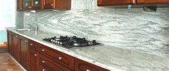
Light gray color
A light gray countertop is suitable for white, gray and dark gray furniture, as well as the color of concrete, which does not highlight the remains of splashes and possible crumbs as much as white.
The photo shows a light gray countertop on the island table and the main work area; the color matches the walls and looks organic with the white set.
Metallic color
Metallic color or a tabletop made of aluminum/stainless steel in a steel shade is best used when creating a high-tech style. This is a practical choice for kitchens where you cook frequently.
The photo shows a metallic countertop that fits into the blue and white interior of a modern kitchen and resonates with kitchen appliances.
Metal and glass
Sometimes traditional solutions are not at all suitable for creating a unique interior. For a high-tech kitchen, you can purchase a metal countertop. It is distinguished by its resistance to dirt and high temperatures. It is not difficult to keep such a surface clean; to do this, you only need to clean the surface on time.
Tempered glass is used to produce glass countertops. This is a very expensive and rare material. Most often, countertops are made with only small decorative inserts. They look great, but are high maintenance.
Dark work surface
Dark shades of the work surface attract with practicality; in glossy and matte versions they look equally advantageous together with a light or dark kitchen set.
Black color
The black tabletop and anthracite colors look stylish. Suitable for a medium-sized kitchen or larger, it visually separates the upper cabinets and lower cabinets. Looks good in any style.
In the photo, a black glossy countertop in the interior style of modern classics acts as a stylish accent and a practical solution.
Galaxy color
Galaxy color is suitable for a kitchen that wants to diversify without using decor. The pattern represents smooth transitions of colors with characteristic inclusions.
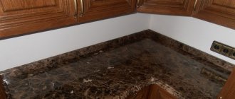
Dark brown color
Dark brown shades, cappuccino color, chocolate, look good with the same floor or dining table. Suitable for light, white kitchens as a contrast.
Dark grey
A dark gray work surface looks neutral, fits any style, and combines with white, pastel, and gray shades of the kitchen.
Pros and cons of dark countertops
The main advantage of such models is their spectacular design . Black, brown, purple, blue options look interesting. They are combined with lighter kitchen facades. Dark shades are practical: dust and dirt are less visible on them.
Dark countertops are suitable for spacious kitchens ; in small ones they overload the space and visually reduce it. Such surfaces are not suitable for Provence, shabby chic, and scandi styles.
Interesting things on the site:
Advantages and disadvantages of concrete countertops
Artificial stone kitchen countertop
About Epoxy and Wood Countertops
Choosing a color countertop
To create a bright accent in the kitchen, just choose a colored work surface, which will be complemented by wallpaper or textiles.
Red
A red tabletop is often found in combination with white and dark furniture. Red gloss can be repeated in the color of the dining table or floor finish.
Burgundy
It is better not to combine burgundy with red; it is suitable for the modern design of a light kitchen.
Orange
An orange countertop is suitable in combination with white furniture for a small kitchen, and in combination with dark brown furniture for a spacious room.
Yellow
Yellow adds light to the room, but it is best to choose it only for the tabletop and one other decorative item, such as potholders or a teapot, because yellow can cause eye fatigue.
Pink
Suitable for lilac, pink, white, gray headset. A kitchen with a pink countertop looks impressive and at the same time non-aggressive.
Blue
Blue is best combined with gray and white kitchens in Mediterranean and modern styles.
Green
It has a beneficial effect on vision and is suitable for any size room. A light green shade of the countertop is suitable for a large space and a kitchen set in white, light gray, dark brown shades. The olive color looks good in a Provence style kitchen and creates a noble atmosphere.
In the photo, the bright lime-green work surface acts as an accent and harmoniously combines with the white facade and mosaic apron.
Turquoise
A turquoise tabletop goes equally well with dark brown, white and black furniture, as well as with colored yellow and pink facades.
Violet
A purple work surface can be combined with the same walls, but it is better to choose a light beige color for the facades. A lilac countertop is suitable for a Provence style kitchen or a modern small kitchen.
The photo shows a combination of a purple table, countertop and mosaic tile elements in a colored kitchen, the set of which consists of three colors.
How to choose the color of the countertop to match the kitchen set, apron and other interior elements
Under the kitchen set
You can choose a countertop for your kitchen set in different ways:
- Tone to match the facades of the set;
- To match the lower tier or individual cabinets.
At first glance, it seems that the easiest way is to choose a countertop that matches the color of the facades. But, as practice shows, it is difficult to achieve a 100% match due to the difference in material textures and the limited choice of countertop shades. The exception is white and black kitchens - choosing a countertop of the same tone for them will not be difficult.
White kitchen with white countertop
However, shades that are as close to each other as possible can also look good. In this case, a sample of the tabletop you like should be “tried on” to the facades. There is one more nuance - since the countertop and facades of the same color make up a monochrome ensemble, it is worth introducing other contrasting or bright accents into the interior, for example, this could be an apron or separate cabinets.
If your kitchen fronts are decorated in different colors, then the coolest decision you can make is to choose a countertop that matches the accent cabinets or lower tier cabinets. This kitchen looks harmonious and not banal.
Under the apron
Choosing the color of the countertop for the apron is easiest for two reasons:
- They can be made from the same material, which means that there will be no problems combining shades and textures.
- The apron and countertop can become a single and central element of the kitchen. Visually, this combination looks orderly, since it does not “split” the interior. In addition, it greatly simplifies the choice of apron color and kitchen design planning in general.
By the way, it is not necessary that the tabletop and apron be decorated in the same color. So, for example, if the apron is lined with colorful tiles, then the tabletop can be decorated with the color that is in the wall composition.
For floor finishing
Another good trick is to choose a countertop color that matches the floor or a shade as close as possible to it. For example, these could be the following combinations:
- Laminate flooring + Laminated chipboard countertop;
- Parquet board on the floor + Tabletop made of the same type of wood (or just in a similar shade);
- Tile/ceramic granite floor + Natural/artificial stone countertop to match the floor finish.
Under the windowsill
There is something in common between a kitchen countertop and a window sill: they are often at approximately the same level, located close to each other, and are used for storing things. They can also be made in the same shade and from the same material.
Color and pattern of stone work surface
The stone work surface is not only expensive and wear-resistant, but also has a unique pattern that is not repeated twice.
Granite
The color of granite depends on the mineral components; it can be pinkish, scarlet, gray, black, or coffee-colored.
Marble
The color palette of marble includes a basic white color with grayish, red, chestnut, and green admixtures.
Onyx
Onyx is available in yellow, beige and coffee shades with characteristic large white or black flat stains.
Almandine
Almandine countertops in the kitchen are particularly durable and resistant to high temperatures.
Opal
The working surface made of opal can be of a dull or bright shade with a wood or stone texture; it can be gold, scarlet, black, milky, pink, blue.
Quartz
Quartz, or pressed granite, can be of any color due to the addition of paints; it can be completely white, which is extremely rare in nature.
Malachite
Available from light turquoise to emerald and black. Notable for its smooth color transition and concentric circle shapes.
Travertine
Kitchen countertops made of travertine can be gray, white, brown, or gold.
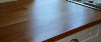
Wood table top
Oak
Oak is available in several tones.
- White oak comes in a white, ash color due to bleaching of the fibers. May have pink or gray streaks.
- Bleached oak is combined with orange, purple, turquoise, gray, black and gold.
The photo shows an eco-style kitchen, where a bleached oak countertop is combined with a light floor and white trim.
- Bog oak
Bog oak can be pure black or smoky, with a hint of gray. Suitable for white-gray, beige-brown, emerald, scarlet kitchens.
- Golden or natural oak has a golden, coffee, orange color. The tones blend into one another and are combined with dark chestnut, gold, yellow, and burgundy.
- Dark oak comes in chestnut and dark chocolate colors and can be combined with white, ultramarine, gold, and burgundy.
- Wenge colors range from gold to chestnut, burgundy, dark purple with black textured lines. Combines with bleached oak, maple, ash, blue, orange, cream, white, emerald kitchen.
Beech
It has a warm golden hue and is classified as a light wood, which can be combined with lilac, brown, gray, salmon furniture in the kitchen.
Nut
Walnut countertops come in a medium to rich brown color with a gray or red undertone. It is distinguished by dark veins and lighter strokes. Combines with dark green, beige, sand purple, burgundy, milky, black.
The color of cherry in the kitchen can be considered golden, red or chocolate, combined with heavenly, milky, pale green, beige, coffee, pink.
Alder
It has a golden hue, honey orange color without dark details. Similar to golden oak, combined with gray, beige, pale red, burgundy, olive, lilac, white, black.
Ash
Ash comes in light (coffee color with distinct lines) and dark (dark chocolate color with the same texture). Light ash is combined with concrete, milky, white, mint, brown colors in the kitchen, and dark ash is combined with burgundy, white, milky, green.
In the photo, the work surface and the surface of the island part are made of light ash, which is combined with a dark gray set and emphasized with light inserts.
Terrado is similar to the color of asphalt, metallic and concrete. The gray base color is complemented by abrasion-type shading. Combines with white, gray, dark brown, black furniture.
The bamboo work surface has a pattern created by pressing the stems. It can be dark, light brown, brown with green streaks.
Choosing colors for countertops made of different materials
Plastic
A tabletop with plastic can be no less practical; in addition, PVC coating has a wide variety of textures, decor, imitation wood and stone.
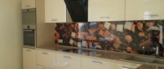
The photo shows a kitchen with a plastic countertop, which matches the apron in color and material, which is why there is no boundary between the work surface and the apron.
Laminated chipboard or MDF
Kitchen countertops made of laminated chipboard or MDF are made using the postforming technique, when a layer of plastic and a moisture-resistant coating is applied to the panel under high pressure, and a drip tray is attached to the ends to prevent the accumulation of moisture.
A laminated work surface in the kitchen can be dark or light, of any shade and design, repeating stone, chips, the texture of oak or other wood. Also, a plastic countertop can be made to look like marble or granite, be glossy or matte, and not fade in the sun.
Acrylic
The acrylic work surface in the kitchen imitates the color of stone; it comes in any color with tints and shade transitions, in a glossy or matte finish.
In the photo, the table top and work apron are made of acrylic, which are made to look like stone and are combined with a white set.
What are they made of?
Thanks to well-chosen materials, the countertop and apron will not only become the main decoration of the kitchen, but will also make life easier for their owners. After all, dirt, grease stains and other contaminants most often form in this work area. Since the work surface and apron play a protective and decorative role, it should be made of materials that are easy to clean. Typically, countertops and backsplashes are made from:
- ceramics;
- artificial stone;
- glass;
- metal
Interesting article: Elegant kitchen backsplashes made of white tiles, as well as 5 more popular colors!
Ceramics
Ceramic countertops and backsplashes are considered the most popular. The shapes and sizes of tiles can vary greatly from each other. Their size varies from 10 by 10 cm to 25 by 40 cm. Hexagonal and octagonal slabs are also relevant.
The tile work surface has:
- high mechanical strength;
- aesthetic appearance;
- ease of care;
- practicality;
- resistance to moisture and sudden temperature changes;
- variety of colors and patterns.
The tile can have a smooth, embossed, or rough surface.
Its main advantages include the fact that greasy stains are quickly removed from the surface using any folk remedies or using household chemicals.
Glass
Finishing a working area made of tempered glass is used in modern interiors - Loft, Minimalism, Hi-Tech. Their surface can be matte, transparent, or patterned.
Important! Tempered glass looks incredibly stylish with LED lighting.
The advantages of glass surfaces include:
- convenience and ease of care. This material does not absorb odors, is easy to wash and clean with various means;
- ease of installation. You can cope with the installation of glass surfaces on your own, without resorting to the help of specialists;
- affordable price.
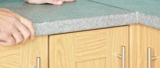
Stone
Stone countertops and aprons are most often made of granite, marble or acrylic. Durable characteristics and beautiful texture make these materials popular among designers.
Working surfaces made of stone are a solid slab or separate parts about 2 cm thick. This material is different:
- resistance to high temperatures;
- chemical resistance;
- long service life;
- beautiful appearance.
Metal
Metal working areas in the kitchen can be made from:
- galvanized steel;
- of stainless steel;
- chrome plated.
Their surface can be polished, matte, with imprints, engravings and any other decor.
The advantages of metal surfaces include:
- resistance to mechanical damage. Metal is quite difficult to scratch or damage;
- resistance to temperature changes;
- high performance.
Kitchen and countertop color
You can choose a color based on the rules of combination in tone or contrast. You can also choose the color of the work surface to match the color of the headset.
| Facade | Tabletop |
| The gray façade serves as a backdrop for eye-catching elements and details and is combined with neutral and bright tones. | White, light grey, dark grey, black, red, orange, dark green, pink, lilac. |
| The white façade is versatile and can be combined with many colors, an ideal choice for kitchens of any size. | White, black, gray, red, burgundy, orange, brown in dark shades, bright shades of pink, green, yellow, purple, blue, turquoise, pastel colors. |
| Blue itself is attractive and needs to be balanced with neutral shades of textiles, aprons, walls and work surfaces. | White, light grey, beige, orange, yellow, black, light brown. |
| Beige goes well with any warm and cold shades. | Beige is a tone lighter or darker, white, brown, chocolate, vanilla. |
| Green kitchen furniture is best combined with neutral or warm colors. | Yellow, red, brown, white, black, gray. |
| Black attracts attention and needs to be diluted with light tones. | Pink, lilac, white, gray, metallic, black, brown, all shades of wood. |
The photo shows a blue set, which in the kitchen interior is complemented by light gray walls, a brick wall, a black dining group and a gray countertop. Good lighting is important for this combination.
General principles for choosing colors
Before you start choosing a color, pay special attention to the material from which the countertop is made. There is no need to save money: the cheapest price segment is represented by countertops made of chipboards of different densities with a plastic coating.
Such furniture will cause more problems than benefits - it is not resistant to fire or moisture, and is also quite harmful from an environmental point of view. On top of that, the service life of such countertops often does not exceed a couple of years.
There is also no point in overpaying: natural stone in the manufacture of countertops is more for luxury than for practicality. Therefore, the best choice is furniture from the middle segment (tiled or stainless steel).
Tile cladding, moreover, offers a large selection of colors that can satisfy the most demanding consumer.
To ensure that the process of selecting the color of the countertop does not cause unnecessary difficulties, adhere to the following rules:
- It is better to decide in advance on the color scheme of the future kitchen; this will greatly facilitate the process of combining furniture and countertops.
- The texture is of great importance: it should match or go well with the facade of the kitchen unit and the apron.
- Don’t be afraid of bold decisions, but remember: the kitchen is one of the most “visited” rooms in the apartment, so excessive brightness can get boring very soon.
We’ve decided on the basis for color selection, let’s move on to specific tones and the possibilities of their use in the kitchen.
Color of the table, floor, apron, sink and countertop
The color of the tabletop can be harmoniously combined in contrast or resonate with the color of the dining table, floor or apron.
Dinner table
The tabletop can be matched to the color of the dining group if it is in the kitchen. In order to diversify the color palette, you can choose a companion color, for example, a gray table and a white countertop. Also for a classic style, a combination of one color is suitable, for example, sand and yellow in different tones.
In the photo, the worktop and island part of the kitchen are different in color, but look organic with the set and the shade of the floor.
Floor
A flat work surface can match the color of the kitchen floor. For example, dark wood laminate or laminate tiles will go well with the same countertop. A contrasting glossy black floor will pair with a matte light surface, and dark beige tiles will look good with a honey-gold countertop.
In the photo, the color of the floor matches the set, and the countertop matches the color of the kitchen walls.
Apron
You should not choose the same tone for the apron and work surface, as this space will not provide a visually clear line of demarcation. It is better to choose one color in different shades, for example, lilac and violet, or light gray and the color of concrete. For contrast, a glass apron with a photo print or a mosaic apron are suitable. If the countertop in the kitchen is glossy, then it is better to choose a matte apron.
In the photo, not only the apron, but also the walls are made in the same color as the work surface in a gray and white high-tech style interior.
Sink
The kitchen sink can be ceramic, metal or stone, so it can match the color of the countertop or stand out in contrast. The work surface looks seamless and merges with the sink. The overall style is emphasized by a stainless steel sink with a gray countertop.
In the photo, the sink and countertop are matched in the same color, which makes the work surface uniform and without color differences.
When choosing a kitchen countertop, you need to take into account the size of the room, the color of the furniture and the finish. A bright work surface itself serves as an accent, and a neutral one serves as a background for kitchen utensils.
Golden rules
An experienced designer knows how to choose a kitchen countertop by color. Specialists always follow new trends and, based on them, create their own interpretation of interior design. There are a great variety of different design options for headsets. To choose the most suitable one, it is necessary to decide at the stage of ordering or purchasing a kitchen how the work surface will be organized. Will it stand out against the background of the furniture, go beyond the set and form a bar counter? The tabletop may be partially located in the living room area, then its color should match the design of the main room.
There are three options for win-win color combinations. The first is that the combination of colors of the kitchen set and the countertop matches, or is built on the principle of analogy with the color of the lower cabinets or upper wall cabinets. The second is that the combination is built in contrast with the furniture. Third, a multi-color tabletop is used. Each option has its own characteristics, so it makes sense to talk about the advantages and disadvantages of each.
Primary color gray Source kuhnyagid.ru
When the color matches
If you choose a tabletop whose color matches the color of the furniture facades, the work surface will dissolve in space and will not attract attention to itself. This feature of the combination is most suitable for kitchens decorated in a minimalist style. In this case, the decor is faced with the task of hiding the working elements as much as possible and emphasizing the decoration of the walls, focusing on household appliances or the elegant shape of the furniture set.
The photo shows how the white countertop in the kitchen, white furniture, and white accessories form the highest degree of sterility of the interior. It is ideal only for lovers of an extreme form of minimalism. This combination of colors is very popular with perfectionists, those who are obsessed with cleanliness. In such a kitchen there is always impeccable order.
White kitchen with white countertop Source mebelvs.ru
If you add paintings with a bright plot, painted in rich colors, to the white interior, the atmosphere will liven up slightly. Strictness will disappear, freshness will appear, while the impeccable appearance of the furniture content will remain.
A bright kitchen apron will also help eliminate excessive severity. If you pick up dishes, flower pots, and textiles for the window, you will get a very lively space in which a cheerful person will feel good.
Look how impressive the gray countertop looks in the photo in a white kitchen. This is not even a contrast, but a dilution of the dominant with a similar cold shade. This combination emphasizes the monolithic nature of the headset. Therefore, the monumentality of the style does not suffer.
Gray dilutes white Source i.pinimg.com
See also: Catalog of house projects with a kitchen
Everything changes when a fusion of the colors of the work surface and one of the tier of furniture (upper or lower) is used. If the tabletop, apron and upper cabinets are made in light shades, the set does not put pressure and does not visually clutter up the space. The lower dark cabinets come to the fore; they become the dominant feature around which the rest of the decor plays out.
If the color of the lower cabinets, countertop and apron match, a similar combination is also ideal for the kitchen. It doesn’t overload her and perfectly emphasizes the chosen style. Typically, in this situation, the dark color is supported by the identical design of the dining group. Then harmony is maintained, the interior becomes very cozy.
The color of the lower cabinets, countertops and splashback match Source idealkuhnya.ru
When contrast comes to the fore
Such solutions are usually liked by fans of the avant-garde. Here you can experiment in two directions: make the set in a light color, and make the tabletop in a dark color, or vice versa. The most famous contrasting black and white combination. It is considered a classic, which is why it is especially popular. This pairing is best revealed in a kitchen designed in the style of fashionable glamor, French chic or minimalism.
The black color of the tabletop is most suitable for a white set. In this case, it looks gentle, elegant, fresh. Dark inserts give it a strict character. When accessories support the color of the work surface, the design is harmonized. To do this, you can hang black lamps in the room, and decorate the walls with black and white photographs or reproductions.
Choosing black appliances helps achieve an even distribution of dark color in a light kitchen. If you install a black oven under the work surface, a black microwave on the top tier, and a black sink with the same mixer flush with the countertop, the interior will become more graphic.
Black appliances make the interior graphic Source promobonuscodes.com
See also: Catalog of companies that specialize in the construction of extensions to existing houses
Change your approach, buy light-colored household appliances, and you will be able to create a single plane of furniture. Then the work surface will cut the kitchen in half, and it will immediately catch your eye. If it is glossy and the facades of the furniture are matte, the effect will be enhanced. A black kitchen apron will create strong depth; a white apron, on the contrary, will emphasize the beauty of a dark plane. Therefore, knowing how to choose the right color for the kitchen countertop, you can create completely different interiors.
A black work surface will require special care. Any crumb on it will be noticeable, any stain, any scratch. Therefore, for the manufacture of countertops, you need to choose materials that are resistant to mechanical damage. It can be natural stone or conglomerate.
If you want to slightly diversify the kitchen and reduce the severity of the black and white design, you can use accessories in yellow, red, pink. They will set a completely different tone. By changing them, you can change your mood.
Bright accessories soften the black and white design Source modernplace.ru
There are different contrasts. Headsets in which the tabletop differs in color from the facades only in shade look beautiful. The furniture itself can be blue, and the work surface dark blue and vice versa. Light and dark shades of brown look good in this combination.
Interiors are harmonious if the color of the working surface matches the tone of the walls. And here there can be a great many variations in execution. The photo shows how this technique works.
The color of the countertop matches the color of the walls