The meaning of color in the interior
The right combination of colors is a whole science. Especially if the interior is designed to combine several shades at once. When choosing a palette, it is worth remembering that each color has a different effect on a person’s mood and well-being.
Gray color makes the bedroom interior strict and laconic.
Black is rarely used as the main color. More often used in an ensemble with other colors. If you decide to focus on black, choose glossy surfaces of furniture and textiles. Matte materials will make the room look like a crypt.
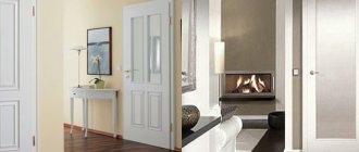
White color gives the bedroom a feeling of lightness and cleanliness. It is better to use warmer shades of white as the main color or complement the snow-white interior with colored details.
Orange tones and gives vigor. For the bedroom, it is better to combine it with calmer colors or use muted shades of orange.
Blue is great for the bedroom. This color is calming, but you should choose warmer shades for rooms with insufficient light.
Turquoise tone gives a feeling of cheerfulness and lightness.
Beige and pastel yellow colors make any bedroom sunny and cozy, which helps you calm down and fall asleep.
Grassy green shades soothe and rest the eyes.
Features of choosing colors for a living room combined with a kitchen
The rules for choosing a palette for a living room combined with a kitchen are actually not much different from choosing the color scheme for any room.
However, there are nuances that are worth paying attention to.
- A popular solution is white for the kitchen, then the facades of the kitchen unit literally merge with the wall decoration, visually freeing up space . But this range remains the brand itself, so you should choose it only if you are ready to regularly care for such surfaces. True, you should not skimp on white furniture - modern manufacturers offer functional coating options that do not absorb dirt and are therefore easy to clean.
- The kitchen can be made in the same color as the living room . Then it’s worth considering constructive zoning methods that will prevent the work block from merging with the recreation area.
- When combining a dining room with a living room, and not just a work area, it is worth decorating the entire room in the same style, but you can choose a different color . In the kitchen, for example, it is bright - pink, blue, blue, green, and in the guest area - neutral, more balanced. The dining room will become a transition between areas with different purposes. It can be arranged in a transitional shade or in a combination of the main ones.
- A comfortable color scheme with the same background will help make the living room together with the kitchen unit compositionally complete . But it is important to choose harmonious details: the decor, together with zoning tools, will make the interior self-sufficient. A trio or even a quartet of shades will look organic here. Of course, tones in the same palette with one catchy look look more stylish, but you can also choose notes of different character.
Since in the kitchen area, instead of wall decoration, furniture is usually visible, it is its facades that will be combined with the decoration in the hall. The doors can be made neutral or similar to the background, but the apron will stand out. Therefore, its color and pattern should be chosen in harmony with the decor in the recreation area. This could be colored furniture for the living room, like sofa cushions, lamps, or a similar panel.
The unity of style and color should not be neglected even in budget interiors. Here, at a minimum, the countertops, curtains, and designs in terms of decoration should be the same - in the apron of the working area and the accent wall of the guest area. Only then will the most modest furnishings, as well as luxurious decoration, in any color, be comfortable and harmonious.
Why should you paint your walls?
If you're choosing between wallpaper and wall paint, there are at least a few reasons to choose paint:
- Almost any surface can be painted. Paintable wallpaper, drywall, plaster, wood, brickwork and even bare concrete walls.
- If the walls are prepared for painting in the bedroom, a radical change in the appearance of the room will take a couple of days.
- Using paint, you can give absolutely any shade to the walls and apply a design. To do this, you can use stencils or give free rein to your imagination.
Wall color and cardinal directions
When choosing the color of the walls for the living room, you should pay attention to the lighting of the room. The same shade will look completely different in natural and artificial light.
Turning the room towards any of the cardinal directions also affects the overall “picture”. For the north side, soft and warm shades are suitable; they compensate for the lack of sunlight. It can be yellow, green, beige or chocolate.
If the windows face south, then the living room can have cool shades, since there is enough daylight in the room. Sky blue, turquoise and white.
For the eastern side it is better to use warm light colors, for example, soft pink, honey, peach.
For a living room with windows facing west, preference should be given to cool colors. The walls can be painted gray, blue, mint.
What will you need to paint the walls?
To decoratively paint bedroom walls, in addition to the paint cans itself, you will need:
Rollers. They are much more convenient and faster to paint large walls than with brushes. You will need wide rollers with spare attachments. To paint walls near the ceiling, you need rollers with a long handle, and for the lower part - with a short handle. The denser and shorter the pile on the roller, the smoother the paint will lie on the surface.
Paint brushes. You can't do without brushes at all. With their help, they paint corners and those narrow places where the roller cannot reach. A brush with cone-shaped bristles is suitable for such purposes.
Masking tape. It is used to delimit the area to be painted. You can use it to cover the ceiling and floor plinths and divide the wall into even stripes if you plan to combine several colors.
Paint tray. It should be wider than the roller you are using and have a grooved bottom.
Additional container or jar. Useful for mixing or tinting paint.
Preparing walls for painting
Before plastering the walls for painting or gluing the appropriate wallpaper on them, you need to do the following:
- Completely remove any coverings from the walls. This applies to old plaster and wallpaper. The walls should remain “bare”.
- Before painting the walls, the bedroom must be thoroughly cleaned, dried and ventilated. Dust on the walls can form clumps and be visible under the paint layer.
- All unevenness must be smoothed out using plaster.
- Apply 2-3 coats of latex primer to the walls. It will increase adhesion and the paint will adhere better to the walls.
- After each coat of plaster or primer is applied, leave the room to dry for at least a day.
- Before starting work, apply masking tape to the ceiling and floor plinths.
- If you are mixing or tinting paint, dilute enough material to cover the entire desired area. It will be very difficult to get exactly the same color again.
- Apply the paint with a roller from top to bottom, and then horizontally, so that the paint lays more tightly on the wall.
How to choose paint
There are many types of paint available on the market now. Water-based paint is best suited for painting walls in a bedroom interior. It can be acrylic or acrylic-latex based.
This paint has several undeniable advantages:
- High drying speed;
- Safety for humans and the environment;
- Neutral odor;
- Air permeability;
- Resistant to moisture and mechanical stress.
When choosing a dye, it is important to consider that after drying, its tone will become a little lighter.
Features when painting various wall materials
A large assortment of paint and varnish products allows you to paint walls from different materials in the hall. However, each of them has certain application features.
Concrete
Painting a concrete surface is the simplest and most inexpensive option for decorating a wall made of this material. Before painting, the concrete is thoroughly washed to remove dust and dirt. This is necessary because contamination reduces the life of the paintwork. A soap solution using a rough brush or rag cleans the surface well.
It is important to choose the right finishing method and color scheme.
If there is rust, it should also be removed using a solution of copper sulfate. The final stage is to seal the cracks and cracks with putty. It is important that the concrete surface is completely dry after using sealant and priming before painting.
Tree
Decorative finishing of wooden walls involves the use of many types of paint and varnish products, since most of them adhere well to wood. Preference should be given to those paints that allow wood to breathe. Non-toxic acrylic paints based on water and acrylate resins, as well as water-based paints, are most suitable. It is vapor-tight and does not clog the pores of the wood log.
Often, home residents want to make the living room special, so they resort to ways to change its functionality.
Important! Interior painting of a house or apartment should be carried out with environmentally friendly and safe compositions.
Brick
Most often, a brick wall is painted several months after construction. Working with fresh masonry can lead to defects. The peculiarity of the material is that its uneven surface and porous structure do not allow the old coating to be easily removed.
By decorating each zone in a specific color scheme, you can visually divide the space without creating physical obstacles.
Over time, the base shade changes its original color. The best option for brick is silicone-based paints. Despite the high cost, it does not interfere with air circulation and hides minor defects.
Before starting work, the brick is cleaned and washed with water. A few days later (at least 7) after all the moisture has been released, priming and painting of the surface begins.
Wallpaper
Paint and varnish products for wallpaper are divided into three groups: acrylic, water-based and latex. Any type of paint is suitable for paper wallpaper; acrylic is suitable for vinyl wallpaper. The latex composition fits well on non-woven and glass wallpaper.
Painting walls in the interior makes the room not only attractive, but also creative with the help of a wide range of decorative techniques.
Options for painting wallpaper for a room in two colors can be assessed in different photos. Among them: highlighting only one wall with a different color, horizontal and vertical division, inserts, artistic stripes, geometry, alternating gradient tones.
For reference! Any type of wallpaper can be repainted no more than 10 times.
Plaster
For plastered walls, epoxy and polyurethane paints that do not require special preparation of the walls are an excellent solution. They protect the surface well and fix the plaster better. The best option is emulsion paint. Its pigment penetrates well into the pores of the finishing layer, firmly attaching.
Wall design ideas are not limited to plain painting; structural paint and other original decor options will create a beautiful interior.
Drywall
It is painted after puttying the joints and the entire area of the material, sanding and priming. Silicone or acrylic paint is most often used. They are plastic and create a special protective film.
In the interior, 2-3 types of wall decoration are often used to diversify the design.
Types of paint
In addition to the above, paints on other bases are used for painting walls:
Oil paints. Made from drying oil. This paint has a specific smell and takes a long time to dry. After drying it gives a dense glossy finish. The surface does not breathe under a layer of oil paint, so the paint may crack and fall off over time. Nowadays it is more often used for painting metal surfaces.
Enamel paint is made from varnish. Durable paint that dries within 24 hours. Has a specific smell. For better adhesion to the wall, it is necessary that there are roughness on the surface.
Glue. To make it, mix starch and hot water in one container until thickened, glue and water in a second container, and paint in a third. Then all three emulsions are mixed and applied to the walls. The coating is environmentally friendly, but requires some skill to use.
Alkyd
Characteristics of alkyd paint.
For the hall it is allowed to use paints based on alkyd resins. Compositions of this group can be used for both internal and external work. Alkyd paints have a distinct chemical smell.
The following compounds fall into this category:
- Oily. It is made on the basis of drying oil, so it dries for a long time. Over time, a yellowish tint appears. Oil compositions are used only for external work due to toxic fumes.
- With alkyd resin. Used for painting plaster, metal, wood. After drying, the finish has no odor and is safe for health. The color does not change throughout the entire service life. The paint does not allow moisture to pass through.
- Enamel. The finish has a glossy texture. The enamel is suitable for painting indoors and outside the building. The paint protects the surface from corrosion and is not destroyed under the influence of adverse factors.
Coloring
There are many options for painting walls. We suggest using the following sequence, which is followed by professional painters:
- Use a brush to paint the interior and exterior corners of the bedroom. Start at the window side and work towards the exit.
- Using a brush, paint the areas that the roller cannot reach (joints between walls and baseboards, areas behind radiators and along doorways).
- After putting paint on the roller, be sure to remove excess paint by rolling it over a special ledge in the tray.
- Paint large areas of walls with a roller.
A color scheme
To use shades correctly, you need to have basic knowledge. The combination is carried out in three directions:
- monochrome;
- related;
- contrasting;
- related and contrasting.
In the first case, one color is used, and different shades are added to it. The second option uses halftones located next to each other and located in ¼ of the color wheel. With a contrasting combination, opposite edges of the color wheel are chosen. In the latter case, the main color that unites them is added to related shades. For example, light green and beige contain a common yellow, these three shades will combine favorably.
Carefully. The combination of yellow and black indicates danger.
More details about the choice are shown in the video:
Useful tips
Dilute the color in white paint to the entire required volume. This way you will avoid multi-colored walls.
Plain walls look boring and faceless. Paint the bedroom walls in two colors. One of the walls can be made an accent, and the rest can be painted in lighter and calmer shades.
Choose the color of the bedroom walls to paint depending on the lighting in the bedroom. For a southern bedroom, you can choose cool shades, but if the windows face north, paint the walls in warm colors.
Apply the paint in three strokes. The first is vertical, the second is horizontal, the third is cruciform.
Photos of the best interiors
Bedrooms in a modern style look impressive in black and white. The combination of two opposite colors is complemented by stencil designs. Large images or repeating motifs create a calming atmosphere in the room. The harmonious combination of dark and light details in the interior is a bit reminiscent of the luxury of decadence.
Black walls in the bedroom Source www.decormag.ru
The larger the window openings in the bedroom, the brighter the colors allowed. Panoramic blocks will allow you to use rich tint options. With good lighting, the design in dark tones (black, brown) will not be lost. The emphasis is on the details:
- lamps;
- textile;
- decor on the walls.
Bedroom with a large bed Source lurkingfish.com
Modular painting on a plain wall Source sonnhatrongoi.net
The combination of terracotta in the bedroom interior Source answers-stairs.ru
A feminine pink bedroom will be radically transformed by mixing the main color with green, turquoise or brown. A mandatory element of the interior is white furniture. In the room, metal lighting fixtures and drapery on the windows are relevant.
Soft pink bed on a white interior background Source casaydiseno.com
Combination of shades in the bedroom interior Source kamernet.nl
Coloring ideas
In the photo of painting the walls in the bedroom there is often a combination of several colors. When choosing color options for the bedroom, you need to take into account the wishes of the owners, the architectural features of the room, and the existing furniture. Most often you can find these types of wall painting:
Horizontal division of walls. The parts can be divided equally or the bottom part can be 2/3 narrower than the top. The border can be left as is or decorated with a border.
Colored inserts. To do this, paint the wall in a neutral color. Then markings are made using molding, and the inside is painted with a more saturated color.
Striped walls. The stripes can have any direction. The main thing is that they are not too narrow. Stripes of the same color, but of varying degrees of saturation, look noble.
Accent. If you want to add some freshness to your bedroom, choose a central wall and paint it a bright color. This technique is often used by designers.
How important is color in a room?
Painting the surface of the walls in the bedroom should be thought out competently: this directly determines what mood you will wake up in and live your day. To complement the picture, it is important to harmoniously combine curtains, furniture and wall shades. If the rules are not followed, dissonance arises, which affects health and well-being.
Paintings, framed photographs and other decorative elements look great on painted walls.
A huge palette of colors makes it possible to choose an option to your liking and easily change it if desired.
There is an opinion that many colors in one room create psychological discomfort; in such conditions it is difficult to concentrate. Bedrooms in red tones: orange, terracotta, crimson create an unpleasant feeling of walls that are squeezing. But this depends on a person’s perception of colors - if you like the shade, you can safely use it in any variations.
Two-tone bedroom
If you are looking for a bedroom wall painting idea, consider a two-tone color scheme. There are three principles for combining two colors in the interior:
- Degrade - a combination of two shades of the same color;
- Related colors. For example, combinations of black and white, orange and yellow, blue and light blue.
- Contrasting combinations. You need to choose both colors of the same temperature.
The best colors to combine with other colors are grey, white, beige and yellow.
Choosing a color for the bedroom
To make it comfortable to relax in the room, you must like the shades. Combinations allow you to find a middle ground between your favorite color and creating a relaxing atmosphere. The selected palette is combined with all the details in the room, complementing or accentuating the decor.
Main principles
The walls of the bedroom are a background that must be harmoniously combined with the design of the ceiling and floor, decorations and furniture. One or two shades in the interior look boring and monotonous, so designers gradually add accents in upholstery and textiles. No irritating colors are used in the relaxation room.
Wall color for a small room Source www.remontbp.com
If you need to emphasize key details in a space, then a combination of light and dark tones is used in the bedroom. The walls will become the backdrop for accentuating the furniture ensemble in colorful shades. Beige interior items look better surrounded by rich surfaces. A white room will become cozier with warm wood flooring, doors and windows.
Pale blue wall shade Source www.pinterest.com
The fashionable gray range belongs to the cold type of shades. To make a space look cozy, you need “warming” accents. Natural furniture with natural patterns will become the main detail of the interior. Against the background of light ash walls, a contrasting graphite bed looks majestic.
Bedroom with a pop of color Source www.retroden.com
The more complex the print on the wallpaper, the softer the design. Bright patterns in the relaxation room are allowed only at the head of the bed; the rest of the room is kept in neutral colors. The ornament does not fall out of the main palette; there is a harmonious repetition of motifs on textiles and furniture facades. A monochromatic accent wall is highlighted with an original texture.
Cozy room Source ru.dreamstime.com
The choice of color design for the bedroom depends on the location of the room relative to the cardinal directions. Northern rooms are poorly lit, so light warm shades compensate for the lack of ultraviolet radiation. The sunny range of yellow, golden and peach will give you a feeling of comfort. The heat of the South will be hidden by cool blue and pistachio, and light beige and silver will add air.
Recommendations from psychologists
A harmoniously designed space has an impact on mood, health and psychological comfort. The wrong color for the bedroom will disrupt sleep and reduce productivity. If you are constantly in an irritating atmosphere in a room, your health worsens and depression develops.
Psychologists recommend using pastel shades in recreation rooms. The calming range consists of a basic tone, which is mixed with white for softness. Colors have a calming effect on the human nervous system and help you relax faster. In the bedroom you can use your favorite color, muted to neutral. The less emotion there is in covering the walls, the more favorable the atmosphere for the inhabitants.
If there is not enough stability in life, then it is better to decorate the room in an expensive classic style. A respectable direction in the morning creates the right mood and helps you achieve success. Combinations are used indoors:
- beige with brown;
- milk with coffee;
- ivory shade with gray tones.
Blue is associated with calm and security, but in a bedroom color it is not recommended in a saturated form. Blue walls diluted with white will relax the psyche. To give the room a feeling of coziness, it should be combined with warm beige. Natural green in any range (except acidic) fits perfectly into a relaxation space and helps to calm down.
In a marine style Source archiprofi.ru Emerald green in design Source www.facebook.com
Pure white in the room looks cold and hospital. To remove boring sterility from a room, use bright accents. Red details look beautiful on a light background, but not more than 1/3 of the total. The base color goes harmoniously with gray cream.
Classic trio: red, black and white Source happinessiseva.com
Psychologists consider purple to be an unfavorable option for decorating a bedroom. The shade spoils the mood, causes depressive thoughts, and is therefore undesirable as a base background. If a person likes the range, then it is better to use pastel lavender and lilac on the walls.
Bedroom with two beds Source insedia.me In shades of lilac Source theluckystone.co
In the bedroom interior you should avoid dark or bright saturated colors. An excess of dark shades contributes to the appearance of disturbing thoughts. Aggressive red excites the psyche, sends signals to the brain about danger, so you won’t be able to relax in the room. In the relaxation room, favorite tones are used sparingly in the form of single accents and inclusions.
Beautiful bedroom interior Source amatterdarkly.co
How to choose a color
There are several win-win options:
- Any color in pastel shades;
- Classic options (beige, gray, brown);
- Delicate shades of a cold palette (lavender, turquoise, pistachio);
- Golden tones (mustard, peach, beige);
- White color in combination with any other.
You should avoid too dark colors, purple tones and overly bright colors when decorating your bedroom. These colors will not allow your eyes and nervous system to fully rest.
Popular colors for the living room
Fashionable design for the hall involves combining coquetry with home comfort. Light pearl and quartz tones add playfulness to the interior. Light finishing visually expands the space.
If the room is small and the ceilings are low, it is not recommended to choose bright, rich finishing options. This color scheme is appropriate in spacious rooms.
The interior color scheme, popular this season, is made up of a play of contrasts in the coffee-with-milk palette. Brown paints for walls are chosen to be rich, but not flashy. Designers create a bright contrast by combining orange and milky-blue tones.
Table of color compatibility in the interior.
Beige
Designers recognize beige as a win-win option. The shade harmonizes with many other colors and is used in different interior styles. Warm pastel finishes give the living room a homely feel.
The mood of the interior can be changed with the help of accessories. Effectively beige walls are combined with decor in the form of brickwork or textured plaster.
Grey
A universal fashionable color, often used to create interiors in loft and modern style. The decoration is decorated with a complex texture and geometric pattern.
Blue
Walls painted in blue tones create a relaxing environment. Wall decoration using blue paint is created in a marine, Mediterranean style. Blue shades are suitable for creating an interior in an oriental style.
Living room in blue tones.
White
A classic neutral color that goes well with almost any color. Bright colors look better against its background. White walls visually expand the space, filling the room with lightness. By experimenting with texture and accents, it is possible to create an original, fashionable interior.
Green
Color is often used by designers when creating wall decoration in the living room. Eco-style is not complete without green colors. Depending on the dimensions of the room and the chosen design, different tones are used. The finish looks impressive in both delicate and rich shades.
Yellow
If there is not enough light in the room, yellow wall decoration will help make the interior warmer. The bright color is associated with the sun and summer. Rich colors are used in spacious rooms.
Living room in yellow.
Olive
A variety of green color, which adds nobility to the interior, is liked by many owners of houses and apartments. In combination with natural wood, olive wall decoration helps create a comfortable environment.
The color suits Scandinavian, classic and country style well.
Peach
Warm peach tones are associated with summer or early autumn. They fill the space with calm and comfort.
Turquoise
Turquoise-colored walls fill the room with freshness and help visually expand the space. Pastel colors are used when creating an interior in a small room. A spacious room can be decorated with a combination of deep turquoise with white, gray or beige.
Living room in turquoise color.
Selecting combinations
Having decided whether you want to see a monochrome color or a combination of tones, it is worth considering several factors:
- Bedroom dimensions. For small rooms, it is imperative to use light shades that will make the room visually larger.
- The new wall color should match the existing floor and ceiling.
- The cool or warm tone of the walls should correspond to the level of natural light during the day.
- Dark colors visually bring the walls closer, while light colors move them away. Using this technique, you can visually balance an elongated room.
Features of choice
By choosing the color scheme of the walls, you can visually increase or decrease the size of the living room.
Factors influencing color choice:
- Room area
- Lighting
- Personal preferences
- Functional requirements
For compact living rooms, light colors are suitable, making the area of the room seem larger. A pattern on one of the walls will successfully complement the interior, in harmony with the overall color.
In spacious rooms there are much more opportunities for realizing fantasies. The color palette can be soft or contrasting.
Vertical stripes on the wall will stretch out the space, while horizontal stripes will expand it.
Color and style
Each interior style has its own color combinations. To make the interior look harmonious, it is better to adhere to these traditions:
- For Provence, milky, blue and light pink colors are used;
- Natural style loves shades of green and brown;
- For baroque it is better to choose pastel colors;
- A classic interior requires white;
- High-tech loves black, white, gray and red;
- Minimalism welcomes black and white;
- Country means brown and shades of sand color.
Combination of decoration and furniture
The choice of color for the living room and its furniture is usually based on simple rules of harmony. And in this matter, it is not so important what the chosen shade for the walls will be - it is important to find an aesthetic combination.
Traditional combinations include natural duets and trios. This, of course, is the color of greenery and wood, sky and earth, greenery and buds. Obviously, the blue, pastel olive and pistachio walls of the living room are complemented by brown furniture. An example would be a combination of woody and living greens, mint and fuchsia.
Combinations of beige colors with all natural shades also look harmonious: the color of sand and sea, clouds and clear sky. But the most organic are considered tones that are close in scale - for example, cream, sand and peach, as well as pistachio, azure and emerald.
The achromatic palette always stands out from competition, because it goes well with any – both natural and “poisonous” tones. White, gray or even black color of the living room does not determine the shade of the furniture set - any other shade looks great against such a background.
To find the optimal combinations, you can use a circle in which harmonious tones are selected using shapes inscribed in it - triangles, squares or rectangles - depending on how many shades are needed for the design.
Design ideas
Designers offer ready-made solutions that will look great in almost any bedroom.
One of the walls is painted dark brown. White or off-white furniture is placed on the wall.
Bright stripes, spots or prints on a neutral gray wall. Paintings and posters in bright colors can be used as accents.
A minimalist design in pure white will help to visually enlarge a small bedroom. The accent can be a bright floral picture above the headboard or a bright bedspread on the bed.
To diversify monochrome walls, you can paste not even, but embossed wallpaper before painting.
Painting the walls is the easiest and most modern way to transform your bedroom. If you choose the right combination of colors and quality materials, you can easily update your bedroom on your own.
Pros and cons of painting walls
When answering the question of what color to paint the living room in an apartment, you need to evaluate the positive and negative aspects of painting. Among the advantages are:
- a large selection of coloring compositions makes it possible to obtain decor with the required properties;
- easy application and renewal;
- quick drying;
- a variety of color palettes allows you to realize any design idea;
- using textured means you can hide base defects;
- water resistance;
- Possibility of application on smooth and textured surfaces;
- resistance to mechanical damage;
- simple restoration of the damaged fragment;
- possibility of combining colors and patterns.
It should be designed in such a way that it feels warm and cozy.
Another significant advantage is obtaining the desired tone from paint of any color by mixing it with a color scheme. For example, if painting the walls is too dark or light, then you can achieve the desired result by adding the desired component.
The first thing that catches your eye when entering a room is the walls.
Despite the many advantages inherent in painted walls in the living room, there are also disadvantages:
- not suitable for application to walls with significant defects (cracks, scratches, dents and other irregularities);
- stains and dirt are clearly visible on the painted surface (untimely cleaning can lead to a reaction between the dirty stain and the paint, which changes the color of the stained area of the surface);
- in the presence of temperature and humidity changes, the paint begins to peel off over time, giving the room an unattractive appearance.
The future design of the room, its mood and style depend on the walls.
For reference! The paint is least susceptible to fading; it does not turn yellow and does not lose its brightness over time.