Psychological influence of color
The color brown has been strongly associated with nature in all cultures; It is not for nothing that ancient images and figurines of the Earth goddess were covered with paints in brown shades. In nature, the brown palette is present everywhere; people perceive it as a familiar background and subconsciously associate it with calm, stability and reliability.
Psychologists note that color helps relieve fatigue and stress. Its natural, calming origin gives it the ability to calm the nervous system and reduce the degree of conflict situations. Brown color does not cause irritation, as happens with bright shades; it looks no less stylish than white and black, but it is not so strict.
The interior with a predominance of brown tones on a subconscious level feels solid and comfortable. This color is liked by practical people with established views on life, who know how to set realistic goals and achieve them. Thanks to its combination of properties, chocolate color in the interior is suitable for use in any interior.
Contrasting choice of shades Source roomester.ru
Shades
It is difficult to consider a color boring, the number of shades of which has exceeded a hundred. The palette consists of warm and cold shades, formed by mixing black, red, yellow and blue tones in different proportions. Some shades have natural names: walnut, wenge, terracotta. Others are associated with food and drinks: caramel, chocolate, coffee with milk, cognac.
The brown palette is common for finishing walls and floors, furniture and textiles. The ceiling is the only surface where it should be avoided. It is customary to choose shades of chocolate based on the size and purpose of the room:
- Spacious rooms with good lighting. Any shade of brown will work, including rich, cool shades of dark chocolate or black coffee.
In the large bedroom Source coffeesummit.org
- Small rooms. It is worth paying attention to warm and lighter colors: reddish brown, almond, coffee with milk.
- In the nursery, shades of cocoa, cinnamon or milk chocolate dessert will bring maximum benefit - they will lift your spirits and set you in a calm mood. Majestic dark wood in the office will help you concentrate and increase your productivity.
In a small nursery Source mebel-go.ru
Photo of a chocolate-colored living room interior
Note! Green living room - 75 photos of green living room combination ideas
Let's discuss this article together:
Click to cancel reply.
Advantages and disadvantages
Sometimes strict and conservative, sometimes calm and life-affirming, brown color is always popular. Its use for interior decoration has the following advantages:
- Versatility. Like black or white, it can become the background - the main tone for which the rest of the color palette is selected.
- Combinatoriality. You can choose a shade of brown that will match any shade on the color wheel.
- Positive effect on well-being, calming effect.
Disadvantages appear if the shade is chosen incorrectly, without taking into account the size of the room. If the room is of modest size, an excess of brown in the decoration makes the room dark and dull.
A strict, contrasting solution Source img.aviarydecor.com
See also: Catalog of companies that specialize in the construction of turnkey country houses
Combination with other colors
When working with a specific interior, the primary and then additional colors are selected first. Brown is known for its ability to mute some tones and emphasize others. Therefore, if it is taken as the basis for the design, the choice of the rest of the palette is thought out especially carefully, taking into account the following relationships:
- White. The combination turns out to be bright and is considered one of the most suitable for any interior. There is a minus - if you limit yourself to only these two tones, the result turns out to be rather bland. The white-brown pair urgently needs to be enlivened with other colors, the choice of which depends on the richness and warmth of the brown.
Bright living room Source legkovmeste.ru
- Pastel colors. Beige, cream, ivory and similar tones are light representatives of the brown spectrum, so their combination is justified in all cases. The brown-beige interior is self-sufficient and can exist without additional color accents. The combination creates a cozy atmosphere and is often chosen for living room or bedroom designs. If desired, the duet can be diversified with bright accents.
Beige-brown duo Source www.smalldesignideas.com
- Red. This pair of related colors looks respectable and luxurious, one has only to remember the famous living rooms and offices decorated in the English style. The spectacular red-brown combination looks especially harmonious if you make it more complex, using several shades (no more than 3-4 at a time) of one color or another. The tandem can be complemented by white, burgundy, plum tones.
With a touch of red Source www.decorsnob.com
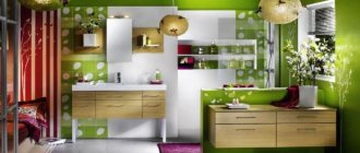
- Green. Two natural shades cannot fail to create a combination that is pleasing to the eye. The green-brown palette is perceived as an absolutely natural, natural combination of colors; chocolate, no matter what green shade it pairs with, will always evoke a feeling of harmony. Combinations of deep, rich shades are common in classic interiors. Modern styles are characterized by more dynamic variations. So, the combination of chocolate and juicy lime will add a touch of freshness to any interior, from the living room and dining room, to the office and kitchen.
In the chocolate-green dining room Source st.hzcdn.com
See also: Catalog of companies that specialize in interior remodeling
Video description
About beautiful combinations of brown in the following video:
Previous combinations have been used in interior design for centuries. Modern style solutions allow for much bolder color combinations, which use the following colors:
- Blue. One of the favorite combinations of the Art Nouveau style; it will be exquisite if you choose the right shades in tone and equal in saturation. So, deep cobalt, azure blue and ultramarine will be an excellent complement to the color of coffee, old bronze, copper or chocolate. The main condition is that blue should be used in moderation, mainly in furniture upholstery, carpets and textiles.
Blue and gold accent Source decor.alimy.us
- Blue (turquoise, tiffany). The interior is bright and cheerful. Turquoise goes well with any shade of brown, including beige, caramel, and sand. The tandem can be complemented with gray-blue colors; This technique is suitable for small rooms, as it helps to make them visually larger.
In the company of pale blue Source dizajn-gostinoj.com
- Yellow. The habit of using yellow in combination with noble brown has taken hold in Art Nouveau interiors. In modern styles, the combination is widely used when decorating children's rooms and kitchens. In living rooms and bedrooms, yellow often serves as an accent, a harmonious complement to brown.
Unsurpassed modernism Source www.lovehappensmag.com
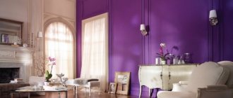
- Violet. Gives a brown interior a flair of mystery and luxury. It is recommended to use it in doses so that the situation does not make you want to immediately leave the room. In modern design, borderline shades of purple are more often used: plum, lavender, soft lilac. They combine well with red-brown tones (burgundy, mocha).
Noble Marsala Source www.nelliadesigns.com
- Pink. You don't often see rich pink combined with chocolate (unless it's a fusion). The favorite combinations of modern designers are pale pink and peach shades in combination with light brown, cocoa or café au lait. The bedroom, children's room or bathroom turns out elegant and positive.
Example of color balance Source www.betterhomestitle.com
Interior
If you liked this interior and want to implement it in your apartment, then listen to the advice. There are some home design patterns or rules:
- If you don’t know whether you will be able to brightly illuminate your home or not, make only one of the walls chocolate. Let others remain light: beige, cream, milky, delicate pink.
- If the walls are chocolate, then let the furniture and accessories be light.
- Make sure that the walls are several shades lighter than the furniture, and accessories in the same contrasting colors are brighter.
- Choose decorations for the room that make it softer and more comfortable.
- More often, by the way, bright, rich tones are accessories. This way the interior will not look so strict.
Related article: Green carpet in the interior: a walk on green grass in your own living room (37 photos)
Room decoration
Brown color predominates in private interiors; this once again confirms its positive influence on our worldview. Therefore, it is important to learn how to use it correctly so that the bedroom or living room looks cozy and not boring. Designers have many ready-made, proven solutions:
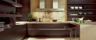
- For the kitchen and dining room. The comfort of brown decor, conducive to a delicious meal, is relevant in these rooms like no other. It is recommended to complement the background tone with beige, red, orange, and green. In small rooms, you should pay attention to the compatibility of furniture and walls. If dark brown furniture is chosen, then the walls are made light; otherwise the interior will turn out gloomy.
Chocolate and creamy range Source 4.bp.blogspot.com
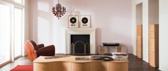
- For the living room. The brown color scheme is valuable because it creates a harmonious, relaxing atmosphere. To support the atmosphere, additional colors for textiles, sofa upholstery and carpet are also chosen warm: beige, orange, red. If a living room in chocolate tones should look strict and noble, add white, light blue, deep blue.
By the fireplace Source roomester.ru
Furniture
If all or most of the walls are light, then, of course, buy dark furniture. If on the contrary, then creamy, creamy, delicate yellow or light green, blue. Now they will make to order not only the standard one, but also original tones and shades.
Many people try to make the walls light, but the furniture is in chic coffee and chocolate tones. Good wooden furniture. She is natural and good. Against a light background of walls and ceilings, such furniture looks great.
The best posts
- Mobile heated floor - what is it and where is it used?
- We insulate the floors with our own hands in an apartment on the 1st floor
- Application of heat distribution plate for heated floors
- Israeli-made Pandoor doors: features and models
- Door seal: the culprit of drafts, noise and odors
- Screen partition at IKEA: the beauty is in impermanence
- Types of mastic for protecting wooden floors
- What tools are needed to install self-leveling floors?
Related article: Making your own curtains from beads with your own hands