Choosing a white kitchen style with a wooden countertop
A white kitchen with a wooden countertop is the best option, suitable for most modern interiors. The only thing to consider is the nuances corresponding to each of them. For example, for snow-white Scandinavian, there is a restriction on decorative elements. The fewer there are, the more consistent the interior of the room will be.
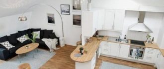
Example of a white kitchen interior Source pinimg.com
White kitchen with wooden countertop Source pix-feed.com
Important! A white kitchen with a wooden countertop is unacceptable with hi-tech and minimalism. The texture of natural wood will be too cozy for them.
Kitchen space
Each person spends a lot of time in the kitchen; here we, at a minimum, have breakfast and dinner, and also spend several hours a week preparing lunches. And every person wants to beautifully decorate their kitchen space, as well as make it quite multifunctional. That is why today we will look at such an option for decorating a kitchen space as a white kitchen with a gray countertop; in the photo you can see what it looks like.
In general, any room in white always looks very advantageous. All this is due to the fact that, firstly, white color visually expands the space and brightens the room, and secondly, it gives it a fresh look and is itself a universal color. White color is quite easy to play with, because it goes well with the entire existing color scheme.
Some people categorically refuse to use gray color in their home interior. When asked why, many answer that this color is very gloomy and dull. In fact, it only seems so. Designers quite often use gray on a white background. The important thing here is just not to overdo it. Few people decorate their walls in a monochromatic gray color. Here we can really agree that cozy is not enough, but some people like it. Notice how interesting the gray kitchen countertop looks in the photo; this is clearly visible.
The whole secret is to add a little grayness to some background, as in our case. That is, if you take white or beige as a basis and add gray shades to this combination, you can get a rather interesting result.
Classic
The commitment to the classic style has remained unchanged for several decades. The interior of a white kitchen with a wooden countertop, designed in light colors with the presence of multi-color compositions, will remain popular for a long time. To create it, you will need to comply with a number of conditions:
- The furniture is in a classic style, made from natural materials. Imitation of wood in the form of MDF is allowed, but only high-quality, recreating the beauty of natural wood.
- Lines and shapes are strict, geometric.
- The colors are natural, pure, without gloss.
- The tabletop is wooden, without restrictions in color and texture, ranging from bleached oak to dark wenge.
White corner kitchen in a classic style Source design-homes.ru
White kitchen in a classic style with a wooden countertop Source www.polka.life
Classic white kitchen with a natural wood countertop Source www.polka.life
Important! When designing a style, you need to understand that classic means high-quality furniture created for several generations of heirs. Therefore, with all its appearance it must show quality and reliability.
Tree
A very good option would be to use gray with wood. The warm tones of wood are slightly muted by a gray background, so if you have too much wood in your interior, adding gray shades will help lighten the mood.
Gray color is very widely used in large homes that are furnished with large, luxurious furniture. In such houses you can often see golden-colored decorative items and an abundance of natural materials such as wood or marble. Gray color in such an interior helps to balance the situation a little and make it simpler. And also, as we found out earlier, it goes well with wood and other natural materials.
It is also worth mentioning here that the gray color goes very well with modern furniture thanks to the gray and chrome surfaces that are often added during furniture production. And this is important, because most people strive to keep up with the times, and prefer to use modern styles in home decoration rather than old classics. Although in classic styles, gray tones can be played out in a very interesting way.
Modern minimalism
In such interiors, white tone plays a key role. An excellent result will be its use not only in kitchen elements, but also in wall covering materials. The effect is enhanced by bright inclusions. For example, an apron with a leafy or floral pattern.
White kitchen in a minimalist style with a wenge wooden countertop Source www.ostof.ru
Minimum decor and maximum simple lines Source 3.404content.com
Kitchen in a minimalist style with stylish chairs Source happymodern.ru
When arranging a kitchen in a minimalist style, pay attention to 2 important conditions:
- The facade of the headset should be glossy.
- The finishing of the walls and ceiling is matte.
This will allow you to contrast the zones and prevent them from visually merging.
Kitchen design in gray and white tones: styles and solutions
Traditionally, a white and gray interior is furnished in modern design styles - high-tech, functionalism, minimalism, etc. In this case, the kitchen has very specific features:
- The floor is most often made of stone or ceramic tiles in cool shades. It can be black and white tiles, marble covering, or tiles with an imitation of the texture of natural rock. Typically, such a floor is equipped with heating. Of course, such solutions are relevant for all styles, but in modern technological styles, cool shades are relevant. Here the floor will be gray or even black, and perhaps white, but not wood or brown.
The photo shows a modern gray and white kitchen: the floor is in shades of gray.
- The walls in such an interior are most often painted or plastered. Their color can be either white or black-gray, especially in a spacious room. And it’s not just the backsplash, but also the dining room and living room can be quite dark. This design will be organic in a room where part of the walls are glazed at full height.
- Furniture, countertops and decor can be anything. For example, the living room can be quite bright or, conversely, neutral; curtains - invisible or even in the form of blinds or roller shutters; the countertop and kitchen apron are dark, as in the next photo.
The photo shows a dark beige countertop, curtains and flooring in a modern, functional kitchen.
- The set is most often chosen in glossy or metallic color. The facades can also be snow-white - in the same shade as the walls of the room, which visually makes it more spacious and neat. You can also make a combined set: white top, dark gray bottom. It is better to install such furniture against the background of white walls; in this case, a dark gray apron will be harmonious.
The interior of a gray and white kitchen in one of the old design options will appear completely different.
Classic kitchen interior: dark gray and white palettes
A classic kitchen design, when gray and white colors together predominate, will look non-standard, because in the traditional version, the classic involves a set and finishing in white tones with gold trim or pearl patina. A gray and white palette can make the interior more restrained, at the same time less luxurious and more laconic. Nevertheless, the gray range can be quite luxurious, because it is also the color of silver.
- The floor in a retro interior will always be wooden, ceramic or stone, but in a warm color - natural terracotta ceramics, wood or brown stone. Of course, in the work area it is better to use coatings that are easy to clean. At the same time, such a floor should not be destroyed under the influence of water. Wood is best left for the living room and dining room.
The photo shows ceramic floors in the kitchen and living room, covered with wooden flooring.
- The walls can be covered with striped wallpaper, a small flower or a large openwork pattern. If the main background is made in white and neutral tones, then the ornament and stripe can be dark gray, black and graphite. The beige range is also applicable if this color is also used in other details.
- If the living room is combined with a kitchen , then here you can change the roles of individual shades by swapping them. For example, the pattern on the walls in the work area becomes the background in the relaxation area.
The photo shows a kitchen with dark gray wallpaper and a living room with light trim.
- A set in a classic, as in any retro style, is usually quite simple and geometric. Without unnecessary decor and openwork, the furniture facades will be decorated with overlays, carvings, and glass inserts. You can make the top lighter and the bottom darker, then the room will seem less cluttered. Glass in upper facades works in a similar way; a light apron, tabletop, dining area and an equally bright living room.
The photo shows a white top and gray bottom headset.
- Curtains, decor, countertops and aprons are details that are usually made different in a retro kitchen. For example, in a classic kitchen the curtains will be heavy and perhaps even black and gray. In a Provence style room, the curtains are usually light. The apron, tabletop and curtains can even be neutral – beige and warm coffee palettes are appropriate here.
The photo shows a gray and white kitchen: a beige palette in addition to the main colors.
Provence
The interior in the style of the French province creates home comfort and atmosphere. This solution is an excellent option not only for a country cottage, it looks great in city apartments.
Wooden countertop in a white kitchen decorated in Provence style Source www.dizainvfoto.ru
Interesting! Properly designed, it will evoke a sea breeze, interspersed with the aromas of lavender petals, Provençal herbs and ripe vineyards.
A wooden countertop in the interior of a white kitchen in Provence style is created taking into account several factors:
- Only muted shades of light natural tones are used.
- Extravagance is achieved by adding a bright accent (curtains or shelves for souvenirs). This decorative element should be made of natural material; if it can be “aged” or you can choose an element with scuffs or scratches, that’s great. This will further strengthen the hint of belonging to Provence.
- The material of the kitchen set is natural wood or MDF with a matte finish. Gloss, plastic or chipboard are unacceptable here.
- Wicker baskets are an excellent solution for storing small items. From a functional point of view, they can advantageously replace drawers.
Healthy! A cupboard with glass doors will further enhance the effect and style.
Combination
In general, a light kitchen with a gray countertop is certainly good, but some go further and decorate the kitchen in gray and use black for the countertop. Of course, the mood here is completely different, but to be honest, it looks very unusual.
Very often we can see the use of black in the interior, as opposed to white. A kind of yin-yang. But there are very few people who think of playing with gray and black. But in vain, because gray and black go together just as well. In this version, light gray color is taken as the basis. The walls are painted with it, gray tiles are laid out, and dark gray furniture is used for contrast. But it’s the black that adds that very zest. Therefore, a gray kitchen with a black countertop has a right to exist.
Some designers may even use completely black furniture, but here we really have to agree that it looks quite gloomy. However, if you find the right shade of gray and add it where you need it, you can get quite an interesting result here too. As an option, completely black furniture, light gray walls, apron and floor.
If you still decide that you will use a black countertop when decorating your kitchen, then it is better to look in advance for household appliances in black. Since the tabletop alone will stand out from the general background, and it needs to be supported with something. Of course, it is not necessary to buy all black household appliances; one stove will be enough. Moreover, you can always use black decorative items. This could be some kind of vase or the same lamps on the table. But here it is important not to overdo it, otherwise you can overload the situation. In general, everything is in your hands.
Modern
Unlike previous options, modernity in a white kitchen implies the presence of gloss. Immediately upon entering the room, the impression of an abundance of natural light should be created. This is achieved as follows:
- The smooth, shiny surfaces of the headset reflect light, visually enlarging the space.
- Facades can be made of PVC with chrome inserts. The glass of a bar or buffet is tinted and translucent.
- There should be no open shelves. Everything is hidden in cabinets and drawers.
- Straight shapes can alternate with rounded ones. The original bar stools in the Art Nouveau style will look great.
- Decor and textiles are inappropriate here. Visible appliances should be built-in, if possible.
- The effect will be enhanced by a glossy stretch ceiling with built-in LED spotlights.
White kitchen in Art Nouveau style with a wooden countertop Source svetvip.ru
Kitchen in modern style with a combination of white and brown Source kyxhi.com
White glossy kitchen in Art Nouveau style Source architizer-prod.imgix.net
Important! Modernism in the interior of a white kitchen with a wooden countertop is pragmatism, restraint and abstinence from unnecessary things that do not have a functional load.
Advantages and disadvantages
Let's look at the advantages and disadvantages of a white kitchen with a black countertop.
Pros:
- Visually increases the space. A snow-white floor and ceiling will add height, and light walls will easily expand a small room.
- Versatility. When decorating a kitchen in white and black, it is difficult to make a mistake in combinations, so it is easy to avoid “coloristic” mistakes.
- Twice the light. The white surface is able to reflect light, the room is filled with additional lighting and gives a feeling of spaciousness.
Despite the undeniable advantages, let's consider some of the disadvantages of a white kitchen:
- Impracticality. Dirt on a white background is more visible than on a black background. It takes more time to clean the white surface.
- Sterility. Associations with a hospital arise in people’s imaginations, especially when using cool shades of white.
Natural wood or laminated wood
The best material for making countertops is considered to be hard wood species: oak, beech, ash. Soft varieties are not used due to the high likelihood of chips, scratches, and dents.
Interior of a white kitchen with a countertop made of natural wood Source pix-feed.com
Tabletop made of laminated wood in the interior of a white kitchen Source pix-feed.com
There are 2 options for countertops made of natural wood:
- Solid - carved from a whole piece of wood. The so-called longitudinal cut (slab). The technique is expensive and has a number of operational disadvantages compared to glued analogues.
- Glued is a more popular manufacturing method. It is made from processed and dried lamellas glued together. Compared to solid ones, it is cheaper and more resistant to moisture, which makes it more popular.
Healthy! A glued wood countertop for a white kitchen can be solid-lamella or finger-jointed. In the first, long slats are connected only in width, maintaining the continuity of the wood texture. Spliced compositions are made from short elements; their texture will no longer be as uniform.
The color of the wooden tabletop is selected according to individual order. In addition to impregnation with protective varnish and wax additives, it can be treated with a darkening stain or coated with a background-changing varnish. The most popular tones are considered to be shades of mahogany, wenge, varieties of oak (stained, bleached, gray), walnut, cherry, and beech.
Chipboard
It is made from moisture-resistant chipboard sheet covered with natural veneer. The blanks are placed in a vacuum press, where they are glued together under the influence of high temperature and vacuum. The distinctive features of such countertops are the following:
- Low chance of peeling.
- A visual effect that is in no way inferior to variations made entirely of natural wood.
- Lower price.
- Impossibility of sanding chips and cracks (veneer thickness no more than 3 mm).
- The need for care according to the principle applied to wooden ones (to prevent drying out and accelerated wear, they need to be treated with special oils and penetrating wax compounds).
- Another drawback that makes them not so popular is that if the surface layer of veneer is damaged, the chipboard underneath quickly becomes wet and becomes unusable.
White kitchen and chipboard countertops Source arquidicas.com.
White kitchen in combination with a table top made of laminated chipboard Source kuhnier.ru
Advantages and disadvantages of design
In addition to sparkling whiteness and a solid appearance, the design of a white kitchen with a black countertop has a number of advantages
Advantages:
- Contrasting surface finishes suit many styles. Bright elements are used sparingly.
- Expansion of area. A slight feeling of weightlessness appears in bright rooms. The glossy finish of the black countertop does the same.
- Interesting design. Bold creative decisions are made with contrast.
Designers consider impracticality to be the main disadvantage. In a white kitchen with a black countertop and backsplash, dirt shows up clearly on dark surfaces. Splashes, liquid leaks, and stains are easily noticeable. Contamination quickly shows up on plain surfaces. Matte or glossy shine does not matter.
Glossy facades are easier to care for.
Fingerprints show up clearly on glossy surfaces. Samplers are used temporarily so as not to make a mistake with the choice. Small fragments of finishing are considered at home. They are washed with a rag and tested for strength. A sample is selected on which stains, prints and smudges appear the least.
Classic finishing style with black and white color combination is often used
HPL plastic
The simplest option from an economic point of view. Chipboard board covered with imitation natural wood - laminated plastic using postforming technology. Such a tabletop repeats not only the pattern of wood fibers, but also their texture, and costs 3-4 times less.
The surface does not require regular maintenance, like wooden or veneered countertops. It is glued using a similar technology of high-quality vacuum pressing. It has disadvantages similar to veneer products: it cannot be sanded, and if the decorative protective layer of plastic is damaged, the entire structure of the chipboard is destroyed.
An example of a plastic countertop in the interior of a white kitchen Source pinimg.com
White kitchen in Scandinavian style Source homify.com
Healthy! Prices for laminated countertops in the catalogs of one of the largest retailers of finishing materials in Moscow and Moscow Region start from 2,550 rubles. The cost of a board of similar size made of solid beech starts from 9,890 rubles.
Apron material and color
When choosing the material and color of the apron, you should rely on 3 points: economic component, practicality and ease of use, compatibility with a wooden countertop. The last condition applies more to the shade of the material, since the abundance of finishing materials allows you to organize the most original surfaces and patterns.
White kitchen porcelain tile backsplash Source homify.com
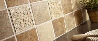
Porcelain tiles, mosaics, and tiles are easy to clean and are not susceptible to high temperatures, excess moisture, or chemically active detergents. The abundance of shades, patterns and textures allows you to choose the optimal solution for any interior. The disadvantage is that it is difficult to install with your own hands.
Important! A key factor influencing the preservation of an aesthetic appearance is the choice of high-quality grout for joints.
Laminate as a work apron in a white kitchen Source altastore.ru
Laminate is an original and inexpensive repetition of the wood texture of the countertop. Here it is important to distinguish between the horizontal and vertical planes. This is created taking into account the choice of the shade of the elements, which differ from each other in the play of tones. The advantage is a wide selection, low cost, and easy installation. The disadvantage is the likelihood of damage to the seams as a result of numerous cleanings with detergents.
White kitchen with imitation stone apron Source i.dobrzemieszkaj
Natural and artificial stone, clinker - go well with wood when they fit into the overall design style. An advantageous solution in terms of elegance and visual effect. The shortcoming will manifest itself in practice. The complex textured surface of the masonry is problematic to clean. This is especially true for the area near the stove and sink.
Healthy! The only option to “save” the situation would be varnishing and installing protective plexiglass.
White kitchen with PVC apron Source dekorin.me
Plastic, melamine wall panels - a huge selection of materials makes it possible to choose a profitable solution for any style. The pitfalls are that it quickly loses its original appearance due to the heat of the gas stove.
Interior styles
Wood for making countertops is best suited for styles such as contemporary, eco-design, minimalism or country.
Country style.
Wood in combination with light shades will create a comfortable atmosphere in the room. Country styles and eco-design involve making furniture from durable wood and then painting it white. As a result, they will look as natural as possible. In Provence and country styles, often only the top of the cabinet is made white, while the lower cabinets and apron remain wooden.
Country and Provence style
The contemporary style suggests that a white kitchen with wood will necessarily have a third shade. It can be grey, beige or black. This combination can decorate any interior. For example, in a beige kitchen with a wooden countertop, only the cabinet doors and splashback may have a brown tint, which goes well with the wooden countertop.
In contemporary style.
