Design features
The use of red in interior decoration should be measured. The color is very bright and complex, so it is rarely used in its pure form, more often mixed with other shades.
- Basic shades: terracotta, red brick, wine, scarlet;
- Shades of red are best used for decorating spacious rooms;
- The palette is suitable for decorating active places;
- To preserve visual space, red is combined with white.
The influence of red color on humans
Any color affects a person’s psychological state; it can have a calming or, on the contrary, stimulating effect. Red is an aggressive color associated with fire and blood, its meanings are quite contradictory. On the one hand it is a symbol of passion, beauty and joy, on the other it means war, power and destruction.
Red corresponds to people with leadership qualities; it should not be used in the interior and clothing of people with unstable psyches. It is also able to influence physical condition, increase heart rate and increase breathing rate.
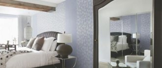
Wallpaper with red flowers: floral motifs
Floral themes seem to never go out of style. Scarlet wallpaper with flowers is the trend of the season. Bouquets of wildflowers with green leaves look good on such coverings.
But more common are wallpapers in white or another light shade with red flowers painted on them. Mostly poppies and roses.
Large flowers are suitable for spacious rooms with a minimum amount of furniture, and small flowers for small rooms. The fewer elements in the apartment, the larger the pattern on the wallpaper can be.
Flowers on the wallpaper - a classic plot
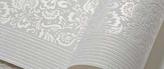
Types of wallpaper and their properties
| Paper wallpaper | The most impractical option. Red wallpaper fades in light, does not interact well with indoor humidity and has a short service life. However, it is an environmentally friendly material with low cost and a wide variety of models. |
| Vinyl | Wallpaper has a two-layer component, vinyl and paper or non-woven fabric. The top layer can be of several types, with different textures, thicknesses, resistance to damage and interaction with moisture. |
| Non-woven | Wallpaper consists of mostly cellulose and binding materials. Non-woven wallpaper is characterized by increased wear resistance and hides unevenness. |
| Liquid | In its original form, liquid wallpaper is a dry powder, which is subsequently diluted with water. The material is applied according to the principle of plaster, due to which it allows you to level out unevenness. |
| For painting | The material is a pure white surface onto which paint, for example red, is applied. There are three main types: non-woven, paper, vinyl. The canvas can have different textures and patterns. |
| Textile | The canvas consists of several layers, front and base. The base is made of non-woven fabric or paper, the outer part is made of fabric. The cost depends on the quality and value of the textile part. Textile wallpaper performs the function of noise and heat insulation. This type is difficult to care for and highly soiled. |
Possible combinations of black and red colors
Interior designers consider red and black canvases on the walls to be quite an aggressive design tool that can obscure other colors. Although fashion magazines often suggest a color palette, professionals suggest combining these tones with subdued shades.
As suitable combinations, designers recommend complementing red and black with white. It will bring freshness to the interior, emphasize the elegance of black, and eliminate the negativity and aggressiveness of red. The resulting room will be bright and spacious, filled with harmony and homeliness.
These colors, according to interior professionals, are optimal for modernism, minimalism, and hi-tech.
Attention! To obtain a classic interior in a living space, you will need crimson, burgundy, and purple tones.
To give the interior elegance and grace, you need to arm yourself with gold color. It is a symbol of material stability and luxury, therefore it is optimal for the eastern as well as the classical direction.
In such a situation, designers recommend using only bright red shades for the walls, filling the room with furniture with gilded elements. Gold-tone frames, bedspreads with gold embroidery, and beautiful tassels on thick curtains are suitable for decorating walls.
Design options
Plain wallpaper
Red plain wallpaper is suitable for decorating one of the walls of the room, which will focus attention. To decorate the walls around the entire perimeter, you should choose a softer shade and use abundant natural and artificial lighting.
Wallpaper with ornaments
Ornament can reflect the style and character of the room. Beautiful flowing lines will emphasize the classic direction; a more restrained ornament may correspond to the modern direction. In combination with a light tone of the pattern, the main shade of red will not be so flashy. This type of wall decoration is suitable for the design of a living room or office.
Floral drawing
Red wallpaper with a floral pattern is suitable for interior decoration in an Asian style. An image of bamboo stems or sakura flowers will highlight the overall idea. Light red roses or peonies fit the shabby chic style.
The photo shows the interior of the living room with floral wallpaper.
Patterns
Depending on the chosen design, the red wallpaper pattern can have simple or complex shapes. The color of the pattern can make the main shade even brighter and richer or, on the contrary, lighten it. Monograms and damask wallpaper are suitable for the interior of a classic bedroom and living room.
Strip
Bright red wallpaper with white stripes is associated with candy and creates a playful, festive mood. In combination with beige and gray colors, the interior has a calmer character.
The photo shows an example of using red and white wallpaper in a modern nursery; stripes on the wall visually expand a small room.
Cell
The classic Scottish check does not lose its popularity and remains relevant; this finishing option is suitable for an office or an aristocratic bedroom. A regular red two-tone checkered pattern is suitable for decorating a kitchen.
Wallpaper with imitation
Red wallpaper with an imitation of some material allows you to save room space while creating a unique interior; in addition, this is the simplest finishing option.
- Imitation of red brick or masonry creates a loft-style interior without eating up space. A combination of two shades of tiles is suitable for finishing a kitchen.
- Imitation fabric on a red background creates the impression of soft and warm walls. They can be successfully combined with other shades and materials.
- The unusual and rich texture of wallpaper under plaster adds luxury to the room. The type of finish is suitable for the hallway and living room, and goes well with strict shades.
Photo wallpaper and 3d wallpaper
Modern printing methods make it possible to recreate any image on various types of surfaces. The wallpaper can have a predominant red color or use it in the details of the image, for example, on one of the walls of the living room, red poppies can be depicted on a neutral background.
The relevance of red and black tones
Wallpaper in black and red colors suggests a serious and responsible choice of materials. When selecting them, the homeowner needs to pay close attention to the pattern of the wallpaper. To create a trendy interior, red and black wall canvases with a geometric pattern on a red background are suitable.
Currently, folk motifs created in black as well as rich red colors are considered a fashionable trend for wall design.
Manufacturers of decorative materials for walls have picked up this trend and are trying to find new interesting solutions for customers. Of particular interest among the folk versions of Russian wall painting is the “Khokhloma theme,” which is associated specifically with red and black tones.
Photos in the interior of the rooms
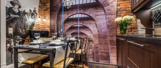
Kitchen
As a rule, only part of the kitchen in the dining area is covered with wallpaper. It is more practical to finish the work area with tiles. Red elements can overlap with the set or decorative elements.
Living room
Red tartan in combination with antique furniture creates a unique aristocratic interior of the hall. Plain wallpaper is recommended for decorating a living room in a modern style.
Bedroom
Passionate shades of red give romantic motifs. It is worth choosing a calm, non-irritating shade.
Children's
The use of bright colors is encouraged in the children's room. Scarlet color can be combined with other sunny shades in photo wallpaper. Creative ideas will help you create designs for children of different themes.
The photo shows a children's room with walls decorated with wallpaper with a floral pattern.
Hallway and corridor
The red color of the walls is suitable for large or open hallways combined with a living room. In enclosed spaces it is worth using more light.
The photo shows an entrance hall in a classic style. The walls are decorated with gray-red wallpaper and white wall panels.
Question of color
Red wallpaper goes best with many colors and shades in the interior.
Namely:
- Blue and snow-white. They will bring the design closer to elegant naturalness and will look appropriate next to bright scarlet wallpaper;
- Green. It, combined with red, inspires and complements the color palette;
- Cream and beige. They add a touch of calm and harmony to red wallpaper, balancing the color;
- Coffee and gray. They will become a kind of “highlight” in an interior where the red palette predominates;
- “Related” pink and shades of red are suitable only in the form of minor accessories to create accents.
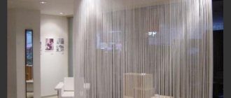
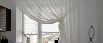
Tips for choosing curtains
Red is very bright and saturated, it is worth taking a responsible approach to choosing curtains so that they do not interrupt the overall tone and harmoniously complement the interior of the room.
- White tulle is suitable for any room,
- For a classic style, floor-length curtains made of noble material are suitable,
- Curtains can be decorated with garters, holders, tiebacks,
- In a loft interior it is not necessary to have curtains,
- In Asian style, you can use roller blinds.
About black and red style
Currently, manufacturers of numerous finishing materials are trying to keep up with fashion trends in interior design. They offer customers materials for walls of different colors, including the most extravagant options.
There are several current trends related to the use of black and red tones in interior art.
Option 1. In a modern interior, black finishing canvases with a red floral print are quite appropriate.
Option 2. As additional accessories for red and black walls there will be a variety of accessories, as well as furniture made from noble dark woods.
Option 3. The combination of black, red, white colors allows you to create a Japanese theme in your city apartment. An interesting solution in such a situation would be to use red wallpaper with rich black hieroglyphs. Professional designers do not recommend covering an entire wall with such wallpaper; it is enough to limit yourself to focusing on one wall.
Advice! You can take the image of a dragon as a colorful Japanese-style landscape. It symbolizes danger, the water element, strength, and is associated with family well-being.
This design option involves the use of furniture of simple shapes made from dark wood. All elements of the created interior must correspond to a refined and laconic style. The video fragment describes in detail the algorithm for using red color in modern design
If the red and black wallpaper has amazingly beautiful ornaments and patterns, the interior takes on a luxurious oriental flavor. Interior professionals recommend using silver and gold, as well as sand and beige shades as mandatory additions to the created image.
To complement the imagined image, of course, capes with large tassels, capes and pillows, carved furniture elements, paintings in huge frames, and heavy curtains are suitable. Professionals call soft sofas a mandatory attribute of such a room. For example, in a similar style, you can decorate a girl’s boudoir.
Among the fashionable interior trends, we note wallpaper with large red flowers, made on a black background. It is advisable to introduce a fresh green tone into the composition. Tulips, large poppies, delicate gerberas, and scarlet roses look elegant and beautiful against a black background. This kind of decor is suitable for decorating a bedroom; for example, you can cover the wall above the head of the bed with similar wallpaper, or highlight a relaxation area in the living room.
Which style to choose?
Classic
Warm light red color with a terracotta tint goes well with natural wood furniture. The interior should not be overloaded with details; the red tint of the walls will become the main accent of the design. The decoration will be complemented by a light floor and a dark ceiling.
Modern
The interior can combine different colors and textures. The wine shade of dark red combines well with gray, creating a strict and chic interior. A warm shade of red combined with white or bright colors gives positive energy. Walls with abstraction create a creative and fashionable design.
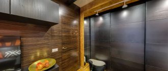
Loft
Red brick wallpaper is a classic way to decorate walls for a loft style. Design should include plenty of natural light.
Country
It is characterized as a rustic style, in which natural materials are abundantly present. The walls can be decorated with red wallpaper imitating painted wood. Laminate or parquet and ceiling beams, all the details in the overall picture give the room coziness. Rustic wall decor will look harmonious against a red background.
The photo shows a country style bedroom. The walls are decorated with different finishing materials - wood and wallpaper.
Advantages and disadvantages
First of all, we recommend that you find photos of red wallpaper on the Internet in order to understand exactly what this design looks like and generally what will be discussed in this publication.
Let's look at what's good about this room design. The main advantages of red wallpaper:
Red is quite a festive color. It is associated with fun, joy, audacity, passion, love... This color is often used to decorate living rooms and bedrooms. But in other rooms it will certainly look stylish and interesting too.
Shades of red inspire, delight, activate the nervous system and promote positive thinking. The most important thing is not to oversaturate the room with red.
Often, when designers are faced with the task of making the interior of a room luxurious and sophisticated, masters of their craft give preference to the color red.
If the decor seems too pale, then add a red tint to the light colors. This will change your room beyond recognition.To ensure that the room is not too bright and flashy, it is recommended to glue wallpaper only to one of the walls. This is a great way to freshen up a room.
But not only wallpapers with red flowers have advantages, but also disadvantages:
The color red can have a bad effect on the human nervous system. If a room is oversaturated with red, it will be difficult to stay in it for a long time, because it will put moral pressure on a person. Naturally, you are unlikely to be able to relax and have a good rest in it.
If people have problems with the nervous system or if there are overly active children in the house, then such wallpaper should be abandoned.
Too much red reduces performance. But this only happens if there is too much of it in the room.
Shades of red that are too dark can make a room appear smaller.
Combining red with other colors
| Combination option | Description | Photo |
| Red and black wallpaper | A bold combination that is not suitable for compact rooms. Black color in interior details creates a modern interior. | |
| Red and white | The universal white color looks harmonious in combination with any shades, including red. The combination will refresh the room and add light. | |
| Red-white-black | The perfect combination of three colors. Interior details and decoration may overlap with each other. The predominance of one shade or another affects the overall picture. | |
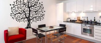
| Red-green | A non-standard combination of red and green can be used in the nursery, living room and office. | |
| Red-gray | The combination looks good in a minimalist and modern style. The interior is stylish and bold. The combination of burgundy and gray looks especially luxurious. | |
| Red-blue | If you combine blue and red wallpaper you can get an ultra-modern or marine style. | |
| Red-yellow | Bright, summer colors are suitable for decorating a living room or children's room. A muted version of the combination creates Asian motifs. | |
| Red-beige | The combination of red and beige is suitable for decorating a restrained interior. Light floors and furniture look harmonious in a calm beige color. | |
| Red and gold | Red wallpaper with gold patterns can be used to decorate a classic living or dining room. | |
| Red-brown | The chocolate color mutes the bright shade of red. Brown can be used in wooden decorative elements or textiles. | |
| Red-pink | A daring combination of red and pink, which should be used in doses in decoration, for example, in photo wallpaper on one of the walls, combined with a calm base of the main palette. |
How to choose the right shade of red wallpaper for walls
To delve into the rules for using red coatings, you must first determine which shade of this palette will be used in the interior of the room. This will avoid mistakes during the repair process. The red palette consists of several directions. Each of them has a specific effect on a person and is used by designers to create various effects.
To delve deeper into the rules for using red coatings, you need to decide on the shade that will be used in the interior
Features of using burgundy wallpaper as finishing
Shades related to the burgundy and wine palette are mainly used to decorate the walls in the living room. In other rooms, such coverings will look too gloomy and depressing. It is advisable to use burgundy canvases in spacious rooms where there is a good lighting system and large windows. In this case, it will be possible to convey as subtly as possible all the nuances of the romantic and classical styles. The result is a luxurious interior.
Helpful advice! If you want to create an antique atmosphere in the room, you can use red wallpaper with gold-colored ornaments. As an addition, moldings and decorative frames, furniture that matches the style, as well as wallpaper panels with patterns are suitable.
Burgundy shades belong to the dark palette. They can create a cramped effect in a room and significantly darken the interior. It is advisable to dilute this finish with light colors. It is best if the color ratio is the same. Otherwise, the burgundy shade will still have a squeezing effect.
Burgundy shades can create a cramped effect in a room and significantly darken the interior
Burgundy and wine palettes go well with natural materials:
- stone;
- wood;
- brickwork, etc.
It is not recommended to combine burgundy with dark colors. It is better to give preference to pastels and bright shades.
Bright shades of red: photos of interiors in poppy color
Wallpaper with a bright poppy shade is suitable for rooms intended for outdoor activities. They are used as decoration for the play area in the children's room, and you can also paste over one of the walls in the living room.
Wallpaper in bright poppy color can be used to place accents in a room or to divide space into functional zones:
Wallpaper with a bright poppy shade is suitable for rooms intended for relaxation
- a place to relax and receive guests in the hall;
- dining and work areas in the kitchen;
- a playroom, a sleeping area and a place to study in the nursery.
To prevent such a bright palette from having a negative impact on a person, experts advise using such tones locally, for example, in the form of inserts on top of a more delicate and calm base.
The use of pale red and soft pink wallpaper
If you don’t want to overload the room, you should choose red wallpaper in a light color scheme as decoration for a restrained interior. At the same time, the design will not look boring. However, it doesn't hurt to add bright accents. To do this, you can use textile elements made in catchy colors.
Delicate pastel shades of pink are suitable for calm people, as well as lovers of the classics
A soft pink finish is suitable for almost any room, the main thing is that it echoes the overall design of the room. You definitely need to make sure that the wallpaper goes well with the curtains, curtain design and decorative part of the interior. Coatings that imitate leather look quite interesting. They are recommended for extravagant and self-confident people.
Related article:
Wallpaper in loft style: a non-standard approach to creating an elegant interior
Features of wallpaper for different rooms. Room design options. Rules for using wallpaper.
Delicate pastel shades of pink are suitable for calm people, as well as lovers of the classics. If you are choosing decoration for a teenager’s room, you should give preference to original design options. For boys, a space theme is suitable. In a girls' room, wallpaper with large flowers would be more appropriate.
Helpful advice! If there is dark furniture installed in a room with pink wallpaper, it is advisable to decorate the window area in light colors. The best option would be curtains in light gray, cream, white and beige colors. They will add light and visually expand the room.
We combine shades: red-beige, black-red wallpaper and other color combinations
Red tones must be diluted with shades belonging to a different palette, but this should be done correctly. Designers usually use ready-made combinations, the colors in which are in harmony with each other.
Red tones must be diluted with shades belonging to a different palette
Red and pink wallpaper is a daring combination. This finishing option must be strictly dosed. An excellent solution would be photo wallpaper in red and pink tones that are pasted on one of the walls. At the same time, the main palette of the room should be calm.
On the Internet you can often find pictures of red and black interiors. This bold color combination can be used exclusively in large rooms. If you add black details to the decor, you get an interior in a modern style.
Fans of non-standard designs will love the combination of red and green colors in wall decoration. This design is suitable for a children's room, office or living room. To create an interior in a modern and minimalist style, you can use red and gray wallpaper. Such rooms look bold and stylish. A luxurious combination is obtained by combining gray and burgundy colors.
A universal combination of red and white wallpaper will refresh the interior of the room and add light to it. The ideal combination is white, red and black. These shades can overlap with the design of various interior details. It should be remembered that the predominance of one of these colors affects the overall picture.
The combination of red and black colors can be used in large rooms
Based on red and blue wallpaper, you can create a room interior in a marine style or support an ultra-modern design direction. Red and yellow shades look bright and summery. This wallpaper is suitable for a children's room and living room. If the range of red and yellow wallpaper is muted, this combination can be used to create an Asian-style interior.
People who prefer discreet designs should pay attention to the combination of beige and red. No living room or dining room in the classical sense would be complete without red and gold trim. As an alternative to black, you can use chocolate tones. Brown shades mute the excessive brightness of red. They can be emphasized with the help of textiles and wooden details present in the decor.
Important! Shades of the red palette, such as purple, fuchsia and raspberry, contribute to increased blood pressure. Therefore, they are not recommended for use on walls in rooms where hypertensive patients live.
People who prefer discreet designs should pay attention to the combination of beige and red
Combination with furniture, floor and ceiling
In the interior of a room with red wallpaper, furniture in light colors will look harmonious.
- For design in a modern style, white furniture is suitable; it will brighten the interior.
- For classics, you can use wooden furniture; the color scheme may favor brown or beige.
In the photo the room is in red and white tones; thanks to the light color, the bedroom seems more spacious.
The red color of the walls looks harmonious with light shades of wooden flooring: parquet, laminate or linoleum with wood imitation. For a modern interior, a combination of red walls and a gray tiled floor or self-leveling floor is suitable.
Considering the richness of red shades, when finishing the ceiling it is better to use classic colors: white, beige. When repairing, it is worth using colors that restrain the red tone.
Learning to combine red wallpaper and other colors
Red wallpaper in the interior is used to draw attention to the object, as well as to separate one zone from another.
Each room is individual, and wallpaper of such a rich color is perceived differently in one room or another, so it is important to know all the nuances when using them.