Design subtleties
Often conservative people choose a coffee interior. But it’s not just the older generation who have a love for the classics. Attractive shades do not go out of style for many years. Designers choose a soft palette, as it is an excellent backdrop for placing various objects of art. These include paintings, sculptures, photographs.
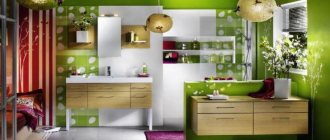
When it comes to a small living room, a coffee accent looks great on 1 wall. The interior in the color of coffee with milk looks beautiful in the office. It has the ability to soften decor while aiding research or teaching activities.
The choice of textiles is important in an interior in the color of coffee with milk. Replacing curtains can affect the perception of a room. If the windows face south and the walls are white, then coffee curtains can protect you from the hot sun. The shade of coffee perfectly ennobles any room. It makes the room cozy and luxurious.
You can purchase accessories for the interior - figurines, antiques, paintings, lamps. Embroidery on textiles looks great. Pillows and carpets are suitable for such an interior. The background can be diluted with gray or blue inserts. It is advisable not to use yellow and purple, as they can make the space heavier.
Cozy coffee and coffee-with-milk color in the interior
The coffee color is both invigorating and softly enveloping; it can be used in the interior both as a background and as an additional tone to highlight accessories. Light coffee is more suitable for walls, while dark coffee looks good in furniture and decorative elements. Even in the photo, an apartment where several tones of coffee color are used at once (often together with the color of baked milk) looks elegant and aristocratic.
Coffee is most often used by people who are confident in their position and stand firmly on their own two feet; family traditions are always important to them. The coffee palette combined with the color of milk allows you to get an interior that reflects simple and sensual joys.
A calm and extremely restrained color in the interior gives the necessary warmth and evokes a peaceful mood. Finding yourself in such a space is like drinking a wonderful coffee with milk prepared by a loved one.
Luxurious combinations
All shades of coffee color - from the lightest to almost black - look great in the hallway. However, with this choice it is worth setting the correct level of illumination. Milk looks great even in dim lighting, but for dark tones you need a good light source (it’s better if there are several of them).
The colors of fresh café au lait, peach and beige are ideal for the bathroom. Designers advise complementing such an interior with dark accents in the form of separate elements.
The main advantage of coffee color is its neutrality. The color of aromatic coffee with milk is the ideal background for almost any room; its combination with other colors allows you to create a truly comfortable interior.
Subtleties of design solutions
Coffee-milk color can favorably emphasize the necessary areas and decorative elements. The cozy colors of coffee and milk help connect diverse objects with the overall decor. A design in which the wallpaper, floors and furniture are painted in the color of coffee or coffee with milk is considered conservative and calm.
This type of interior is usually chosen by people who are not inclined to often change the appearance of their home. Designers also advise those who have difficulty choosing a color palette for a room to choose a coffee color. The color, called “café au lait,” will serve as a base on which other shades can later be applied.
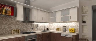
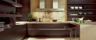
Kitchen in coffee tones
A kitchen decorated with a predominant color of coffee (or coffee with milk) is suitable for family people who value comfort, coziness and family evenings with loved ones.
It’s easy to choose a coffee interior for any kitchen. This can be wallpaper of different coffee shades, against which a kitchen set made from the darkest types of wood will stand out. The kitchen also looks decent if you choose a variety of accessories in coffee tones.
You can get creative with the design of walls, window openings, and tiles for decorating your work area. The interior of the kitchen looks decent and modern, where on one of the walls there is a picture with a painted cup of steaming coffee.
An interior dominated by the color of coffee with milk looks elegant if the kitchen contains appropriate decorative elements. Glass jars of various shapes, filled with coffee beans of different colors, shapes and sizes, and a coffee tree fit organically into the design.
Photos of similar kitchens can also be found on thematic websites. Focusing on visual images, you can independently create an attractive and harmonious design.
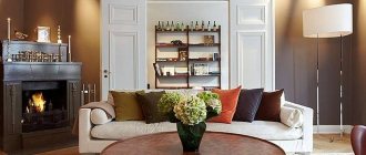
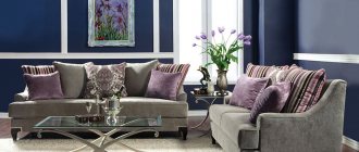
Discreet living room
A living room containing coffee tones always looks conservative and luxurious. Here you can buy light coffee wallpaper, furniture, accessories and household items. The coffee color in the living room can be combined with a variety of shades.
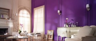
The coffee-milky shade looks good with blue and white. This interior looks eclectic and at the same time does not tire at all. Curtains for the living room can be blue, sofas and carpets can be light coffee. The colors of cappuccino, cherry and orange look great together. The living room, bright due to juicy cherry and orange tones (which are best used in textiles), will be balanced by the color of coffee with milk. Milky color with brown (the same coffee with milk) forms an elegant combination. The walls in such an interior must be lighter than the furniture.
Coffee in the living room can also be combined with lemon color, especially if the window faces a less lit part of the street.
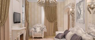
Cozy bedroom
A bedroom in coffee tones evokes drowsiness, induces tenderness and gently envelops you in color. Coffee walls narrow the room a little, thereby making it protected and cozy.
The interior of a bedroom in coffee shades will become romantic if you add bright accents to it. Bedrooms where the main color of coffee is combined with herbal or fuchsia look ideal in the photo. In the bedroom you can use terracotta together with the color of milk.
Stylish bathroom
A light coffee color always looks harmonious in a bathroom, but you just need to use it when choosing tiles for the walls. You can dilute the milky shades with dark chocolate colors and asymmetrical patterns. The bathroom looks noble, where coffee color is combined with gray shades.
Calm nursery
The coffee room for children encourages knowledge and seriousness. To prevent the color of delicate coffee with milk from becoming boring, you can dilute it in the nursery with peach, orange, red, lavender, blue and pink tones. Using bright accents and accessories will make this room attractive to a child.
The coffee interior creates a feeling of security, coziness, stability and comfort.
www.colors.life
What do psychologists think?
What effect does an interior in the color of coffee with milk have on a person, according to psychologists? According to experts, this color stabilizes the nervous system. Comfortable housing allows you to “talk” and discuss problems. Since the milky range does not include cold colors, the room remains warm in winter. Thanks to the lack of pressure on the psyche, you can quickly relax.
Interior design in the color of coffee with milk helps you forget your worries for a while. It does not have a depressing effect on guests, but is able to stimulate the hosts to creativity and intellectual activity. Therefore, popular colors are often found in offices. Brown wallpaper is useful for those who lead an active life.
Coffee color was previously used in the decoration of aristocratic palaces. Chocolate decoration makes the room look solid. This effect will be enhanced by expensive furniture made from precious wood and parts made from genuine leather. A luscious accent is provided by a luxurious Persian carpet on the floor.
Windows and textiles
As for window decoration, the modern variety of textiles and other materials will allow you to highlight the aesthetics of your bedroom in coffee tones.
Depending on the chosen style of the bedroom, for classics you can choose cream silk or satin curtains with lamrequin; for minimalism, white Roman curtains are suitable; sea green linen and cotton can be chosen for eco-style.
To decorate the bed, you can choose a bedspread and decorative pillows to match the curtains.
Textiles are also used to make soft wall panels, for example, for the head of a bed or decorating the walls of a room. Such black coffee or cappuccino colored panels will add even more softness and comfort to your bedroom.
The headboard of the bed with a large floral ornament of chocolate color, enclosed in a wide, similar in tone, wooden frame with lighting, which smoothly goes to the ceiling above the bed, looks very impressive.
The main thing is, when you come up with and realize your design fantasies, do not overload the interior with unnecessary details that can disrupt the magic of the atmosphere created by coffee shades.
Coffee shades will add grace, splendor and even nobility to your bedroom, regardless of the chosen style. All colors in the interior should be in harmony and not contradict each other.
Photo
Natural colors and shades are very popular in the design of living spaces for a reason. They pacify, give tranquility, they connect us with nature, which makes the atmosphere in the room soft and enveloping.
Among the entire natural palette, shades of brown occupy a special place, especially those that are associated with pleasant and tasty things - chocolate, cocoa, coffee. Coffee color is very popular among them, because it gives the room rigor and style, inner nobility and at the same time comfort.
Benefits of color
Although the coffee-milk color serves as a reminder of the taste properties of the chocolate drink, it can still have a calming effect. These shades are often used to decorate furniture - sofas, kitchen units, tables, cabinets. This combination is not annoying. The colors don't get boring for a long time.
A skillful approach to design allows you to create the desired effects, since the shades of coffee are different: from light to dark. This color in the kitchen will allow you to install antique pieces of art, photos, paintings, and souvenirs. And in a small living room, the color of the walls can become decor. In the sleeping area, the color coffee with milk perfectly calms and lulls you to sleep.
Photos of interesting design ideas for different rooms
Coffee with milk is a light, warm, cozy shade that provides many possibilities. It has several shades, characterized by different properties:
- a more beige warm tone is suitable for classic, traditional interiors,
- the light, almost white tone will be an excellent addition to modern minimalist apartments.
This calm, gentle tone is an excellent choice for fans of a cozy, relaxing environment. It is often chosen to decorate the bedroom, living room, and bathroom.
A delicate coffee-milk shade helps create an atmosphere of silence and peace; it has not gone out of fashion for many years, and works great in various styles. It is used in modern decors, emphasizing their simplicity, and in antique-style ones, in which it does not compete with the decorative forms of furniture and details.
Coffee beige has an important advantage - it easily blends with other colors:
- green,
- bronze,
- gray,
- purple,
- red.
This color combination is pleasing to the eye and is perfectly perceived.
This shade is beautifully presented in monochrome arrangements consisting of many of its shades - from light milky to rich coffee. From creamy whites to medium and dark shades of brown, these color combinations create a relaxing mood, perfect for unwinding after a hard day.
One coffee-milky shade without expressive decorations seems uninteresting, but it is not. Its attractiveness is determined by the use of many shades of beige, replacing bright patterns with expressive textures, which are better visible in a calm environment. An expressive texture will be ensured by:
- decorative plaster,
- 3D panels.
Below is an example of an interior decorated on a monochrome basis in several shades of beige. Accents of strong red will help liven up the decor, bringing energy to a calm atmosphere. Orange and yellow additives work similarly. Despite the living room being decorated in soothing beige tones, the room looks dynamic. This is due to the strong tonal contrast. The light background is combined with dark brown and black accents.
Latte color in the living room
Beige succeeds in decorating a living room intended for the whole family and will bring peace and harmony. Colorful additions and interesting furniture shapes look nice against the background of beige shades.
The colors of the walls and accessories can be light, beige, in tones closer to white or brown. Depending on the shade of coffee, latte is used to decorate a room with a warm or cool atmosphere.
Interesting effects are achieved by combining beige in different shades. For example, as a wall color it will add depth to the interior and highlight selected elements.
You need to pay attention to the lighting of the room:
- when decorating a room, dark shades should be used in the sunny part, around the window;
- For the dark part, it is better to choose light shades of latte coffee.
Caffe latte goes well with most colors. When decorating the living room, you can use calm tones:
- green,
- brown,
- yellow,
- orange.
The discreet combination of light coffee and white is interesting. A classic example is white furniture in the living room and beige shades on the walls.
You need to be careful not to make the interior monotonous or boring. It is worth adding accessories, additives of a warm shade.
Beige in the design of the living room will make a pleasant combination with strong colors:
- red,
- black,
- fashionable blue.
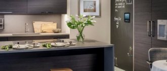
Cappuccino colored kitchen
A beige kitchen is light, spacious, and does not look as sterile as pure white. Coffee tones add a cozy touch to the atmosphere. Therefore, many choose latte shades for kitchen furniture facades. To emphasize them, you can use a slightly darker background. A countertop in a darker shade - dark brown, gray - can visually separate the line of upper wall cabinets from the floor cabinets.
Cappuccino color in the kitchen interior - photo
Warm dark beige fronts of the upper wall cabinets of kitchen furniture are combined with white lower cabinets. The wooden tabletop adds elegance.
The beige walls in the kitchen-dining room make an excellent background for white furniture, perfectly warming the interior.
Coffee latte goes well with elements from:
- wood,
- bricks,
- stone
The coffee-milky color is not always constant; depending on the presence of daylight or artificial lighting, it changes, becoming darker or lighter. To prevent your kitchen interior from looking boring, you should think about bright, interesting color accents.
Photo. To liven up the beige kitchen decor, turquoise and purple accents appeared in several places. Interesting design allowed us to combine modernity with classics. The steel on the appliances, baseboards, and cabinet handles meets the beige glass splashback above the countertop.
Photo. Beige kitchen furniture pairs beautifully with black items, giving the kitchen a glamorous style.
Bedroom in coffee tones
Don't be afraid to mix light coffee shades with bright colors. These do not have to be permanent interior elements; it is better to choose bright colors for textiles and other accessories. Bright fabrics can be easily changed when the interior becomes boring. For example, in the bedroom shown in the photo below, the accent on purple linen helped to enliven the atmosphere of the interior.
Paired with turquoise, a cool blue, creates a refreshing, attractive color combination.
Light coffee color in the bathroom
When choosing bathroom furniture, the interior is not doomed to a traditional white color scheme. Light coffee-colored furniture looks elegant and timeless. Bathroom furniture with milky coffee fronts is a popular choice. Earth colors, including shades of beige and brown, are very popular. By choosing this color for your bathroom furniture, you can be sure that your bathroom will look fashionable.
Coffee tones are timeless, if the current fashion passes, this furniture still looks elegant. Warm colors will add coziness even to modern times. Below are examples of modern bathroom furniture in light coffee color. The soft, streamlined shapes of the vanity cabinet in a delicious cocoa shade create a cozy atmosphere. The combination of cabinets, open shelves in wooden decor with facades in a light cocoa shade does not clutter the interior and creates a feeling of lightness.
Light, warm colors will add coziness to a trendy industrial-style bathroom.
Interior use
If you carefully look at the photo, the interior in the color of coffee with milk looks original. When major renovations are not planned, you can make 1 accent wall. It is best to purchase a furniture set made of natural wood, as the combination of natural textures and shades creates a peaceful environment.
If you are redecorating, you can use wood panels instead of painting. For finishing you can use:
- Bog oak.
- Mother-of-pearl nut.
- Ripe cherries.
- Larch.
Since the shade of wood is very different, owners can choose the finishing material directly to match the interior. Much is determined by the way it is processed. Usually simple impregnation or painting, as well as heat treatment, are used.
Colors
The color of the coffee-with-lait walls in the interior will look harmonious only when it is correctly matched to the rest of the room’s details. To do this, you should familiarize yourself with several shades. Experts advise using the following color combinations of coffee with milk in the interior:
- For large rooms with high insolation, coffee wallpaper is perfect. But brown color is also suitable for small rooms, if used in moderation. It is necessary to decorate one wall to express the accent. Other walls may have light shades.
- Finishing wallpaper for painting allows you to do the work yourself. A matte structure will look more attractive compared to a glossy one. It emphasizes the texture of the material.
- A great option would be a print of coffee beans on the wallpaper chosen for the kitchen. Dark areas can be used to decorate the work area.
Basic shades used in decoration
Don’t think that coffee color can only be dark brown; don’t forget another wallpaper color – coffee with milk. It is very different from the original shade, but, nevertheless, it is also usually classified in this group, so we will look at the features of each option in more detail.
Coffee color
This option is also very often called chocolate, so don’t be surprised if this particular option appears in the wallpaper article.
Let's look at the main features of this group of shades:
- Premises decorated in the color in question create an atmosphere of peace and allow you to relax and fully unwind from numerous worries. It’s comfortable to be in such rooms, they don’t have an irritating effect on people and set them up for productive intellectual work; it’s not for nothing that this finishing option is very popular in offices.
- As psychologists testify, brown wallpaper creates an atmosphere in a room in which you can relax and escape from worries. This option is especially good for people leading an active lifestyle, for whom complete relaxation is important.
- Since ancient times, the color of coffee has suggested a certain exclusivity and aristocracy. This color design was often found in noble estates and palaces of kings, which is why even today chocolate wallpaper creates an atmosphere of fashionability and solidity. To further enhance the effect of luxury, you need to choose the appropriate furnishings: wooden furniture, leather upholstery and expensive carpets on the floor.
If you decide to use this option in your home, you should remember a few simple recommendations:
- Coffee wallpaper for walls is great for spacious rooms with good natural light. But this does not mean that they cannot be used in small rooms, you just have to decorate only one of the walls in this way, the rest, this will allow you to focus on a separate area of the space.
- It is very good to use this color option when the surface structure will be highlighted in the most favorable light. If you are doing the work yourself, then consider the following factor: a matte surface highlights the texture of the material much better than a glossy one.
- Very often you can find coffee bean wallpaper for the kitchen; this option is quite interesting and is perfect for this type of room. In this way you can decorate one of the walls or decorate an apron over the work area. It all depends on what you want to get in the end, but it’s important not to overdo it; coffee beans are good as an accent, but you shouldn’t use them as the main background.
Coffee with milk
The closest color to this option is beige, but it is several tones lighter. Coffee with milk wallpaper in the interior may not look very bright, but it’s worth diluting and complementing it with several shades - and you get a very cozy and stylish environment.
This option has the following properties:
- It belongs to neutral shades and promotes mental activity and fruitful learning. That is why it makes sense to cover the work area in the nursery, office or library in a similar way.
- Using this background, you can highlight the most important elements of the interior and highlight them favorably. The combination with dark coffee color looks very good; this option is classic and has been widely used for at least several centuries.
- You don’t need instructions on how to combine such wallpaper with the interior; they match almost all natural shades, so decorating it yourself won’t cause any difficulties.
Shades
The color of coffee with milk in the interior of a living room or other room looks original with a harmonious selection of all design elements. Light colors are often used to decorate surfaces, while dark shades are chosen for furniture. This is the right approach. The emphasis is on an aristocratic setting, which looks great against a light background. You should not use only light or dark shades, as the space loses its shine and grandeur.
The combination of cream and brown tones, diluted with splashes of seasonal flowers, looks great. These are turquoise or amethyst details, orange or terracotta. If the room lacks freshness, you can use olive inserts. You also need to consider quality lighting. The right light highlights exclusive accessories and expensive items.
Combination with other colors
A beige room doesn't always look the same. Beige walls look different depending on the color combination you choose. Latte is versatile and there are many ways to combine it with other colors. The final effect depends on personal taste.
Supporters of classic solutions can combine latte with other muted colors:
- white;
- light peach;
- yellow;
- apricot;
- dark chocolate.
Such combinations will create a calm, cozy, clear scheme that never goes out of style.
Fans of unusual solutions should combine lattes with flowers:
- salmon;
- powder pink;
- grey;
- pistachio;
- olive;
- blue;
- lavender.
This combination is not obvious, it will bring dynamics to the interior and give it a unique character. The classic, elegance of latte tones will be overcome by pastel tones, giving the room a light carefree, modern atmosphere.
Below are some ideas for combining coffee and milk tones with other colors.
In combination with earth flowers
Natural, delicate beige tone is perfectly presented in the company of earthly colors:
- dark green,
- brown,
- ocher.
Dark wood furniture, cream linen fabrics, and ceramic accessories are ideal for the interior design of a cozy living room or bathroom. A beige interior with a somewhat colonial character will be decorated with furniture made from exotic wood species - rosewood, bamboo.
Nautical inspirations
The golden hue of café latte often appears in nautical arrangements. Beige is the perfect counterbalance to shades of blue and white and unpainted wood elements. The rough texture of the walls looks beautiful. Coffee and milk looks great in combination with soft blue; cold and warm shades balance each other, making the room fresh and cozy at the same time.
Dynamic interior with bright colors
A modern interior is an excellent opportunity to combine beige with expressive colors:
- red,
- turquoise,
- orange.
Brave contrasting colors combined with a tinted cream background will create a harmonious, original composition. The beige and black combination provides an interesting effect. This combination can decorate a spacious living room or office.
Decor and finishing
Thanks to accessories, you can complement glossy furniture. Mirror surfaces can visually expand the space. Combinations may include the following set:
- Milky-colored hanging shelving and brown chairs can create a cozy atmosphere in the kitchen.
- The combination of brown and red details on cabinets, according to experts, increases appetite.
- The use of gold fittings will make the decor luxurious.
- Frosted glass and brown wood texture create a sophisticated, modern decor.
The color of coffee with milk in the bedroom interior will look good if harmonious elements are selected for the design. At the same time, the materials used for finishing are varied.
Wallpaper
Wallpaper in the interior in the color of coffee with milk should be chosen taking into account the functional purpose of the room. If this is a kitchen, then the best decoration would be the theme of small cafes. For the hall, it is preferable to choose contrasting ornaments and brown borders. Art Nouveau curlicues above the head of the bed will suit the bedroom.
Coffee color can be on one or more walls. In your office, you can use the alternating method: use dark wallpaper at the bottom, and light colors at the top. A decorative border is placed at the joints.
In the interior, the color of the walls, coffee with milk, can be used in other rooms. For the hallway, choose the shade of milky cappuccino with vertical lines, since this room is usually cramped. Combination with wooden furniture allows you to expand the space. It is better not to use dark colors. And photo wallpaper with a still life, abstraction or engraving will suit perfectly. An industrial style is possible, in which brick walls are imitated.
Living rooms in a coffee-colored house, a room not only for receiving guests
The tradition of decorating a living room is more common in European countries and the USA, where you can find no home without this room.
Living room design in coffee tones
However, today such rooms are appearing in Russian houses and apartments. You can also place a living room in a small room - place a sofa and an armchair, a small table and the room can turn into a cozy place for meeting guests and gathering family.
Attractive illustration connects the entire interior and you can find them on the drinks list. The inspiration for the creation was found by the Dutch designer, both of whom studied at the famous Gerrit Rietveld Academy in Amsterdam. “The Netherlands is very open as a former colonial power, designers can work with the original, they are not afraid of change and experimentation, but they always keep an eye on the subsequent use,” explains Bara Lockfeer.
At first glance, the uninvited viewer also embraces the division of the space into two parts - not only because of the four, but also because of the style of the device itself. The lower part is illuminated and directly invites you to sit with a good coffee or lemonade. The colorful plastic and tin chairs were a clear choice for the designer, significantly lightening up the space, while the dark interior tones delivered a dose of energy.
Despite its name, the living room should not be focused only on receiving guests. This is a room in which all family members are pleasant and comfortable. Here you can watch TV or read, relax in an easy chair and have a cozy time.
Traditionally, the layout of the living room is built around upholstered furniture - sofas and armchairs are located in the center or along the perimeter of the room overlooking the TV or fireplace. You can place coffee tables in the middle or along the edges.
The wooden benches cover the history of 200-year-old wood and beautiful joinery - combined with a bespoke metal sole, the surface of which has been tailored to create a perfect example of how to promote a mass-produced product combined with quality material.
The ground floor is an original reading table based on the Dutch tradition, suitable for comfortable seating for a large group of people and, of course, for reading. Above it hangs a porcelain chandelier with a low pendant, both of which are not from the Netherlands. The basis of the space is always the ceiling and floor; you can add accessories to the atmosphere.
Place other furniture, such as a chest of drawers or chairs, which will complement the living room functionally. In the center of this composition you can place a soft, cozy carpet. In the living room there is space for flowers and trees in tubs, paintings and family portraits. Memorabilia and souvenirs can also be placed here - they are pleasant to look at during moments of relaxation and can be shown to guests.
The equipment, despite the variety of materials, styles and origins, is noticeably neat. The owners were able to preserve key parts of the original First Republic House interior—perhaps a 1920s column, an original piece of molded flooring, or a floor with industrial railings.
The reduced ceiling combined with black adds four cozy touches and an intimate atmosphere. There are black faux leather seats with colorful buttons that were made to measure, this time in Bohemia. The entire floor is considered a contrast to the ground floor from the start and creates a friendly bar atmosphere. This feeling will be especially enhanced by the arrival of the evening, when the cafe darkens and switches to evening fashion.
What should you consider?
The advantage of color is its unpretentiousness. There is no need to use complex design techniques to emphasize decorative elements. For such an interior, original souvenirs, coffee tables with carved legs, books, and vases are suitable. You can place posters or artistic abstractions on the walls.
Designers know how to combine colors, creating new design options. Shades of latte, espresso, cappuccino, and macchiato can be used in the interior. Similar tones are often used in catering establishments. They decorate walls and furniture. This creates a cozy space. To decorate the interior, it is not at all necessary to involve specialists. You just need to follow simple recommendations:
- Do not use a combination with bright and acidic colors - green, pink, blue.
- The general background can be diluted with decorative details of a contrasting tone.
- A local lighting system must be used.
When decorating the interior, you should not skimp on materials. They should suit the room and be practical. Then the completed repair can last for a long time.