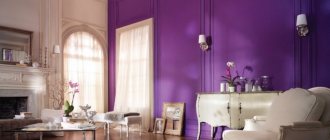
Decoration of walls, floors and ceilings
In a kitchen in peach shades, white, beige and cream tiles look organic, and it is advisable to leave the floor dim.
But if you wish, you can make a few colorful spots on the floor - make small islands of bright tiles, and you can do the same with the ceiling.
Light walls tend to get dirty faster - dirt is clearly visible on them, so in such a kitchen it is better for them to be tiled or covered with washable wallpaper.
It is recommended to decorate the kitchen area directly associated with food preparation in dark shades of peach, then dirt will not be so noticeable.
An excellent solution is a mosaic made of small tiles, but then you need to not overdo it with multi-colored kitchen utensils. Wallpaper should also be chosen in plain colors or with a simple pattern.
Combination with other colors in the interior
Natural shades of color harmonize with many colors, creating different effects in the room. With the right choice of colors, the interior acquires softness and sophistication.
Colors with which peach tone is combined:
- White color. This is one of the best companions for delicate shades. Peach walls with white furniture, windows, lamps, and wooden flooring make the interior cheerful, warm and cozy. This combination is suitable for decorating a children's room.
Children's room design in white and peach tones Source art-designs.ru
- Green color. Cold and warm green shades allow you to create a complete interior of the room. A bedroom in warm peachy green tones looks soft.
Using a peach-green combination in a bedroom interior Source dizainexpert.ru
Cooler shades, such as mint, refresh the interior, making it stylish and modern.
Combination of peach and mint colors in kitchen design Source krovati-i-divany.ru
- Beige color. The combination with beige shades maintains a comfortable, pleasant interior atmosphere.
Combination of peach and beige shades in the design of a modern living room Source krovati-i-divany.ru
When dark, for example brown, details are added to these shades, the design becomes more strict, serious, but no less comfortable.
Peach and beige combination in a classic living room Source praktica-rs.ru
- Grey colour. Gray sets off and dilutes the natural tone of the interior well. This combination looks quite stylish. Upholstered furniture or fabric elements can be made in gray.
- Brown color. The combination of peach with brown shades allows you to decorate a luxurious room, majestic and pathetic.
A harmonious combination of peach and brown colors in the living room Source rehouz.info
Often it is enough to simply place wooden brown furniture against the background of peach walls. This interior looks expensive and stylish.
Wooden furniture against the background of peach walls in the bedroom Source yandex.by
- Black color. Black in combination with peach is rarely found in the interior. So that the natural shade does not get lost against the background of black, it is worth adding elements of other colors that will allow you to tie the interior into one whole. For black, more saturated, bright shades are suitable.
But it’s better for peach to be dominant and black to emphasize the details.
Combination of peach and black colors in the design of a cozy living room Source homedecorated.net
- Red color. The combination with a red tone creates an original, bright, colorful design. These shades are often used in oriental stylistic trends.
Harmonious combination of peach and red colors Source yandex.uz
- Orange color. Peach and orange set off well and complement each other in room design.
Peach and orange shades in the interior of the room Source rehouz.info
The combination of peach with other colors often looks pleasant and harmonious.
Finding the right combination is quite simple.
Kitchen textiles
For a kitchen, it is always important how it is lit, so when designing kitchen windows, you need to consider how many there are and whether they are located on the sunny side.
For a kitchen in peach shades, design experts recommend roller blinds - this is convenient because it saves time on washing and ironing rag curtains.
If you don’t like the blinds, and you definitely want fabric curtains, then you need to stick to dark colors that don’t get dirty.
Instead of the usual tablecloth, it is fashionable and practical to use wide napkins on the kitchen table - if something is spilled on the table, it is easier to wash one napkin than a large tablecloth.
In addition, in a peach kitchen with napkins it is easier and more interesting to play with color; this accessory can be changed according to your mood and make the interior extravagant with table textiles - either green or red.
How to choose a peach-colored kitchen set
When choosing a kitchen set, you need to focus on the type of coating, shape and material from which it is made.
Matte or glossy
The matte peach-colored set looks sophisticated and attractive. Most suitable for such a stylistic direction as country or vintage.
A glossy kitchen looks festive and emphasizes the advantages of an interior designed in contemporary or high-tech style.
Glossy peach set is comfort and practicality in one bottle
Facade material
For a classic facade, natural solid wood would be ideal. Of course, the cost of a headset made from such material will be high, but the quality, environmental friendliness and safety will more than justify it.
MDF boards would also be a good option. They are also environmentally friendly, durable and have a long service life.
In order to save money, an alternative option would be a set made of chipboard. However, despite its attractiveness, the facade will swell during operation, and the peach color will lose its attractiveness when exposed to sunlight.
Important! To prevent deformation, the set is covered with an aluminum edge.
Form
For a spacious kitchen, the best solution would be to choose a radius kitchen unit. They are great for furnishing a kitchen-living room or dining room.
To save space, choose a linear set, which is installed along one wall. A corner set, equipped with spacious drawers and spacious countertops, will perfectly complement the interior of a small area.
Molded form is spacious and comfortable
Decorative decorations
There is no need to decorate a kitchen in a peach color scheme with many details, since this color itself creates homeliness.
Therefore, in such a kitchen, very few interior decorations such as vases, frames and figurines are enough. Sometimes, in order for the interior to look complete and stylish, original curtains are enough.
Interior decoration
It’s not difficult to make such a kitchen more interesting.
- Lighting
Lighting for a peach kitchen is best chosen with white light; a yellow tint of this color can make it orange. With good lighting equipment, this shade will visually increase the space of the room.
It is best to distribute the lamps throughout the ceiling, and install wall or hanging lamps above the cooking area.
- Furniture and appliances
Of course, choosing only one set is not enough, so attention should be paid to the selection of furniture and equipment.
Attention! A vintage cabinet, the decorated elements of which will reflect the style of the room, will look ideal in a soft peach-colored kitchen.
As for armchairs or stools, they should not stand out from the general concept, so it is best to choose ones that match the color and style of the set.
- Textile
Curtains or drapes can be in harmony with the cushions on the chairs or with the tablecloth. Plain tulle is suitable for any style direction, and the sophisticated cut will emphasize the design idea.
- Accessories
Accessories are the most important element in creating an interior. They show the character of the room and help emphasize the overall style.
Suitable accessories:
- photos,
- paintings depicting food,
- vases with flowers or dried flowers,
- watch,
- various figurines.
Everything is important in design, from spoons to kitchen furniture
Lighting devices
Lighting is important in the kitchen, so you need to pay close attention to how the work surfaces are illuminated. Typically, lighting is placed under wall cabinets - this is convenient, since the countertops are well lit and the light does not hurt the eyes.
In terms of basic lighting in the kitchen, it is not chandeliers that are appropriate, but small lamps - they save space and look more appropriate in the kitchen.
The peach color itself visually makes the space lighter, so it is better to choose soft lighting, and artificial “daylight” light will make the peach color less cozy.
When furnishing a kitchen in peach tones, the main thing to remember is that this color does not tolerate additional variegation and unnecessary details.
What colors should not be used
It is unacceptable to use many shades in the design, because in this case the space will feel overloaded.
Peach color goes well with pale and pastel shades.
Bright, flashy colors should be avoided, as they will clash with the interior concept.
Photo of peach colored kitchen design
Psychology of color
Shades of velvety fruit create a calming environment. Moreover, the overall impression also depends on the chosen tone. Light colors give a feeling of security and reliability - a real home. Brighter options lift your spirits and give a feeling of celebration and happiness.
A peach-colored kitchen set will appear a little velvety, regardless of whether it has a glossy or matte surface. This will give the room warmth and tenderness. If you want to make the kitchen cooler, use it in combination with pink.
Peach in clothes
From a psychological point of view, this shade sets up a positive mood, and when chosen, indicates a person’s romantic mood. Peach is light and delicate, which is why women and girls often buy clothes of this color. It suits most people, even curvy ladies, and hides figure flaws. The tone is ideal for bridesmaids at a wedding, although some brides choose dresses of this color themselves.
The best combination is peach and white. Fruity trousers, a skirt and a white blouse are suitable for any occasion, even a business meeting. If you need to add austerity to the look, put peach on top, and replace the skirt and trousers with black ones. The combination of peach and gray is considered very effective; the image will be soft and romantic. Sets of peach-colored items with beige, brown, blue, light blue, and turquoise details look beautiful. It is also important to take into account the texture of fabrics, which will allow you to create fashionable looks that are most suitable for this feature.
How to obtain by mixing paints
If you need to get a fruity color for painting the walls of a room, it is better to turn to a professional, since it is difficult for a non-specialist to maintain the proportions of the components. If you need to get a new shade for painting, you can do it yourself. For this you will need:
- palette;
- brushes;
- paper;
- set of paints (red, yellow, white).
Watercolor
Let's look at how to make a rich shade using watercolors.
- We take red color.
- Add 4-5 drops of the yellow component.
- Mix everything thoroughly on the palette.
- We pour a couple of drops of white. Let's get in the way again.
- If necessary, if not enough, add more white paint.
- When the palette is made, we make several strokes on the paper. Let's see if we achieved the desired result.
- If it turns out too “pink”, then soften it with yellow watercolor.
Gouache
When working with gouache, take a red, yellow, white, brown jar.
The production procedure is similar to watercolor:
- First, yellow is added to the red tone.
- Mix thoroughly.
- White is poured in. Only for a more saturated tone, add a drop of brown at the end.
- You need to mix everything well and try it on canvas.
Painting walls in different rooms
Individual preference is paramount when choosing the right color for the walls in a room, but to achieve optimal results, there are some guidelines to consider.
This room in most apartments and houses is very modest in size, so the optimal color for such a room would be light (beige, ivory, orange) with possible brighter accents. Due to this, the hallway will seem much larger.
If the corridor is narrow, then several shades are used to paint it, which are recommended to be placed in the form of horizontal stripes. An interesting solution would be to create black central or side borders. The main color can be gray, light brown, beige.
The photo shows a corridor in beige shades; this color is considered the most used in such rooms.
Corridors usually do not have enough daylight, so the main palette of paints for walls should be light colors
Provided that all residents constantly gather in the room, blue, light blue, purple and pink shades are optimal. They are complemented by gold, red and gray colors. For a room used in other situations, a more austere interior with a predominance of cool colors is selected.
Choosing paint for a nursery is more difficult, since you need to take into account the preferences of the child or teenager. Gender also plays a significant role: boys gravitate towards bright and complex color combinations, while girls prefer calm pink and beige shades with rich splashes. Naturally, such an interpretation is often conditional, therefore, taking into account the wishes of the child, the best option is to use natural colors and their shades.
Primary and additional colors
How to make a color wheel
The color wheel is a tool on which you can visually construct all significant color schemes. Colorists, artists and designers need a paint mixing table and a color wheel in their work. He can help the child with his first acquaintance with flowers, and will also explain how to combine gouache or plasticine himself, getting something new.
You can create such a combination tool yourself:
Using a compass, draw a circle of the desired radius on paper. Without a compass, you can also circle any round object without going beyond the boundaries of the sheet. Step back from the main circle and draw another circle inside, half the size of the first. Next, draw an equilateral triangle in the inner circle. Divide the triangle into three parts by drawing perpendiculars from the middle of each side to the center.
On the inner circle, place points opposite all the perpendiculars, connect them together with the vertices of the triangle. Draw 12 equal sectors between the circles. Take three basic tones: blue, yellow, red. They will fill the internal sectors of the triangle and the sectors in contact with its vertices. It is better to use gouache to fill the circle.

