The meaning and features of color
Lavender can be called a cool shade of purple.
The color is beautiful and airy, carries a touch of romance and is especially attractive to creative people. Impact on a person (psychology): Despite the external lightness, too much lilac color can plunge a person into a state of depression, so there should be a measure in everything, in this case the colors will have a positive effect, and the surrounding atmosphere will lift the mood.
Psychology of color
There are many contradictions in the lavender shade. Psychologists say that choosing this color indicates the seriousness of a person. And at the same time, lavender is a creative color that gives hope for a bright future. It contains notes of nostalgia, flavored with naive gullibility and directness.
In the interior, this shade is designed to add mystery to the room. Its riddle is not so easy to solve, even if you surround this color with many details.
Sincere and slightly cool, lavender is associated with sunset or dawn. There is little solemnity in it; it is not suitable for pompously decorated houses and apartments. But it contains thoroughness, kindness and hidden light, ready to manifest itself at any moment.
This shade of purple is characterized as a different, seemingly unearthly color. For some it reminds them of space, but for others it evokes memories of waking up with their grandmother in the village. Lavender is as versatile as you can imagine. That's why he is so loved by many designers.
Photos in the interior of the rooms
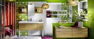
Kitchen
A pale lavender shade will make the kitchen bright and envelop it in tenderness. Lavender tone may be present in the decoration or filling of the kitchen interior.
For example, one of the walls painted in a lilac-lavender tone will be successfully adjacent to a light kitchen set and an apron over the work area of similar shades; the design will be bright, but not flashy. Another design option would be an ash-lavender set in combination with wallpaper with small floral patterns and textiles in milky tones.
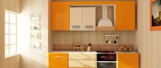
The photo shows a kitchen in Provence style. A pastel lavender shade looks harmonious with a white set.
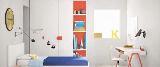
Bedroom
Depending on the richness of the tone, the interior can correspond to modern or classic stylistic trends. White wooden furniture against the background of light lavender walls will decorate the design in classic and Provence style, dark furniture with straight shapes will complement modern design, the interior will become brighter and the shapes will be clearer.
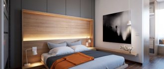
The photo shows a small bedroom with photo wallpaper in lavender tones.
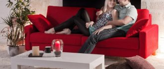
Living room
A hall or living room is a place where it should be cozy and comfortable, a place where you can spend time with friends or enjoy solitude, the interior can be in either a bright or light palette, and furniture and decorative elements can be stylish or emphatically classic. It would be quite appropriate to decorate one of the walls with photo wallpaper or an unusual material, such as a painted wooden panel in a lavender shade.
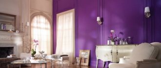
The photo shows a delicate living room in a light palette. The decor and finishing are in the same color scheme.
Children's
Lavender tone is not only beautiful, but also versatile. It will look equally good in the interior of a children's room for a boy, a girl and a baby. The shade is not irritating and goes well with many colors. A teenager's room can be decorated with 3D wallpaper with favorite characters or playful designs.
Bathroom
In the interior of small bathrooms, lavender tiles in bright colors will look good as elements on a light background; the pale tone will not hide the space; it will be complemented by light decorative items, curtains, and glasses.
The photo shows a bathroom in white and lilac. The lavender hue echoes in the decoration of walls and decor.
Hallway and corridor
In closed or small hallways, it is better to choose a light shade of lavender; it will make the interior fresh without sacrificing space. The design can be decorated with fresco or stone. If you want to decorate the hallway in a bright shade, for example purple, a combination with a milky and creamy shade would be a good interior solution; the colors will balance each other.
Balcony or loggia
In a city apartment, balconies, as a rule, do not have a large area, so it is better to choose a light palette as a background and use bright colors for decorative purposes.
What colors can lavender be combined with?
Lavender goes well with many bright and pastel colors, although its duets with gold, silver, white, and green are considered the most successful combinations. No less often in interiors it is used together with soft pink and cream, which gives the room lightness and airiness.
Lavender with white
The combination of white and lavender creates a feeling of freshness in the room. In bright light it looks good, but if you want to enhance the notes of romanticism, it is better to introduce decorative elements from soft fabrics, vintage or natural textures into the design. Typically, white wall decoration is done, which is diluted with lavender accessories. It is also possible to paint the walls in a lavender tone in combination with white furniture, ceilings and textiles.
Lavender with pastel
Combining lavender and pastel colors also provides a fresh, soft and peaceful look to any room. Adding cream, light gray, milky shades will add spaciousness, although at first glance, this combination may become blurry. To avoid visual “depersonalization” of the room, you need to introduce several rich accents from contrasting tones or shades of a dark purple palette.
Lavender with bright colors
The combination of lavender and rich tones will be justified if the goal is to achieve a lively, dynamic interior. Lavender with the following colors are considered trendy tandems:
- yellow;
- light green;
- raspberry;
- orange;
- lemon;
- bright greenery;
- purple.
When diluted with bright tones, lavender will look more stylish, and the room will take on an original look. It’s just important not to overdo it with adding colors, otherwise they will overshadow the delicate background.
Lavender and dark tones
The color lavender should be used more carefully in small rooms, since even with a slight darkening it will visually conceal the space. The introduction of dark tones is unacceptable here, it will only increase the oppressive feeling. The combination with black is not recommended, regardless of the size of the room: it is perceived as difficult, the atmosphere will create melancholy.
In rooms of sufficient size, lavender can be combined with dark shades in the form of accents or individual decorative elements. Successful duets can be lavender and the following colors:
- dark purple;
- purple;
- chocolate;
- terracotta;
- emerald;
- metallic
When conflicting shades are chosen in a correctly calculated combination, the room takes on a luxurious look, but only a professional can find such a combination.
Combination with other colors
Depending on the shade combined with lavender, the character of the room will be different, from gentle and playful to stylish and fresh.
| Combination | Description | Photo |
| Lavender white | The most neutral and light color combination. The interior is light and airy. The combination is suitable for interior decoration in almost any style, such as Scandinavian, Provence or modern. | |
| Lavender gray | The combination is especially successful in pastel colors. With a predominant gray color, the interior will seem colder, with lavender it will appear brighter. The combination is suitable for a room in the neoclassical, high-tech, Scandinavian style. | |
| Lavender pink | Shades that are close to each other, the interior will be romantic and warm. The combination will look especially good in the living room, bedroom and nursery. | |
| Lavender blue | The blue color will refresh the interior and dilute the delicate lavender palette. | |
| Lavender green | A juicy combination, regardless of the intensity of the shade, is associated with bunches of grapes or branches of lilac. Suitable for decorating kitchens, living rooms and children's rooms. | |
| Lavender blue | The combination is rich and strong. In a bright palette, it is best used in well-lit apartments. So that the room does not seem small and there is no oppressive feeling, you can add a neutral light tone. |
Lavender color: a favorite by right
I would like to focus your attention on the color purple, because it is one of the most popular lately, and to be more precise, it is lavender.
Lavender flowers actually come in several shades.
Lavender is a light shade of purple. We came across this new definition of color recently, as it came from Europe. There, vast fields are occupied by this beautiful flower, which has a delicate aroma. This is probably why the shade of this flower evokes warm emotions in us, pleasant associations with nature and freshness.
In the design, lavender shades add mystery and nostalgia to the room
Lavender shades always look good with green, purple and brown accents
If you like this color palette, you can use it in the design of any room. Lavender colors in the interior of a home open up a world of limitless possibilities, helping to realize the most daring ideas. This color is convenient because, depending on the shade and saturation, it can look great with others, creating a serious image and have a lighter, more casual look.
Thanks to this feature, not only women want to see the color of lavender in their living room and bedroom interiors, but also men are in no hurry to give it up, since this shade is universal.
Lavender color visually increases the volume of the room, so it is often used to decorate small and low rooms
Style selection
Provence
Lavender color and Provence style are almost inseparable concepts. The lilac-violet hue is immediately associated with endless fields of lavender, which impress with their spaciousness and natural beauty. The best combination in a Provence interior would be white furniture, with a slight touch of noble antiquity, and neat lavender-colored details; this could be both interior decoration and decorative elements.
Classic
The classic style is discreet, elegant and not pretentious. The details are smooth, the palette is calm, and the interior is not overloaded with unnecessary decor and artificial materials. Lavender color will be appropriate in light, pastel and ash colors. It can be used as a background color or as a filling, such as furniture upholstery or textile parts.
Modern style
Modern design allows you to be bolder when decorating your home. Colors can be brighter and shapes asymmetrical. Decorating the room will not be boring, for example, using photo wallpaper, brightly colored elements or a multi-colored ceiling and floor. The usual white canvas can be replaced by a suspended or suspended ceiling in a lilac shade, and the room will immediately change its image.
The photo shows a bright living room in lavender color. The accent wall is painted in geometric patterns of different colors.
Country
Warm rustic style will transform a city apartment into an island of comfort, where you can enjoy the details of rural life. The colors are light, the furniture is made from natural materials, the design is completed by throws, pillows and decorative elements, such as clay jugs and vases in the kitchen or massive candlesticks and a floor chest in the living room.
The role of furniture and textiles in a lavender bedroom
The classic bedroom furniture set includes a bed, bedside tables, a wardrobe, a mirror and a dressing table for ladies. In a Provence style bedroom, lavender colors are held in high esteem and are widely used. If wallpaper with a floral pattern in this shade is hung on the walls, then the furniture must be light and made of natural wood, preferably artificially aged, dusted with time. An antique-style carved couch with lavender upholstery and cushions to match the curtains will be in place.
In a large, bright room, lavender color is suitable for decorating window openings
If you don’t dare or don’t want to make lavender walls, “dress” them in light neutral tones, and add a shade of lilac or lavender to the facades and upholstery of furniture, headboards, pillows, and complete them with lavender curtains and floor lamps.
All upholstered furniture looks great with lavender upholstery
A bright glossy facade will make the kitchen more fun
A carved sofa with lavender upholstery will add sophistication and luxury to the room.
When the interior of the room is made in a loft style, in which the walls are not finished, against the background of gray concrete walls or brick, white glossy furniture looks contrasting and unusual. The color spot will be a crimson carpet on the floor or a bedspread in the same color scheme.
A lavender living room is an undeniable trend, a bedroom is an outer space or a sweet memory of nature. This color truly has many faces and is different for everyone. Take a chance and you will find the shade of purple that suits you.
Finishing
Walls
In the living room, children's room, hallway and kitchen, wallpaper will be one of the best solutions; it can be paintable wallpaper, photo wallpaper, with a small or large pattern.
The photo shows a bright children's room. One of the walls is decorated with soft lavender wallpaper with polka dots.
The pattern and its presence are determined by the stylistic direction of the room and the design idea. In a bright bedroom, an interesting interior solution would be to decorate one of the walls with photo wallpaper with a lavender field, and for an eco-style living room, an interesting option would be a painted wooden wall.
The photo shows the dining area. The wall is decorated with photo wallpaper depicting lavender fields.
For the bathroom, toilet and partly the kitchen, it is better to choose tiles; the stores offer a huge selection of different colors, shapes and patterns.
Floor
For the living room, bedroom and children's room, you can choose a carpet or rug of any shade you like; if desired, you can change it to another. Linoleum or laminate are easy to maintain; this finishing method is suitable for the kitchen, hallway and living room. In addition, during repairs, you can make self-leveling floors with the effect of a marble coating or the image of patterns.
Ceiling
A colored ceiling will make the interior of the apartment non-standard and interesting. The easiest way is a stretch ceiling; the color and material of the canvas can be any. Another finishing method would be a suspended structure, single-tiered or multi-tiered; if desired, you can combine different colors. A canvas with photo printing, such as photo wallpaper or a stretched canvas with a photo image, will also look interesting.
Lavender decor
To introduce notes of bright or calm lavender shades into the interior, it is not necessary to completely change the design of the room, undertaking a major renovation. It is enough to add some decorative elements in the appropriate color scheme. As accessories you can use:
- bright paintings and panels with lavender;
- decorative pillows in purple-lilac shades or snow-white, but with lavender prints;
- storage boxes with images of lavender fields;
- bouquets of dried lavender that can be used in any room, especially for Provence and country styles.
You can find and order many suitable accessories for creating a lavender interior in the Lavender Decor online store. In the thematic collection dedicated to lavender and Provence, you will find more than 100 items that combine perfectly with each other. We deliver goods throughout Russia, and 5% back bonuses from each purchase will make your shopping profitable.
Go to the LAVENDER DECOR section
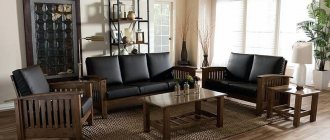
Furniture
Lavender sofa
Will decorate almost any interior. In a modern living room, this could be a massive sofa with straight shapes and dark lavender upholstery; the interior will be complemented by several details of a similar shade. A model with smooth shapes and light upholstery with a floral pattern or stripes will look better with a classic or Provence style. The picture will be complemented by several decorative pillows.
Bed
A tall soft headboard in a beautiful lavender shade will look especially chic; metal studs, rhinestones or buttons can be used as decor. Another, simpler way to add lavender notes to your bedroom is with pastels or a bedspread. The beauty of textile decor is that it is not difficult to change it to a different shade, thereby changing the appearance of the room.
Closet
A wooden vintage cabinet painted in lavender tone will take pride of place in any room and become a separate object of attention. A more modern model can be considered an ordinary wardrobe or wardrobe, the doors of which are decorated with mirrors, decorative moldings or film with a photographic image.
Armchairs and chairs
Armchairs or stools can be combined with other pieces of furniture or become a bright accent in the interior of the room. In the living room, a beautiful velvet chair will look harmonious with a sofa in a restrained beige shade, and chairs in the kitchen or dining room can match the furniture, curtains or dishes.
In the kitchen
In the kitchen, this color helps everyone who wants to lose weight. It is a slight appetite suppressant. But it also has a beneficial effect on the nervous system. If a designer wants to achieve the effect of a delicate interior, then he will choose lavender as the basis of the color palette.
The most advantageous option for a kitchen in such tones appears if the windows of the room face south. The color of lavender goes well with kitchen sets of simple and clear shapes. The natural colors of the kitchen corner will only enhance the impact of the color, revealing its depth and nuances.
Bright lavender can make a small kitchen seem smaller. In a small room it is better to use light shade options. Leave languid and multi-layered variations for large spaces.
If this color option is meant in the kitchen as an additional one, then it will be acceptable on blinds, the façade of a set or on ceramic tiles.
In monochrome interiors, shade is a real salvation and an effective weapon against boredom. Add a violet-colored pillow to a black and white interior and the room will be transformed.
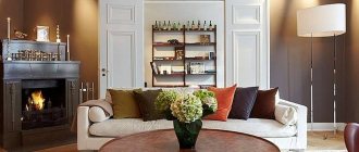
Lavender curtains
Thick curtains in a light or, on the contrary, dark lavender shade go well with a white veil; the room will remain free and will not be overloaded with color. Curtains can be decorated with fringe, unusual tiebacks or holders.
The photo shows a classic living room in light colors. The windows are decorated with lavender curtains.
An interesting effect can be achieved with ordinary lavender tulle curtains; the room will be filled with freshness and soft light.
In bathroom
Dreaming of a black and white bathroom? Don't rush to use monochrome tones everywhere. Lavender splashes will certainly bring a touch of freshness to such a bathroom.
What about a lavender bath? Then the main tone should be diluted with a green, beige or even gray shade. With this combination, tiles with floral patterns are best suited. Marble and violet walls complement each other perfectly. Modern bathrooms are decorated mainly with cool tones. Therefore, according to statistics, lavender is used most often in them.
Accents in the interior
Carpet
A suitable rug will add coziness to the interior of the room. A plain, long-pile fabric will decorate a modern living room, nursery or bedroom. The combination of short pile and floral pattern will look harmonious in more delicate directions.
Paintings and panels
Paintings can match the color of other objects or become a bright detail. The writing style and the image itself should reflect the design idea and mood of the room.
Pillows
A decorative detail quietly completes the image of the room. The print will support the thematic idea, and the material reflects the style in the interior.
Blankets and bedspreads
A cozy lavender blanket will not only decorate the room, but also warm you up on a frosty evening. The blanket protects the surface of the furniture and matches other items, such as drapes.
Accessories
An important part in the design, accessories, like other interior items, support the overall idea and make the image of the room complete.
Choosing lavender color for the bedroom
Lavender flowers have different tones
Violet tones are varied from dark saturated to light, almost white. Before choosing any of them, you should understand their diversity.
The basic ones include:
- Light purple;
- Violet with medium intensity;
- Violet;
- Lavender;
- Lilac.
In a spacious, bright room, a delicate violet tone can be used to decorate window openings
Light lavender and lilac tones are reminiscent of spring flowers and create a cheerful and fresh atmosphere. With their help you can make a small room larger, visually lighter and cleaner.
Violet or lavender colors create a peaceful and romantic mood
Dark tones are cold, rich and aggressive. For the bedroom, they are selected in doses as accents in the form of photo frames, sofa pillows, decorative blankets, and curtains.
Deep cool tones can be combined with rich turquoise to create a cool color scheme
The color, in which the blue tone predominates, is associated with the emotions of passion, rudeness and authority. You can radically change the perception of the room by adding light lilac and lavender tones - the atmosphere will become calm and harmonious.
Lilac color in the bedroom interior
Striped
Lilac striped wallpaper will help correct the shortcomings of the room and brightly decorate the room. If the room has low ceilings and you want to visually stretch it out, then we think that vertical stripes are ideal . When choosing wallpaper, it is important to consider the color of the stripes and their alternation, as these two factors will influence the final result.
Consider the color and alternation of stripes
A horizontal stripe will visually enlarge a narrow room with high ceilings. It is important to abandon such decor in the case of low ceilings, since visually the room will become even lower. A universal option for a large living room and bedroom is a wide stripe.
A diagonal stripe will allow you to clearly highlight one wall in the room. The remaining walls should be decorated in a lilac monochromatic color. We recommend not to forget that a diagonal stripe will help disguise uneven walls.
Choosing stripes for a children's room
Lilac in the interior: how it affects mood
I remember the wisteria on the residential houses and streets of Florence. This lilac plant hugs fences, houses and the whole of Italy!
Pastel shades, neutrals and nudes are the colors that are trending in weddings today. White has not gone away: conservatives and lovers of luxury firmly settle on it. Bold and extraordinary personalities add black, gray or gold. And for those who choose lilac - its soft tones, lightness and freshness are important on day X.
Reason number 7: lilac will help you fall in love and get married!
Usually this is lilac floristry, lilac textiles, the groom’s scarf and the bridesmaids’ outfits - everything is restrained and laconic. By the way, brides who choose lilac flowers for their wedding bouquet and boutonniere are quite modest and wise in life. Wedding arrangements made from mountain lavender flowers look very stylish. The symbol of retro fashion will highlight the creativity of the couple. And a particularly delicate bouquet is obtained with charming lilacs or noble peonies. In the East, they believe that lilac is a symbol of love, and peony is responsible for wealth.
Reason No. 8: this color gives warmth, creates comfort and real coziness.
For me, as an artist, color is something formless, but with enormous energy: yellow, green, lilac - each of the tones affects the mood differently. It depends on the saturation of the shade, how much color there is and what mood the person is in. Lilac evokes something fabulous and promising. And at the wedding (and after) it’s necessary!
Selecting curtains
In our opinion, a universal solution for lilac walls would be white curtains. White curtains and light tulle will help make dark wallpaper less gloomy. The pattern on the curtains will go well with a similar pattern on the wallpaper. A not very good option is white curtains in a light lilac color (to prevent the room from looking dull, it’s important to add decor made in bright colors).
A bold and bright option is a combination of yellow curtains and lavender shades. A sunny color will make the room truly fresh and help cope with boredom. Such a combination would not be very practical for a bedroom interior.
Combination of curtains and wallpaper in the bedroom
In the design of a children's room where a girl lives, in our opinion, it is important to use pink curtains. In this case, it is best to select accessories in cream and white colors.
A creative option, in our opinion, is green curtains with a pattern. This combination will give the room the missing freshness and spring mood. A beautiful option for curtains is alternating horizontal stripes of different shades of green.
You can even choose green curtains
If a bachelor lives in an apartment, then he can pay attention to a practical and discreet combination - gray curtains and a purple background. Gray curtains with a shiny surface are considered a very stylish option.
We advise you to avoid blue, purple, brown, cherry and chocolate curtains. Together with lilac walls, this option will look out of place.
Lilac in the interior: how it affects comfort
One of the “lilac” impressions was winning a competition to implement a project for TV presenter Roza Syabitova. The interior is based on lavender colors combined with mint and white shades.
Lilac can be present in any room (it’s even useful in the bathroom, since the color is tender, romantic and magically mysterious), if it is appropriate in the concept itself.
Reason number 1: you will want to spend as much time as possible in the most delicate bathroom.
Cool shades of lilac (lavender, dark purple, indigo) will be appropriate in rooms where the windows face south or east. If you use them in western or northern rooms, it will be cold and uncomfortable.
Reason #2: Hot indigo will make the room seductive and put you in a playful mood.
Lilac, both muted and active in many of its shades, can fit into both minimalism and modern classics. Everything depends only on the concept and imagination of the designer.
Reason #3: lilac can be used in all interior styles! If you try, of course.
If you paint the floor and ceiling lilac (in different tones), then the area of the room will be perceived as larger than it actually is. A lilac self-leveling floor in a bright room will “press” on the viewer, emphasize the horizontal lines and expand the space.
Reason #4: A bright lilac floor will prevent you from tripping!
And if you paint the floor and back wall of the room lilac, the room will move apart. A feeling of isolation and enclosure will appear when all the walls, floor and ceiling are painted lilac. Although any color works this way.
Gray-lilac will bring a slight sadness to the interior, but a rich one will increase appetite and cure anxiety. But if there is too much color, anxiety will increase.
Reason No. 5: if the walls in your apartment are lilac, then they will say about you “a sensitive, creative, sophisticated person.” Cool!
The Organza interior salon has a huge selection of wallpapers and interior textiles from famous brands.
Lilac is a natural color, so it must be combined with some natural tone: white, green, brown, gray, red, yellow.
Reason #6: Lilac goes well with many colors, even your favorites!
Color is measured by wavelength, the interval between vibrations, and beats. When comparing the frequency of sound and the wavelength of color, it turns out that lilac is the note FA-MI.
Do you want to know how your favorite colors affect your comfort and mood? Read:
Lavender interiors
Beautiful lavender color is suitable for a variety of rooms; it is only important to use it correctly when decorating the interior.
Bedroom
Lavender walls in the bedroom are a good solution in aesthetic and psychological terms. A gentle, light shade will promote restful sleep, improve your mood, and help you relax after a hard day. Even a few minutes of being in such a room will reduce nervous tension and give you a feeling of peace.
In the morning, in daylight, the lavender shade is filled with natural freshness, charges with positive energy, sets you up for work, that is, it acts in the opposite way. This color is usually used in girls' bedrooms, since it traditionally belongs to the “feminine” range. Men do not use lavender in the bedroom; such a decision will look strange. As for the matrimonial bedroom, as a compromise, you can decorate the walls with other pastel colors, and add lavender in the form of decor - linen, curtains, textiles, accessories.
Kitchen
In the kitchen, the presence of lavender tones should be treated carefully. It is usually used in a fashionable design technique called an “accent wall.” You can also use lavender in decorating the dining area or install a dining group of this color in combination with light pieces of furniture.
Living room
For the living room, the color lavender suits well, especially if the room matches the Art Deco and classic styles. Usually matte paints, plain wallpaper of the same shade or individual inclusions and accessories are used. Some designers offer non-standard solutions: for example, furniture facades or lavender-colored ceilings, which will look fresh and stylish when successfully combined with other light tones.
Bathroom
A bathing room is rarely spacious, so you shouldn’t get carried away with using rich, bright colors. Lavender should be gentle, pastel, combined with pink, silver or white, beige. This will eliminate the visual reduction in the size of the room and ensure originality and optimism of the interior. In a large bathroom, it is allowed to combine light lavender with dark purple shades, which can be used for zoning or highlighting individual elements.
Combination of lavender color with different tones
The combination of lavender color with other tones is juicy and attractive. the color itself, like a shade of purple, enhances nearby shades, so the coloring of any pair will be at a high level. The main ones will be color contrasts, although both light and heat are present, but to a much lesser extent. Take a look at the example charts and get inspired to use this color in your art.
The combination of lavender and pink is juicy, feminine, and romantic. The lighter, warmer the pink, the more airy the combination, the brighter tones: magenta, fuchsia, etc. - add dynamics to the composition. The range is composed of royal pink, sakura, lilac, magenta, raspberry.
Lavender color combines with red to form a bright, harmonious pair, due to the presence of a pink undertone in lavender, which is part of red. Pairs with warm reds will be brighter, and pairs with cold ones will be softer. The palette consists of scarlet, scarlet, raspberry coral, carmine, bright burgundy, and wine.
Lavender and orange: color combination. Orange consists of yellow and red, where yellow is a complementary tone to violet, and red is related, so combinations with shades of orange look natural and attractive. For example, a combination with light peach, orange-coral, bright orange, red-orange, red.
How to combine lavender with yellow? Yellow is complementary to purple, so pairing it with it will be the most impressive. But since the color of lavender is not pure, dark purple, the combination with yellow will be softer, and therefore attractive. But even in this case, preference is given not to piercing yellows, but to softer tones with an admixture. The composition includes champagne, sunny, saffron, yellow gold, mustard.
Warm green is combined with lavender according to the principle of natural gamma. Warm green tones can often be seen in combination with lilac flowers. It's a calming combination with a nice warm-cold subtle contrast. Consider pairings with pistachio, chartreuse, swamp, deciduous, dark green.
The combination of cool green and lavender creates a deep, yet rich palette. Cool tones, such as water color, menthol, mint, emerald, malachite, are closer to pure, like the shade of lavender itself, so couples with it look fresh and positive.
The color combination: lavender and blue is based on a slight contrast of warm and cold, where the main tone is warm, gentle, summer. This tandem enhances the lavender aesthetic while keeping the pair modest and natural. A palette of aquamarine, water color, dark turquoise, Prussian blue, and thunder has been compiled for you.
Lavender and purple: a combination in its own color scheme. This gradient gives volume to the composition. This is a play of light and shadow, bright and pale, dark and light. If you want to concentrate on the mystery, transcendence of color, then this is the ideal option. The palette includes blue-violet, glycine, purple, grape, dark purple.
A combination of lavender and brown. In this combination, echoes of an additional pair are heard (brown is half yellow). However, this is the most natural option: soft, light, contrasting, it wonderfully transforms the main shade. Consider combinations with oak, tan, golden chestnut, chocolate, dark chocolate and choose the best ones.
Neutral shades go well with lavender. White, beige, gray, black are successful invisible colors that allow rich colors to bloom and delight us. Each neutral presents lavender in their own way. White – gives an airy look, beige – brings softness, naturalness, gray – detachment, black – chic. For example, consider pairs with creamy, light beige, steel, anthracite, wet asphalt.