Features of gold color
Warm golden walls are associated with movement and activity. Here it is important to correctly combine bright wallpaper with curtains. Also, the color gold is always associated with the luxury and elegance of palace halls. If there is an excess of gold, the interior may lose the atmosphere of sophistication, so you need to combine wallpaper with neutral curtains and upholstery.
Most often, gold walls can be found in classical interiors (Baroque, Rococo), but gold-colored wallpaper is also used to decorate rooms in a modern style.
Combination: gold and pink in the interior
The combination of gold and pink colors in the interior will tell us about the beautifully gentle and brilliant lady who owns this design. Delicate shades of pink are often used for walls and furniture, bright shades such as fuchsia and purple-pink are often used as accessories, with significant support from white or cream colors.
Rose gold also goes well with pink in the interior. They are often accompanied by white and gray shades.
Interiors where rich shades of pink predominate and often have significant gold support indicate high female status.
Combining gold with pink, you can add white, gray, blue and purple tones.
Types of wallpaper and their properties
There are the following types of gold wallpaper for finishing residential premises:
| Paper | Eco-friendly, breathable, and available in a wide selection. They fade quickly, absorb odors, and do not hide uneven walls. There are single-layer and double-layer with embossing and relief. Suitable for living room, bedroom and nursery. |
| Non-woven | They allow air to pass through, have a dense base, can hide wall defects, and are widely represented on the finishing materials market. Suitable for all rooms except kitchen and bathroom. |
| Vinyl | Due to the durable PVC layer, they can imitate stone and wood. Resistant to moisture and sunlight. They come on paper or non-woven base. Poor breathability and some types of foam vinyl may contain chemical additives. Suitable for kitchens, bathrooms and hallways. |
| Liquid | They hide all the unevenness of the walls, do not have harmful impurities, and consist of threads, cellulose, glitter and dry glue. There are smooth and embossed. They are applied like plaster and allow air to pass through. |
| For painting | There are vinyl, non-woven and paper. They are a white canvas with prints, patterns or bas-reliefs. Such wallpaper can be repainted several times without harming the walls. |
| Textile | They have a paper or non-woven base with a top covering of fabric fibers. Among the minuses, it is necessary to note the difficulty of cleaning from dust and the soiling of the material. |
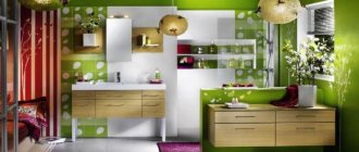
The photo shows an example of a living room design with textile wallpaper that creates a glowing effect from any angle.
Variety of species
Wallpapers are produced in different qualities using a variety of materials.
The most economical option is still paper. But the value of the material is not only in its availability, but also in its environmental friendliness. Paper allows air to pass through, otherwise they are also called breathable. Therefore, they are perfect for living rooms. But there are also disadvantages. Short service life, fade, get dirty easily and cannot be wet cleaned.
Vinyl is a type of washable wallpaper. Consist of two layers, paper-based or non-woven vinyl. This option is characterized by increased decorativeness. The hot stamping method allows you to create very high-quality textures. They look good and expensive in the interior.
Fabric - also come in two types. On a paper basis and non-woven. In the first case, an environmentally friendly option. They breathe well, as the fabric surface and paper base allow air to pass through well. Textile wallpaper also has significant disadvantages. They collect dust, get dirty easily and absorb odors.
Paintable wallpaper is ideal for creating a decorative canvas in your own color scheme. Outwardly they look like a white canvas with an ornament. The main and unique advantage is that such wallpaper can always be repainted in a different color.
Linkrusta is an option that is more like plaster and bas-relief, as it has a three-dimensional pattern
When making renovations in an apartment or house, you should always consider what functional load a particular room bears. For the hallway and kitchen, it is logical to purchase wallpaper that is wear-resistant and washable. Natural-based wallpaper is suitable for living rooms.
Design and texture
The texture of gold wallpaper depends on its type and the degree of expression of the pattern. Plain wallpaper acts as a background for furniture and looks good with textured curtains, molding and edging.
Wallpaper with patterns can visually change the perception of space. For example, vertical stripes lengthen a low room, while horizontal stripes make it wider.
The photo shows a classic-style bedroom, where decorative gold stripes visually lift the ceiling.
Geometric motifs are suitable for art deco and high-tech styles. It is important that the curtains are plain and do not repeat the wallpaper pattern.
Floral patterns are preferable for a bedroom with a light and romantic atmosphere.
The photo shows an example of a golden floral pattern on the wallpaper in the dining room. This wall decoration makes the room luxurious.
Patterns and monograms on gold wallpaper will decorate a living room or bedroom in a classic style. The pattern can be a contrasting color or a similar shade.
A unique accent can be created using 3D wallpaper in the nursery, kitchen or bedroom. It is important that the wall to be pasted is level, there are no shelves or sconces on it. Backdrop wallpaper can be thematic, or simply create a volume effect.
The photo shows an example of how a simple interior can look unique thanks to a 3D image on the wall.
What colors does gold go with?
The use of golden tones requires careful selection of additional shades. By itself, this precious color creates an expressive accent, while others only emphasize it and serve to create a general background. The most winning combinations in the home interior include:
- Pastel palette. This design looks elegant and soft, but at the same time luxurious. White and gold or beige and gold interiors fit well into any room, regardless of style. This option is suitable for use on all walls in the room.
- Warm colors. To create a pleasant sunny atmosphere in the room, it is enough to use yellow wallpaper with gold streaks or patterns. The tandem of these shades looks great in the nursery, bedroom, and also in the kitchen.
- Blue accents. The interior turns out to be spectacular and unusual. Relevant for the classic style and rooms with a large number of old antique pieces of furniture and accessories. Golden-blue wallpaper is associated with a marine theme and brings lightness and freshness to the room.
- Chocolate and brown shades. The combination is suitable for strict and traditional interiors. To prevent the tandem from looking too gloomy and gloomy, it is diluted with light furniture and textiles.
- Green patterns. Gold wallpaper in the interior with a green pattern will please the eye and lift your spirits. It is better to stick them in the room that is the most visited in the house. Often, canvases are used in a classic style, but experiments are acceptable. Thus, a geometric pattern is relevant for modern trends, while the image of floral and plant motifs is relevant for Provence.
- Bright palette. Today, wallpaper with gold in the interior is increasingly combined with red, cherry, pink, purple and other rich colors. The result is expressive interiors. They must be used with caution. In the bedroom, a contrasting tandem does not allow you to set yourself up for a calm, relaxing holiday.
- White and gold wallpaper is an ideal solution for small spaces. This combination visually expands the space, filling it with light.
- Black and gold interior is a bold combination in which sunny tones should play a secondary role. Otherwise, the design becomes overloaded and tasteless.
Often, additional shades are used on wallpaper, as well as in textiles, furniture, and accessories. The main advantage of golden paintings is that they are an excellent combination with light and dark pieces of furniture of any direction.
Which style to choose?
When choosing wallpaper, it is important to maintain unity of style in the design of walls, curtains and furniture.
- The classic style is recognizable by its characteristic print: white monograms and ornaments on a gold background, or gold patterns on a dark background. The size of the patterns depends on the dimensions of the room. Plain wallpaper will be decorated with embossed borders, moldings and decorative items.
The photo shows an interior where gold wallpaper is decorated with moldings. This way you can decorate not only the bedroom.
- Modern style is distinguished by restraint and practicality, so here you can see plain wallpaper with gold accents, geometric patterns and straight lines.
- The loft style is characterized by created negligence, monochromatic walls and decorative items made from scrap materials.
- Art Deco is characterized by luxury, an abundance of gold, glass and geometric patterns. This style is suitable for a spacious living room or kitchen, since there should be a lot of decorative interior items.
Rules for using color when decorating walls
- When decorating large surfaces, it is better to make bright accents, creating a composition using paintings and mirrors in golden frames or panels with moldings imitating metallized elements.
- If golden paint is used to decorate the walls, all other details should be done in neutral colors. Opt for white or gray upholstered furniture, plain curtains and a minimum number of details.
- Warm gold can make a room appear smaller, so it's best to avoid using it in small and cluttered rooms.
- When choosing wallpaper with leaf decor, look for strict geometric patterns and vertical lines. Monograms are appropriate only for pompous Empire and Baroque styles, and ornate hieroglyphs - for oriental movements.
- Avoid a simultaneous combination of glossy and matte textures of gold elements.
An excess of gold can ruin the overall impression of the interior. Therefore, this shade should be used with extreme caution for wall decor: on large areas, metallic reflections can look garish and tasteless.
Tips for choosing curtains
Properly selected curtains, which are combined with wallpaper, furniture and other textiles, create an overall complete picture of the interior.
There are several options for selecting curtains, for example:
- curtains can be matched to the color of the walls, but with a difference of several tones;
- plain curtains of a contrasting color are suitable: white, black, blue, red, or with a gold pattern;
- curtains can match the color of the carpet, upholstery or bedspread;
- the pattern should be either on the wallpaper or on the curtains. You can also match the pattern of the curtains to the pattern on the wallpaper to achieve a unifying effect.
Interior in Arabic style
The impression of luxury and comfort in the Arabic style is created by designers not due to solid gilding from floor to ceiling, but thanks to individual decorative elements correctly integrated into the interior of the bedroom or living room:
- There are complex and ornate gold patterns with a huge number of small details that decorate furniture (inlay, mosaics) or embroider pillows and other woven interior items (drapes, carpets, bedspreads).
- In the Arabic style there is no furniture as such, to which the European eye is accustomed. Chairs in the living room are replaced by large and small pillows, and sofas and armchairs are covered with soft bedspreads, the role of which is sometimes even played by carpets (also embroidered with gold thread on a burgundy or red-brown background). The tables are low and inlaid with colorful elements.
- The bedrooms are distinguished by the fact that the central place is occupied by a massive bed in a special niche. Such niches are usually decorated with openwork details, which gives lightness and airiness to the room as opposed to the bed, which is covered with a thick dark blanket (red-brown or purple) made of expensive fabric.
- Also in the Arabic style there are many elegant decorative elements that give the rooms the desired flavor. For example, wooden or gilded mosaics decorate fragments of niches and individual pieces of furniture, as well as entire columns.
In the bedroom and even in the living room, the lighting is soft and subdued, because its purpose is to create some mystery and intrigue in the spirit of Scheherazade’s fairy tales. This is where gold color in the interior comes to the rescue. Lamps with lampshades or chandeliers in beige and brown tones, imitating gold, covered with patina, are perfect for creating a mysterious oriental atmosphere.
Combination options
The versatility of gold allows it to be combined with other colors. Additional color can be presented in different proportions and forms, for example, it can be a contrasting accent wall, a pattern, or the effect of color transition from floor to ceiling.
Gold goes well with white and beige colors, all shades of brown. This combination is typical for classics.
Red and gold colors look noble in the interior, and burgundy furniture with gold patterns will emphasize the triumph of the room.
The combination of gold with cool colors of turquoise, lilac and greenery is suitable for sunny bedrooms.
The photo shows an example of an interior where wide stripes of lilac and gold visually cool a well-lit room.
A blue living room or bedroom with gold ornaments will emphasize the nobility and tranquility of the home.
Deep shades of blue and purple combined with gold are suitable for a spacious living or dining room.
For gold color, gray acts as a good background in any shade. Suitable for a bright bedroom or kitchen.
You need to be careful when combining gold with yellow, black and silver, since yellow is very similar to gold, silver does not go well with gold, and black, if there is a lack of lighting and space, can create melancholy.
The photo shows an example of a successful color combination, where black is the highlighting touch of the entire interior.
Combination of gold with other colors
Gold color is a warm color that is best combined with other warm shades and tones:
- Chocolate.
- Green.
- Blue.
- Persikov.
- Turquoise.
- Purple.
- Red.
- Pink.
Gold also goes well with black, as well as light, neutral tones and shades such as white, beige, gray, and ivory.
So, in the photo below we see an example of a successful combination of gold color with warm pink and peach colors. Stylish, soft gilt pillows from Caitlin Wilson Textiles look good paired with a pink sofa and peach fabric living room chairs, and in addition to the golden tones of the pillows, the designers used matte gilded picture frames and gilded wall hangings in dark shades of gold.
Cozy living room in warm colors of gold, pink and peach.
And here is another example of a successful combination of gold with another warm color - green. The designers painted an old retro-style desk bright green, and the designers painted the legs and handles of the drawer gold. The table turned out to be very stylish and unusual!
Retro-style table before and after modernization.
A stylish green table with gilded legs and drawer handles is perfect for arranging a small home office for the owner of the house. Green and gold colors go well with light, neutral tones of the walls, floors and ceilings of the room.
Stylish gold-plated desk in your home office.
Stylish and fashionable accessories and decorative items for decorating your home can be quickly and easily made with your own hands!
Thus, the designers of Caitlin Wilson Textiles, using ordinary acorns and gold paint, created unusual and original decorations that can be placed in a vase or simply laid out on the dining table, desktop, cabinets and bedside tables. If desired, you can tie gold threads to the stem of the acorns and hang them on your Christmas tree.
An excellent and unusual design solution that will not leave your guests indifferent!
Acorns with gilding for decorating a house or apartment.
In the next photo, the designers used not only gold paint to paint the acorns, but also red and brown, since warm shades of red and brown go well with golden tones and shades.
Red, brown and gold acorns for interior decoration.
Gold wallpaper with an unusual ornament is perfect for the walls of the living room, dining room, home office, library and other rooms of the house or apartment. Black and gold wallpaper looks very stylish, elegant and original.
Golden-black wallpaper for rooms in a house or apartment.
Combination with furniture, floor and ceiling
Depending on the saturation of the wallpaper, different colors of furniture will be suitable. You need to follow the rule: the darker the walls, the lighter the furniture, and vice versa.
- For gold wallpaper with brown patterns, furniture that matches the pattern is suitable.
- Light furniture will suit dark gold walls.
- The ceiling and floor should be the same color, or it could be a dark laminate and a white ceiling.
- There is no need to make the walls and ceiling the same color in a small room.
"Golden" rules
To correctly use gold color in the interior, you must adhere to some rules:
- try not to clutter the interior with gilded massive objects, especially furniture and tiles;
- textiles with gold embossing and gold threads should be harmoniously combined with all elements of the interior;
- Be sure to stick to one direction in style and have a sense of proportion.
gold color in the living room interior
As you know, gold is a noble metal.
Subject to the above truisms, the use of gold color in the interior will bring the expected results . Otherwise, an oversaturation of gold will destroy nobility and bring disappointment to the owners.
Wallpaper in the interior of rooms
It is important not to overload the room with gold if it is not intended to do so.
- For a spacious living room, a combination of gold wallpaper with red velvet, neutral beige and white will be suitable, which will become the basis. Candlesticks, gold fittings, and carved furniture would be appropriate in a classic interior. Modern design welcomes clear lines, simplicity of furniture and its functionality.
The photo shows an example where golden walls are the background for the furniture and textiles of the living room.
- Vinyl or 3D wallpaper in the dining area are suitable for the kitchen. If the kitchen is small, then you can combine white with gold.
- Pastel colors of blue, green with light gold ornaments or an accent wall made of textile wallpaper are suitable for the bedroom.
The photo shows an example of a bedroom in light colors with blue accents, where the wallpaper is decorated with a gold print.
- The children's bedroom will be decorated with walls with gold stars. It is best to choose paper wallpaper that will not harm the baby.
The photo shows an example of a children's room, where white wallpaper with a gold pattern was used to decorate the wall in the recreation area.
- For the hallway and corridor, plain vinyl wallpaper is suitable, which can be wiped with a damp sponge to remove street dust. The hallway sets the tone and creates the first impression of the owners, so it is important to think through the style so that it is not overloaded with decor.
The gold color is suitable for the interior of any room, provided that there is a balance between the colors. It comes in different shades, so everyone will find their own option.
Combination: gold and blue in the interior
Blue also includes blue shades, so first let’s talk about the combination of gold and blue.
Blue-green tones of water are a good pair with medium-dark and bright yellow gold. Milky shades, light gray, light beige and brown shades must be added to it. This interior is similar in aesthetics to a white and gold room.
The combination of gold and turquoise has a playful and relaxed tone, where gold can be associated with the color of sand and turquoise with a hint of the south sea.
Dark blue elements in a white-gold and gold interior will attract attention and speak of the serious, idealistic mood of the owner. And from an aesthetic point of view, this is a bright, rich, but calm option. It can be complemented with yellow, orange or grey, brown or soft pink tones.
Gold goes well with dark blue without the support of white shades. Of course, it is necessary to have textures and ornaments, which makes the dark blue deeper and the gold lighter and brighter. This gives the contrast extra power. To this combination you can add black, hot pink and golden beige shades.
Golden ratio in the interior
Experienced designers know a pattern: the most impressive thing to the eye is not the setting where objects are arranged strictly symmetrically, but the one where the golden ratio is applied. The golden ratio was actively used by the ancient Greeks in the construction of temples, the creation of mosaics, and was based on the proportions existing in nature (the structure of a shell, the petals of a flower, on the fibers of trees). In interior design, such a section means the absence of even multiple parts; compositional elements should be arranged so that one side is slightly longer than the other (about 1 to 1.6).
The space of any room (kitchen, bedroom or living room), organized in accordance with this principle, creates a feeling of harmony, which allows a person to feel comfortable and cozy.
Thus, the golden ratio allows you not only to correctly arrange the furniture in the room, but also to determine in what ratio it is best to use a particular combination of shades in the design. For example, you can achieve interesting effects if you fill about 60% of the room with gold, then use about 30% of the accompanying color (brown, beige, white are suitable for this), and finally, 10% of the interior is filled with an additional color as accents (purple is suitable here). , blue, blue, red-brown, gray-green).
Of course, these proportions are approximate; in addition, it is important to approach the combination of accompanying and additional colors responsibly so that the effect is harmonious and not repulsive.