Psychology of gray
Gray color helps to increase confidence, pragmatism and increase intelligence in a person. From a psychological point of view, this color is the personification of calm, balance and security.
Negative qualities include the possible occurrence of emotions such as feelings of melancholy, fatigue, decreased creativity and increased depression. Neutral light shades are conducive to relaxation and rest.
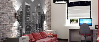
The photo shows the interior of a teenager’s bedroom in the attic, made in gray tones.
Combination of gray with other colors
The uniqueness of gray lies in the fact that it combines very harmoniously with almost all representatives of the color spectrum, helping to create unique interiors:
- Violet shades on a gray background give the room some solemnity.
- Green - calms, putting emotions in order.
- Orange and yellow - save you from depression and improve your mood.
- White - makes the interior elegant and neat.
- Black - emphasizes important details.
- Beige and brown colors against a gray background provide a feeling of tenderness and comfort.
- Pink fills the interior with playful romance.
- Gold ones add luxury.
When using gray in interior design, it is important to consider the light level. The same interior can look bright and elegant with an abundance of light, but seem boring and gloomy with a lack of it.
Shades of gray
Modern design uses a wide variety of shades, for example, pearl gray, metallic, ash, linen, the color of wet asphalt and many other tones, which are an ideal and unobtrusive background for rich accents.
The photo shows a warm gray color in the design of a living room in a Scandinavian style.
Silver tones look especially fresh, stylish and solemn in the room. For those who like a discreet and non-irritating design, light gray colors are perfect. The graphite shade in a matte finish without unnecessary shine has a very impressive look. This combination will be a beneficial addition to chrome parts.
Bath
A good choice for finishing this room. Pearl will go very well with the theme, since it is associated with the sea, and the bathroom is often decorated in a similar theme. Light colors go well with the most popular trinity: blue, blue and white.
However, you can choose a more original design. The combination of gray and red looks luxurious in the bathroom. However, such colors require a lot of space. If the room is small, it is better to choose lighter options, for example, gray-white, gray-mint, etc.
Apartment design in gray
Combination of gray color in the interior
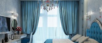
Textile
A smoky palette will add discreet beauty, nobility, elegance and solidity to the interior. Light gray furnishings in combination with steel or anthracite-colored curtains will create a mysterious and ambiguous atmosphere in the room. Tulle, complemented with curtains of slate, mouse, gray or lead colors, will significantly improve the room and give it elegance and fashionability.
A universal decor would be a gray carpet or black rug, which is a classic and win-win option. When harmoniously combined with the surrounding design, they will make it more holistic and thoughtful.
The photo shows a window in the bedroom, decorated with white tulle curtains with slate-colored curtains.
Rooms in gray tones
Subtleties of color decoration of premises.
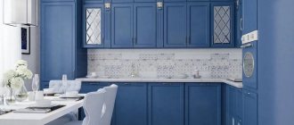
Kitchen
A kitchen space with a predominance of gray tones promotes concentration on the process of cooking. This design is associated with a production area in an upscale restaurant, complete with steel furnishings. A home kitchen equipped with wooden furniture or stone countertops becomes more practical and looks stylish thanks to this color scheme.
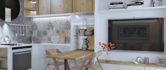
The photo shows gray color in the interior of a kitchen made in neoclassical style.
Living room
In a small living room, an excellent solution would be to decorate it in warm colors, while for a spacious hall, cool shades are suitable. A monochrome palette will add some complexity to the atmosphere. The interior can be complemented with bright accents in the form of curtains, a sofa with pillows, armchairs and more.
The photo shows a small guest room in gray and white colors.
Bedroom
Light gray colors with a matte or light and silky texture are especially appropriate for decorating a bedroom. White or pink accessories will add even more tenderness to the room, and beige or brown elements will fill it with warmth.
Bathroom
This color scheme is a fairly practical option for the bathroom, since dirt and stains are less visible on gray surfaces. When choosing a tint solution, pay attention to the dimensions of the room. In a room with a small area, it is better to use light tiles, paint and other finishes, as well as use glossy and mirror surfaces.
Hallway and corridor
This hallway interior looks noble and elegant. Due to the cladding and decor in pearl grey, aluminum or silver tones, it is possible to expand the corridor space and add light to it.
Children's room
Gray wall decoration in combination with light furniture, a white ceiling plane and rich inclusions will be a worthy solution for a stylish nursery design.
The photo shows a children's room with walls painted gray.
Toilet
The interior of a gray toilet will look much more original with the help of additional contrasting accents, such as colorful mosaics, bright paintings or other decor. You can decorate one wall in the room with graphite and anthracite shades. In this way, it will be possible to achieve the correct distribution of light and shadow in the space, making it more comfortable and organic.
Cabinet
Smoky and steel colors that create a business atmosphere are considered indispensable in the design of a work office. The gray-brown combination will give the room some solemnity.
Balcony
Light or warm gray as the main background will harmoniously complement rich accents in lemon, red or orange colors. This palette is not subject to fading and exposure to ultraviolet radiation, so it is considered an ideal option for a loggia.
Gray floors and walls
Neutral background walls help tie the rest of the colors of the details and door together. Gray on the walls is an excellent solution for a complete change in the interior, it will help give the room lightness. But to decorate walls in residential areas, it is better to dilute it with blue and pink so that the shade is not so faceless. These colors will definitely appeal to those who like Provence, romantic or classic. When choosing a shade, you must take into account the fact that the room will be transformed under the influence of daylight or artificial light.
Gray walls create a romantic atmosphere, enveloping the room in a mysterious haze
Gray wallpaper looks nothing like paint. They may have stripes, patterns or geometric shapes. If the emphasis is on the wall, then you need to choose wallpaper with a light print.
In a room with gray wallpaper, a floor with a pronounced wooden texture would be appropriate.
Using gray laminate in the interior
This flooring is often used in European classics. This flooring can be easily combined with white, gold or metallic colors. Also, this laminate will fit perfectly into the gray and white design of the apartment. But in order to avoid overload, you need to take into account several nuances when choosing a gray laminate:
- Gray on the floor visually makes the room smaller, so it is not suitable for a small room, a one-room apartment.
- Gray laminate in the interior of an apartment will “calm” the room, make it softer, fresher and more spacious if the interior has a lot of massive furniture. He is considered by many to be very beautiful and sophisticated.
- Grayish-beige, gray-violet laminate will create coziness in the room. This color is perfect for relaxation and creativity, creating unique projects. But for a work area this coating will be a bad solution.
Gray laminate flooring in the living room
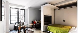
Gray laminate in the bedroom
Gray laminate in the kitchen
Design options
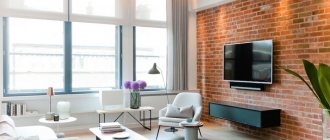
Almost any interior requires the creation of special areas for concentrating attention. Colorful splashes of opposite colors complement the overall picture, making it more balanced. Gray is especially harmonious when combined with wood trim. It favorably emphasizes the natural texture and connects all design elements into a single composition.
The photo shows a gray living room with bright accents, decorated in a loft style.
A truly aristocratic duo creates gray and gold. For this combination, more noble silver or pearl tones that have a barely noticeable shine are better suited.
The photo shows a living room design in gray tones combined with golden-colored decor and curtains.
Decor and lighting
An interior in a similar color scheme requires proper lighting in the form of a main central chandelier, floor lamps, decorative and table lamps, sconces, spots, spotlights and more. It is desirable if the artificial light is more intense and of higher quality; it is better if it has a warm, soft and yellowish glow.
You can add shimmer to your decor using metal elements, steel, bronze or copper accessories. Green plants and flowers will allow you to breathe life into the room and decorate the surrounding space. For an elegant and sophisticated design, use glassware, crystal or mother-of-pearl decor, which will make the decor shine.
The photo shows the lighting design in the interior of the kitchen-living room in gray-white-brown colors.
What colors does it go with?
Primary companion colors with which this color scheme harmonizes.
Gray-white
This interior base provides a blank canvas for other elements. Basic shades combined with each other can be harmoniously complemented by a wide variety of tones. The combination of soft and natural gray with milky or caramel colors will create a light, unobtrusive atmosphere in the room.
The photo shows the design of a spacious gray and white living room.
Combination of beige and gray
A more calm and natural environment will be provided by the gray-beige combination, which is suitable for those who strive for relaxation and home comfort.
The photo shows light gray wallpaper with patterns combined with beige furniture in the living room.
Gray-yellow interior
Yellow is considered the ideal color to break up a monotonous gray interior. Regardless of the mixing proportions, such shades are organically combined with each other and fit perfectly into the design of any room.
The photo shows a bedroom in smoky tones, complemented by bright yellow accents.
Pink and gray
Pink color against a gray background will create a romantic and slightly frivolous atmosphere in the room. Such a coloristic solution is appropriate in designing a woman’s interior or in decorating a children’s room for a girl.
Combination with blue
The classic tandem of blue and gray sets the mood for relaxation and rest and therefore fits especially harmoniously into the bedroom, living room or bathroom.
The photo shows a living room design decorated in gray and blue colors.
Gray-turquoise
Monochrome and muted gray combined with refreshing turquoise has a very interesting look and is perfect for those who love non-standard interior solutions.
Taupe design
This range represents restraint and refined taste. Gray with brown or wenge has a very impressive and stylish look, which gives the room a special presentability.
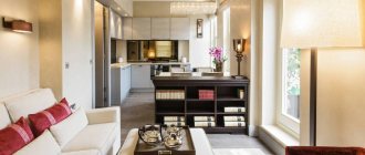
The photo shows a gray-brown color combination in the interior of a modern kitchen-living room.
With orange
Such a self-sufficient combination is rarely complemented with accent colors. The gray will balance and calm the orange and make the surrounding design feel balanced and organic.
Gray-green
The natural color duet evokes natural associations. The most suitable colors for adding freshness to a monochrome interior are light green, mint or olive. A mustard shade will allow you to play up light gray or dark gray colors.
Grey-violet
The neutral smoky shade allows you to relieve the rich purple from being too heavy. Gray makes an excellent backdrop for rich purple or lilac, which gives the decor an interesting and compelling look.
The photo shows a graphite-colored bathroom with purple accents.
Children's
Light gray-beige or gray-blue colors can be used as a background, but in this case it is necessary to dilute it with rich colors. Small children will be bored in a cold steel environment. But teenagers focused on studying, as well as just calm boys and girls, may like this design.
Classic gray is well suited for a study space so that the child is not distracted while doing homework. It is also appropriate in the sleeping area, but in a place for games or a hobby corner it is worth using richer and more cheerful colors.
Modern apartment design in gray
Gray room interior
Sulfur color in combination with other shades in the interior
How does it look in different styles?
Several examples of interior design.
Scandinavian style
Northern European design is mainly decorated in light gray shades, which are diluted with pure white tones and bleached wooden details. Folk decor in the form of woven rugs, knitted textiles or patchwork style elements is chosen as bright inclusions.
The photo shows a Scandinavian-style living room in light gray colors.
Loft
In industrial style, gray tones occupy most of the space. Achromatic shades are found in concrete walls, cheap silicate brickwork, hog tiles, metal pipes and other communications. Thanks to the huge window openings, this environment looks free and spacious.
Minimalism
This direction is almost impossible to imagine without a gray color palette. Minimalism involves the use of warm and light gray tones as cladding, sofa upholstery, furniture elements and more.
The photo shows a minimalist kitchen design in gray shades.
High tech
For high-tech, predominantly mirror or plain textures in gray are appropriate. The technological design solution is emphasized by silver or dark gray colors.
Classic
In a calm and restrained classic interior, gray color is equally suitable for wall decoration, furniture, textiles or fittings. Luxurious furniture, dim lighting and expensive decor will perfectly match granite or gray-blue colors.
How to properly use gray in decoration
In this part of the article, we will take a closer look at the situations when and in what styles it is worth using gray, and with what it is most successfully combined.
Good colors to combine with a gray interior
We think that the principle of “reviving” a gray room is already clear to the reader; all that remains is to note only the most successful colors suitable for this:
Light gray walls in the interior and coral accents are the perfect combination for the style of the 60s
- Red and orange have already been mentioned - these colors are great for creating interiors in retro styles. The room gets some life, plus it becomes comfortable to work in, since this part of the color spectrum excites the human nervous system.
Bright yellow in such quantities looks somewhat provocative, but gray walls and furniture balance this effect
- Yellow was also mentioned earlier, but we repeat ourselves for good reason, since in combination with gray it looks especially good. It inspires joy and optimism, but you need to be careful with this color and not overdo it.
Advice! The main feature of a gray background is that it enhances the saturation of even pastel shades. For this reason, bright pieces of furniture and furnishings should be introduced into the interior in small quantities to avoid color dissonance. An example of such a combination “on the edge” is shown in the photo above.
Gray room with purple accents
- Purple, lavender and pink also look great against a gray background. Such a union gives the room homeliness and warmth. It is better to use gray walls and furniture in light colors, otherwise the space will become crowded, putting pressure on a person.
Dark blue inserts and yellow accents soften the Nordic vibe
- Blue color gives a gray room even more severity, especially if dark colors are used. The photo above shows an interesting technique, where parts of the wall are painted in both colors at once, and the transition between them is made in the form of a gradient. The presence of blue always looks stylish and will really appeal to people with a developed imagination.
Interior in gray tones with the addition of turquoise
- Blue, turquoise or sea color are blue, but since they are lighter and brighter, the effect of their inclusion in the interior is completely different. The room is refreshed and the person becomes very light and comfortable psychologically. This combination is one of the best for use in bedrooms and even children's rooms. In the second case, it is recommended to add a little yellow, green and orange.
The sand-colored carpet looks good against the background of the sofa
- Although the sandy shade is part of the yellow color spectrum, it is usually complicated by dark dotted inclusions that enhance the visual effect of surfaces stylized as this material. It helps add light to the room, creating a light accent that does not strain the eyesight and psyche.
Green in a gray room
- Green inserts look great in a gray interior - and they are as close as possible to natural shades. By combining this with the addition of bright lighting, you can achieve the effect of a “plant kingdom in the ice.” It is worth adding living ornamental plants to pieces of furniture, which will create even more warmth and comfort.
Gray and white interior
- White color should be present in any gray interior, as it is the first regulator of illumination and adequate perception of the surrounding space. According to the classics, the ceiling is made light, but often sections of walls, semi-columns, furniture, doors, floor skirting boards, textiles and household appliances become white in the form of separate accent zones.
Advice! When there are a lot of white surfaces in a room, it is worth adding black ones to them to make the space varied. It is very good to use textured materials in decoration that do not have a monochromatic color - this also applies to walls and furniture.
Interior styles that suit gray
You shouldn’t mindlessly paint walls in gray tones, because you need to understand what the end result will be, and here the result is unpredictable. Even the use of successful color combinations will not create a complete picture in the room if you do not adhere to strict rules for interior design in a particular style. Gray is not the same color for popular styles today, and here are the most successful solutions.
Structural simplicity and convenience of minimalism
- Minimalism is a direction that does not recognize the overload of space with both household items and colors in decoration. For the largest surfaces, light, neutral, muted tones, including gray, are used. Gray color in minimalism should be diluted with other equally inexpressive colors - white or matte steel are perfect for this role. Also, wood products, light tulle on the windows, and a monochrome carpet will fit perfectly here. The direction does not welcome the presence of patterns and ornaments - the walls can be diluted with a simple painting painted in a modern genre.
Neoclassical style
- Classic style - today it is not very popular, but still retains the calm, richness and grandeur of the heritage of the 19th century. Gray color can be used here both in decoration and decorative items. It goes well with white, gold, brown and beige colors. Color is used only in a matte form, so as not to go beyond the style - the only exception is small patterns on the walls.
Abundance of gray in high-tech style
- High-tech: for this style, gray is the main color in the palette. Gloss is welcome here, so plastic parts, plexiglass and equipment appear in this color. In this direction, it is so organic and relaxed that it practically does not need to be diluted with accent inserts.
Light and enthusiastic Provence
- Provence. This style prefers neutral, light, pastel colors, which include light gray. Wood-clad walls and furniture facades are painted in it. In order not to go into the Scandinavian style, it is necessary to dilute the main palette with soft blue, pink, white and beige. It is very important to use curtains and tablecloths made of natural fabric, with embroidered patterns in the form of flowers and birds. Such a room should have a lot of natural light and living plants.