Blue color can completely transform a space, filling it with freshness and lightness. A variety of shades allows you to choose the ideal option for any room, including the kitchen. Blue is calming and reduces appetite, but can also look completely uncomfortable and out of place if used incorrectly. Let's learn how to correctly use color in the interior of a blue kitchen, and get inspired by photos of interesting solutions.
Characteristics and features of blue color
Most people recognize this color as calming and peaceful, but when it comes to its use in the interior, the impressions can be completely different:
- Too many rich and bright blue tones can be annoying. It is important to maintain a balance of light and dark, that is, the thicker and darker the blue, the more light areas and details there should be in the interior. Imagine a small blue-black monochrome kitchen with bulky furniture in the same shades. Gloomy place, isn't it?
- Blue needs a partner. At the same time, the color of the sky can act as a primary, additional, or simply decorative color - it is very universal. The ideal proportions are as follows - 60% primary color, 30% additional and 10% decor.
- Blue needs good lighting. During the day, a powerful stream of sunlight enters the kitchen, so it is better to leave only a thin curtain on the windows or leave it completely “naked”. As soon as it gets dark, numerous lamps take the initiative - chandeliers, sconces, floor lamps, spotlights, and so on.
- Blue actively affects the temperature of the room. If it brings coolness on a hot day, then in winter you can freeze, so it is necessary to add warm colors to the interior.
Blue dulls the feeling of hunger, so a person will eat less. In addition, the taste of the dishes may be distorted, but there is nothing harmful in this - especially if the owners have long wanted to lose weight. For better results, you should also buy blue dishes.
Advantages and disadvantages
Although blue is considered a universal color, it is also complex. It has a lot of positive aspects, but there are also negative ones. Before choosing it for your kitchen, you should familiarize yourself with all its characteristics.
Reasons to say yes to blue include:
- calming effect if applied in the right amount;
- decreased blood pressure;
- beneficial effect on intellectual work;
- creating the effect of rigor and nobility;
- creating a fresh atmosphere;
- visual change of the room - for example, you can narrow it and lengthen it;
- Great for almost any style, but especially for Scandinavian, Mediterranean, Art Deco and Empire.
But there are also negative sides to this solution:
- a decrease in appetite is good only for those who want to lose weight, but children with their growing bodies do not need such an effect;
- must be used with caution on northern windows to prevent the creation of an “icy” room - be sure to add warm beige, yellow or orange shades;
- if there is little natural light, a chamber effect may appear;
- if the kitchen is too spacious, then blue can make it even larger - a feeling of emptiness will appear, and the comfort will disappear.
Some disadvantages cannot be offset by all the advantages, so before starting to renovate and decorate the kitchen, you should think carefully.
Blue kitchen: advantages and disadvantages
Let's start with the positive aspects of using this color in the interior:
- Blue has a calming and calming effect.
- From a physiological point of view, it is known to help lower blood pressure.
- Gives the impression of nobility and severity.
- It can visually lengthen and narrow the room and give freshness to the interior.
- Great for Mediterranean and Scandinavian, Empire and Art Deco styles.
However, along with its advantages, blue, especially when used in the kitchen, can have significant disadvantages, including:
- The main disadvantage of this color is that it helps reduce appetite. Of course, this fact can be looked at from different angles: for those who care about their weight, this property will even be useful.
- Also, do not forget that blue belongs to a cold palette, so in winter it is unlikely that such a kitchen will be warm and cozy.
- For dark rooms with little natural light, this color can be a death sentence: it will weigh down the furniture and make the kitchen cold and uncomfortable.
- A kitchen that is too spacious in this color scheme will seem even larger, which can cause a feeling of emptiness and again deprive it of comfort.
Thus, not all the disadvantages of blue paints are compensated by their advantages, so you need to think carefully before using this color as the main color in the kitchen.
What shades are there?
When choosing a shade for a future kitchen, people usually focus on their own tastes. But it is important to take into account some features of tones, for example, use dark ones only in spacious rooms.
There are really many shades of blue:
- cornflower blue is a cheerful and dynamic shade that is used in textiles or furniture;
- azure - a translucent light tone reminiscent of the sky in sunny weather, used as a base and combined with warm and bright tones;
- indigo - rich and deep tone with a violet undertone, used as an accent color spot;
- cyan - deep blue with a green undertone, sometimes called poisonous blue, found in modern designs and creates a feeling of celebration;
- turquoise is a blue color with two undertones - green and sea wave, requires contrasting combinations, emphasizes good taste;
- forget-me-not - a rich, delicate tone, distinguished by lightness and sophistication, suitable for a kitchen set or background;
- and others.
Conventionally, all shades of blue are divided into dark and light. It is the first group that can make the room gloomy, so it should be used with caution in small rooms. But in a spacious kitchen there is nothing to be afraid of, since dark blue will only add nobility to the interior.
If we talk about light shades, they are much less demanding on the kitchen, its level of illumination or size. But at the same time, they are considered the coldest, so they are not used on “northern” windows.
You must understand that the choice of shade depends not only on your own preferences, but also on the characteristics of the room, as well as on other colors present in the kitchen.
Shades of blue
The blue color is quite diverse, but all its shades can be divided into light and dark. The above-mentioned feature of giving the room gloominess is especially characteristic of dark shades. However, dark blue will add nobility to spacious and well-lit rooms.
As for light shades, they are less demanding on the space and lighting of the kitchen, but it is the light shades that are the coldest. In general, deciding which shades are best to use in the interior completely depends on the other colors that are present in the kitchen.
How much blue can there be in the kitchen?
If you want to add blue tones to the interior, but your enthusiasm has diminished after the listed shortcomings, then you can start with accents that will add the very freshness to the kitchen that is necessary on a hot summer day.
You can choose as an accent:
- dishes;
- apron;
- one wall;
- table top;
- curtains.
If the shortcomings do not seem significant at all, then blue can be used as the main color without any problems. It is advisable to combine it with warm tones. Let's take a closer look at the combination of blue with other colors.
Small kitchen in blue tones
Designers advise not to overuse the color blue when arranging a small kitchen. It should be present in small quantities - for example, in the finishing of the kitchen apron, the lower facades of the set, and several decorative details.
In this case, the shade of blue should be chosen lighter. To create the illusion of space and light in a small kitchen, it is recommended to use a blue tone in tandem with white or light gray.
What to paint blue?
When you hear the phrase “blue kitchen,” the first thing that pops into your head is blue furniture or walls. These are not the only options that can be decorated with this color, although they are the most popular.
Kitchen set
A blue set will definitely attract all the attention in the kitchen, so it is better not to duplicate this tone in the room or choose very small decorative items to match the tone, for example, a vase or dishes. Antique metal handles look best on such furniture, for example, from:
- bronze;
- become;
- copper
Chrome or nickel plated surfaces are also suitable. Not everyone will decide to buy a completely blue set, so there are also analogues on the market - for example, a white or beige top and a blue bottom.
It is important to think about the apron - it should be combined with the blue kitchen. The following tones are perfect for this:
- grey;
- white;
- cream;
- brown;
- yellowish.
It is worth paying attention to the material from which the set is made. The options are completely different.
Materials for blue facades
The kitchen is a room with rapidly changing conditions: temperature and humidity, so you need to choose a high-quality set so that it is not afraid of all these changes, but endures them with dignity. The main thing that is responsible for quality in a headset is the material. Let's consider different options for blue facades:
- MDF is a popular and budget option, which is compressed wood shavings. It is not impeccably durable, but will last 10–20 years;
- array - environmentally friendly, expensive and beautiful. The disadvantages include susceptibility to changes in temperature and humidity, which is very out of place in the kitchen;
- plastic - the set is not completely made of plastic, but is simply covered with it. The base can be made of MDF or chipboard. This option can also be considered a budget option; the bonus is resistance to damage;
- Laminated chipboard is another budget option. Only laminated chipboard is not environmentally friendly, as well as good stability and service life. Modular options are often found. It will be appropriate only in a rented apartment or for rare use in the country.
Headset shape
When choosing a headset, it is important to focus not only on its material or color, but also on its shape, because a suitable option will greatly simplify the life of the owner. There are not many options:
- linear (single-row, straight) - suitable for even the smallest kitchen, the set is installed only along one wall;
- double-row (parallel) - an excellent solution for a wide kitchen, the work areas are located opposite each other. You might want to think about a layout without top drawers. There is one minus - there is often not enough space for a dining area;
- corner is the most versatile option for arranging furniture. It turns out to be a very convenient working triangle; by using the angle, a lot of storage space is created;
- letter P - characterized by a huge and comfortable work area, but most often the dining area is moved to another room. One of the sides of the letter P can be made in the form of a bar counter and act as a partition in the kitchen-living room;
- island - requires a very spacious kitchen. You can also move a work area to the island, for example, an oven, a sink, and also arrange dinner gatherings if the family is not very large.
Matte or glossy
The latest kitchen design trends say that glossy finishes are, of course, better. But such a decision has its negative and positive sides.
They look luxurious and stylish, reflect light and visually enlarge the room. But at the same time, dust, drops of grease, and scratches become much more noticeable than on a matte surface. Dark glossy facades are especially guilty of this, since imperfections on light ones are not so noticeable.
Matte surfaces are not so demanding to care for, and all kinds of dents and dust particles are much less visible, so the fresh look will last longer. But aesthetically they are often inferior to gloss.
We wrote more about which kitchen to choose, matte or glossy, here >>>
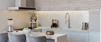
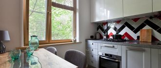
Tabletop and apron
Another design option in blue is the work area. This can be a separate apron or tabletop, or both items at once.
In any case, the work area should be in harmony with the rest of the room’s decoration - walls, ceiling, floor, and kitchen unit. Since the work area does not take up as much space as the set, its blue tone can be duplicated in curtains or a dining area.
Often the countertop and apron are made of the same material. This creates a very harmonious atmosphere, especially with a corner layout.
The classic combination of a white kitchen and a blue countertop. Pay attention to the fittings and small inserts in the apron
Materials for the blue work area
The blue color greatly limits the number of materials suitable for finishing the work area. For example, first of all you will have to abandon natural and artificial stone, as well as untreated solids. But there are still many options to choose from.
| MDF and chipboard | These panels are wood chips, just processed differently. In this regard, these options cannot be called durable. In addition, due to contact with water, they can swell, so such surfaces should be treated very carefully. |
| Ceramics | Ceramics have long since taken root on an apron, and on a countertop it will look very original. This is an excellent material - resistant to moisture and temperature. The only negative is the seams. They will become clogged with grease, dust and dirt, and over time, fungus may even appear. |
| Steel | A very practical material - durable, easy to care for and resistant to high temperatures, water and chemicals. It’s not for nothing that restaurant kitchens use steel for everything. But the kitchen in the apartment is not a service space, and the style of steel is very difficult to fit into the interior. Most often, comfort disappears instantly. |
| Strained glass | Another practical option - it does not absorb dirt and grease, and is not afraid of water and temperature. It is more suitable for an apron (more details in this article), since it is afraid of strong impacts and falls. But there are also glass countertops. |
Notice how beautiful it looks, not the typical white boar, but the blue one. Epoxy grout will keep the seams in their original condition for a long time
Floor
Blue flooring is a rare solution in the kitchen. If it does occur, it is most often about dark tones. Still, for a kitchen floor, practicality comes first, and only then beauty.
For this reason, the leading position in flooring is occupied by ceramic tiles or porcelain stoneware. In addition, they are easy to choose the desired shade. Finding blue laminate or linoleum is much more difficult.
An innovation in flooring – self-leveling polymer floors – is also gaining popularity. They can be chosen in absolutely any shade, since the material is tinted like paint. You can put any image on top - even a photo of your favorite cat.
If we talk about color solutions, there is a universal rule - the floor should be at least a shade darker than the walls.
Walls
If you are a little afraid of painting all the walls blue, you can “practice” on one, making it an accent color. This is a very trendy solution that will always look stylish.
It is better to make the remaining walls light - monochrome or with an unobtrusive blue or light blue pattern. Monochrome blue walls are not suitable for small rooms - it will feel like an aquarium.
You should only choose vinyl or non-woven wallpaper, since paper ones will not be able to withstand the complex kitchen atmosphere. Paintable wallpaper is also popular - an excellent solution that will allow you to quickly update your interior.
If the kitchen is small, then you can take a closer look at photo wallpapers depicting a landscape or space. It is important to choose a photo with a deep perspective - this will make the kitchen seem larger.
How to choose wallpaper?
It would be logical to choose wallpaper based on the intended style of the kitchen:
- a light floral pattern will decorate the interior in Provence and shabby chic style;
- “red brick” wallpaper would be appropriate in a room in a loft or country style;
- Plain painted options are perfect for a classic or, conversely, modern kitchen.
The main thing is to remember the rule: the smaller the kitchen, the lighter the walls.
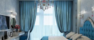
Curtains
Blue curtains will be a real lifesaver in cases where you want to add bright colors to the kitchen, but there is a fear of going overboard, for example, in a white kitchen.
If the window is small or standard, then you should take a closer look at light, flowing fabrics that can let light through. The only exception is the sunny side: it needs dense material that could save the room from the sweltering heat.
As for fabrics, it is better to take a closer look at mixed options, as they are considered the most practical, but linen or organza will also work. As for the types of curtains, you can limit yourself to ordinary curtains, Roman or roller blinds, or blinds.
What kitchen interior elements can be done in blue?
The kitchen set is blue - it can be made of wood, chipboard and MDF with elements of glass and plastic. Sets in such cool tones are more suitable for furnishing kitchens in modern styles (minimalism, hi-tech).
A good option for such a set: glossy facades made of plastic, the presence of aluminum profiles and other metallic-colored fittings, a mirror finish on all surfaces.
Not everyone will decide to buy such furniture for their kitchen, so very often manufacturers offer alternative options in which only the lower part of the facades is decorated in a lower color. The upper part of such a set can be made in white, orange, vanilla and beige shades.
In a classic interior, blue sets can rarely be found. You can use a similar shade when decorating a kitchen in a country style - but it should be muted and dull. In blue you can make countertops, kitchen aprons and match curtains.
Blue wallpaper - designers do not recommend choosing solid blue wallpaper, especially if the kitchen is small or faces north. White or beige wallpaper with a large blue pattern on it will look much better.
It is not necessary to glue such wallpaper on all the walls so that the room does not look tacky. It is enough to decorate one wall with them. The remaining three can be painted white or covered with white wallpaper. An important point: wallpaper must be washable, so it will last much longer and will not lose its original characteristics.
A blue kitchen apron will look good when decorating a kitchen in Provence, shabby chic, minimalism and hi-tech styles. As a finishing material, you can use ordinary tiles, tempered glass, and decorative plaster.
A mosaic consisting of ceramic or glass fragments in several shades of blue will look great. A blue apron will go well with a white, gray or black work surface.
Blue curtains can be chosen if the kitchen is spacious enough and gets a lot of sunlight. Blue fabric can be either natural or synthetic; the choice will depend on the chosen interior style. It is important to remember that in a minimalist and high-tech kitchen, curtains look out of place, so they should be replaced with blue blinds.
The blue floor is a rather non-standard solution, but it has the right to life. Porcelain stoneware, tiles, and wooden flooring can be used as materials for arranging such a floor.
In kitchens with interiors in modern styles, a blue self-leveling floor with a glossy sheen will look very interesting. A blue floor will go well with blue upper facades, a blue apron and blue decorative elements.
Style decision
The variety of blue tones allows you to fit this color into almost any interior style. But at the same time, each design direction has its own characteristics that must be taken into account: some styles are ready to accept blue entirely, while others - only as decoration.
Scandinavian style
Scandinavian-style kitchens always strive for white. It is considered the main one and dominates the decoration of walls, ceilings and floors. Furniture supports this trend and chooses white or light gray tones, but you can also decorate the set in blue.
Natural tones are best suited for this. For example, a calm color scheme of cold tones, reminiscent of an ocean wave or dull glaze. It is worth choosing accessories to match, for example, dishes, a picture, or at least a photo frame.
Provence
In the style of a cozy French village, blue can act as the main color, or just as part of the decor, for example, in the form of a pattern on cute curtains and tablecloths. If you decide to decorate your kitchen in blue tones, then most likely it will be a set, a brick apron, window frames with a window sill and doors.
The chosen tones are muted and taken from observation of nature: for example, sky blue or the color of newly blooming cornflowers.
Minimalism
This design direction prefers to avoid unnecessary things. This applies not only to decor or furniture, but also to the color scheme - only 1-2 tones are used.
A blue set with glossy surfaces and strict geometric shapes will fit into such an interior. But the color range is wide - from aquamarine to indigo and eggplant.
High tech
This style really likes to use space as technologically as possible, so this is where you can find the latest technologies, built-in appliances that combine a large number of different functions.
Bright colors are used as rationally as possible and at the same time limited. In blue you can do:
- headset;
- one wall;
- ceiling;
- niche.
But this is rather an exception to the rule, since high-tech does not really like bright spots in the interior.
Classic
The classic style of the interior is important for the most natural materials and colors, so if the set is blue, then the most dim tones are chosen, for example:
- Navy blue;
- gray-blue;
- baby blue;
- indigo blue and so on.
It is important to repeat the chosen shade in the interior, for example, in decor. These could be towels, curtains or dishes. Moreover, these items are not chosen to be monochromatic: blue should be present on them only as decoration.
A similar lighting system can be easily installed in suspended or plasterboard ceilings
Loft
A typical loft-style kitchen looks like this: a large area with high concrete walls and huge windows, protruding pipes and an exposed air duct. Blue in such an interior can only be used as an accent if it is important to attract the attention of those entering.
For example it could be:
- gray-blue wall or section of floor;
- dark blue buffet or cabinet.
It is also important to ensure that the color matches the brick and metal, so blue paint with a metallic effect will look impressive. It can be used to cover decorative elements - chair legs, lamps or the same pipes.
A bright blue retro refrigerator will also look creative. Stylistically, it can be supported by old posters on the walls and an antique sofa with a sleeping place - a very interesting solution.
Modern style
The set is made in blue, its shape is strict and straight. The appliances selected are built-in and modern; their shiny surface reflects light, making the space more spacious.
You can complement the interior with other colors, but you should avoid excesses in colors and decor. In a kitchen in contemporary style, only the most necessary items are left, among which there should be order. Blue is chosen in tone closer to gray or cyan.
Country
The main task of a country style kitchen is to create a warm and cozy atmosphere. Blue goes well with wooden surfaces, so it is better to use them equally.
Choosing a blue kitchen style
Classic - here blue can be present in curtains and tablecloths, but it is better to choose a set made of wood. Decorative elements and a chandelier can be blue in such a kitchen.
High-tech - decorating a kitchen space in a blue shade will look bright and stylish. All tones are suitable for hi-tech design. To make the interior look harmonious, it is important to have glossy surfaces with chrome elements. Additional shades can be gray, black and white.
Loft - in this interior direction, blue is used as an additional color. Blue looks great against the background of brick or gray plastered walls. In a stylish loft kitchen, blue furniture and a dining group would be appropriate.
In addition, you can decorate a blue kitchen in the following styles: Provence, Mediterranean, Art Deco, ethnic and Scandinavian.
If the kitchen is small, designers do not recommend overusing blue colors. It is acceptable in individual elements - the lower façade of the set, the work apron, the decor. At the same time, the blue color scheme is chosen to be light, so that the room appears larger and wider.
Lighting
A blue kitchen is extremely sensitive in matters of light, since there is a need to dilute the cold atmosphere.
Modern design involves a multi-level lighting system, that is, the main source of light is a chandelier in the center of the kitchen, and then spotlights provide illumination in the necessary areas, for example, at the apron and dining table. If the kitchen is small, then you should abandon complex designs in favor of laconic and simple lamps.
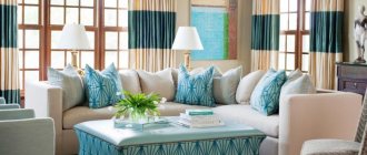
Kitchen in blue tones: combination options
When it comes to a blue kitchen, many people imagine that absolutely everything will be done in this color. In fact, there is always room for experimentation. Therefore, more and more often, designers recommend combining several shades in one interior. Thanks to this, the kitchen will not be too bright, and spending time in it will definitely be pleasant for all family members.
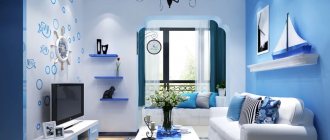
White and blue kitchen
The combination of white and blue colors in the interior will always be relevant. It is quite soft, not intrusive and generally looks good in almost any style. In addition, this option is ideal for small experiments. After all, if you wish, you can always add bright, contrasting details that will instantly transform the room.
Blue kitchen
As you know, blue and light blue come from the same range. Therefore, they always go well with each other. However, visual perception largely depends on shades. Too saturated or dark colors will make the room feel cold. Otherwise, you can get a slight freshness effect.
Beige and blue kitchen
No less successful and attractive is the design of the kitchen in beige and blue tones. These shades are natural, so they always have a beneficial effect on a person. However, designers recommend not stopping there and complementing the kitchen interior with bright accents. These can be beautiful bouquets in unusual vases, a lush plant in a pot or decorative details. This design will look much more attractive and stylish.
Yellow and blue kitchen
Recently, yellow has become incredibly popular. It is used literally everywhere, from the design of clothing, accessories and ending with the interior. This is not surprising, since the color is quite bright, sunny and always improves mood and morale. As for kitchen design, you can increasingly see it in yellow and blue tones. This is an ideal solution that allows you to achieve a harmonious combination of freshness and warmth. Therefore, if you want a stylish, light kitchen design, then feel free to choose this option.
Brown and blue kitchen
Brown color is increasingly used for kitchen furniture. In this case, the rest of the room can be done in blue. This combination allows you to make the kitchen visually very beautiful, but at the same time unusual.
Small kitchen
In typical houses, the size of the kitchen can hardly be called impressive. Unless we are talking about an impressively small area, for example, in a Khrushchev building.
Most often, this is also combined with a low ceiling, which makes the situation difficult. After all, even ordinary blue furniture will attract too much attention and look bulky. If you add a dark blue floor to this, the room will seem much smaller and more like a closet.
Therefore, the main rule for small kitchens is as follows: use only light colors of the palette. If you want brightness or deep dark shades, then they can be included only as decor. And don’t forget about the need for lighting.
Multifaceted blue: characteristics of shades
Cold blue is insidious with its variety of tones and halftones. They are completely different from each other and have different effects on the surrounding space, but with each of them the kitchen is transformed and changes its “mood”.
Charming indigo is a calm and cool color. It looks royally restrained, stylish and modern. Suitable for any kitchen style and matches almost all materials and textures.
Mysterious cobalt is a self-sufficient and noble color that plays differently depending on the shades and textures surrounding it. Versatile and energetic, it will be appropriate both as the main tone and as bright accents.
Universal turquoise creates an unobtrusive and comfortable family atmosphere. Like a sea breeze, it refreshes the kitchen interior, even if the scorching sun is shining through the window. Can change under the influence of artificial lighting: look luxurious in cold weather and dull in warm weather.
The aqua color requires careful handling and moderation. Looks good on small surfaces in combination with warm shades. The kitchen turns out to be light, airy and summery, but at the same time cool.
Azure gives rise to associations with the sea and sky on a clear day. In the kitchen interior it looks good in combination with warm shades (ochre, yellow), adding energy and dynamics. To give volume to the space, the azure is complemented with details made of wood or metal.
Inspiring blue gives a feeling of peace and quiet, allowing you to relax and collect your thoughts. Visually expands the space, and in combination with wooden or wicker furniture in natural shades gives a feeling of warmth and comfort.
Metallic blue is catchy and bright, in harmony with the high-tech style. In combination with glass and chrome elements, it shimmers, creating the effect of shimmering frosty frost. Due to the aggressiveness and depth of the color, it looks only in well-lit kitchens with southern or western windows.
How to combine blue in a kitchen interior?
As a result, we will collect the basic rules and recommendations that will allow you to create a harmonious blue kitchen:
- use it as an accent, for example, for a headset, apron or curtains - not everywhere at once;
- choose an additional neutral tone - white, beige or gray;
- use metal surfaces in decoration - gold, bronze or copper;
- To avoid a “cold” interior, add wooden surfaces.
BLUE KITCHEN DESIGN. Blue kitchen. Best Ideas. Kitchen in BLUE COLORS
What kind of apron to make in a blue kitchen?
If you have installed blue furniture in the kitchen, then a win-win option would be to install a white apron in the kitchen. With this solution, the facades are already self-sufficient and a white apron will only make them more delicate.
It is better to choose a tabletop made of metal or go with white stone. If your backsplash is gray, then the countertop can be either white or gold.
Designers do not recommend installing a dark apron. It will just make your kitchen heavier.
Don't be afraid to put your kitchen in gray or blue. Explore items that you could use to complement your kitchen. Here every small detail will add its own sophistication. A blue kitchen cannot be complete without a fruit plate.
It will always add richness and color to your interior. A blue kitchen is modern, practical, and with the right approach you will create a real picture full of warmth and home comfort.