Psychology of blue color in the interior
In psychology, a craving for the color blue means reliability, organization, and unhurried decision making. Blue accents in living and working spaces are very helpful if a person is subject to mood swings, is tired of the pace of metropolitan life, and cannot concentrate on what is important.
By the way, psychological relaxation practices are often carried out in blue rooms.
The effect of blue furnishings is explained in more detail by chromotherapy (literally translated “color treatment”), and the discoveries of this science are partially used in the art of design.
How blue color changes the atmosphere of a room and its meaning in the interior
It has been scientifically proven that blue color relieves nervous tension, fatigue, normalizes blood pressure and relieves insomnia.
Therefore, sapphire and other blue shades can be used when decorating an office (where they help you focus on plans and affairs), and especially in the bedroom or lounge area.
In living rooms, where a person is most often, the blue color gives a feeling of calm and prompts pleasant, healthy thoughts.
But besides this, expressive blue accents in the room often hint at wealth, nobility, and subtle taste.
After all, pure blue is also the color of velvet and other expensive materials, sea souvenirs, and oriental ceramics.
The deeper the shade, the more expressively all these positive qualities appear.
In addition, even a dark blue tone (if used sparingly) amazingly makes a space feel deeper and freer.
However, due to the abundance of blue, despondency can appear, and sometimes the feeling of anxiety and alienation deepens.
A more positive feeling is given by diluted blue, close to blue, smoky or lavender. Such colors inspire, awaken imagination and wild dreams.
Therefore, let's move on to how to choose the right blue shade for any living area and use its energy.
Bedroom design in blue tones: pros and cons
World culture previously associated this tone with the supreme deity, which is why the palace where the clergy were located was often painted blue. Color has a special effect on a person, making it an ideal option for a bedroom.
Being in such a room, you can serenely relax your body and soul, because such a tone has a calming effect.
The gamma is used in decor, furniture, and finishing elements. The advantages of this approach are:
- wide variety of tones;
- promotes relaxation and spiritual stabilization, improvement of psychological state;
- combines perfectly with other palettes. This will allow each person to create an exclusive design for their home.
The blue bedroom looks especially impressive - the embodiment of one of the most creative design ideas.
Some people believe that a bedroom in blue and light blue tones exudes coldness. Experts recommend abandoning this shade when the room’s windows face north. If the sun's rays do not reach the seating area, the colors help create a gloomy and prickly interior. Household members will dream of leaving the room, psychologically “warming up” somewhere warm.
Interest in the color blue arose in ancient times. Even then, the noble shade was given special significance, associating it with the manifestation of divine powers.
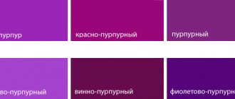
Shades of blue: dark blue, blue-green, light blue, gray-blue
Pure dark blue color is deep, aristocratic, very grown-up. It can make the environment richer and at the same time more comfortable. There are examples of this in both classical European and ethnic oriental interiors.
However, the power of a rich blue tone comes through when it is used sparingly - in furniture, textiles, and when it stands out against the background of the main color scheme.
In the American classic style, for example, such a color scheme is welcomed: a delicate beige-brown background and expressive blue details.
In Arab and Moroccan homes, blue is also called royal blue, but is used sparingly, as if cooling the hot oriental palette of colors.
Light blue shades, close to blue, look less status, but these are the colors that are used to decorate rooms in health resorts and recreation areas. They are very pleasant for the eyes and the body as a whole: they erase anxious thoughts and restore a relaxing feeling of carefreeness, even relieve insomnia.
Soft bluish tones are characteristic of French classics and French romanticism. What is characteristic is that these styles have smooth color transitions and no sharp contrasts.
Thus, the blue color appears at its best in combination with similar tones - with gray (typical French!), white, pistachio or dark blue.
Gray-blue and blue-lilac colors have a similar pleasant effect.
Any shades of the spectrum between blue and blue-red (violet) are warmer and more comfortable than pure blue. They allow the eyes to rest, relax, and are best suited for kitchens. And they serve as a marker of the most “homey” interior style - Provence.
And finally, a very interesting natural tone is formed when mixing blue with green - the color teal. This is the color of seascapes, basic in beach and tropical interior styles.
At the same time, it makes the interior more youthful and interesting if it is accentuated in a spacious living room, library, or lounge area.
Let's talk in more detail about how blue accessories change the atmosphere and what colors they can be combined with.
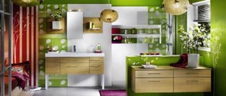
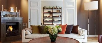
Blue shades in the living room
The color blue was used to decorate the living room in the Art Deco and Empire eras. Is it possible today to create an interior that would combine the requirements of modernity, sophistication, and unusualness of the above-mentioned styles?
In order not to make drastic changes to the atmosphere and at the same time refresh it, it will be enough to add an accent - some large blue object. For example, a sofa. It can be complemented with pillows and other blue accessories that can highlight the sophistication of old things in a classic style.
To create a country-style living room, you should use a combination of a delicate cornflower blue tone with a straw yellow color.
living room in a classic style in blue
For a harmonious combination of tones, you need to use combinations of shades of the same range. For example, if your walls are painted indigo, then in order to achieve color harmony, select accessories in green or aquamarine. Walls painted in a light blue tone can be combined with rich blue objects in the living room.
In the high-tech style, cold tones are used: blue walls in the interior can be combined with glass, metal and light furniture.
A warm shade of blue looks great with light wood, sand tones or white. This combination, which takes you to the seashore, is often used by designers to decorate a living room in a marine style.
combination of blue and green colors in the living room interior
Combination of blue color in the interior
Rule 1 . A rich dark blue, “royal” color almost always looks easy and advantageous not as a base color, but when it dilutes a light color palette.
Example 1. If this tone is present on an accent wall in a small, bright bedroom, it relaxes and maintains a feeling of spaciousness and freedom. Note: in this case there should be enough diffused light in the room.
In a large and dimly lit living room, an abundance of the same shade will look gloomy.
Example 2. At the same time, in a bright guest or dining area, bright blue accessories - a sofa, paintings - can look quite interesting. They will make the atmosphere fresher, more youthful.
There is one exception. Deep blue is used in large blocks, along with gold or silver, in an expensive Art Deco style. In this case, it deprives the interior of lightness, but in return focuses attention on the high cost of finishing, status and taste of the owner. And this finishing option is suitable for a studio office or hallway.
Rule 2 . Muted blue tones, on the contrary, are very successfully used in the basic color scheme of living rooms.
Example 1. In the Provence style, for example, gray-blue furniture is welcome.
Example 2. Marine style presents ready-made examples of how to successfully combine bright blue accents and a turquoise or gray-blue background palette.
Blue color next to other colors: a lot of interesting effects
Pure blue is quite a strong color and if there is a lot of it in a room it does a phenomenal job of creating a cool environment. However, when combined correctly with other colors, it only slightly refreshes the interior.
2 serious mistakes in using blue
Saturated blue almost never (with the exception of one case) cannot be harmoniously combined with pure red. Both colors will enhance each other and tire your eyesight.
A combination of deep blue with dark brown or black will also look gloomy.
And now about the pleasant things.
The blue color looks nice and beautiful in such combinations
- next to light neutral colors - white, gray, beige
- with diluted red and yellowish shades - fuchsia, pink, coral, orange, sand
- with similar shades - blue, light purple.
The combination of basic blue and white colors is most successfully played out in the Gzhel style. This is a style that harmoniously transferred into interiors from the Russian art of ceramic painting.
But many peoples outside of Russia have their own “Gzhel” - in China, the Mediterranean! Therefore, blue and white prints and color blocks can be used in marine, colonial, and oriental styles. Such notes bring lightness to the interior.
Muted blue tones, in particular the most marine, blue-green, ideally and softly combine with sandy yellow, beige, and light woody colors.
Such basic combinations are used in beach, tropical, eco-style, that is, precisely in those situations when you need to create a pleasant environment for relaxation and recuperation.
And the combination of blue with blue, gray-blue, and violet further relaxes and harmonizes the mental state. And in the lounge areas you can use different gradients of blue, sometimes with the addition of other “beach” and tropical shades.
Next to shades of gold or silver, a deep blue tone reveals its chic. Rare and elite blue materials and painting elements become more noticeable. And in traditional high-status interior styles - classic, art deco, oriental palace - this effect is often used.
Thoughtful combinations of blue with pink or coral colors can be used in simpler and more modern youth rooms. On a pink background, blue looks dynamic and fresh. And for connoisseurs of pop art or the eternally young disco style, this is an interesting find.
There is one exceptional case that we mentioned - oriental style. Only in bright and spacious oriental interiors can blue color be used in tandem with red, rich orange and even black, organically complementing the fabulous patterned picture of a rich house.
As you can see, additional colors can make the same blue tone more calm, relaxing or, conversely, strong and status-bearing.
Let us tell you in more detail which companion flowers you can use it with in different residential areas.
Combination with other colors
- White. Classic style combination. In this case, any blue color can be used in the interior. An atmosphere of lightness, freshness and coolness is created. Blue combines with white, creating an almost physically perceptible coldness. Brighten up your interior with brightly colored accessories. Dotted inclusions of coffee, chocolate, muted scarlet and marengo will add extravagance.
- Black. Bad decision for an apartment. Light and bright shades do not look good with black, and dark ones create an atmosphere that puts pressure on the psyche. Lighting can help correct the situation slightly. Use bulbs that produce warm yellow light rather than cool blue light.
- Yellow. A few years ago, blue and yellow design in an eclectic style, where the main thing was comfort, was fashionable. It has a right to exist, but remember that you need to combine either warm or cold yellow and blue colors. Even pale yellow will create significant contrast. Light yellow and cornflower blue – rustic interior.
- Orange. The best combination possible. Harmonious interior in tropical style. The combination of neon orange and bright blue is hard on the eyes. Choose muted tones - peach, pumpkin, salmon, amber. Blue must certainly be bright, otherwise it will look faded and inexpressive against the background of orange. Bright blue would also work.
Related article: Shades of white in interior design
- Red. The combination of colors excites the nervous system. There can be no talk of peace in such an environment. Red can give blue extra depth if one is dominant and the other is used in a targeted manner.
- Pink. Brings back memories of the pop art era. Yes, but only if the tones used are close in brightness. Both blue and pink should be warm or cool. Light colors are used mainly to decorate the rooms of children of different sexes.
- Brown. The perfect combination. Any tree of deep, rich tones in the interior of apartments looks noble and elegant. This also applies to all natural shades of brown - cocoa, leather, cinnamon and so on.
- Beige. Cold color under the influence of beige tones becomes warmer and softer. The atmosphere is very cozy and psychologically comfortable.
- Green . Combining blue and green is not an easy task, although this combination is found everywhere in nature. Being nearby, these tones merge into one unintelligible spot. It's not clear where blue ends and green begins. They need to be separated in space or at least have a clear boundary. Blue should be as bright as possible, and green should be light (or vice versa). Without bright accessories in warm colors, the interior of the apartment will turn out cold. You can simply take as a basis a blue-green color that changes depending on the lighting.
- Grey . Any tones give a strict and elegant combination. It is desirable that the blue be closer to the violet part of the spectrum. The darker it is, the lighter the gray should be (and vice versa). Matte gray is most often used, but pearl gray also looks very noble (if you add blue or purple). Dark gray will perfectly complement transparent blue.
- Gold and silver. An invariably stylish combination, but it is important not to overdo it. They are used for sophisticated accents and dramatic touches, highlighting the depth of dark blue.
- Several shades of blue. A dark tone and several light shades (blue, aquamarine) makes an interesting combination. With this apartment design, choose the lightest for the walls, the darkest for the furniture. Accessories – in intermediate tones.
How to use blue color in the kitchen interior
For the kitchen, history itself has created the most harmonious design option - Gzhel. With just two colors, this style makes a large kitchen space feel free, cohesive, and incredibly homey all at the same time.
Due to the fact that the blue color is present in patterns and small details, it enhances the effect of white - it expands the space and makes the interior light.
True, such a style requires careful selection of furniture, household appliances and even plates and small accessories. Therefore, it is more practical to use blue in large blocks. But not pure blue - it suppresses appetite and makes the atmosphere formal.
You can interestingly combine the color scheme of the Provence style (gray-blue furniture and white, beige or white-pink background decoration), and dishes with Gzhel elements.
Choosing a style for a blue bedroom
A blue and white bedroom or another combination of tones is not only a current classic and loft. Modern style can be different. For example, the following options go perfectly with all spectrums of this color.
The blue bedroom is a room in which you can truly relax and unwind.
Luxurious classic
Dark color or in combination with gold is the embodiment of classics. You can complement the interior with antique furniture, paintings with wooden frames and other identical elements.
A dark blue or blue-gold bedroom will be the ideal embodiment of a classic style.
Fashionable high-tech: universal blue
This range never goes out of style. Therefore, blue shades will perfectly complement the fashionable high-tech style. More technology, straight lines, correctly selected materials in addition to this color - this creates a wonderful highlight.
To make your blue bedroom look organic, try to combine different shades in it.
Art Nouveau style
The Art Nouveau concept is characterized by clear forms, the use of metal, glass, and wood. All these components will be perfectly complemented by deep blue. For example, furniture, blue glass decorative elements.
Clear shapes, metal, glass and light wood are what you need to create the perfect modern room.
Minimalism and blue color
Today, conciseness is a popular trend in many areas of life. The combination of white and blue will perfectly emphasize this design concept, filling it with comfort and solemnity.
It is very easy to decorate such a room - use light furniture, simple shapes and appropriate accessories.
Blue color in the bedroom interior
In a bedroom or lounge area, it is desirable to create a soft and relaxing French environment, with a grey, blue or milky white base tone and varying gradients of blue in the accents.
In a bedroom for a child or ageless adults, you can use the same colors, neutral and pleasing to the eye, but only in the form of interesting marine prints.
In a country bedroom - with large windows and natural finishes - “beach” colors and combinations look perfect. For example, a blue-green background color and sandy or woody shades that set it off.
The combination of dark blue in clothes
The combination of dark blue in clothes is diverse. A strict shade in itself, it “weights down” soft, bright, delicate tones, taking them out of the zone of fun and romance into the territory of strict style, feminine sophistication, and elegance. It is for this reason that it was included in the basic palette.
Dark blue combines with white for a bright, feminine, contrasting pair. It is often complemented with gold and black.
Gray enhances firmness and develops everyday life. For contrast, it looks better with white and black, and silver accessories are better with it.
Black weighs down dark blue. Dilute this combination with brown or beige.
The brown tone brings our shade down to earth, but does not deprive it of its nobility, but, on the contrary, enhances it. Often such pairs are diluted with beige; you can add black or red to them.
Beige softens the main tone. Some options can even be called romantic, but basically the effect is to enhance femininity.
Bright shades of yellow help dark blues reach the point of drama, although if the colors are soft, the feeling of the combination is reversed. White and gold often accompany such colors.
Orange, as an additional shade, makes the combination the most catchy. To reduce excessive influence, the combination is significantly diluted with white, and orange is used either in accessories, or its shade is borderline with other colors, such as peach.
Pink is influenced by dark blue, as controlled sensuality, restrained tenderness. This very contrasting, emotional combination is complemented by white and gold.
Shades of purple continue dark blue, its cold restraint and royalty. The combinations are very harmonious, but without the support of other tones they look boring. It can be blue, dark gold, gold, gray, brown, black, red.
Red breaks the usual boundaries of blue, filling it with strength and energy. The composition is often complemented with brown and gold.
Dark blue goes well with all green shades, creating an aura of calm and serenity. The combination also needs to be broken up, for example, with brown, gray, other shades of blue or green, or gold.
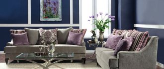
Blue color in the living room interior
A similar design would be suitable for a spacious lounge area of a city apartment.
And in a spacious living room you can use bolder color ensembles with blue. For inspiration, here are two radically different examples.
The first option is to create a fresh and informal atmosphere. To do this, you can use single blue pieces of furniture and bright posters and accessories. Gray, white or beige colors will allow you to harmoniously combine everything into a cohesive picture in the pop art style.
The second option is the opposite example of how to use blue to emphasize status and subtle taste. In this case, a classic color scheme is used - deep blue is used in decoration and textiles and combined with golden, silver or beige shades.
And finally, to zone a spacious living room-studio and separate an intimate relaxation area, you can use blue and a color block that contrasts with it (white, pink, sand).
Any shade of blue can have a relaxing and therapeutic effect when applied correctly in a living space. But in total there are about 180 (!) of these tones.
Review different designs and combinations to see which blue is right for you.
How to correctly use blue tones in design
“If there is too much blue in the interior, it should be complemented with light colors”
What do you need to remember when decorating an interior in blue shades so that it does not depress or make you feel depressed?
- An abundance of blue tone is suitable for a large and spacious room, the windows of which face the south and are well lit. For small rooms, it is better to use only blue elements in the form of accessories and decorative accents.
- If there is too much blue in the interior, it must be supplemented with light colors. You need to think about the lighting of the room. Often with its help you can make a blue room unique and magnificent.
blue color in the bathroom interior
- In the art of design, there are styles where blue is completely indispensable. These styles include Empire, high-tech, modern, art deco, Scandinavian and Mediterranean styles. If you intend to create an interior in blue tones, be sure to study the basic principles of interior design in the specified styles.
- Although the blue color has sophistication and style, you should not use it in its pure form to decorate those rooms in which you spend a long time, for example, the bathroom, kitchen and bedroom. If you want to make a blue living room, be sure to dilute it with warm and light tones.
Blue color in the interior - photo examples
Bed
It is considered the main piece of furniture in any bedroom. Using a blue palette in the bedroom interior, the blue tone takes center stage. It is most often used in the color palette of the entire interior. As an accent, it is advisable to use dark blue color to decorate the bed frame.
In furniture stores you can choose any model of headboard you like, as well as footrests in blue. With the help of these shades, the bed frame will acquire a chic shine and will be able to attract the attention of any person.
Bedroom wall coverings
You can decorate the walls beautifully using blue wallpaper in the bedroom. Often, only a separate area of the wall is used with this material, for example, the area above the bed. Depending on the chosen room design, the wallpaper can be a plain texture or have a pattern.