Combination principles in general
When discussing colors, it makes sense to turn to the language of analogies. So, when analyzing shades, we can say that the entire palette is a house in which the colors are the residents, and their shades are the characters. Here, as in life. One is warm, the other is indifferent (neutral), and the third is cold.
All colors are divided into warm, cold and neutral.
How well they get along (combine) with each other will determine the success of choosing a particular palette. There are several methods to achieve the right combination. The most popular are two of them:
Apportionment
If we take a certain color scheme (for example, the design of a room), then the entire design is taken as one. Next, the main color should appear in six-tenths of the style, three-tenths of the other will be responsible for contrast and attracting attention, and one-tenth of the third will be allocated to accent and shades.
Colors in the interior should be distributed according to proportions.
Game of contrasts
This approach is based on the universal dualism of things: wet - dry, warm - cold, dark - light. Every color has its opposite. Using this you can select very interesting palettes. However, you should be careful! For example, dark warm shades do not “get along” with light, but cold tones.
By playing with contrasts, you can create a harmonious environment in your home.
The magic of color or the gradient effect in the interior
Gradient in the interior is a modern solution used to decorate various living spaces. It is based on a smooth transition from dark to light tone. This method can be used when decorating various interior details.
The gradient effect helps bring freshness and excitement to the room. Typically, designers use various shades of blue, as it gives a beautiful combination of colors in the interior.
Gradient effect
Experts recommend making the transition in such a way that the darker tone is near the floor and the lighter tone is near the ceiling, this will visually enlarge the room.
Impact on humans
The connection between color and the emotional state of a person was known in ancient times, however, only in the middle of the last century a series of scientific experiments began to be conducted to study this issue. It turned out that color influences changes the tone of the autonomic nervous system, in particular its sympathetic and parasympathetic divisions.
However, certain reactions to color have long been used in design and advertising. For example, red is often appropriate where you want to attract attention or make an accent. Yellow or orange are considered “antidepressants”, raising vital energy and imparting optimism, while green is considered to calm the psyche.
Yellow and orange are uplifting, while green is calming.
Important! It should be remembered that color perception is a subjective characteristic, since it depends on the functioning of the visual apparatus and the mental state at a particular moment in time.
Color circle
A color wheel is a diagram that includes primary colors and shades so that it is convenient to find their most harmonious combinations. In the simplest case, this palette looks like this:
The color wheel includes the main shades.
It is known that there are three basic colors: red, yellow and blue. Combining them produces three more: purple, green and orange. By combining secondary colors with primary colors, you can get six more. Total - twelve. They form the basis of the above diagram.
In relation to interior design, six sampling options are used, which provide the most optimal color balance:
- Sequence of three. A chain of shades following each other at the same level in the same direction.
- Opposites. Two colors placed on the same circle, but located on opposite sides relative to the center.
- Classic triangle. An equilateral triangle, centered at the intersection of the medians. Its peaks will form the color combination.
- Isosceles triangle. The center is in the middle of the greater height. The top opposite the base will determine the contrasting shade for the other two colors.
- Rectangle. One vertex is selected as the base one. The rest allow you to adjust contrast and saturation.
- Square. A special case of a rectangular diagram. Allows you to obtain a smoother palette.
Options for combining colors and shades.
Color wheel and rules for combining colors in the interior
When choosing a color palette for the interior, you don’t have to contact a designer and spend a lot of money - you can use your own “color cheat sheet” - a color wheel.
Credit: @
Gradation of colors in a circle.
It is a circle divided into 12 color sectors. The basis is made up of three colors: red, blue and yellow, located on three sides. Between them are their derivatives: violet (between red and blue), orange (between red and yellow) and green (between blue and yellow). The remaining 6 are also derived shades. The color gradient starts from the center, where the lightest shades of the sector are located, the outer ring is the darkest.
Credit: @
Primary and derivative colors of the circle.
Primary colors and their derivatives.
Using this color palette, color combinations in the interior are selected according to one of the following types:
- Monochrome – only one color segment is used;
- Complementary – polar color segments are used;
- Harmonious - implies the use of a primary color, two supporting colors and one additional, neutral one.
In a broader sense, a harmonious combination of colors in the interior can be selected based on the basic schemes:
- 1. Analog circuit is the most optimal design option. Three adjacent spectrums are used - a calm and harmonious environment is guaranteed.
Credit: @
Similar color combination.
Credit: @
The brightness of the analogue combination of blue with others in the interior.
- 2. A complementary combination includes a primary color, 1-2 contrasting shades to highlight the details of the decor - all three are diametrically located - as well as a neutral shade - black, white, gray or beige.
Credit: @
Complementary color combination.
Credit: @
Polar colors in living room design.
Pink and azure tones are a classic contrast.
IMPORTANT: a good choice is a combination of bright colors in the interior with gray. This neutral shade draws back the aggressive brightness, balancing the color scheme.
- 3. The contrasting triad is similar to the complementary circuit. Two colors located next to each other on the color wheel are added to the main color. You can make accents on furniture and accessories using the last two, or decorate the design with two “related” colors, and make accents with one contrasting one.
Credit: @
Contrasting triad of shades.
Credit: @
Yellow-violet contrasting color scheme.
- 4. The classic triad gives rise to complex color combinations in the interior. Three equally spaced colors on the circle – one as a base, the other two as accents. To soften the “variegation”, you can add neutral tones.
Credit: @
Classic triad of shades.
- 5. Rectangular or square design. In the first case, two pairs of opposite spectra are taken, and in the second, all colors are equidistant from each other on the color circle.
Credit: @
Rectangular combination scheme.
Credit: @
Square color scheme.
IMPORTANT: no matter how many colors you have, in order to avoid the “traffic light” appearance of the room, it would be better to take only one as a basis, and use the rest as additional or accent colors.
Credit: @
Schematic combination of colors in the interior.
Color combination table
As a tool to facilitate the work of an artist or designer, so-called chromatic tables were created, which are palettes of primary colors that allow you to combine them as you like, and indicate the permissibility or impermissibility of such combinations. An example of a table can be seen in the figure:
Using the table you can determine the compatibility of colors in the interior.
Additional Information! To begin with, you should try combinations of light colors with neutral shades - such options will suit almost any room.
Options for choosing colors for furniture.
When an apartment is being renovated, but there are no plans to replace the furniture, then you have to subsequently select colors to match the existing furniture. For such cases, another color compatibility table has been developed. This table is quite easy to work with, since the colors of the furniture are listed in the left column, compatible colors in the middle column, and incompatible colors in the right column.
There are quite a lot of compatible colors, but this does not mean that all of them should be used. It is enough to choose no more than 5 of them, combining them with universal colors such as black, white and grayscale.
Furniture and wallpaper. Combination of colors in the interior.
Combination of neutral warm and cool colors: features
Each color, in addition to the main definition, also has secondary characteristics, such as hue, tone and halftone. It is the latter that allows us to say that this shade is warm, and that one is cold. Warm tones include orange, yellow and red. Cold ones are white, blue, green, and also... black. Colors with equal shares of halftones of both temperatures are considered neutral.
The table will help you identify warm, cold and neutral colors.
There are some techniques that determine the combination of shades with different halftones. The most important thing you need to know is that colors with the same undertones go well together and, conversely, different undertones, it is advisable to separate them. However, in the latter case, such combinations are often used for contrast. As for pure white and pure black (sometimes gray is added here), they combine well with other colors.
Important! The only color that “keeps” a constant temperature is orange! It is always warm and has no cold undertones.
Orange is the only color that does not have a cold tint.
Color interaction in interior design
When designing the style of a room, the designer must first of all understand the meaning of each element and its role in the composition. So, if walls are often the key element, then the door can be used for a focal point of contrast or accent, if necessary. However, it can be the other way around - it all depends on the idea.
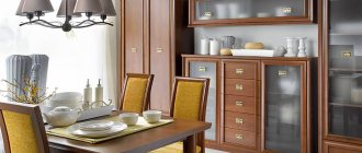
For furniture
When choosing furniture, you should proceed from the main principle: its color should contrast with the background of the room’s decoration.
Furniture should contrast in color with the walls.
For example, a black or white sofa should be placed in rooms with a similar design - it will not draw attention to itself and will not “eat up” the space. For rooms made in neutral shades, it is better to select large furniture in pastel colors, while leaving bright armchairs or chairs for the effect of separation and contrast.
For walls
Since the walls play a key role here, they can be painted, roughly speaking, anything. It all depends on what emphasis you need to put. As a “harmonizer”, paints of neutral or calm shades should be chosen.
The walls can be painted in any shade you like.
Pastel colors are most often used; they are perfect as a basis for any design solution: furniture, floors, and ceilings can be of any color - such a universal substrate.
For floor
The floor tone is selected in two options: light and dark. In the latter case, the advantage of this design is the possibility of using the same color in any room. In the presence of high-quality lighting, this allows you to clearly emphasize objects. However, you should not install doors of the same tones together with a dark floor.
The floor can be either dark or light.
It is preferable to leave a floor made in light shades in the bedroom, living room or bathroom, along with pastel walls. Thanks to better reflectivity, this will make the room a little brighter, and also visually increase the internal volume.
For the ceiling
Typically, ceilings are painted in light colors or pure white, although both matte and gloss can be used. This solution goes well with other color options for both furniture and walls. If you need to make an accent, this is done by placing appropriate accessories on the floor or hanging on the walls.
As a rule, ceilings are painted in light colors.
In some cases, it is possible to paint the ceiling in dark colors. It should be borne in mind here that such a solution will have a positive effect only for rooms with high ceilings (more than three meters). In this case, the floor must be made light. This solution is appropriate for a minimalist design, as well as in rooms with panoramic windows.
For interior doors
It is best to choose doors made of natural wood, as it fits into any interior and design. At the same time, it is necessary to understand that the canvas and platbands must be perceived as one whole, that is, they cannot be separated by color.
White doors are perfect for classic style rooms. Cool shades, including dark tones, should be used extremely carefully - mainly for rooms in a strict, minimalist style. On the other hand, dark doors can be used to provide contrast when decorating in a neutral color.
For interior doors, it is better to choose a light warm shade.
Shades of white
The more complex the undertone, the more noble it looks. However, snow-white with gray shading creates a dirty impression. Warm tones look much more interesting. It’s not for nothing that ivory-colored wedding dresses are so popular among brides.
Albino elephants
Nature has chosen for us a combination of white, light beige, soft blue, light mango, golden copper and lead. It has a balance of warm and cold colors, bright and pastel. Without a hint of gloom, the composition is full of light and love of life. You can also view the strength of additional tones, such as blues and oranges.
Baker's hands
This palette ranges from cream, light ash rose, light platinum, light silver, red pink brown and red purple. Both the delicate and contrasting range of pink-red and pastel gray tones, balanced in temperature, create an atmosphere of fences and joy.
Festive marshmallow
A bright palette of festive shades of cranberry next to cream, namely: blue-gray, beige, red rose, burgundy. Soft and expressive harmony lifts your spirits, fills you with enthusiasm and a thirst for fun. There's a contrast of bright spots, warm versus cool, light versus dark, and there's even a distant reminder of complementary tones.
Cactus and rose gold
The airy range of cloudy, green, pink shades gives the feeling of flying in a space of light. This combination consists of such colors as cream, water green, royal pink, salmon gray, stone green, wormwood. All “paints” are complex, of medium brightness, leaving the impression of smoothness and elegance.
Color and type of room
From a coloristics point of view, the correct selection of the right colors is influenced by both the size of the room and its purpose (for example, a bedroom or a bathroom). In addition, the setting and lighting are of great importance.
Kitchen
For the kitchen it is better to choose something from a calm, soft palette. As a rule, yellow or turquoise, although red can also be a good solution. They are believed to “give life” and promote digestion. In addition, they can be used to place accents or attract attention. It should be complemented with a gray, black, white or beige shade.
Turquoise is a great color for the kitchen.
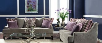
Living room
In most homes, this room is the center of a variety of pieces of furniture (cabinets, hollow niches, etc.) and is often used for different purposes: from the bedroom to the dining room. Therefore, most often the emphasis is transferred to the sofa, which is preferably gray or neutral in color. However, sometimes they do exactly the opposite. If the room is small, everything is done in cold colors.
It is better to buy a gray or neutral sofa for the living room.
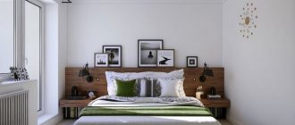
Bedroom
Everything here should be aimed at achieving comfort and peace. The best option would be a purple shade or something from pastel colors. However, there are successful design implementations with achromatic colors, combined with a play on saturation and halftones. Delicate shades of blue or pink are also good, but it’s better to forget about red!
A purple tint or pastel colors are suitable for the bedroom.
Hallway
This room can successfully continue the theme of monochrome design. It doesn't have to be black and white. It is advisable to choose a color from the middle of the color chart, otherwise if it is too dark or too light, all the dirt and dust from the street will be visible. It is worth giving preference to beige, green or silver shades. In some cases, they will go well with red.
The hallway should be decorated in not too dark and light colors.
Children's
On the one hand, children love everything bright and eye-catching, but on the other hand, the child’s preferences and character must be taken into account. For hyperactive children, it makes sense to decorate the room in calm colors.
It is better to decorate a children's room in cheerful but calm colors.
In addition, solutions based on the game of contrasts are a good option. In such cases, different colors can be used to organize zones: sleeping, playing, working. The main thing is that the color is bright. For girls it is pink, sand, blue, and for boys it is yellow or green.
Bathroom
Usually, white or monochrome is chosen for the bathroom - this is due to the fact that designers usually strive to emphasize its purity. However, everything is not so simple. In most cases, you can choose any color, even black. Often there are bathrooms made in light green, lavender, pink and even terracotta colors. Contrast and midtones play a key role here.
You can choose almost any color for your bathroom, even red.
How to choose furniture to match the color of the floor or the color of the walls
The correct choice of color scheme determines how successful the final interior design will be. All exclusive furniture and expensive materials will become unimportant if the room is uncomfortable to be in. Therefore, you should adhere to the basic rules:
- You should not make the design in one color - it must be “diluted”.
- The selection must be made based on the size of the room.
- It is advisable to start with light shades, especially for rooms with a small area. This will provide the effect of visually expanding the space.
- For houses with spacious rooms, you can use dark colors - this will “compress” the dimensions a little.
- Bright colors require contrasting combinations.
- When choosing furniture, you should stick to the same shade (be within a compatible palette) with wallpaper or wall painting.
- For solid colors, the furniture should look more contrasting compared to the rest of the decoration.
There are also rules for selecting furniture.
What colors go together in the interior?
I talked about the basic rules for using color when creating an interior in the first part of this article: I recommend starting there in order to at least understand the terms. Now let's talk about types of color harmonies - useful schemes for choosing colors that complement each other.
It is important to say here that any colors can be combined with each other in one space, but the greater the divergence from standard schemes, the more effort will have to be made to achieve harmony. The same scheme can look completely different depending on the choice of shades and amount of color, so why complicate your life?
Examples of color combinations
A correctly selected palette will create a feeling of comfort and harmony in the room. In this case, as a rule, they start from the walls, taking them as a basic element. All other colors will complement or dilute it:
White
Goes great with almost any shade. Any furniture will look good against the background of such walls. It is perhaps not advisable to use it with warm colors, since white can mute them, which will not allow you to place accents correctly.
White color easily combines with all tones.
Red
Here the choice is limited to either dark shades or bright, rich ones. For example, gold will perfectly complement this color, and black will create a feeling of severity and solemnity. Pastel colors can be chosen if you want to somewhat soften the overall background.
Red color can be shaded with strict or pastel colors.
Yellow
Causes a feeling of lightness, positivity with a small amount of carelessness. Pairs well with black, green, purple and brown. Often used when decorating rooms in a variety of styles, from classic to modern.
Yellow color evokes a feeling of lightness and positivity.
Green
A brown or beige shade suits it best. This combination is considered calming and allows you to create a calm, peaceful environment. Cooler shades will immediately add severity to the interior and “modernize” it.
Beige and brown go best with green.
It turns out that the play of colors is actually a serious thing! Therefore, you should not ignore color when decorating the interior, especially if you do it yourself. The way the color of furniture doors and floors is chosen will influence the atmosphere in the house - whether there will be chaos and confusion or comfort and harmony will reign.