Furniture colors
The decision on choosing the color of furniture depends on many parameters: the size and purpose of the room, its design and color palette. To make an effective choice, it is useful to get an idea of the range of materials presented in furniture stores.
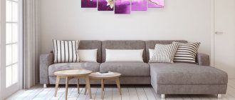
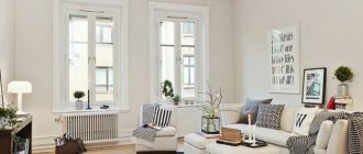
In a gray interior Source tobiaszmeble.lh.pl
When assessing the options, you should also understand that cabinet and upholstered furniture made from natural solids are less varied than products made from natural or painted veneer. Color solutions for veneered MDF include dozens of shades, some of which are quite unusual.
Catalog fragment Source xcm-models.com
What furniture and appliances can be used?
Regardless of what shade your facades are, remember the main thing: the technique can be absolutely anything! Paired with white gives a fresh look, a black oven or refrigerator will add drama, steel is ideal for modern trends.
In the photo, black appliances in the kitchen look like wood
In order not to overdo it, the wood-look kitchen in the interior is combined with plain wall and floor surfaces and the rest of the furniture as neutral as possible. For example, wooden facades are decorated with a single-color tabletop and a table is selected to match its color. Otherwise, if everything is made of wood, you are guaranteed to get the feeling of being in a bathhouse, and not in a modern apartment.
Light furniture
Thanks to furniture in pastel shades, even a modest-sized room is filled with light and seems more spacious. Light colors furnish classic and minimalist interiors and are a common choice for the bedroom or kitchen. Light furniture is made from the following types of wood:
- Shimo ash. There are several types of material: milk, cream, coffee. A characteristic feature is distinct tree stripes.
Bedroom in a modern style Source bedroom.adstores.ru
- Karelian birch. It has a patterned texture with a beautiful pattern reminiscent of marble. The background is white, light yellow or brownish sand. The pattern is darker - brown to black or with a reddish tint. A unique feature of Karelian birch is its moire pattern, when dark fibers are visible through light ones. The color of their birch furniture is characterized by a glowing effect, giving it a luxurious look.
From solid Karelian birch Source euromebelshop.ru
- Light beech. The structure of the wood is uniform, so the color is distributed evenly. The shades are quite varied: whitish-gray or beige with a pinkish, yellowish or brownish-reddish tint.
- Pine. Material with a pronounced amber texture and brownish-brown stains. Sometimes products are deliberately given a more saturated, almost orange hue.
In addition to the main varieties, light varieties include acacia with a yellowish-gray surface, gray-pearl or matte beige milky oak, alder, apple, and pear.
Pine set
See also: Catalog of companies that specialize in the construction of turnkey country houses
Combination options
In interior design there are never clear rules for the design of elements. But if you don’t have professional experience, then it’s better to use already established solutions that will look great in any interior.
White kitchen with glossy facades
White color will cope even more effectively with the task of optimizing the space of a small kitchen if you choose glossy facades. The surface reflects light, which increases illumination.
In the high-tech style, smooth glossy facades without fittings create an even greater effect of technology.
At the same time, excess gloss looks tasteless. Therefore, adding woody tones is a great way to maintain balance. Here are some options on how you can combine glossy furniture.
- The top of the set is glossy, the bottom is wood-look.
- The top is wood grain, the bottom is glossy.
- Glossy facades, apron and/or wood-look countertop.
Two-color set
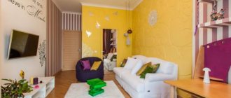
You won’t surprise anyone with a two-color set, but the problem of choosing colors that match each other and with other interior items remains relevant. White paired with brown can already be called a basis, with which in the future it is easy to work even for an inexperienced person ignorant of the rules of design.
Are you afraid that glossy facades will be inappropriate? Choose matte ones. They are versatile and look more natural.
Wood-look tabletop
Another successful combination in which light species benefit most is ash, light oak, beech, hornbeam, and alder.
It will be harmoniously combined if the tabletop of the set and the dining table are made in the same color and from the same species.
In a loft-style kitchen, a thick countertop with the effect of a rough, unprocessed solid can become a style-forming element.
This may also be interesting: White kitchen design with black countertops: 5 tips and 28 ideas.
For more examples, watch the video:
Apron
A wall panel in the work area made of chipboard or MDF can be a separate accent element against the background of a white set or complementary to the same work surface.
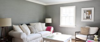
Intermediate colors
When figuring out what furniture colors there are and how they fit with a particular finish, many people pay attention to furniture in intermediate shades. It is valued for its ability to fit into interiors of different color palettes. Often it serves as a compromise for small spaces, when it is important that objects do not look bulky, and white interiors are not liked. Almost all intermediate shades are warm; items are made from the following types of wood:
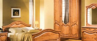
- Oak. The name rustic oak is often found; means a medium brown shade, close to the color of chocolate or hazelnut shells.
Retro-style bedroom Source russdveri.ru
- Cherry. Includes a whole range of shades from golden to reddish-red and dark red. It is valued by designers for its structure reminiscent of noble mahogany.
- Alder. The wood can have a rich honey, beige-red or reddish tint.
In the green dining room Source i.pinimg.com
Some design tips
Tip #1.
The most win-win solution is to make the apron and tabletop in white or wood. If you choose other suitable shades for their design, for example, black or gray, then you need to support them in other elements, for example, a gray apron to match the sink or countertop, a black apron and a black countertop, etc.
The black color of the sink complements the hood and oven
Plinths, work surface and appliances in the same color scheme.
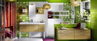
The accent is green tiles. You can decorate with mosaics or tiles with multi-colored patterns in a Provence-style interior if the color scheme is supported in the decor, for example, in a bright vase, chair covers, napkins, etc.
Drawings on an apron would be appropriate in country style, but in Scandinavian, minimalism or hi-tech it is better to give preference to simplicity and restraint.
To finish the apron, it is better to choose ceramic tiles to match the furniture or countertop, boar tiles, skinali or chipboard/MDF panels.
Tip #2.
White facades without fittings with a push-pull opening mechanism will require more frequent maintenance.
A matte surface does not show fingerprints as much as a glossy one, but this does not change the essence. A more practical solution in this case would be to decorate the top of the headset with white, because... the top row of furniture gets dirty less often.
The top row has smooth fronts, the bottom row has handles
Another solution is to make mortise or profile handles for opening cabinets and drawers. They are invisible and protect stylistic unity.
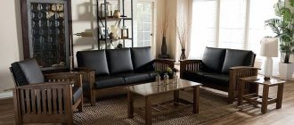
Dark colors
Furniture in a dark, rich palette gives the interior a touch of respectability. It is used to create a wide variety of interiors: classic, rustic, chalet and modern. Dark furnishings eat up space, but individual dark objects can be included in the interior of small rooms. Dark tones include:
- Nut. Popular dark brown color, with chocolate, reddish or gray tint. The texture is heterogeneous: beautiful winding stripes, dark veins.
On a light floor Source st.hzcdn.com
- Red tree. Among the various names for furniture colors, this is most often associated with luxury. Several species fall under the name, including sandalwood, mahogany (tropical species), berry yew, padauk. The wood is red-brown or dark cherry in color; The texture and degree of saturation differs among different varieties. Natural wood darkens over time.
How to make your interior truly stylish Source 1.bp.blogspot.com
- Wenge. The color of mature wood is unusually decorative and varied; the palette includes blue-black, chocolate, burgundy tones with black or golden veins.
- Ebony. Depending on the breed, the color can be deep black, dark brown, with a reddish tint, with grayish or beige stripes.
In wenge color Source 4.bp.blogspot.com
See also: Catalog of companies that specialize in interior redevelopment
LiveInternetLiveInternet
Tuesday, September 09, 2014 00:32 + to quote book
|
| Categories: | Design Ideas/Interior Design Utilities |
Tags:
interior design utility
Cited 398 times Liked by: 47 users
Like share
0
Like
- 47
I liked the post - 398
Quoted - 2
Saved
- 398
Add to quote book - 2
Save to links
Liked47
0
How to combine wood in the interior
In any interior you can find many wooden components. This is not only a cabinet or table, but also flooring (laminate or parquet), a door, a mirror frame. To create a harmonious interior, you should focus not only on the colors of the furniture and their names, but also on the color of the surroundings; The following tips will help:
- When choosing the color of furniture, it is important to consider what kind of interior it is intended for. There are interiors (usually modern) where the accent is important, and its role can be played not only by the closet or doors, but also by the floor covering. In classic interiors, coherence and color harmony are more important.
In the office Source static.wixstatic.com
- Accent. In most interiors, the emphasis is on furniture, with the floor and walls serving as the background. Therefore, it is important that there is a contrast in color between the set and the decoration. In this case, doors and baseboards should match, but doors and floors should not.
- Limitation. It is recommended to limit yourself to two shades of wood in one room to avoid chaos. Three colors are allowed if one of them is white.
On a white background Source st.hzcdn.com
- Combination. There will always be a good result if you combine only warm or only cold tones of wood.
- The shades should not be related, differing by a tone or two - you will always get the impression that you tried to choose a color, and it didn’t work out.
- Unity of texture (pattern). If the surface of the floor or doors has a noticeable ring pattern, furniture, regardless of color, is also chosen with a bright texture. Textiles are chosen using the same principle - colors may differ, but the print must be repeated.
Unity of texture Source veloxng.com
- Unity of finishing style. Harmony will be preserved if all wooden surfaces, regardless of color and species, are processed in the same way: deliberately rough or, conversely, carefully polished.
- Separation. There are two equally disastrous situations: when, for example, the table merges with the floor covering, or when they do not combine in any way. In both cases, a carpet can save the situation. It will separate the table from the floor, creating a distracting color accent.
In the hallway Source dekormyhome.ru
Oak and oak strife
Parquet and laminate, table and cabinet furniture, a door and even a mirror frame - there are many wooden parts in our interior.
Why is it so difficult to combine them with each other? Firstly, a tree of the same species differs in color and pattern when cut. Everyone has their own internal color and it is simply impossible to find two oak trees that are absolutely identical in color.
Secondly, those tree species that are most often used in interiors are very similar in shades. It happens that two different breeds look in a room as if they were simply choosing similar colors.
How to combine different colors of wood so that it looks advantageous? Here are 7 tips from designers.
What you need to know about solid wood
Solid wood is a natural material that is used to make luxury furniture.
The array comes in the following types:
- Solid wood, which is a board obtained by sawing a log lengthwise. The disadvantage of this material is its limited width, which is usually 40–50 cm.
- Furniture panel, that is, an assembly of lamellas. This option is the most common and consists of gluing wooden boards into a shield so that the seams are as invisible and durable as possible.
If we talk about solid wood, which is produced at domestic enterprises, then it is usually made from spruce or pine. Not so often, but alder, birch, ash, beech and oak are also used for gluing panels. Their cost is slightly higher than products made from coniferous trees, but such furniture is more durable and durable.
Furniture made from solid wood is often confused with the veneered version, that is, when the product is covered with thin wooden plates, and inside there is a budget material, like chipboard. This allows you to create the look of natural wood. If we talk about solid wood, then these are thick beams that are connected to form a facade, countertop or other similar elements.
Today there are the following material options:
- Combination of solid wood and veneer.
- Wood production.
- Manufacturing from type-setting solids.
As an example, we can take a frame, the main part of which is made of natural wood, and the inner part is made of veneer. Due to the similarity of their texture and color, it may seem that the product is made from the same material. In some cases, if it is necessary to hide differences, it is necessary to resort to painting.
In some cases, the façade is made entirely of wood.
It is worth noting that finding such an option is quite difficult. The facade in this case is made of wooden planks glued together. Typically, this method is used in the production of countertops.