When working on interior design, it is very important to remember that any decision must be informed. Design for design's sake, aimed simply at creating a beautiful interior, is a dead end. The arrangement of furniture, the use of decor, the choice of materials - everything needs to be thought through very carefully, taking into account practicality and comfort. Otherwise, the interior of the house may turn out to be stylish, but not functional - and as a result, it will have to be constantly changed, which often leads to the complete disappearance of the original concept.
To prevent this from happening, it is useful to study in advance the most difficult places in creating an interior design. Knowing common mistakes can help you avoid them. Let's look at 7 common mistakes and give tips on how to avoid them.
Inconvenient location of switches and sockets
This point needs to be thought through at the project development stage, so that for basic things you don’t have to use extension cords, pull additional wires and resort to other tricks. This is especially important now, when every home has a lot of electrical appliances, and gadgets also need to be constantly recharged.
How to avoid? Calculate in advance how many outlets you will need and where they should be placed. Install switches at the level and in those places where it is convenient for you, and not where it is easiest to do.
Combination of styles
Forget about the 2000s admonition that you only have to follow one style. You are the owner of your home and have the right to choose what it will be like. In modern design, it is considered bad manners to follow one style, but it is still worth choosing a vector within which you will look for “your” stylistic moves.
Thoroughly research possible design styles, make a Pinterest board or collage, and see how your chosen elements come together. We recommend following one piece of advice: you shouldn’t decorate different rooms in different styles, otherwise you risk resurrecting those very 2000s, when everyone wanted
“all the best at once.”
Look at 18 photos that will teach you to distinguish eclecticism from bad taste.
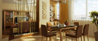
Too dense arrangement of furniture
This mistake is more common in small apartments, but it is also not uncommon in the interior design of large luxury apartments. Many designers and clients are afraid of free space - this fear is justified by “practicality” and controversial considerations that every square meter should be useful. In reality, practicality is about making sure that each piece of furniture is usable, rather than cluttering the entire space with furniture.
How to avoid? The distance between all furnishings in the apartment must be at least 60 cm. In interiors created by professional designers, this rule is observed very strictly - the distance between objects is from 60 to 90 cm, sometimes more.
But no less.
Color errors
So let's move on to color. This is one of the fundamental factors. After all, a correctly selected color scheme can hide planning flaws or deficiencies in the configuration of the room. There is no need to talk about a crooked combination of colors - it can ruin even the most beautiful and fresh design. Now about the most typical color mistakes.
Monochrome interior: bright, cozy and... boring. Perhaps it's time to dilute it with new shades
Solid color design
Modern trends lead to simplification. In new styles you will not find floral wallpaper combined with bright textiles and furniture. But in some cases, simplification leads to extremes. And, oddly enough, there are interiors decorated in a single color. White and gray are the height of fashion these days. Minimalism, loft, techno, hi-tech and other modern trends love it. But there is no need to go to extremes. There are other colors too.
A monochromatic interior needs to be diluted with bright details.
If you don't want your room to turn into a solid, featureless spot, add a few bright details to the basic gray or white.
Too boring
It’s no longer monotonous, but still too dull. Don't be afraid of brightness and uniqueness. Many designers are afraid to use red, yellow, and purple colors, as they are considered very bright and provocative. Nonsense! Yellow is the color of sun and joy, orange is love of life, red is passion and health. They can, and even should, be used.
Style uniformity quickly gets boring - be careful not to create a boring interior
Look at the psychology of colors, and you will understand that bright colors carry a deep meaning, so they need to be included in the interior. But the main thing is not to overdo it, otherwise the picture may turn out to be too colorful. Try to include bright and colorful details into a boring and ordinary life.
Very colorful
The other side of the coin is the overly bright design. This error is also quite common. It sometimes happens due to the difficulty of choosing one or two variegated colors. I like yellow, green, red and orange. But you can’t fit them all into the overall picture. Maybe for artists, but in design this is unacceptable.
Remember! Too bright design is boring.
You can turn any wall into your own art gallery, covering it with paintings, family photos or drawings of your children.
Do not forget that bright colors have a strong influence on the human psyche and can evoke certain emotions. Of course, red will give you vigor and passion, but over time it can tire you. Therefore, if you paint all the walls this color, you cannot expect a positive result. Apply the highlighting technique - cover a large area in a bright tone, but not the entire room. Spot-paint the room in variegated colors and you will get a lively and uncluttered interior.
Incorrect combinations
Monochromatic, boring or motley results from the inability to combine colors correctly. Sometimes designers refuse to use several colors for fear of messing up. Others, on the contrary, use everything. In both cases, disharmony results. Therefore, one of the main skills is the ability to choose the right palette.
It’s easier to first find fabrics that you like, and then choose the shade of the walls
Study the color wheel and become familiar with the rules for combining shades. Entire books are devoted to this. But if you don’t have time to study all the details, look at the rules for combining the color you like.
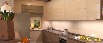
Insufficient storage space
No matter how many things you have, they all need to be stored somewhere. And every item should have its own place - from chargers to camping gear. If things do not have their own place, they will lie anywhere, and this greatly spoils the overall appearance of the interior.
How to avoid? At the design stage, it is worth considering storing everything - now this can be done very conveniently and compactly with the help of special organizers, additional shelves, and containers. When planning storage locations, you should follow the general rule - fill no more than 75% of the free space. This will help you store things conveniently, compactly and with reserve for new items.
Abundance of horizontal surfaces
A layer of dust quickly appears on all horizontal surfaces (shelves, countertops). Daily cleaning solves this problem, but not everyone is ready to monitor cleanliness in this mode. In addition, objects that should not be there often accumulate on shelves and other surfaces - keys, glasses, toys and other small items.
How to avoid? If possible, minimize the number of horizontal surfaces in the interior. This will help solve 2 problems at once - reduce the amount of dust and prevent clutter.
Furniture around the perimeter
Furniture around the perimeter of the room is one of the most common, but not always the most successful solutions.
Since the times of the USSR, the interiors of our grandmothers have meant placing furniture along the walls around the entire perimeter of the room. This method of arranging objects has long been outdated. Don’t be afraid to place a sofa in the middle of the room, and use a wardrobe to divide the room into zones.
Too active wall decoration - bright colors, catchy prints
Such interior design solutions look very impressive, but living in such an environment all the time can be uncomfortable. Bright colors quickly tire, prints get boring, and changing the design of the walls is not so easy. Therefore, you should be very careful when choosing the color and pattern of the walls in the kitchen or living room - let them be neutral shades and patterns that do not irritate anyone and do not catch the eye.
How to avoid? If you want to see something interesting and unusual on the walls, let it be a panel or one wall, decorated in any way you like.
This option will be an excellent compromise - the room will look stylish and unique, but the interior design will not be tied to the design of the walls.
Errors during interior repairs and renovations
It is difficult for a person who is not familiar with the intricacies of design art to determine the order of work, make accurate measurements, calculate the amount of finishing material and take into account other nuances.
For example, they do not consider it necessary to level the walls before covering, which leads to distortion of the wallpaper pattern. As a result, you have to redo areas that have already been painted or glued, buy additional material, or look for the same one. More often, due to such mistakes, there is not enough money allocated from the family budget.
When decorating walls
Excessive originality in the use of finishing materials. With walls covered with clapboard, the apartment will turn into a country house, with textured plaster - into an industrial space, and with bright photo wallpapers it will disrupt the harmony and introduce discomfort. Handprints remain on painted walls.
In a small room, you shouldn’t single out one wall and decorate it with bas-reliefs. Vertical stripes disrupt the proportions of spacious rooms.
Errors in creating a color palette. You cannot rely only on your own choice; in this case, consult with relatives, close friends or good neighbors.
More: Plastic windows: proper care extends service life
Using more than 4 colors for the interior, the “homemade” ones turn the room into a tiring rainbow. Also, you shouldn’t get carried away with one color, only 60%, the remaining 40 are shades of this color.
Interior design mistakes when decorating the ceiling
It is a repair error if the ceiling is covered with incomprehensible plasterboard structures on which difficult-to-guess images are applied. In addition, they complement it with an abundance of lighting and decor.
When finishing the floor
Before applying a rough and ribbed coating, it is worth considering how to clean the floor and how long it will take to remove dirt from the grooves. Dirt is more visible on a dark or white floor than on a light background. By installing heated floors without taking into account space for furniture and a refrigerator, you will have to spend money on wasted electricity.
Other interior design mistakes
The arches do not look good with low ceilings and narrow corridors, and through the glass inserts of the doors, light penetrates into the bedroom and children's room, interfering with sleep.
Non-natural wood or stone reveals itself with a repeating pattern. This material is often pasted in inappropriate places, overloading the interior.
A common mistake is when artificial stone tiles are glued on top of plaster.
New houses undergo shrinkage, which lasts 2 years. If you do European-quality repairs right away, something will suffer.
When planning to expand the space, it is considered a mistake not to allocate a fenced-off area for sleeping.
Bad light
A common problem that is now occurring more and more often. We rarely write by hand, and high-quality lighting no longer seems so important. But in reality, this is very important - at home there should always be an opportunity to do any business in a comfortable manner. Study and fill out documents, read a paper book - all this is convenient to do in good lighting.
How to avoid? At the design stage, provide for the installation of lamps wherever they may be needed. And it’s better to do this with a reserve - it’s easier to remove unused lamps than to install new ones.
Imitation of natural materials
In interior design, this topic is one of the most sensitive. We live in a time and in a world where almost any material can be copied with varying degrees of reliability. For example, brick is easily imitated by textured wallpaper or panels. Natural stone is often replaced by artificial stone - and there are many such examples.
How to avoid? Try to use a finish that matches the original material as closely as possible. Imitation is always visible, and it looks very sad - as if you are trying to make an impression where it is unnecessary and impossible. Modern technologies and materials allow you to find an option that is suitable in price and quality, so that the result will definitely please you.
Author: Anna Lyakh, chief architect-designer