Regardless of belief in the psychological impact of different colors on a person and adherence to the philosophy of Feng Shui, it is difficult not to agree that shades of red are among the most powerful. They set the mood and attract the eye. The dynamic red color in the interior largely depends on the chosen style and finishing materials. It is also influenced by other colors: the right color combinations will help you find the most suitable combination for different types of rooms, from the living room to the bedroom.
Shades
Red color is very diverse:
- muted natural shades of fallen leaves;
- natural bright colors – poppy, berry;
- deep rich – ruby, wine;
- catchy, slightly futuristic, attracting and holding attention.
But when designing, you cannot separate the color from the texture of the materials that will be used. There are styles that will require glossy surfaces (plastic, leather, enamel, varnish) to enhance the brightness.
More natural shades in combination with natural wood, a calm neutral background (for example, cream) - a coordinated interior without intrusiveness, but memorable and effective. Terracotta and brick tones will coexist in different styles; they are quite natural, with the right companions, they are appropriate in all rooms of the house.
Cheerful shades (mostly berry, coral) are perfect for accessories. Even the ornament will not make the interior colorful and chaotic if you adhere to moderation and create a good, soft background.
Modern interiors are not afraid of bright colors and red is combined not only with neutral colors. Deep shades used for the main surfaces (walls) can add excessive drama, refer to oriental style, historical classics.
Relevant. A dosed amount of gold and glass will enhance the overall effect of the expressiveness of red shades.
The meaning of red and its shades
Red color in the palette is considered the most emotional, passionate, sensual. In psychology, it is associated with pressure, strength, power, symbolizes leadership, determination, and self-confidence. One only has to remember the color of the robe of the royals, the armbands of the champions, and which path the “stars” follow to receive awards. According to psychologists, this shade increases performance and endurance, but in large quantities it can be dangerous because it will cause:
- aggression;
- hatred;
- fear of danger.
It has been noticed that modest, timid people do not like the color red, although its presence in the interior can enhance such qualities as determination and responsibility. In the design of apartments and offices, different shades of red are often used. These include both rich and muted tones:
- brick;
- terracotta;
- scarlet;
- wine;
- burgundy;
- dark coral;
- alizarin;
- purple;
- blood red.
The brightness of the red color can depend not only on the specific shade, but also on the type of material. For example, red glossy plastic for a kitchen set will look more defiant than matte MDF surfaces of the same shade. Calm red tones look restrained, therefore they are indispensable for creating elegant, rich interiors of a living room or office.
Design features
It is worth considering in advance how much red color will be acceptable in each specific interior:
- If the total area of the apartment is small, then the space-reducing red color is used in the details. Large objects such as a closet, a soft area, and basic surfaces are decorated in neutral, mostly light colors. The total proportion of red should not exceed 30%.
- When there is no feeling of confidence that the prevailing red color is suitable for decorating a room in the house, and for a long period, then it is used only where a little time is spent - the bathroom, the hallway.
- The strong red color should be distributed evenly, for example, echoing patterns and ornaments, so you will have to spend time selecting textiles, furniture upholstery, wallpaper, and designer items.
- When the room has constant natural shading, they refuse to decorate large surfaces in rich colors.
If the color red does not play a leading role in the design, then the table will help you decide on those options that will not greatly affect the budget when replacing.
| Room | Furniture items, furnishings | Decor and textiles |
| Living room | Replacement covers for furniture, console, screen | Curtains, vases, decorative pillows, lamps |
| Bedroom | Ottomans, cabinets | Curtains, paintings, lampshades, bed linen |
| Kitchen | Apron, small appliances, dining room furniture | Towels, curtains, colored glass, serving items |
| Bathroom | The decision must be made immediately | Towels, rugs, accessories, bathroom curtain |
Red bathroom design
When decorating a room in such a bright color, you should definitely take into account that the design of a red bathroom requires a very careful approach.
Due to the fact that the color is quite aggressive, it will require the correct selection of partners and use in the right places, and in a sufficient amount of space.
The following uses of red in the bathroom are possible:
- On the floor.
- On the walls.
- On the ceiling.
- Closet.
- Plumbing.
But red absolutely cannot be used everywhere.
Its excess will lead to the fact that a red bathroom will become so dominant that the interior will no longer be correct, and can only cause irritation and depress its owners.
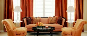
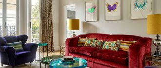
Living room - a luxury for all times
For the main, front room in the house, a certain boldness or, on the contrary, a verified, sophisticated sophistication is quite permissible, which is easily achieved by introducing red color into the interior of the living room. The furniture will attract attention, and the red walls are a serious statement of interior chic.
What design techniques are in demand lately:
- Modern style with a black and white base - cool colors for the largest piece of furniture - the sofa.
- Replacing the previous combination of black with gray is an interesting alternative, with the addition of fashionable steel elements.
- A beautiful solution would be a combination of muted red with white and beige. It will add a retro touch if supported with details.
- A calm but memorable classic is two-color walls, for example, snow-white and wine.
- A stylized (or even real) fireplace portal will inspire family evenings.
- Wood can have a reddish tint, adding status to the interior - cherry, alder from more budget ones. Designers advise not to limit yourself to finding one ideal combination among textures and textures, but to use a complex approach that gives volume to the room.
Design Tips
To especially ideally incorporate this color into the interior, you need to adhere to the following tips:
You need to know that it will occupy a predominant position in the design, and to avoid variegation, other colors used should be chosen less bright and active
The dimensions of the room play a huge role in creating the design.
So, if it is free enough, then such a solution can be safely applied, but in addition to this, it is extremely important that such an interior does not look quite aggressive or repulsive. If, for example, the room sizes are small, then be careful. It is known that red color visually reduces space. To prevent this from happening, its use must be limited. For example, red tiles in the bathroom can be laid only in the area of the bathtub or shower stall, or the wall decoration can be done using wallpaper with components of this shade
For a small room, too many red surfaces will not be very pleasing to the eye.
For the design in question, it is extremely important to have proper lighting. It's great to be able to adjust the light intensity. Lighting sources must certainly be combined with the overall style and color solution.
Kitchen – fashionable and diverse
When decorating a kitchen, bright red color is one of the popular solutions. But it is worth considering such a psychological effect: it increases appetite in direct proportion to the desire to create culinary masterpieces.
Very often, large steel-colored household appliances prompt the decision to decorate the kitchen “red + gray.” Most often, the headsets are made in modern minimalism with a certain amount of current industrial chic. Materials that contribute to this:
- glossy facades;
- colored plastic;
- fake diamond;
- metal elements.
Another fairly common option is a red set with the addition of white. Suitable for those who value aesthetic appearance, conciseness, and order. With red it is easy to create coziness in the kitchen-dining room, using it as an additional color rather than a basic one.
Manufacturers of household kitchen appliances are constantly offering new items in bold, clean colors. This trend strongly extends to the color red - as an attractive, rather exclusive alternative to the boring ones. And such courage is appropriate in both large and small kitchens. A red refrigerator becomes an interesting item with character in a studio apartment, making a positive statement about the owner.
Bedroom – calm and cozy
Psychologists do not recommend using this color as the dominant color for the recreation area. But you shouldn’t completely ignore it - how an additional color can increase sensuality, add intimacy and intimacy.
The moderation of red will allow you to create a bedroom in various styles - from adapted Japanese to fashionable urban or glamorous. An accent wall as a decorative technique, relevant for the bedroom, may well be colored if it is located behind the head of the bed.
In addition to the fashionable component of bedroom design, tactile sensations are important. The rest room should not have excessive artificial gloss. Diverse textures and matte finishing materials will make the bedroom truly cozy:
- velor headboard, small furniture (ottoman, armchair);
- silk bed linen;
- fur, “fluffy” details.
In any room, the determining criterion is not only the amount of red, but the colors that complement it.
What style is it suitable for?
It is used in many directions, both modern and historical. The choice depends on the available range. After all, each tone creates a corresponding mood. We bring to your attention the most popular and suitable styles for using red in the interior.
Classic
Classic is distinguished by calm and smooth lines. However, burgundy and cherry are often used here. The latter is a particularly frequent guest. With its special depth, it can create a tranquil environment. Also here we will meet Bordeaux. This proud and graceful tone has long been a classic example, having the ability to create a refined atmosphere.
In a classic interior, red is combined with olive, gold and emerald colors
Different shades of the classics are implemented mainly in textiles. Thick maroon curtains, a tablecloth on the table with matching patterns, a carpet with an ornament of this color. These details will well emphasize the classic style in the interior.
Renaissance
Historical motifs are increasingly gaining momentum, transforming into modern design. The most common are the Renaissance and ancient Greek movements. If the second is distinguished by calmness and the predominance of light, cold notes, then the first is an eternal holiday and luxury. You can't do without a fiery mood here.
The sophistication of wooden furniture and the restraint of red walls
The most popular color for interior decor is red and gold. This is the calling card of the style. It is also sold mainly in large pieces, such as carpets, curtains, sofa upholstery, pillowcases, etc.
The greatest application of the direction is found in design projects of the bedroom, living room and hall. In other parts of the apartment it may be less pronounced.
Minimalism
Red color is a common color in minimalist interiors. Due to its strict focus, complete painting of surfaces in this way is already found here. Light and bright colors are more acceptable here. Scarlet, purple, traditional, fiery - they are all welcome.
Red bedroom in minimalist style
Modern trends offer an interesting technique - painting one wall. He can be found in any of the rooms. This way you will be able to highlight one of the functional areas, put a bright accent and visually enlarge the space.
Loft
Another current trend that accepts the proposed color. However, it is more reserved and loves dark moods. Therefore, for the loft, choose shades close to brown.
This movement, like many current movements, is characterized by features of minimalism. You won't see a lot of small details or painting here. Plain wall coverings, urban motifs and rough features are the features of the loft. Therefore, colors need to be selected appropriately.
A combination of red, gray, white and black in various proportions is appropriate in the loft
They can be implemented in wall or (less often) ceiling coverings, furniture and textiles. Remember, loft loves rough features, minimalism and dark notes.
Provence and country
These two directions are very similar. Only Provence is distinguished by greater tenderness, softness and calmness. One of the details that unites them is the red color scheme. The whole spectrum has taken root here, only it is implemented in different details.
In country music there is always wood that goes well with all shades of red.
Since these are environmental currents, we will see an abundance of wood in every project. Mahogany looks great in living room design. Also, various little things will help support the appropriate colors.
In both styles, great attention is paid to textiles. It is found in abundance in the kitchen and living room and plays an important role. The predominant tones of both styles are calm, so the one under consideration realizes itself in details; in textiles it also appears partially, combining with the main ones.
Freshness of red and white interior
This is a very noticeable combination, interesting, life-affirming and special in every style:
- checkered – country, English;
- patchwork ornament - rustic;
- linear drawing - Japanese;
- abstraction - modern.
Looks beautiful in a patterned design. But if you are not satisfied with any floral and plant patterns or ornaments, and you want to see the surrounding objects as monochromatic, then decide in advance which piece of furniture will be red. On a snow-white background, small decorative items can get lost, but a console or a sofa can become central figures.
Relevant. With the same amount of red and white in one interior, the first will dominate, visually occupying more space.
If in such a two-color interior you leave the walls behind red, this will require white:
- interesting furniture design;
- cornices, baseboards of the correct height;
- increased demand for the beauty of the door leaf;
- stylish design of wall planes - mat frames with black and white photographs.
Such a solution will be definitely memorable and appropriate for the living room and dining area. White color is absolutely incapable of reducing the dynamism of red, but there is an excellent candidate for its replacement - beige.
Red and beige: harmony is nearby
Beige shades give the interior softness, comfort, and tranquility, and therefore are still in demand, although they are not fashionable favorites. A certain versatility is achieved thanks to various gradations in color temperature:
- sandy, straw with a yellowish tint;
- light coffee; grayish-sand, close to khaki;
- with the addition of gray, making the original color as neutral as possible.
Red in the interior of such a room is a splash of color with a slight tonic effect. And if it’s quite easy to choose shades based on personal preferences, then you need to be more careful with the quantity so that the room doesn’t turn from “beige with interesting red details” into something flashy.
What methods are used to make the duet appear in the best light:
- Some interior photos confidently demonstrate a combination of two shades of red, but of different densities - wine and scarlet.
- Adding to the red dominant accent color in the interior one more, in small quantities: the most logical is green, as well as bright yellow and pale blue.
- White color will deprive the room of static, enhancing the overall brightness.
- Black monochrome or dark brown with micro accents (photo frames, fine lines, pattern).
- Floral motifs on textiles in a retro spirit or modern geometric, more dynamic ones - the red-beige combination can pleasantly surprise.
Combination with other colors
As a very strong color, red in the interior can be diluted with other shades in equal and different proportions. It is permissible to mix two or three colors at the same time; this will make the interior look more interesting.
Red-white
Red and white combines two independently strong colors, where one will prevail over the other, which will change the perception of the interior. Red will promote activity, and white will balance it with calmness.
Red-black
Black and red can attract and repel, so it is important to maintain balance, choose a minimum of black, good lighting and neutral colors such as gray or white will not go amiss.
Red-gray
The gray-red interior is suitable for the bedroom, kitchen, where the pulsation of fire is pacified by a gray neutral color.
Red-green
Red and green in bright shades are found in nature and are organically combined despite the contradiction. By changing the temperature of the colors, for example, choosing olive and burgundy, you can create a moderate interior.
Red-brown
Red-brown looks harmonious because of its proximity, brown supports the passion of red with stability. Often used in classical or English style.
Red-beige
A red-beige interior looks better with rich shades of beige, such as straw, sand, or a combination of the two. Beige calms red and creates a welcoming atmosphere.
Red-orange
Red-orange makes the room hot, so it is not suitable for southern rooms, children's rooms and bedrooms. Energizing, also suitable for the living room.
Red-yellow
Yellow-red, unlike orange, does not allow for mixing shades, but it also looks bright and adds energy and light.
The photo shows an example of a combination of yellow walls and red furniture and kitchen appliances. This combination makes the room bright and without sunlight.
Red-blue
Red and blue are combined by contrast and opposition of cold to fire. For a warm interior, the background should be a scarlet or wine shade, and blue should be decorative items.
Red-blue
Red and blue are suitable for creating a modern or nautical style in a nursery, both colors should be dark.
Red-turquoise
Turquoise and red create a stylish and energetically strong atmosphere.
The photo on the right is a turquoise-red bedroom with a white ceiling. Red emphasizes turquoise and does not get lost against its background.
Red-gold
Red and gold suits the baroque style of the living room or bedroom, where dark red is combined with gold trim and furnishings.
Red-white-black
The red-white-black combination can often be found in modern design, where red plays the main role, and white balances out black.
The photo shows a bedroom in black, white and red, where when the window is closed, an atmosphere of luxury is created due to velvet and corduroy textiles.
Black-gray-red
Black-gray-red doesn't look as gothic as black and red, but it's also bold and interesting. An alternative version of a lightweight red and black interior.
In the photo there is an interior where textiles are decorated in red, gray is used to decorate the walls, and black decorates the chandelier and furniture.
Red-gray-white
The red-gray-white interior looks harmonious, stylish and not provocative, where gray holds two strong colors together.
Red and cheerful yellow (orange)
Such an invigorating combination in a northern location is a good choice, since associations with the sun will disperse dullness in the most natural way in the summer. On the color wheel, two colors are adjacent, but in order to create a harmonious combination, to find them regularly, you will have to try:
- Vanilla yellow and raspberry are a bold, modern combination.
- Orange is the main color, and red acts as local accents.
- White, creamy shades will lower the tonic level.
- Gold instead of yellow is a respectable interior, where pomp is balanced by achromatic colors.
- Use with caution in children, despite its positive nature and apparent obviousness.
- The lemon-black color scheme will contrast with large red objects.
- The current version of yellow is mustard, in harmony with coral.
Rare combinations: red and blue (turquoise)
The combination of red, as a warm color, with cool blue and indigo shades is not very popular precisely because of the different color temperature, the opposite of being on the color wheel. But if you take shades with a cold undertone - raspberry, “cardinal”, and introduce them as small accents, then a room with a blue base will sparkle with “new” colors.
A harmonious way to combine these colors in one room is to use both as accent colors. The following styles perfectly convey the mood:
- marine - blue-red recognizable combination with white;
- retro – bright blue and rich scarlet, complemented by black and white monochrome;
- country – dusty bluish shades and several variations of red;
- loft - a brick wall, the most natural possible, and blue textiles, for example, a rug, an interior art object that sets the character.
The most unobtrusive combination possible is suitable for a children's room, bedroom, kitchen. Adding greenery to the interior of the room is quite appropriate, as well as other bright micro-accents (yellow, lilac).
Fashionable turquoise, as a bright dominant, will get along quite well with a calm red color, close to coral, especially if both are used sparingly, based on an achromatic base. These could be chairs, sofa cushions, chests of drawers. But rich blue (indigo) in this combination makes the design too eclectic, more suitable for creative people. This is one of the most controversial combinations, and even the perfect selection of shades is not a guarantee that you will like the interior for a long time.
Red color in the interior - 50 ideas
The red color in the interior has a very powerful physiological and psychological effect on a person, so interiors in which the red color plays a major role are quite rare. Decorating an interior using red is quite difficult. This can only be done by professional designers who successfully cope with such a difficult task.
Red color in the interior is one of the brightest and most emotional colors in the entire palette. This color is associated with energy and strength. It is impossible not to notice it in the interior, even if it is present in the interior only as accents. When using red color in interior decoration, you need to remember that it should not be overused. In small quantities it energizes, but oversaturation can lead to irritation and depression.
Very often they use not pure red, but different shades of it. Today, red color in the interior can be used in almost any room, but the main thing here is to choose the right shades that will match the room in which it will be used. There are several shades that are most often used in interior design. These shades include: terracotta, brick red, noble wine red, scarlet and other shades. Shades need to be selected to match the main color of the interior, and such an important point as the style and dimensions of the room should not be missed.
Red is one of the most favorite colors for many designers. Using it you can turn a dull room into a masterpiece, the main thing is to use its shades correctly and place accents. Shades of red will look good in the bathroom, toilet, kitchen, gym, club and relaxation areas. There are also a lot of colors and shades that red goes well with.
White color is an integral companion of red. It perfectly neutralizes the excessive effects of red, and the combination of these colors means care, justice and integrity, which attracts people. This combination expands the space and delights with fresh contrast. It’s good to add black to this combination. The resulting monogram of colors will be the most stable and contrasting.
With the help of catchy combinations of red, orange, and dark yellow, you can energize the interior. The combination of such shades is more suitable for living rooms and children's rooms. If you take orange color to combine with red, then you need to give preference to a shade that has more yellow in it to avoid mixing colors. A combination of red and green will be very effective, but they have a very strong contrast, which can be weakened by using soft shades of both colors. To add contrast to the design, you can add black to this combination. A combination of red and shades of brown will be noble and respectable. A very good combination is provided by shades of gray and red.
In addition to the shades that red pairs well with, there are shades that are difficult and rarely paired with this strong color. Quite a rare combination of red and blue colors in the interior. Here, most likely, there is a stereotype that cold and warm colors do not go together. Sometimes you can move away from stereotypes and try to experiment. The blue color looks beautiful against the background of red, but it is very bright, so it is used very rarely, and if used, then with great care. The combination of red and pink can be called exotic, but the resulting combination turns out to be quite rich and unusual.
When planning a color scheme, do not be afraid to experiment, choose, combine and try. But do not forget that taste and a sense of proportion remain decisive when choosing the color scheme of the interior.
Red and yellow always make a good combination, and against the backdrop of almost snow-white walls, the living room will amaze with its freshness and purity. Accents of red in the bedroom interior look bright and charming, which, in combination with a delicate palette of blue, will act refreshingly and give vigor and strength. The muted red color of the walls, combined with a dark floor, will add laconicism to the interior; diluting this range with white elements can create a very interesting design.
The interior of a bathroom in such a color scheme will look shocking, which is not suitable for everyone, but those who love a vibrant life, without compromise, will appreciate this design. The modern kitchen interior looks laconic, and in combination with chrome parts and white and black inserts it can create a wonderful ensemble of high functionality.
The interior of the living room is decorated in different shades of red, which looks quite impressive and creates freedom of space, and transparent shelving will help zoning the room. A modern kitchen in white and black looks fresh and stylish, and red glossy surfaces make the kitchen interior more harmonious.
The interior of the living room is decorated in calm shades of beige, but in combination with red it will become emotional, and a minimum of furniture will free up living space.
The red color in the bedroom interior is used as an accent, which goes perfectly with the white decoration and gives the room freshness and cleanliness.
The combination of white and red gives the interior a smart and fresh look, white helps soften the red and prevents the space from visually shrinking, and soft lighting makes the bathroom cozy. The three-color scheme of white, red and black is the most contrasting and stable, and glossy surfaces give the room a modern design.
A kitchen interior in red is a rather bold decision, but it is justified because, when used skillfully, it turns the kitchen into an elegant room with increased energy.
The combination of red and yellow in the bedroom interior is justified and gives the room a calm and romantic look, and accessories enliven the space.
The style emphasis is placed on the design of the ceiling lighting, which gives the living room interior an extravagant look, and the abundance of white makes the interior delicate and fresh.
Original bathroom furniture, combined with design elements of unusual shape, gives the interior an extravagant and rich design in a modern style.
A large and spacious living room is combined with a kitchen, made in the same style, and bright red details in the design of the recreation area will radiate vitality. The use of extravagant white details in the design of a room decorated in red creates an interior in a minimalist style, which visually expands the space and gives a feeling of freedom.
Terracotta shades of red harmonize perfectly with shades of brown and create an atmosphere of calm; white color will balance red and expand the space.
The facade of the kitchen is made in ruby red and makes it dominant in the interior, which lifts the mood and stimulates the appetite, while the calm gray color will balance and create harmony. The central figure in the interior will be a massive bed, and all other pieces of furniture and accessories will complement the style solution; bright red will give the bedroom the appearance of a boudoir.
Rich red color in the interior has an exciting effect; to balance it and achieve harmony, a large amount of white was used in combination with bright lighting. Furniture in a noble gray color, combined with terracotta-colored textiles and a bright carpet, gives the bedroom interior a noble look, and vases with flowers and indoor plants will help enliven the interior. A modern wine-colored kitchen set is visually softened by white walls and a light floor, which combine harmoniously and give the interior a slightly daring look. The interior of the room is decorated in an oriental style, using stylish accessories, which, in combination with the red color of the walls, will fill the office with energy and allow you to enjoy the depth of shades.
The spacious bedroom is filled with a terracotta shade of red and oriental motifs, which were used in interior design, and in combination with white color and soft light it will acquire comfort and coziness. Dark wood furniture harmonizes perfectly with the terracotta shade of the wall, and by using this shade in textiles you can achieve harmony; white linen will enliven the interior.
The shades of red used in the bedroom interior are rich in sensuality, and a warm shade of green will help to dull this feeling, which goes well with a light floor. The use of red in the kitchen is quite common and justified, because it lifts the mood and invigorates, and the abundance of white visually increases the area. In the interior design, red was used for zoning, which visually separated the library from the recreation area, and a rich shade of yellow will add sunlight to the interior.
The spacious living room is divided into two functional areas, which are highlighted in different shades of red, but with the help of design elements the unity of style is maintained.
The combination of dark red and white makes the kitchen festive and elegant, and a glossy black countertop will be an appropriate addition to the color scheme and easy to use.
In this bedroom, red was used as the main color, but the abundance of white and large windows help balance the color scheme and create a cozy and warm interior.
The red color in the interior walls will favorably emphasize the beauty of wooden furniture, on which you can place many things dear to your heart, which will give the room a unique coziness; by placing a large mirror opposite you can visually enlarge the space.
The combination of white and red is always an advantageous option for decorating a room; style elements made in unity of shape and size will help add special charm; photos and flowers will help add coziness.
It is necessary to introduce red color into the interior of a children's room with caution, but correctly placed accents will give it vital energy and festivity. Coral and terracotta shades of red harmonize perfectly with shades of gray, which in combination gives a beautiful harmonious living room design in a modern style. Light, milky-colored furniture looks great in a children's room, and beautiful shades of red will help add liveliness and brightness to the room, which will be fresh and joyful against the background of the main white color. The dining room is decorated in white, which in combination with red furniture will give the interior a unique flavor and enthusiasm, which will be the key to a good start to the day.
A wonderful addition to the kitchen interior would be a small corner made with an emphasis on red, which will look impressive and unusual, but quite original and distinctive. Red color in the interior is the color of love and passion; an interior in this color scheme will be the key to an active and rich life, and extravagant details will add a charming atmosphere to the bedroom. White color always gives a feeling of cleanliness and freedom, and adding small details of red to the design can transform the bathroom into a charming room. Dark furniture combined with pastel shades of beige is ideal for the dining room, which creates a calm and pleasant atmosphere, red color will enliven the space of the room. A large glass table in combination with a red kitchen set goes well; in order to slightly soften the assertiveness of the red, it is recommended to decorate the walls with white. An extraordinary design of the bathroom in various shades of red will show originality of thinking, and soft lighting will add tenderness to the interior, which will promote relaxation. To decorate the interior, we used calm pastel colors of beige and orange, which will give the living room a calm and relaxed atmosphere, and adding bright accents in red will make the room more cheerful. Everything in the interior design is subordinated to a comfortable rest, the delicate color of the walls will have a calming effect, and the bright design details will fill the room with sunlight.
The designer chose the perfect combination of shades of red and gray, which perfectly emphasizes the minimalist style, and the originally designed walls add sophistication and originality to the interior. The extravagant color of the floor speaks of the originality of the owner, which makes the room bright and dynamic, corresponding to the modern rhythm of life. The living room is decorated in contrasting shades, which creates harmony of space and makes the interior cheerful and calm at the same time; the colors complement each other perfectly and create a harmonious design.
Red and Green: Association Game
Most ready-made palettes with these two colors are natural, embodying nature. For a calm, soft combination:
- Noble marsh, rich light green, fashionable shade of young greenery.
- Pure scarlet, burgundy with hints of brown.
- For a cold palette: contrasting colors will be dark, extremely close to black (purple, blueberry), creamy white with a bluish base.
- For a warm palette: dark brown and a lot of diluted light yellow, vanilla. Peach and orange are a spectacular addition.
Together, “red + green” set a certain mood and require implementation in decor and decoration: floral and plant patterns, berries, bouquets of flowers, autumn palette. Different color saturations, the addition of wood, and stencil elements will allow you to embody a country style for the bedroom and dining room.
Important. Lighting greatly affects the red-green tandem, sometimes not in the best way - preliminary colors and fabric samples will help.
Too pure, not muted colors - for a youth environment, as this is a rather rich combination. They also avoid overly obvious implementations - for example, photo wallpapers with poppies, tulips. Macro photography can quickly become boring, and in small rooms it can look depressing, despite the life-affirming palette.
Red and brown – noble chic
The classic solid combination of red and brown is still used to decorate an office or library. This noble harmony is found in many historical styles, complemented by gilding, natural wood, and leather.
Some designers were able to rethink it in a more modern way. And the first thing you need to consider when betting on this duet is the darkness of the room. Additional lighting sources will not hurt - from sconces with beautiful lampshades that provide diffused light, to spot lighting for wall decor and paintings.
One of the varieties of brown is chocolate, with which you can get beautiful combinations. Lovers of dark wood, wenge for flooring and furniture should take a closer look at brick-red, terracotta, and other warm shades.
There are several rules for error-free design:
- one shade of red;
- light yellow, vanilla companions;
- a lot of glass elements.
Relevant. Red-brown shades of a floor carpet with an ornament are a win-win solution for many interiors, luxurious, but not pretentious.
In which rooms is red appropriate?
Such a bright shade and its more subdued variations can be used in the interior of most rooms: from the bathroom to the bedroom.
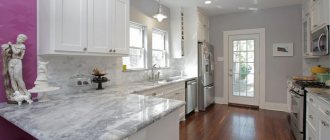
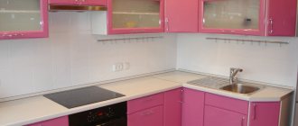
Kitchen
This color tends to awaken the appetite, so it is used quite often for kitchen decoration. You can make an accent wall, apron, countertop, or even a set or its individual elements red. This color will be best combined with white, gray, and beige in the kitchen. Bright tablecloths, potholders, lampshades and teapots look beautiful against a light background.
Bathroom
The pale red tint of the walls will be an excellent companion to white plumbing fixtures: sink, toilet, bathtub. Also, red tiles are often laid on the wall near the shower or bathtub, leaving other surfaces neutral. It is better to make the floor brown or white. Burgundy tones in the bathroom, like other dark shades of red, are permissible only in large rooms.
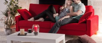
Living room
To make this room luxurious, just combine red curtains and furniture covers with dark parquet and light walls. If the picture is complemented by gilding, crystal, natural wood and velvet, the interior will look royal. However, red for the living room can be used not only in classic styles, but also in Provence, country, minimalism - it finds application everywhere.
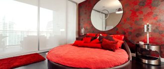
Bedroom
You should not introduce too bright red tones into the interior of the relaxation room - muted, delicate shades are suitable, which will promote relaxation. The lighting of floor lamps or sconces with red lampshades will add mystery and intimacy to the bedroom. Brown furniture, forging, glass, and crystal are perfect for reddish walls or textiles.
Children's room
Red is not used in the rooms of young children: it can negatively affect the development of the child’s nervous system and instills aggressiveness. But its light shades in the bedrooms of older girls and boys are a good solution. The color is suitable as an accent color in the form of chairs, bed decoration, stripes on curtains.
Hallway
In the hallway or corridor, you can combine red with white, as well as with light gray shades. It is important to organize good lighting here, because most often this room does not have windows and seems cold. Floor tiles in a checkerboard design (black and white or brown and white) will dilute the interior.
Red and pink: the right to exist
Unlike brown, pairing with pink is an ambiguous combination. With the abundance of these two self-sufficient flowers, rapid fatigue is possible. They can cause strong dissonance, and it is not surprising that photos of such interiors often become anti-examples of what not to do.
How to get rid of “puppetry”, excessive immaturity? This color combination will in any case be considered exotic, but it is quite possible to get away from stereotypes about being purely feminine:
- The red-pink color scheme, complemented by gold, is a typical oriental interior.
- Complex patterning, including for metal (Moroccan and other ethnic styles).
- Adding a third companion - lilac, sky, yellow for micro-accents.
- Strict lines, conciseness, a touch of minimalism, simple forms of furniture.
- Dark pink (fuchsia, purple) against the background of burgundy - muted, as if powdered side surfaces.
- A moderate proportion of decor with character that sets a positive mood, only a few antique items that do not lead to a feeling of “museum-ness.”
Red and gray: next level
This combination is quite hackneyed. Surely, everyone has seen posters with English themes (buses, telephone booths). To move away from templates and take the budget to a new level, you should:
- Use a bold combination: gray with a bluish tint and crimson.
- Complement the main red accents with yellow and orange.
- The main gray should be different - for example, light walls and a dark (close to graphite) sofa.
- Matte, muted shades of red will add sophistication to the interior.
- Different textures - for example, gray stone, trendy concrete and laminated surface.
- Natural light wood (floor, furniture legs), mirrors, silver metal will refresh the interior, making it more interesting.
Too much dark gray combined with scarlet tones can create a depressing impression, especially if it is a living room. But the bathroom will turn out very elegant. They will straighten out the situation even in a small space:
- a logical large amount of white (standard plumbing);
- silvery shiny components (like a heated towel rail);
- mirror surfaces.
Shades of red
Red is very diverse in its color tones. It refers to those colors that have the most shades among other colors in the spectrum.
In order to decorate a bathroom in red colors, the following are most often used:
- terracotta;
- cranberry;
- grenadine;
- tangerine;
- spicy;
- coral;
- dubarry;
- poppy red;
- azalea;
- color of added berries;
- red with an orange tint;
- Baroque roses;
- deep sea corals;
- tomato;
- scarlet;
- barberry;
- chili pepper color;
- crimson;
- cherry.
Each of them is able to create their own and unique design for the bathroom.
Red and black: dark contrast
Even if gray does not always make the interior feel comfortable and suitable for permanent residence, then black is the champion in depressiveness. Especially:
- small room;
- the ceiling is not white;
- insufficiently thought out lighting;
- lack of a clear stylistic position.
Adding snow-white as a way to “dilute” the interior sometimes doesn’t work. You can achieve the opposite effect only by increasing the contrast, turning the interior into a Gothic one. If such a task is not set, then others are added to soften the categorical design: pastel, light gray.
Natural greenery, metallic surfaces, forging, wood, interesting and appropriate objects (piano, fireplace) can smooth out excessive harshness. Black and white interiors, despite the lack of novelty, do not lose their leading position in demand. Emphasizing red as an accent is an option for confident owners who love clarity and structure.
All the presented photos demonstrate a variety of cold and warm tones, and it is important to find “yours.” Individuality is an integral part of a successful project, but it is most evident in the decor. This is a good way to create red interiors not only in the rooms where you are awake, but also as a cohesive color for the entire home.
Photo of a red bathroom
Read here! A modern chest of drawers for the bathroom - see how to choose it in the review. New furniture designs, the best chest of drawers configurations and stylish designs in photos and videos!
Please repost
0