The influence of terracotta color
The brown shade of red is natural, incorporating the full depth of several colors:
- passion red;
- confidence and calmness of brown;
- the life force of orange.
Terracotta is a tertiary color that embodies the colors of ceramics, the brightness of autumn and the austere beauty of rock. This shade is so versatile that it can be used in any room: hall, living room, kitchen, bedroom or nursery.
In order for curtains in a brown shade of red to look advantageous and not hurt the eyes, you need to figure out the colors that go best with it. Companion shades do not include too bright and artificial tones. The terracotta color may get lost against their background.
For your information! This color has a peculiarity - it highlights the sophistication of the design of the room, but at the same time does not draw attention to itself.
This demanding shade is best combined with pastels, as well as confectionery and fruit. The design can be complemented by elements of yellow, reddish and red tones.
Terracotta and interior style
In some ethnic styles there are many spectacular examples with this natural material and its shades, traditionally used in home decoration. This is a Mexican, Indian, African and Moroccan type of interior design, where this color is preferred.
Room interior in terracotta color
Bright room with terracotta shade
The most appropriate use of a warm color palette in a modern style.
- Eastern ethno-stylistics widely uses this range - from Africa to Southeast Asia. It is difficult to imagine archaic ethno-design without the use of terracotta.
- Rustic country with all its varieties is based precisely on this palette. This is American country and French Provence, a chalet from the Swiss Alps and the style of a Russian mansion. Natural red brick and ceramic dishes are the main finishing favorites.
- In classics and minimalism, this natural color is used mainly for finishing the floor surface.
- In a classic English style, it goes well with natural wood and dark greenery.
- Natural colors in textiles and upholstery perfectly complement shabby chic, boho, retro and vintage.
- Natural tones will perfectly complement the Egyptian and antique style, the decoration of bungalows and mansions in the spirit of colonialism.
- Experts use this color to slightly dilute a boring pastel interior or add natural warmth to a modern urban setting such as loft and functionalism.
Those who can independently create a luxurious interior for a spacious apartment or decorate a modern studio apartment in a new way should experiment with this palette. Use as a background, complement or as a dominant tone. Terracotta combined with other natural colors is an excellent compromise between extravagance and nature.
Room design in terracotta color
Interior design of a summer kitchen in Italian style
Application in a modern interior
If you want to decorate your interior simply, yet elegantly, then you can give preference to straight straight curtains in the classic version. This model will always be relevant. Photos of similar terracotta curtains in the interior can be seen below.
For rooms with high ceilings, it is possible to provide the use of lambrequins. The tiebacks can be very simple; you just need to decorate them with a gold cord or provide them with beautiful tassels.
Curtains on the windows are additions to the interior design of the room. Therefore, they must be in harmony with the overall color scheme of the room, and must be combined with the wallpaper on the walls.
A style that combines several pure shades, of which no more than three are used, can be chosen as a basis. Some other designs use adjacent shades and undertones of brown and orange without restrictions.
Successfully composed interior combinations allow you to enliven an insufficiently colorful environment, add brightness and combine well with living plants. Even in a minimalist style, a feeling of energetic interior will be created, an abundance of sunlight will be created and the beauty of natural materials in the design will be emphasized.
Application
Recently, modern designers have very often begun to use shades of unfired clay to create modern interiors. Curtains of this shade will not be striking, but will subtly highlight the entire interior of the room.
Related article: How to choose and install a transom above the door
For such curtains, it is worth filling the room with natural shades. Natural decorative elements or wooden furniture are best suited for this purpose. Living plants will beautifully highlight terracotta curtains: this is clearly visible in the photo. Modern design perfectly accepts the color terracotta. Designers claim that if you set the accents correctly, cozy curtains of an unusual shade will enliven the faceless walls and the modern room will sparkle with natural colors.
A bright, rich shade will perfectly decorate modern minimalism and create movement. And if you choose an original cornice of a similar tone, the rich shades will saturate the room with color. And light reflections of sunny color will appear on the walls. Clay flower pots or oak picture frames will look great in the room.
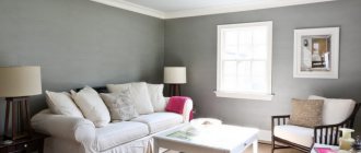
Living room
For a room in which the whole family gathers and guests are received, special requirements are imposed on the interior design. Terracotta-colored curtains will look organic in a living room with an oriental design. In this room, terracotta color can be combined with crimson and other warm shades. It is ideal for use in living rooms with dark and light beige walls.
There is always upholstered furniture in the living room. If it is made of dark wood and has brown upholstery, then for a softer perception of the interior it is recommended to combine light terracotta curtains with curtain fabric of a light milky shade.
It is not at all necessary to choose only plain curtains. Interesting and no less effective in the interior of the living room are terracotta curtains with prints of golden color or soft yellow.
Terracotta and beige together can create attractive combinations for interior design. For a living room, these combinations are ideal; for a bedroom, it is better to soften them and focus on diluting dark shades with light ones.
Here are some winning terracotta color combinations:
- combination with shades of milk and dark chocolate;
- mixing with explosive carrot and cheerful yellow;
- gold plus beige;
- rosewood color with ivory;
- milk and white chocolate.
Combination of terracotta palette with other colors
Experts consider this color to be universal in atmosphere and warm in perception. Artists can name up to 20 different shades of this range, but the main ones are:
- Raw clay tones;
- Pumpkin (with a large admixture of yellow);
- Red-brown (classic);
- Sunset color (with a predominance of red);
- Carrot (large proportion of orange);
- Rust color (orange and brown);
- Brick (baked clay).
Natural shades combine well with each other. Therefore, terracotta wallpaper in the interior can be easily combined with living greenery, shades of wood, pure white and sky blue on the ceiling and natural tones in textiles. It is much more difficult to combine floral and acidic shades with this color, but experts find successful extravagant solutions, even with purple.
Room design in terracotta color
Bright room with terracotta shade
Bright room with terracotta shade
Universal solutions - in combination with delicate pastels, with cold and warm colors. A classic win-win option is a combination with a milky white background, light beige walls and wallpaper in blurred yellow shades with a fine black or brown pattern, as in the photo.
An unexpected effect can be obtained by combining:
- with pale green;
- turquoise;
- blue;
- mustard;
- red;
- olive;
- lilac;
- gray;
- lemon;
- black.
Attention! To create a harmonious interior, it is important to think through the combination of colors with each terracotta shade, where proportions, background and correctly placed accents are important.
Room interior in terracotta color
Room design in terracotta color
Table of recommended combinations of terracotta with primary colors
| White with blue | Reddish tint. | You can add turquoise, emerald or chocolate |
| White milky | Under classic terracotta | An ideal duo that goes well with beige, brown and wood textures |
| Grey | Many tones ter. | It's better to add blue, blue or black |
| Beige | Dark ter. | With red and black |
| Yellow | Shades with a high percentage of brown | An excellent duo, where mustard or olive fits in |
| Orange | Dark tone | White or light beige + fresh greens |
| Red | With pumpkin | Dilute with cold greenish tones and black accents |
| Violet | Bright tone | White background and accessories in large proportion |
| Green | Calm shades | Sky blue or white + orange |
| Blue | Reddish ter. | Dilute with gray and white |
| Blue | Dark juicy rub. | With blue and turquoise |
| Black | Red ter. | Excellent combination, choose other shades of this color, you need a light background |
| Brown | Svetly ter. | The universal duo will enhance beige, golden or orange |
Traditionally, the proven trio is used - rich terracotta plus milk and chocolate. As you can see, there are not many recommended options. But clothing designers manage to find a noble “combination of incompatible things” in one textile.
Bright room with terracotta shade
Bright room with terracotta shade
Bedroom
For your bedroom, you can choose one of the soft shades of terracotta color - a lighter and more delicate option. Combinations with orange, chocolate, milk and light pink look very good together, evoke thoughts of relaxation and help you fall asleep quickly.
For your information! When selecting curtains, it is necessary to take into account their compliance with curtains and wallpaper.
For dark walls, curtains are selected a couple of shades lighter. To prevent the room from looking depressing, the shades can be diluted with milky or other light inclusions. Depending on what colors terracotta is combined with, the room can be given either the delicate look of a women’s bedroom or the strict look that distinguishes a men’s room.
Options for successful combinations in the interior:
- peach with carrot;
- combination with gold and purple;
- mixing with peach and thick burgundy color.
Each of these combinations is advantageous and unique in its ability to create interesting, unusual interiors. Even a slight deviation of just a semitone can completely transform a room.
Briefly about creating an interior
Not only the shade of the curtains plays a big role, but also the overall color palette of the interior. As a rule, curtains are an addition to the general background; they should harmoniously match the wallpaper. Depending on the chosen style, a certain number of colors and shades are used in the interior. There are monogamous styles, where pure tones predominate, and, as a rule, there should be no more than two or three. There are more advanced variations of orange and brown, in which adjacent and similar shades can be used in large quantities. But any style or type of design has its own requirements and rules; they help create competent and beautiful images in the interior.
So, the first thing you need to consider is the general background of the walls and the proper selection of textiles that will match the wallpaper. In order to beautifully and correctly combine tones, many designers use a color wheel or color palette. They help to correctly select the desired range.
The terracotta color of curtains has many variations and color combinations. It is worth considering the most common and interesting of them. So, rich terracotta goes well with all the warm shades of pastel colors.
You may also be interested in: Using blue tulle - tips with photos
Kitchen
This color is a good solution for the kitchen. It will be especially effective on Roman window blinds. The shade of natural untreated clay is a modern design direction. Terracotta adds coziness to the room where the family gathers around the table.
For your information! The shade looks no less interesting in a translucent version as curtains.
Warm terracotta can even be introduced into the kitchen in a rich shade that is closer to carrot or pumpkin.
Children's
For a child's room, terracotta color, which looks good on its own, can be combined with bright and cheerful shades. For example, green or yellow. To ensure that the curtains do not stand out from the overall interior, you can furnish the room with decorative items in the same shades.
The combination of terracotta color with purple, red and blue colors will look interesting and non-trivial. These additional colors will make the interior sparkle with new colors and look much brighter and more cheerful.
Advice! If there are already any predominant colors in the nursery, then it would be better to abandon terracotta.
What colors does terracotta go with?
Terracotta is a very natural, “natural” color, so the entire natural range of the world around us, from green grass to the blue sky, will harmoniously complement it. One of the most win-win options is a beige palette, which will be an ideal base for terracotta.
Julie Lansom, evelinaro
Recommendations for design
When using terracotta color for the finishing touch in the design of rooms, you should pay attention to the recommendations of designers that will help you avoid mistakes:
- To give the design a sophisticated aristocracy, it is advisable to use plain fabrics for curtains.
- The harmony of the created interior should be emphasized and complemented by accessories. These could be the following items: vases made of untreated clay, indoor plants, paintings on the walls in antique frames.
- This color is suitable for many styles, including minimalism, oriental, safari and ethnic styles.
- Additional colors in the interior should not overwhelm the terracotta shade.
- The overlap of the shade of the curtains with other elements of the room’s design is an undeniable plus for the interior design. This could be, for example, textiles in the form of sofa cushions, the shade of a carpet, figurines or vases.
Terracotta color is always warm, it has no cold variations. With it comes comfort and peace into the house. It gently flows into neighboring shades and smoothes out interior imperfections. And creates a special atmosphere at home.
Terracotta house
Calm, deep, brick color is appropriate in any room of the house. When deciding where and with what to use it, you need to take into account the dimensions, the degree of illumination of the room, and the color of the existing furnishings.
Hallway
The room, as a rule, is small and insufficiently lit, so wallpaper of dark colors is excluded, only light ones are needed. Against their background, darker wardrobes, laminate flooring, African masks, and mirror edging will look great. They won’t take up space visually, but they will provide a stylish design.
Living room
A real terracotta color in the interior of the living room, if it is large and bright, may well be dominant. The walls are acceptable, saturated, not too light, but not completely dark. Against their background, wooden furniture can be of any color. The best options are black, beige or white wood. Its texture can go well with terracotta finishes.
For small rooms, color is embodied in light wallpaper or other wall decoration. A brick-terracotta or darker sofa will be a contrasting addition.
It should be borne in mind that the bright rich colors of the furniture against the light background of the walls seem even more saturated. In order not to overdo it, the floors are made dark, and furniture, textiles, and accessories are selected lighter. It is better to choose upholstered furniture with textile upholstery. If it is leather or leatherette, a matte surface is preferable. Turquoise or sky-blue islands will add romance.
The living room will look complete with ceramics, natural carpets, and skins. The walls will be decorated with paintings in bright yellow-red and terracotta colors, and curtains made of rough linen.
Kitchen, dining room
These rooms are usually small, so only light-colored walls are allowed. Towels, oven mitts, other textiles, and utensils in ocher, ripe pumpkin, carrot, or other bright colors will add style to the kitchen.
If you want the dining room to look romantic, and a candlelight dinner does not seem out of place, you can decorate it in a pastel range of orange shades. The walls are the lightest, the tablecloth, chair upholstery and curtains are brighter. The darkest of the entire interior will be the floor in the form of fired clay tiles, and the brightest accent will be the dishes.
Bedroom
As a room for relaxation and sound sleep, it is traditionally bright. A calm, space-harmonizing terracotta color in the interior is ideal for a bedroom, even as the main color, so the walls are made in tones of a terracotta palette such as creme brulee or beige. Furnishings in dark, rich colors will brighten the room, but it is appropriate to use them in doses. They may have:
- upholstery of furniture, pillows;
- curtains, bedspreads;
- small accessories such as a clay vase, other ceramics or photo frames;
- wooden bed headboards;
- sconce;
- dressing table.
Terracotta combines beautifully and mysteriously with gray, brown, and blue. These could be glass segments of the facade of a wardrobe, the same curtains, a bedspread.
If the bedroom furniture is white, terracotta walls and brick style are also a good solution. The atmosphere will become more relaxed and stylish, and the brick color scheme will become visually less solid.
Children's
Joyful sunny shades are definitely chosen. An interior in terracotta colors in a nursery will make the child calmer, even more reasonable, and assiduous. It will be easier for schoolchildren to cope with homework in such an environment.
In a girl’s room, it is better to decorate the walls with golden-yellow or soft green wallpaper. The boy will prefer the brick shade. In both cases, the furniture is preferably light blue or light blue.
Bathroom
Shiny chrome and tiles can harmoniously combine with bright segments of the brick palette: pink-red, orange, but they are appropriate as accents and details. For example, in the color of the towels or the edging of the mirror. The walls are soft peach or ice cream color.
The traditional terracotta color in the bathroom interior speaks of some conservatism of the owner. Scarlet terracotta, on the contrary, is about creativity. Extravagant people choose richly bright tiles of this tone for the floor or even mosaics. Turquoise or greenish shades will add freshness and diversify the yellow-brick palette.
An apartment in terracotta tones signals the peace of mind, optimism and self-sufficiency of the owners. She makes it clear to guests: there is no need for flashy bright colors; the owners already know their worth.
No matter what interior this original deep color is combined with, it will turn the house into an island of respectability, peace and tranquility.