Types of wallpaper
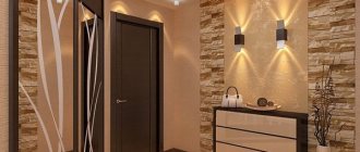
The walls in the corridor and hallway are susceptible to contamination. Therefore, it is recommended to purchase wear-resistant products from which it is easy to wipe off dust and soot. Vinyl wallpaper is dense, the top layer is covered with a protective film. There are many options with bright designs, you can always find an interesting pattern. A significant advantage is the ability of the coating to hide minor defects and unevenness of the walls.
Large corridor decorated with wallpaper with an original pattern
Liquid wallpaper resembles decorative plaster in texture. They are often used for covering walls in the corridor. They are a dry powdery finishing material. They are diluted with water and applied to the wall with a spatula.
Glass wallpaper is considered the most durable. They can be painted with acrylic paint. The relief surface will give an original texture
If you like natural materials and want to improve sound insulation, pay attention to cork flooring. They are always natural warm shades
Non-woven wallpaper can imitate the texture of stone or wood.
The cloth finish looks impressive. But not everyone can afford to buy expensive fabric and invite a specialist to attach it to the walls. A compromise solution would be paper-based wallpaper with a fabric covering. They are glued using wallpaper glue.
Glass wallpaper is considered the most durable
Paper wallpaper must be replaced after 2-3 years, and if there are pets in the apartment, the coating may become unusable within a year. If you get bored with wall decoration, you can easily replace the decorative coating. Due to the affordable cost of the material, it becomes possible to frequently update the furnishings. The advantage of paper is that it breathes, so fungi do not grow under it. Russian and foreign manufacturers produce thick paper wallpaper made of two layers - duplex. This wall covering is much more durable.
Wallpaper color and texture
The ideal option for small rooms is a light palette, both warm and cold shades. Here you have plenty to choose from: cream, white, blue, light rose, peach, light yellow, gray, ivory, light mint. And, of course, all variations of white will help to visually expand the space.
If the room is small, avoid wallpaper that is too dark
When choosing a color palette, focus on the level of illumination in the room. So, if it is filled with plenty of natural or natural light, you can safely use cool shades, and if the lighting is insufficient, give preference to warm tones. All soft shades of yellow are perfect for darkened rooms. Such wallpaper will be even more impressive if you paste it not only on the walls, but also on the ceiling.
Dark or rich bright colors are not prohibited in small rooms, but it is better not to get carried away with them: they can be used in small wallpaper decor, but no more.
As for texture, it is important to remember four simple rules:
- Wallpaper with a shiny surface, for example, glossy or silk-screened, visually pushes the walls apart and increases the distance between them.
- Textured wallpaper with volumetric changes and play of shadows makes the room deeper and more spacious.
- Wallpaper with a reflective surface creates a mirror effect, thereby increasing the amount of light, which helps to visually expand the room.
- Matte wallpaper, decorated with a textured pattern, visually narrows the room, so their use is undesirable.
Modern ideas and solutions, decor for the corridor
- Do the doors from the rooms get in the way? There is no need to rush and install sliding doors. They have no soundproofing at all, so you will hear every step in the hallway. Better use curtains! They do not suppress noise, but they are a hundred times cheaper. By the way, sliding doors require a cavity in the wall, so the sound insulation will be even worse than that of a curtain.
- No big pictures! Small frames with photos or drawings are suitable, since the contrast will make the room wider.
- More reflective surfaces. Is it possible for a wardrobe with mirrored doors? You don’t even need to think about it – take it.
- Illuminated shelves wouldn't hurt. For example, for keys or souvenirs. But no more than 2-3, they also eat up real space.
Using wallpaper
Most often, wallpaper is used to decorate the walls and ceilings of residential premises. They also influence the interior design and even the visual perception of the room. Wallpaper patterns can visually expand or reduce a room.
It is better to give preference to wallpaper in light colors
It is important to consider that the drawing also affects visual perception. So, a large image narrows the space, and a small one, on the contrary, will make the room more voluminous
Therefore, wallpaper with small patterns looks great in small rooms. You can also achieve excellent results by combining wallpaper.
Large drawing
- A large pattern on the wallpaper brings the surfaces closer and, therefore, makes the room smaller. If such a pattern is placed only on the back wall, the room will be visually shortened.
- A small pattern on a light background creates the illusion of volume.
- The transverse stripes on the wallpaper seem to push the walls apart, making the ceiling seem lower. Just as in the case of placing wallpaper with a large pattern on the back wall, the room will be visually shortened.
- Vertical stripes on the wallpaper increase the height of the ceiling. Wide stripes enhance this effect.
Visualization methods
Methods
To level a narrow and long room, you need to use wallpaper with a horizontal pattern. At the same time, to bring the far wall closer, you can use warm-colored wallpaper.
Bright and wide wallpaper conceals the height of the ceilings. Therefore, bright wallpaper can only be used to create accents. A room whose small walls are covered with wallpaper with a large pattern, and the larger walls, on the contrary, with a small pattern, looks very impressive. Large patterns can successfully divide a room into functional zones.
Horizontal pattern
Small dark rooms with low ceilings can be enlarged by gluing darker wallpaper in the lower part and the lightest wallpaper in the upper part. The joint can be covered with a suitable horizontal strip or left as is, without placing emphasis in this place.
Photo wallpaper can also expand the space. There is only one condition - they need to decorate only one wall. The photo wallpaper should have a perspective design. For example, with a road going into the distance, mountain ranges, a field or water surface, etc.
Expanding the room
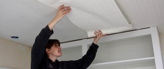
Another option for removing the ceiling is to stick wallpaper on the walls and “go” to the ceiling, 15–30 cm. In this case, pasting the wallpaper should start from the ceiling. In small rooms, the overlap on the ceiling should be minimal and vice versa.
Depth of perception is created by wallpaper without a pattern or with a barely noticeable image. So, you can successfully highlight interior items. The light colors of such wallpaper increase the space and allow you to decorate the walls, for example, with paintings or photographs, drawings or paintings.
Peculiarities
Often a narrow corridor differs in length. It is necessary to take into account all the little things when designing. It is recommended to first draw the project on paper. You can make a drawing by placing objects schematically. This will allow you to assess how rationally and competently everything can be arranged. The plan helps determine where to place outlets, in what quantity, and how best to divide the room into segments if necessary.
Original design of a narrow hallway with a floor lamp in the form of a lamppost.
There should be no unnecessary elements. Each detail is functional and helps to visually expand the space. Special attention is paid to the arrangement of furniture. The passage must have a width of at least 80 cm. Consider this parameter when placing objects.
Narrow corridor in peach tone.
One of the key design tasks is the need to visually expand the narrow corridor. Other features include:
- It is not possible to place furniture along the same walls;
- Objects with shallow depth are mainly used;
- Implement many tricks to visually increase the area;
- Lighting requires special attention. It must be of high quality, bright;
- If there is supposed to be a door between the corridor and the rest of the rooms, it is better to replace it with a sliding structure. This will save meters;
- Use light colors in decoration. If you plan to introduce wallpaper with a pattern, it should be large.
It is imperative to use a large, full-length mirror in the design of a narrow corridor. This will visually make the space larger.
Narrow corridor with built-in wardrobe.
How to choose
When choosing suitable brick wallpaper for the hallway, you need to take into account some nuances:
- For such premises, it is recommended to buy more wear-resistant and durable wallpaper that can be washed. This is explained by the fact that any decoration in the hallway quickly gets dirty and has to be cleaned regularly;
- The texture of the wallpaper plays an important role. They can be embossed, embossed or perfectly smooth. Embossed options are more similar to natural brickwork, but are much more expensive than other canvases. In this case, you need to rely on the amount of money you are willing to pay for the wallpaper;
- Don't forget about harmonious design. Brick wallpaper should be chosen based on the main interior and the color of the hallway. For example, for a dark room you should not choose the same dark canvases. It’s better to turn to contrasting combinations that look very stylish and fashionable;
- Contact only well-known and high-quality manufacturers. The excessively low cost of wallpaper should raise some suspicions, unless, of course, we are talking about paper options.
Design of a narrow corridor in a panel apartment: lighting to the rescue
Proper lighting is the key to successful design. With the help of spotlights you can visually enlarge even the cramped room. However, now we will not talk about them. Take a closer look at the photos below:
What exactly gives these corridors their charm? The answer is simple - chandeliers. Yes, yes, beautiful and stylish chandeliers precisely matched to the style of the entire room. This is beauty!
By the way, the point is not only in the chandeliers themselves, but also in their location.
- If you are a perfectionist by nature, hang identical chandeliers along the ceiling at equidistant distances.
- If you want a little lightness and ease, you can experiment with placement.
Techniques for increasing space
A small room can be changed for the better if you know professional techniques. To make a room seem larger than it actually is, use light, pure colors, glossy surfaces and mirrors. The right combination of these techniques gives an excellent result for a small hallway. Talk about the possibilities of visual changes in more detail below.
Light wallpaper and a full-length mirror will visually enlarge the space.
Zoning
The entrance hall and corridor perform several utilitarian functions - storing street shoes, outerwear, a wardrobe, a mirror, preferably a full-length one, and also divides the rooms between each other. For a narrow corridor and a small hallway, it is better to zone it according to the purpose of the function performed, highlight it with color, light or a piece of furniture.
Zoning the hallway and kitchen.
Zoning a small hallway with wallpaper and a closet.
For long and narrow spaces, three-dimensional images of waterfalls, city streets or endless fields are used. It is necessary to use spot lighting, wall lighting; geometric patterns located across the length of the corridor are desirable.
An image of city streets on the wall in the hallway.
3D image with city streets.
Visual illusions
A small hallway requires courage when choosing a design, since the space can be corrected through a distortion of perception. These illusions give an internal feeling of spaciousness, freedom and airy space. This effect is easy to achieve if you use a photo print depicting a view from a window, a mountain landscape or sea distances.
Photo wallpaper with the image of the sea.
The effect of changing space or trompe l'oeil is achieved using geometric lines. For example, stripes located along the height of the wall make the ceiling higher. This illusion is obtained if you use not only images, but also elongated structures in the form of panels and moldings.
Black and white geometric lines.
3D drawings
I want to enlarge a hallway of any size, at least visually. To do this, use wallpaper with a three-dimensional image. Drawings of large flowers, sky, garden, river will decorate the wall and create the illusion of infinity of space. A part of the wall, ceiling or door panels is suitable for placing the picture.
The image of flowers in the hallway will visually increase the space.
An image of a river on the wall in the hallway interior.
Modern technologies make it possible to apply patterns on furniture facades and parquet boards on mirrors. This design will visually change the corridor, adding a feeling of air and space, which is what the hallway lacks.
Photo printing of an image on the mirror of a wardrobe in the hallway.
Image on a parquet board.
Additional recommendations
If you want to surprise your guests, then you should try 3D photo wallpaper. You need to be careful with them not only because of the cost, but also the complexity of installation. It is better to seek help from specialists.
3D photo wallpaper with landscape.
You need to select photo wallpapers, adhering to the style of the hallway, so that the photo wallpapers emphasize it. In case of insufficient lighting, LED photo wallpapers will be a good option, which will not only look beautiful, but also illuminate the hallway. Installation requires certain skills.
If the material has already been selected, then it is supplemented with decorative elements, once again emphasizing the finish.
Photo wallpaper with ornaments in the hallway.
If the photo is of a canvas depicting vegetation, then you can hang flower pots or some artificial leaves and so on on the wall. If a brick or stone wall is chosen for photo wallpaper, then you can add imitation stones or bricks in some places. Photo wallpaper is a really good option for decorating a hallway, accessible to everyone.
Choosing the right lighting
The hallway is always limited in natural light, since there are no windows. The problem can be solved a little by removing the doors or demolishing the partitions, but these are radical solutions and should not be resorted to. As always, we will replace natural lighting with artificial lighting.
You should immediately abandon massive chandeliers. They are only possible if the ceiling height reaches 2.7 meters (found in some houses). And then, it’s better to abandon hanging ones in favor of ceiling ones. Their cone of light is wider and they do not take up space.
The main light can be implemented in 2 ways:
- Full chandelier. For example, good ceiling-type LED chandeliers. They don't take up space, light up the whole room, and look beautiful. Again, hanging ones are not needed in the corridor and they will not be used there.
- Small lamps. For example, spot ones are suitable. But you need to be careful with them, as they often burn and will have to be replaced within a year. Small lamps with a wide diffuser are better.
After the main thing, accessories are selected. The ceiling light will still prevent you from doing makeup, for example, or combing your hair. For this you will need side lighting. Suitable:
- Sconce. Compact lamp mounted near the mirror. They take up almost no space, look stylish and neat.
- Accent light. If there are paintings hanging in the hallway (which, by the way, is useful for expanding the space), they can be emphasized with spotlights or special gallery spots.
The design of a long corridor in an apartment is also determined by the amount of light. For example, if you hang a chandelier directly above the entrance, it will illuminate 2/3 of the room. This is not good, because now the hallway resembles an even smaller box.
How is this resolved? Another chandelier at an equidistant distance.
Features of color selection for wallpaper in the hallway
Contrasting color combination for wallpaper in the hallway.
Based on external conditions, choosing wallpaper by type is not difficult. More questions arise when choosing a color scheme, depending on the size of the room, its illumination, as well as its geometric shape.
For narrow corridors with small dimensions, plain wallpaper with light and calm colors is suitable. Visually, they will help to increase the space, and if the corridor area allows, then a monochromatic palette will serve as an excellent basis for artistic canvases. Gray is not boring. This tone can serve as the basis for the implementation of any design solutions, and its versatility lies in the fact that the gray shade can be combined with any other colors. An excellent combination with white, gray or brown elements in beige shades. For glass or mirror interiors, silver shades with a metallic sheen are optimal. Wallpaper in cool colors is suitable for a minimalist style. Decorative elements made from natural materials will help to create the necessary harmony. The minimalist concept is relevant specifically for small hallways. At the same time, the design does not necessarily have to be trivial. In corridors with a large area, you can safely experiment with black color. A floral print on the wallpaper will help refresh the interior of the hallway. These can be large flowers, thin tree branches, trunks or just leaves. A light palette is more suitable if vertical surfaces are finished with white baseboards
By focusing on just one wall, you can emphasize the shade of the door or ceiling, thereby changing the appearance of the room. Textile wallpaper with embossing will add a touch of bohemia. In order to emphasize the advantage of this material, it is necessary to carefully consider the floor covering
With a well-chosen combination, textile wallpaper can create the effect of luxury.
How to glue: choice of color and design
The color design of the corridor often has to be matched to the existing decor of other rooms in the apartment or house. And this means that you will have to stick to the same range or choose from matching colors. Moreover, the choice of color is complicated by the presence of a large number of doors. It is impossible to ignore them.
The best option is if you are planning multi-color wallpaper for the corridor, and you can find ones that contain a color similar to the color of the doors.
In a corridor with light doors, light shades look more organic
If the color is too dark - wenge, for example, then you will have to play it up with plinths and/or decorative elements, but the walls in such a corridor are definitely better if they are light: against their background, dark doorways look like decoration.
Wallpaper in the hallway under dark doors
If we talk about colors in general, then you can use any. Even dark ones. But they look good in spacious rooms with plenty of light (read about hallway lighting here). And one condition: it is better to avoid variegation and small patterns. They make the room even smaller. If your corridor is small and narrow, then you will have to choose from light, neutral tones, and with a subtle pattern.
In general, narrow corridors are a separate matter. With the help of some tricks you can achieve the effect of expanding space. For example, if the ceiling height is sufficient, in a narrow corridor approximately in the middle of the wall you can make a strip of a different color. This technique allows you to “fall apart” the walls to the sides. The effect is enhanced if there is a large mirror or mirrored cabinet doors on the opposite wall.
A clearly marked strip lowers the ceiling slightly and pushes the walls apart
You can use striped wallpaper in a narrow corridor. But you need to look for wide stripes. Narrow ones will create a variegated effect. If these are not found, you can combine two colors of the same type (read about color compatibility tables in the interior here). If the ceilings are high, you can place the stripes horizontally; if not, vertically.
Striped wallpaper in the hallway
In order not to overload a small space with alternating colors, the stripes are arranged in fragments, and the rest is covered with plain wallpaper. This, by the way, is one of the methods of combining in the interior.
One wall is striped - the rest are plain painted
How to combine wallpaper in the hallway
If desired, you can combine the strip with a large floral pattern. But choosing wallpaper from different collections without the appropriate skills is extremely difficult. In this case, it is easier to use one collection. Many manufacturers produce canvases with different patterns that are combined with each other. An example of a combination of striped and floral wallpaper in the hallway in the photo below.
How to cover a hallway with different wallpapers: one option
By the way, note that the color of the door almost exactly matches one of the stripes, and the jambs match the other. Maybe that's why this option looks nice
Another example of combining wallpaper in a hallway from the same collection
There is a classic combination option: when 1/3 of the walls at the top or bottom is covered with other wallpaper. The lower part is usually made darker, the upper part lighter. This technique visually “lowers” the ceiling, which is useful if the room is narrow and high.
The lower third is darker - one way to combine
Moreover, the lower part is not necessarily monochromatic. It can be a small pattern, a stripe, or sometimes a monogram. It all depends on the style of the apartment or house.
Another version of the same technique is in the photo below. In this case, the darker part occupies 2/3 of the walls, and so that the room does not seem gloomy, a large floral pattern is chosen.
The room turned out to be bright
What wallpaper color makes a room bigger?
To make a small home more spacious, you can use special optical illusions. Even the tiniest apartment can become visually wider if you use the following combinations:
- The right shades.
- Combination of light.
- Installation of mirror surfaces.
- Using wallpaper with patterns or designs. Photo wallpapers are also used in similar buildings to increase the space for a small room.
To choose wallpaper for a small room, you should be guided by the following principles for choosing colors:
- If the ceiling is white, then it is better to decorate the surface of the walls with cool tones.
- To visually expand the free space, blue and light gray shades are used.
- Golden tones fill the building with light, but do not affect the space in any way.
- Black and dark blue colors are not suitable for small spaces. When purchasing such wallpaper, the room will seem even smaller.
For a bright room
If the room is bright, the walls should be made blue, green or turquoise. It is better to avoid using dark shades.
A bright bedroom provides more opportunities in choosing shades, since you can combine bright elements in it. In this case, the main color scheme should be light, but cold. To refresh the interior, blue, gray and mint colors are used.
For a dark room
The lack of lighting in a tiny room is compensated by installing lighting fixtures and mirror surfaces. It is better to decorate the walls in light colors, giving preference to warm colors. The following shades are considered the most compatible with a dark interior:
- Light yellow.
- Beige.
- Light green.
- Sand.
These tones will fill the room with warm colors and imitate the sun's rays.
Choosing wallpaper for a small room: wallpaper with a pattern
Of course, light and plain wallpaper will greatly visually expand the space of the room, but at the same time give it a very boring and conservative look.
The use of patterns and ornaments on wallpaper will add a more colorful and positive mood to the interior, but not all of them are suitable for small rooms.
For a small room, photo wallpaper is not the best option: in extreme cases, it is permissible to hang photo wallpaper with a small pattern
How to choose patterned wallpaper for small rooms:
- Firstly, wallpaper with a small, non-contrasting pattern can completely replace plain wallpaper, while a large pattern, even with a slight contrast, can significantly spoil the decision to visually increase the volume of the room. The correct option for using wallpaper with a large pattern in a non-contrasting color would be to paste it on one wall of the room, against which low furniture such as a sofa or bed is placed. For example, using wallpaper with a floral print will look spectacular in the bedroom at the head of the bed.
- Secondly, for small rooms, wallpaper with a rare contrasting pattern of small or medium size is suitable, which will enliven the interior of the room and will not reduce the space. For example, in children's bedrooms, wallpaper with small images of cars for boys, or characters from the animated series “My Little Pony” for girls will look effective. But you should completely abandon the use of large contrasting patterns on wallpaper, as they can eat up a large volume of the room.
- Thirdly, you should not consider decorating small rooms with wallpaper with high contrast and pattern density. Even a room with a small amount of furniture will visually seem too cluttered and uncomfortable. Therefore, you should either completely abandon this type of wallpaper. or allocate only one wall of the room for them.
Concluding our discussion about the use of wallpaper from drawings to decorate small rooms, it is worth mentioning once again that it is worth focusing on light shades of color, which visually increase the space of small rooms.
How to visually change the proportions of a narrow corridor? Features of corridors in Khrushchev buildings
Let's start with the features. The design of the long corridor in the Khrushchevka apartment is more reminiscent of a train carriage. It is long, goes through all the rooms, but at the same time even 2 people can hardly fit in it. This is what we should build on.
Designers recommend zoning the space for a narrow corridor in a Khrushchev-era building. It includes:
- Shoe cabinet;
- Clothes hanger;
- Place for umbrellas and brushes.
It seems like a banality, but it gets rid of unnecessary junk. Often the brush is placed next to the entrance and it gets in the way, and the debris is the main space compressor. Therefore, the first thing we do is get rid of the unnecessary and put things in their place.
Now you need to play with both colors and designs. It is not worth making the corridor monochromatic, unless it is “light” colors (light gray, white, beige, soft blue). They are not annoying, making the walls invisible.
The problem with a narrow hallway in Khrushchev is that it looks like a long box. On average, type II-18 houses were built with ceilings of 2.5, which is uncomfortable if the height is not 1.50. They need to be visually raised. To do this, we use a simple technology for a two-tone interior corridor in an apartment. We divide the room in half with a horizontal line and paint the lower part or wallpaper it darker than the upper part.
Diagonals increase the space quite well. They are convenient, since the expansion goes in all directions, not strictly upward or outward.
A win-win option is photo wallpaper or painting. The first ones create an additional “window”. Physically, everything remains in its place. But visually the hallway seems much larger and there is no emotional constraint. The painting may be different, but it is better if it does not look like a Catholic fresco. Watercolor drawings in a casual form are much more interesting. You can even do this with a child.
The main thing is to avoid these design mistakes of a narrow hallway in Khrushchev:
- Dark colors. The corridor is not a very sunny place anyway. And if you add gloomy walls to it, with a lack of light it will be very oppressive. Here even a wide room will shrink.
- Massive chandeliers, sconces, floor lamps. A useless and vulgar move that only clutters the room. Best avoided at the design stage.
- Three-dimensional drawings. Yes, photo wallpapers and paintings make the room visually wider. The three-dimensional picture, on the contrary, begins to put pressure on and “eat up” the imaginary space.
- Massive finish. Likewise, there is no need to hang stucco on walls, much less columns.
- Block the passage. On average, even a very obese person needs only 80 centimeters to comfortably walk in the hallway. If furniture, a lamp, a cabinet reduces this width, it is better to remove it.
How to stick
So, having made your choice, the only thing left to do is transfer the wallpaper to the wall. It must be prepared in advance:
Remove previous coating. Eliminate all irregularities
In the corridor you need to pay special attention to this, since the space is small, all the shortcomings are especially visible in it. Prime the wall. As a result, it should turn out smooth, monochromatic, clean.
Next you need to inspect the wallpaper. Lay them out on the floor. If the product consists of several parts, check the fit of the pattern and the unity of color. Proceed directly to gluing. Some decorate with photo wallpaper not the entire wall, but only part of it. To do this, markings in the form of a grid are applied to the wall so as not to miss. Begin gluing the photo product from the lower left corner. To do this, use a special glue, which may come with the product. When gluing, you should only coat the wall, and you do not need to touch the canvas.
As for the application technique, there are two types of it: overlapping or butt to butt. The instructions on the package will tell you about this.
To learn how to glue paper photo wallpaper, see the following video.
Metal and transparent furniture
Choose reflective surfaces for a small hallway, and this doesn’t have to be just mirrors. Metal, polished or satin, looks noble, as in this composition with a chest of drawers and a round panel. The good thing about transparent furniture is that it doesn’t seem to exist, it’s only outlined: just a godsend for small rooms!
Nowadays there is a huge amount of interesting furniture - consider some non-trivial option, for example, a chest of drawers in the form of suitcases stacked on top of each other. If things fit into two tall cabinets, then you can place a chest of drawers with a mirror between them.
Author of the project: Vera Gerasimova. Photo: Dmitry Livshits.
