What is color temperature and what does it affect? The concept of warm and cold colors in coloristics differs from the generally accepted one in the study of exact sciences; it determines not real physical properties, but the perception of it by a person, the impact on well-being and mood. Although this knowledge is subjective, it has been tested by many years of practice in areas such as art, design or color therapy. Stylists and makeup artists, in addition to color temperature, work with shade temperature. Color temperature and shade are often confused, so let's look at them separately.
Color temperature.
The psychological effects of color on people and some animals have long been known, especially if large areas are painted. Therefore, distinguishing between warm and cold colors is important when choosing interior color schemes.
This experience is backed by research. It turned out that cold colors reduce, and warm colors increase, blood circulation. For example, a room was painted a certain color and people were asked to determine the temperature. In rooms painted blue and green, people felt the temperature was 2-3 degrees lower than in a room painted red and orange. It is no coincidence that in everyday life the designation of cold in blue and hot in red on water taps, thermometers and other objects. These everyday symbols further cement temperature-color associations in the mind. Associations are also supported by natural phenomena. The sky, ice, water have blue shades. The sun, fire, sand are orange.
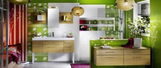
Yellow color
The color yellow gives a person a feeling of joy, has a beneficial effect on mental activity, and helps increase productivity. Yellow color is very rich and intense, so it is practically not used in its pure form - pure yellow is best suited for accents. Since the Middle Ages, each color has been given a symbolic meaning. Therefore, yellow - the color of rye and gold - was considered the color of abundance and wealth.
In light shades, light yellow is a great choice for the kitchen. Pale yellow is a calming, relaxing color - a shade for a quiet bedroom. Bright yellow can create a bright and fresh, spacious atmosphere even in a small room. Egg yolk is an extremely vibrant color that is an ideal choice if you want a hallway or living room like this to be as welcoming and friendly as possible.
Absolute color temperature.
Let's divide the color wheel into two halves. At the upper pole is the warmest color – orange. It is considered the warmest because it does not have cold shades; later we will look at this property in more detail. At the lower pole is the coldest color - blue. On the sides of the color wheel are temperature-neutral colors – green and purple. Both are formed by a mixture of cold and warm colors, green - yellow and blue, purple - red and blue. All colors in the top half are considered warm, while the colors in the bottom half are considered cool.
Achromatic colors: white, black and gray are neutral.
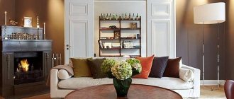
How to combine colors correctly when decorating a living room interior in warm colors
Properly selected combinations of shades can create magic. Let's look at how to choose the right flooring color for a living room interior in warm colors, focusing on the walls and ceiling:
- A dark floor made of natural wood (parquet, boards) or laminate in a room with white surfaces visually expands the space.
- A dark floor combined with a dark ceiling and light walls reduces the height and lengthens the room.
- A light floor against a background of light surfaces increases the height of the room.
- The combination of a light floor with a light ceiling and dark walls narrows the space.
- Only one color should be predominant.
- An excessive variety of colors overloads the decor of the space being designed.
- To the main color you should add its own shades.
- Items of furniture must be chosen darker or lighter than the walls of the room.
- The colors of the floor and ceiling should be different. Otherwise, the space will look disproportionate, resulting in a feeling of discomfort.
For a room with light surfaces, an excellent solution is a dark color for the floor, as well as baseboards and doors, which will create contrast. White baseboards and doors against a dark floor will fill the space with air and soften the accents.
- Complex combination.
A universal solution for a living room interior in warm colors, which uses various combinations of traditional shades (white, beige, gray). This way, beautiful and modern classic interiors are created that do not have to be remodeled due to the installation of new furniture, replacement of flooring, etc.
- Triad, or a combination of 3 colors.
Three colors are taken as a basis, which are combined in different ways. For example, the popular triad of red, yellow and blue creates an atmosphere of cheerfulness and energizes. Using them in their pure form, you will get a bright, rich living room interior in warm colors. And if you want to make the room more calm and cozy, halftones are perfect.
The use of the triad in the interior of a room charges its visitors with positivity and tones, which is why it is often used when decorating a living room.
- Similar combination.
This solution works with two or three shades of colors located nearby on the color wheel. First, the main one is selected, intended for decorating the room. And then they select several tones to the right or left of it in the color wheel. This option is both simple and creative.
- Separate-complementary combination.
In this case, those shades are used that are located opposite each other in the color wheel, that is, contrasting. But there is a little trick here. In fact, it is not the color that is located opposite that is taken, but the one next to it. This way you can create contrast, which will not be as intense as, for example, with a complementary combination.
- Tetrad, or a combination of 4 colors.
This solution is different in that in addition to one main color and two additional ones, one more is used, specifically for placing accents. A living room interior decorated in this way in warm colors looks very unusual, interesting and positive. Most of all, such a play of color will appeal to young people, as well as those who are in constant motion and fast rhythm.
- Gradient effect in the interior.
The use of a gradient in the design of a room is a modern solution that is perfect for various living rooms. Its essence lies in a smooth transition from dark to light tones. This option is also applicable to the design of various furnishing elements. Professional interior designers advise making the transition so that the darkest tone is near the floor and the lightest tone is near the ceiling. This technique will also help you visually increase the space.
Relative temperature. Cold and warm shades of colors.
Understanding relative temperature is important when working with multiple colors and color palettes. It helps, for example, to convey space and volume in an image or surface using color.
Apart from orange and blue, all colors can be both warm and cold relative to others. Using a color wheel, this is as easy to determine as absolute temperature. Warmth decreases as you approach the lower pole and blue color, for example, red or yellow will be cooler than orange, and lemon or magenta will be cooler than red and yellow. The same principle applies to increasing warmth: cyan and violet will be warmer than blue, turquoise and purple will be warmer still. Temperature gradations are especially evident in analogue and nuanced palettes.
A color can be warm or cold not only in relation to other colors, but also to its own shades.
Blue color
From blue - the color of peace. Shades of blue are especially good for small spaces. The presence of blue in the interior always ensures the sophistication of peace and nobility. This is the so-called raw color, which, together with other cool colors and shades, creates a business-like work environment. Therefore, it is most often used to decorate a workroom, for example, an office.
Other rooms don't necessarily look cold. The electric color in the spirit of Matisse will create a cozy atmosphere for the family kitchen. Blue and white is a classic combination that always feels fresh. Combine accessories and colors with fabrics such as plaid or stripes to create a sense of style. Create an attractive look for your room by using blue and orange as a complementary color.
Cold and warm shades of colors.
Difficulties most often arise with determining the shade temperature. Concepts such as cold red or warm red have become firmly established in everyday life, but not everyone understands them to mean the same thing. First, relative hue temperature is often confused with color temperature. Secondly, subjectivity: there is no exact definition of where red begins and ends. Meanwhile, the ability to identify cold and warm tones is important when working with a person’s appearance, for example, determining color types and selecting individual color palettes. This skill can be developed through experience and understanding of a simple principle.
Any color except orange can have warm, neutral and cool shades. How to determine the temperature of a hue using the color wheel?
We take any color and determine its boundaries. Then we find the approximate center. Shades of color lying on the orange side will be warm. On the blue side - cold. Intermediate colors without admixtures of warm or cold are called local or neutral.
Let's take green first. It is formed by warm yellow and cool blue colors. A cool or warm green tint is obtained due to the preponderance of blue or yellow. Moving up towards yellow we get warm shades, down towards blue we get cool shades.
The same principle applies when identifying other colors, such as yellow. Approaching orange, the color warms up. Going down, yellow acquires a greenish, lemon, cold tint. Neutral yellow has no obvious greenish or orange tint.
The orange color stands out especially. This is the warmest and the only color that does not have cold shades. In addition, it distributes warmth to the surroundings. The closest colors: yellow-orange and orange-red are also exceptionally warm.
Red. The same principle applies here: the upper shades, illuminated by yellow, are warm, the lower ones, on the purple side, are cold.
Purple itself is a neutral color, like green, it is formed by a mixture of cool and warm colors. A large proportion of red makes it warm, blue makes it cold. From the point of view of use in warm or cold tones, this is a rather complex color. The differences between warm purple and cool red or cool purple and violet are difficult to discern. It is also difficult to isolate the local purple color.
The same difficulties in defining boundaries apply to purple. Adding red makes it warmer, adding blue makes it cooler.
The difficulty in determining the temperature of a shade is that there are no precise and generally accepted distinctions where the warm shade of one color ends and the cold shade of another begins. Local shades also have no clear boundaries. Usually, when we are dealing with the primary colors: red, blue, yellow and green, this division is intuitive; experience helps to distinguish between other colors.
Blue is the coldest color of the entire palette, it is the antipode of orange. But if orange makes neighboring colors extremely warm and has no cold shades, then blue does not have similar properties. Conventionally, a warm blue color can be distinguished. Some people believe that blue, by definition, cannot be warm, but a warm range of colors can also contain blue if you choose the right shade. Its cold, or local, shades are located in the middle, and its warm ones are located at the edges: on one side, blue is illuminated by yellow, on the other by red. These shades will be warmer than the cool blue.
Blue-green colors stand out separately. Here, warmth-coldness is conditional and depends on whether they are separated into a separate group with their own local color or considered as part of green and blue shades.
If we consider turquoise as a local color, then those located on the green side will be warm, and those located on the blue side will be cold.
If we consider blue as the local color, the same tones will be warm. Here, lightness and saturation are involved in determining color.
So, we come to the influence of lightness and saturation on color temperature. Up to this point, we have considered the properties of warmth and coldness in pure colors and one parameter - tone. But this is not enough, since most often you have to deal with complex colors that contain an admixture of achromatic ones, that is, take into account all three parameters. Lightness changes with the addition of white and black, saturation changes with the addition of gray.
Blue color
Blue color creates a feeling of purity, freedom, peace and quiet. However, you must remember that an excess of blue can cause apathy and indifference in a person. In addition, it contributes to the visual “cooling” of the room, so blue is recommended for use in sunny rooms on the south side and in combination with warm colors.
Using light blue on the ceiling will make the room look taller and more spacious, making it suitable for kitchens and bathrooms. The combination of blue and brown shades gives the interior respect. Mixing with sand and golden shades is romantic and vintage.
Temperature of achromatic colors.
Pure achromatic colors are considered neutral. However, in nature it is difficult to find absolutely neutral gray, white or black; they always have an advantage in one direction. So, cold or warm white color is obtained from the admixture of other tones. Yellow-red ones make it warm, blue ones make it cold. The same applies to gray and black.
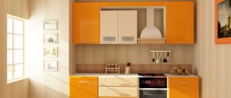
Orange color
In the beginning, the color evokes joy, excitement and passion. Combined with white orange it gives a feeling of sunshine. This color enhances and eliminates the effect of cool colors. Used in shade, pillows and curtains.
Like a warm shade of orange, it improves appetite, improves tone, so you can use it in the design of the kitchen, dining room. Bright orange details look very stylish in the living room when combined with a lighter color scheme.
A noble shade - terracotta - with olive green and burgundy shades creates the style of an antique cabinet. And the combination of oranges with blue and blue is reminiscent of a house by the sea.
Temperature of mixed colors.
For clarity, it will be convenient to return to the color ball model and look at its vertical section. The cold and warm poles of the color wheel are located at the edges, and neutral colors are located in the center. Moving from the extreme temperature characteristics to the middle, the color approaches the opposite pole and is thereby neutralized. In other words, by decreasing saturation, increasing or decreasing lightness, the color will mix with achromatic neutrals and become neutral itself.
The warm group - reds, yellows - become less warm, their diluted shades seem colder.
Dilution with gray and black colors most quickly changes the character of light yellow and lemon shades; they appear greenish and cold.
The orange color does not acquire cold shades, but becomes more neutral. With dilution it quickly becomes unrecognizable and turns brown.
Blue and violet with the addition of white and gray lose their cold properties and seem warmer.
As you can see, using the color wheel it is easy to distinguish cool shades from warm ones. Difficulties arise with the definition of blue-red and blue-green shades; here it all depends on which color is considered local. Complex and mixed colors are more difficult than pure ones in determining warmth and coldness. Here it is necessary to distinguish nuances and see how the same tone changes along with lightness and saturation.
Continued: removing and bringing colors closer >>
Red color
K is a rainy color - the most active, with its help they create the impression of warmth and a spectacular interior. At the same time, a room dissolved in red will look smaller and smaller. This color is suitable for the living room, office, hallway, kitchen, but it is better not to use it in the bedroom. Red color is very active, it causes excitement when exposed for a long time, turns into aggressiveness, but gives a small amount of energy.
Red shades add mood to any colorful solution. These could be pillows, vases or rugs. Red lampshades soften the light and warm the room, giving it a cozy glow. If you are afraid of using bright shades of red, using warm terracotta and wood colors, they will create unique delicate combinations of this color group without much risk.
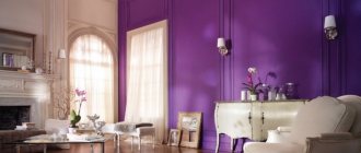
Purple
The color purple puts a person in a festive mood, but the abundance of flowers can cause discomfort. That's why purple needs to be diluted - using lots of white next to shades of purple keeps them bright and fresh, especially when the room is filled with sun. The bright colors of this color can make a room appear larger.
You can add shades of purple to your room through accessories such as bedspreads, rugs, pillows, curtains. The more interesting their texture, the more significant the effect will be.
And the use of light shades of purple is suitable in the kitchen and bathroom. Wine shades can be used in the living room, dining room and office. The bedroom is better decorated in lavender and blue shades of purple.
Green color
Green is the color of life, unity with nature. Works well on the nervous system, soothes the eyes. The color goes well with many other colors (yellow, black, red, brown, white, lilac and a number of others) and can be present in the interior of any room.
Green balm balances and calms, its pastel shades reduce a person’s feeling of hunger, so it is advisable to use it when decorating a kitchen. The ability to relieve stress and restore emotional balance makes greenery an excellent choice for the bedroom.
Depending on the shade, green can help you relax (mint or aqua), active (apple or lime) or hide in the woods (bottle or olive).
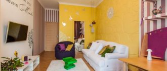
All about how to properly use pale yellow in the interior
Muted yellow is ideal for creating a feeling of warmth and coziness in absolutely any room, it is good for both spacious living rooms and small kitchens.
Pair this pastel palette with other neutrals for an elegant interior, or bold contrasting colors for a modern, stylish decor. Every season, interior fashion designers present new colors that will become relevant and in demand, as a rule, we are talking about bright, bold shades. However, if we are talking about decorating a home in reality, and not on the cover of an interiors magazine, neutral tones are much more important. Soft, muted pastel shades will always be in demand, and everyone needs to know how to work with them.
We invite you to pay attention to the pale yellow range; these colors are not so simple and are not limited to pastel canary. Shades that go into beige, such as creme brulee, and with a gray undertone, like the color of eggshell, are also possible here, darker and lighter . In any case, soft yellow paints are perfect for working with any room; this range gives enormous scope for creativity and creative ideas
A pale yellow color, very reminiscent in tone to the shade of butter or the pulp of a ripe melon, can bring real sunshine, a feeling of joy and optimism to the interior of your home. At the same time, in a well-lit room it works as a neutral tone, allowing you to experiment with bold color combinations.
This photo shows how well pale yellow works in a bedroom. It's incredibly soft and pleasing to the eye, yet this neutral shade is the perfect backdrop for the dark wood pieces, in this case the headboard.
Notice how light yellow works in the kitchen! Diluted with white and complemented with orange details, yellow creates a sunny mood even on the cloudiest day.
The secret of the elegant interior of this living room is the harmonious combination of several neutral shades, among which delicate yellow undoubtedly plays a leading role.
Feel free to experiment with the brightest shades, such as this beautiful blue. If muted yellow is used as a background tone, you can be sure that rich colors will look sophisticated and stylish.
Another great idea is to paint your bedroom ceiling with a soft yellow shade. Whatever the weather outside, when you wake up, you will always feel the energy of warmth and comfort. This is perhaps one of the best ways to create a truly comfortable, rainbow-colored interior.
To create a mood of freshness and brightness in the interior, combine yellow shades with green. These three tones complement each other perfectly; you can take one of them as the main one, and use the remaining two to create accents.
Another great idea for working with yellow is to combine it with soft gray-blue tones; they, like no other color scheme, can add brightness to yellow tones and highlight them with contrast. Use a technique that designers really love: for those interior elements that you don’t want to focus on, use a muted gray palette, and leave yellow for working with the most interesting and beautiful details.