The use of warm and cold pastel colors when decorating your home allows you to include any additional colors. A beautiful sand color in the interior can be diluted with carrot, yellow or burgundy. Blue, violet, light blue will also go perfectly with it. The color scheme may change or be supplemented depending on the room being furnished. For example, dark inclusions are suitable for the hall. And for dining rooms it is better to give preference to more colorful colors.
The correct combination of finishing, furniture, textiles and decor will help create an original stylistic direction. It can be either ultra-modern or classic design. Thanks to the variety of colors, consisting of a mixture of golden, brown, gray or pink, you can easily choose the right range to visually increase the space and create maximum comfort and sophistication in the home.
Shades of sand color
When adding auxiliary colors, sand can become both warm and cold. For example, when mixed with gray, deep but not bright tones are obtained. Adding yellow allows you to get light and rich colors. The brightness of the color also varies. Most of them are light pastel colors. But when mixed with brown or pink, it is possible to obtain rich colors that will stand out when incorporated into the design of the premises.
When combined, the following shades of soft color are obtained:
| With orange | Chocolate, copper, bronze, cognac |
| With yellow | Butter, vanilla, ocher, iris |
| With white | Cream, milk, champagne |
| With gray | Barley grain, peat, coffee with milk, beaver, beige |
| With pink | Antique Brass, Burnt Umber |
| With brown | Bourbon, sepia, cinnamon, brown saddle, caramel |
Color properties
Warm sand color symbolizes calmness and regularity, comfort. Its abundance in the house helps to create harmony in relationships between household members. Ideal for decorating spacious rooms: it creates a special comfort of living. In small rooms it eliminates the “pressure” of the environment on people. Psychologists recommend using warm and gentle colors; psychologists recommend them to decorate rooms where owners are most often found. He is able to calm you down and put you in a positive mood. This especially applies to rooms where children relax and play.
Warm colors have a positive effect on children and promote normal mental development. Suitable for complete decoration of premises and for interspersing as individual elements. With its help, you can highlight furniture, create a beautiful finish, and decorate in an unusual and stylish way.
For rooms that are well lit during the day, it is better to choose cool or neutral colors. Overly catchy and saturated inclusions can reduce the space.
What goes with it?
The soft and warm color goes well with any colors: catchy, dark, pastel. In the interior they complement and emphasize each other. The most beautiful and sophisticated additions to light colors include:
- blue, turquoise. Considered a classic option. Reminds me of the sun, summer, sea. Suitable for styling rooms of any size. Ideal for creating nautical decorations.
- brown, light pink. This range highlights the sophistication of the design. Brown emphasizes the light color of the sand, and pink eliminates the blandness of the style.
- black, cream. The presence of minor black inclusions sets off similar colors. This option is applicable even for small rooms.
- light brown, dark green or olive. The gamma is perfect for a neutral style. Ideal for offices and halls.
- carrot, light pink or salmon. A simple tandem allows you to create a light and warm design. In such a room you will always feel comfortable.
General concept
We all love summer very much, with its warm and good weather, bright scorching sun and pleasant, gentle breeze. It’s a pity that summer passes quickly in our climate, so I really want to leave it in my memory, or even better, take it with me. Sand-colored wallpaper pasted in the apartment will help to refresh pleasant memories of a wonderful time of year.
Sand color is one of the basic shades of beige, which is recognized as the most universal color after white. In the interior of rooms, sand color can be combined with both light and dark tones. It looks great with burgundy, brown, black colors, and also harmoniously combines with white, yellow, and other shades of beige.
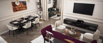
Luxurious dining room of a large house
In the interior of an apartment, two color forms of this tone are most often used:
- Golden sand color, reminiscent of straw, is a very warm and cozy tone.
- Grayish-sandy color, reminiscent of pale coffee with milk, quite cold and fresh tone.
If we consider sand tones from the point of view of their influence on a person, then we can say with confidence that they are not perceived by people in any way. The neutral sand color of the walls is always perceived calmly, does not tire, bother or bother people.
Article on the topic: Patchwork: beautiful and easy photos, all the secrets, pictures, sewing from strips, master class, do-it-yourself video instructions
Colors of this color scheme are perfect for older people who value home peace and comfort. The sandy color of the walls allows you to create a calm, melancholic interior, which may seem boring to modern, impetuous young people. Therefore, wallpaper in this color is best suited for balanced adults who prefer stability and tranquility in all aspects of life.
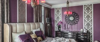
Large cozy bedroom with beautiful wallpaper
What styles does it suit?
Neutral color is ideal for any stylistic direction. After all, it can be used as a base or a discreet addition. Suitable for the following styles:
- high tech. The optimal color for the direction will not be the pure color of sand, but its colors: bronze, copper. The presence of such glossy inserts on the facades and stretch ceilings will emphasize the originality of the direction.
- country. Kind and warm country music is the best solution for the home. Its basic design can easily be done in a golden brown color or its colors.
- chalet. A discreet chalet would not be complete without a splash of pastel colors. It will look good with wood decor or trim.
- Art Deco. Pastel colors are suitable as a base. But to dilute it in art deco is brown or black.
- classical. The use of golden-brown pastels as a basis for classics makes it easy to play with exquisite furniture and decor.
- minimalism. Lightened pastel colors are a good finishing option for minimalism. As an addition, you can use brown or dark brown.
Use in styles
Sand color can be used to decorate an oriental-style interior. A low sofa with carved legs, large wide floor vases, landscapes in gilded frames and curtains made of rich fabrics will perfectly convey the atmosphere of the East.
If you love the classic style of interior design, then sand walls here will serve as a base for other colors. The main thing is to follow the rules of harmony, symmetry and not save money on quality furniture. Cherry wood paneling is perfect.
Sand color is a natural tone, so whatever style you choose, it will perfectly complement and balance the rest of the interior colors. It can mute bright accents or emphasize calm ones.
When choosing a room design, look at the photo of sand color in the interior and make sure that choosing this color will be an excellent decision!
Designers unanimously consider sand color to be a universal option for decorating a room for any purpose. The sand palette is calm and goes well with various additions of any scale and saturation.
Sand color in the interior will be an ideal base for implementing different ideas. Variations of beige colors appeal to almost every style and coexist friendly with unusual details. An elegant sand palette will help create an atmosphere of comfort and friendliness, without excluding a touch of glamor and strict restraint.
In the living room
Warm decoration in the living room creates coziness and allows you to practically use every corner of the room. It is recommended to use brown or light brown as an additional color. They are suitable for furniture and textiles. For example, in a spacious room with a “sand” finish, a sofa, shelves, and a coffee table in light brown tones will look good. You can also choose champagne or cream colors as a base. With them, golden brown will look appropriate and will help visually expand the room and make it more spacious. To highlight recreation areas, you can use light olive or light salmon textiles. To highlight the design in contrast, it is recommended to use rich colors: turquoise, golden, olive.
Application
Sand colors will be appropriate in any room of the apartment. They will bring harmony and peace to every room, illuminate it with their light and add warmth.
Modern bedroom in minimalist style
You can successfully use this color palette in the following rooms:
- Calm colors have always been perfect for the living room, but to prevent the room from being boring, it is enough to place a bright accent on one of the walls. Wallpaper in sand tones will give the room a solemn seriousness, but at the same time will set you in a calm mood. Depending on the chosen style, you can choose colorful furniture and curtains that will set the tone. Wooden furniture in natural colors will look great in such an interior; brown curtains and white tulle will complement the classic style.
- The sand color is calm, light, creating a cozy aura, which means it will be an excellent solution for the bedroom. It can always be supported by white and beige shades, which can be placed on furniture and interior items. A bedroom in this color will suit a married couple with an established relationship. At the same time, any person in such an interior will feel comfortable resting and gaining strength.
Beautiful furniture in a small living room
- In the interior of the kitchen, light colors are often combined with bright and positive ones, for example, with orange, yellow, green, and coffee colors. In this combination, the kitchen interior gives vigor, charges you with energy and positivity from the very morning. At the same time, traces of cooking on wallpaper of this color are not so noticeable. But don’t delay cleaning; it’s always more difficult to wipe off old stains than to quickly remove new ones.
- For a small hallway, this color will also come in handy. It will help expand the boundaries of a small room and make it more spacious. The calm mood of the light walls will emphasize that the house is inhabited by pleasant and balanced people whose life is well organized. The abundance of accessories and furniture in the interior will make the environment more lively and comfortable.
Related article: Technology and stages of wallpapering
In the interior of each room, sand reveals itself differently; it adds solemnity to the living room, comfort to the bedroom, cleanliness to the kitchen, and space to the hallway.
Both seasoned designers and ordinary people can create successful interiors using the color of sand for wall decoration. Sand is a very sociable, successful color that works well in almost any interior.
In the bedroom
Using warm colors of golden brown will help make the bedroom comfortable and cozy. It is advisable to give preference to lightened pastel finishes. Interspersed with black or dark brown will help highlight its sophistication. For example, the owners will be able to cover one wall with cream wallpaper with dark contrasting patterns. The rest should be decorated in light colors. To highlight the bed as the main interior element in a pastel finish, you can use textiles with blue or yellow patterns. Or you can simply decorate the sleeping bed with sofa pillows in turquoise and pumpkin colors. It is recommended to buy canvases chosen for windows in colors that match the pillows and other textiles. You can also zoning a room by combining pastel and bright colors. A small cream or light brown partition will help to beautifully separate a bright relaxation area from a quiet work area.
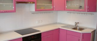
In the kitchen
In the kitchen, golden-brown color will look perfect in glossy facades. They will emphasize his special warmth. Be sure to install a set in this color in a room located on the north side. The presence of warm colors will ensure the creation of comfort. But it is not recommended to choose finishes in similar colors: in the absence of a high-quality hood and infrequent cleaning, its appearance will quickly be ruined. It is better to give preference to decorative accents. Light translucent curtains and golden-brown tulle will emphasize the neatness of the window. This coloring of a corner or dining area will facilitate comfortable tea drinking and meals. An interesting solution would be to install a light brown set and decorate a kitchen apron made of mosaics in the color scheme of sand. The beautiful work area of the tabletop can be complemented by mosaic vases for fruits and sweets in appropriate colors.
Advantages of color
Sand colors are often used to decorate walls, since these colors help create a high-quality interior for both a professional designer and an ordinary person. In such an interior it is difficult to get confused and make gross mistakes; everything is quite simple and clear.
But this is not the only advantage of sand color:
- Sand is included in the palette of light, warm, natural shades, so it can be used in any room, regardless of their location relative to the cardinal points: for southern rooms it will maintain a thermal balance, for rooms on the northern side it will be slightly warmed up.
- Features of color perception help, with proper lighting, to visually increase the dimensions of the room. Not surprising, because this is the prerogative of all light colors. Therefore, even for the smallest rooms of Khrushchev, sand colors will come in handy.
- The color of sand is very versatile, as we have already said, it goes well with light, dark and bright tones. In this case, it most often acts as the main filler of the walls, against which accent colors appear advantageously.
- For most styles and trends in interior design, sand will be appropriate. It can be light and naive in country and Provence styles, restrained and intelligent in the classics, warm and soulful in modern minimalist styles.
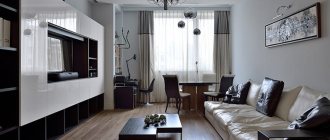
Living room with amazing view
All these factors determine the widespread use of this shade of beige in the apartments and rooms of compatriots.
Note that orange, red, pink and yellow tones can be excellent companion colors for sand.
It’s not difficult to choose wallpaper in this color range; many manufacturers produce decent samples in solid variations and in different colors. Domestic vinyl wallpapers produced by our flagships: Palitra, Mayakprint, ART look quite appropriate and look good in the interior of premises. Among German wallpapers for walls, beige palettes are often found, especially with Provence or country colors. At least the manufacturer Erismann has several collections in this topic.
Related article: Windows with built-in blinds: advantages and disadvantages
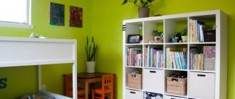
In the nursery
Champagne finishes are ideal for a newborn's nursery. Furniture should be selected in light brown colors. For the room where the girl lives, the following colors should be used: champagne, salmon, light salmon. If it is on the south side, you can use the following colors: cream, lilac, light lilac. For the room where the boy lives, you can combine golden brown and olive or turquoise colors. A universal solution is a combination of champagne or darker colors and orange, yellow. Teens may like combining cinnamon or caramel with white and burgundy.
When choosing yellow and orange colors, you should choose lightened colors. Otherwise, the created environment will not help the child concentrate on learning and relaxation: he will be too excited.
Ideas for wall decoration in the interior of rooms
The color is associated with soft and warm energy. Conducive to serenity and peace. Can be used in any style solutions for all housing.
In the bedroom
Warm peach tones in the bedroom encourage the harmony of your own thoughts, if you do not forget about the rules of combination. Classic means the use of plain wallpaper. Geometric patterns or floral textures will add dynamics. In combination, it is enough to place accents on just one of the walls.
The photo shows a country-style bedroom with muted accents of ordered geometry.
In the living room or hall
Peach color in the living room or hall expresses the special comfort of home. Delicate peach wallpaper can be combined with upholstered furniture in coral, pistachio, brown, green or milky shades.
It is possible to enhance the color on the accent wall, near which a light sofa is placed. Large flowers and patterns are used as an accent.
In the kitchen
The walls in the kitchen areas appear to be the main background of the interior.
- For small areas, pale peach wallpaper is relevant. This will visually increase the space.
- A richer texture is suitable for spacious kitchens.
- Warm peach adds a distinct personality. A combination of several colors is sufficient here, depending on the accents placed.
- A white apron and light furniture combine harmoniously.
In the corridor and hallway
Peach-colored wallpaper in the hallway adds volume and creates the illusion of natural light. Universal interior paints will brighten a too dark corridor. In small spaces, only the lightest palettes, close to the beige color of the wallpaper, can be combined.
In the nursery
Children are interested in colorful colors and bright elements. Peach wallpaper is associated with a girls' room. Monochrome thematic drawings, for example, elements of graffiti, will help to play around.
The photo shows a children's room in light colors with bright elements.
In bathroom
The champagne color is perfect for decorating all the walls in the bathroom. Tiles of this color will make even a small room bright and warm. Caramel is also good for this task. But it is recommended to combine it with white and brown. Brown is ideal for framing a ceiling or dividing a room horizontally. To do this, you should choose thin borders. Placing the curb 10 cm below the walls will help raise the height of the walls. The rest of the walls and ceiling should be painted white. A combination of dark brown and light colors will help divide the room and highlight the shower area. If champagne is in tandem only with white color, you need to highlight the plumbing fixtures. To do this, it is recommended to choose models with bronze, brass taps and valves. The furniture can be installed in white with bronze or brass fittings.