Primary and secondary colors
As you know, there are three primary colors (red, blue, yellow) and three additional colors (purple, orange, green). These are the basic colors. By combining them, you can get all the other colors and their shades (in theory, yes, in practice the situation is a little different). In the figure, the primary colors are represented by circles, and additional colors are formed at the intersection of the pairs. These pairs show how mixing the colors of the main row produces additional ones.
Primary and secondary colors of the palette
In practice, mixing colors is an interesting process, but often the result is difficult to predict. We work with paints, and they are a mixture of a coloring pigment and a binder base. That is, they have their own properties due to the presence of that very base. After all, paints come in different types - oil, acrylic, aniline, etc. Accordingly, the result will be slightly different. When you work with paints from the same company for a long time, you can almost accurately predict what will happen if you add this or that component.
It is also worth remembering that if you mix light rather than paint, the result will be different. Paints are only a reflection of light and not all laws work with them in the same way.
Obtaining additional colors: orange, purple, green, their shades and brown
Pairwise combination of primary colors gives us additional shades:
- Orange is obtained by mixing red and yellow.
- You get purple if you add blue to red.
- Green can be obtained by mixing yellow and blue.
Mixing colors should be in equal proportions. In this case, we get a “neutral” tone. If you are not satisfied with the result obtained, you can add one of the components, “shifting” the shade in one direction or another.
Additional colors and their shades
Please note that red and blue do not always produce purple. Often this mixing of colors produces a “mud color.” This is because your red contains yellow, that is, it is not the main one, but only one of the shades. To get purple, there must be pink or purple instead of red. On the other hand, mixing pink and yellow will not produce blue. So to get a specific color, first experiment with a small amount of paints. Once you are sure of the result, you can repeat it as needed.
If we add to the resulting additional colors the primary ones that are already present in them, we get the same color, but of a different shade. We didn't introduce any new colors, we just changed the concentration of one of the existing ones. This is how we get mixed colors: yellow-orange, red-orange, red-violet, blue-violet, blue-green and light green.
How to get brown color when mixing colors of an additional row
What happens if you add one that is not in it to the additional colors? The result will be a mixture of all available primary colors, and it will give us a brown color (when working with light it will be gray, but with paints it will be either brown or very close to it). So, to get brown, you need to mix all the primary colors: yellow + red + blue. Or add “missing” to one of the additional ones:
- add yellow to purple;
- to green - red;
- add orange to blue.
That is, to get a brown color, you can mix three primary colors or add the missing primary color to the additional ones. Interestingly, if you mix the same light waves, you get gray light. But paints are only a reflection of light, so there are certain differences.
Color wheel - how to make it
If the colors - primary and secondary - are placed in a circle, according to how they turned out, we get a traditional color wheel. We divide the circle into 12 parts. At the vertices of the triangle, fill the sectors with primary colors.
Drawing up a color wheel
Their derivatives, obtained from equal shares of neighboring colors, are in the center of the sector. These are called “first-level complementary colors.” To the right and left of them we place the shades that were obtained by adding another part of the corresponding component. This is how we get our own color wheel.
Mixing colors creates a color wheel
Please note: mixing paints from different companies gives different shades. Therefore, creating a color wheel is useful if you are going to be working with certain paints for a while. Looking at the result and knowing how you got it, you can understand what you can add to get the desired shade.
Getting shades
All colors that exist in nature are called chromatic. This is all the variety of colors and their shades. In nature, three colors are not found in their pure form - white, black and gray. They are called achromatic. By adding achromatic colors to others we get different shades.
Each color can be darker or lighter
For example, we get pink by adding white paint to red. For blue - add the same white to blue. And so with all the colors that are present in the color wheel. The lighter the shade we want, the more white paint. Sometimes - for very light shades - it is easier to achieve it by adding the desired dye to the white paint. These light shades are called pastels.
To obtain pastel shades with a “dusty” effect, gray is added to the primary colors. Please note that multiple achromatic colors can be added. For example, we got the desired “degree” of pale purple, then added a certain amount of gray to it. The tone was a little more subdued.
How to get shades of colors: mix paint with white, gray or black
If you need to turn a saturated color into a dark one, add black to the base color. This is where you have to be very careful, add a little at a time, stirring thoroughly.
Laws of color mixing
Before starting design work, carefully study the rules of tinting in order to obtain the color of the desired shade and tone for painting.
Paints are divided into 2 types:
- Achromatic - white, black and grayscale.
- Chromatic - yellow, blue and red, as well as composite and additional colors obtained by mixing these basic ones with each other.
For chromatic colors, tone, brightness, and the ability to reflect or absorb light rays are important.
When tinting paints, a 12- or 24-segment color spectrum is used, in which the basic chromatic colors are located at the vertices of an equilateral triangle inscribed in a circle. Between each of the main ones there are components obtained by mechanically mixing two nearby ones.
| Basic | Composite |
| Red + yellow | Orange |
| Yellow + blue | Green |
| Blue + red | Violet |
When mixing basic and composite colors that are nearby in the color spectrum, additional halftones are obtained. This is how a color wheel is compiled for 12, 24 or 48 colors.
How to mix paints to get the right color
Everything described above can be easily implemented in practice if you need “simple” colors, which are obtained from mixing primary and secondary colors. Adding achromatic ones to them will not be difficult. By experimenting with the amount of “additives”, you can eventually get exactly the shade you wanted. By the way, try to find your color in a small amount by mixing on the palette. At home, the palette can be replaced with a plastic plate. If you are mixing paint for interior use (on walls, for example), once you get the color you like, apply it to a small area and let it dry. You will see that the color has become a couple of shades lighter. And this must be taken into account when creating your own shade.
Proportions of paints and oxidizers when mixing
If you have shoulder-length hair or shorter, a standard tube of dye (60 ml) will be enough for you. If the strands are of medium length, arm yourself with two tubes (120 ml). If the curls are very long, then you will need 3 packages (180 ml).
For tone-on-tone or darker coloring, use an oxidizing agent of 1.5-3%. 1-2 shades lighter - 6%. 3 shades lighter - 9%. For strong lightening - 12%.
As a rule, paint and oxidizing agent are mixed in a 1:1 ratio. If you need to do intense toning or lightening, the proportions change to 1:2. Before dyeing, you need to study the instructions for using dyes of a particular brand.
Dewal, Hair coloring kit
The set contains a cap, gloves, cape, bowl, applicator, brush, 2 clips, spatula and hook.
665 RUR
Available the other day
OLLIN, Paint scales
Electronic scales for measuring the amount of material.
(23)
RUB 1,276
RUR 1,276 Buy
OLLIN, Coloring bowl, black, with rubberized bottom, 360 ml
Container for preparing the coloring composition.
141 RUR
141 RUR Buy
Estel, Activator De Luxe 1.5%, 60 ml
Activator 1.5% De Luxe is used with Estel De Luxe cream colors for intense toning.
(11)
55 rub.
55 RUR Buy
Mixing experiments: what you need to know in advance
The world around us is filled with a wide color palette, but all the colorful splendor is based on three primary colors: blue, red and yellow. It is by mixing them that the desired halftone is achieved.
To get a new shade, use base colors in different proportions. The simplest example of how to get green. The answer is extremely simple: mixing yellow dye with blue. A visual table of primary, secondary and transition colors obtained by mixing is presented below:
This table will help you understand that the question of how to get yellow is in itself incorrect. It cannot be achieved by combining other components, since yellow belongs to three basic tones. Therefore, when the need for yellow arises, they purchase a ready-made dye or extract the pigment from natural products, which is not entirely advisable.
The same initial colors, taken in different proportions, when mixed, give a new result. The larger the volume of one dye, the closer the final result after mixing will be to the original shade.
Experiments must be carried out taking into account generally known rules. If you combine chromatic colors that are close to each other on the color wheel, after mixing you get a paint with a pronounced chromatic hue, although it does not have a pure tone. The combination of dyes located in opposite directions leads to the formation of an achromatic tone, in which a gray tint predominates. The chromatic circle will help you navigate the optimal combination of colors:
For example, if you take red cinnabar and lead white, the resulting bright pink color will darken after some time. It is advisable to take the most limited amount of original paints to obtain the desired tone. When mixing, their compatibility must be taken into account. For example, oil-based dyes are sensitive to solvents. It is better to immediately exclude materials that darken or quickly fade. A table of combinations that should not be used will prevent errors in the creative process:
How to get gray and its shades
To prepare an achromatic gray color, mix black and white in different ratios, depending on the intensity of the shade required. To prepare a light gray tone, black paint is gradually added to white.
To obtain a concentrated dark gray tone, add white to black. New shades of gray are created by mixing white with one base color and one component color that are in contrast to each other on the color spectrum.
| Colors and proportions | Resulting color |
| White + blue + orange 2:1:1 | Gray-blue |
| White + orange + green 2:1:1 | Gray with a yellow tint |
| White + lemon + purple 2:1:1 | Gray with beige tint |
A whole range of gray undertones is obtained by mixing basic, composite or additional colors. In this case, you should take as a basis a classic gray color scheme made from achromatic colors.
| Colors and proportions | Result |
| Base + blue 1:1 | Gray pearl |
| Base + emerald 1:1 | Marble gray |
| Base + lemon 1:1 | Yellow-gray |
| Base + white + blue 1:0.5:0.5 | Bluish gray |
| Base + white + green 1:0.5:0.5 | Gray-green |
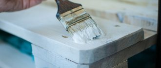
Necessary tools and paints
Tools required for painting and varnish works:
- brushes of different shapes, sizes and hardness - for different types of work;
- spatulas - for puttying surfaces before painting;
- paint rollers – for performing large volumes of work.
The best paint brushes are made from hog bristles. They are made flat and round. There are synthetic brushes, they are durable, but they do not provide such a neat and even surface when painting as natural ones. To apply an openwork pattern, thin artistic brushes made from kolonka or squirrel hairs are used.
There are the following types of brushes:
- Swing round brushes are used to cover large surfaces (floors, ceilings, walls).
- Flat brushes help smooth out imperfections in the paint after painting with other tools. Suitable for working with stencils.
- Hand brushes are designed for painting small surfaces (window frames, doors, radiators).
- Narrow panel brushes are designed for creating patterns, even stripes or painting areas that are inaccessible to handbrake brushes.
- End brushes are designed to create a “shagreen” effect on the surface to be painted.
There are 2 types of paints used for design and repair:
- for interior decoration;
- for street painting.
They differ in chemical composition, solvents used and method of application to the surface.
There are special requirements for materials used indoors; they must:
- do not burn out in the sun;
- withstand exposure to moisture;
- be resistant to temperature changes.
The following types of paints are used for interior decoration:
- Oily. For painting wooden floors, doors and window frames. They fade strongly from sunlight and are not suitable for façade decoration.
- Water-based. They are diluted with water, dry quickly, have no pungent odor, and are resistant to fading. Gives a smooth matte surface
- Acrylic. Bright and durable, resistant to moisture and temperature changes, and do not fade in the sun. Suitable for painting walls, ceilings, furniture and facades.
- Alkyd. Durable, resistant to fading, but toxic to humans. They are used for painting floors in large areas provided there is good ventilation. Suitable for external work.
- Latex. Quick drying and non-toxic. Protects against mold formation. When dry they form a shiny glossy surface. Suitable for painting walls and ceilings in bathrooms and kitchens.
Options for obtaining gray and its shades
Classic gray is a neutral color.
When chromatic spectral colors are added to it, it acquires cold or warm shades:
- Achromatic neutral colors of various tones are prepared by mixing chromatic colors in different proportions.
- When adding cyan, emerald or blue to classic gray, cool shades are obtained.
- For rich colors in warm tones, add ocher, orange or bright lemon paint to gray.
- Copper shades are created by adding red, burnt orange or terracotta to a base.
Variety of shades of red
Red consists of a trio of original colors that make up the base. Therefore, even a minimal set of paints cannot do without it. However, the question of how to get a red color when mixing paints sometimes still arises. This happens because magenta is involved in printing, so creative searches for how to get red are natural. Everything is solved extremely simply: to obtain natural red, yellow is mixed with magenta in 1:1 volumes.
The color scheme of red is diverse, so there are many combination options:
- An extremely popular question is how to get a crimson color. The initial colors for the mixture are red and blue in equal proportions; introducing small amounts of black or white color will help to vary the shade of crimson.
- There are several answers to how to get brown. The easiest way is to combine red and green. Since green itself is the result of mixing yellow and blue, then, accordingly, a combination of three primary colors will help to achieve a brown background. More detailed ways to achieve shades of brown are presented in the diagram:
- Pink can be obtained by combining red with white.
- If you mix 2 portions of red color with 1 part of yellow paint, you will get scarlet. To get orange, you need to increase the volume of yellow. Depending on the desired shade, orange is created by mixing pink paint and yellow dye.
- You can achieve burgundy in different ways. The easiest one is to add a drop of blue paint, because red itself is dark. A similar result will be obtained by introducing a little yellow and a drop of black paint into the red color.
- Mixing red and pink dye allows you to achieve a softened red undertone; white color will help increase the result.
- Combining red with violet in a 3:1 ratio results in a dark red tone.
The variety of shades of red is demonstrated by the next circle. It is worth noting that adding white colors to any mixture leads to lightening of the tone, and black ones to darkening.
The table below will help you understand the names of shades of red:
Color mixing table and decoding of numbers
Now let's move on to the most important and interesting thing. 
What do these numbers mean?
The numbers in the left column are the lightness level, where 2 is the darkest (black), 12 is the lightest, mix is mixton.
The numbers in the top row are the main shades:
- …/0 – natural without additional tone;
- …/1 – ash with blue-violet pigment;
- …/3 – golden;
- …/4 – red with copper pigment;
- …/5 – red with purple pigment;
- …/6 – purple;
- …/7 – red-brown;
- …/8 - pearl.
Estel, Activator De Luxe 1.5%, 60 ml
Activator 1.5% De Luxe is used with Estel De Luxe cream colors for intense toning.
(11)
55 rub.
55 RUR Buy
Kapous, Hyaluronic Cremoxon Developing Emulsion 6%, 150 ml
Cream-oxide is intended for coloring tone-on-tone or 1 tone lighter than the original (natural) hair color, coloring gray hair.
(37)
60 rub
60 RUR Buy
Estel, Oxygen 3% Princess Essex, for hair coloring, 60 ml
Three percent oxygen is ideal for light toning and tone-on-tone coloring.
(24)
55 rub.
55 RUR Buy
Estel, Oxygent 6% De Luxe, for hair coloring, 60 ml
Six percent Oxygen is ideal for dyeing 1-2 levels above your hair color and in darker tones.
(36)
55 rub.
55 RUR Buy
However, you probably noticed that after the slash (or dot) there are 2 digits in the paint numbers. For example, 8/34, 10/65. What does the second mean? She talks about the extra shade:
- …/…1 – ashen;
- …/…2 – purple;
- …/…3 – gold;
- …/…4 – copper;
- …/…5 – mahogany;
- …/…6 – red, purple;
- …/…8 – coffee.
Let's look at some examples: 7/11 is a light ash blonde with an enhanced ash nuance. 9/34 - very light golden blonde with copper nuances.
Variations of blue
An equally rich palette of shades is obtained by mixing with blue dye, which is part of the basic triad. Therefore, its presence in any set is mandatory. However, even a set of 12 colors sometimes does not meet the needs for a true blue tone. The reason is color variations. The classic tone is called royal, and on sale it is often replaced by ultramarine, which is characterized by a bright dark shade with a slight presence of violet. Therefore, the question of how to get blue no longer seems absurd. The way out of this situation is to add white to the base color in a ratio of 3:1. Blue is obtained in the same way, only more white is used when combining.
An interesting color of blue with a moderately saturated result is obtained by combining darkish ultramarine with turquoise.
The following recommendations will help you figure out what colors you need to mix to get shades of blue:
- Equal volumes of blue and yellow dye will give a dark blue-green tone. The introduction of white promotes some lightening, but the brightness is reduced. The reason lies in the combination of three components, and the more there are, the duller the color turns out.
- To get a turquoise color, mix cyan blue and add a slightly smaller amount of green. This shade is also called aquamarine.
- The color obtained from equal volumes of blue and light green is called Prussian blue. When white is introduced, the saturation decreases, but the purity of the hue does not go away.
- Blue and red colors in a 2:1 ratio produce blue with a hint of purple. The resulting color is lightened by adding white.
- Mixing equal parts of blue and pink magenta will give a royal blue, which is characterized by unusual brightness.
- Blue can be darkened by mixing it with black in a 3:1 ratio.
A table with the names of shades of blue will be an assistant in mixing experiments:
Graphite hair color
How to get a fashionable graphite shade? Nowadays, you don’t have to go to a salon: you can get what you want at home, using household or professional dyes.
Hair dye/shade
- SYOSS Oleo Intense, 4-50 (graphite chestnut);
- FarmaVita, Ash Iris, 5.12 (graphite);
- Acme color, “Rowan”, 723 (graphite);
- L'Oreal PRÉFÉRENCE, 6.21 (Rivoli tone, pearly gray-blond);
- L'Oreal Casting Creme Gloss, 210 (black-gray, pearlescent);
- L'Oreal PRÉFÉRENCE, 1.0 (tone “Naples”, black-gray);
- Estel 7.1 and 8.1 (gray-blond tone).
Mixtons to enhance color
To give your curls an ashen tint, mixtons are used: they enhance the cold tint and neutralize yellowness. The corrector should be ashen, blue, purple:
- Estel Sense DeLuxe 0/66 (purple);
- Estel DeLuxe SENSE 0/11 (blue);
- Estel DeLuxe Corrector 0/G (graphite).
Tinted balms
- Wella Color Touch Relights (metallic);
- Tonic from "Rocolor" in shades 01 (Amethyst), 02 (Mother of Pearl) and 10 "Smoky Topaz".
Variety of green
The original green is usually presented in all sets; if the required dye is not available, there are no problems obtaining it. Pairing yellow with blue gives the desired green background. But any direction of creativity, be it painting, interior design or another option for decorating objects, requires a wide palette of green. The basic principle of all experiments is to change the proportions of the base colors; white or black dye is used to lighten or darken the background.
Next we will talk about mixing options and the results of the experiment:
- The combination of blue and yellow with a small addition of brown represents khaki. Green with a small amount of yellow forms olive.
- Traditional light green is the result of mixing green and white. Adding yellow or blue will help regulate warmth.
The circle demonstrates a variety of green colors. The base dye is located in the center, followed by the additional component, and then the result of mixing. The last circle is experiments of the resulting tone with the addition of white and black dye.
The next table will become an assistant when conducting experiments.
Color mixing options to create shades of gray
The tone that is obtained by combining white with black is considered classic. The finished color can be changed as follows:
- introduce a drop of blue or green, making it cold, pearlescent,
- add yellow or ocher to get a warm ash color,
- make a duet of mouse and antimony to create a metallic shade,
- combine gray with pink to create a beautiful ash pink, dusty color.
If you add red to black and white, you will get an interesting copper-gray tone. Also, an unusual ash color is prepared by combining yellow, white, and violet - this combination also ultimately gives an achromatic shade. When mixing watercolors, gray comes from the duo of blue and brown. The scope for imagination is quite rich, and many experiments ultimately make it possible to produce the shade the artist needs!
Other shade combinations
The color kaleidoscope is not limited to combining basic dyes. For example, gray is often required. Different proportions of white and black pigment will give a wide achromatic palette.
How to get ivory color? The base color will be white, with ocher and dark brown gradually added in small portions. Ocher promotes the appearance of warm tones, increasing brown leads to a cold background.
Another table shows the many mixing options:
How to get black? By combining cyan, yellow and magenta. They are not always available, so three basic dyes will help. Combining green with red will also give some semblance of black, but it will not be pure.
Hair dye mixing technology
So, we have a scale of the first 10 digits. What happens if we mix 2 lightness levels? It's simple: add up the numbers and divide in half. For example, we mix 6 and 8 and get 7. We are looking for the arithmetic mean.
We found the base (dark or light) and move on to the nuances. How to give your hair cool or, for example, golden shades? Let's look at examples.
For light copper-golden - 7/44 and 7/34.
For beige blonde - 8/76 + 8/71 + 8/74.
For a very light pearly blonde - 10/65 + 10/76.
For juicy red chocolate: 5/5 + 5/7 + 5/0.
We distribute the proportions of a particular paint based on the desired intensity of the color nuance.
Kapous, Cream hair dye Studio Professional 9.26
Color: very light pink blond. Volume: 100 ml.
(81)
177 RUR
177 RUR Buy
Kapous, Cream hair dye Studio Professional 9.23
Color: very light beige pearlescent blond. Volume: 100 ml.
(141)
177 RUR
177 RUR Buy
Kapous, Cream hair dye Studio Professional 10.02
Color: pearly blonde. Volume: 100 ml.
(136)
177 RUR
177 RUR Buy
Estel, Cream color Princess Essex 9/76
Color: blond brown-violet/delicate lily. Volume: 60 ml.
(94)
165 RUR
165 RUR Buy
How to tint acrylic paint
There are 2 ways of tinting paint: machine and manual. We wrote more about them in the article: types of colors and tinting methods.
Therefore, here we will indicate only the most important nuances that need to be taken into account when mixing the desired color of the acrylic base:
- The amount of color should not exceed more than 20 of the total volume of paint. Otherwise, the properties of the coating are reduced, which affects its service life.
- When calculating the amount of color required, it is better to use the services of specialists or consultants of the store where you purchase the materials. At the same time, if you plan to mix the color manually (read about the types of tinting in the review article about colors), it is better to make the mixture with a margin of 10 percent. The justification for this is the fact that reproducing a similar color is not always easy, if not impossible at all, in the case of the proportions of the color and base “by eye”.
- Acrylic paints and colorants for them are a fairly safe material for health. And yet, it is recommended to carry out the work with gloves so that there is no direct contact with the skin.
The process of tinting acrylic paint is similar to tinting any other base. Knowing the main stages of tinting and following the manufacturer's recommendations, you can easily obtain the desired color.
Tinting in compliance with proportions
An inaccurately added dose of pigment will lead to a change in the color of the dye and the texture of the mixture will change.
Tinting facade paint begins with adding water to the color, thoroughly mixing the mixture and adding it to the white base.
Painters use several options for proportions. The resulting color intensity is:
- at 10% if 1 kg of CM is mixed with 100 g. color;
- at 5% if 50 gr. pigment is combined with 1 kg of white base.
There are 2 types of pigment substances offered in construction stores:
- with bright saturated colors - colorant;
- pastel shades are created by liquid coloring.
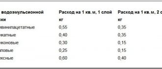
In water-based CM, the amount of pigment substance should not exceed 20%; in CM oil composition – no more than 1.5%; in CM of other types - limited to 7%.
When choosing a color for facade paint, you need to take into account that it contains organic and inorganic pigments. They have differences in properties among themselves. So, organic ones are bright colors, but they do not tolerate exposure to the sun well, they fade. Inorganic - resistant to atmospheric conditions, but there is no brightness of shades.
There is a need for tinting the dye if the shade offered in the store is not suitable or the chosen dye is not in sufficient quantity and there is no longer such color on sale.
The facade will look elegant and impressive if it is painted with tinted enamel.