Home » Decor » Interior colors
Interior colors
Novozhenina Anna
Perhaps the most soothing shade for the human eye, mint color added to the interior will give a spectrum of emotions. Like other shades of green, mint helps create a refreshing ambience, especially in areas where you want to relax and recharge, such as the bathroom, bedroom. Fresh notes of mint provide a flexible backdrop for other flowers. For an elegant color scheme that looks fresh all year round, try mixing soft shades of mint with lacy white, pale gray and dreamy lilac.
Mint is a pastel color that looks good in interiors and goes well with many shades. Gives a fresh, peaceful feeling, goes well with light, dark tones, metallics, and other pastels.
Gives a fresh, peaceful feeling
This shade, although it gets its name from the plant of the same name, actually has little in common with the color of the source. The leaves of the mint plant are dark green, as if covered with a grayish shroud. And mint flowers are fluffy panicles of a dirty blue color.
The fluffy green stem also does not inspire much confidence. In fact, the color of mint does not copy the plant, but people have been using mint gum, jelly beans, and tea for a long time, so they have a constant image of something fresh, similar to aquamarine.
In the palette of green shades, the colors of turquoise and mint are very close to each other. Comparison with blue tones places it next to cyan. Experts identify four shades of mint:
- menthol;
- light turquoise;
- pistachios;
- sea waves.
Thus, we can say that mint is on the border of cold and warm tones. It is enough to add a little yellow to it to soften it beyond recognition.
Mint is a pastel color that looks good in the interior.
Peppermint was very popular in the 1950s, although it was often used in the 1930s and 1940s. The color is really elastic, very popular today. It is not uncommon to see mint green walls in modern projects. It often appears in modern accessories, especially when combined with metallics.
Wallpaper
Wallpaper of a single mint shade is often used in the Scandinavian style, which is famous for its visual purity, bordering on minimalism. A beautiful palette typical of the Scandinavian style, as well as natural materials together with the menthol of the walls create a balanced, harmonious combination.
Tip Choose simple graphic patterns or wallpaper with a floral print . To decorate the walls, you can use decorative wallpaper without accessories on the walls. Such walls will increase the space and improve the atmosphere.
The colors of turquoise and mint are very close to each other
Non-woven mint wallpaper very beautifully decorates a child's room for both sexes.
The meaning and features of color
A mint shade is a combination of blue and green; the intensity of the mint shade depends on the predominance of one color or another. The resulting mint is not directly related to the color of the mint leaves.
A variety of mint can be considered menthol, turquoise in a light shade, sea foam color and light pistachio.
Like the entire group of green shades, mint has a positive effect on the psyche, induces relaxation, and has a beneficial effect on the functioning of the visual organs.
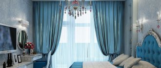
The photo shows a bedroom interior with green and purple patterns and white ceiling beams that add depth.
Update your living room with mint curtains
To make your living room look bright and fresh, pay attention to the choice of curtains. They can make or break your design, so choose them carefully. For an updated, pastel look that will help your living room reach its potential, mint curtains are the latest trend!
In a well-lit room they can really show off their potential. They make your room look fresh and stylish while allowing other items in your room to take center stage.
In a room that already has mint elements, pastel curtains will help keep the color scheme cohesive.
The color is really elastic, very popular today
Mint furniture as the perfect pastel element
The idea of painted walls may seem too permanent and therefore intimidating for some, so there are other ways to spice up your living room with lovely mint decor to transform it into pastel perfection. Adding mint furniture guarantees comfort and cheerfulness, two characteristics that any living room can strive for :
- In a living room with neutral wooden furniture, the sofa bed will be the focal point, the element that provides the life-giving effect.
- Mint coffee table and chairs are an obvious choice. If you don't want the retro feel to get out of control, just add a chair in a different shade to balance out the fresh mint!
- Bright living rooms decorated in a clean, simple style are the right place for a mint sofa. If you want just a hint of boldness, add a chair in a stronger shade of mint.
- In a modern living room with many attractive elements, it is sometimes difficult to determine the focal point, as if you don’t know where to look for it. An amazing mint sofa solves this problem in an instant.
- A pastel mint sofa is a trendy touch that can fit into any living room.
Bright decor
This pastel color can really compete with many other basic pastels, which are usually used in the interior to provide a background and decorative base. Also think about painting your facade menthol if you live in a private house . It harmonizes with the surrounding nature and is universal for facades of any style.
Create a minty mood
Mint is calm and pleasing to the eye. It is suitable for different styles, looks good both in modern, minimalist design, and in traditional rooms, vintage design, shabby chic. Since it goes with many colors and also works in different types of rooms, decorating a home with this shade is quite simple and can be tackled by a novice decorator. But despite its calm nature, there are a few important things to remember.
Calm, pleasing palette
This is a two-part color that has many different shades:
- sea foam;
- light turquoise;
- menthol;
- mint;
- pistachio ice cream.
Therefore, every homeowner will find a shade that he likes.
This shade of green in the interior plays a certain therapeutic role, because at first glance it always attracts you, rarely repels, but on the contrary, attracts attention, makes the room bright, fresh, spacious.
Good for different styles
Last year it was very popular, one might even say that it is a trending color - not only in design, but also in fashion. But since it is familiar in the fashion industry, it is a kind of novelty in the interior. The peculiarity of this color is space and comfort, so it is often used for bedrooms or kitchenettes. It also unusually refreshes and makes the room cleaner.
Bright and calm
When deciding to use it in your home, first think about decorating the walls with it. Soft green walls will have a relaxing effect no matter where you apply them. You can choose mint green as wallpaper besides wall paint.
Advice Let it be wallpaper that contains mint green in a pattern that will make the room comfortable and lively. Apply it in the bathroom, living room or kitchen for a fresh, vibrant look.
Soft green walls will have a relaxing effect
Great background
Calculate the exact cost of repairs using an online calculator
and receive a free detailed estimate for repairs
Calculate
There cannot be too much mint color in the interior - it does not catch the eye, does not overwhelm and evokes only pleasant associations with warm countries and summer meadows. For a living room, kitchen or bedroom, it is difficult to imagine the best background, imbued with purity, lightness and coolness.
Photo: decoist.com
Photo: bedroomupdate.com
Shades of mint color harmonize perfectly with their derivatives: green and blue tones. On a light, seemingly weightless base, azure and herbaceous accents will look great - this way light mint will reveal its color potential more widely.
Photo: flauminc.com
Photo: thespruce.com
Mint decor – where and how to apply?
First of all, you can choose it for walls and cabinets in the kitchen, especially for vintage, rustic home interiors. It can be easily integrated into different places in your decor, such as textiles. Mint greens are also suitable for a romantic setting.
Bathroom
If you want to use it in the bathroom, you have many different options. Use it for wall tiles, floor tiles, shower curtains, or choose mint green for decorative bathroom accessories. In the bathroom, you can use mint green towels or romantic details to create a retro feel.
In the bathroom interior
Living room
In the living room, you have the option to use it everywhere from decorating the sofa with menthol green pillows, choosing mint accessories, using mint green on the curtains to change the ambiance of the room. Or feel the fresh feeling by choosing greenery for your walls.
In the interior of the living room
Bedroom
In the bedroom, you can say hello to the sun by choosing mint greens for your textiles. It is useful to try it with a relaxing effect on bedspreads, bed linen, curtains, and pillows. When it comes to the bedroom, a vintage or rustic makeup look is no bad thing.
In the bedroom interior
Styles
Designers identify several main bedroom styles in mint tones:
- Country style;
- Minimalist simplicity;
- French Provence;
- modern modern;
- High tech.
Although initially everyone preferred to choose mint for bulky compositions with stucco, gold and oak floors. Fortunately, times are changing and now decorators are increasingly choosing a modern theme to replace outdated canons.
Mint combo: combining colors
The best thing to do is think about the mood you want to create and then just trust your own vision. The result will always depend on the amount of natural light in your space, so check the combination of shades you already have in your room before making your final decision.
Mint comes alive with many shades. It is important to know that the color combination of mint with other tones will be dominant and emphatic, despite its delicate shade. Therefore, it is important to choose a tone. Menthol is associated with freshness, energy, and cheerfulness . Peppermint is bluer - like a sip of cool water on a hot day.
Menthol is associated with freshness, energy, vivacity
Mint and metallic
Create a bright and bold effect by combining metal with mint, especially in the kitchen where you can place a lot of metal appliances. Combined with shiny metallic elements in the kitchen, mint looks cool and fresh. Pair brass with mint for an elegant, luxurious look, or with brushed nickel fixtures to create a decidedly cool space.
Mint is a suitable accompaniment for stainless steel appliances, or it can even be used as a designer color for select appliances, large or small, in a space as more manufacturers join the trend.
Combined with gray and white
Combination with white
To use the relaxing properties of menthol in the most effective way, you can combine it with white. The combo with white is a clean, crisp scheme. Here you can safely experiment by using white walls with menthol furniture, or vice versa. White trim with this contrast always adds architectural interest.
Mint and white striped wallpaper will fit perfectly into the look. And in combination with red and yellow, you can add energy to the surrounding space.
Adding white wherever there is mint is a win-win. You can safely add as much of it as possible to increase the feeling of freshness, cleanliness and spaciousness. This combination will remind you of summer and salad greens from the garden beds.
Combination with black
This is a radical, but very effective way of decoration. Pairing mint with black lacquer furniture or molding is one of those ways that will leave a strong impression.
Combination with lavender
Pastel shades always look good together and have a very feminine and “cute” feel to them. Lavender is a great alternative to pink if you want something soft but not too girly.
Grey
Gray calms and mutes the natural energy of mint. To keep the palette soft, try adding light gray, pastel colors.
In the interior of the nursery
Aquamarine
When combined with each other, these two colors create a truly concentrated retro atmosphere from its heyday. Add red to complete this look.
A stunning combination of peach and mint
Both of these colors are modern and sophisticated. But when they combine with each other, miracles happen. Designers get their best ideas from natural inspiration. Both of these colors are very appetizing and evoke associations of a juicy and light dessert. Mint-peach interiors look just as appetizing.
Kitchen in light, delicate colors
Pink mint color
This combination is also suggested by nature - we see it in all beautiful flowers and, first of all, roses. Pink and mint are on opposite ends of the color spectrum. This beautiful combination therefore creates a dynamic aspect that is rich in contrast and can be combined in different ways during installation. Use mint as a wall color or simply choose furniture and accessories.
This combination was originally developed in the fashion industry to create a vintage shabby chic look. But the success of the “mint rose” migrated to interior design. The fresh duo returns in a new form - you can see interiors made in coral pink, salmon, and bright orange.
In the style of minimalism
Salmon and mint
While menthol can range in intensity from green to blue, salmon ranges from coral to pink. This is a rather dynamic, tropical combination that will not go unnoticed and evokes an association with exotic fruits - mango, guava.
Mint and brown
Rich chocolate brown paired with mint is a timeless color combination that always looks fresh (and brings to mind chocolate mint ice cream). And the classic combo of black and white with mint can give any room a classically sophisticated, vibrant look.
Combined with beige
Mint evokes the freshness of the spring season. There are many unusual color combinations you can use with it to make your space more interesting. Try raspberry, orange, olive green, gray or even navy blue.
Using mint in the nursery
Mint combines the calming power of blue with the nourishing power of green, so the symbiosis of both colors creates a serene shade that is optimal for a nursery. The green tone will reduce a child's anxiety, providing a deep instinctive sense of physical well-being. Blue tones relax both the mind and body and have been shown to physically lower blood pressure, heart rate and breathing - all of which are needed to ensure your baby gets a good night's sleep .
Mint green looks beautiful with almost any color and is suitable for a boy or girl. For a girl, you can choose a combination with coral and soft pink to ensure a sweet look. For a more masculine effect, add a hint of blue or orange, or pair it with gray or yellow to suit a boy.
Combines the calming power of blue with the nourishing power of green
Green has a reputation as a universal color, as it is the most natural, natural color. This means it goes with almost everything. However, when choosing colors, you should keep in mind that mint falls into the family of pastels, that is, shades that are diluted with white.
Advice Therefore, when choosing colors, you should give preference to pastels to make the interior balanced. You really can’t go wrong with this choice, and you can safely choose your favorite ones.
Combination with gold
I would like to draw your attention to another interesting property of any cold pastels, and mint ones in particular, to be combined with shiny metallics. A touch of shimmering gold adds warmth and richness to a pastel palette and adds visual interest .
A glamorous metallic trend can be created with an accent wall, which not only creates a stunning focal point, but a sense of cohesion by highlighting gold or silver accessories and tying them into the decor.
Looks beautiful with almost any color
Alternatively, glossy gold (or silver) stickers can be used for this purpose. This is a good alternative or complement to wallpaper that will provide decorative flexibility.
Tip Create an accent wall with stars or a funky polka dot ceiling. You can even use stickers to decorate a boring dresser or headboard.
Babies spend a lot of time looking at the ceiling. This can be used to allow him to contemplate something shiny. Add a brass or gold chandelier to your menthol interior. Turn a standard chandelier into a sparkling mobile. It’s easy to make it yourself from scrap materials.
Suitable for boy or girl
Brass pieces also work great and complement menthol tones. Choose a brass lamp on a leg, and place a brass table next to it for small items - these two items will transform a standard nursery into a real designer room.
Why is mint so attractive?
Designers all over the world have been promoting their love for this color for ten years. The main argument is versatility, the right harmonious combination with a large palette. The bedroom in mint tones exudes calm and tranquility; you want to immerse yourself in it, as if in meditation.
A high-quality interior is an opportunity to examine every detail, enjoy the play of light and the change of shades. Deep mint has several dozen shades that combine well with each other and will look unobtrusive in their combination.
Decorating Tips
Decorate with mint in a room that has a lot of natural light, as this color acquires its richness and such a beautiful shade in the light of the sun. With artificial lighting there is a risk of getting a “hospital ward”, especially if cold halogen lamps are used.
, etc. Mint can also work well with chrome surfaces, but in comparison, gold materials, and especially brass, add warmth and brightness.
Add decorative elements
A good idea is to use mint in retro-style interiors. Mint was often used in the 50-60s of the 20th century, and we can still see these famous kitchen appliances that have survived to this day - refrigerators, food processors, stoves - as well as tiles and other mint items. So, if you love vintage, you can use this color as inspiration for your retro interior.
It is necessary to add a warm shade to any menthol interior, as it will need complementing. Although it's so light and fresh, it's not complete without something warm and/or dark.
Wonderful energy appears in rooms in which there are combinations with red shades - coral, red, orange. Use this effect for your purposes.
To match the sea wave
Use mint pastel instead of other more common neutrals . It makes the room bright, but is still calm and delicate enough to serve the same role as a classic neutral. I don’t see a contradiction in not considering mint pastel as a neutral.
Mint in the interior of a corner kitchen
The angular location of the furniture set in the kitchen is due to the lack of square footage. Mint shade is an excellent solution for small spaces. It is able to visually expand the room and give it freedom of space. In this case, it is better to combine mint with white colors.
The angular layout will ensure perfect compliance with the “working triangle” rule
Experienced design professionals advise choosing a mint-colored kitchen set. And combine ready-made furniture with the rest of the finishing elements. The fact is that the emphasis on the set looks best thanks to the textured, carved facades. This gives extra volume.
Let's look at the example of a mint-colored kitchen, the photo of the interior of which you will see below.
A snow-white kitchen apron paired with LED lighting will provide bright illumination of work areas
The flooring is selected from large format ceramic tiles. The grout must be white. Also make the walls and ceiling space snow-white. This gives extra lightness.
Make all sorts of patterns from figured plaster on the walls. Combine ancient Greek forms with modern finishing materials. Thanks to this you will get beautiful patterns.
Relief images of antique dishes and fruits would be appropriate in the kitchen interior
It is desirable to give the ceiling an airy effect. This is done using an LED strip placed in a niche along the edge near the walls. You immediately need to make a two-level ceiling. The glow of the tape is usually chosen to be white. But with an unusual approach, you can make blue and even mint.
Start adding a hint of mint from the dining area. Be sure to buy wooden table and chairs. Decide in advance on the color of mint. Buy furniture in this color.
The design of the chairs is selected based on the overall interior of the kitchen
It would be interesting to install a beige tabletop. This will add freshness, dilute the monotony, and create a border between the lower and upper cabinets of the set.
Nowadays, practical and durable countertops made of artificial stone are in fashion.
Buy a kitchen set of a similar shade, as well as a table and chairs. Differences are unacceptable.
When choosing a gray palette as a second accent, pay attention to the need to enhance the mint contrast. This is necessary to give visibility, brightness and freshness. The gray tone is too pale, just like mint. But applying sharp contrast will correct the situation.
A kitchen apron, household appliances or pieces of furniture can serve as a gray accent.
What not to do?
Less is better than more. If you think that rich mint walls or furniture will be unnecessary, start exploring the color small first.
Tip: Use it in pillows, scatter accents throughout rooms, add a small vase to a window. Even a small amount of menthol accessories will perfectly refresh the space
.
Try to get acquainted with color in the spring, when nature wakes up and freshness is felt especially sharply.
Use pastels in a given style