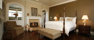
Features of two-color combinations
Many people consider two-color design to be the only solution for arranging a kitchen space. Combined kitchens light top dark bottom attract consumers for the following reasons:
- The right color combination balances the space and corrects some of its shortcomings. A light top visually makes the interior lighter and expands the space. This is true in small rooms or if the ceilings are low.
- The two-color combination is universal, it can be used in any style, from classic to modern.
Red and white kitchen with radial facades Source tomkuhni.ru
- The number of two-color combinations is huge. In combination with the finishing of the floor, walls and ceiling, the variety increases indefinitely, allowing you to choose a palette to suit your personal tastes.
- Lower dark facades have double benefits. They not only make a harmonious pair with a light top, but also allow you to successfully integrate large household appliances.
Lilac and pistachio Source wixstatic.com
Lighting Features
When choosing lighting, take into account the size of the room, the amount of natural light and the surface of the headset.
Matte coatings absorb light . It would be good if such a kitchen had good lighting from above. For example, a large chandelier or several small ceiling lights.
For glossy coatings, light is also very important. Such a set can be additionally illuminated with LED strip or add glare from wall lamps.
Which kitchens is it suitable for?
A kitchen set with a light top and a dark bottom can be placed in any size room. Dark shades seem difficult to perceive, so the lower tier of the facades looks down-to-earth, a reliable foundation for the upper part.
The upper, lighter tier makes a harmonious pair with the dark top. If the room is very small and there is not enough light in it, a combination set can create a feeling of clutter. To prevent this from happening, the colors of the facades are chosen that are not too contrasting and saturated, and the decoration of the room is done in light or pastel variations; according to the style.
In a modest-sized room, you can make dark and light facades glossy. Reflective surfaces will help visually expand the boundaries of the room. The inclusion of a third color will help balance the two-color combination, for which a countertop or kitchen apron is suitable. This addition will soften the too contrasting combination of primary shades, which is always pleasing to the eye.
Three colors in kitchen design Source design-homes.ru
Options for the color palette of kitchen sets
Gray palette
Gray color can be oppressive. Many people associate it with the bustle of the city, cars, and traffic jams. In order to avoid this, you must follow the rules:
- Use mother of pearl in the interior. This will help remove the coldness and alienation of this base color.
- If the room is hot and filled with light all year round, then gray will help reduce this effect.
- Gray interspersed with green will remind you of the sea. This will add romance to the room.
- The brown color scheme will “insulate” the kitchen and make it more comfortable.
If you used white and gray shades when decorating your kitchen, then in order for it all not to look too boring, you should add bright accessories to the interior.
Gray looks laconic with beige tones, pure white. The latter is a easily soiled color, beige is more practical. It can be used as the main material for curtains, floor finishing, and wallpaper ornaments.
Gray is combined with gray of a more saturated, dark shade. Then a gradient effect is created when one color smoothly transitions into another. As a rule, the floor is made darker, and the ceiling is the opposite. The kitchen set will always stand out in such a kitchen.
If the floors are decorated in a dark color, then the upper space should be done in lighter colors.
Red gamma
Bright or, on the contrary, discreet red is stylish. It indicates the courage of the owner, because not everyone is capable of such a decision. Red contains strong energy. A kitchen set of such an accent color can be calmed down with light olive, gray or white.
Cool reds, which include raspberry, amaranth, and cardinal, look more restrained. Warm shades make the room more comfortable and homely.
Red color is bright, bold, energetic. It can be diluted with white color.
Violet tones
Purple is not the most common color for the kitchen. It combines warm and cold shades. Among the many shades of purple, plum, lilac, and eggplant are used for the kitchen. This color is often compared to mysticism.
It negatively affects people with a weakened psyche, while at the same time, dark purple can depress stable people. It must be diluted with more neutral colors: white, gray, beige.
Purple, like red, should be diluted with other colors. White, gray or beige shades are suitable for this.
Glossy purple reflects light and makes a space appear larger, but it stains easily. Therefore, it is better to use matte surfaces.
A kitchen decorated in purple tones is suitable for original and energetic individuals.
Palette of blue and green
Green in the kitchen is always refreshing and reminds of naturalness and nature. It helps you relax after a hard day at work. In such a kitchen, softness and calm immediately appear. A green kitchen set will suit any style.
Light olive visually enlarges the space, but the same cannot be said about dark, heavy green. It does not need to be used for tabletops and furniture.
Another kitchen design option is olive with white.
Blue in the headset is associated with freedom and lightness. An ideal solution for a small kitchen. Blue will help add “air”. According to psychologists, blue increases the desire to create, invent new things, and make discoveries. It goes well with white or brown. The set, made entirely in this color, is pumping.
The blue color in the interior always looks cozy and original.
The kitchen is an important element of any apartment and its proper arrangement will help maintain appetite and health.
Style color features
Most kitchens are designed in a modern style; often with the inclusion of individual elements of other directions. In such cases, kitchens of two colors, with different tops and bottoms, will harmoniously fit into the space, while the choice of colors depends entirely on the preferences of the owners. Some styles have limitations, and you have to choose the shades of the facades within a specific color palette. Restrictions are present in the following styles:
- Provence . The style of the French countryside imposes limits on the choice of dark shades. Light, pastel colors are favored here: beige, pistachio, cream, delicate variations of green, blue and purple. To achieve the desired balance, the tone of the lower tier is made more saturated.
- Country . The popular rustic style, compared to Provence, has a richer, brighter palette. A common kitchen option here is a white top and a wooden bottom.
With turquoise top Source design-homes.ru
See also: Catalog of companies that specialize in autonomous gasification
- Vanguard . Avant-garde design is based on bright and pure colors, without complex shades or combinations. Contrasting combinations of black and white, red and white or blue, black and yellow are not uncommon. At the same time, the walls can also be as bright as desired: if not dazzling white, then, for example, yellow or blue.
- Minimalism . It is important to limit yourself to a minimal palette, usually white and shades of gray. Additionally, it is allowed to use black, soft blue, as well as natural wood tones. As a rule, the top is made white or light gray; The owners decide whether the set will be matte or glossy.
Contrasting choice of colors Source eurodom-serp.ru
- Eco style . The kitchen set is light and discreet, but the palette is more diverse due to the inclusion of green tones. If you don’t like green in principle, it’s easy to find a replacement in blue. To make the eco-interior more dynamic, a bright or rich tone of green is chosen for the lower tier of facades: not mint, but lime, not olive, but chartreuse.
- High-tech, loft . The color palette is similar to minimalism, but with additional, deeper tones of blue and brown. A two-tone kitchen in similar shades looks restrained and stylish. White color is more often used for high-tech upper facades. For a loft, variations of gray, perhaps with a concrete texture, would be more natural.
Favorite color is always nearby Source wp.com
- Art Deco, Art Nouveau . The palette for the kitchen includes both muted and rich tones, including brown, lilac, wine, and terracotta. The styles are associated with luxury, so this design is chosen for a large room with high ceilings.
Kitchen palette: color and style
To choose a harmonious combination, you must first select the basic tone. If you want to use a dark color, it is better to start with it.
- Black is a classic dark color that has many shades and can be deep matte or unobtrusively glossy. It goes well with any color scheme - light cream, white, blue, pink, yellow, green, literally the entire palette in pale colors will be harmonious with the color of the night. Black itself can be used in any style. Most often, the bottom of the headset in a technological room is painted with it. Black furniture tops are rare, but this is an interesting solution: here you can play in contrast with another area of the kitchen or living room.
The photo shows a kitchen in a modern style: black bottom and white top.
- Dark gray has a similar character, but it is still perceived differently. As a rule, surfaces of this color have the texture of stone, less often wood, but preserving the natural structure changes the perception of the shade. Gray also goes well with any palette: with warm tones, this tone becomes more comfortable, and with cold ones, the room turns out to be quite detached, even businesslike. This is the best option for a modern interior. A glossy gray set is a common solution for high-tech style. The bottom here will be gray, and the top will be white, creamy, faded blue, champagne color.
- The dark chocolate design is elegant and sophisticated. The kitchen can be decorated in either a retro or modern style. Brown shades are usually combined with a warm palette - champagne, beige, milky. A technological interior may also contain combinations with a cool spectrum. This combination will be harmonious in modern style, country style, and minimalism.
- The dark green shade – emerald, malachite – looks elegant. These colors are beautiful in a classic interior, but can also be used in modern ones, but they will not be as noble. Usually they repeat the natural texture of the stone, but, of course, wood is used in the decoration of the set. Green looks luxurious in a duet with cream, milky, beige, and champagne.
The photo shows a kitchen design using dark green.
- Deep blue has an interesting character: it calms and captivates at the same time. At the same time, this shade never looks too cold, so it can be combined with shades of a wide range: beige, champagne, ivory, pale yellow. Blue is usually used in nautical, Greek, Mediterranean styles. Modern functional design can also use dark shades of blue. This color is also harmonious in a modern style kitchen.
- Rich purple will be mysterious and extraordinary. This is a bold decision, since it must be combined carefully, as well as used indoors. A harmonious duet with violet would be light lilac, beige, champagne, creamy, pale yellow.
What to consider when choosing colors
To make your kitchen beautiful, it is not enough just to choose two colors from the desired style palette. Other factors that may influence perception must be considered. The following recommendations will help you make your choice more interesting:
- The lower tier is black - a more appropriate choice for a large kitchen (from 15 square meters). If the room is smaller, you should opt for a brown, gray or blue tone.
Design classics Source design-homes.ru
- If a kitchen with a white top and dark bottom looks too simple, the design can be diluted with small bright accents, for example, on the kitchen apron. Sometimes the impression can be corrected if the sink contrasts with the countertop. In any case, there should not be more than three or four colors.
- If you want to visually unload the upper tier, you can choose a kitchen with glass facades. Glass inserts are varied in design and always make the design more individual.
- Usually they strive to ensure that large household appliances repeat the color of the lower facades. Less common options are when the slab is chosen to match the top tier. Both options are legitimate, as they do not violate color harmony.
With an emphasis on the apron Source behance.net
- For a small kitchen, a small appliance in a contrasting color, a kettle or coffee maker, can become an accent. Such a touch can be an independent detail, or emphasize the colors of curtains or furniture upholstery.
The combination of light and dark in kitchen design
Of course, the color scheme can be very diverse - depending on the taste, character and wishes of the owners. There are some priorities in choosing shades when decorating a kitchen in a certain style, as well as some composition rules.
A single dark color in any room is appropriate only when it is constantly flooded with light. This could be a fairly spacious southern kitchen, perhaps with full-length windows or even two, or when it is a corner room of your own home. Dark brown – chocolate, for example – looks harmonious. Most often this is natural solid wood. But, as a rule, in such a room there is always a bright corner or surface. The same tones as black and dark gray must be combined with light colors.
The set, wall decoration, floors, accents - all the details, or rather their shades and proportions, influence the character and mood of the interior. A design in dark colors can be quite gloomy, so this palette is always diluted or used only in one area of the room with light finishes in other parts of the room.
You can choose a successful combination for work furniture, and then any color scheme can be harmonious and comfortable. Most often they choose a light top and a dark bottom, but the reverse option is an equally interesting compositional solution.
Shades surrounded by finishes
The combination of colors for the kitchen top bottom in itself can be as beautiful as you like, but in the end it will look very ordinary. The problem occurs if the two-color combination does not fit well with the decoration of the room. To avoid mistakes in room design, consider the following points:
- The cabinets on the bottom row should be slightly lighter than the floor covering.
- Usually the furniture is made a little darker than the walls. In the case of a very small room, it is advisable to order wall cabinets to match the walls. This will help the upper facades blend into the background and visually unload the room.
Gray interior Source hzcdn.com
What should an apron be like?
The choice of materials for finishing the walls above the sink and stove is quite large: ceramic and glass tiles (mosaics), plastic, decorative panels. The color of the apron is usually chosen based on one of the following principles:
- for furniture - in this case, the design has something in common with the set (color, finish, pattern, etc.);
- under the floor or ceiling - tiles or decorative panels of the same color or with a similar texture;
- for accessories - the apron can match the color of curtains, lamps, tabletops, chairs, etc.
The mosaic of the apron echoes the shade of the lower tier of furniture.
Next to furniture of very bright and contrasting colors, the apron should be in a calm or neutral color scheme so as not to overload the interior and vice versa.
Basic ways to select color combinations
If you are afraid of missing out on choosing the right colors for your new kitchen set, use a color wheel (any scheme will do). You can also rely on the taste of designers and search among time-tested ideas.
These include a combination with an achromatic color. Achromatic (literally colorless) are black, white and all intermediate shades of gray. The beauty of neutral tones is that they can be combined with each other and with any other color; the result will always be flawless. If you like the color blue, but on furniture it seems overtly provocative, the best solution would be a kitchen with a blue bottom and a white top.
White and blue combination Source amazon.com
Light tone in kitchen design ↑
Pastel colors are best for tight spaces. This is a good choice for rooms with asymmetrical shapes. It also makes sense to design a kitchen in pastel colors if the windows face north and there is not enough natural light. The dim, monochromatic design is universal and hides design flaws. The main thing is to select all the interior elements in a single style.
Photo of a kitchen with white bottom, dark top
Light and dark colors in the interior are not always just a contrasting white and black palette. There are many options, and it all depends on the personal preferences of the premises owners. However, there are some color rules that should be followed so that the design is not only aesthetic, but also psychologically comfortable:
Light tone in kitchen design
- If a light tone prevails in the kitchen design, you need to focus on bright details. An option is to add elements that differ in color. This will add expressiveness to the interior and help highlight the necessary areas. We offer photos:
Light design with contrasting elements
- If dark is chosen as the main color, then you should carefully consider the lighting of the room. Dark is suitable for a large kitchen with windows facing south. Thus, wood-like decoration in dark shades creates an atmosphere of stability, peace and even some conservatism. And yet, so that it does not seem gloomy, it is advisable to add 1-2 light surfaces.
Brown top and white bottom - combination options
- Not only the color scheme is important, but also the proportions and shades. An excess of pastel colors “blurs” contours and boundaries, while dark colors visually narrow the space, making the room seem cramped.
Photo of a minimalist interior: graphite top, milky bottom
- There are practically no restrictions in the selection of colors. Any color scheme can look great if you choose the right combinations. Traditionally, the top is light and the bottom is dark, but there is always room for variety: the reverse combination has its advantages and looks no less impressive.
Spectacular combinations - bright top and neutral bottom
- White and black in the interior get along well with each other. You can use only these two colors, or you can add a third. All options are good if the accents are carefully thought out.
Photo of a small black and white kitchen
Techniques for creating a kitchen in light colors ↑
The influence of color on a person’s mood has been known for a long time. Psychologists even recommend using chromotherapy to regulate the internal state - calming, activating thinking or feeling a surge of vital energy. When decorating a room, you can choose classic shades and dilute them with elements of suitable tones.
White, beige, shades of coffee with milk, ivory go well with any colors. You can focus attention on individual areas and achieve the effect of chromotherapy using other tones.
So, burgundy will look elegant and increase tone, improve appetite, and speed up metabolism. Orange will set you in an optimistic mood and help in creative activities. Yellow calms and activates intellectual potential. Blue and green help control emotions, and purple helps to tune in to learning and thinking.
Photo of a red and white headset on a light background
To achieve the desired effect, you should adhere to several rules for decorating a light kitchen:
- Wall decoration. Walls in pastel colors are an excellent option for those who want to hide the shortcomings of the room. To avoid monotony, you can add dark or bright details - an apron, pieces of furniture, accessories.
- Furniture. In a bright kitchen, sets with a top row of cabinets made in burgundy, yellow, orange, blue, green, gray and even black will look luxurious.
- Appliances. If household appliances will be in plain sight, then it is better to choose gray or black appliances with a metallic sheen. Bright accents are appropriate.
Light wall decoration plus brown and bright details
Black and white contrast in the interior ↑
Black and white design is a win-win option for lovers of the classics. White symbolizes purity, openness, freshness, and novelty. It has a positive effect on mood and well-being, and promotes the development of creative potential. Black is the color of restraint, reflection, relaxation, but its excess can cause blues, depression and even depression. It is important to distribute the colors correctly.
Determine the dominant color. If it is white, it will expand the space, add air and light. In this case, black details will help to delimit the room, divide it into functional zones, or simply create accents.
Decide what colors you will use for the ceiling, walls, splashback, countertops and fittings. Often, different fronts are chosen for the top and bottom rows of cabinets. Typically, wall cabinets are made white, and floor cabinets are made black, but no one forbids turning ideas about aesthetics upside down by swapping them.
Black wall cabinets and white cabinets - contrasting bottom and top
Our photos and simple rules will help you when developing a design project:
- The main color for a small kitchen is white. It is best used to decorate ceilings, walls, and window openings. It is very risky to make a white floor. This can create unusual effects, but given the dirtiness of the coatings, it is better to choose a finish that is either black or light, but of a different shade.
Floor design option
- The black set with glossy surfaces against the background of a light floor looks luxurious. The design can be complemented with a glass table, white chairs, and patterned textile elements. Decor would be appropriate - vases, paintings, flowers, as in the photo below.
Black set
- A white set and a black apron are what is needed for people seeking to individualize their interior within the framework of the classical tradition. You can complement the look with black household appliances and chairs. To prevent the set from visually blending with the floor finish, you should choose a dark, but not black, floor covering. A good option is under the tree.
Black splashback and countertops
- The opposite option - a black set and a white apron in a light kitchen - also looks good. You can complement the design with wood-look elements. An example is in the photo.
Black set with white apron
- A “checkerboard” on the floor is a common design technique, but its popularity does not make it any less relevant. This is an excellent option if the set is completely made in white. Black elements in furniture are acceptable, but there should not be too many of them. The photo below suggests a risky option that is not suitable for every room.
Checkerboard pattern on the floor
- The dominant black color would be appropriate in a spacious room with good lighting. However, completely painting the walls black is dangerous: you can create the effect of a closed, too cramped and gloomy space. But dark gray is a good solution. Look how it looks in the photo.
Gray walls, black and white furniture
- White top and black bottom - sophisticated, elegant and... banal. Why not experiment with combinations? This will help make the interior less conservative, but still sophisticated.
Black floors and countertops
Bright accents for a light background ↑
In a light kitchen, dark and bright details are appropriate. They help to place accents and avoid the effect of a hospital room. The ceiling and walls can be made in white, milky, or beige. This will optically enlarge the kitchen and make it more comfortable.
Photo of a kitchen with dark and translucent details
Bright wall decoration looks impressive in combination with a snow-white set, light bottom and black household appliances. Red, white, black are in perfect harmony with each other, and the interior as a whole looks beautiful and elegant. For the floor, it is better to choose a wood-look covering. We offer photos of a successful design.
Red top and light bottom
If pastel shades are chosen for the walls and ceiling, you should carefully consider the lighting and dilute the interior with other colors. This could be household appliances, metal-look furniture fittings, and decorative elements. This kitchen design with large windows will create a feeling of limitless space, peace, and spiritual comfort. The main thing is to avoid oversaturating the interior with contrasting details.
Bright accents for a bright kitchen
A snow-white kitchen with contrasting details can be a source of inspiration for fans of unusual combinations. You can achieve the effect of a “technological” interior by using illumination of work surfaces, accessories, and color accents. The bottom should be made “warmer”. The wood tones of the floor finish are a little “grounding” and calming. A marble countertop will add a sense of stability. You can see what it looks like in the photo.
Photo of the design of a bright kitchen
If the walls, floor, splashback, and floor cabinets are made in pastel colors, it makes sense to make the top of the set dark and add one, but expressive, contrasting accent. Decorating part of the wall with wallpaper with black stripes looks gorgeous, and the facades of wall cabinets can be decorated with a light pattern. The interior will seem strict but harmonious.
Bright detail on a black and white background
A bright kitchen looks great, the top of which is made in bright colors. This effect is achieved by using different colors for wall decoration. The wall above the set and the kitchen apron are made bright, and the rest of the details are white. Dark elements are appropriate in this design. An example is in the photo.
Contrasting wall - darker top
A dark top and a light bottom are relevant for interiors made in the “Russian style”. The white facades of the set will optically expand the walls of a cramped kitchen, and dark surfaces will balance the space and add dynamism. The top can be complemented with a bright Gzhel pattern, and the bottom can be left light, as in the photo.
Small kitchen in “Russian style”
Briefly about the main thing
A kitchen set can provide an excellent opportunity to experiment with color. A beautiful two-tone kitchen will make the room more interesting without overloading the space, and you can enjoy your favorite color every day,
A two-color combination is a universal solution that can be used in any style and is suitable for a kitchen of any size. If for a large kitchen any combination of dark bottom and light top is available, then for a small room the choice of colors is limited.
When choosing shades, pay attention to the colors of the finishing materials of the walls, floors and ceilings. To complicate the design of the facade, use additional colors for the countertops and apron, choose glass facades and install contrasting household appliances. Beautiful color combinations are selected using the color wheel and basic compatibility rules.
Ratings 0
Glossy or matte?
When choosing a kitchen set, in addition to the material and its color, you should decide on the texture of the facade . It can be matte or glossy.
The main advantage of matte coatings is their high practicality . Handprints and dust are practically invisible on them. Matte facades absorb light and create an atmosphere of comfort and warmth in the kitchen. This set will harmoniously fit into a classic kitchen or a room in a minimalist style.
Reference. The main disadvantage of matte surfaces is the lack of a wide choice of style solutions.
The matte surface does not need to be constantly cleaned , but during cleaning it is more difficult to wipe off dirt from a non-smooth set than from a glossy one.
Glossy kitchens are good for their gloss and shine . Rays of light are reflected in them, filling the room with cozy reflections. Gloss can visually increase space. Even very dark shades look attractive in gloss. Such sets will perfectly complement the interior in the Art Nouveau, hi-tech and loft styles.
Important! Due to the large amount of glare, you need to carefully select the lighting in the kitchen to make it comfortable to be there.
The ideal smoothness of the glossy surface provides resistance to the absorption of grease, dirt and moisture . It is much easier to clean than matte. However, maintenance of the glossy set must be regular. Every day you have to wipe the surface so that there are no traces of fingerprints, streaks and dust on it.
Combination with wallpaper, curtains, decor
The design and color scheme of a kitchen with a two-color set can be very diverse. But in most cases, when choosing a black and white or milky brown set, the walls and ceiling are finished using neutral base colors.
The best option is to cover the walls of the room with light wallpaper (lay out panels, plaster), and cover the floor with dark material. Depending on the interior, you can use linoleum, tile or laminate. If you want to make a bright accent, then it is better to use an apron for this. It can be finished with contrasting red, blue, yellow, purple and any other color.
The only color you should avoid using is gray, since this combination can make the room too boring and oppressive. Curtains can also act as a bright accent.
At the same time, they can be purchased in a separate contrasting color, or combined with each other several tones, one of which will be the main color of the headset.
What style suits it?
Even before purchasing a set and finishing materials, it is necessary to determine in what style the room will be decorated.
The most appropriate two-color black and white set will look in the following styles:
- high tech;
- avant-garde;
- minimalism;
- classic;
- modern
On a note! Regardless of the chosen style, light cabinets are always placed on top, and dark ones on the floor. This combination is the most correct and practical.