Design features
Pastel shades are considered to be diluted with white. Visually, it looks like a white veil has been applied to an ordinary pure tone. The result is a pleasant, light shade.
- Considering the nature of the pastel palette, it would be a good interior solution to use it to decorate small rooms. Light wallpaper will visually increase the space.
- Pastel goes well with white and gray tones, as well as with brighter manifestations of its shade.
- Pastel colors look good both as a background and as accents.
For rooms with windows facing north, it is better to choose pastel wallpaper in a warm tone, such as yellow or peach. Cool tones, blue, mint, lavender, are suitable for the south side.
The influence of pastel colors on a person's mood
What colors are usually called pastel and what effect do these tones have on a person’s mood? Pastel colors are considered to be derivatives of bright colors, diluted with white. These are opaque shades, usually in cool colors. For example, a derivative of a pastel color from red will be pale pink, and a derivative of green will be mint.
Scientists have proven that bright, flashy colors in the interior increase blood pressure and activate brain activity, while muted tones set a calm mood, have a calming effect on the nervous system and help relieve tension. If you look at blurred tones, eye fatigue is relieved, the body switches to relaxation mode, and the mood becomes even and serene.
If you look at blurred tones, eye fatigue is relieved, the body switches to relaxation mode, the mood becomes even and serene
Color selection
Pastel pink
An incredibly delicate and light pastel tone is associated with powdery rose petals. Soft pink wallpaper looks good in the interior of a children's room for girls, a bedroom, a living room and other rooms in the house.
Pastel yellow
Positive sunny unobtrusive pastel tone. It will look harmonious in the interior with neutral basic colors such as white and beige. Pale yellow wallpaper will brighten up a room whose windows face north.
Light peach and light coral
Tones that are close to each other will add color to the interior and make it brighter. They will look harmonious with turquoise and blue colors. Peach will be harmonious as the base color of the walls. Coral tone is more suitable as a bright accent.
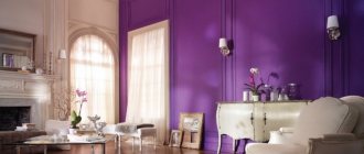
Pastel lilac and lavender
Soft purple goes well with white and gray. The ideal wallpaper tone for decorating a living space in a classic or Provence style, the design will be fresh and cozy.
Pastel green and mint
Pastel green walls not only look refreshing, but will also have a positive effect on the psychological side of a person. Mint is a suitable option for an interior in the style of shabby chic and Provence; green shades will look warmer.
Pastel blue
Soft pastel blue will be associated with summer skies and clear water. Cool shades of wallpaper are best used for interior design with south-facing windows.
Cream, ivory
Cream pastel wallpaper is ideal as a background, it is not as bright as white and looks much softer. Both shades of pastel will be harmonious in classic and modern styles. The interior can be diluted with details of other, brighter colors.
The photo shows a minimalist ivory-colored kitchen, some of the facades are decorated with wood.
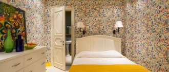
Pastel colors inside the children's room
This color palette has a calming effect on active or excitable children, without suppressing them psychologically, but calming them down. For this reason, pastel colors are the best choice for children.
They are especially organic inside the room for the little ones: pink, blue, pastel yellow, light beige. Furniture in bright, saturated colors will suit these shades.
Children's interior in pastel colors Source modernplace.ru
At an older age, children like more saturated colors. They create a festive, sunny atmosphere in the nursery.
A cozy workplace for a girl Source yandex.ru
Ivory color looks great with golden, light beige.
Interior of a children's room with a wigwam Source www.houzz.se
Various shades of olive, blue, and bluish gray are suitable for boys.
Children's room in light colors Source sk2.htgetrid.com
If the walls are turquoise and matched with wooden furniture, you get a harmonious color scheme.
Interior of a room for two adults Source www.topdom.ru
The classic design of a nursery in pastel colors, where there is a transition from white-blue to blue, looks stylish in a boys’ room.
In blue pastel colors Source hug-fu.com
Girls love different shades of pink, peach, lavender, and gold. It is permissible for them to complement the room with beautiful lace and cover the windows with translucent airy curtains.
Children's room for a girl in pastel colors Source dizayndoma.bisniswork.com
The current trend is to use delicate pink, lilac or dark gray with fuchsia. These combinations are diluted with white.
Children's room for a girl Source www.pinterest.ru
The two-color walls of the nursery look very beautiful. For example, a combination of light yellow and blue. These shades should not become monotonous; they are diluted with splashes of other shades of the same color, which gives the interior a special picturesqueness.
Bright combination of colors in a children's room Source www.pinterest.ru
For a schoolchild's room, psychologists recommend choosing lilac or purple, they stimulate mental activity.
Wallpaper in pastel colors
Plain
Pastel plain wallpaper will become an elegant backdrop in the interior. The walls can be decorated with wallpaper of the same color, thereby giving freedom in the choice of furniture and decorative parts.
With a picture or pattern
The pattern or ornament on the wallpaper plays an important role in the overall picture; it emphasizes the chosen style of the room.
- Geometric patterns or stripes will decorate a modern interior;
- Ornate monograms correspond to the classical direction;
- Cute floral patterns on the wallpaper are suitable for shabby chic design;
- Imitation of any material, such as plaster or brickwork, will decorate the interior in a rustic or Provence style.
The photo shows a dining area in Provence style. The walls are covered with pastel purple wallpaper in different forms.
Photo wallpaper
Wallpaper with photo printing allows you to make your interior completely unique. Photo wallpapers with images in pastel colors can decorate one or more walls, thereby becoming a gentle accent in the interior.
The photo shows a children's room in a marine style, decorated primarily in white and pale blue pastel colors, one of the walls is decorated with wallpaper with photo printing.
Textured
The wallpaper has a pleasant textured surface that forms a variety of images; these can be floral patterns, geometric shapes, imitation plaster or other patterns. In combination with pastel colors you will get an interesting and discreet design.
The photo shows a nursery design with textured liquid wallpaper in light yellow tones.
Rules for combining pastel shades with other colors in the interior of rooms
Trends in the fashion world are subject to seasonal mood swings, new trends and flights of fancy of interior designers. And only the design of rooms in pastel colors was and remains a classic of the genre. It is these “dusty” shades that create coziness and serenity in the house. How to correctly combine delicate colors with other colors so that the room does not look boring and faded?
To make the space look well-designed, pastel colors need to be diluted with darker or brighter shades. It is important here not to overdo it with the color palette. Choose one or two shades as a base that will dominate the room. The rest of the interior can be matched to this color, slightly blurring the shade or vice versa, making it brighter.
Natural wood goes well with pastel colors. In this case, you can choose furniture in the same light shades (walnut, birch), or play with contrast and choose wood in rich dark tones (oak, cherry). If you prefer light-colored furniture, lay the floor with darker-colored parquet. Psychologically, a person feels confident if the floor has a dark, matte surface.
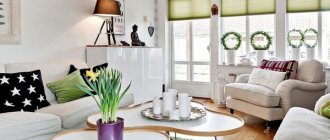
Photos in the interior of the living room, kitchen
The living room and kitchen are the places where you spend a lot of time; when renovating, you should choose the most pleasant palette for wallpaper so that over time you don’t get tired of it, and the colors continue to please you.
The photo shows a modern living room in beige tones. Peach shade is used as accents in the design.
Several bright decorative elements, such as an ottoman, a painting, dishes or flowers, will “revive” the interior and make it brighter.
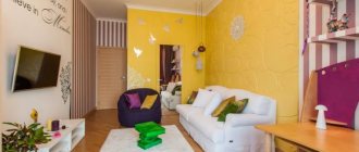
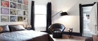
Design of a bedroom, children's room
The bedroom and children's room are the most suitable rooms for decoration in a soft pastel palette. The interior will be light and bright, the wallpaper will create a positive, non-irritating atmosphere.
The photo shows a bedroom in a neoclassical style, decorated in a white and peach palette.
In a nursery, pastel colors can serve as a background, and the content can be brighter. For a bedroom, a combination with a light shade close to white would be ideal; the room will be romantic and airy.
Bathroom and hallway
One of the main advantages of light color is its ability to visually expand space. In standard city apartments, the corridor and bathroom do not have large areas, and pastel colors will visually make them more spacious and brighter.
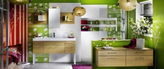
Kitchen
Kitchen
The entrance to the room will be marked on one side by a built-in refrigerator, on the other by a cabinet-column designed for storing jars of bulk products. The walls of the kitchen, corridor and hallway will be covered with plain wallpaper in a delicate powdery pink shade. With the help of light sources, it will be possible to separate the cooking area from the dining room: the L-shaped kitchen front will be illuminated by several spotlights, and the dining group in the bay window will be accentuated by an elegant pendant.
Photo in the interior of a country house
A delicate palette in a country house will look stylish, open spaces and large rooms will fill the house with light.
In addition to decoration, pastel shades can fill the interior through furniture and other details, for example, an antique pale green cabinet will become the main object in the bedroom, and a pale blue wooden set in combination with linen textiles will make the kitchen sophisticated and romantic.
Kingdom of pastel shades
Pastel shades are experiencing a rebirth. These soft tones have gone beyond the boundaries and firmly settled in the interior of living rooms, bedrooms and kitchens, giving them a retro atmosphere and an extraordinary uniqueness of modernity. Pastel shades create an elegant and sophisticated environment that envelops you with its tranquility and sensuality. They have the advantage of being soft and calm tones, striking in their diversity and variability of execution, which, if necessary, can become neutral. Pastels are desaturated, lighter and sweeter shades of any color. In color psychology, they have a less emotional and more intellectual visual impact. This is not only, but also combinations of warm and cold shades with light tints. The main reason for using pastel shades in the interior is the relaxing effect. Soft pastel colors are the perfect way to decorate your living room without drawing too much attention, but with a touch of solid character. Pastel colors can be compared to punctuation marks in a favorite book - they organize the interior, creating a visual dialogue between the living space and human feelings. Pastel colors are not only suitable for creating a space with a feminine character or intended for youth. When combined with deep tones, pastel shades will help create depth and drama in your interior. They are easy to experiment with. For example, using different pastel shades on walls, windows, and ceilings will help break up the monochrome color schemes. Pairing pastel shades with midtones will create a charming striped print effect. These tones pair well with natural materials such as wood paneling and parquet flooring in white oak, bamboo or maple. Use cream, green shades and floral motifs, and you will have a classic English-style living room. The predominance of white, cream, pale blue and blue-green tones will give the room the airiness of a beach-style design. Pastel shades will expand the space and give a feeling of innocence.
Furniture and decor
Furniture
Pieces of furniture in pastel colors can become either the main object of attention in the interior or be a laconic and inconspicuous addition. For example, a vintage chest of drawers or a pale lavender velvet chair at the dressing table will certainly attract attention, and a cream-colored sofa or dining table will become a continuation of the design idea.
Curtains
Tulle of one color or another can change the perception of the room, for example, a light yellow or peach shade will make the room warmer, and blue, lilac or mint, on the contrary, will refresh it. Curtains made of thick fabric will protect from excess light, while preserving space.
Textile
The textile part of the design makes the interior cozy. Pillows, throws and rugs are details that can slightly change the mood of the home, making it playful, for example, with a floral pattern on a pink background, or romantic with plain soft lavender accents.
Paintings and posters
Paintings even in the same color palette can look completely different, depending on the writing technique and image style. The drawing can support the overall stylistic direction or reflect a thematic idea.
Accessories
Decorative interior items are the finishing touch in creating an apartment design. Candlesticks, ceramic figurines or flower vases will add romantic notes to the interior of the room. In the nursery these can be beautiful dolls, soft toys or night lights, in the kitchen decorative wall plates or useful little things, and in the bathroom a rug, boxes or cups for brushes and soap.
Style decision
Shabby chic
Shabby chic is the most cozy and homely style that cannot be imagined without finishing and filling in pastel colors. Pastel wallpaper with playful floral patterns, furniture with flowing shapes and lots of cute decorative elements will envelop your home in an atmosphere of coziness. The colors most often used in shabby chic design are milky, mint, peach, pink.
Provence
Provence style is associated with space and the charm of endless lavender fields. Pastel accents on a white or milky background will make the interior airy and delicate. The walls can be decorated with plain wallpaper, plaster, wallpaper with floral patterns or frescoes.
Modern
The style allows you to combine different colors and materials. In the design of one room, pastel wallpaper will look harmonious, for example with geometric patterns of the same color, but of different saturation. The furniture has simple shapes, and decorative items will highlight the style of the room.
Classic
Pastel colors in a classic interior create an incredibly delicate and elegant design. The walls will be decorated with wallpaper with a slightly noticeable pattern, and elegant furniture and noble textiles will complete the look. The design can be left in one color tone or you can add several bright colors in the form of paintings or fresh flowers.
Scandinavian
It is usually done in light, soft colors. White color is most often taken as the basis, multi-colored details act as accents, for example, pieces of furniture, textiles, and part of the decoration. Details of any color will look harmonious.
The photo shows a Scandinavian-style dining room in white and mint color.
Nautical
A light palette of turquoise, blue and beige will make the interior incredibly fresh and fill it with marine motifs. Delicate colors can be used as primary colors in the interior or as additional ones.
A color scheme
Combination with neutral shades
To achieve the most light and delicate interior, the most successful combination would be with neutral shades such as white and light gray. Both colors combine harmoniously with almost the entire color palette, and when combined with pastel tones, they form a romantic and relaxing design.
Monochromatic
This is a combination of one color of different saturation, from white pastel to deep shade. In the interior, such a combination can be found in the decoration or filling of the room, for example, wallpaper with a smoothly flowing pattern or a sofa with brighter pillows and blankets.
The diagram shows an example of monochromatic combination.
The photo shows a stylish compact living room. The design uses a monochromatic combination of lavender shades.
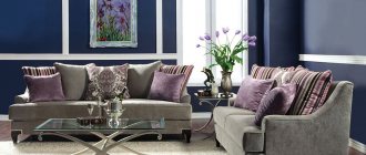
Complementary
Opposite shades from the color wheel, such as soft pink and blue, are considered complementary. In apartment design, this combination looks brighter and more interesting. Despite the contrasting colors, the room will not be overloaded due to soft shades.
Similar
The shades adjacent in the circle will become a continuation of each other in the interior of the room. The shades are close to each other, but are not variations of the same color.
The photo shows a bedroom in mint-orange tones. The walls are decorated with wallpaper with a small floral pattern combined with paint of the same tone.
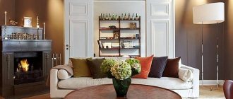
Bright accents and pastels
Accents are an important detail in decoration; every little detail can change the character of a home. Bright elements will decorate a modern style, delicate colors are suitable for a classic and softer direction.
The photo shows a bedroom with pastel floral wallpaper. The bright coral headboard serves as an accent.
Pastel in the interior
Pastel background
As already mentioned, light powdery tones lose a significant share of the properties that are inherent in the main color. That's why they are so good as a color base. In this they compete with neutral tones (white, beige, gray), often used to create a background.
With a pastel background, the interior can be monochrome, consisting of shades of the same color of different saturation.
Mix of pastel colors
All shades of this kind combine perfectly with each other. You can combine them in the interior in any way. For example, in painting walls in blocks (using the “color blocking” method) or in grouping multi-colored pillows on the sofa.
Pastel multi-colors are much safer and more pleasing to the eye than mixing rich tones.
Pastel accents
Yes, elements of not only deep, but also muted colors can serve as bright touches. True, the range of their application is limited - pastel accents “work”, as a rule, only in neutral interiors.
Pastel furniture
Furniture in soft spring tones looks light, sometimes even weightless. It doesn't overload the space. This makes it an ideal solution for small spaces.
Pastel furniture brings lightness and spring freshness to the interior.