Design methods
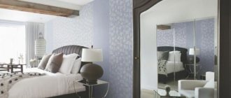
A bedroom in powdery shades is fresh and elegant, which is more typical for ladies. When decorating a men's room, you should take a closer look at shades of blue and green. In both cases, pastel colors will add freshness and coziness, which is so necessary in the bedroom for a comfortable and sound sleep.
As a rule, designers use one of the following combinations when decorating an interior:
- Two different tones are used: the main one is neutral and the additional one is pastel. For example, gray and pastel pink, elegant brown and mint.
- Only two pastel colors are used. In this case, don’t be afraid to make a mistake, all pastel colors look great with each other and can be easily combined: blue and pink, lemon and mint, etc.
- Three or more pastel shades are used in a variety of combinations. In this case, everything also depends on your imagination: in the end, the interior will not turn out too flashy (pastel colors will soften and brighten), the room will be lively and fresh.
To dilute the fading of the main shades, white, brown, gray colors are used, but light, beige and its shades (cream, milk, beige, etc.) are considered the most suitable. To give the interior a cooler accent, designers use gray, and brown is suitable for incorporating vintage elements.
Pink in a harmonious duet: what colors to combine with powdery pink?
Combination of dusty pink and light gray Shades of dusty pink and light gray create calm, harmonious combinations. The gray color always remains in the shade and effectively balances the pink. The presence of pink adds subtle notes to gray. Gray and pink can be combined with other colors: especially white, beige and black.
A combination of dusty pink and gold.
They complement each other perfectly, bringing the discreet charm of the French boudoir, a touch of exoticism and luxury. Both colors like to dominate, so they should be used in moderation. It is best to bring gold in the form of accessories (pens, photo frames, vases, mirrors) or original furniture (openwork chair, coffee table). Paired with pink, metallic accents in copper and rose gold are also stunning.
Dusty pink and green The duet of dusty pink and green is an unobvious, but very successful combination. It is suitable for interiors decorated elegantly, as well as with a large amount of eccentricity. The expressive duet will especially appeal to those who are tired of the look of white walls and minimalist apartments. To create an elegant decor, use powder pink and bottle green. Add gold accessories, good quality fabrics and mood lighting. If you prefer a calm atmosphere, add exotic motifs: cacti, pink flamingos, palm leaves.
Combination of dusty pink and blue
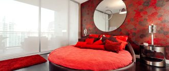
A duet of dusty pink and dark blue is another tandem. By choosing slightly brighter, darker shades of blue, you will create a cozy and intimate atmosphere - perfect for sleep, meditation or evening relaxation. Combining pink with dark blue gives your interior a sophisticated character and depth.
Pink and blue in the interior
What else can be combined with pink? Of course, white or another pastel color, especially blue. It also goes well with burgundy.
Pink kitchen color in popular styles
The right combination of companion shades allows you to use pink in different interior styles, each of which is characterized by the use of a specific color scheme and materials. But a wide range of pink makes it possible to “masquerade” to suit any style. See for yourself.
Pink color combination in the kitchen
Classic style
This style is distinguished by the use of natural materials in decoration, wooden furniture and symmetry in the layout.
The main thing here is rigor and elegance.
When choosing colors, a combination of light pastel colors with dark brown, deep green, blue and gold tones is used. These colors will become accents in your kitchen.
Classic pink kitchen style
Scandinavian style
This interior is characterized by restraint and the dominance of light shades. It minimizes the use of decor or small interior decorations. The combination of pink with elements of white or white-pink design will easily emphasize the Scandinavian identity of the kitchen.
Scandinavian style pink kitchen
Retro style
This style is distinguished by eclecticism, in which old and new are mixed. The interior is filled with whimsical shapes and original combinations of colors.
Retro pink kitchen style
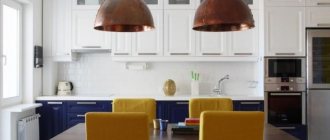
For a retro-style kitchen, the most popular option is to use yellow-pink or pink-blue combinations. Striped wallpaper, polka dot furniture upholstery and kitchen textiles with a similar print also perfectly highlight “that time.”
Retro style pink kitchen
Provence style
Provence style is a sophisticated version of French country, which is characterized by the use of wooden surfaces, a combination of practicality and modest elegance.
The main color scheme is blue-white or turquoise. Adding pinkish shades to it allows you to create light, unique interior solutions in a small kitchen space. At the same time, white furniture with pink accents will look very impressive against the blue background of the interior.
Pink kitchen in Provence style
Shabby chic style
Shabby is a style that has been relevant since the end of the 20th century, created by American designer Rachel Ashwell. It was she who came up with the idea of painting old furniture white and updating old curtains with light ruffles and frills.
The shabby style is characterized by an abundance of light and delicate shades, from white to golden beige. The combination of white and pink colors and old, updated in a special way, furniture will help create chic and tenderness in your kitchen.
Pink kitchen in shabby style
Country style
This style is a functional rustic kitchen with a predominance of wooden surfaces, natural cladding in light brown tones. Practicality and simplicity are important characteristics of this kitchen, which is filled with simple design furniture, rustic attributes that fill the space with childhood and kindness.
Pink country style kitchen
Japanese style
This style is an example of absolute minimalism and simplicity. It is characterized by the use of cream, white and always woody shades. After all, the main thing for the Japanese is the harmony of the soul even during the moments of cooking.
Pink kitchen in Japanese style
The psychology of pink cuisine
Pink kitchens, with the right choice of colors, allow you to create elegant, restrained or trendy bright interior images.
Pink fits perfectly into different design styles, allowing you to hide the architectural flaws of a room, for example, making it visually more spacious.
Pink color in the kitchen
Do not forget that, according to psychologists, the color pink has a calming effect on a person, relieves stress and emotional tension, which is very important, because everyone has to spend a lot of time in the kitchen. Thus, just being in such a room, where the eye can focus on a warm and cozy shade, can maintain mental health, emotional stability, necessary for creating strong family relationships, as well as strengthening overall well-being.
Pink color in the kitchen
To prevent the presence of pink in the kitchen from causing associations with a frivolous and naive doll image, you do not need to use it in large quantities. It is imperative to choose notes that will limit the dominance of pink, emphasizing its positive qualities.
Shades of pink in the kitchen
By learning how to correctly combine pink color with neighboring shades of the spectrum, you can create impeccable kitchen interiors.
Terrazzo in the interior
Terrazzo is usually understood as classic Venetian floors laid with mosaics using natural stone. This type of finish was used several centuries ago. In a slightly modified form, terrazzo began to be used in the 70s of the last century. Back then, this was the name given to floors whose white base contained bright inclusions of granite, quartz, glass and marble.
The taste of rhubarb and meringue pie is impossible to forget: the sourness makes it special
Cranberries, persimmons and bourbon: preparing sweet sauce for pancakes and pancakes
The Voice of War and Victory: how did Levitan’s great-grandson grow up and did he follow in his footsteps?
Now such a pattern can be safely used not only for finishing the floor, but also for decorating furniture and walls.
Wicker furniture
Wicker furniture has gained great popularity recently. Rattan products are an excellent option. They are made of natural material, elegant in design and fit perfectly into the interior of beige and powdery tones.
For decoration, you should look for a wicker chair, floor lamp or chandelier.
12 years ago, two young Belarusians won the Green Card lottery and moved to the USA
Sweet snack in a hurry: make cake pops from honey and peanut cookies
The hunter experienced the most exciting journey at the age of 92: he got lost in the forest
Pink color in the interior: how to use it?
Pink Walls Decorating your walls in pink seems like a crazy idea. And in vain! This is the perfect way to add variety to your living room or bedroom decor. A pink wall is a spectacular backdrop for a designer sofa, table or bed. Remember, however, that everything needs moderation. Instead of painting the entire room pink, it's better to limit yourself to one wall or a selected corner. If you want to avoid any associations with a little girl's room, choose dirty or heavily bleached shades of pink. Also avoid infantile motifs (including hearts, flowers, animals), or exaggeratedly decorative furniture or accessories.
Pink furniture Sofas, poufs and armchairs with pink upholstery are one of the most current trends in interior design. Particularly popular are models in the mid-century style: elegant, complemented by soft pillows, standing on thin, curved legs. Pink upholstery can be made from inexpensive polyester fabric, but velor chairs and sofas look much better. The combination of fleecy material, slightly shiny texture and soft pink creates a sensual and at the same time extremely elegant combination.
Pink accessories
Buying a pink sofa is a bold move. It is much easier to incorporate pink into the interior using tasteful details. Items of simple shape, without fancy decorations, are best suited: pillows, vases, picture frames, handmade ceramics. Designer lamps or rose gold sconces can hang above the dining table, near the bed or sofa.
In the shade of the trees
This house is located in a green area, on the outskirts of Moscow. In the interior design, the English architect James Soane from the PROJECT ORANGE bureau used natural shades of ocher, greenery, and tree bark, because the main decorative element in the house is the green landscape outside the window.
James Soane: “When I look at our house, I can easily imagine it somewhere in Surrey, England. At the same time, it does not stand out from the Russian context. This is a completely organic building for Moscow.”
James Soane: “When I look at our house, I can easily imagine it somewhere in Surrey, England. At the same time, it does not stand out from the Russian context. This is a completely organic building for Moscow.”
The kitchen facades (an individual project made according to the architects' sketches) are painted in the most delicate shade of green, in harmony with the parquet flooring and warm-colored wooden furniture. Lunch group, Conran Shop.
The kitchen facades (an individual project made according to the architects' sketches) are painted in the most delicate shade of green, in harmony with the parquet flooring and warm-colored wooden furniture. Lunch group, Conran Shop.
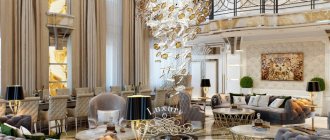
Pastel in the interior: why designers love it so much
“Pastel colors are perfect for the interior! They are calm and complex, beyond time, fashion and season. I love working in this range. It is universal for every room and serves as a wonderful backdrop for any style.”
Daria Reznikova
interior designer, architect @dariareznikova
These colors visually increase space and are able to change saturation depending on the lighting. Therefore, they are good to use in those rooms where the light is directional, and there is also a play of light and shadow.
The ideal companion to pastel colors is white. To add a graphic touch to the interior, introduce it into the design, and pastel colors will appear in the most advantageous light.
But you should be careful with too bright shades - they can make the pastel tone fade.
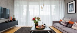
When choosing colors for your living room, don't forget to consider the lighting and size of the room. If the windows face north, and especially if the room is small, choose warm shades: milky, champagne, peach.
In large, well-lit rooms, cool tones will work better: gray, muted ultramarine, mint, noble blue.
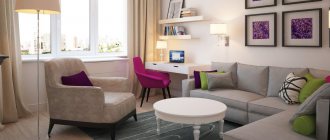
The bedroom seems made for a pastel palette. The delicacy of color, its calmness and tenderness will set you up for rest and relaxation. Beige, gray, lilac, green, and add lemon for a nice contrast. Photos in white frames will also be a pleasant interior decoration.
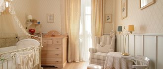
Nursery design in pastel colors is so cute! Blue, gray, olive, turquoise, brown are suitable for boys. And pink, peach, beige and lavender will decorate the interior of a little princess.
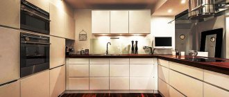
A kitchen in pastel colors, of course, will add more worries to the housewife - it requires cleaning more often. But how cozy and noble these colors look, especially in combination with white design elements.
A bathroom that traditionally uses a lot of white will benefit from pastel shades. Blue, green, gray, beige will fit perfectly into the space.
Don't forget to add softness and warmth. This can be done using both lighting and textiles. Fluffy towels and rugs will come in handy.
Advantages and disadvantages of a pink kitchen set
The pink headset has many advantages. This color is a great way to stand out from the crowd and create a truly stylish and unique kitchen . The bold color scheme is complemented favorably with gray, pearl, white and ash-pink shades. Pink furniture looks great in spacious rooms, makes the kitchen bright and has a positive effect on mood.
The interior looks especially delicate if complemented with milky, cream or silver colors. The pink set looks stylish in both matte and glossy versions.
Among the disadvantages, they note that pink kitchens tend to get boring quickly . That is why the set is complemented with lighter and more delicate decor, textiles and finishing. This color scheme does not fit with classic, country, and Scandinavian styles. For decorating a small kitchen, a powdery color is more suitable than a rich pink. Otherwise, the room will seem even smaller than it actually is.
Bedroom in soft colors: how to choose the perfect color?
In a bedroom, whether classic or modern, the color palette should be balanced. Good colors for a relaxation room are pastel, powdery and natural shades. A delicate interior can delight not only with beautiful furniture, but also with color. What colors to choose for the bedroom: cool or warm, intense or pastel? In this article you will find answers to these questions. Find out how to introduce subtle color into your bedroom interior and what wall colors to use so that the arrangement is not tiring for the eyes. The photo gallery will help you with ideas.