Experiments in creating original wall decoration have no limits. Imitation of stone or brickwork, textured plaster and other techniques are certainly very unusual, but, alas, not everyone can afford it. In addition, such techniques often require professional skills and abilities in application to the surface. However, you can always find an alternative, and in this case it is companion wallpaper. What they are and how to use them in the interior - more on that later.
What are companion wallpapers?
Companion wallpapers are two options for covering walls that differ in color, texture or pattern. But the most important principle here is a harmonious combination of paintings.
Most often found: neutral tones on two or three planes, bright ornamental and expressive companions on one or two planes. This finish can be presented in the form of stripes, squares and other combinations that look great in interior design.
A lot can be said about the advantages of such wall decoration, but the obvious ones are:
- unlimited possibilities for designer creativity;
- originality and non-standard finishing with companion wallpaper;
- by combining styles, textures, and colors, you can successfully hide the obvious shortcomings of a room;
- wallpaper companions assume the presence of ready-made combinations in an abundance of various modifications. And you don’t need to painfully and time-consumingly select combination options - manufacturers of finishing materials have already provided for everything;
- paired wallpaper is an excellent option for simple zoning;
- Such wall decor can be organized in any room, be it a living room, bedroom, nursery or hallway.
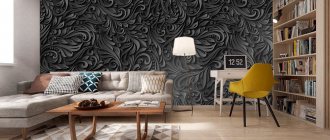
Drawings and patterns on black wallpaper
Manufacturers offer finishing on a wide variety of themes - geometry, ornaments, stripes, floristry, vegetation, animals and nature.
The beauty of a black background is that any pattern or picture looks extremely detailed on it. Black color:
- highlights silhouettes;
- makes lines and borders clear, and smooth lines even smoother;
- adds luxury and grace to plant and flower arrangements.
On black wallpaper, even a simple calligraphic inscription will look original. The black background contrasts with any of the shades. Therefore, this finish has a pronounced volumetric effect.
Designer's advice: We recommend paying special attention to the choice of canvases for medium-sized rooms. The “turnaround” rule applies here: the smaller the room, the more light inclusions there should be on the decoration - large ornaments, floral patterns. In this case, wallpaper from the Cirrus collection from the AS Creation brand would be an excellent choice.
Selecting couples: basic rules
In order to organically fit a similar decorative finishing technique into a room of any style, purpose and size, you must follow several important but simple rules. So, combination options can be classified as follows:
1. Same color palette, but different textures and patterns. This type is found in ready-made collections from manufacturers. Distinctive characteristics are a background canvas of a monotonous neutral shade or with a barely noticeable pattern. His companion is expressive, bright, in the same tone, but much more noticeable. This type of finish is usually used in European classical styles.
2. Different colors, but the same pattern and texture. Here the background wallpaper is quite neutral and calm; Decorative, on the contrary, are catchy and noticeable. There should be at least 60% background paintings in the room. This technique is popular in modern styles such as minimalism, eclecticism, and hi-tech.
3. A different pattern, color and texture is the most original way of combining, but manufacturers do not produce ready-made combinations, so here you need to trust your personal preferences and taste. Typically, this technique is used in experiments only by professional designers who have been choosing finishes for many years. This combination looks beautiful in eclectic or pop art styles.
Color combination ideas
Beige
The calm, universal tone goes well with a variety of colors. Beige harmonizes with bright and calm, warm and cold colors. It also successfully serves as a background. The best combinations will be with wallpaper companions in white, blue, emerald, red, brown and black. Depending on the partner’s color choice, companion wallpaper will look good in the interior of any room.
White
The white tone is harmonious with any colors. The combination can be soft or contrasting, the colors rich or pastel. A combination of white and blue, red or black will look especially good. Also, the texture is clearly visible on a white background.
Gray
The gray color of the wallpaper is harmonious with clean and dusty shades. Cold and warm gray tones are suitable for interior design in a modern style. The combination with pink and purple colors will look soft and gentle. Wallpaper companions of blue, red and fuchsia are a more contrasting, but no less successful combination.
Greens
The green tone of the companion wallpaper will look good with warm natural shades, such as brown, gray, orange, cream, gold and black. Eco themes will make the interior warm and the atmosphere soothing.
Black and white
The combination of black and white already looks complete and complete, they complement each other. However, yellow, light green, orange and purple shades can be an excellent companion to black.
Purple
The beautiful purple color will go well with gray, lilac, olive and white. Purple is suitable for interior design in a modern style. A rich shade is best used as a secondary shade.
Brown
Warm chocolate shade harmonizes with blue, turquoise, green and pink. Rich colors will stand out against a brown background. The combination with companion wallpaper in cream and beige shades is suitable for decorating an interior in a classic style.
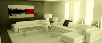
The photo shows a loft-style living room. The walls are decorated with different types of companion wallpaper, some of them with imitation brickwork, others with plaster.
Pink
Pink color can be a delicate pastel shade or a rich fuchsia color. The light version of pink is combined with turquoise, light blue, mint, white, gray, olive and brown. For a fuchsia tone, the company will be accompanied by wallpaper companions of mustard, gray, and light green colors.
Blue
Companion wallpapers in white, grey, pink and yellow go well with a delicate blue tint. Among the bright colors to combine, red, orange, and brown are suitable. Depending on the partner color, the interior will be bright and rich or calm.
Golden
Golden accents will decorate the wallpaper with companion colors of turquoise, peach and gray. Gold looks impressive with companion canvases in brown, red and black tones.
Yellow
Sunny yellow combines well with cool shade companions: blue, blue, gray, black and lilac. Yellow color will add sun to the interior of the room.
Lilac
The lilac shade can be combined with companion wallpapers of cream, light yellow, pink, light turquoise and black. The shade creates a delicate combination even with dark colors.
Turquoise
Refreshing turquoise will be a good companion to brown, black, dark pink, beige, white and yellow. A good addition would be golden or silver elements.
Options for combining background and bright canvas
In addition to the selection of colors, patterns and textures for companion wallpaper, it is also worth considering the combination of volumes of background wallpaper and bright ones. Let's consider a few main rules:
- one wall is decorated with bright wallpaper, the rest with background wallpaper. This option is often used in decorating a children's room;
- alternating canvases in stripes, the width of which can be different or the same;
- horizontal zoning, when the lower part of the walls is covered with dark wallpaper or quite bright wallpaper with a large pattern, and the upper part is covered with neutral light wallpaper or with a small pattern (or vice versa). The joints are usually decorated with molding. Such a solution will help visually adjust the space. So, in a room with high ceilings, for the lower part of the wall with a bright or dark background, it is best to allocate a place up to 2 meters high from the floor; if the ceilings are low or standard, then 1 meter will be enough.
- inserts are a relatively simple option for decorating walls. After all, first of all, the background canvas is pasted, and on top of it is a bright and noticeable companion. Eye-catching inserts are framed. This type of wallpaper combination is typical for classic interiors;
- The patchwork method is interesting, but quite difficult to implement. The decoration on the walls is very similar to patchwork, but in this case it is made from wallpaper. Here the shreds are distributed in a checkerboard pattern. In this case, individual companions should be contrasting and fit perfectly with the rest of the elements. The main principle is harmony and integrity of the perception of the composition;
- contrasting walls and ceiling - this technique is used for a clearer perception of the volumes of space; This method of finishing gives the room greater depth and expressiveness.
Note: when choosing a pair or three of companions, keep in mind that contrasting combinations visually reduce the space. Therefore, the ideal option for a compact room would be plain canvases and patterns, but not bright combinations.
Examples of combinations in the interior of rooms
For the hall (living room)
The living room has more interior design options than other rooms in the house. Unlike a bedroom or kitchen, a combination of companion wallpaper in bright colors and with voluminous patterns that can be united by a common theme would be appropriate in the living room.
With the help of companion wallpaper, you can highlight any area, for example, a relaxation area near the sofa and armchairs or a cozy place for reading. In addition, companion wallpaper will be a good interior solution for a living room combined with a kitchen; this method of finishing will help to designate zones, visually separating them.
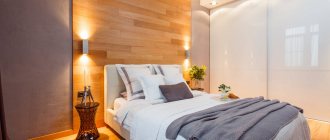
For the bedroom
Companion wallpaper is a common design solution for bedrooms. This method of finishing can be used to designate a sleeping or lounge area, as well as visually enlarge the space.
The photo shows a marine-style bedroom. Companion wallpaper, like other items, has a pattern with a common theme.
With bright, contrasting companion wallpaper, you can decorate the wall above the head of the bed, thereby highlighting and decorating it.
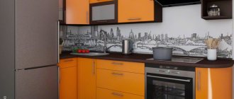
For kitchen
Companion wallpaper will help divide the kitchen into a work area and a dining area.
Bright wallpaper can be used to decorate the entire wall of the dining area or just the part directly above the dining table. The wall above the work area can also be an accent wall. Wallpaper should be protected with transparent glass above the cooking area.
For the hallway
In Khrushchev-era and standard city apartments, the hallways are not very large; paired wallpaper companions will make this room more interesting and voluminous.
It would be more appropriate to use companion wallpaper with a light color palette; different patterns and textures will diversify a small space, and light colors will preserve the area.
For children's
Companion wallpaper is an excellent solution for a child’s room; original combinations will make the child’s room more interesting and fun. A boy's room can be decorated in a light blue tone, combined with yellow or white motifs.
For girls, wallpaper companions in delicate colors are suitable: pink, lilac, yellow. For a child’s nursery, it is better to choose a calm palette; you can decorate a teenager’s room in bolder shades.
The photo shows a children's room for a girl in the attic. The decoration is made with companion wallpaper in a light palette with pink accents.
How to visually adjust space using companion wallpaper?
This finishing method allows you to successfully correct flaws and irregular shapes of the room. Let's look at the basic techniques:
- background wallpaper can be used to cover walls with defects, and bright wallpaper can be used to cover a smooth surface. This will help distract attention from imperfect planes;
- it will be easy to turn the rectangular shape of a room into a square if long surfaces are decorated with canvases with a vertical pattern, short surfaces with a horizontal pattern;
- if you want to extend the space, the opposite plane to the entrance is decorated with wallpaper with a darker color; if the task is to expand the room, the same place is decorated with pastel light shades;
- It is better to avoid bright contrasts in a small room, they will make it even smaller;
- in a room with a large, luxurious square footage, you can safely use three companion wallpaper options without any special restrictions on brightness.
Advice: when choosing wallpaper for a combined finish, you should not buy canvases from different manufacturers and different price categories. Budget material will contrast too much with expensive material. This will significantly reduce the cost of interior design, even if the texture and color combination is chosen well.
Paired wallpaper is a great option to refresh and dilute the standard decor of a modern interior. To make such canvases look harmonious, listen to the rules described above regarding combinations, but it is better to entrust this issue to a professional specialist with extensive experience in creating such projects.
What type of wall decoration is in your apartment? And what type of wallpaper combination did you like best? Share with us in the comments.
Tips on how to choose: basic rules
To create a harmonious interior, you will need to follow certain rules when choosing wallpaper. They will help you navigate the variety of styles and colors. Thanks to them you can create a harmonious interior.
Rules for selecting companion wallpaper:
- The choice of combinations, patterns and colors of wallpaper should be combined with the overall design of the room. Provence is characterized by a floral theme and the use of stripes. In this case, a pastel color palette is used. They can be used for horizontal pasting. The bottom has plain dark colors or striped wallpaper, and floral material is placed on top. For Japanese interiors, the emphasis is on niches in the room. The European interior is characterized by types of materials for wall decoration with images of flora, gilding, and damask patterns. They can be used for one wall or a separate area.
- It is necessary to select a material for finishing walls of the same thickness so that there are no problems at the joints. They will begin to stand out due to the uneven edges.
- There is no need to combine finishing materials of different costs. More expensive options with cheaper ones will lose their attractiveness and take on a vulgar appearance.
- When using a decorative panel, the wallpaper is chosen to be plain; an option with a small pattern is possible.
- We must not forget about the mental impact of flowers. Universal colors include yellow, brown, green, orange, and white.
The combination of colors and textures determines the atmosphere of the room. Combining colors can visually expand or reduce a room. For a small room, choose different shades of the same color. The background of the wallpaper should be lighter than the decor.
How to hang two types of wallpaper on different walls
Consider a room with four walls, which are designated by the letters A, B, C and D. There are three ways to hang companion wallpaper.
Combination
Adjacent walls are decorated in the same style to give them equal importance. One pattern is pasted on planes B and C, the other - A and D.
Opposite
In this example, the two styles are placed on opposite sides of the room. The first one is on walls B and D, the second one is on walls A and C.
Selection
One wall, for example B, can be covered with bright wallpaper with a prominent pattern. The remaining planes are covered with simple designs.
Wallpaper for a small bedroom
Those who have a small bedroom should not be upset. You can completely harmoniously and tastefully create a modern and cozy interior. In addition, there will be much less consumable materials, which will allow you to choose higher quality and more expensive wallpaper.
Designers have always advised and continue to do so by gluing light-colored wallpaper in small rooms. This will visually increase the space and improve the lighting. It is better to avoid any bold or flashy designs. The most suitable option for such a bedroom would be non-woven or liquid wallpaper.
Rules for using black wallpaper
In order for the finished design to truly meet your expectations, choose wallpaper, focusing on some features of their use in the interior . Thanks to the wide range of black wallpaper produced by modern manufacturers, choosing a material that is stylish and pleasant to the touch is not difficult, but this does not mean that such wallpaper will look harmonious in your room.
Therefore, we recommend that you adhere to the following rules:
- in order to make black walls lighter and more harmonious, give preference to glossy coatings or wallpaper with additional inserts with textures, mother-of-pearl tints or gilding . Such effects will help dilute the deep and rich black color;
- When choosing the optimal place to stick wallpaper of this shade, decide in advance for what purposes these walls will be used. For example, it is advisable to decorate surfaces with paintings or a TV that will constantly attract attention in more pleasant colors, since black color will constantly distract the eye;
- a room decorated with black wall coverings requires mandatory compliance with lighting standards : the more light that enters such a space, the more comfortable the overall environment will be;
- It is advisable to decorate the interior with wallpaper in black tones with the additional use of lighter elements in the design . Dilute the wallpaper with inserts of other shades, cutting them out from leftovers, or select furniture and accessories that match the contrast;
- Since the black shade affects the perception of the size of the room, making it more cramped and narrow, try to transform the space through special expanding effects or use them exclusively for decorating large rooms . One of the most successful options for expanding walls in small rooms is to hang black wallpaper in the interior on one or two opposite walls and combine it with wallpaper in white or beige shades.
By the way, the success of your design will also depend on the correct combination of shades in such an interior . Since black is a rather dark and bright color, carefully consider combination options: most standard rules for selecting shades for combinations do not apply in this case.
Why combine different wallpapers?
- This combination makes the interior unusual
and varied. Canvases with an active pattern may seem too colorful, but using them as an accent in combination with a calm background “partner” looks harmonious and does not hurt the eyes. - Zoning
is a useful feature of paired combinations. Separate the work area from the reception area in one room - please: the contrast of light wallpaper and coverings with a floral pattern will visually divide the space. - The non-standard layout
of the room will become its highlight thanks to different wallpapers. Niches and protrusions can be emphasized with bright canvases, which will make them the center of attention.