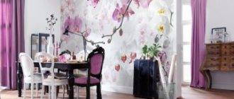
The emergence of visual art dates back to the era of the birth of mankind, and at all times people have sought to decorate the interior of their homes with works of art or their reproductions, posters, photographs, posters and posters. Today’s material is about how to properly place paintings and posters in the interior, decide on the storyline, color scheme and image size.
Features and Differences
Classic paintings
Both of these varieties can often be found in the interior as a decorative element. Designers refer to these elements with the combined term “interior painting.” This can also include engravings, panels, drawings and photographs.
The peculiarity is that the image has a certain plot. Such images are made in the form of a landscape, still life, abstraction or reproduction of a famous work of art, a motivating inscription, a poster, an advertising poster or a photo in a retro style.
Impressionist paintings
Note! Any of these varieties is suitable for decorating a residential interior - it is only important to choose the right style and color scheme so that the image fits organically into the existing environment. So, if you place a large number of different paintings on the wall, the atmosphere of a creative workshop will appear.
Mosslanda - shelf for pictures
DIY paintings in the apartment interior
What is a poster and a painting
Composition of posters in a modern living room interior
A poster is one of the most budget-friendly options for decorative elements for interior decoration. It is distinguished by a huge variety of plots. The advantage is that any idea can be implemented in a custom poster format.
- The image is applied to matte or glossy photo paper and then placed under glass. You can also print on newsprint or paper that imitates canvas. The main thing is that it is quite dense.
Interior feng shui paintings
- The painting allows us to demonstrate the diversity of subjects and techniques in fine art. And its main difference from a poster lies in the hand-made nature of the product, its individuality and exclusivity.
- Oil, watercolor, acrylic, and gouache are used to paint the canvas. Plots are written in a variety of styles and directions. This also includes drawings made with pencil, pastel, charcoal and other materials.
Paintings in the interior of Provence
- An important feature of the painting is the frame in which the canvas is framed. There are canvases that do not require a frame, but more often the frame is an integral part of them. Choosing the right frame is also an art.
- It is important to use it to emphasize what is depicted, and not to make the framing the main decoration, depersonalizing the plot of what is written. With the help of the frame, the canvas is given a touch of nobility and aristocracy.
What then should be called a poster?
To define this concept, let's first look at some examples of what is offered for sale in addition to everything that was listed above and what we have already decided on. Here are some examples.
The examples presented above are all very different both in style, genre, and performance technique. But they all have one very important property in common. Unlike copies and reproductions of paintings, the primary source for their images is not a work of fine art created by a human hand, but an electronic file obtained using one of the digital technologies. This can be a photo or video image, or a file obtained using computer graphics. It, in turn, is divided into raster, vector, three-dimensional and fractal. Each of them has its own advantages. For example, vector graphics are good because they allow you to increase the size of the source file practically without distortion or loss of quality.
3D graphics allow you to create unusual, impressive images. Fractal graphics are the most modern and promising. It is based on the principle of inheritance of object properties, therefore it provides very wide opportunities for creativity.
This property of the above products allows us to call them posters .
For the poster in its original form was also the brainchild of printing products, which most often did not use works of art as source files, but created stories using the technologies available at that time. Such, for example, as applied printed graphics.
Here is one of the surviving advertising posters for the film "Metropolis" (Germany, 1926).
Although this poster is over 90 years old, it is not much different from modern posters of this theme.
Modular pictures
Beautiful paintings for the home
A separate category of compositions for interior decoration includes modular-type structures. They can differ in size, shape and number of modules.
Examples of placing modular paintings in the interior
Each module is made in the form of a canvas stretched on a stretcher. To ensure that the integrity of the single plot is not violated, a frame is not used for each module.
Paintings of flowers for the interior
In Ancient Greece, the term “driptych” was used to describe two tablets – an ancient analogue of a notebook. Regarding paintings, a driptych is a composition of two canvases with a single storyline. In this case, the size of the canvases can be the same or different depending on the desired visual effect.
Corner modular paintings - triptych
A triptych is a composition of three modules, and a polyptych is made of more. Each module can be an element of a single segmented image, or they can be paintings in the same style.
What wall paintings are trending now?
At all times, paintings made it possible to give a house some aristocracy and chic, which certainly had a beneficial effect on the image of the owner. However, if earlier works of art were available only to wealthy people, today anyone can decorate their home with a beautiful painting, a high-quality copy or at least a reproduction of a famous painting.
Modular paintings are a good way to decorate the interior of an apartment or house
Most people prefer to buy only fashionable items, including fine art. Just buying a painting is not enough, because if a classic is in trend, it is unlikely to look harmonious in a high-tech interior. In addition, it is necessary that the canvas is not only fashionable, but also corresponds to the preferences and inner world of the owner. Let's look at what's in fashion now, and remember that this lady is fickle, and her mood changes very quickly.
There is no money for the original - you can order a high-quality copy
Modular pictures
Modular paintings are an artistic canvas divided into several parts (modules) - 2, 3, 4, 5 or more. They are very popular nowadays because they look quite unusual and modern. Segments of the painting can be placed horizontally or vertically on the wall, depending on the subject, of course. One of the advantages of modular paintings is that even when large in size they do not look bulky, since, unlike traditional paintings, they do not have frames and are divided into several elements. Depending on the number of segments, they are divided into diptychs, triptychs, polyptychs, etc. Below are several examples of modular paintings depending on the number of modules.
Modular painting - diptych
Modern triptych
Triptychs have been known since the Middle Ages, if not earlier
An example of a modular polyptych painting
Modular picture of 5 symmetrically arranged segments
Copies of famous paintings
Paintings by contemporary artists are unlikely to be suitable for decorating interiors in classical styles, but paintings by old masters will look very harmonious. If you are not a wealthy person and cannot afford to buy the original, then ordering a good copy (replica) of works by famous painters is quite affordable for most people.
If you are not an expert, it is very difficult to distinguish a good copy from the original.
Such a copy of a famous painting will be a worthy decoration for an office in a classic style.
Who doesn't want to experience beauty?
Several high-quality replicas of famous paintings will add special chic and sophistication to the living room.
High-quality copies of famous paintings in the interior of the living room will allow you to turn it into a small branch of the Louvre or Hermitage
Trends in modern interior design
Gallery of paintings in the interior
To decorate modern interiors, designers recommend paintings in the style of expressionism or abstractionism. With their help, you can easily create an accent spot, distract attention, adjust or maintain the color scheme of the interior. The distinctive feature of such images is their dynamism and positivity.
Unusual DIY paintings for the interior
The works of recognized authors and contemporaries will fit equally organically into a modern interior. Posters with abstract images are distinguished by a wide range of colors and subject lines.
Note! When choosing an interior painting, they primarily take into account the color scheme and style of the room, and not the popularity of a particular image.
Where and how to place posters on the wall
It is also important to choose the sizes of posters correctly; the size should fit the size of the room itself and the furniture located in it. If the poster will be located above the furniture, then it should be at least half the width of this furniture, because this way it will look proportionate. And not too small.
When placed on an empty wall, compliance is coordinated with the width of the wall surface. In a small room, a very wide image will look out of proportion. And in the end, it will visually make the room even smaller.
If we are talking about a piece of furniture that is not very wide, then the poster above it should be approximately the same size.
Posters influence the visual perception of the size of the room itself. To increase the length of the room, you can hang a modular picture, which will take up a lot of space across the width of the room. If you want to lengthen the room and visually make the ceilings higher, then purchase narrow, vertically located works.
To increase the length of the room, you can hang a modular picture, which will take up a lot of space across the width of the room.
The level of location also plays an important role in the correct perception of images. Experts say that the best option is to place the picture at a height so that the center is equal to eye level. The type of room is also taken into account here. For example, in the living room, it is taken into account that it is at the level of a standing person, and in the kitchen it is necessary to hang a picture lower. After all, people sit in the kitchen more often than stand.
The best option is to place the picture at a height so that the center is equal to eye level.
The article talked about the basic rules for choosing posters and their correct location. Of course, it is difficult to reveal all the nuances in one article, but this information will already be of great help in choosing a suitable poster for decorating a room. A poster can really become an excellent decorative element and play a fundamental role in the design of an apartment. You can transform a room with your own hands, you just have to take this issue seriously. Take into account all the parameters of the room and decide in advance on the place where the poster will be purchased.
Paintings and posters as a decorative element
Paintings with a night city in the interior
Despite the fact that paintings and posters are one of the popular ways of decorating the interior and are presented in a wide range, you need to choose them wisely. You will also need to take into account the purpose of the room in which the image will be used, its area, color scheme and style.
Color spectrum
Posters for interior paintings
The color of the image should be organically combined with the existing interior and at the same time not merge with the decoration and furnishings - this is an accent element that attracts attention. A painting can connect several objects in the interior that do not harmonize with each other on their own.
Cross stitch pictures
With the help of one or more paintings placed on a free wall of a flight of stairs, you can logically link two floors with different color schemes, if both dominant shades are present on the canvases.
How to hang pictures correctly
In order for the image to fit organically into the interior, it must contain shades that are present in the setting or decoration. To create an accent, add a bright painting or poster to a room with neutral decoration.
All eyes on the picture
And vice versa, if the decor of the room is contrasting, you can smooth it out with the help of an image in soothing colors. By choosing black and white images, you can talk about creating an elegant and strict atmosphere in the interior.
Photo paintings for interior
Existing types of posters for walls
Posters can be divided into a number of types, because the images on them differ in theme, they are also different in size, color schemes and other parameters; dividing them by type can help you quickly decide which one is best suited for a specific purpose. Below we will look at various variations of posters.
Posters can be divided into a number of types, because the images on them differ in theme, they also differ in size, color schemes and other parameters.
Large
As the name suggests, they are distinguished by their large size; photo wallpapers and posters often do not differ today. If such large images are used to completely cover one side of the room, this is how the space is zoned. Posters on the wall of large sizes can have drawings of any theme: abstract, natural, urban and others. Large posters are more suitable for large spaces, because too large a poster in a small room will make it look even smaller.
Large size wall posters can have designs of any theme.
Photo posters
Photo posters on the wall involve printing large-sized photographs. They can be printed on glossy or matte paper, and decorated using a backing made of foam cardboard or hardboard. Various frames are also used.
You can use your own photographs; a good option is to place several photo posters on the wall with different photographs of family members, adhering to some common theme; there should be something uniting these photographs. Perhaps it will be printing black and white photographs, or one type of frame, maybe a color scheme, for example, photos taken at one time of year.
A good option is to place several photo posters on the wall with different photographs of family members.
Black and white
The combination of black and white is a classic in many interior solutions. A black and white image has its own mystery; the absence of bright colors makes you think. These colors look good when the room is also dominated by these colors. This is a more formal style and is also suitable for offices.
The black and white theme is also suitable for the rooms of teenagers who love these colors.
A black and white image has its own mystery; the absence of bright colors makes you think.
Other possible types
We can highlight the now popular trend of hanging, the so-called modular paintings. They represent the placement of one image on several posters, also differing in size. This design fills the space well; the unusual differences in the size of the frames make it interesting. Modular paintings look modern and original.
This design fills the space well; the unusual differences in the size of the frames make it interesting.
Art posters are most often printed on canvases, which are stretched on a stretcher, then covered with texture gel to make them look like paintings; they are most often framed in a baguette.
On sale you can find posters that have a limited edition; they will make such a poster unique; sometimes the author of such images leaves their signature, emphasizing the exclusivity of the work. They naturally cost more because of their uniqueness.
Art posters are most often printed on canvas.
Paintings and posters in different rooms
Paintings with poppies in the interior
The functional purpose of the room plays one of the main roles when choosing the style of the image and its plot. Do not forget that the image on the wall has a psychological impact on a person and creates the necessary mood.
In the kitchen
Reproductions of paintings for interiors
Paintings in the kitchen are often used to decorate a free wall in the dining area.
The following nuances are taken into account:
- Complex and intricate designs can overload a room with pronounced functionality;
- If the interior is achromatic, then it is better to use black and white images;
- Using the image you can emphasize the style of the room. If this is Provence, then a photo with a clear sky against the background of a lavender field or another landscape will look organic;
- For the dining area, you can choose retro posters with inscriptions;
- In a modern minimalist interior, you can add color using an abstract image on a poster with no more than two bright shades that will echo the same colors in the decor.
Paintings in the interior: how to place them correctly
In the living room
Wall decoration in a room with neutral finishes
When decorating a living room, consider the following:
- For a classic interior, it is recommended to choose reproductions of novelist and realist artists, as well as works in the ancient genre. The painting is framed in a luxurious baguette;
- For a living room in country or Provence style, you can choose a light landscape painted in watercolor;
- The Scandinavian style in the living room will be supported by a marine-themed landscape;
- For modern minimalist design, abstraction, black and white drawings and photographs made in the pop art style are used;
- The living room area can be effectively emphasized using a modular version of the painting.
In the bedroom
Modern paintings for the bedroom
When choosing a canvas for the bedroom, take into account the specifics of the room. The atmosphere here should be conducive to quiet rest and relaxation. Therefore, it is better to refuse bright and dynamic plots. More often, the bedroom is decorated with images of flowers and natural landscapes, painted in watercolors in delicate, pastel colors.
Large embroidered paintings in the interior
For a modern style, you can choose a cityscape in black and white, and for an eco-style, posters with macro photography of plants or butterfly wings are suitable.
In the children's room
Image of animals in nursery decor
When decorating a children's room, the color scheme of the images itself is chosen to be bright and cheerful. The plot can be very different - from bright holiday landscapes to fantasy abstractions.
You can decorate the room with images of animals and plants, made in pastel, soothing colors. The main condition is the positive energy of the image, which will create a life-affirming atmosphere in the children's room.
A collage of personal photos is another way to decorate a child’s bedroom.
Several family photographs, arranged in a gallery style, combined with bright posters in the same style, will create an original decorative composition. It is better to abandon massive, elaborate frames in favor of simple, thin frames.
You can decorate the wall in the nursery with your child’s own drawings, framed
In the hall
Option for decorating walls in the hallway
A frequently visited room in an apartment is the entrance hall and corridor, which connect all the rooms with each other. And although a person does not stay in the hallway for a long time, it is the appearance of this room that forms the first impression of the owner of the house. Images for wall decoration are chosen to be simple and easy to understand.
Minimalism and abstraction - the perfect combination
Often the hallway does not have a large area and a mirror is usually hung on a free wall, but if the wardrobe is equipped with mirrored doors, then the free wall can be decorated with a suitable poster.
Photo gallery in the hallway
If several doors lead from the hallway to different rooms, then in the partitions between them several canvases are hung in a row in the direction from floor to ceiling or one canvas in the central part of the partition.
In the bathroom
Bathroom interior
In the bathroom, it is better to hang such decor away from the water source. You can decorate a free wall. To prevent the canvas from being damaged by high humidity, it is framed with glass.
The theme of the image is selected accordingly - the water element in any manifestation. Abstraction or plant themes are also suitable.
Retro poster in the bathroom
Note! The subject of the image should also contribute to psychological relaxation and relaxation. Sharp outlines and bright colors should be avoided.
Posters for the interior. How to choose and place correctly?
Interior posters as a design element are currently becoming increasingly popular. And this is explained primarily by increased quality, at least from professional manufacturers, and a large number of styles and subjects offered.
First, let's define what a poster is in the modern sense.
The fact is that there is an outdated idea that a poster is just a poster on paper with the image of famous actors or musicians and that’s it.
Today, interior posters have completely different aesthetic and consumer qualities.
What is the fundamental difference between modern posters?
- Firstly, they are usually made on high-quality photographic paper, often with imitation canvas, or on natural canvas, which brings them closer to full-fledged paintings, but their cost is quite affordable.
- Secondly, copies can be exclusive, and not printed in thousands, as in Soviet times.
- Thirdly, modern posters are made in various styles, which makes it easy to match them to the interior of any room.
- And finally, such posters can be placed in a natural wood frame and look very good in any interior.
This is true, of course, primarily for professional workshops with a good reputation and work experience, such as Artwall, which produces high-quality products in accordance with the wishes of the customer both in the choice of material and in external design and sends orders by cash on delivery throughout Russia.
Another manufacturer of high-quality posters and reproductions of paintings on natural canvas is ProCanvas . So you can definitely use her services. In any case, in both the first and second options, the choice of goods and the price/quality ratio will be much higher than in the store closest to you. You can be sure of this. Unless, of course, you are a fan of Chinese “paintings”, which are sold everywhere.
As already mentioned, interior posters can be made in a very wide range of themes and styles, including not only traditional portraits, but also city landscapes, nature, still lifes, youth auto-moto trends, erotic subjects and much more.
An original poster makes the interior of a room elegant and original.
Poster in the style of abstract art. Looks good in the overall interior of the room.
An example of a good poster matching the overall style of the room.
The poster is made in the style of impressionism. It looks quite harmonious in a bright interior.
The perfect match of the poster to the interior of the room creates a complete picture.
Poster in pop art portrait style. Goes well with the overall interior concept.
Well, we seem to have sorted out the concept of a poster.
Now a few words about the purpose of posters.
The main function of posters is, of course, interior decoration. They really help to enliven a room, give it the look that suits your taste and worldview. And the final result will largely depend on how correctly you can choose a poster specifically for your interior and place it on the wall. Either it will be a stylish, modern and at the same time not very expensive design of your home, or it will be a “waste of money” and a demonstration of the lack of your own taste and style... Alas, this also happens and even more often than you think. Just in order to evaluate how correctly or incorrectly the poster was chosen, you need to have some knowledge on this topic.
So how should you choose a poster and integrate it into the interior of your apartment?
There are some rules and wishes in this regard.
Let's start by choosing an image for the poster.
Now I don’t mean the color scheme, but rather the content of the image or its semantic meaning. Not every image will be equally appropriate for every room, be it a living room or a bedroom. You need to try to take into account the atmosphere of the room. If, say, abstract art is quite appropriate in the hallway or living room, and in a young man’s room there is a photo of a cool car or motorcycle, then in the bedroom calm scenes with flowers, landscapes, still lifes, Japanese motifs or light erotic notes would be preferable. And of course, battle scenes and aggressive plots that will create a state of anxiety and tension in you are not suitable for the bedroom or children's room.
A good combination of the basic tones of the poster with the color of the upholstered furniture.
The abstract theme of the poster in the living room goes well with both the design style and the color scheme.
A composition of posters of the same type also looks good.
Calm colors with a classic arrangement of posters are more suitable for the bedroom.
And one more piece of advice regarding the image, although subjective: never hang paintings or interior posters in your home that for some reason you don’t really like, even if “knowledgeable people” recommend them.
If you don't like these creations, it doesn't mean they aren't well made. They just carry energy that is alien to you. You should definitely coexist comfortably. It is also not advisable to hang images that contain advertising in one form or another. Such a poster will never psychologically belong to you. It will belong to those who placed this advertisement. Why do you need someone else's thing in your house?
It is also worth mentioning about the color scheme.
It is highly desirable that the poster be combined not only with the interior design style of a particular room, but also have common, unifying colors with it. For example, with walls, furniture or floors. Then everything will look elegant and harmonious.
This statement is also true if you also decorate the interior with so-called modular paintings.
A composition of two different but similar posters also has a right to exist. True, in this case they look somewhat larger than they should be.
But we can note a good combination of warm, calm tones in a room where you can relax and unwind.
A poster, as an integral part of the interior, allows you to get a complete picture.
An example of the ideal combination of a poster with the color scheme and interior style of the room.
In general, there is the so-called “three colors” rule. Its essence is that in the interior of a single room it is not advisable to use more than three primary colors. Otherwise, such an interior will look too colorful and tasteless. Unless, of course, you are a supporter of bright eclecticism, which involves the use of many bright colors that create an extravagant interior and even some chaos.
Such a colorful, but in its own way original interior also has its supporters.
By the way, in some cases black and white posters look very good, if this is appropriate for a particular interior.
An excellent combination of posters with furniture and carpeting.
The sofa and carpet go very well with the black and white posters. In addition, black and white posters traditionally go well with red tones.
Proper placement of the poster is also important.
If it is relatively large in size, then it should be placed alone on a sufficient area of the wall, but not occupy it completely. Sections of the wall up to the furniture or corner of the room should be at least 20 centimeters and about 40 centimeters up to the ceiling. Otherwise, it will look too big for this room, that is, poorly chosen.
If you have several small posters, then it makes sense to combine them into a composition. It doesn’t matter if they are made in different styles and colors. In this case, you can place them in frames, but they must be identical. Then the composition will look solid. In the center you should place those posters on which you would like to focus attention.
Separately, we should talk about the methods of composing compositions.
Posters for the interior can be positioned symmetrically horizontally in one line, have the shape of a rectangle with a predominant width or height, and also be positioned diagonally. When using asymmetrical placement of posters, the design becomes more modern and dynamic.
The choice of placement method should depend on your intentions, since the shape of the composition or individual poster affects the visual perception of the room. A horizontal arrangement visually increases the length of the wall, and a vertical arrangement visually increases the height of the ceiling. Therefore, in each individual case you need to decide what is more important to you.
If you need to arrange a small area, say, near the kitchen table or an armchair with a coffee table, then in this case the best option would be a square or rectangular composition located vertically.
The vertically positioned poster harmonizes well with the allocated area.
As for the placement height, this also depends on the purpose of the room.
In the living room, it is preferable to place the center of a composition or a separate large poster at a height of about 160 centimeters, that is, at eye level.
If this is a kitchen, then you need to focus on those sitting at the table and place the poster accordingly at a height of about 120 centimeters. The same rule applies equally to paintings.
And one last piece of advice: if you are not sure that you are making the right decision when composing the composition, then before you gouge the wall to install the fasteners, cut out rectangles from newspaper to the size of the posters and secure them to the wall with masking tape. This will help you find the best option.
By the way, how to attach a poster or picture to the wall without unnecessary problems is described in great detail and clearly in the article “Hanging a picture without nails.”
I will be glad if my recommendations on how to choose the right posters for your interior and place them on the wall will be useful to you. Experiment using the knowledge you have gained, but be sure to listen to your inner voice and your own taste.
And there is one more thing I would like to say in conclusion. This article specifically looked at interior posters as an effective means of decorating rooms. As for interior design in a broader sense, on this site you can find a lot of useful information on this topic. In addition, you can get acquainted with training courses on interior design, developing design projects, making wonderful stained glass windows, air bubble panels and much more.
Best regards, Alexander Tkachenko.
Latest articles on this topic:
- How to choose the right painting for the kitchen: important points
- How to lay laminate flooring correctly - useful tips from an expert
- What are posters - the most correct and accurate answer
- How to choose linoleum for your home based on quality - expert advice
- How to choose curtains for the living room: photos, designer tips
- How to choose interior doors for an apartment based on quality and price
