The Provence style, popular in recent years, is suitable for both small kitchens and large rooms. Wall decoration plays a vital role in the harmonious design of a living space. Well-chosen wallpaper in the Provence style not only creates a warm and light atmosphere, but also visually makes the kitchen more spacious.
What types of wallpaper are there in the Provence style for the kitchen, and how can you use them to make the room more beautiful and interesting? Read about it in our article.
How to choose Provence style wallpaper for the kitchen
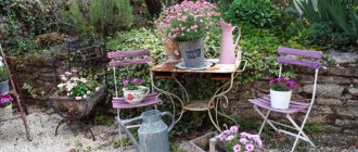
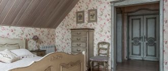
Provencal wall materials are ideally combined with other room decorations - furniture, flooring, ceilings, window drapes. The most popular option is wallpaper with lavender for the kitchen. They create a calm, relaxed design typical of the countryside, but at the same time, a luxurious appearance typical of sunny France.
Provence is called “French country,” a type of rustic interior design.
When choosing a coating, they evaluate the color scheme and the size of the details of the design. The cramped the room, the smaller the images on the wallpaper are selected and vice versa. Floral print is the main characteristic feature of wallpaper. The latter should not be shiny, but only matte and rough. Most often, two or three types of coatings are used simultaneously in the kitchen space - these are bright photo wallpapers and plain ones that imitate plaster, products with small flowers and larger patterns.
It is characterized by quiet, soft colors, natural motifs and natural materials.
Tip: when buying canvases with small flowers, the curtains are plain, but if the curtains themselves are decorated with a beaded pattern, you need wallpaper with large patterns or without them at all.
The interior deliberately avoids gloss and perfection. The design is aimed at simplicity, awakening sincere feelings.
Why do designers recommend Provence style?
As you know, the kitchen is the room where every housewife spends the most time. That is why it should personify coziness and comfort.
To achieve the desired result, it is very important to choose the right finishing material for a given space. And, of course, all other interior items, including furniture and textiles.
As you know, the kitchen is the room where every housewife spends the most time. That is why it should personify coziness and comfort.
Provence style is the personification of romance and tranquility. It comes from the outback of France, which determines its characteristics.
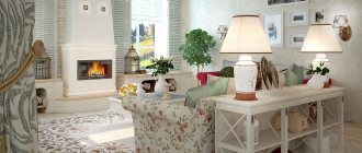
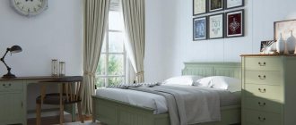
The style involves the use of natural materials. Moreover, this applies to both furniture and textiles with finishing materials. The color palette of the room is as close as possible to natural shades. At the same time, it turns out to be quite bright, as a result of which one gets the impression that a person is not in the room of a modern apartment in a large metropolis, but somewhere in the outback near a lavender field and a warm sea.
The style involves the use of natural materials. Moreover, this applies to both furniture and textiles with finishing materials
The interior of the room is created in such a way that it seems very bright. The room is filled with light thanks to the use of light and warm shades in the design.
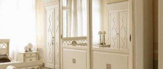
Important! If we talk specifically about furniture, then it should be harmoniously combined with the wallpaper. The image on the wall should match the upholstery on the furniture. If the designs do not involve the use of upholstery, then they can be painted with a similar design to that shown on the wall.
A design solution can be used where the cool turquoise hue meets the warmth of wood surfaces, all against the backdrop of perfectly matched patterned wallpaper. As a result, the kitchen looks fresh, playful and attractive.
Once again I would like to clarify the drawing that is depicted on the canvas. Typically, the Provence style involves the presence of a small branch print. But if the designer chooses wallpaper with a large pattern, then you should be extremely careful when selecting all other items in the interior.
Once again I would like to clarify the drawing that is depicted on the canvas. Typically, the Provence style involves the presence of a small branch print
It is necessary to take into account that the furniture and appliances that are in the room must be
central color, otherwise there will be a feeling of overabundance, and the kitchen will seem very small or too bright.
Usually in any interior the emphasis is on one thing. If these are walls, then you can choose wallpaper with a bright print, but when it comes to accents on furniture, then the finishing material of the wall should have a small, discreet pattern.
Distinctive features of the style
Provencal premises have the following easily recognizable features:
- light, mostly warm, color scheme;
- wide ceiling beams, false beams;
- covering walls with plaster or wallpaper;
- rough texture;
- abundance of natural materials;
- slightly worn or patinated carved furniture;
- clay, porcelain decor - vases, figurines;
- live potted plants, dry bouquets;
- forging elements as zoning or furniture parts;
- draperies with ruffles, colored embroidery, cutwork;
- numerous floral prints.
When choosing photo wallpapers, they decorate only one wall - usually it is located in the dining area. Popular motifs include rural landscapes and interiors, ancient streets and bridges over streams, trees and climbing plants “crawling” along trellises.
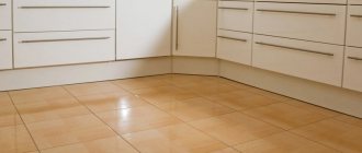
The ideal floor covering is boards and tiles; carpets, parquet and laminate are inappropriate.
Tip: it is not necessary to use all the characteristic elements of the setting at once - just a few are enough.
The shabby wooden surfaces of tables, bedside tables and chairs look organic.
Peculiarities
Even the most ordinary person who does not understand design can identify a room decorated in the Provence style. What features does the French countryside style have? Mainly, it is a light color scheme in muted and pastel colors, which can be seen both in the choice of furniture and in the decoration of the entire interior.
The style was named after the province
In a Provençal room, the morning of French spring always comes - sunny and cheerful. Designers do not use bright contrasts . Decoration with color serves only to emphasize the relaxed atmosphere.
The initial task of decorators is the optimal selection of patterns. The lines should intertwine in such a way that the result is an elegant ornament. Quite often, colorful wallpaper is used to decorate the walls of a room. Flowers of Provence look almost realistic, so a person will be able to determine the type of flower at first glance. The picturesque bouquets also look like they are alive, and the ornaments used are created from many recognizable elements.
Advice When starting to decorate a Provence style room, you should remember that furniture, wallpaper and textiles should have the same pattern.
Light colors in muted and pastel colors
Furniture is most often artificially aged, or antique furniture is restored, preserving its natural appearance. Rough furniture made from wood damaged by woodworm looks harmonious. The texture can be smooth, matte, with smoothed corners.
Individual pieces of furniture are decorated with carvings and forged parts.
Ceiling cornices, windows and doors are decorated with decorative frames. Provence does not require strictness and symmetry, which cannot be said about the classics and English style.
Today's designers allow the use of some details that are not typical of Provence - modern furniture, finishing materials. However, with the Provencal style, classic colors and decorative details must be used, without which the design direction loses its ancient French spirit.
Decoration with color
Tips for choosing wallpaper colors in Provence style
The most characteristic wallpaper, Provence photo wallpaper in the kitchen interior, is made in the following colors:
- floral white with violet;
- sandy yellow with pale purple;
- cream with amethyst;
- pearly white with brownish pink;
- lavender with vanilla;
- pale blue with antique azure;
- light green with mustard;
- agate gray with muted yellow;
- beige with gold;
- soft pink with dusty white;
- pale amaranth with bluish-gray.
The more spacious and illuminated the room, the more windows it has, the darker, colder tones are permissible in it. A cramped room with only one window is decorated only with the lightest, warmest colors.
Wallpaper and fabrics can be chosen in one color from inexpensive options.
Tip: decorating a room with several types of wallpaper made in wood tones looks especially good.
Feel free to fill the surfaces of tables and bedside tables with dinnerware, fresh flowers, plants, wooden crafts, figurines and toys.
Paintings
The French province of Provence on the Mediterranean coast is famous for many of the amazing landscapes of Van Gogh and Cezanne. To decorate a kitchen in this style, you can create entire compositions from paintings, frescoes and panels. Images can be framed in beautiful frames or applied directly to the walls. They will make the atmosphere in the kitchen friendly and welcoming.
How to use paintings in the Provence style in the interior:
In the dining area, panels made using the patchwork technique with various patterns and ornaments will look great.- You can hang metal frame plates on your walls
- On one of the walls you can place modular canvases depicting a French village and a sunny blooming garden.
Depending on the size of the room, you should choose different works of art:
- For a large kitchen. There is room for creativity and there is an opportunity to hang large panels, as well as decorate an entire wall with a French fresco.
- For a small kitchen. It is better to use small thematic decor, for example, soft pillows with embroidery in the Provence style or small images of landscapes in carved frames.
To convey rustic motifs in the design, you can place small pictures and decorative elements on the shelves:
- Painted pockets for small items.
- Kitchenware with lavender motifs.
- Cute accessories and pictures in the form of garden tools, animal figures and flowers.
What to look for when choosing Provence style wallpaper
The style of Mediterranean villages suggests various wallpaper options. These are paper or fiberglass, non-woven or textile, vinyl and “liquid”. When purchasing, pay attention to the texture, pattern, color design, and print sizes.
Wallpaper in delicate shades of beige, sand, and lavender is best suited to an interior in the style of a French province.
These are usually light-colored canvases decorated with repeating floral patterns. Less often, the product is made with a dark background, but flowers are always present - they are arranged in the form of a lattice grid, intricate weaves, or chaotically.
Other “rustic” prints that are simply suitable for styling are:
- cockerels and hens;
- "beaded" geometry;
- village houses, landscapes;
- wicker fences, baskets;
- suns;
- stylized pets;
- painted teapots, cups, other utensils;
- a cage made in pastel colors;
- bouquets, still lifes with fruit;
- light-colored brickwork;
- dim-colored vertical stripes;
- ornaments imitating lace that has turned yellow with time.
Kinds
In most cases, when choosing ceramics for a backsplash for a Provence style kitchen, they pay attention not to its cost, but to its appearance. This is explained by the fact that the tiled covering should be the highlight and main decoration of the room. Taking this point into account, there are several types of tiles.
Interesting article: Modern wallpaper in the Provence style in the kitchen: photos and design options using paintings, frescoes and panels in the interior
Terracotta with patterns
This material is considered new for 2020 and has a whole kaleidoscope of Mediterranean patterns. It is widely used not only to create an apron, but also as a floor covering. The released collection includes several different shades of terracotta and about 10 different patterns.
Advantages of aprons for a kitchen in the Provence style: photos, as well as tiles in the style of a warm French village"
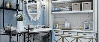
White and blue colors
This colorway perfectly reflects 17th century European fashion. At that time, all homes, from Portugal to Holland, were decorated with white and blue patterns (birds were especially popular). French aristocrats considered it their duty to decorate their summer houses with white and blue tiles, and the best ceramic products of this format went only to the French and English kings.
And now the fashion for white and blue ceramic products has not completely passed; they are actively used to decorate bathrooms or kitchen aprons. And since Provence has different shades of the sea, white and blue ceramics will be the ideal solution.
Under the brick
Most often, such ceramics are presented in the form of a “hog”. It completely imitates the geometry of natural brick, but the greatest advantage is considered to be ease of cleaning.
The surface can be of the following types:
- smooth (almost glossy);
- rough.
The note! The strongest decorative effect is observed in red unglazed ceramic products.
For a Provence style apron, ceramics with a rough surface and any pastel colors are also perfect. To give the interior completeness, professionals recommend laying such ceramic products with wide seams.
Hexagon
Such an unusual material will fit perfectly into an interior that combines a combination of several styles, namely:
- Provence;
- Eclecticism;
- Modern.
Such ceramics can combine motifs of Spanish Art Nouveau by analogy with the style of the famous architect Gaudi, fragments of marble, fabric inserts, geometric patterns, fragments of flowers (characteristic of Provence) and denim fragments.
A rather interesting option are classic hexagonal ceramic products containing Mediterranean patterns of Provence and patchwork style elements.
Interesting article: Blue kitchen design Provence: turquoise, mint and blue
Information! This ceramics is widely used by newfangled designers who love original solutions.
The material has a hexagon format, but most of the designs are made using chipped ceramics, so it is quite difficult to determine the exact dimensions.
Arabesque
When choosing this option for a ceramic product, you need to make sure that the design is suitable in style for Provence, most often it is a variety of floral patterns, geometric shapes, leaves.
A significant advantage of arabesque ceramic products for use in a kitchen apron is that they are resistant to detergents, chemicals, grease and wine stains.
Patchwork style
For the first time, people started talking about patchwork ceramic products in the United States. This technique goes well with a kitchen decorated in French style; it can also be used when arranging a kitchen in the style of Kitsch, Country or Eclectic. On the territory of European countries, they learned about this technique only at the end of the 19th century, and then thanks to Arabic majolica.
When using this ceramic product for a kitchen apron in the Provence style, it is recommended to pay attention to the smooth, almost glossy surface, which provides the impression of a seamless ceramic fabric. In these situations, a thin grout joint is used.
An original option would be patchwork tiles that imitate antiquity.
Preferred shades:
- gray;
- blue;
- pearl.
Drawings must be graphic, floral or fantasy.
Cellulose or paper wallpaper in Provence style
Beautiful wallpaper for the kitchen in Provence style in the photo in the interior, looks most suitable for the decor. This is a traditional option, almost entirely made of natural material, which corresponds to the basic principle of this style. The canvases “breathe” well, but for wet areas near the sink, cutting surfaces, gas stove, it is not recommended to glue them, since the canvases strongly absorb all odors and liquids. If dirt gets on the surface, it is almost impossible to wash it off without damaging the structure of the paper.
A kitchen in the Provence style can be decorated with canvases with small floral or plant patterns; the colors are pleasant, not bright.
The most durable, high-quality wall coverings are made from American paper. Vintage motifs are printed on it, and the canvas itself does not fade for a long time, even in direct sunlight. Two-layer options with moisture-resistant impregnation also serve well.
The design will be completed with stylized dishes and linen textiles.
Design and drawing options
The birthplace of the Provence style is France. This design direction assumes the simplicity, romance and comfort inherent in country houses in French villages. Provence wallpaper for the kitchen is always made in pastel shades (pink, blue, light green, yellow, lilac) and suggests the presence of simple patterns or designs.
Most often they are performed in the following style solutions:
- stripe _ The lines on the wallpaper are classic for Provence. Stripes are always made in delicate shades and can echo floral patterns. The direction can be either vertical or horizontal;
- monograms _ Although ornate patterns are more characteristic of the classical style, they can also fit harmoniously into Provence. The main thing in this case is muted neutral colors;
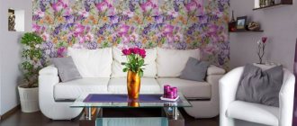
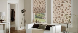
- with flowers . Plants are the most important element for creating a romantic and summer mood. Usually roses, peonies, and daisies are painted on light wallpaper. Flowers are also often depicted on photo wallpapers in the Provence style, which help to attract even more attention;
- birds . Flying birds are associated with freedom and space. They are often depicted together with flowers or berries;
- pattern imitating plaster . White and beige with relief and texture will fit perfectly into Provence. Wallpaper that imitates plaster will help save time on finishing and finances. A distinctive feature of such canvases is that they are often combined with wooden or plastic panels.
To make a Provencal-style kitchen as stylish and unusual as possible, it is recommended to combine several types of different coatings, for example, wallpaper with flowers and white brickwork.
Color spectrum
The main characteristics of this style are pale, dusty tones that appear slightly faded. Provence is characterized by wallpaper in the following shades:
- dusty pink . A delicate and feminine color that looks great with grey, white and green. Pink is considered universal and is suitable for decorating kitchens, bedrooms and even living rooms;
- white. Provence style allows the use of white wallpaper with minimal decor. The most relevant are wallpapers that have a textured texture, for example, imitating wooden boards or brickwork;
- light gray This color can be combined with almost all shades and is also great for use as a background tone. The gray shade will look especially interesting if plaster-like wallpaper is used to decorate the room;
- blue _ This shade visually increases the size of the room and makes it look fresher. If this color is chosen, you can use both plain and patterned wallpaper. When choosing blue wallpaper, many designers advise decorating the walls with wooden panels that will frame a certain section of the wall like a picture;
- green (olive, mint, pistachio, herbal). Wallpaper in these tones will make the interior cozy and lift your spirits;
- yellow . This color is ideal for a room that faces north.
Also, blue and lavender wallpapers are often used to decorate a kitchen in Provence style. But they are more often used to decorate one wall.
On a note! Italian wallpaper for kitchens in Provence style is considered one of the best and highest quality.
"Liquid" wallpaper in Provence style
“Liquid” wallpaper is used especially often, since it can be applied to surfaces that have uneven surfaces. They are made mainly in yellowish tones, which allows you to emphasize the effect of antiquity and create a design option that is as close as possible to the original. The main advantage of the coating is the absence of seams and joints on the finished surface. The texture of the material resembles ordinary plaster, but is painted in pastel colors. Applying floral images to them will require some skill, although stamped options are acceptable.
Another option for finishing in the Provence style would be liquid wallpaper or imitation plaster.
Combination options
Trying to create an unusual and more modern interior, many apartment owners decide to combine wallpaper. If you want to use several colors at once to decorate a room, you need to choose the combination wisely, otherwise the room will seem overloaded.
The optimal solution is to use white as the main tone, since almost any shade combines well with it. Depending on individual preferences, white can be combined with both warm and cool tones.
As for other colors, they can be combined as follows:
- milky and ivory colors will harmonize perfectly with pink, yellow and turquoise wallpaper;
- if the main color is blue, it can be diluted with white, gray and pink tones;
- Green wallpapers are best combined with yellow ones.
Also, Italian wallpaper for the kitchen in pastel shades can be combined with various wooden panels and beams that will fit perfectly into the Provencal style. In this case, the boards can be left light brown or painted white. It is worth considering that in most cases the lower part of the wall is finished with wood. The coating in this case acts not only as decorative, but also as protective. Another acceptable option is a combination of wallpaper in pastel shades with imitation brickwork.
Glass wallpaper in Provence style
This is an environmentally friendly material that does not require perfectly smooth walls. It is quite moisture resistant, durable, has a beautiful appearance, a wide range of colors, and does not accumulate dust or static electricity. The surface of such wallpaper resembles fabric (burlap) or is made smooth, and contains only natural materials (quartz sand, dolomite, soda, lime). Under such a surface, as well as on it, fungi and mold are not able to develop. The only drawback is that the canvases are produced exclusively in one color.
The material can be repainted up to 20 times, and with careful use it will last 25-30 years.
How to choose ceramic tiles for the kitchen
The kitchen is the most visited place in the house and is exposed to a lot of external influences, so it is important to pay special attention to the selection of tiles for it. Only the right cladding will last a long time without losing its qualities during intensive use.
Here are the characteristics that kitchen floor and backsplash tiles must meet:
- Strength. So, tiles with strength class 3-4 are suitable for flooring.
- Resistance to not only steam and fat, but also acids and alkalis. It is important to pay attention to the labeling. So AA on the tile indicates the highest level of protection of the material from exposure to chemicals.
- Density of the outer coating, without excessive porosity.
- Heat resistance, important for owners of both electric and gas stoves. High-quality tiles can withstand temperatures up to 125 degrees Celsius.
- Sufficient dimensions of one element to eliminate a large number of seams.
- Slip resistance is a characteristic important for flooring. Here you need to opt for the ribbed surface of the tiles, so as not to turn the kitchen floor into a kind of skating rink.
Important! Floor tiles that are too rough will not be suitable due to their low decorative value during operation.
- The right color scheme, which depends not only on compatibility with the main interior, but also on practicality. Too dark colors highlight the slightest cracks and stains, so it is better to give preference to light tiles. For the floor, the ideal option would be a surface with a pattern or imitation of stone or wood. This will help mask small dirt and stains that may arise during use.
When preliminary calculating the material, it is important to add another 10% to the final result, since there are often cases of defects or simply damage to the material during the installation process. The stock will eliminate the need to return to the store.
Advice! You shouldn’t buy too expensive tiles; there are options in the middle price segment that are decent in quality and appearance.
Non-woven wallpaper in Provence style
Non-woven fabrics are many times stronger and more durable than paper ones. It is permissible to paint them yourself if the shade becomes boring over time. This product is made with various texture options - plaster, brick, stone, wood, etc. They are easy to stick, perfectly mask small unevenness in the walls, are resistant to high humidity (do not get wet), wear-resistant, and do not shrink at high temperatures. Such wallpaper usually has clear, abrasion-resistant designs and patterns. There are also disadvantages - high price, the need for washing, since textured options accumulate dust excessively.
For the kitchen, you can choose a washable wallpaper option; they can be easily cleaned with cleaning products.
Vinyl wallpaper in Provence style
Matte foam vinyl coverings that are not embossed or textured are also a great idea. This option has become popular due to the variety of colors and reliefs. The texture of such wallpaper imitates stone, plastered walls, textile materials, and goes well with other types of decoration. Multilayer fabrics have strength, heat-protective and sound-proofing properties, they are durable, wear-resistant, and not too expensive.
They are environmentally friendly and safe for others.
Wallpaper with patterns and photo wallpapers Provence
The wallpaper will have a characteristic print or pattern:
- small flower;
Everyone recognizes Provence by its symbol – lavender.
Any wildflowers can be depicted - cornflowers, daisies, etc.
- large flowers and bouquets in Provence colors for an accent wall;
- striped or pale checkered;
- with the architecture of a small provincial town or village;
- “delicious” motifs with the harvest: grapes, olives, vegetables. Still lifes;
- rural themes: fields, grain harvesting, windmills, etc.
It is important to note that the design of the picture will never be intrusive, and the color palette of the image seems to have aged or faded under the scorching sun of southern France.