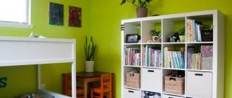
What color typeface are you looking for wallpaper for:
1 Beige 2 White 3 Orange 4 Red 5 Brown or wenge 6 Green, light green 7 Black and white 8 Yellow 9 Blue, light blue 10 Violet, lilac 11 Black
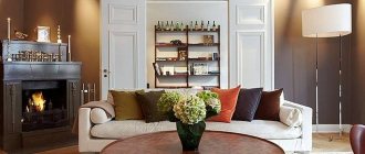
When planning the interior design of a kitchen, many are guided by their preferences, room size and financial capabilities. The first thing that is planned is the shape, size and color of the furniture, and then everything else is designed for the set. Therefore, it is more convenient to choose wallpaper that matches the color of the furniture. So, let's look at what wallpaper to choose for the kitchen depending on the color of the set?
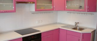
For beige headset
Beige and vanilla remain the most popular kitchen color. There are many reasons for this:
- 1 Beige color is an ideal solution for a small kitchen, as its light palette works perfectly to visually expand the space.
- 2 Beige is a neutral color and is perfect for recreating any style - from sophisticated classics to chic modern, from romantic shabby chic to textbook loft.
- 3 For those who think beige is boring, we advise you to pay attention to such shades as caramel, cappuccino, creme brulee. These delicious colors will make your kitchen not only cozy, but also especially homey.
- 4 Beige is a universal color and is not capricious in choosing a pair. On the contrary, by choosing one or another color of wallpaper for a beige set, you can charge your kitchen with a festive atmosphere, give it sophistication or create a harmony of comfort.
Wallpaper color for beige kitchen:
Beige and sand shades will create a very delicate and sophisticated interior.
Whites are a perfect match. The kitchen turns out bright and cheerful. But avoid boiling white, otherwise the interior will turn out faded and “dirty”. Beige and brown are an original combination, if only beige will dominate. It is better to choose white wallpaper with a dark pattern.
Purple or lilac - bold and bold. The interior turns out dynamic and rich. It is better to choose plain wallpaper without a pattern.
Muted red, burgundy, terracotta are a harmonious pair, provided that the decor is minimal.
Gray - the kitchen will be cozy and delicate. It is only important that both gray and beige are as light as possible.
Green - the result is an interior that is close in spirit to eco-style or country style. In such a kitchen, an abundance of indoor plants and floral patterns is appropriate.
Important: if you have a beige kitchen, avoid fluorescent, cold light. It will make the interior look dirty. The same applies to appliances - a beige refrigerator and stove against a background of beige furniture is too much. It is better to choose a metallic color technique.
Colored (chromatic) kitchens
Colored or chromatic kitchens are rooms decorated using one or more colors. Rooms designed in one color are monochrome. Depending on the number of colors used and their location in the color wheel, colored kitchens are divided into: three-color (triads), contrasting and analog.
Single color (monochrome)
Decorating a room in one color is not an easy task, because in addition to the main, basic color, which can be any color, it is also necessary to use its shades. At the same time, the more shades are used, the more interesting the interior becomes. When decorating a monochrome interior, it is permissible to dilute the main color with white. Lately, designers are increasingly using silver instead of white. The love for metallic is due to its neutrality and compatibility with many colors; besides, gray color is very practical and does not stain.
To prevent a monochrome kitchen from becoming boring, you should remember:
- For decoration, you need to choose more than three shades, one of which will dominate.
- Using shades of the base color, you should divide the room into zones (zoning), thanks to which you can adjust the layout.
- The use of materials of the same color, but different textures, allows you to add a touch of diversity to the interior of a monochrome room.
- Contrasting accents can liven up monochrome, but the main thing is not to overdo it.
Single color purple kitchen
Monochrome kitchen in green tones
Monochrome turquoise kitchen
Monochrome beige kitchen
Tricolor
A classic example of a triad is the combination of red, yellow and blue.
Three-color kitchens or triads are rooms in the design of which three colors are used, located in the color wheel at the same distance from each other. In this case, only one color can be dominant, the rest are used to add emphasis.
Triads can be designed using the following colors:
- red-yellow-blue
- purple – orange – green
- blue-yellow-red
- peach – light green – lilac
- pink – lemon – blue
Contrasting
Using contrasting colors in the interior requires extreme care, because using colors opposite in spectrum can make the kitchen too aggressive or pretentious. In this case, one color is chosen as the main one, and the contrasting color should balance it. The deeper and brighter the base color, the more active the room will be, and conversely, the lighter and paler the base color, the calmer the room will be.
Contrasting cuisine is currently at the peak of popularity, but over time it can not only get boring, but also begin to irritate. To avoid this, it is best to choose flooring and furniture in calmer colors, and choose the color of wallpaper or curtains in contrast.
In this case, the rule of subordination should be observed: the color of the furniture is taken as the starting point, the floor is made darker, and the ceiling is made lighter.
The most popular rooms are those designed in the following contrasting colors:
- blue+orange
- purple+yellow
- blue+peach
- light green+pink
- lilac+green
- beige+dark brown
- red+gray
The combination of any bright color with black or white is also contrasting.
Analog
An analog kitchen is a room whose design is made in colors located next to each other on the color wheel. These are not shades of the same color, but completely different colors, for example, yellow, orange and red or green, yellow and light green.
You can use more than two colors in an analogue design, but only one should dominate. For example, it is acceptable to decorate the interior using green, blue, orange and yellow colors, with a predominance of the primary color (yellow or green).
In the design of an analog kitchen, it is necessary to use adjacent colors of the same brightness and saturation.
Classic wooden kitchen
Orange-brown kitchen
Creative kitchen-workshop in soft colors
For white headset
White color is neutral and goes well with any other color. If you have a white set, it’s better to start from a given style. Modern furniture will look better against walls with a graphic design, stripes, unusual graffiti, photo collage or wallpaper.
You can choose bright wallpaper that imitates tiles or brickwork. For an accent wall in a modern kitchen, you can choose photo wallpaper with a 3D panorama.
Classic white furniture goes well with pastel-colored wallpaper.
The more luxurious the furniture, the more pale and unnoticeable the pattern on light-colored wallpaper should be.
For cozy white furniture in a country style, cheerful colors are suitable: floral, plant motifs or images of a rural landscape are possible.
For a Provence style kitchen with white furniture, wallpaper with images of lilies, lavender, and irises is perfect. In this case, it is advisable to choose the rest of the decor in the same shades as the flowers on the wallpaper: cream, lilac, purple, sky blue.
White furniture is a common choice for Scandinavian kitchens. To emphasize the style, you can choose blue, beige, light blue or light gray wallpaper.
Choosing a color based on the style direction
Coffee option for kitchen design.
Even before the renovation begins, it is necessary to think about the style of kitchen design. The concept determines what the tiles for the kitchen splashback should be, the shade of paint, and the design of the furniture.
Commonly used styles:
- Rustic. The surfaces are painted a creamy, beige, straw color. You can use pink and light orange tones.
- Hi-tech, techno. White, gray, and steel shades go well with these styles.
- Mediterranean. Olive, cream, yellow-green tones are suitable.
- Provence. The walls are made light lavender, lilac, beige-pink.
- Scandinavian. The style requires cold tones - blue, white, sea green.
General recommendations do not always suit everyone without exception. Using the advice of designers, owners can create their own design project, selecting paints and finishing materials taking into account their ideas about beauty and comfort.
For orange furniture
Orange furniture will dominate the interior - regardless of what shade of orange is chosen. This color is the emperor. And therefore the wallpaper plays the role of exclusively background.
Against the background of gray wallpaper, an orange set always looks great. The orange-gray pair is the most harmonious for the kitchen. Moreover, you can choose the steel color of household appliances.
Green wallpaper will add festiveness and lightness to the room. The main thing is that the wallpaper is plain.
White wallpaper with an orange pattern is a bright pair. This combination can be diluted with wooden inserts: for example, by choosing a wood-colored tabletop.
The main thing in such a bright combination is to create a harmonious interior and not to overdo it with a rich orange shade.
Gray + red
These two colors look very impressive side by side. It is better to use gray shades as a base so that they mute the bright, juicy red elements. The furniture and walls in the kitchen can be gray, and chairs, stools, household appliances and curtains can be red.
Project author: Andrey Popov
Project author: Andrey Popov
By the way, in addition to gray, gray-blue and blue headsets go well with a small amount of red.
Project author: Marina Zhukova
Project author: Marina Zhukova
For red furniture
Bright kitchen furniture with glossy fronts will look best in a spacious kitchen or in an apartment with a studio layout. Such furniture immediately becomes the dominant feature around which the rest of the interior is built.
A juicy red shade for the set (scarlet, carmine, red, crimson) is highly not recommended for a small kitchen. The abundance of red in a tight space leads to rapid fatigue, irritates and can even cause aggression. The optimal solution: a set of calm, muted shades of red - terracotta, burgundy, garnet, coral, cherry.
Since the red set will play the main role, it is better to choose a neutral background color for the wallpaper. White, cream, light wood, ivory, and gray wallpapers are perfect.
Red and black kitchens create a dramatic effect. Black wallpaper for a red headset is a bold decision. The kitchen turns out to be dynamic and hyperbolic. It is better to stick to modern styles.
The combination of red and black will balance white well. For example, white wallpaper with a black graphic pattern is an ideal choice for a red kitchen in a high-tech or minimalist style.
Recommendations from psychologists
Any color has an impact on a person’s psychological state. Before choosing, you should read the recommendations of psychologists.
Experts do not advise using very variegated and bright colors, as they activate the nervous system. Depending on your temperament, psychologists advise using the following colors for the kitchen :
- Cholerics should use rich red or orange.
- Phlegmatic people are prohibited from using red and orange shades.
- Sanguine people need to paint the kitchen yellow or light green.
- For melancholic people, calm shades of white, blue, indigo and brown are suitable. A similar range can be used by phlegmatic people.
Those who love bright colors should know that red has a strong effect on the psyche - it not only activates the body to action, but also increases appetite, so this solution may be required for people with anemia.
It is forbidden to use red for hypertension, unbalanced people and those prone to sudden mood changes. The solution is not suitable for those who are always trying to lose weight.
Orange has similar qualities as red, but the effect on the psyche is milder. Such walls improve your mood and improve the functioning of your digestive system. Green shades have a good effect on digestion.
Psychologists also advise taking into account the area of employment, the main type of work. Because during active everyday life it will be quite difficult to be in a bright room.
Dark shades can negatively affect a person’s mood; in addition, they are not used in small areas. If dark colors are present, they will definitely need to be diluted with softer, lighter ones.
Black and brown paints are rarely used for the kitchen, as they visually make it small and create the effect of constant dirtiness. Such a decision can worsen appetite and affect mood.
Too bright and saturated colors tire and irritate any person; warm shades give vigor, and cold shades can calm.
Choosing a light color can enliven the design; dark ones will make the kitchen restrained and calm.
If the set is brown or wenge
The wenge-colored set looks luxurious and in itself is a real decoration of the kitchen, without much need for additional decor. Wenge-colored furniture is usually characterized by simple, laconic forms that emphasize the texture of the material.
Dark furniture will look most advantageous against a light background, and therefore it is better to choose wallpaper in pastel colors: cream, sand, milky, beige.
If the wenge color is from a warm palette (with a chocolate or burgundy tint), the wallpaper can be vanilla, muted orange, terracotta, pistachio.
The cool shade of wenge (with hints of purple or green) harmonizes with lilac or green wallpaper.
Plain wallpaper looks best. Keep the patterns to a minimum so as not to overload the interior. As a last resort, you can choose wallpaper with a faded pattern or gold embossing.
For green furniture
Green or light green is a win-win option for kitchen furniture, as the color is soothing and inviting. The “plus” of green is that it can be combined with almost any other color. The main condition: the couple must be in harmony in tone.
So, if you have furniture in warm shades of green: grassy, olive, light green, then you should choose orange, yellow, burgundy or rich beige wallpaper. A good addition to such combinations would be brown accessories or materials that imitate natural wood.
Light green furniture will become the dominant feature in the interior. It requires a neutral background, so it is better to choose plain white, milky, beige, or cream wallpaper. And the color balance will be supported by light green accessories: a border on a tablecloth, a pattern on light curtains, a lamp or dishes.
You can pair moss or olive-colored wallpaper with light green facades. But be sure to balance out the pair with pops of white. Light green furniture will look organic against a background of light, natural shades: brown, pink, blue, sand. Light green categorically does not accept proximity to lilac and violet.
Cold shades of green (with an admixture of blue, gray or cyan): mint, turquoise, pine, emerald harmonize with cold colors - blue, cobalt, steel, boiling white.
Table of color combinations in the kitchen interior
Below is a simplified table with a selection of basic tones. But, as you understand, additional colors depend on the primary shade itself.
| Color | Complementary scheme | Analog | Triad |
| Red, scarlet | Green, grassy, light green | Orange, raspberry, burgundy, eggplant | Blue, azure, lemon, mustard |
| Ocher | Blue, light blue (not pure!) | Scarlet, lemon, peach, coral | Raspberry, turquoise - depends on the shade |
| Yellow | Violet, lilac | Mustard, green, orange, red | All shades of blue, light blue, red-orange, red, crimson, fuchsia |
| Green, herbaceous, light green | Red, crimson | Azure, turquoise, yellow, mustard | Lilac, orange, red, blue, violet |
| Blue | Orange, peach, coral | Green, purple, blue | Yellow, eggplant, scarlet, raspberry, green |
| Blue | Orange, peach, coral | Turquoise, burgundy, lilac | Canary, red, orange, raspberry, fuchsia |
| Violet | Citric | Crimson, orange, scarlet, azure | Green, grassy, light green, orange, peach, coral |
| White, black, gray | Goes with everyone | ||
Black and white set
The duet of black and white is considered a classic - strict, but impeccably elegant.
The combination of black and white facades always looks impressive, elegant and fits perfectly into the concepts of avant-garde, art deco, minimalism, and retro.
Combinations of black and white set and wallpaper color.
White wallpaper or white with black graphic design. This tandem creates a monochrome atmosphere. I felt like I was in a newsreel from the beginning of the last century. The ideal combination to create a retro style - you can add posters with graphic designs and retro accessories.
A good option for a small kitchen is to cover the accent wall with black wallpaper with a white pattern, and the rest with white wallpaper with the same black patterns.
If the facades of the furniture are glossy, then for the walls it is good to choose warm shades of white: cream, beige, milky.
Gray or “wet asphalt” colored wallpaper is appropriate in a modern interior. They go well with the metallic shine of kitchen appliances. But the interior requires bright lighting.
Blue wallpaper will dilute the interior with colors, and blue wallpaper will add softness and tenderness to the black and white kitchen. Yellow wallpaper looks good in combination with a black and white set, if yellow is more like the color of dull gold.
Which color to choose
The following tips will help you decide which wall color for the kitchen is best, based on the given parameters of the room.
For a small kitchen
In older housing stock, the space allocated for the kitchen is small, and therefore it is so important to correctly decide on the color scheme of the walls.
Before choosing the color of the kitchen in a small apartment, you should familiarize yourself with the following rules:
- To open up narrow walls, choose neutral shades combined with bright accents. In this case, a milky shade of white combined with a brighter pearl color looks good;
- An azure shade will also allow you to visually enlarge the space, but it must be combined with the general background. For example, a snow-white ceiling and a light blue floor covering will go perfectly with azure walls. And for accents on furniture and for curtains, it is better to choose shades of blue;
- in a wooden house or small country house, a light pistachio color in combination with natural wood furniture will look interesting.
You cannot use dark colors in the design of small rooms - they visually hide the already modest space.
For large spaces
Decorating a kitchen space in a large house is much easier. In this case, it is recommended to follow your own color preferences without any special restrictions.
Do not use too dark shades, which have a depressing effect. It is better to choose warm neutral colors, and use furniture and designer decorations as accents.
For yellow furniture
Yellow color for a kitchen set is very insidious from the point of view of psychological impact.
The brighter the shade of yellow, the more sunshine and joy there will be in your kitchen. But an excess of yellow surfaces causes rapid fatigue and irritation.
Neutral shades are considered optimal - golden, sand, mustard, gray-yellow. Juicy, acidic shades of yellow are appropriate in a modern kitchen. For classics, it is better to choose muted tones. Tip: If you like several shades of yellow, always choose the lighter one.
Yellow furniture goes well with white, milky, green (any shades), blue, pink wallpaper. Golden yellow plus red is a great pair for oriental style.
Yellow and blue are a royal combination, provided that the yellow has a hint of gold. Yellow and brown are a combination taken from nature. Add green accessories to such an interior and you will get an interior close to eco-style.
For blue and light blue furniture
Depending on the combination of shades of blue and wallpaper color, you can significantly influence the visual perception of the interior. It all depends on what kind of atmosphere you want to create in your kitchen.
If you add white, light green or sky blue wallpaper to rich blue furniture, the interior will turn out cool.
Peach-colored wallpaper will help “raise the temperature.” Do you want to add cheerfulness to your blue kitchen? You can combine blue with yellow, grass green or orange. Blue furniture and red and white striped wallpaper are a bold decision that will highlight the retro style. But such decoration looks good in a spacious kitchen.
If the furniture is cornflower blue, match it with wallpaper in a sunny yellow or straw shade. This color pair is reminiscent of summer, a field of flowers, a sunny sky and is perfect for embodying a country style.
The combination of blue furniture and gray walls is an option for a spacious kitchen in a modern style. But such an interior necessarily requires bright lighting. And don’t forget about the color tonality - the same cold shades of gray go well with cold blue.
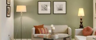
Wall color - features for the kitchen
The choice of finish is influenced by many different nuances.
This:
- the size of the room and its geometry (long and narrow, square, etc.);
- degree of natural and artificial lighting;
- room decoration style;
- finishing of kitchen units;
- the desire of the owners.
Another significant point is the effect of flowers on the human psyche:
- Red. Excites, increases appetite. May cause aggression. White softens the aggressiveness of red a little.
- Sunny yellow. Does not tire vision, tones and invigorates.
- Green. Green tones calm and relax, increase efficiency.
- Orange. Creates a feeling of joy, the orange tint improves appetite and has a beneficial effect on digestion.
- Light blue and bright blue. Calms nerves and relaxes. Cool shades reduce appetite, so this option can be recommended for those who want to lose weight.
- Grey, beige and light shades of brown. These tones are neutral, they are chosen if the main emphasis is planned on furniture and accessories.
You should avoid dark tones of purple, blue and green, they are depressing and overwhelming.
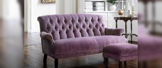
For purple and lilac furniture
Purple is perhaps the most controversial color in the palette, as it combines the coldness of blue and the fieryness of red. It is usually believed that purple is not the best choice for decorating a kitchen.
But this color has so many shades that there will probably be one that you like. Choose: lilac, violet, lavender, plum, blackberry, amethyst.
Rich purple is a chameleon color. Depending on the background, it can change its tone.
Thus, purple facades against the background of red walls will appear purple, and against the background of blue wallpaper they will take on an indigo hue.
In any case, these combinations require a splash of white (to balance the contrast) and bright kitchen lighting.
Various shades of purple are combined with different colors:
- For a lilac kitchen, green, blue, light yellow, and cream wallpapers are well suited.
- Pinkish-purple facades look most advantageous against the background of emerald green or white walls.
- The combination of a purple set with white or light gray walls is a win-win option. The interior turns out rich, but not dark. You can also add black as decoration.
- The soft lilac color of the kitchen set looks especially attractive against the background of light wallpaper, especially if the facades are glossy. It is better to choose wallpaper in conservative colors: white, beige, milky, cream.
- Want to add romance? Choose wallpaper with a light background and discreet patterns of lilac and pink flowers.
For a modern style, you can choose wallpaper with white and lilac stripes. But it is better to use such bright wallpaper for an accent wall, leaving the general background of the walls light.
Taking into account the layout
To choose the right wall color, you need to consider the following points:
- kitchen dimensions;
- ceiling height;
- interior details;
- level of natural light;
- features of artificial lighting;
- already existing general color scheme.
If two walls are free in the kitchen, then you can decorate them in different colors or divide each wall into two colors, both horizontally and vertically.
If there are unlit corners in the kitchen, then they need to be painted in light colors, especially when the rest of the walls are painted quite dark.
If the kitchen has a bay window, then it is better to make the walls next to it light. When arranging furniture in a circular manner, the space between two tiers of cabinets and the kitchen apron should be light, otherwise the impression of a closed space will be created.
If there are two windows in the kitchen located on the same wall, then it is better to make the space between them light: the windows will appear larger.
Narrow
A narrow kitchen is the result of an unsuccessful apartment layout. This occurs not only in old houses, but also in new buildings. The interior of a narrow kitchen is a room with poor proportions, and it negatively affects a person, being perceived as disharmony. With the help of color you can correct this perception.
For such a kitchen, you need to choose only light colors and shades, but the walls and furniture should not be the same color.
There are quite a lot of options:
- if the furniture is white, then the walls can be decorated in light gray;
- A feeling of spaciousness in such kitchens can be achieved by adding soft blue wall decor to white furniture;
- with sandy facades, the walls can be a soft light green color;
- Light wood furniture goes well with cream or creamy walls;
- light green facades will be complemented by beige walls;
- You can draw an ornament on the walls, but the background should be several tones lighter than the drawing.
You shouldn’t completely give up on rich color combinations in a narrow kitchen. But with such decoration there are several nuances: a bright, saturated color can only be on the wall that is on the narrow side opposite the door. It can be painted in any color: red, blue, purple, orange. But at the same time, the remaining walls should be decorated in a soft light color, and the furniture facades should be white or light wood.
It is impossible to paint the walls in such a two-level kitchen. This decor enhances the feeling of disharmony, visually lengthening the kitchen.
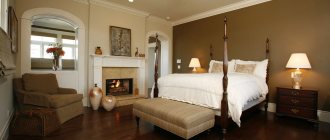
Small room with low ceiling
In rooms with low ceilings, people often experience a feeling of discomfort; it is perceived as stuffy, too closed, and uncomfortable. But with the help of some design solutions, primarily in the coloring of the walls, you can achieve at least the visible illusion of a higher space:
- you need to paint the wall and glue the wallpaper close to the ceiling;
- Vertical stripes on the walls make the space visually longer;
- paint from the walls can “go” onto the ceiling, thus increasing the height; but you cannot go more than 30 cm onto the ceiling in a large room and 10 cm in a small one;
- the ceiling should be painted in light, cool colors, but not white;
- you can paint the ceiling and walls in different shades of the same color: light ceiling, darker walls;
- The ideal solution to the problem is to paint the walls with a decoy pattern: a landscape, still life, flowers, and so on, receding into perspective;
- Light, calm, cold tones visually lengthen the kitchen, so light blue colors are suitable in the interior. Warm tones, on the contrary, make it visually lower;
- It is better to leave the walls in such a kitchen plain.
In such kitchens you cannot paint the walls in two tiers or make borders; apply a large drawing to the walls.
How to choose a beautiful and non-caustic kitchen color:
Big square
The walls of large kitchens should not be painted in cold or too light colors.
Shades of orange, coral, cherry, and purple look great.
The color of the walls in any kitchen should be in harmony with the color of the facades of the set, but in a large kitchen, where there is correspondingly more furniture, this must be taken especially carefully:
- a set of light wood looks good against the background of juicy apricot and cream-colored walls;
- if the set has a lot of glass and metal parts, then almost all shades of red are perfect; if this color is not suitable for the owners for some reason, then the walls can be decorated in crimson, muted purple shades;
- if the set is very dark, or even modern black, but creating a black and white interior is not the goal, then it is better to decorate the walls in a soft light green or sand color of decorative plaster;
- if the set is bright and colored, then the walls can be painted in the same color, but a different shade, usually two tones lighter; if the set is colored, but in light, soft tones, then the walls are painted two tones darker;
- light, cold colors are not recommended in a large kitchen; they visually enlarge the room, and the impression of an uninhabited, half-empty space is created;
- but you can use a light blue color, provided that the furniture fronts are light brown, sand-colored or have the color of natural wood, and the kitchen is always warm (blue color enhances the feeling of cold).
You need to be careful with the color purple, you can get tired of it quickly.
There are universal colors for any kitchen: the color of baked milk, beige, pale purple, light lilac.
Kitchen studio
When zoning, the color of the walls in the living room and kitchen should not be very different.
You should not paint all the walls in the kitchen and living room the same color. To design this option, you should choose three colors, one of which is bright, another is a light shade of a bright color, and the third is either contrasting or any shade of white.
At the same time, a bright color should be used on one of the kitchen walls. And in the living room area, all the walls are painted the same color. So, for example, with a light brown set, you can decorate one wall with bright light green, the remaining two walls with white, and the walls of the living room with soft pale light green. With this option, there should be light furniture in the living room. It will look stylish and modern in a blue-red-white combination.
If the living room walls are decorated with wallpaper, then the kitchen walls can be the same color as the main wallpaper background.
The next option would be to decorate the walls of the living room and kitchen in different tones of the same color. And here, too, a lighter tone should be in the living room.
For black headset
Black furniture always looks luxurious. But the abundance of black surfaces can cause a depressing mood, especially if the facades of the set are made in matte shades.
Black color requires bright lighting and the most neutral background - white is best.
It is no coincidence that black and white has long become a design classic. White wallpaper and gray flooring go perfectly with the black color of the set. Add a few rich shades in the decor, and you will get a wonderful kitchen in a modern style.
Black can be combined with ash gray, smoke color or steel - steel-colored household appliances will fit well into such an interior.
Black furniture and red wallpaper are the solution for a spacious kitchen. Designers only advise avoiding flashy shades of red. Coral, burgundy, and cardinal colors are best suited. With such a palette, it is necessary to add white decor.
Wallpaper for a two-color typeface
Many manufacturers produce two-color kitchen sets. Such furniture requires wallpaper, the color of which will harmoniously complement the shade of each cabinet. A universal solution is to use finishing in neutral colors: light gray, beige, white. In this case, the shade of the headset should differ from the background by 3 to 4 tones. For example, if the furniture is snow-white and blue, then you should use wallpaper in ivory, beige or gray.
Wallpaper can be darker or lighter
An effective solution is to decorate the wall opposite a bright two-color set with light wallpaper, which has a pattern in the shades of the furniture. In this case, the cabinets should be placed on a plain neutral background. In this way, harmony will be maintained in the interior and the color of the furniture will be repeated in other areas of the kitchen.
Patterned wallpaper diversifies the laconic interior of the kitchen
If the set is made in one color, but has patterns or designs of a different shade, then you should choose wallpaper in a neutral tone. The color of the apron and the pattern on the textiles can repeat the pattern on the facades of the furniture.
Wallpaper to match the color of the kitchen: yes or no
In design, it is not recommended to glue wallpaper to match the color of the furniture, because this will lead to all the objects merging into one spot of color. Such an environment will be banal, boring and too simple. Therefore, it is worth using a finish with at least a light pattern.
Even a light pattern will diversify the interior in light colors
You can use contrasting colors in the kitchen. For example, place a black set on a white background. Such contrasts are applicable in this room, since people spend little time here and the surface to be covered is small. This avoids eye strain and the psychological impact of contrasting tones.