How to choose wallpaper by color?
There are several recommendations that will tell you which wallpaper color is suitable for the interior.
- First of all, you need to pay attention to the color of curtains and furniture. Dark furniture goes well with dark wallpaper, and light furniture goes well with light shades.
- If the room has enough daytime color, you can safely choose purple, lilac or blue wallpaper. If the room opposite is poorly lit, then it is recommended to use yellow or orange shades.
- In a room with windows facing north, it is best to put wallpaper in warm colors, if on the south - cool colors.
- It is not recommended to wallpaper a room that is located on the sunny side with dark wallpaper. In this case, the wallpaper will fade very quickly.
Favorable colors:
- white – symbolizes a state of perfection and purity. This color can cleanse a person, make his thoughts brighter, lift his spirits and change his life for the better. By choosing snow-white wallpaper, you unquestioningly invite good luck and harmony into your home;
- red is the color of life, joy and passion. This color is a powerful stimulant; it activates a person’s energy and sets him up to achieve goals. This shade has a great effect on family relationships. Wallpaper of this color awakens passion. Red color has a positive effect on the general condition;
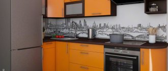
- orange - becomes a source of optimism, pushes people to perform noble deeds. This shade is considered a symbol of freedom according to Feng Shui. Orange relieves depressive thoughts and negative mood;
- yellow – serves as a source of confidence and determination. Color has a beneficial effect on shy people. Helps add more color and fun to life. Yellow promotes fruitful work and helps in achieving goals. Has a beneficial effect on moving up the career ladder;
- green is a pleasant color that is synonymous with balance and contentment. This color helps people find spiritual harmony. Has a beneficial effect on the nervous system;
- blue – wallpaper of this shade can fulfill almost any person’s desires. The color itself symbolizes inspiration and achieving your goals. Blue lures luck into the house.
Criteria for choosing wallpaper
In addition to color and texture, you must also consider some criteria when choosing wallpaper. These include the following points:
- Wallpaper should be environmentally friendly and made of high-quality material;
- The ornament, color and style of the wallpaper should be combined with the furniture and curtains;
- We must not forget about the difficulties of gluing, because some wallpaper requires adjustment to the pattern, so it will take much more rolls than planned.
How to combine wallpaper in the living room correctly
Division into zones
A successful combination of colors and textures will favorably present furniture and other decorative elements of the room. By combining wallpaper, you can divide the living room into zones; this technique will add originality to the design of the living room and add modernity to the interior.
Vertical and horizontal layout
There are two types of combining wallpaper in a room - vertical and horizontal layout.
A vertical composition divides the wall area into two or more segments. You can focus on the classic style by using wall panels and wallpaper. By dividing the height of the wall into three parts, the vertical layout will help highlight the fragment with a TV.
Horizontal combination will divide a large room into zones. You can also highlight the wall with the window and the one opposite it in a different color than the selected wallpaper color.
Wallpaper combination rules
To correctly combine wallpaper in the living room interior, you need to choose between contrasting types:
- type of texture: smooth or embossed;
- ornament: large, small;
- plain or patterned
- color: dark or light
To ensure that different wallpapers in the living room are combined with each other, choose no more than three different textures and colors, maintain a balance of light and dark (70/30), and do not mix checks and stripes in the same room.
How to combine colors correctly?
If you want to use wallpaper in two colors, you need to know which shades to combine with each color. The overall appearance of the room and its atmosphere depend on this.
The most popular option is a combination of dark and light colors. There are shades that go with almost all colors, these include white, gray, beige and brown.
Various types of wallpaper
However, it is not only the color of the material that you need to pay attention to. Another important indicator is the texture of the finishing material.
Bedroom in purple shades - beautiful and elegant
Among the most popular, popular and high-quality types of wallpaper today, the following stand out:
- natural;
- non-woven;
- textile;
- vinyl.
Advice. Of course, paper wallpapers are also produced, but they should only be used if you want or are forced to save money. Since from an aesthetic point of view, they are clearly inferior to all of the above, and such wallpaper will definitely not be able to highlight the advantages of the bedroom and emphasize its special interior design.
Let's take a closer look at each type of facing material, which will help you make an informed and correct choice.
Natural wallpaper
In particular, we are talking about the so-called textured decorating material, which is:
- cane;
- bamboo;
- bamboo threads;
- jute and others.
Wallpaper of several colors in one room - a pleasant atmosphere
If we talk about the specific shade of such materials, it is worth noting that it is best to choose neutral, calm shades that will help create a truly cozy, unique atmosphere in the room.
Non-woven wallpaper
This type of wallpaper is made from a special material, which consists of textile fibers or cellulose. Like natural ones, they are completely safe for health.
Advice. If the walls of your bedroom have uneven surfaces, then non-woven models will be the best option, since they are quite dense and can hide all surface imperfections.
The best option would be a material intended for subsequent painting, since it can be painted an unlimited number of times. That is, to change the interior design, you will only need to repaint the room.
This approach will allow you to save on repairs in the future:
- money;
- time.
Beige and brown colors in bedroom design - severity and clarity of contrasts
The peculiarity of materials intended for coloring is that they have different textures:
- waves;
- Christmas tree;
- matting, etc.
Read also: Bedroom design in light colors: dazzling white and soft beige
Textile wallpaper
This type of material has been used for decorating bedrooms for quite a long time.
It may have the following basis:
- paper;
- non-woven
The main material used to make such a coating is:
- linen;
- silk;
- felt;
- velor.
Please note that this type of finish may have a slightly different shade even if you use materials from the same batch. This is due to their naturalness and is considered normal!
Yellow and green colors: calm shades indicate the refined taste of the owners
However, such a discrepancy in shades should not be considered a disadvantage or defect, since on the wall the coating looks like natural fabric, and small differences in color are perceived as tints of tone.
Advice. If stains appear on the coating, the fabric wallpaper can be cleaned using chemical action. Other wallpapers are not subject to such cleaning.
Among other positive properties of this finish, it is worth highlighting:
- color fastness;
- UV resistance;
- service life reaches twelve years.
Vinyl wallpapers
It is noteworthy that there are two main types of vinyl finishing material:
- non-woven base;
- made by silk-screen printing, this is a special method - hot stamping.
In general, this type of cladding is characterized by the following performance properties:
- moisture resistance;
- strength;
- durability;
- ease of gluing.
Advice. To ensure maximum quality of gluing, vinyl wallpaper must be glued strictly joint to joint, and a special construction roller must be used to level the coating and smooth it.
Black wallpaper
Black wallpaper looks very textured and modern. They can emphasize the subtle and sophisticated style of the owner, but they need to be able to be dosed and combined correctly.
White wallpaper: 185 photos of current design and design options using white wallpaperPaper wallpaper - 145 photos of the best design options for paper wallpaper
- Gray wallpaper - fresh and beautiful ideas for using wallpaper in gray tones (155 photos and videos)
Most often, black wallpaper is hung in the living room; with its help, you can create a unique interior.
Wallpaper color scheme
If you take another look at the above color wheel, you will see that it is divided into two semi-circles, the colors of which are called “warm” and “cool”. Warm colors are red, orange, yellow, their shades and intermediate colors. Cool colors - blue, cyan, green, violet and their derivatives with shades. Below we invite you to consider various combinations of warm and cool wallpaper colors and evaluate the photos: which ones do you like best?
Warm shades
Warm shades of wallpaper colors help the room look more comfortable, warmer, and homely. They visually narrow the room, so it is better to use them in large rooms. Warm tones have an invigorating effect on the owners; they are exciting and passionate. In addition, warm shades increase appetite.
Red wallpaper. Various combinations of red wallpaper are solutions for brave, active and very self-confident people. Red wallpaper goes best with calmer shades of its own spectrum (brown, pink, purple) and most warm colors. Bright red color is best used for curtains, accessories and bright accents, since walls covered with wallpaper of such an aggressive color will probably be too oppressive.
Burgundy wallpaper. The combination of burgundy wallpaper is a universal solution for strict, sophisticated, luxurious classic interiors. The deep burgundy color emphasizes the grandeur of the room, goes well with dark wood and emphasizes the high status of the owners. Goes well with pink, pumpkin, black.
Pink wallpaper. If burgundy is a dark red, then pink is its light version. The combination of pink wallpaper in the interior can look both playful and solid, soft, romantic. It is best to combine pink wallpaper with light brown, sand, milky and gray wallpaper. Remember that the more purple there is in pink, the more vibrant and flashy the color will be. This one is more suitable for a girl’s nursery, while soft pink shades will decorate even classic interiors.
Orange wallpaper. If you are looking for a bright, very warm, homely, cheerful combination, orange wallpaper will help you with this. Orange is the warmest color in the entire spectrum, so its shades will help combat the excessive coldness of the room. Orange tones go well together. Combinations of bright orange with brown, dark chocolate, and caramel look best.
Brown wallpaper. This color is the darkest shade in the orange spectrum. The combination of brown wallpaper will most appeal to conservative people, for whom the solidity of the design, its practicality and weight are important. The combination of brown wallpaper in the interior is not the most difficult task, because it matches almost all colors and serves as both an excellent background and an original accent element.
Peach wallpaper. Peach color is a delicate pastel shade in orange tones. If orange is too bright for you and beige is too light, then peach is the perfect middle ground. This color will go with all warm pastel shades, as well as tones of orange all the way to dark brown. The combination of peach wallpaper will help create coziness, tranquility and sophistication in the room.
Beige wallpaper. The combination of beige wallpaper in the interior is a universal classic. Different shades of beige have always been used to create designs in a wide variety of styles. In addition, beige is the ideal background color for all wallpapers in the warm color spectrum. Beige wallpaper is a combination for those who value simplicity, elegance and comfort in the interior.
Yellow wallpaper. Yellow wallpaper creates a more invigorating and active atmosphere than wallpaper in orange shades. It is recommended to decorate living rooms in yellow, because wallpaper combinations of this color help to lift your spirits, relax and have fun chatting with your family. The combination of beige and yellow wallpaper will help “calm” the room and make it more versatile.
Cold palette
Cool shades of wallpaper will be an excellent choice for those rooms whose windows face south. These colors help to visually “cool” the interior, as well as visually “spread” the walls, making the room larger and wider. They are discreet, soft, soothing.
Green wallpaper. The first association with green wallpaper is nature, grass, life. The combination of green wallpaper in a room will help put the owners in a calm mood; it promotes relaxation and even, as psychologists say, affects a person’s physical health. The combination of green wallpaper is good for the eyes, so it is well suited for decorating offices and nurseries.
Blue wallpaper. The combination of blue wallpaper in the interior is most appropriate in a high-tech, modern and Mediterranean style. It is often found in classic interiors. The color itself calms the nerves, gets you ready to work, and can even normalize blood pressure. Combinations of blue are not advisable to use in cold rooms, and it is also not recommended to use dark blue shades in large areas (this may create a depressing atmosphere).
Tip: use blue or green wallpaper to combine in the kitchen if you often go on a diet - these colors help suppress excess appetite.
Turquoise wallpaper. Turquoise color is a combination of blue and green. The combination of turquoise wallpaper in the interior always looks fresh and unusual. By combining such wallpapers with lighter or darker ones, you can create a unique design that will emphasize the cleanliness and coolness of the room.
Purple wallpaper. The combination of purple wallpaper is considered the least cold of all. The color violet is relaxing and calming, so it is more logical to decorate the bedroom in this shade. It goes best with lilac, pink and a variety of beige shades.
Lilac wallpaper. The combination of lilac wallpaper looks best with light shades, especially with tones of white, gray and milky colors. Lilac is the color that is equally liked by young and mature people, because everyone finds light in it: some find romance and freshness, and some find sophistication and grandeur.
Blue wallpaper. Blue color gives a feeling of peace and carefreeness, purity and well-being. However, when decorating the interior in blue tones, do not overdo it: too much color leads to fatigue, and instead of a dreamy mood, you can end up with prolonged depression.
A blue living room will be conducive to active communication, but the decor will need warm accessories. In the bedroom, blue color will promote rest and relaxation. It’s hard to find a more suitable color for a bathroom, because visually it helps make an enclosed space more spacious, brighter, promotes complete relaxation and gives peace. Thanks to blue, the children's room will be filled with peace and comfort.
As you can see, combining wallpaper of different colors is not an easy task, but it is quite doable. The main thing is to know the rules for combining colors, have sensitive taste and the desire to create a real masterpiece.
Wallpaper color and interior style
If you want to create a modern style, then you should choose brightly colored wallpaper that has a clear pattern and contrasting transition.
To create an Art Nouveau style, pastel shades with bright accents or ornaments are used.
Classic style means plain wallpaper.
Choosing a color based on the cardinal directions
One of the important stages in decorating a living room according to Feng Shui is determining the location of the room in the apartment relative to the cardinal directions. This will influence not only the arrangement of furniture, but also the choice of color in which to decorate the living room. If your living room is located in the eastern part of the apartment, then it is better to decorate it in green colors and choose wooden furniture, because it will be more influenced by the element of Wood. The same design would be appropriate for the southeast direction.
For the living room in the northern part of the apartment, you should choose blue shades. In such a room you can hang paintings depicting lakes, seas, and waterfalls. Interior and furniture items made using metal, white and silver would also be appropriate. If the room is located in the south, red and orange shades will be appropriate, and for the western and north-eastern directions, beige and yellow colors will be optimal.
Remember! Feng Shui does not accept sharp and contrasting transitions of colors; everything should be harmoniously combined with each other.
We design the floor and ceiling according to Feng Shui
Let's take a closer look at what colors are best for decorating individual elements of the living room, starting with the floor and ceiling. When making a floor in the living room, remember that positive Qi energy enters a person through his heels, which means that the floor covering must be alive.
Of course, it is impossible to make the floor sandy or grow grass, which would be an ideal Feng Shui option, but using natural brown parquet is quite possible. The most important thing is that the coating is smooth and does not interfere with life balance. And make sure that the floor is warm, because it is better to walk on it barefoot. Another option would be a thick green carpet, but linoleum, laminate or tile are not suitable materials.
No less important is the design of the ceiling in the living room. The ideal Feng Shui option is to whitewash or paint the ceiling white and keep it clean. Stains, cracks and other defects on the ceiling are sources of negative energy and bad luck that penetrates your life. It is especially not recommended to decorate the ceiling in blue. Blue will be associated with the danger of water hanging overhead. Also, all dark colors will become negative, so be careful with this choice.
We decorate the walls according to Feng Shui
Now let's move on to the design of the walls, which should be attractive, but in moderation. First of all, you need to level the walls so that nothing interferes with the free movement of positive energy. It is better to choose one color for decoration; plain walls are perceived better. The choice of color should be subject to two components: psychology and harmony. Each color has its own impact on a person, so this cannot be neglected; in addition, colors and shades have visual effects that affect the perception of the interior.
So, light colors help to visually increase space, and also symbolize harmony and peace. Dark colors are associated with mysticism. Let's take a closer look at some of the colors that can be used when decorating walls.
- White. I would like to pay special attention to the white color, which symbolizes perfection and purity. It is worth using it in the interior in combination with another color to avoid lifeless design and fill the room with comfort and warmth. According to Feng Shui, yellow goes best with white.
- Red. If you plan to use the red color of the walls according to Feng Shui, then know that this color stimulates the appetite, enhances passion, activates a person, and sometimes causes aggression. When combined with gold, red helps to attract good luck in the area of finances. Therefore, think carefully about how to use this color in the interior correctly, because its excess can negatively affect your mental balance. According to Feng Shui, it is not recommended to combine red and black.
- Orange. This color, combining the energy of red and the kindness of yellow, is best suited for decorating a living room, as it encourages communication. Orange also promotes harmony and well-being; it enhances the significance of the room.
- Gold. This is the color of honor and respect. In ancient times, only emperors could wear clothes of this color or decorate rooms using gold color. It has a positive influence on a person and contributes to the development of virtue. If you use this color in the interior when decorating the walls, you can attract monetary energy.
- Black. Most often, negative properties are attributed to this color, considering it gloomy and mournful. But in Chinese teaching, everything is not so, white is considered mourning, but black is called a magical and enchanting color, so it is quite appropriate in the interior of a living room.
- Blue. Blue is a color associated with water. It has a calming effect on a person, causing a desire to know one’s place in this world, and makes one think about one’s destiny and harmony in everything. This color promotes relaxation, it is perfect for decorating a meditation area in the living room, it stimulates spiritual energy. This color also enhances intuition.
- Green. This color is known to everyone as bringing peace and tranquility. According to Feng Shui, this color of walls in the Wealth zone will stimulate profit and family well-being, because it belongs to the element of Wood, and wood is growth and life. If you paint the wall of a living room located in the Glory zone, this will promote harmonious communication with others. An excellent combination of green and yellow colors, symbolizing success.
- Yellow. Yellow color is a symbol of good luck and positive energy. If you want to cheer up, bring warmth and homeliness, happiness into your home, then yellow is the best color. It makes you smile and feel cheerful and optimistic, and good luck comes to these people. Add yellow to your interior and you won’t notice how you become more positive.
- Violet. This color is associated with the spiritual sphere of human life. Mystical properties and a sense of magic are often attributed to it. This color is characteristic of creative people with developed imagination. The use of purple in the Wealth zone promotes material well-being.
Feng Shui color palette for curtains
Let’s devote a few words to the design of the window in the living room, namely curtains, which can dilute and complement the design of the walls, especially if they are plain. The right curtains help maintain positive energy in the room. In order for this energy to circulate freely, you need to keep the curtains neat and clean. During the day they need to be moved apart, and at night the window should be closed from negative energy. According to Feng Shui, curtains should be long and wide, and they should also have folds.
As for their color, dark blue curtains, as well as crimson and orange, would be appropriate for the living room. Orange curtains will refresh the room and fill it with warmth. You can also hang green curtains that will fill the living room with peace. Take the purchase of curtains seriously, because if they are not designed in accordance with the principles, it will emphasize bad Feng Shui, even despite the design of the walls, floor, ceiling, and furniture arrangement.
In conclusion, we note that decorating a living room in accordance with ancient Chinese teachings is a very difficult task. Only a real specialist who knows all the intricacies of Feng Shui can take into account every detail. Therefore, entrust this matter to a professional to achieve the best result, which will truly attract the positive energy of health, luck and wealth into your home. Be happy!
Similar pages
- What wallpaper colors are best for a hallway according to Feng Shui? Interior color scheme. In the hallway and corridors, the forces of Yin and Yang must be in balance.…
- What colors to choose for the kitchen according to Feng Shui Asians take the design of their homes very seriously. The kitchen is considered the heart of their home. Correct…
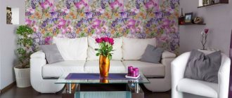
- Wallpaper collection "Floristry" Home comfort and the charm of flowers in the new wallpaper collection "Floristry". Drawing – floral monograms on…
Furniture shades
If your interior has white furniture, then you can use wallpaper of any color. It harmonizes perfectly with all shades, and so that such furniture does not get lost against the background of light walls, you can add a bright accent in the form of decor.
Golden and beige tones are suitable for brown furniture; green, blue and yellow are often used.
If the furniture is multi-colored, it is best to cover the walls with plain wallpaper.
White and the lightest colors will suit dark furniture, against which it will look very impressive.
The right combination of wallpaper and furniture colors will add style and comfort to the interior. Therefore, this point should also be taken seriously.
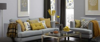
Light wallpaper in the living room
A light shade of the walls visually expands the room, and neutral tones can be easily combined with the color of furniture, textiles and decor.
White wallpaper
White wallpaper in the living room interior will visually expand the space of the room and become a good background for filling it. So, you can use clear contrasts in the form of a dark floor or carpet. The white color of the walls in the interior will fill the room with air; it can be combined with any colors in the interior.
To avoid the effect of a hospital room, we recommend not using white wallpaper with white furniture.
Gray wallpaper
Gray wallpaper in the living room interior with a plaster-like relief or a black and white print goes well with most colors and will perfectly highlight any shade of the interior.
It is better to choose furniture and floors that are two or three shades darker to match the gray color of the walls; this color combination will refresh the room.
Beige wallpaper
A room decorated in light colors becomes spacious, cozy and bright. Beige wallpaper in the living room interior looks elegant and at the same time calm, and goes well with natural wood of any shade. Combines well with light green, light blue, gray, black and white colors.
We recommend choosing a floor darker than the color of the walls; this will add additional coziness to the room.
Types of Wallpaper
There is a wide variety of wallpaper types that currently exist on the market.
- One of the cheapest options is paper wallpaper.
- Non-woven wallpaper.
- Vinyl wallpapers.
- Textile wallpaper.
- Glass wallpaper.
- Liquid wallpaper.
- Bamboo wallpaper.
- Photo wallpaper.
Various photos of wallpaper in two colors or different types can be found on the Internet to get an idea of what they really look like.
What can influence the choice of color?
It is not customary to design all rooms in the house in the same style.
They need to be separated from each other. This is also done with finishing materials. You immediately need to figure out how the room will be used? For the living room, the normal state is a state of fun, trouble. Guests usually gather there. The apartment owner is faced with the task of creating a bright environment so that guests do not get bored.
Color options
The opposite situation is with the bedroom. In the bedroom, most of the time is spent sleeping, so there should be a calm environment. You can’t use shades in the bedroom that give a boost of energy and suppress laziness. You won't be able to relax in this situation. The issue of dimensions cannot be ignored. Finishing material plays an important role in the visual perception of space. There are techniques that increase space. There are ways to compensate for too spacious rooms. It’s just important not to confuse the shades.
Provence style color is ideal for the bedroom
Lighting Features
The choice of color is also influenced by lighting features. When the window faces north, this leads to poor quality lighting. Poor quality natural lighting needs to be compensated. It is not enough to install lamps. You also need to choose the color of the material wisely.
Tip To avoid discomfort in a dark room with the lights off, you need to use light shades. It is advisable not to go out of style.
This color will add more light to your room.
You cannot thoughtlessly use them just because you liked their shade or pattern . Some styles are strict in this regard, for example, baroque or classic. There are fewer problems with conventional modernity, but it also has its own requirements. They affect brightness. You need to be able to combine correctly. You cannot use different shades in one composition. It is important to maintain harmony everywhere.
The color of the wallpaper should be in harmony with the furniture.
The issue of practicality cannot be avoided. Dirt on white shades is very noticeable. For a bedroom or living room this is not so important. This factor is more important for the kitchen. Ceilings and walls get dirty there much faster. The proximity of the stove, the heat from the oven, cooking, lack of free space - all this makes the walls very vulnerable.
Advice You need to choose practical materials.
This also applies to the children's room. Children may accidentally smear or write on them.
Practicality comes first in the kitchen
The location of the material is also a key factor. For one, it is better for it to be located on the wall. Others feel more at home on the ceiling. You should try on the shade in advance, even before gluing. This will help you understand the right choice.
Color selection for rooms
For small rooms, it is best to choose canvases in light colors, which visually expand it and add lightness and airiness.
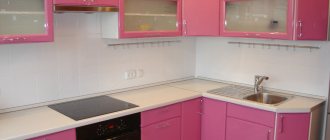
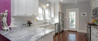
For the kitchen it is recommended to use white and beige; red is also often used, which awakens the appetite.
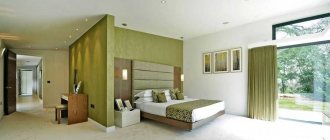
Soft and muted tones, lavender, dusty pink and others are perfect for the bedroom.
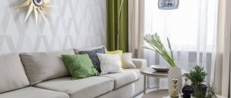
The living room can be covered with either bright wallpaper or canvases in soft and calm tones.
In the children's room you can combine colors. Near the play area you can paste wallpaper in bright and rich colors, and near the sleeping area - soft and muted colors.
If you prefer wallpaper with a print, then it is worth remembering that the smaller the room, the smaller the print should be. For example, in a large room you can hang wallpaper with flowers, the design on which is large, and in a small room - small.
Wallpaper colors that you shouldn't use
The first color that is highly undesirable to use in wall decor is black. This shade has mystical properties. He is personified with something magical and dark.
Brown color also belongs to the unfavorable category. Wallpaper of this color creates a feeling of compression. The walls seem to be pressing on the person. This color scheme is not suitable for either the work area or the recreation area.
Gray - this shade does not carry negative traits, but it does not allow people to develop. Thanks to it, people freeze in place and cannot move forward. It is recommended to avoid this shade altogether. It is not suitable for either a relaxation area or an office.
According to Feng Shui, the living room has the status of “the face of the house”, where favorable Qi energy should circulate freely.
Wallpaper: choice and result
If wallpaper is correctly selected for the interior, it can change the room beyond recognition.
Of course, you can’t choose wallpaper based on color alone; you should focus on the type of wallpaper, outer covering, stability of the pattern, displacement of the pattern when gluing and other points.
When decorating walls, it is best to avoid sharp contrasts. The ceiling in the room should be lighter than the wallpaper, but if the ceilings are quite high, then you can deviate from this rule.
If you plan to decorate the walls with a lot of photographs or paintings, then the wallpaper should be plain.
With the help of striped wallpaper you can visually increase the height of the room, and wallpaper with a small pattern will perfectly hide wall defects.
Rules for choosing shades
To choose a fashionable and modern wallpaper color that would make the interior holistic and harmonious, you need to think in advance about how a particular shade will transform your room.
Consider the following factors and features of your home interior:
- purpose of the room : for example, in the bedroom, where you plan to relax and gain strength, it is better to use a calm and light palette, and in the living room, intended for receiving friends, wallpaper with brighter and more saturated shades is appropriate;
- interior dimensions : whatever the room, the visibility of free space will make it even more comfortable. This effect can be achieved with the help of suitable colors: light shades expand the interior, and dark wallpaper makes the room more cramped;
- brightness of lighting : rooms located on the north side are not always well lit, and the comfort of your loved ones directly depends on this. Decorate such an interior in light and warm colors - and the interior will no longer be perceived as so dull and monotonous;
- interior style : each style corresponds to a number of the most suitable shades, and when decorating the walls it is better to adhere to a successful color scheme of finishing materials. For example, baroque or classic can be decorated with golden wallpaper, while modern modernism involves the use of bright and rich colors in the design of the walls;
- color combination : maintain harmony when using wallpaper of different shades and take into account their correspondence to the furniture;
- practicality of design : some interiors (for example, a kitchen, bathroom or corridor) have a number of specific conditions that affect the appearance of wallpaper for walls. When choosing between light and dark shades, be sure to consider the risk of stains, scuffs and other imperfections on the walls after the renovation is complete.
Selection of wallpaper color, photo
Wallpaper color, photo
Wallpaper color shades should be chosen taking into account their psychological impact. Everyone knows that some wallpapers can have a depressing effect or promote excessive emotionality, while others can calm you down, set you up for relaxation or allow you to concentrate on important matters.
Advice: bright and saturated colors should not be used as a background if you plan to relax in a renovated interior. They can be used as small accents on one of the walls.
Modern wallpaper colors differ in tonality and saturation, and they can be divided into several categories. Let's figure out what colors are considered successful in decorating home rooms.
Wallpaper photo
Please repost